Posts in Tips & Tricks
4 common web design mistakes - and how to fix them

You can have the best product on your shelves, the best customer service around, the best words on your webpages, and the best advice on your blogs, but, if your website’s design isn’t up to par it can all fall flat. 

Getting your website’s aesthetics just right can be a tough nut to crack - especially if it’s not your area of expertise. Small mistakes here and there can wreak havoc with your conversion rate. Many of these web design blunders are easily avoidable – or can be quickly corrected. 

4 Common Web Design Mistakes -- and how to fix them  |  Hue & Tone Creative

All you need is the knowledge about how to correct them, and then you can get your design quickly back on track. If you’re not sure where you might be going wrong, here are four common mistakes we come across and how to overcome them:

1. Hidden contact details

Getting people to land on your website is one half of the battle, getting people to take action is the other. So, make it as easy as possible for visitors to find your form, email, or number.

All too often, organizations leave their contact details buried in their footer or three links deep into their navigation, making it hard to get in touch. 

The fix: Task someone who doesn’t know your site inside and out with tracking down your contact details. If they report back it took them more than a second or two, it’s time to look at your placement. A couple of easy-to-see suggestions include: 

  • At the top right of your main navigation bar, so it’s instantly visible on every page

  • Within your main navigation bar, clearly labelled - something like ‘Contact us’ or ‘Get in touch’

2. Cluttered pages

4 Common Web Design Mistakes -- and how to fix them  |  Hue & Tone Creative

The phrase “less is more” couldn’t be more true when it comes to designing a clean and easy to navigate web page. Lots of sites out there are guilty of cramming each and every page with images, buttons, text, and widget – but all these elements are competing for your visitor’s attention and can quickly become overwhelming. 

People don’t know where to look, what to read, or what’s most important, and they certainly can’t skim your content - all of which can be a big turn-off.

The fix: Go through your website page-by-page and really question what the value of each element is. If there isn’t a motivation behind a certain element, go ahead and remove it. Once you’ve whittled your on-page items down to the essentials, start strategizing about each page’s hierarchy. Make sure you’re incorporating clear call to actions and plenty of whitespace.

Shameless plug: hiring a designer might help with this.

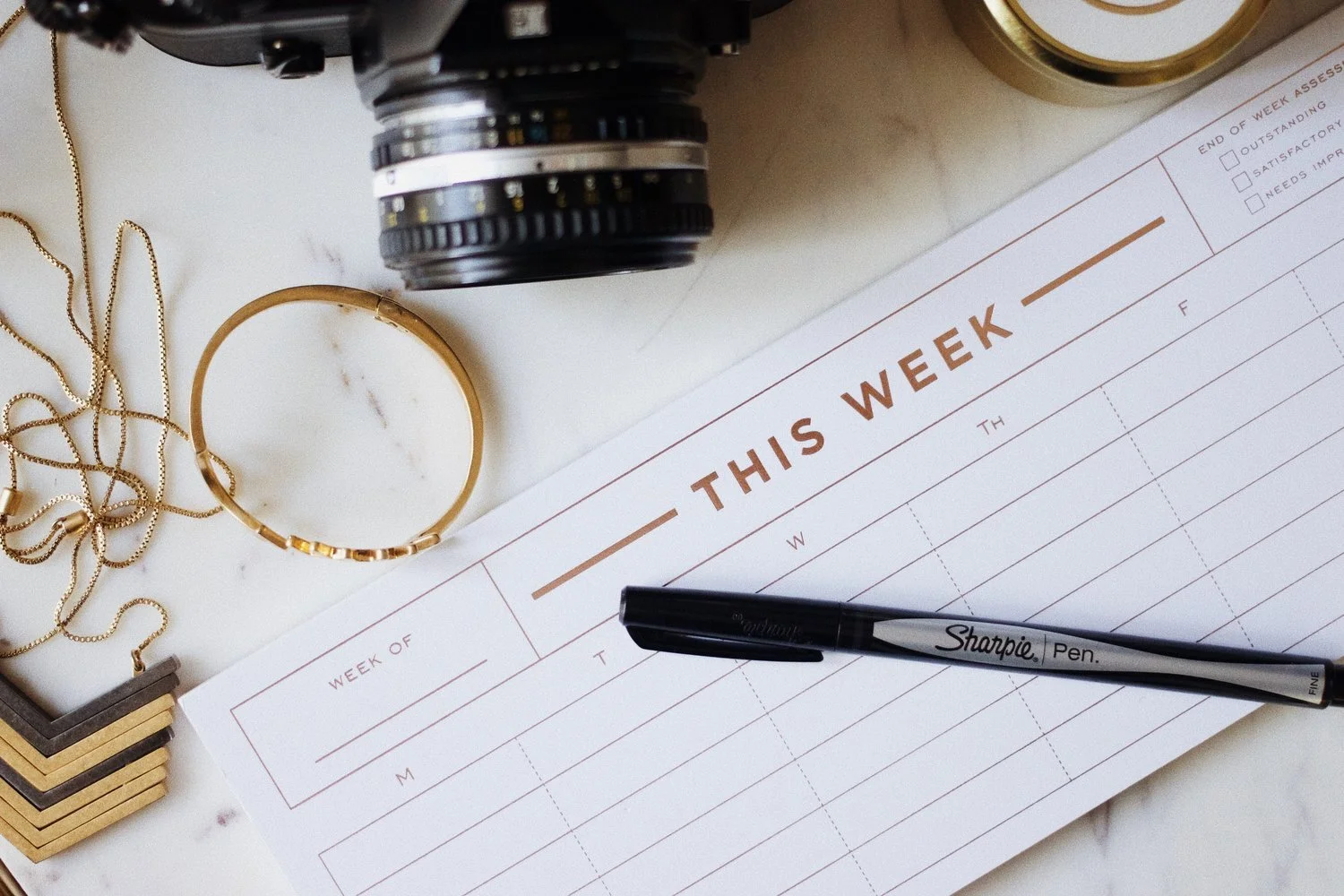
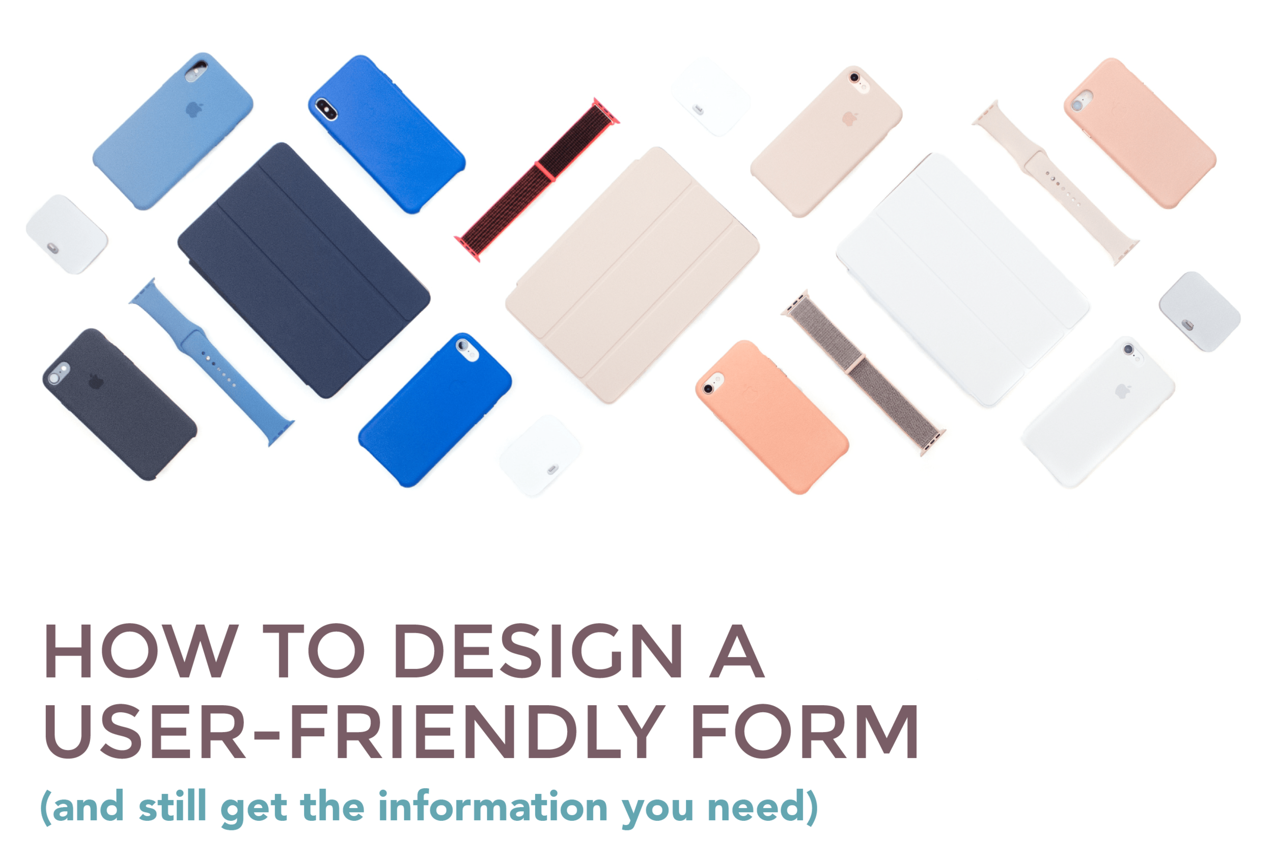
3. Fatal contact forms

Complicated contact forms can be fatal to your conversion rates. If you’ve got lines and lines of fields to fill in, there’s a good chance your visitors will take one look, race to the back button, and exit your site altogether. After all, time is of the essence for everyone on your website or social media. 


The fix: Similar to your site’s pages, go through all your forms field-by-field to see what info is and isn’t needed. For example, you probably don’t need a prospect’s address until they’re further down the funnel – so don’t ask for it, because it could deter people from filling out your form.

In most cases, we recommend keeping forms to just a name and email address. Often, even just an email address field will suffice. 

By the end of this process you should be left with concise, tidy forms, and a clear plan for your data collection strategy.

After some extra advice? Here’s more on how to design a user-friendly form.

4. Absent search boxes

Quick tip: Another quick and easy workaround could be Google Custom Search.

If your site’s relatively big (more than 10 - 20 pages including regular pages, products, blogs, etc.) it’s probably a good idea to add a search box. It makes your site easier to navigate and ensures people will be able to find the content they’re looking for. No more worrying about people leaving the site because the blog post they were looking for was buried in your archives! 


The fix: The solution will depend on your CMS. Some will have a search box feature built-in for you to download, but for other platforms you might have to source a developer to help create a custom one. 


Hue & Tone Creative: Your Website Design Expert

If you’ve not got the time or experience to give your website’s design the attention it needs, then we’re here to give it the TLC it deserves. To see what we can do for you, get in touch today at (336) 365-8559 or hannah@hueandtonecreative.com.

How to conduct A/B testing

Colleague #1:“Lets change the layout of this landing page.”

Colleague #2: “What’s the reason for the change?”

Colleague #1:“Just because. Maybe it’ll work better.”


How many times have you had or heard a conversation along these lines? It’s the marketing equivalent of shooting in the dark and hoping for the best. 

software-developer-and-ux-ui-designer-are-designing-mobile-application_t20_gopNPx.jpg

Spoiler: there’s a better way to make big business decisions.

A/B testing, also sometimes referred to as ‘split testing’, is a type of experiment used by marketers to gauge which variation of a campaign works best. 

The concept itself has been around for a long time, but is particularly relevant in the worlds of email and web marketing. It’s an inexpensive and reliable method to really understand whatworks for the correct audience. 

When it comes to what you can test the possibilities are almost endless, but some common examples include:

  • Landing page copy

  • Call to actions (CTAs)

  • Email subject lines

  • Headlines

  • Product descriptions

  • Advertisement imagery and colors

  • Email sender names

  • Personalization options

How to conduct A/B Testing  |  Hue & Tone Creative

The benefits of A/B testing

How many times have you or a colleague made a decision based on instinct, a gut feeling, or best practice? It’s impossible to predict how people will react, and A/B testing will help you remove some of that guess work.

If done right, it can give you tangible insights that increase web traffic and conversions -- and decrease bounce rates and missed opportunities. 

If done wrong, inaccurate results can be extracted which can result in performance-damaging decisions being made. So, let’s make sure you get it right! 

How to get started 


1. Pick your variable

First things first, you need to pick which variable you want to test. It’s important to focus your efforts on only one element or change at a time, otherwise you won’t know which is responsible for your surge or slump in performance.

For example, if you were focusing on improving the conversion rate of an email and changed the color of your CTA and the template, how would you know which change was behind the results?

That doesn’t mean you can’t fiddle with various elements of a single campaign, it just means they can’t be measured concurrently. Sticking with the email example, you’d need to make your CTA change, analyze your results, take action accordingly, and then experiment with your template

2. Set your goals

Once you’ve settled on your variable, you need to set its primary goal. Let’s say your experimenting with the text on a landing page, your primary goal could be to either: 

  • Reduce the page’s bounce rate

  • Increase the average time spent on the page

  • Increase the page’s conversion rate

3. Create your variables

Next up, you need to create your two variations. Your control version is either what you already have (i.e. current webpage copy) or what you’d normally use (your standard email template, for example).

Your second variation - the ‘challenger’ - is the same asset, but with the isolated change you’re looking to test. For example, let’s pretend your testing if changing the color of your ‘Buy now’ button increases conversions.  

Your control version would be simply leaving the webpage unaltered, and your challenger version would involve using the exact same page, but changing the color of the button to X, Y or Z. It’s as simple as that.


4. Split your data

When it comes to splitting your data, it’s important to divvy it up equally - i.e. 50/50. The reason for this, is that it’s the quickest and most reliable way to get statistically significant results.

To make a decision on which variable is more effective, each has to be viewed the same amount of times. So, if you were to split your data 30/70 (with 30% going to your challenger version and 70% to the original), for example, it’d take much longer for your challenger to rack up the numbers needed to complete your experiment.

If you’re not sure where to start with this bit, here are some of the best rated A/B testing tools to help you:

5. Set your sample size

This one will vary depending on what you’re testing and which A/B testing tool you use. If you’re testing a webpage, for example, you might want to set yourself a target number of visitors to base your experiment on.

Or, if you’re measuring a social media ad, you might choose to set your campaign to run until each variation has earned 3,000 impressions, for example.

For help on how to determine your sample size, check out this guide.


6. Analyze your results

Last but not least, you need to take the time to carefully read and understand your results. During the analysis stage, it’s important to keep your primary goal in mind and not get distracted by other metrics.

By this, we mean if your main goal was to improve email conversions by changing your template, try not to get too caught up with things like open rate, click through rate (CTR), and bounce rate.

Important things to remember

Before you get going with your A/B tests, here are a few final points to bear in mind:

  • Run both your variations at the same time

  • Run your tests for the same amount of time

  • Only run one test at a time

  • Give your experiment enough time to produce meaningful results


Hue & Tone Creative: Your Marketing Partner

If you need help producing your A/B testing assets, you know where we are. To discuss your needs, goals and requirements, contact the team at (336) 365-8559 or hannah@hueandtonecreative.com.

Typography for beginners
Typography for Beginners  |  Hue & Tone Creative

Some web pages and brochures good… and some look terribly unprofessional. If you’re new to graphic design or typesetting it can be hard to determine what makes someone’s branding look good or bad.  

If you’re a beginner – or you’re attempting to brand your own business -- there’s a number of type rules you can follow to give brand a polished look. Following these simple rules will help even the most amateur designer get their webpages and print assets in tip top shape!


1. Less is more when it comes to typeface

If you’re looking for some font pairing inspiration, head over to these two posts about pairing fonts on Squarespace (here and here). 

Choosing the right typeface is key. Get it right, and you’ll set yourself up for stylish, simple and easy-to-read assets. But get it wrong, and you’ll end up with illegible, cluttered and unappealing pages. 

Simple fonts should be used for main body copy, and decorative typefaces should be used sparingly for things like subheadings.

The golden rule in the design world is to stick to a maximum of three fonts in any given piece of artwork - whether that is a website page, social media banner, or hardcopy flyer. However, whittling your fonts down to two can sometimes be even better. 

If you stick to just one or two fonts, you can use varying weights to create a more refined look. 


2. Use a sensible hierarchical structure

Following a logical hierarchy helps to give your site’s pages a clear flow and effortlessly guides readers through the structure of the website. Let’s compare and contrast two examples to give you a better idea of what we mean: 

Good content formatting.png

Exhibit A is a bad example. The website’s name, navigation bar, subheadings, and main body copy are all the same font size. Now there are two issues with that – first, it gives readers no visual indication where they should start reading or what’s most important to look at. Secondly, it makes it really difficult for the reader to skim through the copy.
 

Now, let’s contrast an example of a solid hierarchical structure. The page’s title, navigation bar, subheadings and copy are clearly defined with varying font points, making it much easier on the viewer’s eye.


3. Be creative with contrast

Typography for Beginners  |  Hue & Tone Creative

Being creative is part of being a designer. Now we know we said earlier you should stick to two to three font combinations per project, but that doesn’t mean you can’t mix up your styling by playing around with things like the font’s size, weight, color and style.

Whether you emphasize a key word with italics, change the color of a subead to something more bold, or bump up a term in your tagline to a size that’s more eye-catching, there are endless ways to create contrast within your copy.


4. Keep your alignment neat and tidy

Alignment applies to all your on-page elements - like body text, titles, logos, images, and menu bars. When it comes to alignment, everything should be connected in one way or another. For example, you might want your logo to align with your main navigation bar, your body copy to align with your page’s title, and your images to align with your body copy.

Well thought-out alignment will help prevent your page from becoming disjointed and ensure all your assets create well-measured sizes and distances between each other.


5. Don’t be a stranger to whitespace

Don’t fall into the trap of thinking you need to fill everynook and cranny on your page. Creating whitespace around your words can be incredibly powerful, can help draw attention to text, and will aid you in achieving a simple and trendy look. 


6. Choose your colors carefully

Last but not least is your color choice. The right colors can make or break the look and readability of your copy – there’s nothing worse than colors that make your words a strain to read.

When it comes to color, there are three key components: 

  • Hue - the shade of the color

  • Saturation - the brilliance of the color

  • Value - the lightness or darkness of the color

Source >

When it comes to choosing your colors, the aim of the game is to make your text as easy as possible to read. It’s as simple as that.


Hue & Tone Creative: Let’s work together

Feeling overwhelmed with information? If you’re not a designer, knowing and deciding what does and doesn’t work is easier said than done. If you need a hand with your typesetting - or any other area of design, get in touch with our team today at (336) 365-8559.

8 elements of a great economic development website
8 elements of a great economic development website  |  Hue & Tone Creative

Creating a strong online presence for your development project allows you to widen your reach and share information with interested people and businesses. In addition to capturing the essence of your city or surroundings, your website should also follow a few marketing best practices in order to enhance your effectiveness. 

The things that make an economic development website great are the same things that make any website a dream: intuitive navigation, on-trend branding, and clear messaging. But what else can really help your website stand out from the pack? 

Whether you’re starting from scratch or looking to overhaul what you’ve currently got, here are eight useful tips to help you get the most out of your economic development website.


1. Make your mission clear 

If you want to stand out, your mission needs to be clear, inspiring and distinguishable from the competition. The overarching goal for any economic development campaign is to connect with prospective companies about why you’re a good fit for their company.  

To lure potential job creators to your area, you’ll need to thoroughly develop your mission statement and make sure it’s clear who you’re targeting, how your site or area will benefit them, how you plan to engage them, and what the next steps will be. 


2. Show off your support

No one does economic development alone –chances are you have a handful of partner organizations and public or private financial backing. People should easily be able to determine who is involved with your project, and what portions of the project they are involved with.

However, just adding this information to your website isn’t enough –you’ll want to keep people updated as your project progresses. It can take years for a project to go from the idea stage to groundbreaking, and staying active on social media or sending out a monthly newsletter can help keep people bought in to your project. 


3. Use statistics sensibly 

If you are using statistics to support something you’ve said or to support the value of your mission, make sure they’re up-to-date, accurate, and applicable. If you try engineering semi-relevant stats to fit your message, you’ll just end up confusing your audience. 

 Use tailored statistics and use them sparingly to make the most impact on your audience. 


4. Disclose individual contacts

Don’t use generic email addresses like info@mywebsite.com or contact@mywebsite.com. Potential site consultants will want to be able to do research on all parties involved and want to know they’re about to build a personal connection with someone. 

We suggest including the name, job title, email address, contact number and photo of each of your employees.


5. Stick to the three-click rule

You might have lots of really great content on your website, but if your visitors can’t find it, it’s not going to be doing you any good. The less clicks visitors have to make the better!

As a general rule, you don’t want to make pertinent information further than three clicks away from any given location on your site.


6. Don’t cut corners on imagery

The look and feel of your online presence is clearly important –but it’s not just about branding. When you’re choosing your imagery, don’t cut corners on the quality. 

There will be times when you’re selling a vision for a mid-construction project, which means you may have to use stock photography. If that’s the case, look for images that feel authentic. Try to target stock images that all have a similar style so that your site looks cohesive. 

If you’re in the early stages of a project, we suggest incorporating lots of placemaking imagery to give prospects a better sense of your community. Photos of lively town centers will help balance out the sterile feel of elevation drawings and floorplans.


7. Boast about your buy-in

If you’re in the early stages of a project or are searching for an anchor tenant, community buy-in matters. Showing off major backers will definitely turn heads -- but if you’re stretched for valuable web content don’t limit yourself to just the big names. 

Consider compiling a semi-exhaustive directory of all the small businesses and civic leaders who are engaged with your project. Pull quotes that highlight public support to convey a feeling of success…before you’ve even broken ground. 


8. Keep it fresh

Keeping your stats up-to-date is one thing, keeping the rest of your content fresh is another. When a project is in a construction lull, or you’re waiting for permits to come through, it can be easy to let your content get stale. 

To make sure you don’t fall into a rut, we suggest putting together a content calendar together that highlights key developments for the next year. This will help you brainstorm relevant content for the down times and force you to think outside of the box. Just be sure to keep revisiting your content calendar as construction schedules change! 


Let’s get into business: together.

If you need a partner to help you optimize your website, help you develop a campaign, or maintain your social media efforts, get in touch at 336-365-8559 or hannah@hueandtonecreative.com.

How to write a subject line that gets clicks

The world of email marketing is remarkably noisy. According to research conducted by The Radicati Group, a Technology Market Research Firm, 235.6 billion emails are sent and received worldwide every single day, and that number is only set to increase. 

For you as a marketer, that means there’s an endless stream of emails - both business and personal - to compete with, making the appeal of your subject lines crucial to getting an open. 

If you’re struggling to see the click through rate your campaigns need to succeed, we’ve got a bank of ideas to help give them a boost. 

How to write a subject line that gets clicks | Hue & Tone Creative


1. Short and snappy for the win

Short and snappy is usually the name of the game when it comes to digital communication, and email marketing is no exception. You’ll want to use as few words as possible, while still communicating a cohesive idea or call to action. You’ve only got a finite amount of time to capture people’s attention and if your subject line is too long it’ll truncate. If you’re struggling to know when to stop, aim to keep it within 50 characters.


2. Make it personal

Include personal information -- like the recipient’s name or location -- in the subject line makes it feel unique and tailored to the recipient. It’s important to only do this if you’re certain your data is accurate -- if you refer to ‘John’ as ‘Mark’ in your subject line, there’s only one place your email is going: the trash.


3. Use simple language

People don’t tend to read carefully when they’re scanning their inbox. So, don’t make it difficult for them to skim and easily  understand the subject line. Use simple language that’s easy to understand and gives a clear indication as to what’s inside.


4. Make it actionable

The reason you’re sending an email in the first place is because you have a desired end goal in mind, so incorporate that goal into your leading line. For example, if the email’s promoting a special offer, instead of saying ‘Boots are now 20% off’, you should say ‘Flash Sale: Get 20% off boots today!’ 

Use active and action-oriented language to encourage clicks and promote a sense of urgency. 


5. Create a sense of urgency

If people think something’s about to expire or run out, they’re much more likely to act sooner rather than later. Adding something as simple as ‘ends soon,’ ‘act now,’ or ‘hurry’ to your subject line can help communicate this message.

That being said, it’s important not to overuse this tactic. If you make every email sound like an emergency, it’ll quickly lose its novelty and recipients will stop taking action. 


6. Use numbers

Numbers can help spark intrigue and are great for promoting things like listicles, events, statistics, or blog posts. For example:

  • 8 ways you can save money this summer

  • Join our 2,000 happy clients

  • 200 others are coming to our event – don’t miss out! 

 The use of numbers helps make your subject line stand out, set expectations, and get straight to the point.


7. Ask a question

Questions draw people in, stimulate interest, and get people curious about what you have to say. For example, if your email exists to promote an article on ‘7 common subject line mistakes’, you could send it with subject line questions like: 

  • Are you making these subject line mistakes?

  • How successful are your emails?

  • Do you know where your subject lines are going wrong?
     

8. Dare to be different

If you don’t want to get lost in a sea of sameness, don’t fall into the trap of being the same. Be bold with your subject lines and don’t be afraid of injecting a bit of humor, sarcasm, or strangeness into them. 


Hue & Tone Creative: Email Marketing for the Triad

These eight tips are just the tip of the iceberg! We’ll get email marketing off your to do list and give you the hands on help you need for a successful conversion rate. Let’s chat about it: 336-365-8559 or hannah@hueandtonecreative.com.

How to do a social media audit

Managing your businesses social media channels is a daily, if not hourly, endeavor. You get into the groove of posting regularly, and it makes it easy to forget about the big picture: your overall social media strategy.

If you’re finding it hard to remember the last time you reviewed your overarching social media strategy, it’s probably time to step back and do a social media audit.

In fact, routine audits should be an important element of your social media strategy. Regular audits will help you identify any weak points in your approach, give you more detailed information about your audience, and help you retool your strategy to match current trends. 

We would suggest doing an in-depth audit at least once a year in addition to a monthly or quarterly mini-audit. Doing a monthly check-in will give you a real-time idea of where you’re at with your goals, making it easier to pivot and adapt as you go. 

How to do a social media audit |  Hue & Tone Creative


Set goals for yourself

If you don’t have a set of measurements to grade yourself against, how will you know if your social media has been successful? 

Before you jump into your first social media audit, set some guidelines for what success looks like. There are many third party templates available – like this one from Sprout Social– or you can set your own goals. 

You’ll want to review the following for each profile: 

  • Engagement numbers

  • Publishing frequency

  • Consistency

  • Audience demographics

  • Referral sources

  • Social media budget/ROI

  • Channel specific metrics 


Delve into the numbers

Whether you use built in analytics or an outside platform, you’ll want to make sure you’re checking in regularly to gauge the health of your social media channels. Analytics are invaluable in terms of steering your future strategy and ensuring you are tailoring your content to what works best for each platform.

A few basic things to be looking for:

  • Are you on the right platforms? There’s little value in investing time into daily Facebook posts if the majority of your audience uses LinkedIn. Even if you’ve already done this in the past, behaviors change, so make sure you’re up-to-date with current trends. Do some digging to find out where your audience actually is and refocus your efforts accordingly. 

  • Who is on your page? Thought you were marketing to young women, but most of your traffic is middle aged men? That’s good information to have so you can tailor your strategy accordingly. 

  • What content is most popular? What content is really connecting with you audience – and what isn’t? Consider cutting what isn’t connecting – especially if it’s content that’s taking up the bulk of your content creation time. 

  • When is your audience online? Built in analytics make it so you no longer have to guess about peak posting times. 

  • Don’t forget to track these stats all the way through to your web traffic. When people come over to your site from social media, how long are they staying? Are they happy with the links you’re serving them?

other MAINTENANCE steps

Once you’ve outlined the metrics you’ll use, there’s a few more things we suggest you do:

Need to display more than one link in your Instagram bio? LinkTree is the solution! Check it out here

1.    Go back to your bios

If you don’t regularly check in on your social media bios, you’ll probably be surprised how much has changed since you last updated it. Business objectives change, taglines get updated, and advertising campaigns shift focus – and your social media bios should reflect every one of these significant changes.

Your bio should be tailored to each platform, and no matter where it’s displayed your social bios should be short, snappy, and on-brand. You’ll want to make sure you’ve included an overview of your services, your location, and who you work with/for.


A great example of an Instagram bio

Trendy and affordable clothing boutique for professional women of all ages. Charlotte and Greensboro locations open M-F, 7a-5p. #BoutiqueName

Why it’s good: This bio tells you who this boutique is for, where they’re located and when they’re open. Chances are, that info covers most of the questions first time visitors would ask. Hashtags in Instagram bios are live links, making #BoutiqueName is a valuable use of space. 


A bad example of an Instagram bio

Great clothes, great prices. Founded in 2002, open daily. Visit www.URL.com for more. 

Why it’s bad: When you were founded is pretty much irrelevant information. And, this bio isn’t properly tailored for Instagram – that hyperlink should only be listed in the website field, because that’s the only place a URL is clickable.

How to do a social media audit |  Hue & Tone Creative

2. Refresh your imagery

Visual branding evolves over time – and your cover photos should evolve as well. Bonus points if you update them to fit the seasons, your most current advertising campaign, or special events. 

When it comes to cover photo quality, make sure you’re up to date with the latest trends. For example, most major brands have swapped out a high res image in favor of a video cover photo. If you opt to make the switch, you’ll want to make sure your video looks clear and loads quickly. 


3. Scan the web

Do a quick Google search and make sure there aren’t any profiles out there claiming to be you -- or that you don’t have any old profiles of your own lingering around. If there are, you could be losing out on some business-winning followers.  

If you do come across your own old profile, delete it. And if it’s someone else impersonating you, ask them to remove the page - if they don’t, report it.


4. Create new goals

Now that you’ve tracked and measured your goals, how are you going to improve and change them? Once you’ve concluded your social media audit be sure to set new goals that you hope to achieve in the next month, quarter, or year.  


Hue & Tone: Social Media Solutions for every business

If you need help refining or maintaining your social media strategy, you’ve made it to the right place! No matter what state your social media plan is in, we can help you get your profiles back on track. We can even do the posting for you! To learn more, get in touch with us.

How to maximize your Black Friday marketing efforts

Black Friday officially marks the start to the holiday shopping season. It’s the kick off to what has turned into a four-day shopping frenzy – and whether you’re looking to capture Black Friday shoppers or Cyber Monday sales, you’ll have tons of consumers who are ready to jump on limited-time only deals. 

While this means the competition out there will be tough, it also means you’ve got a load of hungry consumers to target. If you’re gearing up to get in on the Black Friday or Cyber Monday action, here are five tips to help you make the most of your marketing.

How to maximize your Black Friday marketing efforts  |  Hue & Tone Creative

 1. Start it early

Don’t wait until the night before to advertise your Black Friday bargains. We’d recommend warming your audience up a week or two in advance so they: 

  • Know to come straight to you once your sale starts

  • Can start scouting out what items they might put in their basket

  • Can spread the word on your behalf


2. Be clear

People aren’t mind readers, so make it super easy for them to find out when your sale starts/ends, what the discounts will be, and which products or services they’ll apply to.

Drumming your Black Friday bonanza up to be something bigger and better than it is is a risky game to play. You run the risk of not only annoying customers on the day of, but also losing their long-term interest as well. 


3. Check your capacity 

If you’re lucky, your server will see a steep spike in traffic on and around Black Friday as consumers hunt through your site for the best deal. Make sure your systems can handle the increase in volume with ease - the last thing you want is your site or app crashing during peak buying times.


4. Take a targeted approach

Instead of sending out blanket marketing campaigns and hoping for the best, take the time to create a more tailored approach by digging into people’s behavior and targeting them based on past habits. 

Target people who have recently abandoned carts full of items that are now going on sale. It takes more time to set up, but if done right the results will be worth it. 


5. Make sure you standout 

Whatever medium you’re using - email, social media, direct mail, or otherwise, there’s a lot of competition out there. But it’s not only your competitors you’re competing against. 

You need to make sure your marketing collateral stands out from the stuff you typically send out so that recipients sit up, pay attention, and immediately click through to your website. Find the balance between an eye-catching Black Friday ad and your usual brand. It’s a great time to push the boundaries of your every day branding – just don’t lose your brand completely. 


Your Holiday Marketing Partner

Not sure where to start? Not a problem. Whether it’s support with your landing pages, social media strategy or email campaign, we’ve got you covered. For last minute Black Friday support, reach out to us at 336-365-8559 or hannah@hueandtonecreative.com.

12 tips for a successful webinar

If done right, webinars are a great way to engage your audience, add credibility to your name, build meaningful relationships, and raise your brand awareness. But if things go poorly, you’ll be funneling a lot of time and energy into a failed presentation. 

Not sure what “getting it right” looks like? Well, we’ve put 12 tips together to help guide the creation of your webinar.  

12 tips for a successful webinar  |  Hue & Tone Creative


1. Make sure the speaker’s engaging 

If you’re expecting your audience to tune in for 10, 20, 45 or 50+ minutes, make sure the person delivering the webinar has a voice for it. You need someone who has an enthusiastic tone and, most importantly, is clear with their delivery. 


2. Sound out the sound quality 

There’s nothing more annoying than trying to intently listen to something that’s too quiet, keeps crackling, or has irritating background noise behind it. Do a few test runs before you go live so that you can ensure your sound quality is top notch.


3. Don’t forget about the design

As with any collateral you produce, your webinar slide design needs to be high-quality and on brand. Use easy to read brand typefaces, don’t cram too much on one slide, and don’t go overboard on graphics or photos. 


4. Analyze the length

There’s no golden rule when it comes to the length of your webinar. If you’ve got past recordings to learn from, see what time people tend to drop off and take it from there. If this is your first ever webinar, we would suggest never going over 60 minutes. 


12 tips for a successful webinar  |  Hue & Tone Creative

5. Rehearse, rehearse, rehearse

No matter how confident you are with your delivery skills, always do a test run. Fine tune the order of the slides, practice tongue-twisting lines, and work out all the glitch with your transitions –it’s better to work these things out now rather than later.   

It’s a good idea to have someone sit in on the practice run too - their fresh perspective might help you uncover issues you hadn’t previously picked up on.


6. Keep it conversational

Unless you’re delivering your webinar to robots, keep it conversational. It’ll make it easier for people to keep up with and digest, and itwill bring that all-important human element to it.


7. Introduce Q&As

Allowing a forum for Q&A’s is a great way to involve your audience, keep them engaged, and provide them with key takeaways that are tailored to them. 


8. Speak in second person

Refer to your audience as ‘you’. This’ll help submerge them into what you’re saying, build interaction, and make the entire webinar feel as though it’s being delivered to them on an individual level.


9. Bring it to life

Refer to real-life experiences throughout your webinar. In doing this, you’ll instantly make the information more relatable –and, the power of storytelling often makes details easier to remember.


10. Keep mobile in mind 

When you’re doing your test run, bear in mind that people might be watching your webinar on either their desktop, tablet, or mobile. So, make sure it works and streams easily on all types of devices. 


11. Your personal plug 

Don’t forget to mention your product or service at least one point - after all, the goal (whether now or in the future) is a sale. Just make sure you don’t go overboard. If your pitch is toosales-y you run the risk of listeners zoning out.


12. Don’t forget time differences

Last but not least, if you’re targeting people from different countries or time zones, factor these variances into the date and time you’re hosting your webinar –no matter what you’re sharing, people probably won’t wake up at 2am to see it. 


Hue & Tone Creative: Marketing for Greensboro, NC and beyond

If you feel like your webinar isn’t connecting, we can help you take your content to the next level. We can work with you on every marketing project, no matter what the format. To get an idea of what we can do, see some of the projects we’ve worked on in the past or get in touch.

Why you should (probably) be using Hubspot
Why you should (probably) be using Hubspot | Hue & Tone Creative

Should you be using Hubspot for your business? We’ll start by giving you a quick answer so that you know if this article is for you. 

We believe you’ll get a great ROI on using Hubspot for your business if you plan to spend a minimum of $2,000-$3,000 a month on digital marketing. 

Now, to back that up…what does Hubspot do?

Hubspot’s an all-encompassing marketing platform, and it provides businesses with the tools they need to optimize their inbound marketing efforts. 

In a nutshell, some of their software includes:

  • Email: the ability to create custom-made email templates, tailor subject lines to your audience, and conduct A/B tests to continue making improvements.

  • Blogging: helps you optimize your copy to aid with conversions and organic visibility, as well as keep your formatting consistent and clean.

  • Landing pages: allows you to easily build responsive landing pages, personalize their elements (like content, CTAs and forms), and analyze, test and optimize them to keep leveraging their conversion rate.

  • Marketing automation: saves you time by automating your email campaigns with the ability to tweak triggers, conditions and actions, so you’re contacting the right lead at the right time.

  • Lead management: with the click of a button, it enables you to see which leads you’ve contacted, when, and how they responded, to tailor future campaigns to their behavioral patterns. 

  • Analytics: with built-in analytics, reports and dashboards, it gives intelligent insights on all your inbound marketing efforts to see which channels are and aren’t working for you.

  • CMS: it enables you to build a responsive, SEO-friendly site, that’s fully integrated with all your marketing funnels.

  • Social media: you can seamlessly build your social presence by sharing your content from the same place you build your campaigns, and monitor how different social channels perform. 

  • SEO: with content strategy tools, search data stats, SEO tips as-you-type and reporting suites, it gives you all the tools needed to easily plan, optimize, and monitor your organic efforts.

  • Call to action (CTA): it provides you with a platform to design dazzling CTAs and see who’s actually clicking them. 

  • Ads: it takes the guesswork out of your Facebook and AdWords adverts with reports that prove your ROI – with precision.

And that’s just some of the major draws – they also provide a suite of service and sales tools, many of which are free add-ons. 

Lead customers the right way with Hubspot!

Lead customers the right way with Hubspot!

Really good resources

Beyond their software packages, Hubspot also has a large database of free resources that will help you stay plugged in to any emerging trends or best practices.

Our top five reasons why

When it comes to inbound marketing, Hubspot’s one of the leaders in the pack. There are countless reasons to couple up with them, but here are our top four: 

1. It’s an intuitive tool. While Hubspot’s interface is incredibly layered – and can be a little intimidating to first time users – it’s also designed incredibly well. Once you get a basic idea of where everything is at, you’ll be able to seamlessly navigate within the interface as you learn to master their tools.

2. Great free options. Hubspot’s CRM is always free, and many of their basic marketing tools are free as well. It’s a great way to get a hang of the tool and see if it works for you before you spend a single penny.

3. Superb support. In addition to the comprehensive database we previously mentioned, HubSpot’s online and phone support team is available for Service Hub and Enterprise users. 

4. An integrated approach. By letting you control the entire sales process from start to finish, Hubspot cuts out the need for multiple tools. In the long run this will save you time and make your day-to-day digital marketing more efficient. 

5. Detailed reporting. Intensive reporting allows you to see the details on everything from who your customers are, to what they’re viewing, where your customers came from, how your  content is preforming, how you stack up to the competition, and more.


Hue & Tone Creative: Digital Marketing for Greensboro, NC

Need to refresh your stale online ads? Give your Facebook a lift? Breathe new life into your website? We can do all that and more. We’ll rechart the course of your marketing strategy and help you increase the ROI on your digital efforts. Just give us a call to get started: 336-365-8559.

When + why + how to create a new hashtag

Hashtags are everywhere on social media. You’ll see them tacked on to the end of Instagram posts, incorporated into the body of a tweet, and sparingly used on Facebook. They’re key for discovering and organizing social media posts – they make it easy for you to find additional posts on a related topic so that you can more easily contribute to the conversation on a topic.

 But, why should you start your own hashtag(s)? The easy answer is to group your posts together so that people can find more of your content. However, you don’t want to start randomly making hashtags with no rhyme or reason – that will only confuse people and further bury your content.  

Let’s dive into the why – and when – you start your own hashtag. 

When + why + how to create a new hashtag  |  Hue & Tone Creative

The why

Some hashtags are overused -- meaning they get a lot of reach – but after a while the content associated with them may turn into spam. Piggybacking off already popular hashtags can help get you a lot of reach, but your posts may also get lost in the shuffle. 


By creating your own, you can help convert a follower of a more general topic (for example, #marketing), into someone that follows you (#hueandtone). When people discover your content using a general hashtag, the theory is that they’ll want to see more, leading them click on your branded hashtag to see what else you have to offer.  

By creating your own hashtag, you’ll be able to: 

  • Stand out from the crowd

  • Cement credibility and establish authority

  • Increase your engagement and reach

  • Create cross-channel awareness (if you use it consistently) 

  • Be able to track posts other people make about your brand

The when

While there should be a solid reason beyond creating a new hashtag, we also suggest you have fun and play around with them. See what sticks before making it part of your brand identity. As an example, #ShareACoke, has become a staple part of Coca Cola’s social strategy. It works well, because it encourages recurring interaction and tagging. 

That said, some popular reasons for creating custom hashtags include:

  • Launching a new product, service, or campaign

  • Posting live updates from an event

  • Hosting a live chat or Q&A session

  • Running a competition

  • Establishing a general hashtag for your brand 

In each of the above instances, using previously and frequently used hashtags can cause havoc. Not only do they make it difficult for you to monitor, but it can confuse your audience. You don’t want to put your followers in the position of having to scroll through irrelevant content just to find what they’re looking for. 


How to create a hashtag in 5 simple steps 

When + why + how to create a new hashtag  |  Hue & Tone Creative

1.  First things first, define your goals. Some fairly common ones include increasing:

  • Brand conversations

  • Visibility

  • Total link clicks

  • Total reach

  • Mentions

  • Followers

  • Likes

Behavioral patterns vary on different networks, so if you’re using your new hashtag across multiple social channels, you should set goals specific for each one.


2.  The fun part - get creative! But make sure your hashtag’s the right balance between engaging and easily understandable -- if people don’t instantly grasp it, the effect’s kind of lost.

Here are some simple tips to start you off: 

  • Keep it short and snappy

  • Make it easy to remember

  • Ensure it’s relevant to your brand

  • Don’t make it too generic

  • Check it doesn’t have any obscure double meanings -- let’s not forget the #susanalbumparty fail!

3. Do your research. Make sure it’s not already in use on anysocial media networks, and double-check it doesn’t, for whatever reason, have any potentially offensive roots or connotations. 


4.  Make it actionable. At the end of the day, every marketer’s end goal is to drive revenue. Even if your hashtag’s goal is to increase social follows, the bigger picture is more sales. So, if you can, put an actionable spin on your new hashtag -- ask a question, play on an emotion, encourage engagement, or incite urgency, for example.


5.  Last but certainly not least, triple check your hashtag for typos and post it! See what kind of reaction you get, and if you feel like the tag falls flat after a handful of posts, then don’t be afraid to try out a new one. 


Hue & Tone Creative: SOCIAL MEDIA Services for Greensboro and beyond

Struggling to keep up with the comments, likes, and mentions on your posts? Can’t come up with a creative hashtag? Stumped for original content ideas? We can handle all of that for you. From multi-channel audits to content generation and social media monitoring, Hue & Tone is the solution for all your social media woes.

Pros and cons: DIY Web Design vs. Hiring a Web Designer
Pros and Cons: DIY Web Design Vs. Hiring a Web Design  |  Hue & Tone Creative

We’ve all seen commercials for web builders like Wix, Squarespace, and Wordpress. They lead with a promise of creating a great website at lightning fast speed... even if you have no previous experience. It almost sounds a little too good to be true, right? 

It all depends on your needs. While web site builders make it easier than ever for non-designers to pull together their own website, they don’t work for everyone. If you’re a tech savvy business owner who needs a simple site, they might be a great option. But, if you’re tech-challenged, short on time, or in need of a more custom site you probably need to consider hiring a web designer.

Anyone can point out a website they like or select a template – but designers are the ones who can identify and execute all the elements needed for an on-brand, functional website. From color palettes and font pairings to white space and photography, there are some things a novice just won’t be able to execute on their own. 

Before you decide which route to take, let’s run through some of the pros and cons of DIYing or outsourcing your design: 


Outsourcing design: pros

Professional end product

There’s no denying that the end result of hiring a web designer is inevitably going to be stronger than what you’ll be able to create on your own. A strong website design will inevitably help you achieve your website goal, no matter if it’s more email opt-ins, a higher conversion rate, or more brand exposure.  

Functionality aside, did you know that 75% of consumers judge a brand’s credibility based on their site’s design? Web users are savvy, and they can sniff out a homemade website from a mile away – which in the long run could translate to a lot of missed opportunities. 
 

Saves you time and stress

Pulling together a list of your website needs and handing it over to a third party saves you immeasurable amounts of time and stress. You’ll be able to skip the hassle of doing background research, brainstorming concepts, refining ideas, finding your way around unknownsoftware, and making endless tweaks to the site. 

You can simply put your wish-list together, pass it on, and then get on with the rest of your to-do list while your designer handles the creative.
 

It’s a long term investment

Every business’ end goal is to generate revenue. But every good business owner knows that sometimes you have to spend money to make money. While you’ll pay a greater upfront cost to hire a web designer, you’re going to be walking away with a high quality final product that will serve your business for years to come. 

Creating your website yourself has the potential to open you up to issues with data security, mobile responsiveness, search optimization, and more – which long-term could lead to spending more than the cost of hiring a web designer.  


Pros and Cons: DIY Web Design Vs. Hiring a Web Design  |  Hue & Tone Creative

Outsourcing design: cons

It’s more expensive

The price you pay will vary from designer-to-designer (we would estimate anywhere from $500-$8,000 based on the complexity of your site) but it’s certainly more expensive than what a DIY tool will cost you. If you’re a brand new business or start-up with a limited marketing budget, the cost of hiring a web designer may feel prohibitive.  

Although we’ve listed this as a con, we urge you to think of the bigger picture, and your return on investment down the line.
 

Less insider info about your business

Every business has their own way of working, their own personal preferences, and their own knowledge of what’s worked in the past. Understandably, an outsider won’t possess nearly as much knowledge about your business as what you have. It make take a few meetings to educate them on the ins and outs of your business so that they’re able to create an effective website for you. 

If you feel like your designer isn’t listening or doesn’t have the time to talk through the backstory of your business, we suggest finding someone else who will. 
 

Finding the right fit

You do your research, talk to a number of potential designers, and still you feel like you can’t find the right fit. Keep on looking! 

Settling for the wrong designer is going to cost you more time and money in the long run, so be sure to do your research and settle on a clear scope of work before agreeing to anything. 

A good designer should ask you a lot of questions before providing a quote, should explain the process to you, be able to answer your questions, and will outline a clear scope before the project kicks off. If you feel like you’re in the dark about what you’ve agreed to or you feel like they just don’t get your business, then we suggest looking elsewhere. 

Ask for referrals, get the designer to provide ample work samples, and check out the quality of their online presence to get a good idea of their working style and final products. 


DIY design: pros

Save money

There are lots of online tools that let you create artwork for free, or offer additional features for a low fee. Either way, it’s likely to be cheaper than onboarding a designer. 
 

Total control

Working with a designer means having to make compromises based on their expertise, and we’ve seen first-hand how hard this can be for some business owners. If you think you’ll be unable to work with an outside party on your website, you may want to consider keeping the project in house. 


DIY design: cons

Compromised quality

Design is a skill like any other. The same way you can’t waltz onto a construction site and expect to be a builder, you can’t start using software and expect to be a designer.

Imagine you had to build a brick wall right now. Now imagine what the end result would look like. Compare that to what a professional mason would be able to build. The world of design is no different.
 

brooke-lark-609902-unsplash.jpg

More time, more limits

We’ve already mentioned that there are various cheap and/or free design tools around. But with their cost-saving benefits come limitations – both on what free software can do and what you’ll be able to execute with your limited skill set. 

There’s only so much you can do on basic design tools, and by limiting the flexibility of your designs, you’re essentially putting a cap on the potential quality of your finished product.


Tunnel vision

After working solo on your marketing for so long, you think you know exactly what works best and what your customers want. In some cases this might be true, but in a lot of cases there’s value for bringing in a fresh perspective – especially someone who is a marketing expert. Bringing in a web designer will help you get a fresh perspective and some new ideas. 

An expert designer will be able to take your marketing materials to a new level that you’ll never be able to execute with in house design, making you more competitive and more likely to stand out from the crowd. 
 

Loss of expertise

Last but not least, is the loss of experienced, tried and tested expertise. Let’s stick with our construction analogy. If someone asked you to build a skyscraper, you wouldn’t know where to start, or what best practices you need to follow, would you? Nor would you be expected to.

Professional designers have spent years mastering their trade. They’re hot on the heels of current and emerging trends. They’ve had past success and failures to learn from. And, they’ll be able to translate your ideas into something that works well for you while still fitting in with current trends. 

What does all that mean for you? A stand-out final website.


Hue & Tone Creative: Web Design for the Triad

Now convinced you need to hire someone to help with your new website? Give us a call so we can see if we're a good fit for designing your new site or sprucing up your existing one. From web mockups to executing the final design, we want to be your go to partner for all things web and design.

12 things you need to be doing for social media success
12 Things You Need to Be Doing for Social Media Success  |  Hue & Tone Creative

Successful social media will generate quality leads, drive sales, and reinforce branding. But creating quality content takes a lot of planning, creativity, and time. 

Once you’ve identified your goals and audience, it’s time to start brainstorming quality content that will engage your followers. If you've already done that, but feel like your engagement is low, we've got a few tips for you to try. 

These 12 tactics should help you secure those elusive likes, shares, follows, clicks or leads: 
 

1.  Engage with your audience

Despite what the name implies, it’s actually pretty easy to get on social media and not be social. You wouldn’t ignore a current or prospective client’s call or email, so why should your social media communications be any different?

If someone leaves a comment or messages you, be sure to get back to them with an on-brand response in a timely fashion. 


2.  Mix up your feeds

Looking for some fresh posting ideas? We've got a whole series of blog posts on that! 

There’s nothing less effective than social media streams that regurgitate the same old stuff day after day. Content like blog posts and job vacancies are great content -- but they’re not all you should be posting day after day. Hop on trending content like current news, mix up your post formatting, and get creative!


3.  Take a multi-medium approach

Instead of trying to make all your marketing channels work in isolation, make social media a part of your print campaigns – and vise versa. If you’ve got an email or PR campaign going out, create a buzz around it on social media too. Creating a multichannel campaign can help increase your reach and direct new people over to your social channels.
 

4.  Time your posts

Figuring out when your followers are online will help you increase your reach. While Instagram gives you insight into the days and hours that your audience is online, you'll have to experiment with posting times when it comes to other platforms. Play around with posting on different days to see what works best for you and then analyze which hours get you the highest reach and engagement. 
 

5.  Post bold content

On social media getting noticed often means taking risks. People are inundated with fresh content every time they refresh their feeds – and to get results you’re going to have to think outside the box. 

This means something different for reach business -- but start by playing around with different post formats, riskier graphics, and out of the box content.
 

6.  Plan in advance

Don’t overlook big events -- or the social media exposure that comes with them. We suggest creating a social media calendar that spans several months in advance so that you can be proactive and maximize all topical opportunities. 
 

7.  Push people back to your site

Use bit.ly to shorten your links -- and track your traffic. 

If you’re not pushing people back to your website, you’re not getting the full benefits of posting on social media. Whether you’re sending people to a blog post, product page, or dedicated landing page, be sure to include links when they’re relevant. 
 

Use a content calendar to keep track of your social media posts!

Use a content calendar to keep track of your social media posts!


8.  Blur the boundaries

Having strict brand guidelines in place is key for consistency, but if there’s one place to blur your boundaries, it’s on social media. We’re not suggesting going completely off brand – but we are suggesting that you play around with the style of your graphics and the buzz words you use. This will give you a great opportunity to see what your audience responds to – and what they really don’t like. 


9.  Up your video content

Facebook's algorithm has long favored video content over other mediums -- and we don't foresee that changing any time soon. Millions of videos are being watched each and every day, so make sure you incorporate them into your social media strategy. 


10.  Team up with an influencer

If you’re struggling to get the kind of reach you want, think about teaming up with a relevant influencer to give your following a boost. Just be sure you find someone that feels like a natural fit and speaks to your target demographic. 


11.  Shout about your success

Whether it’s a charity sale that went well or an award you recently won, shout about all the great things -- big and small -- that are happening with your business. It’s a fabulous and free way to promote your culture and aid your recruitment efforts.


12.  Be inventive with your images

Use a mix a graphics and pictures and don't be afraid to shake up the content. While your pictures should have a consistent style and look, feel free to branch out when it comes to subject matter. If you're posting multiple times a day, it's easy to get into a visual rut.  


SOCIAL MEDIA MARKETING IN GREENSBORO, NC

Have you hit a plateau for likes and follows? We can fix that! Whether you’re looking to increase your views or simply need a break from handling your account, Hue & Tone Creative has you covered for all things social.

4 reasons why your non-profit should be using Canva
4 reasons why your non-profit should be using Canva  |  Hue & Tone Creative

Canva’s an online design tool, and it’s used by millions of people around the world to help create professional-looking presentations, posters, social media images, menus and more. (You can preview their templates here). 

While we whole heartedly believe that there’s no substitute for professional design, we know it’s not always in the budget for every company or every project. Canva is a good solution if you’re working on a tight budget or pinched for time. 

In fact, we often set our non-profit or small business clients up with Canva templates so that they can enjoy branded templates without having to keep us on retainer. It may sound like bad business sense on our part – but we believe in supporting businesses of all sizes, with all different types of budgets. 

If you’re not familiar with Canva, we’ve put together a few reasons it’s worth exploring:


1.  It gives you inspiration

If you’re not a designer by trade, you’re probably stumped on where to begin when it comes to designing a graphic. Luckily, Canva is brimming with layouts for you to choose from, eliminating the need for a grand creative vision. 

Not having to start with a blank page can save you invaluable time, spark ideas you might not have originally considered, and help you complete the project with a higher quality end result.


2.  Professional looking pieces (for a fraction of the cost)

Because the layouts on Canva are put together by skilled designers, the overall look and feel of your projects will inevitably be more professional -- and in most instances for free!

Canva offers three pricing options, all of which are likely to prove more cost-effective than outsourcing the task to an agency. But remember, by forgoing the input of a designer by trade, you’ll be losing out on all their extra expertise, ideas, and drive (even if you are saving a dollar or two!), so consider the pros and cons carefully.


PACKAGE TYPE

Canva


Canva for Work

Canva Enterprise 

FEATURES

Simple drag and drop editor

Collaborate, design and edit with your team

Teams with 30+ members 

PRICE

Free Forever


$12.95 per month


Contact for a quote


3.  You don’t need to be an expert

There’s a plethora of design tools out there, and some are easier to use than others. Fortunately, Canva falls within the ‘easy to use’ category.

With hundreds of self-explanatory templates to choose from, simple drag and drop functionalities, and the option to access photos within the app, it’s super intuitive, so that even a novice can pick it up in no time.


4.  Filled with features

We won’t bother to list them all for you (you can head over to the Canva site for that), but here’s a few of our favorite features: 

  • Pre-defined social media image sizes, so you can be sure your streams look super slick

  • An option to set color palettes tailored to your business’ branding

  • The ability to organize photo and project folders within the app so that you can access them from any device

  • Advanced export options, including the capability to export your artwork as animated GIF


A word of warning

Canva is great – and we encourage you to test it out. But, we always push people to create consistency where possible. Whether this means using consistent colors or getting a designer to create custom elements to import is up to you. Just because Canva has endless options doesn’t mean you should use them all! Creating a cohesive look with your overall brand is important no matter what tools you use to get there. 

Now, go get creating!


Hue & Tone Creative: Your non-profit marketing partner

While Canva’s a great design tool for a DIY projects, sometimes there's no substitute for a real design expert. That's where we come in. Whether it’s a letterhead, leaflet, social media banner, or flyer, we’ve got what it takes to take your visuals to the next level. Contact us today to learn more about our special non-profit rates!

6 branding mistakes to avoid

Branding is made up of the values that guide you, the visuals that communicate who you are, and the language you use to communicate with your customers. 

If you’re a regular reader, the number one thing you’ve probably learned from our blog is how important branding is. That’s because it’s essential to attracting, converting, and keeping your customers. It builds loyalty, brand recognition, and acts as a touchstone for consumers. 

We believe branding should be flexible and fun. And, while consistency is important, that doesn’t mean all of your assets should be identical. No matter what your industry or offering, there's a few things we think you should avoid. Here’s our top six: 
 

6 branding mistakes to avoid  |  Hue & Tone Creative


1.  Sea of sameness

Think outside of the box and make sure your logo, values, and messaging differentiate you from what’s already out there.  

Everyone has competitors -- and chances are they sell similar or identical products/services. Don’t fall into the trap of trying to imitate what they do! Work with a designer to create a strong brand identity for yourself and then stick with it. It may take time, but you want to establish your identity separate from the competition. 


2. Behind the times

Don’t let your branding give off a less-than-contemporary vibe. In the customer’s eyes outdated branding translates to inferior products and subpar service. 

Just because you went through the branding process when you first started your business, that doesn’t mean you’re set for life. Your business’ branding should be periodically reviewed and tweaked to reflect the constantly evolving digital landscape.


3. Inconsistency

Consistency is key. Your market needs to be able to identify you across every channel and it’s counterproductive to have an entirely different look and feel across different mediums. Whether it’s on social media, direct mail, a billboard ad, or website banner, your brand should be instantly recognizable across everything you produce. If it’s not, you could miss out on brand awareness and the benefits of an omni-channel campaign.


4.  It’s not all about you

When you’re establishing your branding, it’s imperative to remember that what you’re aiming for isn’t about you and your personal preferences -- it’s about your potential customers or clients, so try to avoid getting too personal. 

Just because a color isn’t your favorite, doesn’t mean it won’t connect with your potential customers. If you're having trouble separating your emotions from the process, consider putting some data behind your decisions by conducting market research to gain valuable guidance.


5.  Lack of clarity

Your branding should quickly and effortlessly communicate what you do -- and it should easily grab your potential customer’s attention. In a world where time is a highly valued commodity, it’s essential you snag people’s attention quickly.

If your branding’s unclear, you run the risk of not being memorable…which may send them running to your competitors. 


6. Not following through

Never, ever make false promises. If you are a delivery company and your tagline is “always on time,” make sure you’re always on time! If you fail to deliver on your promises, your branding is irrelevant, and you leave yourself open to complaints and lost customers


Hue & Tone: Branding for the Piedmont Triad

Branding doesn't have to be hard -- in fact, with the right people in your corner it can actually be fun! Let us turn marketing into something you enjoy doing -- not something you dread. We can help you with everything from your initial branding to your day-to-day social media needs.

How to design a user-friendly form (and still get the information you need)
How to design a user-friendly form (and still get the information you need)  |  Hue & Tone Creative

Forms are essential for gathering user’s information in a smart and efficient way. Getting them wrong means a poor user experience and abandoned leads – which translates to missed opportunities and lost revenue. 

Because the formatting and design of your forms has a direct impact on how well they convert, we’ve collated some top tips to make sure your forms are performing as effectively as possible.  


1.  Form length: Always question the why

How long should a good form be? The more fields you give a user to fill out, the less likely someone will be to complete it. However, the more information a lead is willing to give, the more likely they are to be a qualified lead. Like most questions of quality versus quantity, the key is to strike a balance. 

For every question you have in your form, take a moment and really ask yourself why do I need this detail at this stage of the user’s journey? If some of the information can wait until later on in the buyer’s journey, consider leaving it out in an effort to streamline your form.


2.  Page placement

When adding a form to your website, it’s important to place the form near the top of the page. Visitors shouldn’t have to scroll to get to your form – and if they do, chances are they won’t fill the form out. 


3. Tailor the keyboard

In this day and age all forms need to be mobile responsive. But, did you know you can also take user experience a step further by customizing keyboard layouts? 

This one’s only for mobile or tablet forms, but we thought it deserved its own shout out. To make the user’s life eveneasier, you can code your site so that the keyboard changes each time a user clicks on a new field. For example, the keyboard will default to digits when they’re filling out their phone number. 

For more on how to do that, check out this Treehouse article


4.  Time saving tactics

Users are accustomed to a quick and easy sign-up process – nothing should slow them down from filling out the form you provided. To make sure their experience is as streamlined as possible, make sure you’re abiding by these tips: 

  • If the user has already provided you with information, make sure you’re pre-populating any fields you can.

  • Instead of waiting until users click “submit,” make sure to highlight errors or overlooked fields as soon as users click on to the next field. Boxes with incorrect information should be highlighted in red straight away – that way users won’t be stuck scrolling through a form trying to figure out what needs to be fixed.

  • If what you’re asking might be unclear, be sure to add descriptive information or a tip call out near what you’re asking. If a user gets stuck, you can be sure they’ll abandon the form.

  • If there’s no way around using a lengthy form, give users an option to save their information so that they can return and complete it at a later date. And, if this is the case, be sure to automate email reminders that will nudge them to come back and complete the form.


5. Submit button

Once the form is filled out, the last major factor for form success is the “submit” button. While labeling this button “submit” seems like an obvious choice, it may not be the best choice. 

According to Hubspot, landing pages with buttons labeled “Submit” actually have lower conversion rates than those that use other wording. Consider buttons that relate back to your initial offer, or sound less committal than "Submit." Try out things like: "Go," "Download your free e-book," or "Get Started." 


Further reading:  

Looking for a more resources on how to create effective forms and successfully convert leads? We’ll leave you with these three suggestions for further reading: 


Hue & Tone Creative: Greensboro Web, Design, and Social

No matter what your marketing needs, we've got your back. Take a look at all of the services we offer and then get in touch -- we'll work with you to set up a custom marketing solution that addresses all your needs.

5 signs you need help with your content
5 signs you need help with your content  |  Hue & Tone Creative

Your content is at the core of everything you do. Every part of your business relies on strongly written content – everything from your website and welcome emails to business cards and online ads. 

But how do you know if your content is connecting with potential and future customers? We’ve put together a list of 5 key signs that you need to revamp your content or bring in some outside help to revive it. 


1.  Your traffic isn’t converting

Plenty of people are landing on your website, but your conversion rates are way below what you’d expect them to be. There are a whole load of factors that could be contributing to this, but content tends to be one of them – along with page design, graphics, and mobile compatibility. 

Across industries, the average landing page conversion rate was 2.35%, yet the top 25% are converting at 5.31% or higher. Ideally, you want to break into the top 10% — these are the landing pages with conversion rates of 11.45% or higher. 

Ask yourself -- does your content do your product or service justice? Does it clearly explain what you’re about? Does it speak to your audience in a way they want to be spoken to? Is it accurate and engaging? Does it give people a reason to choose you over your competitors? If you just answered with a stream of no’s, there’s plenty of room for improvement.

If you’re not sure how your content is being received, consider sending out a survey or asking a few key customers for their thoughts. Sometimes an outside perspective is needed!


2.  Your website it stale

When’s the last time you added a piece of content to your site? So long ago you can’t remember? Well, therein lies your problem.

Google likes to see fresh content, and places greater value on up-to-date, newsworthy articles. In a nutshell, if you don’t have fresh content, this means you could be impeding your efforts to gain organic traffic. A simple way to overcome this is by adding a blog section (and actually posting on it!) which will help improve your SEO (find out more about that here).

In addition to a blog, consider setting a calendar reminder that goes off every 6 months to prompt you to review and update the content on your static web pages.


3.  Social media struggles

If you’re constantly grasping for ideas of what to post on social media, it’s probably because you don’t have anything to shout about, and the reason you don’t have anything to shout about is probably because you haven’t published anything new – or, worse, you’re out of touch with your audience.

Regular, relevant content will bring your social media streams to life, give you something to talk about, get your audience engaging with you, and drive traffic to your website.


4.  People aren’t talking about you

If you want people to talk about you, you need to give them something to talk about. Producing great content will get people sharing it on social media, encourage other websites to link to your material, and can help get your audience engaged in new ways. 

The end result? Brand awareness, word of mouth advertising, more inbound links (which will benefit your SEO efforts) and inevitably more leads.


5.  No internal linking opportunities

Internal linking aids your website’s navigation, help you define the architecture and hierarchy of your site, and plays a part in building your website authority. 

When it comes down to it, the more relevant content you have, the more opportunities you have to add internal links. For example, we sent you to this article about SEO earlier in our blog post – but because we have so much relevant content we also could have linked you to this article or this article… or even this one! See? Relevant content builds linking opportunities. 


When it comes down to it, having a bank of relevant content not only makes your marketing more effective – it also makes things easier on you in the long run. Having a deep well of articles and posts to send people to gives you more to promote – as well as the behind-the-scenes SEO benefits of establishing authority. 

If you’re stuck on what to post about, we’ll leave you with this blog series for a little further reading. 


HUE & TONE: TRIAD BASED MARKETING SOLUTIONS

Completely stumped on what kind of content to post? Not even sure who your customers are? Or maybe you're just not sure how to reach them? We can help you answer all these questions -- and help you plan and enact solutions for all your marketing woes. Shoot us an email or give us a call.

How long should your videos be?
How long should your videos be?  |  Hue & Tone Creative

It’s no secret that video marketing is on an upward trajectory. In fact, on Facebook alone, more than 8 billion videos are watched every single day. If you’ve ever done any video marketing, you also know it’s no secret that video marketing can be tricky. Finding the right formula of content, length, and delivery method can be difficult to say the least. 


Defining the optimum length

The optimum length for videos is a difficult thing to define, and there are a whole load of variables that can influence the answer, like:

  • Who’s your target audience?

  • What’s your product or service?

  • Where is it being promoted?

  • What’s it about?

  • How engaging is your speaker?

Because of all these factors, the ideal length will vary from industry to industry and business to business.

As an example, let’s think about the type of product you’re promotoing. If you’re selling a $20 item, it’s likely your audience will be unwilling to invest five minutes to watch your video. If you’re selling a $2,000 service though, five minutes suddenly seems like a more reasonable request.


What the data tells us

When video hosting and analytics giant Wistia looked at the stats from 500,000 videos, the sweet spot was 2 minutes. According to their research, it’s after that point that there’s a fairly steep drop off and people click away. 

That said, their numbers also showed there’s minimal drop-off between 6 and 12 minutes -- so, assuming you can keep viewers until the 6 minute mark, by that point, there’s a good chance you’ve secured the next 6 minutes of their time too.

As with any type of content, it’s important to keep your message and goals in mind – if your video needs to be long, it needs to be long. There’s no use in condensing what would have been a 10 minute video down to 2 minutes for fear of people not watching, if the end result means you’re compromising on the quality and credibility of its substance. 


Videos on social media

Once you’ve got your video edited, it’s time to disperse it through social media. According to data from HubSpot, the most engaging video lengths for each platform are:

  • Instagram: 30 seconds

  • Twitter: 45 seconds

  • Facebook: 1 minute

  • YouTube: 2 minutes


Action items: Here's what you can do 

Discovering what works for you is all about trial and error, and engagement is a key metric to measure. So, what can you do to find your own sweet spot? Here are a few ideas:

  • Categorize your videos, because there’ll likely be different patterns for sales, ‘how to’ and tutorial videos.

  • Analyze the play to finish ratio from all your videos to date and see what’s working best.

  • Look out for trends in where viewers are trailing off. If there are any, engineer your next videos to this length and see what results you get.

  • Take a look at what your competitors are doing, and if they’re getting good engagement, see if you can identify any lessons from their success.

If you’re new to the world of video marketing, check out our three-part series on producing and editing iPhone footage herehere and here.


HUE & TONE CREATIVE: SOCIAL MEDIA MANAGEMENT IN GREENSBORO, NC

Need a second opinion on your video content? Ask the experts. From compelling email campaigns to social media account management, Hue & Tone Creative is here to cover all your marketing needs.

Leading the Way: How to Generate More Leads on the Web

In 2015, there were a total of 205 billion emails sent and received. According to Marketing Charts, emails sent to Gmail users found that 68.4% of all incoming messages were classified as Promotions; marketing messages sent for the purpose of driving a purchase or conversion. Promotional emails and other forms of direct marketing are made possible when businesses obtain personal contact information. The more leads a company is able to capture increases their potential for a future sale or conversion. There’s a myriad of ways to generate more leads, but here are a few that can be done quickly through your website and social media without a lot of fuss.

Leading the Way: How to Generate More Leads on the Web  |  Hue & Tone Creative

Don’t Ask, Won’t Tell

First things first: ask for what you want. Sometimes, just having a place on your site dedicated to requesting a user’s contact info is enough. If you never make the request, you’re much less likely to capture the lead. A good place for such a request is a Landing Page.


Create a Landing Page

We love this example from VTL Design! 

We love this example from VTL Design

Basically, a landing page is a place on your site that allows you to capture a visitor's information; most typically through a lead form. More technically, it’s a web page that stands alone from the rest of your site and is created for a specific function. Maybe you’re promoting a webinar and are attempting to attract attendees or maybe you want visitors to subscribe to receive your newsletter. Normally, you can’t reach a landing page from your site’s main navigation menu. Your visitors either land on it or it pops up shortly after they arrive. A landing page allows you to put special requests front and center while capturing user data simultaneously if they choose to proceed.

Simple enough, right? Well, asking doesn’t guarantee a yes, but as stated earlier, you have to at least ask and the landing page is where you pop that question.


It’s not what you ask for, but how you ask for it.

“What’s your math,” is the most creative means by which I’ve heard a phone number solicited. The gentleman wanted something, but instead of asking the same way everyone else has, he got creative and, as a result, he got the digits. On your landing page, you have what’s called the Call to Action button or CTA. A CTA is the equivalent of a pickup line. Traditionally that line has been “Submit”. Research has shown that this word has a lower conversion rate than other phrases. Subscribe, Start Your Free Trial, Launch, Download Now, Create a Site, Get Your Free E-Book, Sign Up for Free are more successful alternatives just to name a few. While it makes sense that your conversion goal will dictate what you ask for, the world is your oyster in terms of how you can ask. So, get creative in your request and the lead may be yours.


Social Sharing is Caring

Does your company have a Twitter account, Facebook Page, Instagram, ect? If so, make sure to include social sharing buttons on your website. Visitors who don’t want to fork over contact information may opt to engage with you through these mediums. They can follow you and you can, in turn, follow your followers. It’s a way to gain instant leads. Not only will your social media promotions show up automatically in their feeds, you will have unfettered access to those interested in your service or product and access to their entire social network. Easy peazy.

A business’s success is dependent upon how successfully they attract and keep customers. Lead generation is an essential part of that task. Capitalize on the traffic coming to your site by extending an offer or making a request that may perpetuate the relationship. Don’t be afraid to make the first move. As leads increase, you’ll be happy you did.


WEB MARKETING IN GREENSBORO and WINSTON-SALEM

If your web traffic is stagnant, it's time to give Hue & Tone Creative and a call. We'll work together to help you get your content back on track and your website in front of new eyes. Want to learn what we can do? Give us a call.

EPS, AI and PDF files and Other Life Mysteries Solved

As another year comes to a close, it’s common to reflect upon our existence and the world at large. What’s the meaning of life, are we alone in the universe and what’s the difference between EPS, AI and PDF files? The first two questions are worth pondering, but in this marketing dimension, the latter inquiry is of much greater importance. Let’s take a closer look at these formats and hopefully solve at least one mystery of the world.
 

EPS, AI and PDF files and Other Life Mysteries Solved  |  Hue & Tone Creative

Encapsulated PostScript or EPS predates AI and PDF files. It and the other file formats can contain any combination of graphics, text and images. The different components comprising an EPS file are communicated in a programming language called PostScript that describes the objects in and the layout of a page. An EPS file internally contains this programming language which accounts for its main benefit: compatibility.


EPS has cross-platform compatibility which means it can be shared between Mac and PCs. While a EPS can be accessed on a Mac automatically, if in Windows, it requires graphic software like Adobe Illustrator, Inkscape and Corel Draw to open and edit this type of file. Also, if the file is print ready, meaning no changes need to be made, an EPS file can be sent directly to a PostScript printer without compatibility issues and to most imagesetters. It’s the original file format for complex designs and is still used by graphic designers and publishing professionals currently. However, it’s been gradually supplanted by AI and to a greater extent, PDF files. Here’s why:


AI or Adobe Illustrator Artwork files are vector based graphics contained in a single page. While AI files have many of the same attributes as EPS, AI is an application-native format. This means that it is designed to be understood by the software that created it. In this case, Adobe Illustrator. AI files can still be imported by other programs like Freehand or CorelDraw, but when doing so, it omits any Adobe Illustrator-specific content it doesn’t understand. Simply put, AI file formats function most optimally in Adobe Illustrator, because they were literally made for each other. Contrarily, EPS wasn’t created for any particular application. This file type is an exchange format where the intent is for it to be openable by multiple applications. Think tailored suit vs one-size-fits-all pant. While EPS is compatible with more applications than AI, the entirety of the information contained, doesn’t always translate into the chosen application. This problem led to the creation of the PDF.


PDF or Portable Document Format is described as the successor of EPS. The PDF was the first file format that enabled a document to be shared electronically while retaining its original formatting. No matter what application is used, you’re able to transfer electronic versions of these documents anywhere, and view and print them on any machine. It allows the exact presentation and exchange of documents, independent of software, hardware, or operating system. Unlike EPS, it translates exactly no matter what. And contrary to AI, it’s not limited by its application of origin.


The file type you use should depend on the project at hand, the tools in your box and you and your team’s preferences. EPS, AI and PDF files all have their unique advantages given the context and you may find yourself using each of these throughout your work.  While there are still larger life questions we all want answered, at least this one can be crossed off the list.


CREATIVE EXPERTS IN THE TRIAD

Can't figure out your mess of files? Not sure what the printer is asking you for? No worries, we'll get your businesses branding back on the right track -- we specialize in branding and collateral design. Whether you need to refresh your existing brand or start from scratch, we've got your back. Contact us if you're ready to stop stressing about your visual identity.

5 Thankworthy Tips for Better Holiday Content
5 Thankworthy Tips for Better Holiday Content  |  Hue & Tone Creative

Macy’s Thanksgiving Parade, The Starbucks Holiday Cup, and the NFL’s Thanksgiving Games are all examples of how companies capitalize on the Holiday Season. You may be wondering how your business can get in the holiday game. If you’re not yet prepared to spend millions on gigantic floating turkeys or interested in joining the controversial cup circuit, you could simply create season-specific content for your darling customers and clients. Below are 5 thankworthy tips to generate more interesting holiday content for your website and social media outlets.


1. Customization is Key.

Your customers’ likes and dislikes, locations, and values, etc., should dictate what you’re posting on a normal basis. Likewise, it’s helpful information for the direction of your holiday content. For local clients, contributing a calendar of nearby holiday events would be beneficial. If your base is smorgasbord of religious beliefs and practices, then focusing on shared values like gratitude and family could aid in promoting holiday cheer without offending anyone. If you don’t quite know the makeup of your patrons, see our helpful guide to creating customer personas. The point is to customize your content for your audience which will have them coming back for more helpings through the holidays and beyond.


2. A little Industry Anyone?

Your content should fit your industry. Gift guides, product reviews, stories regarding your company’s philanthropic pursuits are all popular methods and sources for holiday driven content. Whatever you choose, it should be industry-based. A recipe app could of course feature holiday inspired recipes like red velvet cake or Cajun turkey tips, whereas the Goodwill could, more relevantly, post about finding the perfect holiday look or ways to tailor donations toward holiday needs. Injecting your content with juicy business/industry-specific information will have your customers salivating for more.


3. Help Me, Please!

The holidays are a time for many decisions to be made. What should I cook, how should I decorate, what are the best gifts of 2017 and where should I shop? With so many options to choose from, having a trusted advisor to hep navigate such choices is gold. Do you have information regarding high-demand products or data concerning online shopping vs. in-store purchasing? If so, create posts sharing your expert knowledge. Providing valuable holiday information will delight your clients and could prompt them to share the useful data and your awesome posts with countless others.


4. Picture This.

We’re all familiar with the adage “pictures are worth 1,000 words,” therefore, don’t limit your holiday posts to just text.  Use this time to display compelling images and heartwarming videos about your company. Showcase photos of your office decorated for the holidays or a video of your employees at the annual toy-drive. If your company doesn’t personally participate in these practices, highlight other organizations and businesses who do. Promote vendors, sister companies and other business affiliates by posting videos and pictures of their holiday experiences. It’s a great way of saying thank you to them and to drive some holiday traffic your way.


5. Give Thanks.

Speaking of thanks, some companies like to use the season to highlight the people who make it all possible – their staff.  Who doesn’t like to be appreciated? Create posts that show your employees in festive wear, acknowledging their contributions or cutting a rug at a company party. Create contests for customers and clients regarding the best-looking turkey or ugliest holiday sweater and post submissions on your site. Get others involved by asking for votes. Show the people who matter most that you care and create some buzzworthy holiday content at the same time.


The truth is, there are literally thousands of ways to create interesting holiday content for your site. The challenge is doing so in a way that’s relevant and valuable to those you serve. Honor them this holiday season by providing content that places their needs, wants and contributions at the top of the list.


SOCIAL MEDIA MARKETING IN GREENSBORO, NC

Content stale? That's what we're here for! Whether you’re looking to increase your views or simply need a break from handling your account, Hue & Tone Creative has you covered for all things social.