Posts tagged web design
How to get more email sign-ups
How to get more email sign-ups  |  Hue & Tone Creative

Cultivating an email list is an important element of any cohesive digital marketing plan. It’s fast, flexible, and cost effective. It allows you to directly connect with past, current, and future customers in a tailored and carefully targeted way. 

Like all digital marketing, email marketing has undergone changes in past years – but it’s as relevant in 2020 as it’s ever been. Reasonably priced and highly flexible, email marketing shows a great return on investment:

  • Emails are 6x more likely than tweets to get higher click-through rates (source)

  • Email is 40 times more effective at acquiring new customers than Facebook or Twitter (source)

  • 81% of online shoppers who receive emails based on previous shopping habits were at least somewhat likely to make a purchase as a result of targeted email (source)

  • 72% people prefer to receive promotional content through email, compared to 17% who prefer social media (source)

  • Email marketing has an ROI of 3800% (source)


Who should be on your list 

Avoid spamming people – don’t send emails to people who haven’t actively signed up for your email communications. 

How you organize your email lists will vary greatly based on your goals, but we encourage you to gather every email you can (even if it’s someone you are not ready to market to just yet). Your email list should consist of email addresses from past/current customers and qualified leads. You can use email to communicate everything from company information and product updates to discounts and exclusive content. 

 In order to derive the maximum benefit from your email list, it’s important that you continue building your list over time. The more subscribers you gain, the more valuable your email list becomes – and the more potential revenue you can gain from utilizing it. 


Places to build your email list

  • Call to Action (CTA) buttons/links: Every landing page and blog page on your website should have a CTA for your email list. Embed them in the text of the page and be sure to add a sign-up at the bottom of every post.

  • Gather sign-ups through social media: No matter the size of your budget, Facebook is a great place to capture new leads. The advanced targeting allows you to connect with fairly qualified leads and cultivate them over time through email. 

  • Cart opt-in: Someone who is already checking out on your website is clearly interested in your product – making it a perfect time to ask them to opt into emails. When a customer places an order and gives you their information, you’ll want to capitalize on the opportunity by asking them if they want to receive promotional emails. 

  • Contact forms: Similar to the cart opt-in strategy, allow people who are sending a general inquiry to opt into your email list. 

  • Integrate with your CRM: Do you utilize an existing customer relationship management tool like Hubspot? Using an integration with your existing CRM can be a great way to automatically add new contacts to your email database.  

  • Free Content Offers: Have gated content or a freebie you could use to drive email sign-ups? Share it on social media! If you have a free printout or digital download you want to offer people, make it an exclusive for new email subscribers and deliver it directly to their inbox (which means you’ll capture their email address in the meantime). 

  • Referral Programs: Someone who loves your product is the best ambassador for it – get existing customers to refer folks to your brand. Offer cash rewards, discounts, or points and build a full-on loyalty program that will keep the referrals rolling in. 

  • Exit intent pop-ups: This is a pop up that appears right when you’re about to click to a new page or ex out of the tab. As visitors are about to leave, offer them something that will make them become an email subscriber. This will allow you to continue to engage with them. Just make sure to use cookies to track returning visitors so that you don’t repeatedly show them the same pop-up.

Tailor for maximum benefit 

How to get more email sign-ups  |  Hue & Tone Creative

No matter what stage of the buying process a lead is in, you can create a targeted email that appeals to them. 

Automations that are triggered by a specific action can save you time and allow you to have a more personalized interaction with a customer. Automated triggers also allow you to respond to your customers interest in real-time. Did they abandon a shopping cart full of goods? Send them an email reminding them to check out… or, enticing them with a discount for completing the purchase!

Other Benefits

  • Measurable: Tracking the success of a promotion is easy with the built-in analytics that email software offers. Track delivery rates, bounce rates, click through, and open rates easily and effectively.

  • A/B Testing: Testing the effectiveness of different elements of your email (like photos, copy, colors, or calls to action) will ensure your email is as effective as possible. 

  • Targeted messaging: We’ve already touched on this a bit, but the ability to highly tailor and nurture a lead is a capability almost no other type of marketing can offer. 

  • Everyone uses it: Almost 91% of all consumers use email, which gives email marketing widespread appeal. 

  • Environmentally friendly: In addition to being cheaper, digital mailings save trees. A huge bonus if your business is sustainably minded! 


One last tip: Do you have a list of older or less interested contacts? Reinvigorate it by sending a message to re-engage these contacts. Let them know you’ll be removing anyone who doesn’t respond – and you’ll be pleasantly surprised how many people choose to opt in and stick around. 


Hue & Tone Creative: Your partner in email marketing

Completely overwhelmed by all the emails you have to send out? Outsource the work to an expert and get the full return on investment that email marketing has to offer. We’re here to help you develop a strategy for your digital marketing: from identifying target demographics to crafting emails and targeting social media ads. Get in touch with us today to find out how we can help.

Key accessibility features for your app or website
Key accessibility features for your app or website  |  Hue & Tone Creative

Not designing with accessibility in mind means possibly alienating a ton of potential app or website users. Roughly 15% of the world’s population has some form of disability – which means you could be excluding over 1 billion people from using your app. 

In May, we highlighted 7 tips for successful app design. One of the tips we got the most questions about was the importance of designing for accessibility. Here’s a quick excerpt from that post: 

Designing an accessible interface means thinking about how people with vision loss, hearing loss, and other disabilities will use your app.  

For example, don’t make red and green the only indicator of a successfully filled out form. Add an “x” next to incorrect fields and a check mark by correct fields to serve as additional visual indicator so that people with red/green color blindness can still easily and successfully use your app. Similarly, consider adding transcripts to video or sound clips to aid those with hearing loss.

That quick overview left us wanting to share more about accessible design. Accessibility features should address both permanent and temporary impairments by utilizing simple and intuitive designs that address a wide range of potential impairments. Inclusive design focuses on four main areas: cognitive, visual, hearing/aural, and physical/dysmotility.

There’s a lot of in-depth research available on how best to address the challenges each type of disability may face – but there’s a handful of simple things that any designer can do to increase the usability of their app. 

Keyboard Control

Keep in mind that some users may only be interacting with your site or app through keyboard commands. You want to provide multiple ways to interact with controls. Providing keyboard shortcuts and letting users navigate your app with tab and arrow keys will allow those who are visually impaired to use your app. Once you’ve thoroughly tested the accessibility of the site or app, consider putting instructions or a video online showing people how best to navigate the site with keyboard commands only. 

intuitive navigation

Intuitive navigation will make your UI better for every user, but is also incredibly helpful for those using screen readers or keyboard controls. To increase ease and speed of use, think about what people will need to access most easily and ensure that’s front and center.

high contrast colors

When using colors, make sure you stick to a high contrast color scheme. There should be clear contrast between background and foreground, and any text should have a sharp contrast with the background color. Don’t forget to take your phone for a spin in greyscale to see how everything looks! 

Key accessibility features for your app or website  |  Hue & Tone Creative

Resolution Options

People with difficulty seeing may view your app at up to 200% zoom. Keep this in mind when you design and be sure to test your design out at multiple different zoom levels.


Limit needed gestures

People with limited physical mobility may have a hard time making complicated gestures. To ensure everyone can use your app, you’ll want to make sure that gestures and button sizes are configurable in your app. 


People that have physical motor limitations might encounter problems while navigating a mobile application. Tapping or other forms of gestures need to be configurable so that a user is not bound to a specific gesture. Also, a gesture should never be a mandatory event since physical motor limitations should not restrict the navigational behavior of an app. Both Android and iOS offer users the ability to configure shortcuts for frequently used phrases or words, as well as timing between presses on the screen. The size of buttons (or other touchable triggers in apps) are also configurable.” (Source)


Visual indication

Don’t rely on colors as the sole indicator on any element of your app. Your content should be perceivable in a variety of ways – for example, hyperlinks should be underlined as well as different a color. Checkmarks or “X”s should indicate if a form field has been accepted. 

Alternate text or descriptions

For images or videos that don't contain information, provide alternative text that briefly describes the content. If the image contains data a user needs to know, include a brief description of the data, chart, or diagram. 

Screen readers

Content can be optimized to enhance the experience of those who use screen readers or will be experiencing a text-only version of your app. Screen readers will verbalize both visible and hidden content and read it out loud to the user. It’s important to keep in mind that screen readers rely on the top-down structure of HTML. 

Informative alt text

For more on how to properly write your alt text check out this guide

Screen readers will also read the alt text of your images to help translate a visual experience into a text based one. Alt text is a short label (up to 125 characters) in the code that describes an image for users who are unable to see them. As a bonus, properly tagging and describing images in your alt text can also enhance your SEO! 

Provide alternatives to sound

When it comes to critical audio elements, text alternatives should be provided. Video transcripts, video captioning or audio transcriptions should always be included with video or sound elements. In addition to supporting those with hearing loss, many prefer to view videos without sound or would prefer to quickly skim the content of the video.


Feel like your app is accessible to everyone? Don’t stop there! Be sure you do extensive user testing before hitting the market. And, even after your app is released ensure that users can easily provide feedback. Use customer feedback and analytics to continually analyze and improve your app. 


Hue & Tone Creative

Not sure how to translate your brand into the perfect app or website? That’s what we’re here for. We’ll help you remove the guesswork from developing your brand — and everything you need to communicate it. Contact us today.

75 great promotional words to use
75 great promotional words to use  |  Hue & Tone Creative

The words you use have a direct impact on the actions people take. They’re the difference between someone looking at your advert and thinking “hmm, sounds interesting” and “wow, I’m going to give them a call right now.”

Needless to say, every single organization out there is striving for the latter. 

Take a look at this line for example:

  1. Start earning money today

  2. Start making money today

Both deliver the same message, but the second is more impactful. Why? Because making money sounds simpler than earning it, and in a dog eat dog world where everything’s about maximizing profit - easily, that’s exactly what people are after.

Boosting your conversion rates really could be as simple as tweaking the odd word here and there, so, let today be the day you go through your websiteoffline collateral and online adverts and see where you could be making the most of stronger alternatives.


Words that create reassurance

If you want to convert a prospect into a customer you need to give them a reason to believe what you’re saying and trust what you’re selling. So, here are some words that incite just that:

  1. Promise

  2. Guarantee

  3. Risk-free

  4. Unconditional

  5. Proven

  6. Tried and tested

  7. Protected


Words that create a sense of urgency

Whether you’ve got a promotion that’s due to expire or you just want to encourage your audience to buy now, these words will give them a nudge in the right direction. One thing worth mentioning though is not to over-use these kinds of words, if you do, over time, they’ll lose their effectiveness. 

7. Now

8. Last chance

9. Flash sale

10. Call today

11. Quick

12. Expires

13. Soon

14. Immediately

15. Hurry

16. Ending

17. Going-fast

18. Limited

19. Last

20. Don’t miss out

75 great promotional words to use  |  Hue & Tone Creative


Words that promote ease

People are busy. They don’t have time to faff around and they want products and services that make their life easier, so let them know yours does just that with words like:

21. Easy

22. Simple

23. No-fuss

24. Hassle-free

25. Smooth

26. Painless

27. Straight-forward


Words that invoke value

As a society, we’re a demanding bunch; we don’t just want ease, we want value for money and deals too. You can cater for all these needs with words like:

29. Bargain

30. Free

31. Discount

32. Freebie

33. Sale

34. Value

35. Save

36. Buy one, get one

37. Elite

38. Premium

39. Effective

40. Popular

41. Market-leading

42. Best-seller


Words that give off a personal touch

People aren’t naive. When you send out a promotional email they know they’re not the only one on the receiving end of it, but that doesn’t mean you can’t still make it personal. Here are a few words to achieve this:

43. Invite-only

44. Hand-crafted

45. Just for you

46. You told us

47. We thought you might like

48. Thank you


Words that offer exclusivity

It’s a time-old problem, people want what they can’t have. As soon as we know something’s off the table we want it more, and the same goes for the world of business. Make your products and/or services more desirable by saying things like: 

49. Secret

50. Rare

51. Few

52. Limited edition

53. Unique

54. Select

55. One-off

56. One of a kind

57. Sought-after


Words that promote luxury 

If you’re offering something lavish and your target market’s after the finer things in life, here’s how to up-sell what’s on your shelf:

58. State-of-the-art

59. Luxury

60. Finest

61. Delux

62. Plush

63. Magnificent


Words that inspire 

Saying your service’s ‘really great’ is hardly inspiring, is it? You need attention-grabbing words that motivate people to want to take action, like:

64. Mind-blowing 

65. Incredible

66. Remarkable

67. Life-changing

68. Amazing

69. The new way to…

70. The new you


Words that create curiosity

Finally, if you want to pique people’s interest, stop them in their tracks, and lure them into what you’re saying, start with:

71. Introducing

72. Coming soon

73. Did you know…

74. Discover

75. Stop 


Hue & Tone Creative: Campaign experts

So you’ve got the promotional words you need, but do you know what to put before and after them to make your next campaign really work for you? No? Don’t worry, we can help with that. Get in touch at hannah@hueandtonecreative.com or (336) 365-8559 to see how.

How to write a meta description that gets clicked
Be bold and stand out from the crowd with a good meta description.

Be bold and stand out from the crowd with a good meta description.

When you’re creating an email campaign you probably put a lot of thought into your subject lines, right? Because you want as many people as possible to open them.

Well, when you write a blog post or product page, do you put just as much effort into your meta description?

No? Then you might as well just tell organic visitors to check out the next search result down.

What’s a meta description?

A meta description is a snippet of text (usually around 155 characters) that appears below your page’s title in search results. It advertises the content on that page and it’s your chance to tell people why they need to click through to your site - and not your competitors. 

Time and time again though, people leave their meta descriptions down to chance, banking on Google picking a killer excerpt from their page. But, if you want to smash your SEO targets, that just won’t do. 

A properly put together meta description can:

  • Improve organic click-through rates

  • Increase SEO-lead visits

  • Reduce bounce rates

  • Support conversion targets

How to write a click-worthy meta description

1. Keep an eye on your length: Make sure all your important information is in the first 155 characters. After that, there’s a good chance whatever you write will get truncated and no-one will see it. As with any type of writing, short, snappy and to-the-point wins every time.


2. Inspire action: Let searchers know what they’ll walk away with if they enter your site by clearly communicating key benefits and inducing a sense of urgency. 

For example, if it’s a blog on ‘Why meta descriptions are important’ don’t just start summarizing the page’s content, dive straight in with the benefits, a bit like this:


Increase your organic traffic, leads and conversions today by understanding and implementing the power of your page’s meta descriptions.


3. Include a call-to-action (CTA): Remember, your meta description is your sales pitch for the page it’s linked to, so make use of CTAs like you would with any other type of advert. Phrases like ‘learn more’, ‘get it now, ‘come on in’, and ‘try for free’ ought to do the trick.


4. Use relevant keywords: Don’t go keyword crazy by adding keywords into every other word because you think keywords are the answer to your keyword problems. See what we did there? Keep it natural. 

Generally speaking, Google’s more likely to use a meta description that includes text that matches all or part of a searcher’s query. 

As an added bonus, they’ll also highlight corresponding keywords making your listing even more compelling, like this:

Meta-description-bold-keywords.png

 5. Make sure it matches your content: Luring people into your site with misleading meta descriptions won’t work; Google’s smarter than that and they’ve been known to penalize people for it.

It’s not just for Google’s sake though. Enticing visitors in under false pretences will just irritate them and result in more bounces straight back out as soon as they realize they’ve been taken for a ride, and that won’t do your reputation any favors.


Hue & Tone Creative: greensboro graphic design

If you know what you need to do but you don’t have the manpower to do it, we can help. We’re pros when it comes to creating copy and design that converts. Get in touch with the team at (336) 365-8559 or hannah@hueandtonecreative.com to take the first step.

Everything you need to know about your site’s bounce rate
Don’t let people say “peace” to your web page.

Don’t let people say “peace” to your web page.

Your website traffic isn’t quite where you hoped it would be. You were way off last month’s email sign-up target. Your conversion rates are looking a little lackluster. And your blogroll of posts just isn’t getting read. Sound familiar?

When numbers aren’t being met most people jump straight to loading more money into PPC or churning out an extra email campaign a week. But have you ever tried putting the spotlight on your bounce rate? 

Get this metric right and you’ll set yourself up for the ultimate business journey: more traffic > more conversions > more money. Get it wrong though, and you may as well just point your visitors to your competitor’s site.


What does bounce rate mean?

The term bounce rate refers to the number of people who enter your site - either from Google, a social media ad, email campaign or otherwise, and exit before exploring any of your website’s other content. 

For example, someone types “real estate advice Greensboro” into Google. They land on a blog about house-hunting tips. After they’ve finished reading it, they hit the back button or close out of the browser without clicking through to any others pages. They’ve ‘bounced’ right back out.

Now you know what it is, to help you keep your bounce rate low and conversions high, we’ll be looking at:

  • How it’s calculated

  • How to find it

  • Analyzing your data

  • What a high and low bounce rate means

  • How to improve your numbers

  • Tracking your progress

So, let’s get started.

How is bounce rate calculated? 

The formula’s simple: the number of one-page visits on your site divided by the total number of visitors.

For Example: Yesterday, 2,000 people landed on your website’s homepage. Of those visitors, 700 left without interacting with any other of your site’s pages. Your homepage’s bounce rate would be 35%.

How to find your bounce rate

You can quickly and easily access the bounce rate of any or all of your site’s page on Google Analytics. Here’s how:

  1. Sign-in to your account and select the site you want to look at.

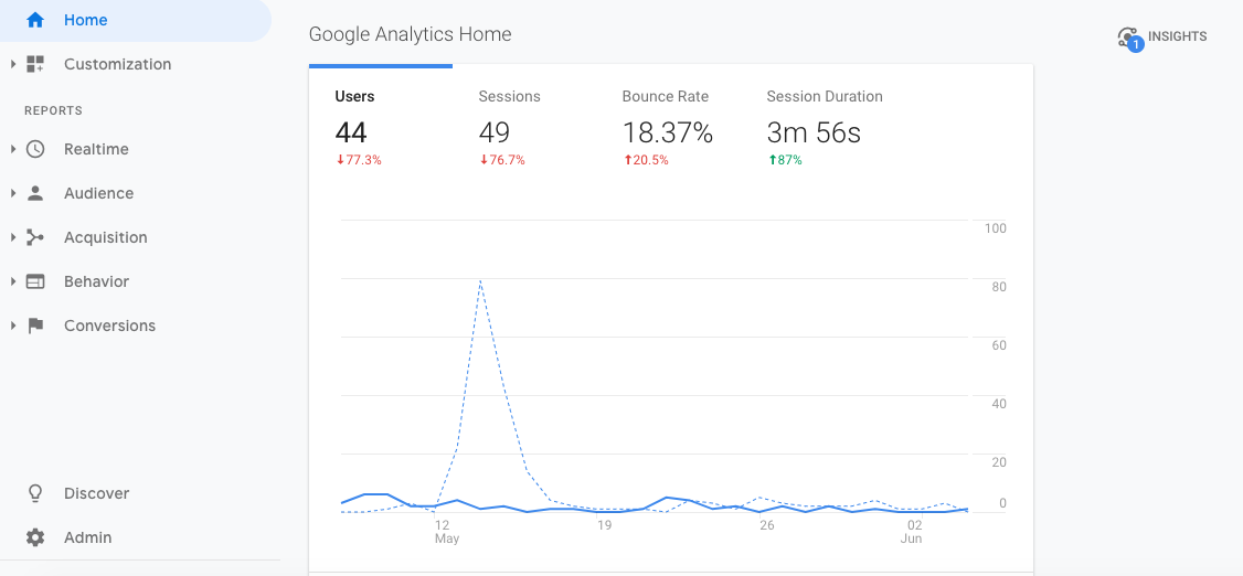
  2. From the homepage, you’ll see your site-wide bounce rate straight away:

3. To delve deeper and see your bounce rate for individual pages, head to the menu down the left of the screen and go to Behavior > Site Content > All Pages / Content Drilldown / Landing Pages. Once you’ve done that, you should see a screen a bit like this: 

Google-Analytics-site-pages.png

Within here you can start to get specific and fiddle with things like the date range, acquisition type, URLs, device, browser, location, gender, age, and more.

For a really detailed look at all the ways you can slice up your data, check out this in-depth guide.

bounce_t20_x6KY7l.jpg

Diving into the stats

Numbers are only the start of what you need to know — once you’ve located your bounce rate data, you need to root around to discover some trends and see what is and isn’t working for you. When you’re investigating your page numbers, ask yourself things like:

  • Does the time of day impact bounce rates?

  • Do certain sections of the site receive higher bounce rates than others?

  • Does social media traffic receive higher bounce rates than organic?

  • Are there any on-page patterns across low-performing pages?

After you’ve armed yourself with this type of intel you’ll be ready to start putting plans in place to boost your numbers - but we’ll talk about that in more detail a little later on.

What does a high or low bounce rate mean?

What constitutes a ‘good’ bounce rate varies from industry-to-industry and site-to-site. Here’s a rough guideline of what’s accepted as the norm though:

Type of website: Benchmark average bounce rate %

  • Content websites: 40 - 60%

  • Lead Generation: 30 - 50%

  • Blogs: 70 - 98%

  • Retail Sites: 20 - 40%

  • Service Sites: 10 - 30%

  • Landing Pages: 70 - 90%


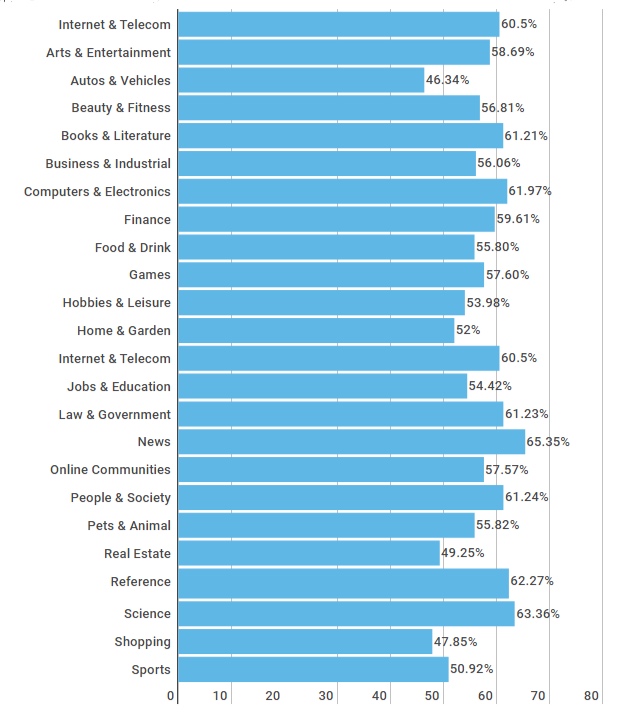
And here are some figures by industry:

Bounce-rate-by-industry.png
 

High bounce rates

Generally speaking, high bounce rates aren’t great. Think about it, if you were consumed by something you’d seen or read on someone’s site, you’d probably poke your nose around a few more pages, right? Well, that should be the aim of every single page of your site, and a high bounce rate could be a sign you’re not delivering. 

If you’re not sure where to start looking, here are a few things that could be contributing to your numbers:

  1. Slow page load times - according to research, a two-second delay can equate to a 100%+ increase in bounce rate.

  2. You’ve provided the visitor with everything they could possibly want and need on that one page alone. To see if this is likely to be true, check out the ‘Average time on page’ stats.

    If visitors have spent a decent amount of time on the page (say a couple of minutes) then they probably did spend the time needed to digest everything and get what they need. If it’s low though, say 10 - 15 seconds, they probably didn’t get past the first paragraph.

  3. Luring people in with misleading title tags and/or meta descriptions and not giving them what they’re actually looking for.

  4. Technical errors. If a visitor lands on a 404 page, for example, there’s not much encouraging them to stick around.

  5. If the content on your page(s) is weak people will bounce straight back out and look for a stronger alternative - which is why quality is so important.

  6. Poor user experiences (UX) can also be a deterrent. Whether you’re bombarding visitors with adverts, pop-up surveys, and/or subscription options, or your navigation set-up isn’t intuitive, both will make it harder to keep people on your site.

Low bounce rates

While low bounce rates on the whole are a good indicator your page(s) are performing well, if it’s suspiciously low (say 10%) it could be a sign there’s a technical error - usually, duplicate analytic codes are the cause.

What are duplicate analytic codes? 

Basically, this just means you have two sets of the same code on your site which results in two page view requests. The effect is Google Analytics then thinks two separate actions took place, disqualifying it from being called a bounce. 

Of course, you should celebrate successes and take credit where credit’s due, but just remember, if something looks too good to be true, it usually is.


How to improve your bounce rate

If you’ve identified a site-wide or specific-page problem with your bounce rate, here are 10 tips to give it a nudge in the right direction.

  1.  Make your content more readable by looking at things like your font, paragraphs, and quantity of text.

  2. Don’t bombard people with interstitials. They’re irritating.

  3. Make your next desired action glaringly obvious. If visitors can’t see your call-to-action, they’re unlikely to click it.

  4. Take a look at your design and branding. If your site looks naff, people might assume your brand’s naff.

  5. Target the right keywords and write compelling - and accurate - meta descriptions. If you’re enticing the wrong type of organic traffic to your site, it’ll instantly impact your bounce rate.

  6. Revisit your email, social, referral etc. databases, and make sure you’re attracting the right visitors. You can have the best website in the world, but if you’re not reaching your target market it won’t work.

  7. Take whatever steps are required to reduce your page load speed; people don’t have time to sit around and wait.

  8. Make sure every single element of your website oozes quality. If it’s not adding value, get rid of it.

  9. Set any external links to open in new windows to minimize the risk of visitors not returning to your content.

  10. Invest in a mobile-friendly site. Desktop versions can be a pain in the ass to navigate around on mobile, and that’s a one-way ticket to losing visitors. 

  11. Introduce relevant landing pages that target high volume keywords. According to a study by HubSpot, companies with 40+ landing pages earn 12x more leads than those with five or less.

Track your progress 

Last but by no means least, don’t forget to track and analyze any changes you make. This will help you further hone in on what does and doesn’t work – then you can harness what you learn to improve other pages of your site.

 To keep your analysis orderly, it might be worth setting up a spreadsheet and recording things like:

  • The URL of the page(s) you’re working on

  • Bounce rates before any on or off-page modifications

  • The date any changes were made

  • What changes were made

  • The bounce rate after your tweaks - just make sure you leave yourself a meaningful amount of time to get a true picture of whether or not it’s helped

 Try not to get too caught up on industry averages either. When determining what success means for you, keep on top of peaks and troughs and focus on your trends over time.


Hue & Tone Creative: Marketing for Greensboro and Beyond

Need some support with your site’s bounce rate? We’ve got you covered from every angle. Get in touch with the team at (336) 365-8559 or hannah@hueandtonecreative.com to see how our design, content, and campaign services could help. 

4 common web design mistakes - and how to fix them

You can have the best product on your shelves, the best customer service around, the best words on your webpages, and the best advice on your blogs, but, if your website’s design isn’t up to par it can all fall flat. 

Getting your website’s aesthetics just right can be a tough nut to crack - especially if it’s not your area of expertise. Small mistakes here and there can wreak havoc with your conversion rate. Many of these web design blunders are easily avoidable – or can be quickly corrected. 

4 Common Web Design Mistakes -- and how to fix them  |  Hue & Tone Creative

All you need is the knowledge about how to correct them, and then you can get your design quickly back on track. If you’re not sure where you might be going wrong, here are four common mistakes we come across and how to overcome them:

1. Hidden contact details

Getting people to land on your website is one half of the battle, getting people to take action is the other. So, make it as easy as possible for visitors to find your form, email, or number.

All too often, organizations leave their contact details buried in their footer or three links deep into their navigation, making it hard to get in touch. 

The fix: Task someone who doesn’t know your site inside and out with tracking down your contact details. If they report back it took them more than a second or two, it’s time to look at your placement. A couple of easy-to-see suggestions include: 

  • At the top right of your main navigation bar, so it’s instantly visible on every page

  • Within your main navigation bar, clearly labelled - something like ‘Contact us’ or ‘Get in touch’

2. Cluttered pages

4 Common Web Design Mistakes -- and how to fix them  |  Hue & Tone Creative

The phrase “less is more” couldn’t be more true when it comes to designing a clean and easy to navigate web page. Lots of sites out there are guilty of cramming each and every page with images, buttons, text, and widget – but all these elements are competing for your visitor’s attention and can quickly become overwhelming. 

People don’t know where to look, what to read, or what’s most important, and they certainly can’t skim your content - all of which can be a big turn-off.

The fix: Go through your website page-by-page and really question what the value of each element is. If there isn’t a motivation behind a certain element, go ahead and remove it. Once you’ve whittled your on-page items down to the essentials, start strategizing about each page’s hierarchy. Make sure you’re incorporating clear call to actions and plenty of whitespace.

Shameless plug: hiring a designer might help with this.

3. Fatal contact forms

Complicated contact forms can be fatal to your conversion rates. If you’ve got lines and lines of fields to fill in, there’s a good chance your visitors will take one look, race to the back button, and exit your site altogether. After all, time is of the essence for everyone on your website or social media. 


The fix: Similar to your site’s pages, go through all your forms field-by-field to see what info is and isn’t needed. For example, you probably don’t need a prospect’s address until they’re further down the funnel – so don’t ask for it, because it could deter people from filling out your form.

In most cases, we recommend keeping forms to just a name and email address. Often, even just an email address field will suffice. 

By the end of this process you should be left with concise, tidy forms, and a clear plan for your data collection strategy.

After some extra advice? Here’s more on how to design a user-friendly form.

4. Absent search boxes

Quick tip: Another quick and easy workaround could be Google Custom Search.

If your site’s relatively big (more than 10 - 20 pages including regular pages, products, blogs, etc.) it’s probably a good idea to add a search box. It makes your site easier to navigate and ensures people will be able to find the content they’re looking for. No more worrying about people leaving the site because the blog post they were looking for was buried in your archives! 


The fix: The solution will depend on your CMS. Some will have a search box feature built-in for you to download, but for other platforms you might have to source a developer to help create a custom one. 


Hue & Tone Creative: Your Website Design Expert

If you’ve not got the time or experience to give your website’s design the attention it needs, then we’re here to give it the TLC it deserves. To see what we can do for you, get in touch today at (336) 365-8559 or hannah@hueandtonecreative.com.

Inbound marketing: 8 tips for design that converts
Inbound marketing: 8 tips for design that converts  |  Hue & Tone Creative

Are your inbound marketing efforts failing to secure the numbers you projected? Are you confident in your concept and scratching your head to figure out where it’s going wrong? Well, perhaps it’s time to look in the direction of your design.  

Design possesses the power to convert spectators into engaged customers. It’s the first and last thing people see when engaging with your business. And it should be a key focus when working to increase your conversions.

So, without further ado, here are eight design tips to give your numbers a nudge in the right direction.


1. Hick’s Law

Hick’s Law is a popular theory that suggests the time it takes someone to make a decision is directly proportionate to the number of possible choices they have. So, in Layman’s terms, the more options you give your visitors, the less likely they are to perform the desired action.

To implement this theory, take a look at your site’s design and structure and ask yourself (and honestly answer!) whether you’ve got too much going on. If the answer’s yes, see how you can hone things down to give consumers one or two key choices. 


2. Don’t be afraid of white space 

To a degree, the phrase “less is more” couldn’t be truer. Don’t cram your designs with color, text, and imagery out of the fear of being ‘bland’. White space can contribute to clean and clear designs that emphasize the content you want visitors to focus on… which, in turn, increases conversions. 


3. Choose your colors carefully

Color can evoke emotion. Emotion can result in action. Action can result in conversion. Use contrast to ensure your text, headlines and call to actions stand out, and experiment with your color choices to see which returns the best results.


4. Remember the 8-second rule

It’s true what they say, the human attention span is less than that of a gold fish - a mere eight seconds, in fact. That means you’ve got limited time to grab a visitor’s attention. 

Think about using: 

  • Large and snappy headlines

  • Eye-catching imagery

  • Clear call to actions

  • Power words


5. Use real faces

Using natural imagery and real people can improve your brand’s authenticity and in turn portray you as more trustworthy, human, and familiar. 

If you’ve got an ‘About us’ section with a breakdown of your employees, put a photo of them next to their bio. And, instead of buying stock photos for everything, consider organizing a photoshoot that shows off your product or office. 


6. Quality is key

Poor quality pictures don’t make a good first impression. They reflect badly on your brand and lead onlookers to associate the quality of your imagery with the quality of your product or service - after all, if you can’t master your pictures, how can you follow through on the other things your website promises? Now we know that’s not necessarily true, but it’s a conclusion people can jump to.

If you’ve got pictures on your site that are pixelated, distorted or just plain tacky, it’s time to go ahead and replace them.


7. Optimize your forms

Having trouble designing a form that converts? We can help with that

When it comes to conversions, your formsare key – because it’s where the action takes place. So, don’t let yourself fall flat at the final hurdle. Keep your form simple and concise, include a clear CTA, make sure the fields are clearly labelled, and use a large submit button.

To see where there’s room for improvement, we suggest trying out some A/B testing (more on that here).


8. Don’t leave out your logo

This one might seem obvious, but it’s not unheard of for people to overlook the most obvious element of their website.  

Whether it’s a landing page, flyer, brochure, business card or online ad, you need to always include your logo. That’s how you reinforce your branding for people – and while it doesn’t have to be the focal point of your page, it does need to be strategically placed so people know where they are and who’s talking to them.


Hue & Tone Creative:

Feeling like these design changes are outside of your expertise? Not to worry, that’s where our creative team comes in! To see what we can do for you, get in touch today at hannah@hueandtonecreative.com

12 tips for picking a good URL
Lead your website visitors right where they need to go…

Lead your website visitors right where they need to go…

Picking the perfect URL is a pretty big deal. It’s your online identity, it’s got to fit your business, and it’s got to be easy to find and promote. Not to mention, if you change your mind down the road it’s going to be a pain to go back and undo.

So, to make your future easier, here are 12 tips to help you settle on a good URL the first time around:


1. Make it easy to type

You want it to be as easy as possible for people to type your domain name into their browser, hit enter and land on your site. If it isn’t, you run the risk of losing potential visitors. So, try to avoid the use of slang (using ‘u’ instead of ‘you’ for example) or words with various spellings (like express and xpress).


2. Keep it short

Tying in with tip number one, keeping your domain name short reduces the chances of people mis-typing or mis-spelling it. Plus, long and complex URLs can be hard to remember, and you want people to remember you, right?


3. Watch out for bloopers

Here’s a prime example for you: penisland.net. The company’s called Pen Island, but we don’t need to tell you what the domain name can be interpreted as… 

The moral of the story: always check for embarrassing double meanings before you buy your domain.


4. Insert keywords

Try to include keywords relevant to your business. For example, if you’re a door repair company, you might want to register for a domain along the lines of doorrepair.com or doorreplacements.com. Keywords not only aid your organic efforts, but they just make sense to your customers.


5. Geographic targeting

If your product or service operates on a local basis, consider tying this into your domain name too. Sticking with the door repair example, this could mean having a domain like: vegasdoorrepair.com or doorrepair.vegas. Again, this makes your domain easier for people to find and remember.


6. Avoid numbers

Numbers can be easily misunderstood. For example, a numeral number 5 could be misplaced with a spelled out number five, and vice versa. 

woman-using-smartphone_t20_AeLxr0.jpg

 7. Skip the hyphen

Try to stay away from using hyphens, too. They can be forgotten about which, you guessed it, makes your website more difficult to be found. 


8. Do your research

The last thing you want is a legal battle on your hands, so make sure you research your chosen domain name to make sure it isn’t trademarked, copyrighted or being used by another company.


9. Don’t gloss over your extension

When we say ‘extension’, we mean the end bit of the url, like .com, .net, .org and .info, for example. Here’s a breakdown of how each is typically used:

  • .co - an abbreviation for company, commerce and community

  • .info - informational sites

  • .net - technical, internet infrastructure sites

  • .org - non-commercial organizations and non-profits

  • .biz - business or commercial sites

  • .me - blogs, resumes or personal spaces

Don’t be afraid of straying from the standard .com. It’s by far the most popular, but because of this, it can be tough to get your hands on a short and memorable URL that isn’t already taken. The key to choosing one that’s right, is making sure it’s relevant.

For example, if you’re a non-profit organization, it wouldn’t make sense to opt for a .biz extension. It might throw visitors off the scent and make them less likely to remember your link.


10. Buy back-ups

Everything up until now has been centered around building a URL that’s sheltered from being misspelled. But, it’s better to be safe than sorry, so it could be worth registering misspelled versions of your domain too, so people still make their way to your site anyway.


11. Bat off your competitors

Stop your competitors from stepping on your toes by purchasing similar domains to your own and redirecting them to your primary URL. For example, if your domain is doorrepair.com, you might also want to consider owning:

  • doorrepairs.com

  • doorrepair.biz

  • doorrepair.net

  • doorrepair.co.uk


12. Check its history

And finally, using sites like who.is and WaybackMachine, check out the domain’s history. After all, you don’t want to be associated with something that has a shady past.


Hue & Tone: Let us help you with your website

Brainstorming, agreeing on, and purchasing your domain name is the first half of the battle... building a website that converts is the other - and that’s where we come in. To see how we can help, contact our team at (336) 365-8559.

8 elements of a great economic development website
8 elements of a great economic development website  |  Hue & Tone Creative

Creating a strong online presence for your development project allows you to widen your reach and share information with interested people and businesses. In addition to capturing the essence of your city or surroundings, your website should also follow a few marketing best practices in order to enhance your effectiveness. 

The things that make an economic development website great are the same things that make any website a dream: intuitive navigation, on-trend branding, and clear messaging. But what else can really help your website stand out from the pack? 

Whether you’re starting from scratch or looking to overhaul what you’ve currently got, here are eight useful tips to help you get the most out of your economic development website.


1. Make your mission clear 

If you want to stand out, your mission needs to be clear, inspiring and distinguishable from the competition. The overarching goal for any economic development campaign is to connect with prospective companies about why you’re a good fit for their company.  

To lure potential job creators to your area, you’ll need to thoroughly develop your mission statement and make sure it’s clear who you’re targeting, how your site or area will benefit them, how you plan to engage them, and what the next steps will be. 


2. Show off your support

No one does economic development alone –chances are you have a handful of partner organizations and public or private financial backing. People should easily be able to determine who is involved with your project, and what portions of the project they are involved with.

However, just adding this information to your website isn’t enough –you’ll want to keep people updated as your project progresses. It can take years for a project to go from the idea stage to groundbreaking, and staying active on social media or sending out a monthly newsletter can help keep people bought in to your project. 


3. Use statistics sensibly 

If you are using statistics to support something you’ve said or to support the value of your mission, make sure they’re up-to-date, accurate, and applicable. If you try engineering semi-relevant stats to fit your message, you’ll just end up confusing your audience. 

 Use tailored statistics and use them sparingly to make the most impact on your audience. 


4. Disclose individual contacts

Don’t use generic email addresses like info@mywebsite.com or contact@mywebsite.com. Potential site consultants will want to be able to do research on all parties involved and want to know they’re about to build a personal connection with someone. 

We suggest including the name, job title, email address, contact number and photo of each of your employees.


5. Stick to the three-click rule

You might have lots of really great content on your website, but if your visitors can’t find it, it’s not going to be doing you any good. The less clicks visitors have to make the better!

As a general rule, you don’t want to make pertinent information further than three clicks away from any given location on your site.


6. Don’t cut corners on imagery

The look and feel of your online presence is clearly important –but it’s not just about branding. When you’re choosing your imagery, don’t cut corners on the quality. 

There will be times when you’re selling a vision for a mid-construction project, which means you may have to use stock photography. If that’s the case, look for images that feel authentic. Try to target stock images that all have a similar style so that your site looks cohesive. 

If you’re in the early stages of a project, we suggest incorporating lots of placemaking imagery to give prospects a better sense of your community. Photos of lively town centers will help balance out the sterile feel of elevation drawings and floorplans.


7. Boast about your buy-in

If you’re in the early stages of a project or are searching for an anchor tenant, community buy-in matters. Showing off major backers will definitely turn heads -- but if you’re stretched for valuable web content don’t limit yourself to just the big names. 

Consider compiling a semi-exhaustive directory of all the small businesses and civic leaders who are engaged with your project. Pull quotes that highlight public support to convey a feeling of success…before you’ve even broken ground. 


8. Keep it fresh

Keeping your stats up-to-date is one thing, keeping the rest of your content fresh is another. When a project is in a construction lull, or you’re waiting for permits to come through, it can be easy to let your content get stale. 

To make sure you don’t fall into a rut, we suggest putting together a content calendar together that highlights key developments for the next year. This will help you brainstorm relevant content for the down times and force you to think outside of the box. Just be sure to keep revisiting your content calendar as construction schedules change! 


Let’s get into business: together.

If you need a partner to help you optimize your website, help you develop a campaign, or maintain your social media efforts, get in touch at 336-365-8559 or hannah@hueandtonecreative.com.

12 tips for a successful webinar

If done right, webinars are a great way to engage your audience, add credibility to your name, build meaningful relationships, and raise your brand awareness. But if things go poorly, you’ll be funneling a lot of time and energy into a failed presentation. 

Not sure what “getting it right” looks like? Well, we’ve put 12 tips together to help guide the creation of your webinar.  

12 tips for a successful webinar  |  Hue & Tone Creative


1. Make sure the speaker’s engaging 

If you’re expecting your audience to tune in for 10, 20, 45 or 50+ minutes, make sure the person delivering the webinar has a voice for it. You need someone who has an enthusiastic tone and, most importantly, is clear with their delivery. 


2. Sound out the sound quality 

There’s nothing more annoying than trying to intently listen to something that’s too quiet, keeps crackling, or has irritating background noise behind it. Do a few test runs before you go live so that you can ensure your sound quality is top notch.


3. Don’t forget about the design

As with any collateral you produce, your webinar slide design needs to be high-quality and on brand. Use easy to read brand typefaces, don’t cram too much on one slide, and don’t go overboard on graphics or photos. 


4. Analyze the length

There’s no golden rule when it comes to the length of your webinar. If you’ve got past recordings to learn from, see what time people tend to drop off and take it from there. If this is your first ever webinar, we would suggest never going over 60 minutes. 


12 tips for a successful webinar  |  Hue & Tone Creative

5. Rehearse, rehearse, rehearse

No matter how confident you are with your delivery skills, always do a test run. Fine tune the order of the slides, practice tongue-twisting lines, and work out all the glitch with your transitions –it’s better to work these things out now rather than later.   

It’s a good idea to have someone sit in on the practice run too - their fresh perspective might help you uncover issues you hadn’t previously picked up on.


6. Keep it conversational

Unless you’re delivering your webinar to robots, keep it conversational. It’ll make it easier for people to keep up with and digest, and itwill bring that all-important human element to it.


7. Introduce Q&As

Allowing a forum for Q&A’s is a great way to involve your audience, keep them engaged, and provide them with key takeaways that are tailored to them. 


8. Speak in second person

Refer to your audience as ‘you’. This’ll help submerge them into what you’re saying, build interaction, and make the entire webinar feel as though it’s being delivered to them on an individual level.


9. Bring it to life

Refer to real-life experiences throughout your webinar. In doing this, you’ll instantly make the information more relatable –and, the power of storytelling often makes details easier to remember.


10. Keep mobile in mind 

When you’re doing your test run, bear in mind that people might be watching your webinar on either their desktop, tablet, or mobile. So, make sure it works and streams easily on all types of devices. 


11. Your personal plug 

Don’t forget to mention your product or service at least one point - after all, the goal (whether now or in the future) is a sale. Just make sure you don’t go overboard. If your pitch is toosales-y you run the risk of listeners zoning out.


12. Don’t forget time differences

Last but not least, if you’re targeting people from different countries or time zones, factor these variances into the date and time you’re hosting your webinar –no matter what you’re sharing, people probably won’t wake up at 2am to see it. 


Hue & Tone Creative: Marketing for Greensboro, NC and beyond

If you feel like your webinar isn’t connecting, we can help you take your content to the next level. We can work with you on every marketing project, no matter what the format. To get an idea of what we can do, see some of the projects we’ve worked on in the past or get in touch.

Web Basics: What is web hosting?

Web hosting. We hear those words a lot, but how many of us actually know what it is? Well if you don’t, then look no further. We’ve cut out the jargon and waved goodbye to all that techy mumbo jumbo as we take a quick look at the basics of web hosting. 
 

What is web hosting?  |  Hue & Tone Creative


Web hosting vs domains

When it comes to web hosting and domains there can be a bit of confusion between the two. We like to break it down like this: 
 

Web hosting: This would be your house, because it’s the space where everything is stored.

Without web hosting there wouldn’t be any websites. It’s the physical location that your website (and everything it entails) sits, and it ensures that your site maintains a sturdy connection to the internet -- without that connection, people are unable to access any of the files on your site (which, in layman’s terms, means you have no website!).

Some examples of web hosting companies include InMotion, 1&1, HostGator, GoDaddy, Wix and Weebly.


Domain: This is the equivalent of your address, because it’s the location your host can be found.

It’s not a physical entity, it’s just the series of characters that make up your site’s unique location. So, the same way you’d enter an address and ZIP code to get to your end destination, you enter your domain name into the search bar to get to your website.

Some of the most popular domain name providers out there are GoDaddy, Hover, Dynadot, Google Domains and Namecheap.


Where should you buy web hosting from?

When it comes to choosing the right web host for you, there are a lot of solid contenders out there. To help you along your way, here are the top five as rated by the experts over at Techradar.


Web host

InMotion

Voted

Best overall shared web hosting

Selling points

Wordpress hosting, business hosting, web design services, and 24/7 US-based support


1&1

Runner-up overall shared web hosting

Baremetal servers, free SSL certificate, secure hacker protection, and email marketing


Best ‘cheap’ option on the market

Unmetered bandwidth, unmetered disk space, money back guarantee (45 days) and $150 search credit


Good all-round service

SEO services, free domain, database backup/restore, and unmetered bandwidth


Wordpress’ #1 preferred partner

Unmetered bandwidth, WooCommerce hosting, Free domain, 24/7 US-based support


What does all that terminology mean?

We just threw a bunch of terminology at you -- but since this is a beginner's guide to web hosting, let's go ahead and break it down: 
 

Bare metal servers: The term ‘bare metal’ refers to a hard disk, and so a bare metal server is when a computer system or network’s virtual machine is installed directly on to hardware.

SSL certificate: In its simplest form, an SSL certificate is a public-facing, digital document that tells people a site is secure. It also lets you know that the company that says they own the website you're accessing legitimately owns it. 

Bandwidth: Bandwidth is the amount of site content and visitor traffic a server can transfer in a certain amount of time.

Unmetered bandwidth: A hosting plan with unmetered traffic. The price you pay each month does not depend on the amount of traffic (data) sent to and from your server during the month

Unmetered disk space: Disk space is the amount of data you can store on a web server. The amount of disk space you need will vary depending on the size of your site. Similar to unmetered bandwidth, unmetered disk space means you are given an unlimited amount of disk space. 

SEO: Search engine optimization (SEO) is the online practice of increasing the amount of traffic you get through to your website via organic search results, like Google. Some hosting companies offer services to help you improve your SEO.


Questions about what any of these terms mean? Leave them below in the comments -- we'll be happy to help clear up any questions you have! 


Hue & Tone Creative: Web Design Services

Once you've secured your domain and hosting, let us help you bring your site alive with a great design and intuitive user experience. Get in touch today to see how we can support your website’s set-up.

5 things we need to know before designing your website
5 things designers need to know before designing your website  |  Hue & Tone Creative

You want a brilliant website. We want you have to a brilliant website. But, to make that happen, there’s the small matter of distinguishing between what you think you want and what your business really needs.

Before we get going, here are a few quick facts for you. Did you know:

  • 38% of people say they’d leave a website if its content/layout was unattractive?

  • 94% of people gave poor web design as the reason for mistrusting or rejecting a website?

  • 46% of mobile users face difficulties interacting with a web page?

If anyone who’s reading this post doubts the importance of a good website, hopefully we’ll be able to clear up any confusion!

Whether you’re looking for a brand spanking new website or a revamp of your existing site, here are five things we need to know before helping you embark on your web design or redesign.


1.  What's the purpose of your site?

There’s a reason we’ve started with this question: it’s probably the most important one. Why? Because your end goal will heavily determine your website’s look, feel, navigation and layout.

Is your aim to sell a product or a service? Or both? Are you B2B or B2C? Are your offerings low or high value? Or do you exist to ply people with knowledge and information? Are you on the web to raise awareness? Or are you after a personal portfolio? There are endless options. All we need know is which goal is applicable to you – and the more specific the goal the better.


2. Who's your target audience? 

Your audience and their persona also play a large part in engineering your website, and this is where collecting data comes in handy. Examples of persona information include


Need help building your audience personas?

We've got a blog for that

  • Age bracket

  • Employment status

  • Living arrangements

  • Education

  • Hobbies and interests

  • Salary

  • Online behaviors

  • Pain points

  • Motivators

  • Personality traits

All of these elements (and more) will influence how people interact with a website and what makes them tick, which is why it’s essential the behavior of your ideal end user is incorporated into your design.


3. What kind of content will you be using?

You can’t have design without words, right? So who’ll be writing those words: you or us? If it’s us, do you have tone of voice guidelines? 

And, do you plan on having a blog? Try and think of the long game for this one. Even if you don’t think you’re in the position to have one in the immediate future, is it in the pipeline? If so, it makes sense to factor it into the design stage from the get go.


4.  What kind of branding do you already have established?  

If this isn’t your first stab at a site, it’s likely you’ll already have some form of branding guidelines established – for both your on and offline brand elements. So, the question is, are there elements of that branding you’re adamant on keeping? And if so, why? We need to know the why to help us build a robust picture of how you want your brand to look.

What have you learned about your existing brand since you started using it? How are customers responding – good or bad? Knowing this will help us to make any necessary tweaks to your branding so you can reach your maximum potential. 

Bonus question: If we’re making tweaks to your branding on the website, do you also need help updating things like your emails, social media, brochures, and letterhead?


5.  Do you have any no-go's?

Whether it’s from an old website of yours, your competitors’, or the local store you buy your groceries from -- are there any color palettes, page layouts, fonts or image styles you absolutely do not like? If so, let us know! 

This’ll help us to build only the elements you like into our wireframes and reduce unnecessary back and forth. The end result? You get your polished, finished product as soon as possible!


Hue & Tone: Your Greensboro Marketing Team

Know your website needs improvements, but not sure what they are? Need a fresh set of eyes on your content and design? Give us a call. We're here to help you with all your web and graphic design needs -- no matter how big or small.

What's the difference between a graphic designer and a developer?
What's the difference between a graphic designer and a developer?   |  Hue & Tone Creative

Although graphic design and web development are two totally different jobs, there’s an increasing level of confusion between the two. 

As online tools make it easier for people to learn new skills there’s been more and more overlap between the two roles. Graphic designers want to dabble in the coding side of things, and developers are paying more attention to the visual elements.

Although they are experiencing more and more of each other’s worlds, there are still several clearcut differences between the skillsets of graphic designers and developers — and you should know what they are before hiring someone to take on your next web project. 


Graphic designers

Creativity

Graphic designers do what they do because they are creative (well, the good ones are, anyway!). They can see your vision from the get go, come up with concepts, and then mock-up your dream website. 

They’re able to illustrate or design anything you might need and are explicitly tuned in to the aesthetic side of things.


Attuned to detail

Unlike developers, graphic designers have a fine eye for things like fonts, sizes, colors and spacing. Because they don't have to focus on making your site work, they're free to hone in on the small details. They’ll perfect and refine every element of your site to meet brand guidelines and will ensure consistency with the rest of your brand.


Marketing awareness

In addition to a fine eye for design, a good graphic designer has a better understanding of marketing as a whole. They not only stay up-to-date on design trends, but they also have a solid understanding of what's going on in the industry so they can keep your brand collateral on trend. Whether it’s an online UX experience or offline advert, they’re responsible for ensuring their designs not only look good, but are built to convert.


Breadth of input

Last but not least, the role of a graphic designer spans far beyond a business’ website -- they can handle everything from creating a print campaign to simple things like re-sizing images. No matter what you need they'll be able to help you put together the entire package, not just your website. 


Developers
 

Make your website work

Where designer's jobs are creative, developer's jobs are technical. Developers can be split into two categories: front end and back end. In their simplest form, front end developers deal with the part of the website you can see. They typically write in languages like HTML, Javascript or CSS. Back end developers deal with servers, applications, and databases.  They work out the details of how and where your data gets stored. 


Technically driven

Developers are very analytically driven, they have a technical mindset and work behind the scenes to make graphic designers’ work live on a website. Each coding language has it's own set of rules and regulations, making their job more about memorization and problem solving than aesthetics. 


Carry the weight of your website

While developers don’t necessarily need to be creative, it falls on them to make sure the website actually works. Does it load quickly? Can you easily log-in and put things in your shopping cart? Is your billing information stored correctly? 

If pages, apps, or websites falter, it’s on developers to get them back up and running as fast as possible to ensure revenue isn’t lost.


So, who should you hire?

In the end, you need both to form a partnership.

Graphic designers and developers come as a package. Although their skills and role vary, they work in harmony to make sure end results are up to scratch.

Think of it like a production line. The graphic designer works on the visual stage, then passes their work onto the developer to encode, and then both work together to quality check the finished product.


Graphic Design for Greensboro, NC and beyond

Let us take the headaches out of creating your new website. Check out our design portfolio to see clients we've helped in the past, and then give us a call -- we can't wait to get the conversation started.

Why having a mobile-friendly site is no longer optional
Why having a mobile-friendly site is no longer optional  |  Hue & Tone Creative

Yes, we know you've heard it before. 

The last web designer you spoke to probably mentioned it 5 times in the last 5 minutes. 

They probably used words like “mobile responsiveness,” “optimizing for mobile,” “responsive design”… maybe they even threw in “MobileGeddon” for good measure. 

But, what is "mobile-friendly," why is there a need for it on your website, and why are web designers so obsessed with it? 

In this post, we'll cover just that. We’ll also give you 7 undeniable reasons why you need to invest in your website being mobile responsive.

But first, the basics.


What is a mobile-friendly website?

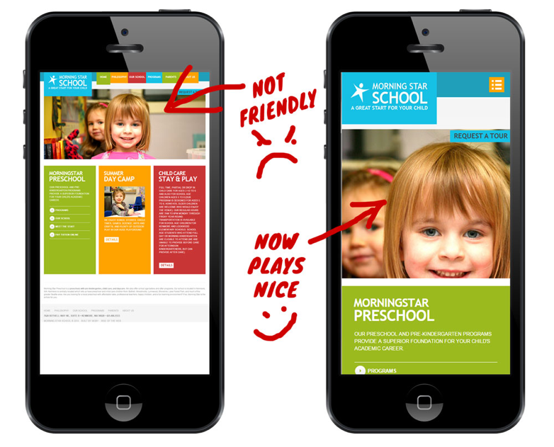
Let's illustrate the concept using a couple of images:

 
Why having a mobile-friendly site is no longer optional  |  Hue & Tone Creative
 

And, this illustration from Google:

 
Why having a mobile-friendly site is no longer optional  |  Hue & Tone Creative
 

See the difference?

One looks like a typical phone app and the other one will require a magnifying glass just to read the site title.

You'll notice the "mobile-friendly" one on the right has:

  • Large, easy to read text

  • Full screen, viewable images

  • An intuitive page layout

  • Easy to use navigation

When you’re on your phone, this is exactly what you would expect a good website to look like. A website optimized for mobile adjusts and displays properly on all smaller screens – not just phones, but tablets too.


Why is mobile-friendly website important?

In addition to elevating your user experience, we’ve got some hard numbers on why mobile compatibility is important. A few highlights:
 

  1. In 2017, 52.64% of all traffic came from mobile devices.

  2. By the end of 2018, it’s expected that traffic on mobile devices will make up 79% of global internet use.

  3. Last year 50% of total eCommerce revenue came from mobile devices

  4. 57% of internet users say they won’t recommend a business with a poorly designed website on mobile.

  5. Nearly 8 in 10 customers would stop engaging with content that doesn’t display well on their device.

  6. 88% of consumers who search for a type of business on a mobile device call or go to that business within 24 hours.

It comes down to the fact that almost everyone uses their mobile device to browse, shop, and interact with businesses. Not having a mobile optimized site directly converts to losing potential customers.

If you are a business owner looking to make your mark in the digital ecosystem, we highly recommend that your website be mobile optimized. You don't want site visitors squinting to see what your website is all about.

Still not convinced? 


6 (more) reasons why you need a mobile responsive website

  • Google prioritizes mobile-friendly websites in mobile search results. Back in 2015, Google made a change to the algorithm that allows websites optimized for mobile to rank better than those that aren’t optimized.

  • Having a mobile friendly site is considered best practices today and it increases your credibility to comply with industry standards.

  • 91% of mobile internet activity is spent on social media. You don’t want to waste your social media marketing dollars by sending people to a subpar or slow loading site.

  • Good site design makes customers happy and saves them time. You always want to give your customers a good experience – and this means having an easy to navigate site. You can be guaranteed people won’t come back to your site if they can’t navigate it easily.

  • A site that operates smoothly leads to people spending more time on your site.

  • Mobile optimized sites are programmed to load more quickly – you no longer run the risk of people clicking away because your site loads slowly!

In 2018, making your site mobile friendly is no longer optional. It’s worth investing in revising or redesigning your website to make sure your site conforms to the industry standard of being mobile ready. If you don't, you risk losing potential customers, lowering the impact of your social and PPC ad campaigns, and alienating people who aren’t willing to put up with an inferior user experience.  


Hue & Tone: Greensboro-BASED Marketing FIRM

Ready to get your site up to speed? We can hook you up. At Hue & Tone Creative, we believe good marketing can help you create a lasting impression on your customers. From site design to business card design -- we can help you with every piece of your marketing strategy.

Web Design Trends to Leave in 2017

The song, It’s so Hard to Say Goodbye to Yesterday was originally recorded for the 1975 film, Cooley High. It’s a real tear jerker and may make for fitting music as we bid farewell to design trends that can’t join us in the new year. Honestly, the list itself isn’t sad at all. It’s actually solid advice regarding 4 web design trends to leave in 2017.

Design Trends to Leave in 2017  |  Hue & Tone Creative

Before we get to the list, let’s quickly discuss why this purge is so necessary. Two letters: UX. UX or User experience refers to a person’s feelings and impressions about using a particular product, system or service. In this case, your website. To keep this experience simple, logical and enjoyable, these 4 web designs must be left behind.


#1. Skeuomorphism

The design concept that merges our real-life perception or characteristics of an object with its digital equivalent. A good example of this is the original Instagram logo; a life-like image of a camera that has since changed to a simpler, semi-flat design. Flat and semi-flat designs have a minimalistic feel and seem to be preferred more widely by web audiences. For this we say adieu to skeuomorphism. 


#2. Hero Images as the whole Story

Hero images are large images that take the place of traditional banners and are generally overlaid with text. Don’t get me wrong, they look amazing. They are captivating, they are alluring and signal substance. The problem is, some websites are little more than these images with no accompanying meaningful content. Perfectly fine for a webpage used for contact information or a place to describe a single product. However, hero images are not enough to tell the whole story about a business and its products or services. Coca-Cola is a great example of how to use hero Images while still boasting a site full of relevant and substantive content. Easy to say arrivederci to hero images as the entire story.


#3. Tight Spacing

Sometimes, full breakups aren’t necessary. A little space goes a long way at rekindling a quenched flame. White space in particular, could vastly improve the look and feel of your website. This can be accomplished pretty easily. Sites that are text heavy can add space between lines and letters, enhancing readability. Similarly, those with lots of products to display should take a hint from Amazon.com which uses grid layout design. The online superstore has successfully employed this design to organize their many products. In either case, the user experience is upgraded. We can happily say adios to tight spacing. 


#4. Sliders and Carousels

These are not the same, but are similar design techniques. They each involve the movement of images in either a sliding or rotating fashion. Neither, according to a Nielsen Norman Group study, were found to be effective conversion tools. A point made many times over the years, but appears on this list due to an even greater downside. The designs could negatively impact your SEO or search engine optimization. While the use of sliders and carousels aren’t automatic SEO killers, the risk to your website’s ranking is real and may not be worth taking that chance. Either, enlist the help of a professional website builder or try something else. Videos are a great alternative to both these elements and may be a better way to tell your story. Let us say Gooday to sliders and carousels. 


Companies in the know wisely improve their websites to increase user satisfaction. This includes, but is not limited to the way the site appears on mobile or desktop devices, how easily and intuitively one can navigate the site, and the overall functionality and feel when engaging with the website. The 4 web design trends to leave behind, tend to interfere with these aims in one way or another. It may not be so hard to say goodbye after all.


WEB DESIGN IN GREENSBORO AND BEYOND

Guilty of using all these things on your website? We can help pull you out of the past!
Hue & Tone Creative will help get your web presence up to speed. Be sure to check out our design portfolio to see clients we’ve helped in the past -- and then give us a call if you’d like us to build you a modern website that truly tells your story.

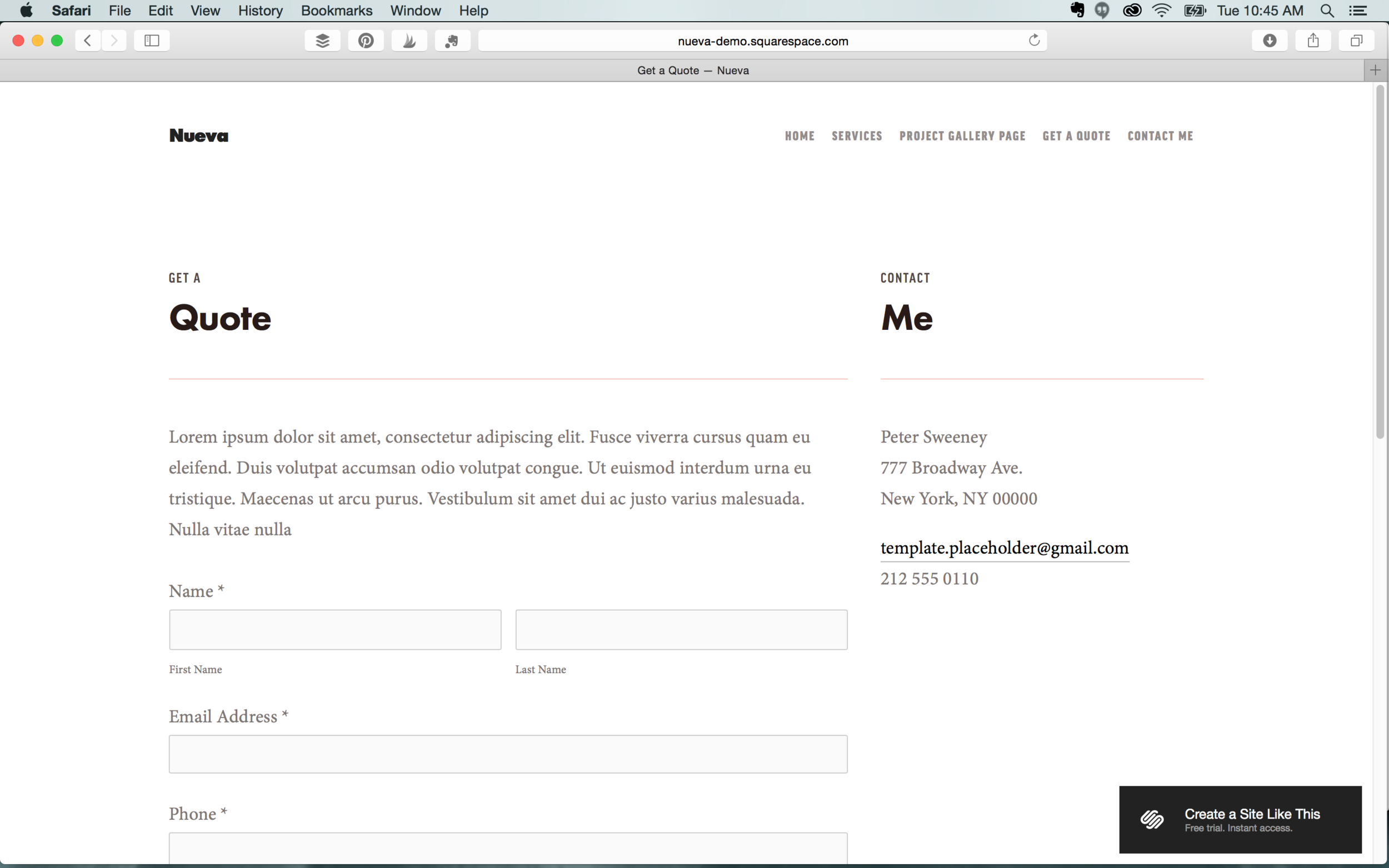
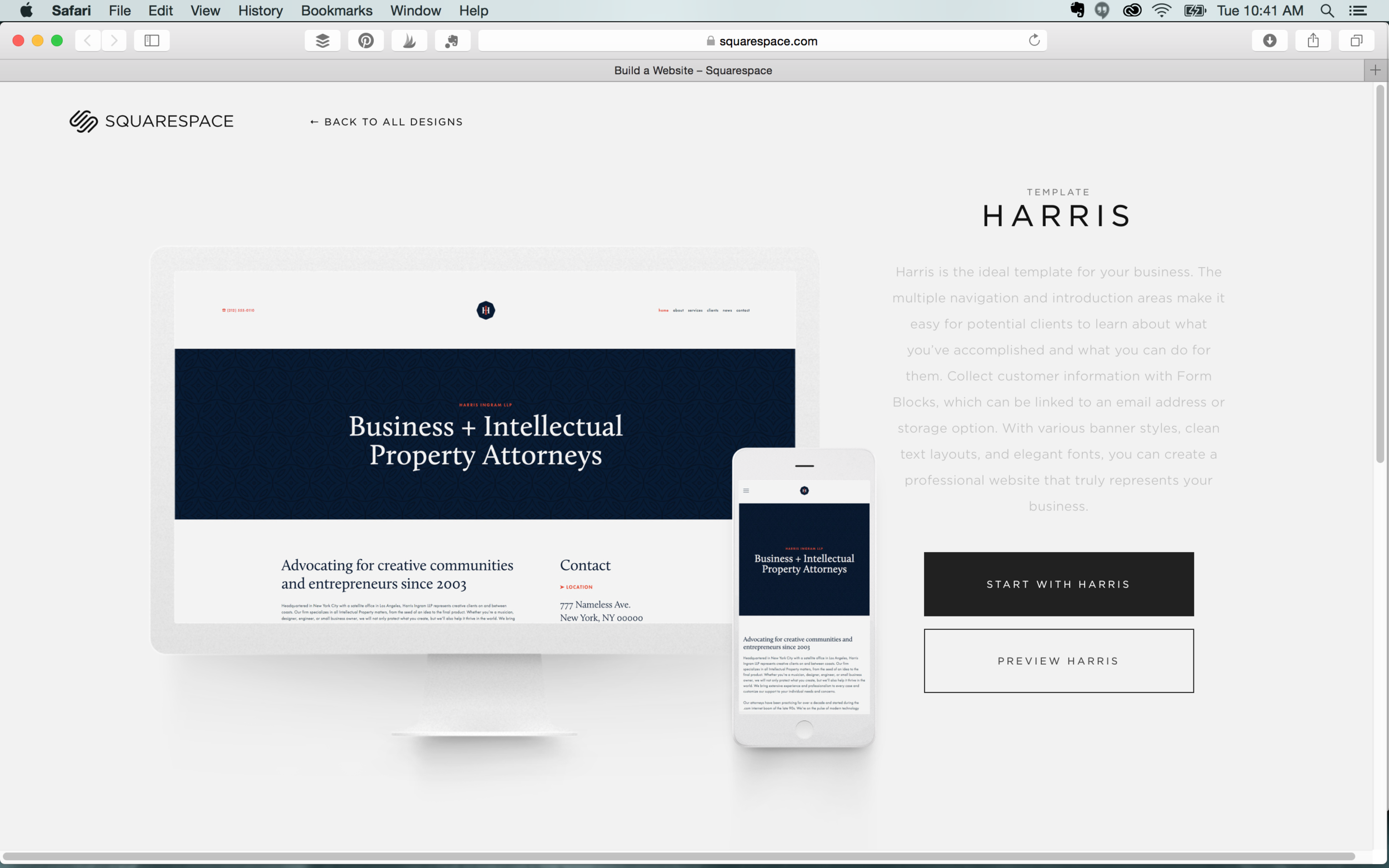
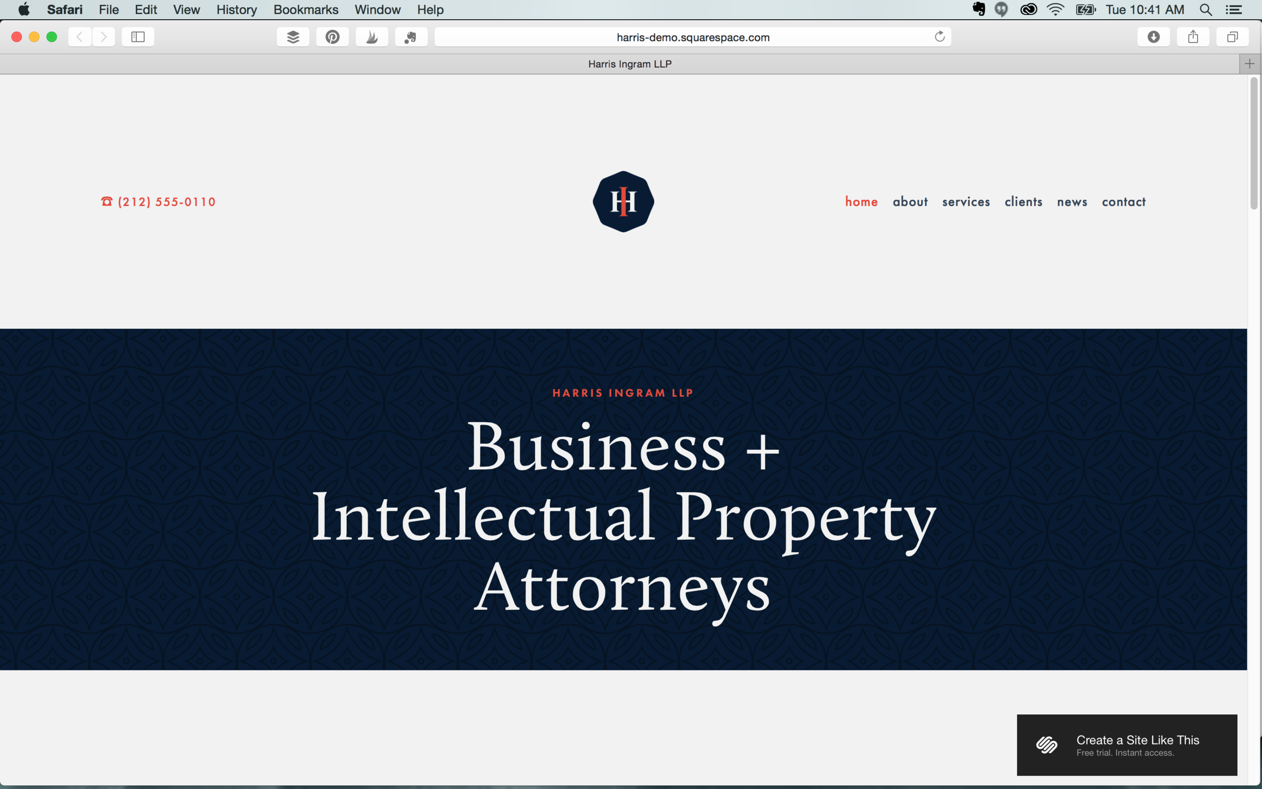
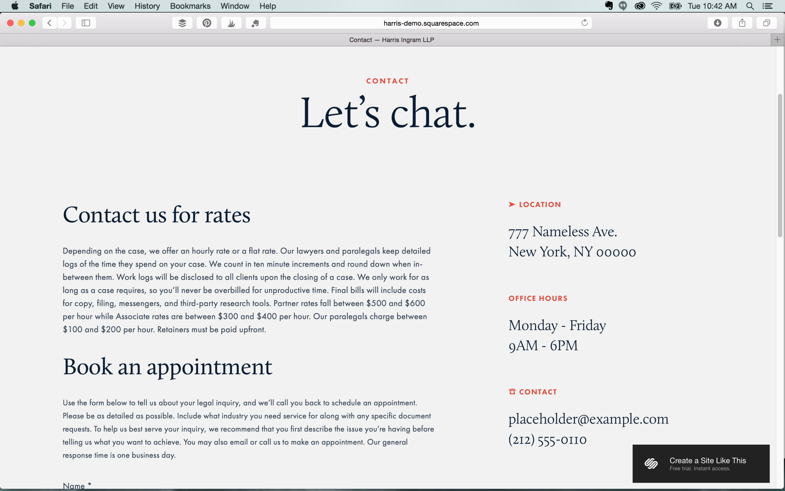
To Squarespace or not to Squarespace? The small business’s question.

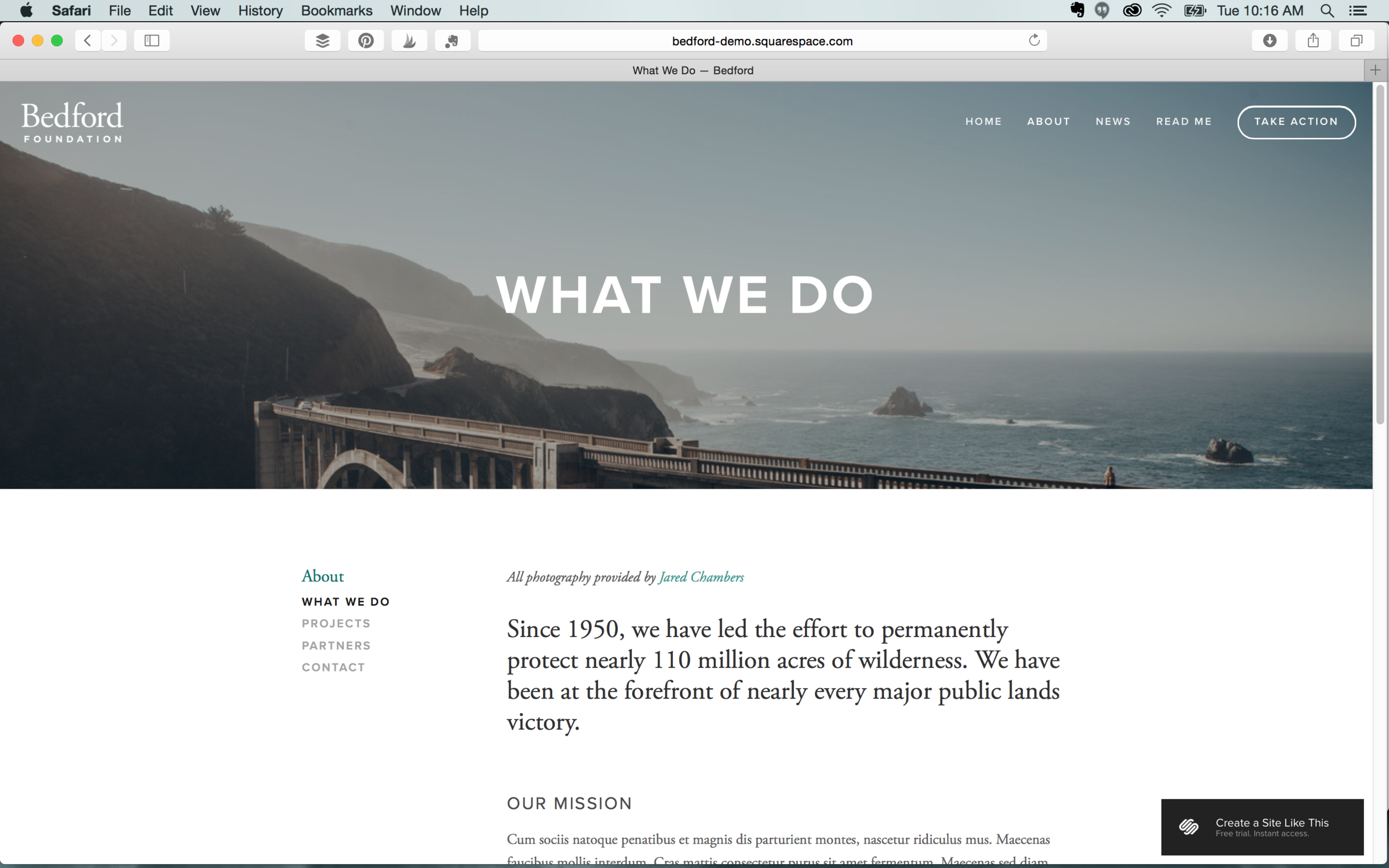
According to the SBA, small businesses account for a whopping 99.7% of U.S. employer firms. If you’re thinking of starting your own small business or maybe you already have, how do you emerge as the peacock amongst all the other peacocks with the showiest feathers? Well, an aesthetically pleasing and user-friendly website would certainly help. In this DIY climate, only one website builder springs to mind: Squarespace. This week, we’ll explore why Squarespace is the best choice for small businesses.

To Squarespace or not to Squarespace?  |  Hue & Tone Creative

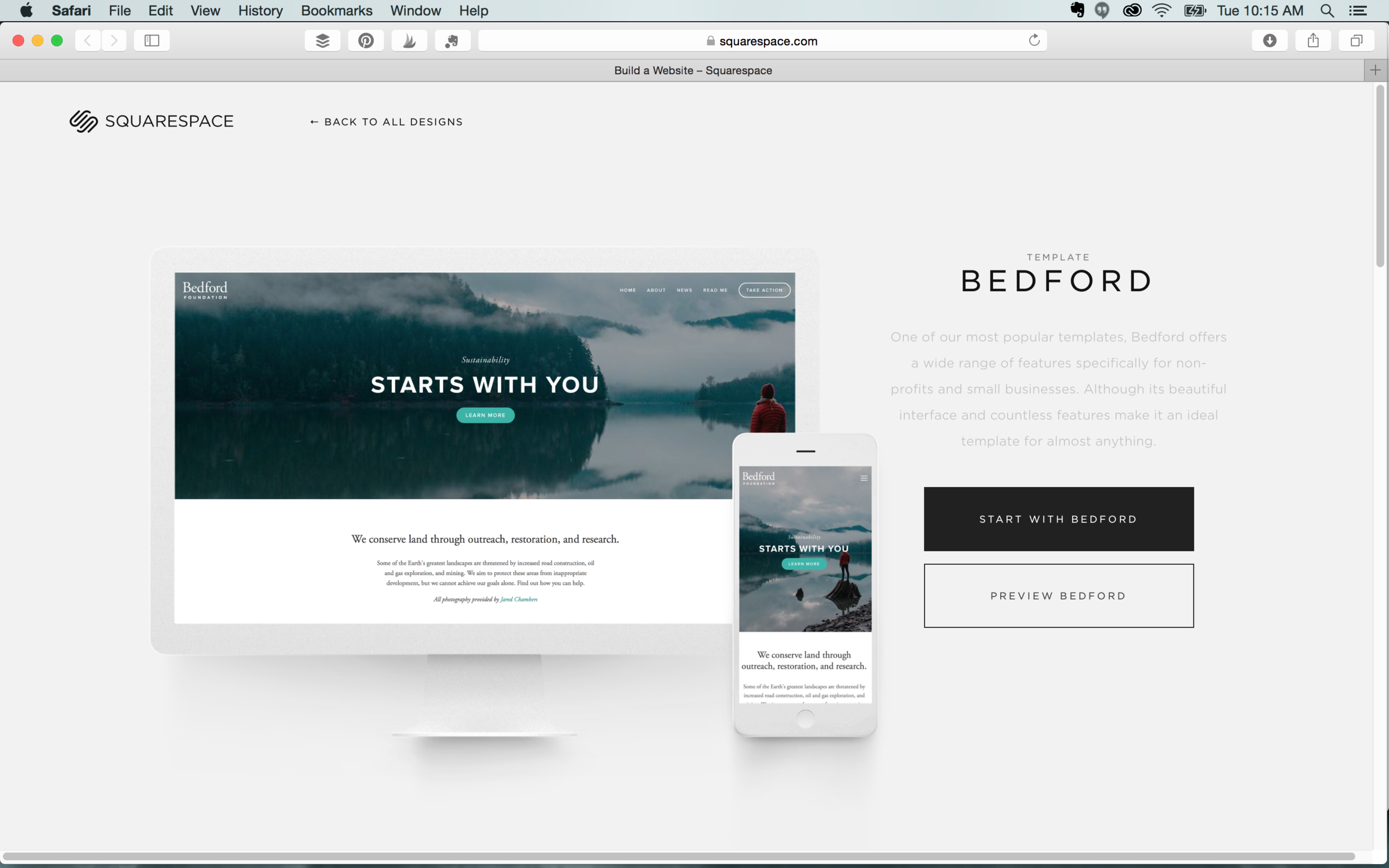
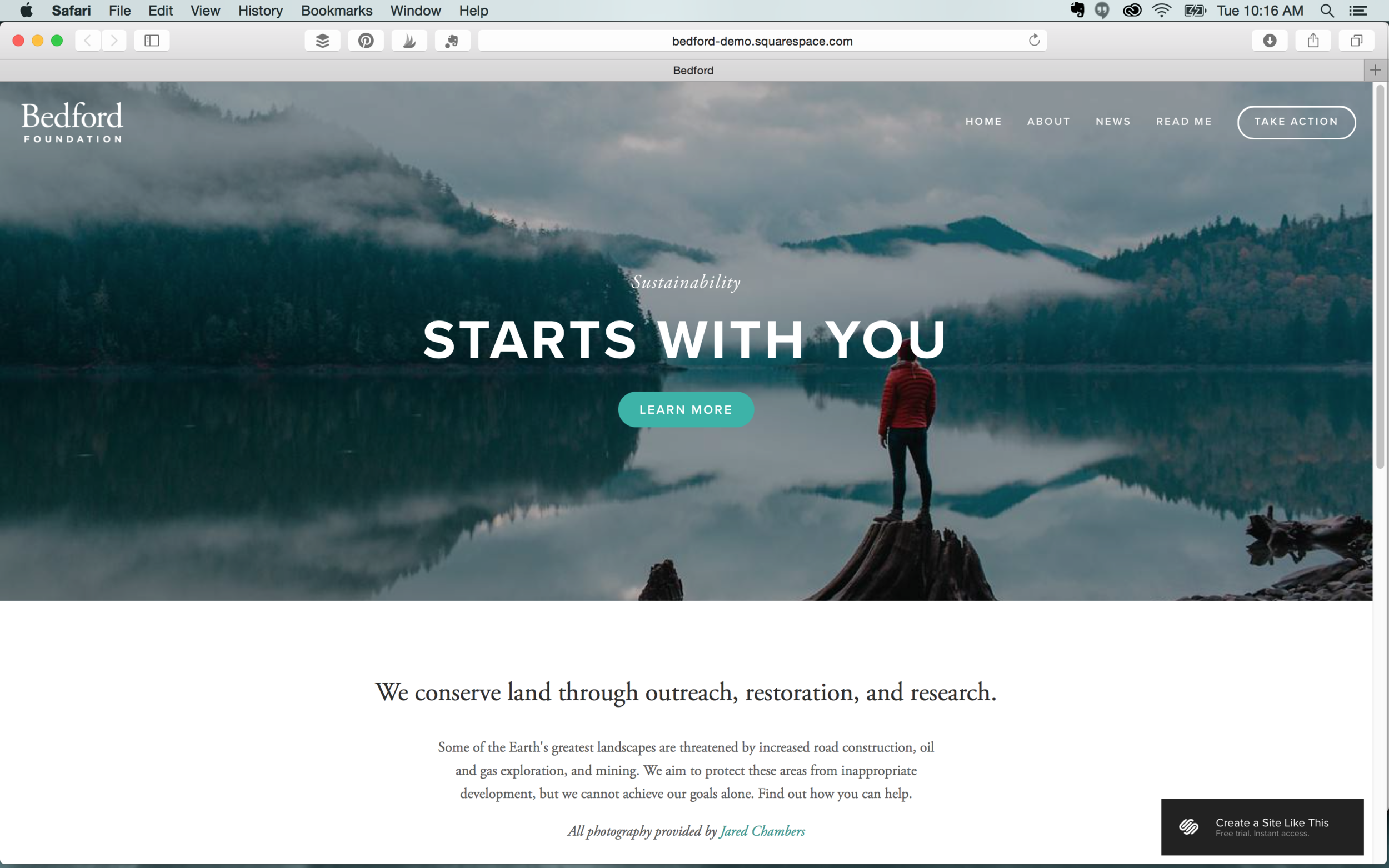
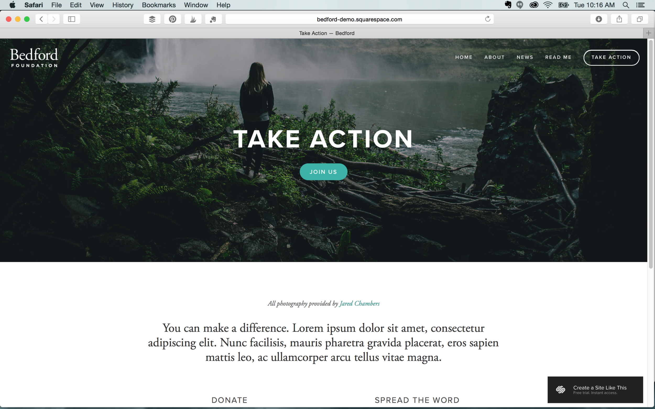
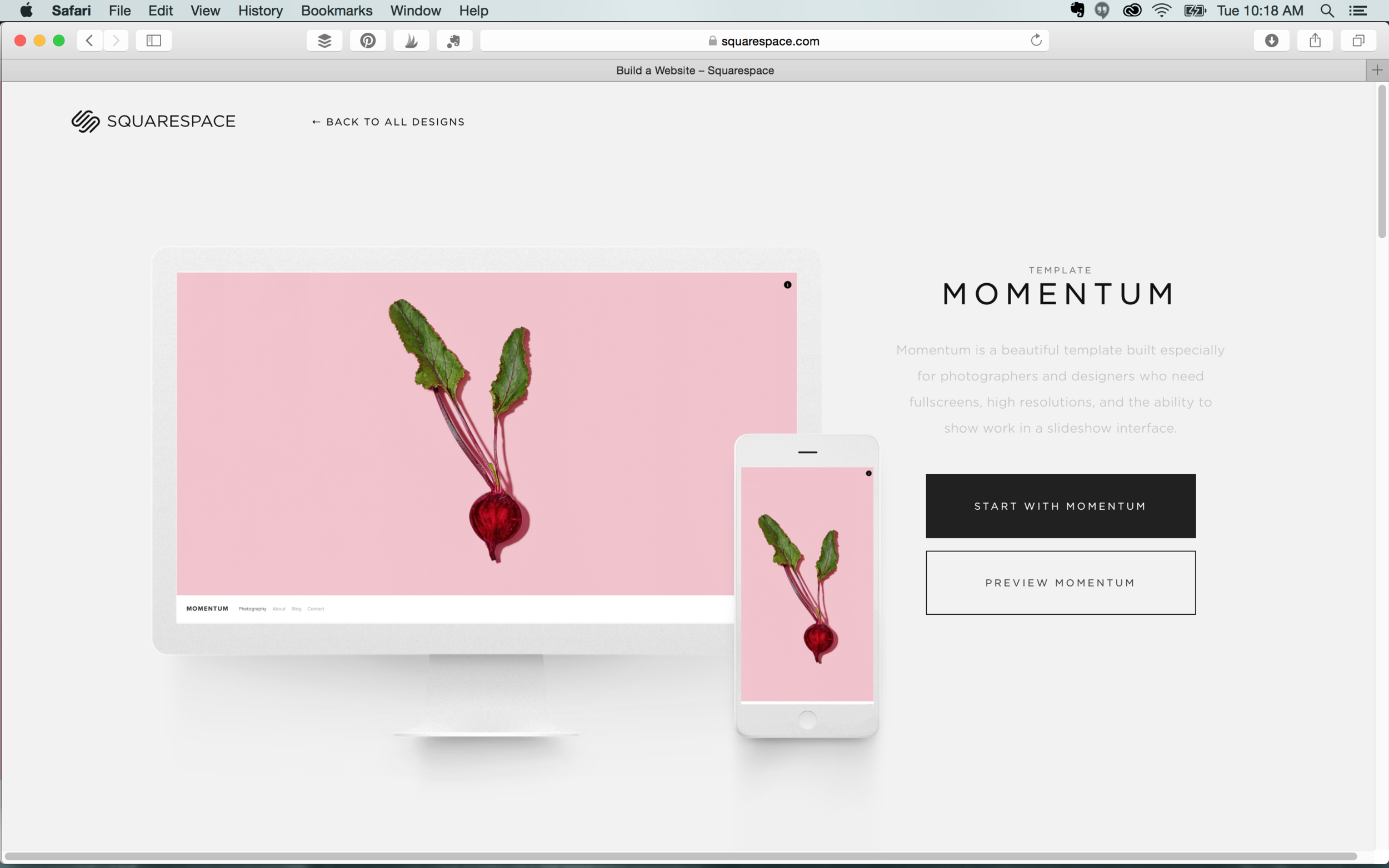
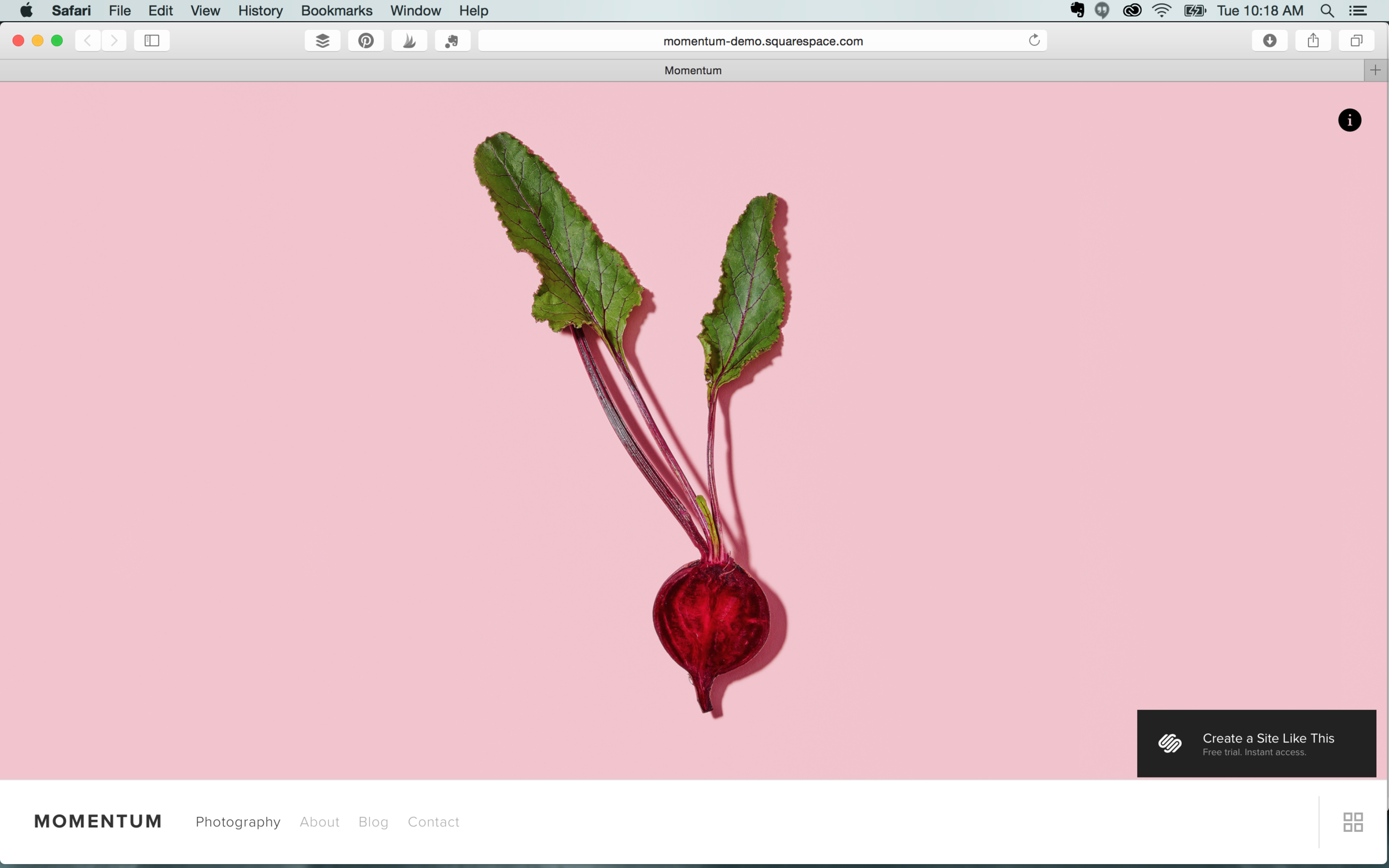
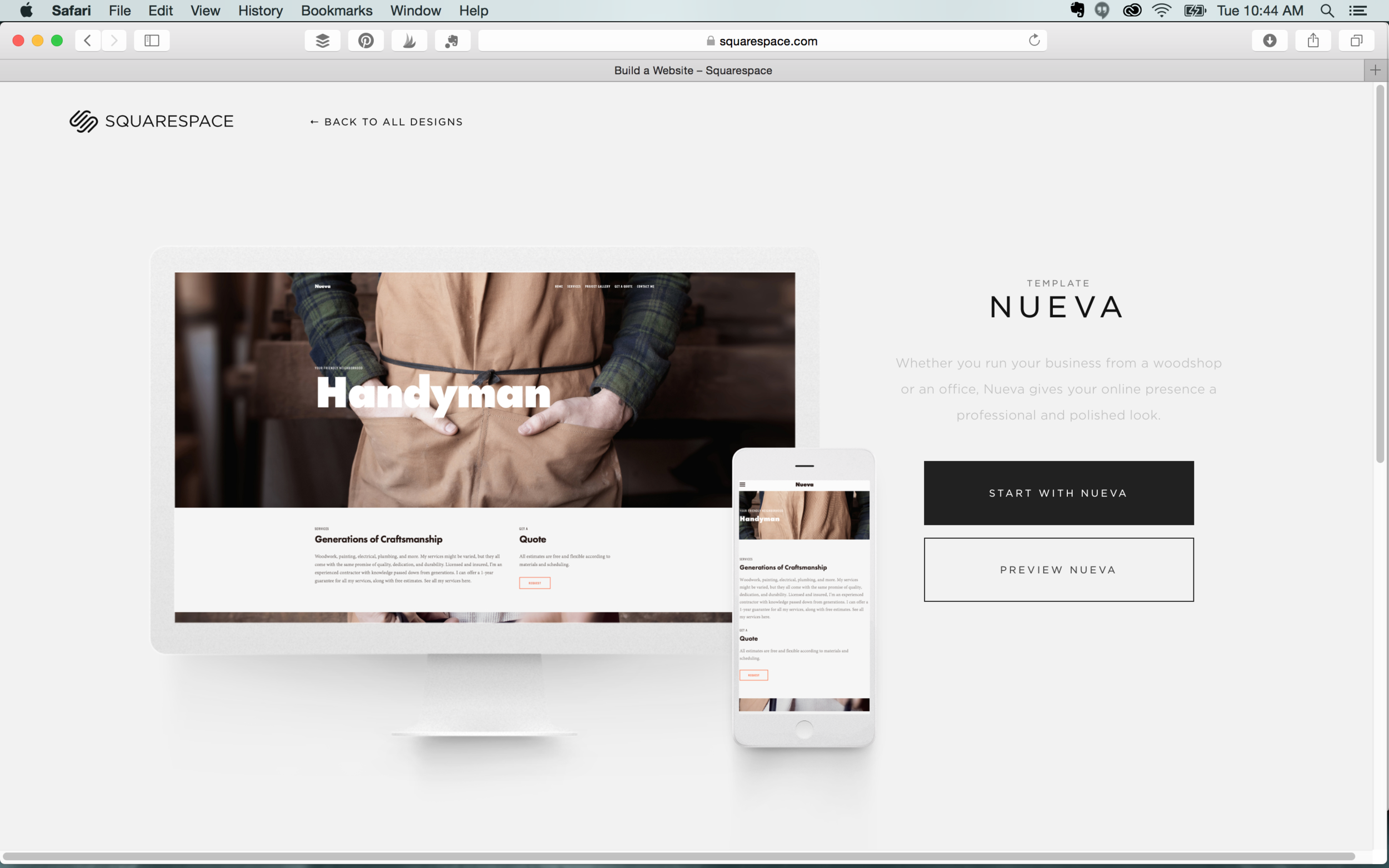
We’ve all heard or seen the commercials for Squarespace, the self-proclaimed “all-in-one solution for anyone looking to create a beautiful website.” And beautiful it is. Squarespace’s landing page is like a mini trip to an art museum. The evocative photographs, set against sleek and colorful backdrops, coupled with drag-and-drop functionality, easily marks its self as the preeminent option. Once there, you’re thrilled and delighted to press the Create A Site button.
 

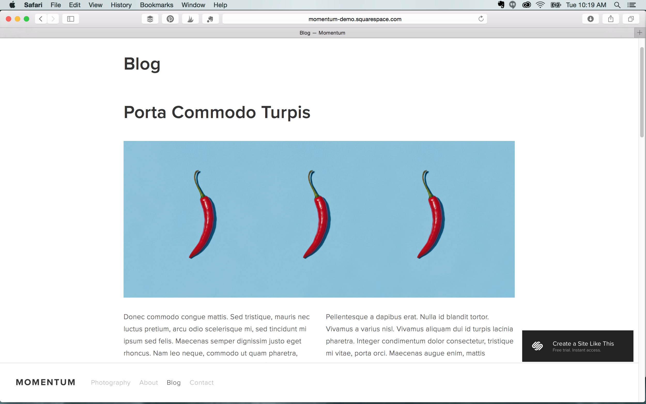
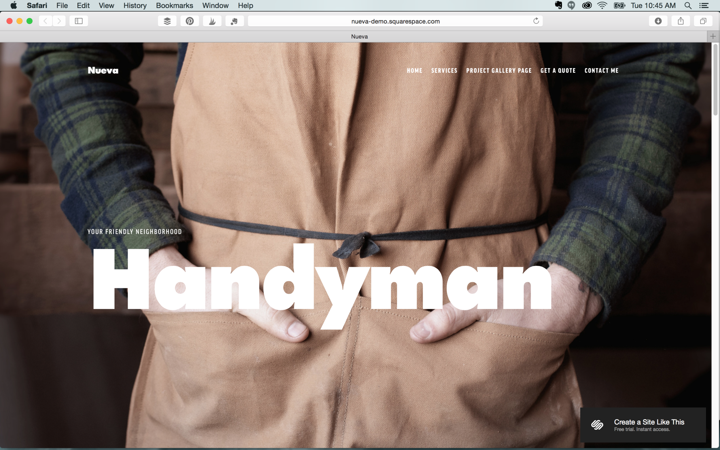
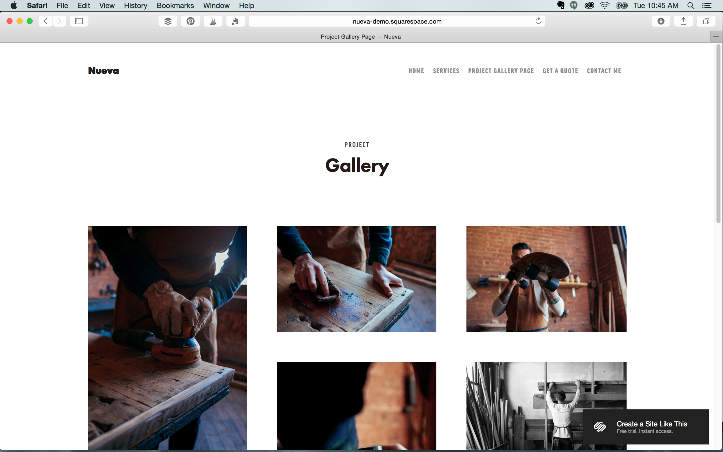
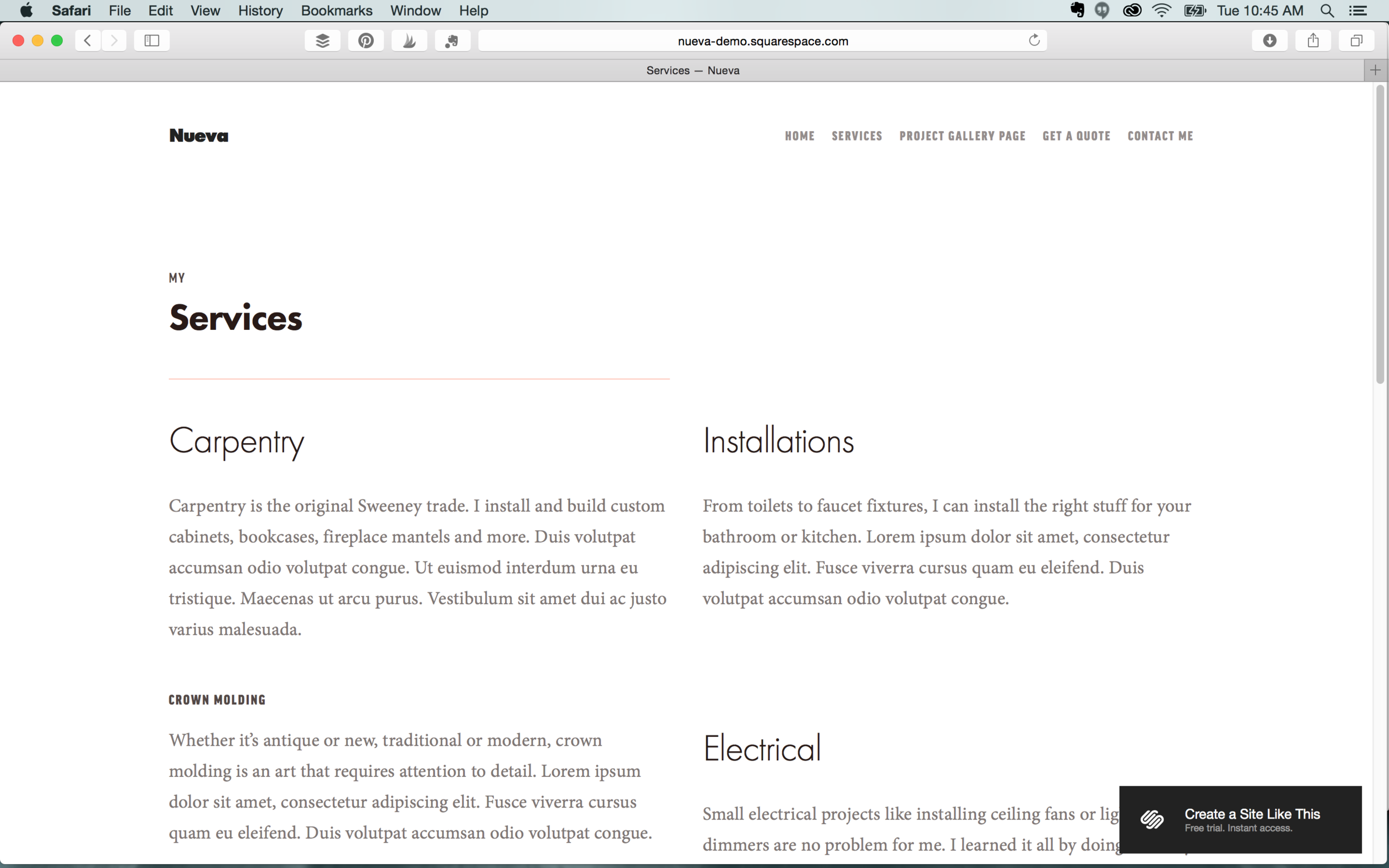
Inside, you’ll find that Squarespace’s versatility is unmatched. The site currently boasts more than 70 different templates. After exploring and choosing the design of your liking, you can begin adding your own content. One caveat, Squarespace’s polished designs only go so far. Be sure to use high-quality photos when swapping out placeholder images. One of the allures of Squarespace is its sleek, professional design, but even that won’t make up for low quality, grainy photographs.

Squarespace has done a phenomenal job with creating beautiful spaces that you can tailor to fit your needs. Do play around with templates if you can’t seem to settle on just one.  Once you begin customizing, Squarespace provides you the option of previewing other templates without losing earlier work. You can experience what your site looks like with a banner overlay, or at various scale sizes, or with numerous navigation choices, or utilizing page animation or displaying a slideshow. And these are just a few of the design options available to you. Like what you see? Great! Let’s talk pricing: 

Screen Shot 2017-11-15 at 8.11.40 AM.png

Squarespace has the simplest pricing plans than any other web builder; with only two total. $12 per month for personal websites, billed annually or $16 paid month to month, and $18 per month for businesses, billed annually or $26 paid month to month. Two additional pricing plans are available if you want an online store. Your hosting and a custom domain name are included with the purchase of an annual membership and that’s certainly a plus.


Other web builders offer free plans, but with limited features, and sub-domain names. Squarespace permits you to try their service for a 14-day trial, but once expired, you’ll need to choose a paid membership to continue service. All things considered, Squarespace’s pricing is competitive with other web builders and the value you receive is undeniable. It has the tools to set any small business apart by adorning it in the most beautiful of feathers and allowing it to really strut its stuff. 


WEB DESIGN IN GREENSBORO AND BEYOND

Loving Squarespace, but not sure what to include on your website? Or maybe your homepage is just looking a little flat? Hue & Tone Creative will help get your web presence up to speed. Be sure to check out our design portfolio to see clients we’ve helped in the past -- and then give us a call if you’d like us to build you a custom, modern website that truly tells your story.

Intro to HTML: Must Know Tags for Beginners
Into to HTML  |  Hue & Tone Creative

If you’re not familiar with HTML, making even small tweaks to your website or custom MailChimp template can be a struggle. HTML is a complicated language and you won’t become an expert overnight – however, you can master a few basics that will make it easier to tweak templates, build web pages, and control your online presence.

This is by no means meant to be a comprehensive guide to HTML, but rather an introduction with some of the most basic tags you’ll need to customize your in-house marketing campaigns. 


What is HTML?

Let’s start with the most basic question – “what is HTML?”

Hypertext markup language (HTML) is a standardized system for tagging text files to achieve font, color, graphic, and hyperlink effects. You use specific tags to customize each element of a web page.

Check it out for yourself: Open up a well-designed site in Chrome, right click, and select "Inspect Element." You’ll be able to get a look behind-the-scenes at how the site was coded. 


HTML Elements

HTML elements are individual components of your webpage that are made up of a start tag <example> and an end tag </example >.

Here’s an example of what a simple HTML page might look like:

<!DOCTYPE html>
<html>
<head>
<title>Page Title</title>
</head>
<body>

<h1>Sample heading</h1>
<p>A sample paragraph would go here.</p>

</body>
</html>


Note the <html> tag at the very top.

This element specifies the language the webpage or document is written in. Without this tag your computer won’t know how to process all the code that follows it. It’s important to realize that browsers do not display the HTML tags, but they use them to render the content of the page.


The Basics

<body>
The visible part of the HTML document is between <body> and </body>.

Your body tag is the first element content tag that you can open after you’ve opened your initial html tag.


<head>
This tag is one of the content elements that can be opened within your body tag. You can vary the size of your headings and subheadings by specifying whether you want <h1>, <h2>, <h3>, <h4>, <h5>, or <h6>.

<h1> defines the most important heading. <h6> defines the least important heading.


<p>
Used for formatting paragraphs of text. Just to be clear, the paragraph tag defaults to which ever style you already have assigned to your style sheet.


<a>
HTML links are defined with the <a> tag.

For example:
<a href="hueandtonecreative.com">You would put the text you want to be hyperlinked here. </a>


<img>
To incorporate an image into your page you’ll want to use an <img> tag -- the source file (src), alternative text (alt), width, and height can all be defined.

Example here:
<img src="hueandtonelogo.jpg" alt="hueandtonecreative.com" width="210" height="210">


Always remember to close your tags. Anytime you open a tag <example> you should close it after you’ve defined all your content </example>. 


Style Elements

<style>
Your style tags help you specify which colors and fonts are used for your headings, paragraphs, etc.


Here’s a few examples:

You could format size like this:

<h1 style="font-size:300%;">This is a heading</h1>
 

Color like this:

<h1 style="color:blue">This is where the text you want stylized goes. </h1>
 

Or both like this:

<h1 style="color:blue;"font-size:300%">This is where the text you want stylized goes.</h1>


Formatting Elements

Formatting assist with the aesthetics of your webpage, kind of like the style elements we mentioned earlier. The main difference between the two is that your formatting elements deal with text effects.

<b>
Used to make specific text bold.

<i>
Used for italicizing text.

<marked>
Highlights text.

<small>
Makes specific text smaller. 


Helpful Resources

Learning HTML isn’t the easiest task, so here are a few tools to help you become a pro in no time!

  • Treehouse is an online coding school specializing in front end web development, JavaScript, IOS, and Python. Learn from over 1,000 video tutorials, quizzes, and coding challenges. There’s a free trial for first time users.

  • Lynda is a digital learning library where you can learn skills for business, design, marketing, and web development.

  • HTML Dog offers free online tutorials in HTML, CSS, and JavaScript. There are specific tutorials for every level of learning: beginner, intermediate, and advanced.


One last note…

Becoming proficient in HTML takes time and consistent practice, so don’t get discouraged if it doesn’t come easy to you! Be patient and try to set obtainable goals for yourself.


Web and Graphic Design in Greensboro and beyond.

Clueless on how to build a website or create a logo? We’ve got you covered! Eye catching landing pages that help reel in leads to business cards that leave a lasting impression, Hue & Tone Creative is here for all of your marketing needs.

The Optimal Font Size for Web, MailChimp, and Mobile

Earlier this month, Twitter rolled out a new font. Unfortunately, not everyone was a fan

Twitter’s switch from Helvetica Neue, to Segue left users complaining that the slender new font was hard to read and caused way too much eye-strain.

Like Twitter, most businesses are bound to make mistakes when it comes to using the right fonts and sizes. Instead of fumbling through and learning from trial and error, do yourself a favor by learning a few of the best font-size secrets. 

Artboard 3test.png

Websites

Whether you’re designing an online shop, portfolio, or blog, it’s crucial that your fonts look clean, appealing, and easy to read.

For best readability, we recommend that you keep your headers and buttons between 30-32 pts and sub headers between 18-26 pts. Body text usually looks best when it’s between 12-16 pts. 


The Optimal Font Size for Web, MailChimp, and Mobile  |  Hue & Tone Creative

Looking to compare email marketing platforms? Here’s a rundown on a few of our favorites.

MailChimp

Email marketing isn’t going away anytime soon. In fact, email is 40 times more successful at bringing in leads than Twitter or Facebook.

One of our personal email marketing tools, MailChimp, recommends that you keep your body text between 14-16 pts. 16 is best for short emails between 2-3 sentences, while 14 pts us better for more lengthy emails.


The Optimal Font Size for Web, MailChimp, and Mobile  |  Hue & Tone Creative

Mobile

According to MailChimp, it’s best to stick to the “one eyeball, one thumb, and arm’s length” rule when it comes to font sizes. Basically, your viewers should be able to see and scroll through the entire email with ease and clarity. 

With this guide in mind, your body fonts should be between 12-16 pts and your links, CTA, and buttons should be between 34-36 pts.


One last note…

When it comes to selecting fonts, the most important thing is to pick an easily readable font. When in doubt, go back to basics. If you stick to a plain serif or sans serif and use these size guidelines, you'll be on your way to finding the perfect typography for your next web project! 


Web & Blog Design in Greensboro, NC

Not seeing much traffic or engagement on your website? It’s probably time for an upgrade! From landing pages to business blogs, Hue & Tone Creative can help you create a site that matches your style and helps reel in leads. 

7 Squarespace Font Pairings
7 Squarespace Font Pairings  |  Hue & Tone Creative

You see a Squarespace template, you love it, you start playing with the fonts... and suddenly you don't love it quite so much. No worries -- it happens to everyone!

Although it may be tempting to stick with the default settings of your template, taking the time to select the right fonts adds depth and personality to your site. With over 600 font options through Google and nearly 1,000 on Adobe Typekit, picking the perfect combo can feel almost impossible.

We're here to take the guesswork out of selecting the perfect Squarespace font combination - here's 7 suggestions to revive your favorite template: 

Merriweather + Roboto Condensed  |  Squarespace Font Pairings  |  Hue & Tone Creative

Merriweather & Roboto

This classic and modern mix of serif and sans serif fonts is perfect for any business. 


Skolar Sans + Domine  |  Squarespace Font Pairings  |  Hue & Tone Creative

Domine & Skolar Sans

Need a clean no-fuss combination? Domine and Skolar pairs nicely with strong graphics. 


Julius Sans One + Franklin Gothic  |  Squarespace Font Pairings  |  Hue & Tone Creative

Julius Sans One + Franklin Gothic

Franklin Gothic is classic, readable, and approachable -- but add Julius Sans One in and you've got an edgy clean feel.


Rift Soft + Vendetta  |  Squarespace Font Pairings  |  Hue & Tone Creative

Rift Soft & Vendetta

Looking for a sophisticated pairing for an upscale brand? The sleek style of Rift keeps Vendetta from feeling too stuffy. 


Essonnes + Futura  |  Squarespace Font Pairings  |  Hue & Tone Creative

Essones & Futura

This duo feel playful and approachable. We love this serif & sans serif mix for boutiques, portfolios, and blogs. 


Park Lane + Tenso  |  Squarespace Font Pairings  |  Hue & Tone Creative

Park Lane & Tenso

This crisp and versatile combo would work well for real estate, bistros, and trendy salons. 


Lust Script + Sofia Pro  |  Squarespace Font Pairings  |  Hue & Tone Creative

Lust Script + Sofia Pro

Feeling a little edgy? Mixing in Lust Script takes this font palette to the next level. 


branding + web services in greensboro: Hue & Tone

Looking for a web designer in Greensboro, Winston Salem or the surrounding areas? Hue & Tone is a creative graphic design agency specializing in logo design, web design, social media management, and more. Give us a call if you’re interested in a custom, branded website that truly tells your story.
How to pick a Squarespace Template

Building a well-designed website for your business can be an intimidating task. Squarespace is one of our favorite platforms because it allows you to easily create beautiful and professional websites for a reasonable cost. 

Although it can be fun to experiment with all the offerings on Squarespace, it’s important to consider the overall goal of your website. Do you need to show off the menu of your organic coffee shop? Promote your event photography? Sell products for your online boutique?

Squarespace identifies their templates as falling into three main types of websites:

  • Information: “The goal of your site is to provide information to visitors, like business hours, who you are, or an overview of a project. The goal might be passive, where visitors find the information, read your blog, and move on, or active, where they sign up for a newsletter, submit a form, or contact you.”
     
  • Images: “The goal of your site is to display beautiful images. If you're an artist, design studio, or photographer, an image-focused template will help you display your work to prospective clients. Sites for restaurants, weddings, and more can also be very visual.”
     
  • eCommerce: “The goal of your site is to sell products, services, or media. If you're selling a small number of products, you can use a Website template to create a small shop. But if eCommerce is the primary goal for your site, a Commerce template provides advanced features to help your product display match your brand and vision.”

Squarespace also offers a cover page option. Cover pages are single-page sites that can be used as a standalone or integrated into an existing site. They’re also great if you need to get something up while you’re building your website behind-the- scenes!

Every Squarespace template offers the ability to add text, social integrations, photos, search, and gallery features. However, only some offer things like index pages, gallery pages, and blog pages. Do your research and identify any special features you might need! 

To make your search a little easier, we’ve picked out five of our favorite templates -- we’ve also highlighted some of the differences between each template. If you’re overwhelmed by the amount of options, these are a great place to start!


Bedford

Bedford is the most popular template on Squarespace and it’s also the template HueAndToneCreative.com is built on. This beautiful and clean interface is ideal for just about any small business.  We also love that Bedford offers the option to have a second navigation in the footer.

Features: Index  |  Blog  |  Header image  |  Folder & footer navigation  |  Page titles  |  Grid & slide gallery  |  Cannot display social icons


Momentum

This clean template is perfect for designers and photographers to showcase high resolution images. If you’re looking to create a portfolio site, Momentum features a great slideshow interface and full screen images. This template’s aesthetic also works well to advertise products.

Features: Index/Gallery  |  Ability to display social icons  |  Page titles  |  Slide & grid gallery  |  No side bars  |  Page titles


Farro

Farro’s sleek editorial style is a great choice for bloggers with strong images or digital publications. This post-like interface could also work well to display the portfolios of photographers.  

Features: Blog  |  Sidebar  |  Ability to display social icons  |  No page titles  |  Grid & slide gallery  |  Secondary navigation


Nueva

We love the professional and polished style of Nueva. We recommend this for stores as well as restaurants. It’s not as image heavy as our other template picks, but it’s well organized and provides the option of a gallery.

Features: Commerce feature  |  Parallax scrolling  |  Multiple navigation  |  Customizable mobile styles  |  Blog
 

Harris

If your business doesn’t rely on pictures to promote your services, Harris is a great option. Its crisp layout, sophisticated font options, and banner styles makes this a great template for law offices, accounting firms, and writers. It also features Blocks to capture customer information as well as several introduction and navigation areas.

Features: Index page  |  Left, center, and right headers  |  Shopping cart  |  Main and secondary navigation


One last note

Even though we’ve made our recommendations, don’t be afraid to try the different templates Squarespace has to offer.  You can switch templates at any time – but *be warned* not all of your formatting will stick when you switch back. For example if you switch from the Bedford to the Nueva, and then back to the Bedford again, you’ll be starting with the original template settings. 

Had a great experience with Squarespace? Let us know in the comments! Feeling a little overwhelmed with Squarespace? We can help!