Forms are essential for gathering user’s information in a smart and efficient way. Getting them wrong means a poor user experience and abandoned leads – which translates to missed opportunities and lost revenue.
Because the formatting and design of your forms has a direct impact on how well they convert, we’ve collated some top tips to make sure your forms are performing as effectively as possible.
1. Form length: Always question the why
How long should a good form be? The more fields you give a user to fill out, the less likely someone will be to complete it. However, the more information a lead is willing to give, the more likely they are to be a qualified lead. Like most questions of quality versus quantity, the key is to strike a balance.
For every question you have in your form, take a moment and really ask yourself why do I need this detail at this stage of the user’s journey? If some of the information can wait until later on in the buyer’s journey, consider leaving it out in an effort to streamline your form.
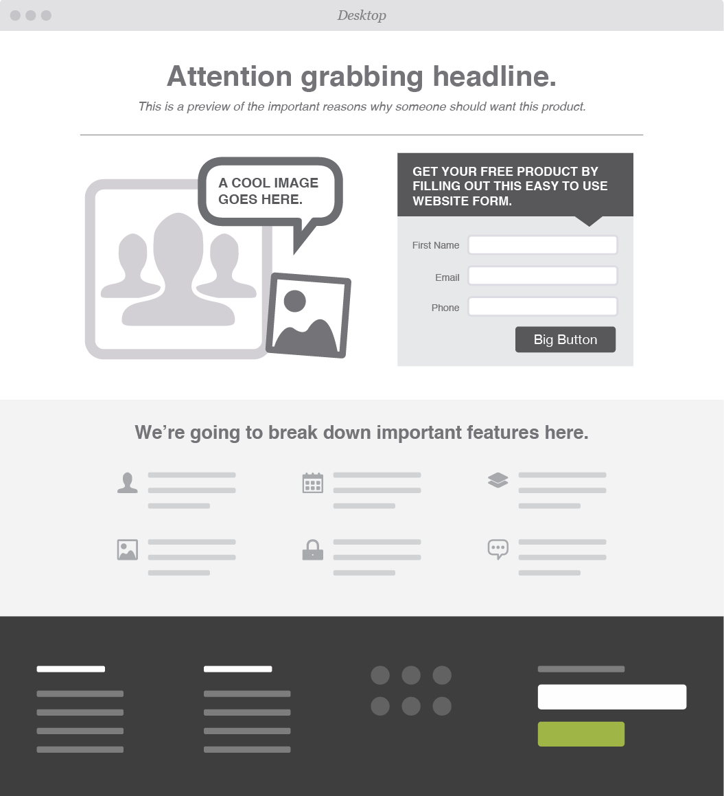
2. Page placement
When adding a form to your website, it’s important to place the form near the top of the page. Visitors shouldn’t have to scroll to get to your form – and if they do, chances are they won’t fill the form out.
3. Tailor the keyboard
In this day and age all forms need to be mobile responsive. But, did you know you can also take user experience a step further by customizing keyboard layouts?
This one’s only for mobile or tablet forms, but we thought it deserved its own shout out. To make the user’s life eveneasier, you can code your site so that the keyboard changes each time a user clicks on a new field. For example, the keyboard will default to digits when they’re filling out their phone number.
For more on how to do that, check out this Treehouse article.
4. Time saving tactics
Users are accustomed to a quick and easy sign-up process – nothing should slow them down from filling out the form you provided. To make sure their experience is as streamlined as possible, make sure you’re abiding by these tips:
If the user has already provided you with information, make sure you’re pre-populating any fields you can.
Instead of waiting until users click “submit,” make sure to highlight errors or overlooked fields as soon as users click on to the next field. Boxes with incorrect information should be highlighted in red straight away – that way users won’t be stuck scrolling through a form trying to figure out what needs to be fixed.
If what you’re asking might be unclear, be sure to add descriptive information or a tip call out near what you’re asking. If a user gets stuck, you can be sure they’ll abandon the form.
If there’s no way around using a lengthy form, give users an option to save their information so that they can return and complete it at a later date. And, if this is the case, be sure to automate email reminders that will nudge them to come back and complete the form.
5. Submit button
Once the form is filled out, the last major factor for form success is the “submit” button. While labeling this button “submit” seems like an obvious choice, it may not be the best choice.
According to Hubspot, landing pages with buttons labeled “Submit” actually have lower conversion rates than those that use other wording. Consider buttons that relate back to your initial offer, or sound less committal than "Submit." Try out things like: "Go," "Download your free e-book," or "Get Started."
Further reading:
Looking for a more resources on how to create effective forms and successfully convert leads? We’ll leave you with these three suggestions for further reading:
Hue & Tone Creative: Greensboro Web, Design, and Social
No matter what your marketing needs, we've got your back. Take a look at all of the services we offer and then get in touch -- we'll work with you to set up a custom marketing solution that addresses all your needs.