Posts in Web
4 free welcome email templates

According to Salesforce’s benchmark study, welcome emails (42%) are the third most popular type of email sent by businesses, trailing only to newsletters (66%) and promotional content (54%). Of the marketers who send them, three quarters rated them as highly effective.

But why are they so important, we hear you wonder? If done right, they engage new customers straight away by prompting recipients to start the next stage in their customer journey -- and they also provide a means for you to follow up on any value propositions you promised (a new customer discount, for example). 

young-woman-using-mobile-phone_t20_ZVNKKR.jpg

One last important thing to note before we dive right in with our templates, are these six golden rules: 

  1. Send your welcome email ASAP

  2. Remember to stamp your branding on it

  3. Include social links to encourage further engagement

  4. Track your email analytics and act on any concerning metrics

  5. Keep them short and to the point

  6. Only use personalization if you’re 100% confident your data is correct

Now, on to what you came for, the all-important templates to get you going…


Example 1: Product Purchase

Hi [insert name]

Thanks for choosing Company X for your Product Y needs - we’re so happy you chose us!

We’ve been delivering our goods to customers - like you - for X years now, and we can’t wait for you to see what all the fuss is about.

As our welcome gift to you, we’d like to offer you 15% off your next purchase with us. To claim your discount, simply enter the code WELCOME19 at checkout.

And if you want to keep up-to-date with our activity (including exciting giveaways!), don’t forget to follow us on FacebookTwitter and Instagram

Thanks again, 

[Company X] team


4 Free Welcome Email Templates  |  Hue & Tone Creative

Example 2: Service Sign-Up 

Hi [insert name],

Welcome to the team!

We’re delighted to have you on board and we can’t wait to start supporting you with our [insert service name].

The next steps are super simple:

  1. Your dedicated service manager will be in touch soon to talk you through the set-up process.

  2. Our Finance Team will invoice you on every [insert date] of the month.

  3. If you have any questions, our customer service team will be available on [insert phone number] between [insert hours and days].

It really is that easy. 

For regular updates, news, hints and tips off our experts, don’t forget to check into our blog every now and then, and if you’re feeling social, why not hit us up on FacebookLinkedIn or Instagram

Thanks again, 

[Company X] team


Example 3: Newsletter Sign-up

Hi [insert name],

Thank you for signing up to our monthly newsletter.

It’ll land in your inbox on the second Tuesday of every month, and it’ll be brimming with useful tips, guides, videos, resources, and more.

If, at any point, you have any feedback on our newsletters, we’d love to know what you think at [insert email address].

To hear more from us, head over to our social profiles and give us a follow:

[Social media icons]

Thanks again,

[Company X] team


Example 4: Event Registration

Hi [insert name],

Congratulations, you’ve successfully signed up to our [insert event name] event - we already can’t wait for you to join us on the big day!

Just so you have them handy, here are the details:  

  • Date:

  • Time:

  • Location: 

Don’t worry, we’ll send a reminder email over a few days before, just to be safe. 

If you have any questions between now and then, you can reach the team on [insert number] or [insert email address].

And so the countdown begins!

See you soon,

[Company X] team


Hue & Tone Creative: Marketing in Greensboro and Beyond

Need a hand writing or designing your very own welcome email? Then look no further - we’ve got you covered. To discuss our email services and more, contact us on (336) 365-8559 or hannah@hueandtonecreative.com.

19 marketing terms you need to know

Let’s be honest. We’ve all been sat in a meeting at one point or another, heard a term we’ve never come across before, not wanted to put our hand up to ask what it means, and instead sat there nodding along, not entirely sure what’s going on... hey, it happens to the best of us.

So, to help you bridge that gap and wave goodbye to your unknowing head nods, we’ve put together a glossary of 19 common marketing terms and what they mean - without the jargon. 

19 Marketing Terms You Need to Know  |  Hue & Tone Creative

1. A/B testing

A/B testing involves creating two variations of one element and running tests to compare which version works best. A few examples of when you would use A/B testing:

  • Email subject line text

  • Colors used for call-to-action (CTA) buttons

  • Content placed on landing pages

  • Imagery used in social media ads

The end goal of A/B testing is to figure out which assets are most successful and, ultimately, improve conversions.

2. Bounce rate

This number can be found in Google Analytics and it represents the percentage of visitors who land on any given page of your website, but then leave without clicking through to any other areas of your site. 
 

3. Buyer personas

buyer persona is a breakdown of what characteristics are typically present within certain clusters of your customer base, for example their:

  • Age, gender and geographic location

  • Professional and/or education status

  • Personality traits - i.e. comfort seekers, impulse buyers, worriers, confident, highly skilled, etc.

It’s worth noting that you can have several different types of buyer personas for a single product or service.


4. Click-through rate (CTR)

This is the number of visitors who visit a webpage and proceed to the next desired step - i.e. they click from your homepage through to a marketing advertisement. Or, they open your email and click through to your landing page.

5. Content management system (CMS)

The majority of us aren’t able to build a website from scratch, which is where CMS’ come in. Quite simply, a CMS is a facility created by web development experts, that allows non-technical users to create, edit and manage their very own site.  

It also helps with things like:

  • Making content SEO-friendly

  • Ensuring content is indexable

  • Automatically generating navigational elements

  • Setting up user permissions


6. Conversion rate

What defines a conversion can vary. For some businesses it might be a newsletter sign-up, for others it’s filling in a form, and for another it could be completing a purchase. So, your conversion rate is the percentage of people who follow through and complete yourdesired action.

A page with a high conversion rate can be classed as well-performing, while pages with a poor conversion rate might be an indication that work needs to be done to improve your numbers.

7. Dynamic content

Dynamic content enables you to present visitors with different content, based on what information you already have on them. 

For example, in the email world, this could be sending the same email to your entire customer base, but sending one cluster to a landing page promoting product X, another to product Y, and another again to product Z, because each item is best suited to their needs and spending history.

8. Evergreen content

Unlike things like news articles and seasonal blogs, evergreen content doesn’t have a sell-by date. It infinitely provides rich, useful information to its readers, and, if done well, it can add a great deal of SEO value to your site. 

For a flavor of what evergreen content looks like, here are a few great examples: 

9. HTML

Short for HyperText Markup Language, HTML is a type of language used to build webpages. It’s the foundation of every single site - regardless of its complexity, and works in conjunction with things like CSS and JavaScript.

11. Landing page

Landing pages are designated pages that are designed for lead generation purposes. Their content will vary from business-to-business, but some examples include offering an ebook, webinar, white paper or event. One element that tends to remain consistent though, is the presence of a form to capture important lead-generating information - like names, job titles, company information and contact details.

12. Microsite

You could say a microsite is a halfway house between a regular website and a landing page. They’re commonly used when companies want to create a unique experience for their audience, and one that’s distinct from their typical style. Because of this, microsites typically have their own domain name and a whole new look and feel design-wise.

13. On-page optimization

This is one of your site’s SEO elements, and it refers to things like your content, title tags, URL and image tags. Basically, it’s the practice of ensuring all the aforementioned areas are optimized for your desired keywords, to help bolster your organic rankings. 

14. Off-page optimization

Another segment that makes up your SEO efforts. Off-page optimization is often much more difficult to obtain success in because it’s usually out of your control, but if you master it, it can be incredibly fruitful.

A few ways to optimize your website off-page include:

  • Link building

  • Social media engagement

  • Social bookmarking

  • Guest blogging

15. PPC

PPC is short for pay-per-click. Quite simply, it involves paying a publisher (like a search engine, social media site or website owner) each time your ad is clicked on. 

19 Marketing Terms You Need to Know  |  Hue & Tone Creative


16. Responsive design

This refers to websites that are built to mould around the device they're being viewed on. So, for example, if you go to a website on your desktop and then again on your mobile, the content will automatically be optimized for both screens’ dimensions, ensuring ease of readability and accessibility.

17. User experience (UX)

UX encompasses everything your organization does from a prospect’s discovery all the way through to an existing customer’s renewal. A good UX can aid your conversions and a bad UX can do quite the opposite. To really get under the skin of a customer’s experience, you have to put yourself in their shoes and bethe customer - market research (like focus groups) can help with this.

18. Viral content

Viral content is the ultimate goal for most. It’s a piece of content that takes the internet by storm and spreads like wildfire through social sharing and re-publishing. Check out these examples for some inspiration. 

19. XML sitemap

Last but certainly not least, an XML sitemap is a file that hosts all your website’s relevant URLs. It helps search engines a) get to grips with your site’s structure, and b) crawl your pages more efficiently.

Although XML sitemaps don’t guarantee your pages will be indexed, they are still the best way to put your website out there and in front of search bots. 

Keywords form an important part of your SEO strategy and they play a key role in getting your pages ranked in search engines, such as Google, Yahoo, and Bing.

The keywords you target should be relevant to your product or service, in sync with what your target audience are likely to search for, and optimized both on-page (i.e. within a blog post or on a product page) and off-page (i.e. in your meta descriptions).


Hue & Tone Creative: Your marketing partners

So now you’ve come to grips with the jargon – but do you know how to truly utilize some of these tactics and trends If you don’t, don’t stress – that’s where we come in! To see how we can fulfill everything from your design and branding to social media and blogging needs, contact us today at (336) 365-8559 or hannah@hueandtonecreative.com

6 reasons to send a company newsletter

“For years, in large part thanks to the newsletter I think, I’ve never had trouble attracting new clients and the right kinds of clients. People will read my newsletter and be able to tell if I’m the right person for the project before they even call me.”

Tom Ahern, Small Business Owner


6 reasons to send a company newsletter  |  Hue & Tone Creative

Sold already? 

Newsletters can, and should be, a staple lead-generating part of your marketing activity. They add credibility. They add value. And, most importantly, they add revenue to your books.

In fact, you could say the proof’s already in the pudding. According to research conducted by the Content Marketing Institute, 83% of B2B marketers already send out email newsletters. And let’s be honest, the majority of organizations wouldn’t be willingly pouring their time and resources into them if the investment wasn’t worthwhile…right? 

Whether you’re already sending newsletters or are new to the scene, here’s a reminder of their six core benefits:


1. Constant communication

Sending a regular newsletter to prospective, current and past customers (providing they’ve asked for it, of course) opens up a non-invasive, continual line of communication. It might be one-sided, but it enables you to keep talking to your target market in a way that doesn’t leave them feeling bombarded. 


2. Gentle reminders

Whether you opt to send your newsletter weekly, biweekly, monthly or biannually, it serves as a reminder of your business to the recipients and ensures your name remains at the forefront of their mind. The benefit to you? It means they’re morelikely to turn to you when they’re in need of your product or service.

3. Add value

If your newsletter is packed with genuinely useful hints, tips, guides and videos, you’ll be giving something back to people for free - and they’ll appreciate that. But (and this is a big but) you’ll only reap the rewards of this if your newsletter content’s rich and relevant, which is where we can’t stress the importance of quality content enough. 


4. Increase sales

If you plan and pick your content smartly, your newsletter could help build your business’ bottom line. By using it as a platform to subtly sell as well as educate and inform, you can give both prospects and existing customers a polite nudge in the direction of a new sale.

For example, if you’re a social media management company and, say, 30% of your customers have only signed up for your Facebook services, why not include an article in their newsletter around the benefits of your Instagram and/or LinkedIn expertise? If not immediately, it could spark a sale down the line.

6 reasons to send a company newsletter  |  Hue & Tone Creative


5. Bolster your social following

More social media followers = more engagement = more reach. It’s as simple as that. As an added bonus, several studies indicate social signals can contribute to how search engines rank pages, so it could aid your SEO efforts too.

To maximize the benefits of this one, just make sure you remember to include links to all your profiles and in a place where they’re easily seen. 


6. Make your content go further 

If you’re investing time, money and resource into producing great content, it just makes business sense to make it go further, right? And your newsletter’s certainly one extra outlet for that. 


Now we’re not suggesting you start churning out generic content and pushing it out through every medium just for the sake of it. It’s important to tailor your content to each platform, audience and end goal -- but if you’ve got a bank of dormant articles, why not tweak and recycle them to boost their value and reach? 


Hue & Tone: all things creative marketing

If you’re sold but just don’t know where to start, we can help you with everything from your content and layout to design and social media. To get the wheels in motion, get in touch with the team at (336) 365-8559 or hannah@hueandtonecreative.com

4 types of emails you need to be sending

Want to learn more about our favorite email marketing platform? Check out this post.

Email marketing can help you engage new customers – in addition to helping you sell your products; email marketing will help you enhance your brand awareness and build trust with new prospects. Once you’ve engaged a customer, it can even help you build brand loyalty.

For businesses of any size, email marketing is a no brainer. If you have a small marketing budget, it’s an easy way to connect with a lot of customers at once. In addition to being low investment, it drives traffic to your website and it’s the channel most customer prefer. 

As your company grows you can also scale your email marketing efforts – making it a useful tool no matter what stage of growth your business is at. 

4 types of emails you need to be sending  |  Hue & Tone Creative


One study from Marketing Sherpa reports that 72% of consumers prefer to receive promotional messages through email (source).


You can send a wide variety of different emails to your marketing list, but if you’re just getting started with email marketing, there’s a few types of emails we suggest you start with. These four types are all great to engage both new customers and old leads. 


1. Welcome email

This is your first chance to get your newfound relationship off on the right foot. Your welcome email should include key components like:

  • A thank you message for choosing your brand

  • Links to your social media channels to encourage additional engagement

  • A discount or deal that’s exclusive to new customers (this not only demonstrate a token of appreciation, but it will give them a nudge to browse your products or services again)

As with any type of email, your welcome email should be kept short and sweet to ensure the recipient isn’t overwhelmed with information. We suggest sending this initial email within 48 hours of signing up or making a purchase - the sooner the better though. Often, people will actively check for your name in their inbox after a sale’s been processed, so any later can look a little lazy!


2. Regular newsletters

Newsletters are an excellent way to naturally maintain contact with customers – it’s a great way to share useful information while also ensuring your brand remains at the forefront of their mind.

Your newsletter could include content like:

  • Blogs relevant to the product/service they took out

  • Company updates

  • Competitions/giveaways

  • Teasers: if you’ve got something new coming out

  • Testimonials: to reaffirm you’re a good brand to be with

Your newsletters should be consistent. Don’t send three in one month and then go silent for the next four. Decide how regular you want to start sending them - weekly, biweekly, monthly or quarterly. Try to stick to the same date and time too, that way people can start to expect (and hopefully look forward to) your updates.


3. Promote your products 

Existing customers present a potential gold mine of up-sell and cross-sell opportunities. If they’ve already purchased from you there’s a good chance they already enjoy your brand, so it’s a waste not to play on that.

It’s really important you don’t go overboard with these kind of emails though. If you do, you run the risk of recipients unsubscribing and losing all chances of reaching out to them. 

Your promotional emails should:

 a)     Be clearly targeted
b)     Focus on quality, rather than quantity
c)     Outline why this product is suited to them
d)     If possible, offer an additional incentive - i.e. a discount

4 types of emails you need to be sending  |  Hue & Tone Creative


4. Ask for a review

If you never ask there’s no chance you’ll get what you want, right? 

Reviews are key to your success. The majority of prospects will peruse your reviews before making their final decision, so the more high-quality testimonials you have to your name, the more chance you have of attaining new leads. 

For existing customers, reviews provide an open platform to air opinions, and show that you a) care what they think, and b) are looking to continually improve and evolve your offering for them.

 Don’t be too keen with your review request though. To make sure it’s meaningful, give the customer chance to actually use your product or service first. Equally though, make sure you don’t leave it too long, if you do, you might slip off their radar before you land in their inbox. We suggest waiting a minimum of about 2-3 weeks before prompting someone for a product review, but no more than 2 months. 


Hue & Tone Creative: Email Marketing in Greensboro, NC

Whether you need help building your overarching email strategy, putting words together, or branding your template, we’re your go to experts. To start or improve your email strategy today, get in touch with our team at (336) 365-8550 or hannah@hueandtonecreative.com.

The 6-month guide to improving your SEO (Part 2)

Just a note: Because of the length of this post, we decided to publish it in two parts. You can find Part 1 of the series here.


Lead the way for your customers.

Lead the way for your customers.

In Part 1 of our SEO Improvement Guide, we reviewed how to run a technical audit, conduct keyword research, and verify that your site is mobile-friendly. Now that you’ve gotten those three things under your belt, it’s time to start curating high quality content and improving your links.

Continue your SEO improvement journey below — you can pace these steps out, or you can do them all at once if you’re looking to super charge your SEO strategy as soon as possible.

July: Curate a content calendar

Regularly producing SEO-optimized content is critical to your organic strategy. In Google’s own words, your content needs to be:

  • Useful and informative

  • More valuable and useful than other sites

  • Credible

  • High-quality

  • Engaging

When searchers type in their query, Google scours the web to find the most useful and relevant results. If you don’t have anything on your site that fits the bill, quite simply, you won’t rank. That means less visibility, missed traffic, and lost visitors. 

When we say content we don’t just mean the regular old blog post, either. Be creative. Test to see what works best with your audience. And don’t be afraid to experiment. Here are a few suggestions to get you going:

  • Articles

  • Guides

  • Videos

  • Webinars

  • Whitepapers

  • E-books

  • Case studies

  • Calculators

  • Infographics

  • Tutorials

  • News

How to create optimized content 

1. Keywords

Using the keywords you collected in April, brainstorm content topics that’ll be picked up in search engines. When putting this list together, try to focus on long-tail keywords, avoid highly competitive terms, and remember to match your topic to your keyword. 

It’s also important to take an audience-centric approach when spitballing your content titles. By this, we mean identifying your audience andthencreating the kind of content you know they wantto see. 


2. Put it in a calendar 

content calendar itself won’t aid your rankings, however, we’d recommend creating one to save you time and to help you get in a groove of posting regularly. It doesn’t needn’t be anything fancy, dumping it in a Word or Excel document will do.


3. Friendly formatting 

Make sure you lay your content out in a way that’s easy on the eye to ensure its readability and engagement. For example…

The 6-month guide to improving your SEO  |  Hue & Tone Creative

The good: This page is clearly divided with subheadings, the content is broken up with bullet points, and the paragraphs are short and digestible. It also has easy to see links. 

The 6-month guide to improving your SEO  |  Hue & Tone Creative

The bad: These paragraphs, on the other hand, are overwhelming long and the lines are very close together. Combined, it’s quite a strain on the reader’s eye.

4. The technical stuff

A few best practices for the technical side of content creation include:

  • Don’t go overboard on keyword insertion - it’ll look spammy

  • Remember to include meta titles and descriptions - they’ll help to improve the number of people who click through from search results

  • Make sure your URL’s reflective of the content’s title

  • Link to other useful and relevant internal pages to improve your site’s architecture and encourage visitors to keep exploring 


The 6-month guide to improving your SEO  |  Hue & Tone Creative

August: Implement a link-building plan

Link-building is arguably one of the most difficult aspects of SEO. But it can also be one of the most beneficial. It requires creativity, time, persistence and, more often than not, money.

There are several benefits that come hand-in-hand with link-building, like: 

  • Improve your domain and page authority

  • Earn extra referral traffic

  • Give your brand’s visibility and authority a boost

  • Increase your exposure to other industry leaders

  • Raise your trust and credibility profile

  • And, of course, aid your rankings


Link-building tactics 

If you’re new to the world of link-building and don’t know how to get your foot in the door, here are a few sample strategies to get you started: 

1. Ask your network: If you’ve got a pool of customers, partners or suppliers who have an online presence, start close to home and ask them to promote you on their site. Something as simple as a partnership badge linking back to your website would do.

2. Build your blog: Your content strategy is a gold mine for links. Once you’ve established yourself as a reliable, industry authority, it’ll become a link-bait hub, and naturally earn you evergreen links by itself.

3. Go viral: Easier said than done, we know, but creating a piece of shareable content (like a meme or funny video, for example) is a sure fire way to bank yourself a bunch of backlinks.

4. Be newsworthy: Whether it’s commenting on something in the headlines or creating your own news - like commissioning a study or sharing a company announcement, jumping on something time sensitive will point the press and bloggers in your direction, and boost your odds of coverage in their publication.


September: Enhance your appearance in SERPS

There are a number of ways you can improve how you display in Search Engine Results Pages (SERPs), but here are just a handful:


Optimize your meta data

Make sure your page titles and meta descriptions are a) relevant, b) include keywords, and c) written in a way that entice searchers to click through. Remember to stick to the recommended character counts too, so that your text doesn’t get chopped off sooner than it should:

  • Page titles should be within 50 to 60 characters, and

  • Meta descriptions should sit between 150 and 170 characters

The 6-month guide to improving your SEO  |  Hue & Tone Creative

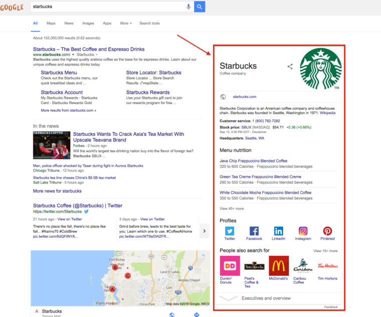
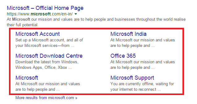
Add schema markup

In its simplest form, schema markup is micro data that can be added to your site’s HTML to enhance how search engines read and subsequently display your page in their results.

Correctly applying schema data can give you a competitive edge in SERPS by giving searchers more, useful information about your company, which can result in a greater number of click throughs. Some popular types of schema markup include:

Ratings and Reviews:

Image via moz.com

Image via moz.com

Organization markup:

Site navigation:

Video and media:

Adding schema markup might sound complicated, but you don’t actually need any coding skills to do it yourself. For step-by-step instructions on how to get started using Google Tag Manager, head over to this guide

Alternatively, if you’re not entirely comfortable dabbling in schema markup yourself, employing the services of an SEO specialist or web developer is another option.


Hue & Tone Creative: Your Greensboro Marketing Solution  

To see how we can fit into your SEO strategy and support your organic efforts, get in touch with our team at (336) 365-8559 or hannah@hueandtonecreative.com today. 

The 6-month guide to improving your SEO (Part 1)

Just a note: Because of the length of this post, we decided to publish it in two parts, and Part 2 will be published next Wednesday, April 3.


Get your content in front of the right eyes.

Get your content in front of the right eyes.

There’s nothing more rewarding than seeing your site featured in one of Google’s hotspots. It’s a coveted place to be. It’s a financially fruitful place to be. But it’s also a very difficult place to get.

Stiff competition and Google’s constantly evolving algorithms make mastering your SEO strategy an ongoing uphill battle. There’s no denying that making the investment in high quality SEO is worth it though. Here’s a few stats to back that up: 

  • Three in four people never scroll past the first page of search results?

  • 93% of visitors begin their online experience with a search engine?

  • SEO leads have a 14.6% close rate, compared to 1.7% for outbound leads (like cold calling, email campaigns and radio ads)?

If you’re an SEO novice, we would suggest starting with a few of our articles geared to beginners (here and here).

But, if you have some experience with SEO and are familiar with basic terms, then this six-month guide is for you. From technical audits and content calendars to schema markup and link-building, this six-month plan will give you one simple objective to focus on each month. In no time at all, you’ll be armed with the information you need to give your organic rankings, traffic, and revenue a healthy boost.


The 6-month guide to improving your SEO  |  Hue & Tone Creative

April: Run a technical audit

Poor technical SEO practices can harm your rankings. It’s as simple as that. It can make your site uncrawlable, unindexable, and inaccessible, all of which affect how search engines view and place your website.

While there’s no such thing as a perfect website, there isa whole host of errors you can look to correct, all of which will help give your SEO metrics a boost. 

Crawl reports: Carrying out a crawl report will help to identify things like: 

  • Broken links 

  • Faulty redirects

  • Meta descriptions and page titles that are either too long or short

  • Meta descriptions and page titles that are missing or duplicate

  • Matching URLs and on-page content

Hint: if you’re new to the world of crawl reports, Screaming Frog is a reputable tool and offers a comprehensive free version.

HTTPS status codes: Studies have shown that HTTPS is now a very strong ranking factor which, suffice to say, makes it a must. So, if you haven’t already made the switch, there’s no time like the present - here’s a checklist to help you through the stages.

Page speed: The time it takes for your pages to load is another important SEO metric. As well as harming your rankings, slow load times can lead to a poor user experience and increase your site’s overall bounce rate, too.

Google’s PageSpeed Insights tool can be used to analyze your URLs. Within this, you’ll get a score (fast, average or slow), along with a list of issues that are dragging your page speed down. It’s worth noting some of these problems might be quite technical (like deferring unused CSS and eliminating render-blocking resources, for example) and may require input from a web developer or SEO specialist. 

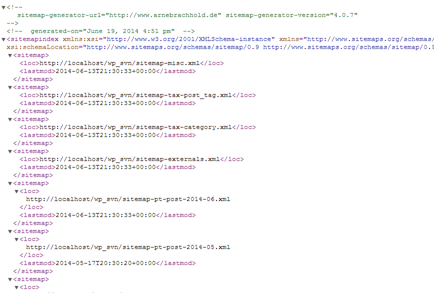
XML sitemap: A Sitemap is an XML file that lists the URLs for a site. Your XML sitemap is how Google and other search engines get around your website, discover your pages and subsequently rank them - if you don’t have one, you need one. 

Your XML sitemap must be properly formatted in an XML document, follow XML sitemap protocol, include all your website’s pages, and be submitted to your Google Search Console (GSC). 

To help you visualize the end product, here’s a snippet from one. And don’t be put off if you think it looks scary, in reality, it’s just a list of your page’s URLs along with the date they were last modified. Like this:

Image via wordpress.org

Image via wordpress.org

Most popular CMS’ have plugins that’ll create your XML sitemap for you. If yours doesn't, you may have to build it manually - check out this guide to find out how, and this one for a step-by-step look at uploading your sitemap to GSC.

For example, you know we’re always recommending Squarespace – and your sitemap is something else they help with. “Your Squarespace site comes with a site map using the .xml format, so you don't need to create one manually. It includes the URLs for all pages on your site and image metadata for SEO-friendly indexing. We automatically update it with any pages you add or remove.” (via Squarespace) 


May: Conduct keyword research

Find the right keywords… they’re out there!

Find the right keywords… they’re out there!

There’s no denying keyword research can be laborious at times, but the more you invest in this stage at the beginning, the greater return you’ll likely get in the long run - so don’t rush it.

Your keyword research lays the foundation for your future content strategy. It’ll help you optimize existing pages, identify opportunities for new pages, and construct a well thought-out content calendar.

 In addition, having a comprehensive list of long and short tail keywords - along with their monthly search volumes, ideally - will enable you to set-up your ranking reports, which play a pivotal part in monitoring your organic efforts. 

What’s a long-tail keyword? A phrase containing at least three words that’s used to target specific demographics opposed to mass audiences. Long-tail keywords are more niche, have a lower search volume, and are less competitive.

What’s a short-tail keyword? A phrase including one or two words that’s used to capture large volumes of search traffic. For example, “social media” is a short-tail keyword, and “improve social media engagement” is a long-tail one.

How to conduct keyword research

There are lots of different ways you can go about gathering keywords relevant to your business, but the most complete approach is amalgamating several different methods.  

Step #1: Brainstorm a handful or two of key topics related to your product or service. Using ourselves as an example, this might be phrases like ‘digital marketing’, ‘web design’, ‘social media management’, ‘email campaigns’ and ‘personal branding’.

Step #2: Get a few heads around a table and start to fill in some of the blanks based on what you think/know your customers are searching for. Using ‘web design’ as an example, this might be:

  • What is web design?

  • How does web design improve revenue?

  • Web design agencies in Greensboro, NC

  • How to find a quality graphic designer

  • Web design cost

  • How to do web design myself


Step #3
: For more inspiration, drop the phrases you’ve accumulated from steps one and two into Google and see what comes up in their related search terms section:

The 6-month guide to improving your SEO  |  Hue & Tone Creative

Step #4: Scour your competitors’ sites and see what terms are trending throughout their pages. If they’re tapping into words you’re not and they’re relevant, you could be missing out and so they might be worth throwing into the mix. 


Step #5:
Make the most of free tools. For starters, you can see which phrases are already leading visitors to your site in Google Analytics, and then there are resources like SEMrush, Moz Keyword Explorer, Google AdWords Keyword Planner Tool, Google Trends, Microsoft Bing Ads Intelligence or Wordtracker’s Free Basic Keyword Demand.


June: Make sure you're mobile friendly 

It’s perhaps no surprise that mobile’s now the predominant platform used for searches. In 2018, the split sat at: mobile (49.06%), desktop (47.2%) and tablet (3.74%).

All’s not lost if your site isn’t mobile friendly- your desktop version can and will still be indexed. That said, if you’re providing a less user friendly experience to visitors, it couldnegatively impact your mobile rankings. Equally, organizations with streamlined mobile sites could potentially see an uplift in their rankings - and that includes desktop searches, too.

If you’re not sure whether your site’s mobile friendly, you can easily find out by using this tool. And if the outcome’s that you’re not already on the mobile-friendly bandwagon, here are 10 steps to help you make the move


Hue & Tone Creative: Your Greensboro Marketing Solution  

To see how we can fit into your SEO strategy and support your organic efforts, get in touch with our team at (336) 365-8559 or hannah@hueandtonecreative.com today. 

Inbound marketing: 8 tips for design that converts
Inbound marketing: 8 tips for design that converts  |  Hue & Tone Creative

Are your inbound marketing efforts failing to secure the numbers you projected? Are you confident in your concept and scratching your head to figure out where it’s going wrong? Well, perhaps it’s time to look in the direction of your design.  

Design possesses the power to convert spectators into engaged customers. It’s the first and last thing people see when engaging with your business. And it should be a key focus when working to increase your conversions.

So, without further ado, here are eight design tips to give your numbers a nudge in the right direction.


1. Hick’s Law

Hick’s Law is a popular theory that suggests the time it takes someone to make a decision is directly proportionate to the number of possible choices they have. So, in Layman’s terms, the more options you give your visitors, the less likely they are to perform the desired action.

To implement this theory, take a look at your site’s design and structure and ask yourself (and honestly answer!) whether you’ve got too much going on. If the answer’s yes, see how you can hone things down to give consumers one or two key choices. 


2. Don’t be afraid of white space 

To a degree, the phrase “less is more” couldn’t be truer. Don’t cram your designs with color, text, and imagery out of the fear of being ‘bland’. White space can contribute to clean and clear designs that emphasize the content you want visitors to focus on… which, in turn, increases conversions. 


3. Choose your colors carefully

Color can evoke emotion. Emotion can result in action. Action can result in conversion. Use contrast to ensure your text, headlines and call to actions stand out, and experiment with your color choices to see which returns the best results.


4. Remember the 8-second rule

It’s true what they say, the human attention span is less than that of a gold fish - a mere eight seconds, in fact. That means you’ve got limited time to grab a visitor’s attention. 

Think about using: 

  • Large and snappy headlines

  • Eye-catching imagery

  • Clear call to actions

  • Power words


5. Use real faces

Using natural imagery and real people can improve your brand’s authenticity and in turn portray you as more trustworthy, human, and familiar. 

If you’ve got an ‘About us’ section with a breakdown of your employees, put a photo of them next to their bio. And, instead of buying stock photos for everything, consider organizing a photoshoot that shows off your product or office. 


6. Quality is key

Poor quality pictures don’t make a good first impression. They reflect badly on your brand and lead onlookers to associate the quality of your imagery with the quality of your product or service - after all, if you can’t master your pictures, how can you follow through on the other things your website promises? Now we know that’s not necessarily true, but it’s a conclusion people can jump to.

If you’ve got pictures on your site that are pixelated, distorted or just plain tacky, it’s time to go ahead and replace them.


7. Optimize your forms

Having trouble designing a form that converts? We can help with that

When it comes to conversions, your formsare key – because it’s where the action takes place. So, don’t let yourself fall flat at the final hurdle. Keep your form simple and concise, include a clear CTA, make sure the fields are clearly labelled, and use a large submit button.

To see where there’s room for improvement, we suggest trying out some A/B testing (more on that here).


8. Don’t leave out your logo

This one might seem obvious, but it’s not unheard of for people to overlook the most obvious element of their website.  

Whether it’s a landing page, flyer, brochure, business card or online ad, you need to always include your logo. That’s how you reinforce your branding for people – and while it doesn’t have to be the focal point of your page, it does need to be strategically placed so people know where they are and who’s talking to them.


Hue & Tone Creative:

Feeling like these design changes are outside of your expertise? Not to worry, that’s where our creative team comes in! To see what we can do for you, get in touch today at hannah@hueandtonecreative.com

12 tips for picking a good URL
Lead your website visitors right where they need to go…

Lead your website visitors right where they need to go…

Picking the perfect URL is a pretty big deal. It’s your online identity, it’s got to fit your business, and it’s got to be easy to find and promote. Not to mention, if you change your mind down the road it’s going to be a pain to go back and undo.

So, to make your future easier, here are 12 tips to help you settle on a good URL the first time around:


1. Make it easy to type

You want it to be as easy as possible for people to type your domain name into their browser, hit enter and land on your site. If it isn’t, you run the risk of losing potential visitors. So, try to avoid the use of slang (using ‘u’ instead of ‘you’ for example) or words with various spellings (like express and xpress).


2. Keep it short

Tying in with tip number one, keeping your domain name short reduces the chances of people mis-typing or mis-spelling it. Plus, long and complex URLs can be hard to remember, and you want people to remember you, right?


3. Watch out for bloopers

Here’s a prime example for you: penisland.net. The company’s called Pen Island, but we don’t need to tell you what the domain name can be interpreted as… 

The moral of the story: always check for embarrassing double meanings before you buy your domain.


4. Insert keywords

Try to include keywords relevant to your business. For example, if you’re a door repair company, you might want to register for a domain along the lines of doorrepair.com or doorreplacements.com. Keywords not only aid your organic efforts, but they just make sense to your customers.


5. Geographic targeting

If your product or service operates on a local basis, consider tying this into your domain name too. Sticking with the door repair example, this could mean having a domain like: vegasdoorrepair.com or doorrepair.vegas. Again, this makes your domain easier for people to find and remember.


6. Avoid numbers

Numbers can be easily misunderstood. For example, a numeral number 5 could be misplaced with a spelled out number five, and vice versa. 

woman-using-smartphone_t20_AeLxr0.jpg

 7. Skip the hyphen

Try to stay away from using hyphens, too. They can be forgotten about which, you guessed it, makes your website more difficult to be found. 


8. Do your research

The last thing you want is a legal battle on your hands, so make sure you research your chosen domain name to make sure it isn’t trademarked, copyrighted or being used by another company.


9. Don’t gloss over your extension

When we say ‘extension’, we mean the end bit of the url, like .com, .net, .org and .info, for example. Here’s a breakdown of how each is typically used:

  • .co - an abbreviation for company, commerce and community

  • .info - informational sites

  • .net - technical, internet infrastructure sites

  • .org - non-commercial organizations and non-profits

  • .biz - business or commercial sites

  • .me - blogs, resumes or personal spaces

Don’t be afraid of straying from the standard .com. It’s by far the most popular, but because of this, it can be tough to get your hands on a short and memorable URL that isn’t already taken. The key to choosing one that’s right, is making sure it’s relevant.

For example, if you’re a non-profit organization, it wouldn’t make sense to opt for a .biz extension. It might throw visitors off the scent and make them less likely to remember your link.


10. Buy back-ups

Everything up until now has been centered around building a URL that’s sheltered from being misspelled. But, it’s better to be safe than sorry, so it could be worth registering misspelled versions of your domain too, so people still make their way to your site anyway.


11. Bat off your competitors

Stop your competitors from stepping on your toes by purchasing similar domains to your own and redirecting them to your primary URL. For example, if your domain is doorrepair.com, you might also want to consider owning:

  • doorrepairs.com

  • doorrepair.biz

  • doorrepair.net

  • doorrepair.co.uk


12. Check its history

And finally, using sites like who.is and WaybackMachine, check out the domain’s history. After all, you don’t want to be associated with something that has a shady past.


Hue & Tone: Let us help you with your website

Brainstorming, agreeing on, and purchasing your domain name is the first half of the battle... building a website that converts is the other - and that’s where we come in. To see how we can help, contact our team at (336) 365-8559.

Data trends: 7 metrics you need to be measuring

Your data’s essentially the backbone of your marketing efforts. It tells you what is and (perhaps more importantly) isn’t working. It shapes strategic decisions. It funnels your money into the marketing channels that give the greatest return. It helps you prevent dead time, maximize resources, and effectively utilize your budget. 

Knowing which numbers to monitor, and what they mean, is key to properly utilizing the data you’re collecting. Here are seven key marketing metrics you need to be measuring: 


1. Total visits

Your totals visits refer to the number of people who check out your website. You can monitor your total visits on Google Analytics for things like:

  • Your entire website

  • Specific pages of your site

  • Campaign landing pages

 Keeping an eye on this type of data is important when you’re trying to gain an understanding of the effectiveness of your overall marketing efforts or the effectiveness of a specific campaign.

Data trends: 7 metrics you need to be measuring  |  Hue & Tone Creative

2. Acquisition type

Looking for different ways to measure your traffic? Here’s our top four methods.

Acquisition is where your traffic comes from – for example is it direct, referral, email, organic, paid or social? This is a key metric to stay on top of, because it tells you which channels are top performers and which may need to be revisited. Either way, it helps you put your efforts into the areas that actually generate a return for you.


3. Bounce rate

Bounce rates tell you how many visitors enter your website and leave before exploring any other pages. For example, are people making it to your ‘About us’ page and then heading off the website without clicking on any internal links? 

Generally speaking, the lower your bounce rate the better. High bounce rates canbe associated with people not finding the content on your page useful, and low bounce rates are more likely to convert and perform meaningful actions.

Bounce rates can be measured on your overall site or for specific pages.


4. Conversions

 This is arguably one of your most important metrics. A conversion can mean different things depending on what your goals are -- for example, it might be a newsletter sign up, filling out a lead form, and or completing a checkout.  

Your conversion numbers help you measure the profitability of your marketing efforts and they can be tracked either directly on your site (depending on how it’s built) or by setting up goals in Google Analytics. If your conversion numbers are looking pretty low, it might be worth looking at your design, content, user experience or product/service.


5. Cost per lead

Quite simply, this is the amount it costs you to turn a prospect into a customer. Your cost per lead should be calculated on a channel-specific basis, and the numbers you retrieve will give you a good idea of which channels are most profitable.

To calculate your cost per lead, simply work out how much you’ve spent on each medium and compare it to how many conversions it’s earned you. For example, if you invested $1,000 into a PPC campaign and got 15 conversions out of it, your cost per lead would be $66.66. 

This cost per lead needs to be weighed against the cost of creating or delivering your product. If closing a customer costs $100 and it takes $400 to manufacture your product, you need to seriously revisit your marketing efforts. 


6. Open rate

Open rates tell you how many of the emails you’ve successfully sent are actually being opened. For example, if you send 600 emails to prospects and 75 of them are opened, your open rate would be 12.5%.

It’s important to keep track of your open rates to understand how a) far your email campaigns are reaching, and b) you can improve your subject lines. Low open rates mean your emails aren’t being read, which results in missed opportunities. 


7. Customer value

twenty20_34643184-b92e-4852-ba8c-d79fae59854a.jpg

Last but certainly not least, is customer value. This is how much a customer is likely to generate you per year (or whichever cycle is most relevant to you) and can help you determine your overall return on investment. 

If you’re a start-up this figure will be more of a forecast. If you’ve been in business for some years, you can use the past few years’ sales numbers to calculate out the average number of yearly sales, along with the value of those purchases.

You can work your customer value out as an overall average or based on clusters – and your clusters could be anything from age and geography to persona and profession. Knowing your customer value helps you set organizational goals and expectations. 


Hue & Tone: Greensboro Marketing firm

When it comes to your business’ numbers, everything from your design to your social media management plays a part in your success. To see how we can help give your bottomline a healthy boost, get in touch with our team today at (336) 365-8559.

Forecasting for 2019: Social Media Trends

Social media continued to dominate the world of marketing through 2018. From an increase in live streaming and Instagram stories to customized chatbots and an ever-increasing emphasis on social listening, brands all over the globe have been improving their tactics by carefully tracking each platform’s changing trends.

Because social media’s constantly evolving, what works today won’t necessarily work tomorrow -so let’s take a look at what we predict is on the horizon for 2019.

Forecasting for 2019: social media trends  |  Hue & Tone Creative

Authenticity

Social scandals were rife last year. From fake news to personal data breaches, social media made the headlines for all the wrong reasons, causing users to really question who they could trust.

As a direct result, 2019’s expected to bring a change in what kind of content is popular. Instead of focusing on social reach, brands are likely to shift their focus to creating genuinely meaningful, transparent and personalized content. This’ll inevitably increase the time it takes to create quality social media content, but the level of engagement that comes as a result will likely justify the time investment.


Social stories

Social media stories grew at an exponential rate in 2018 and there’s no sign of that growth slowing down in 2019. According to findings published by Block Party, social stories are growing 15 times faster than feed-based updates, and some believe they’re set to surpass it completely in the not-too-distant future.

 If you’re not already on the social stories bandwagon, it’s certainly time to hop on board. But remember, stories require a different approach to be effective. Instead of being static updates (like with your feed), they should be live (even raw), provide a narrative, be personal, and give your followers a glimpse behind the scenes.


Instant messaging

 Facebook Messenger and WhatsApp now boast 2.8 billion users between them. That’s a whole load of potential interaction. The jury’s still out on whether instant messaging intrudes customers’ personal space, but there’s no denying that it’s worth trying out with your customer base. 

In an almost completely digital world, 89% of consumers are crying out for businesses to branch out into instant messaging apps for their customer service. However, the same study uncovered only 48% of companies are equipped to do so. That’s a lofty gap to close in order to meet consumers’ expectations – and we expect the gap will begin to close in 2019.


Dimensional ads

Over the years, social media ads have become saturated. Whether it’s a sponsored story, promoted post, or suggested follow, the majority of businesses invest in them, which has lead to increase in prices and a chance in consumer mindset. 

Social ad overload has begun turning audiences off – and many social media users are so inundated they’re starting to become oblivious.

Big brands like Spotify and Netflix have already taken their paid social approach to the next level by building them into full-fledged campaigns that incorporate videos, motion graphics, and narratives. These multichannel platforms are focused on driving engagement, upping discussion, and building trust. In 2019, it’s expected many other businesses will follow suit to stand out from an increasingly competitive crowd.


Groups 

1.4 billion Facebook users tap into the platform’s groups every month, and their usage saw a 40% uplift in the last year alone. Groups are valued by consumers for their intimacy, and because they allow consumers to hold more meaningful discussions in a relatively private forum.

Tapping into this trend requires additional patience and planning – but those who put in the work can expect to see big gains in trust in 2019. 


Hue & Tone Creative: Social Media Services

If you need a hand getting your business’ social media in shape for 2019 (and beyond), then you’ve found the right site. Get in touch with our team today at (336) 365-8559 to see what we can do for you.

8 elements of a great economic development website
8 elements of a great economic development website  |  Hue & Tone Creative

Creating a strong online presence for your development project allows you to widen your reach and share information with interested people and businesses. In addition to capturing the essence of your city or surroundings, your website should also follow a few marketing best practices in order to enhance your effectiveness. 

The things that make an economic development website great are the same things that make any website a dream: intuitive navigation, on-trend branding, and clear messaging. But what else can really help your website stand out from the pack? 

Whether you’re starting from scratch or looking to overhaul what you’ve currently got, here are eight useful tips to help you get the most out of your economic development website.


1. Make your mission clear 

If you want to stand out, your mission needs to be clear, inspiring and distinguishable from the competition. The overarching goal for any economic development campaign is to connect with prospective companies about why you’re a good fit for their company.  

To lure potential job creators to your area, you’ll need to thoroughly develop your mission statement and make sure it’s clear who you’re targeting, how your site or area will benefit them, how you plan to engage them, and what the next steps will be. 


2. Show off your support

No one does economic development alone –chances are you have a handful of partner organizations and public or private financial backing. People should easily be able to determine who is involved with your project, and what portions of the project they are involved with.

However, just adding this information to your website isn’t enough –you’ll want to keep people updated as your project progresses. It can take years for a project to go from the idea stage to groundbreaking, and staying active on social media or sending out a monthly newsletter can help keep people bought in to your project. 


3. Use statistics sensibly 

If you are using statistics to support something you’ve said or to support the value of your mission, make sure they’re up-to-date, accurate, and applicable. If you try engineering semi-relevant stats to fit your message, you’ll just end up confusing your audience. 

 Use tailored statistics and use them sparingly to make the most impact on your audience. 


4. Disclose individual contacts

Don’t use generic email addresses like info@mywebsite.com or contact@mywebsite.com. Potential site consultants will want to be able to do research on all parties involved and want to know they’re about to build a personal connection with someone. 

We suggest including the name, job title, email address, contact number and photo of each of your employees.


5. Stick to the three-click rule

You might have lots of really great content on your website, but if your visitors can’t find it, it’s not going to be doing you any good. The less clicks visitors have to make the better!

As a general rule, you don’t want to make pertinent information further than three clicks away from any given location on your site.


6. Don’t cut corners on imagery

The look and feel of your online presence is clearly important –but it’s not just about branding. When you’re choosing your imagery, don’t cut corners on the quality. 

There will be times when you’re selling a vision for a mid-construction project, which means you may have to use stock photography. If that’s the case, look for images that feel authentic. Try to target stock images that all have a similar style so that your site looks cohesive. 

If you’re in the early stages of a project, we suggest incorporating lots of placemaking imagery to give prospects a better sense of your community. Photos of lively town centers will help balance out the sterile feel of elevation drawings and floorplans.


7. Boast about your buy-in

If you’re in the early stages of a project or are searching for an anchor tenant, community buy-in matters. Showing off major backers will definitely turn heads -- but if you’re stretched for valuable web content don’t limit yourself to just the big names. 

Consider compiling a semi-exhaustive directory of all the small businesses and civic leaders who are engaged with your project. Pull quotes that highlight public support to convey a feeling of success…before you’ve even broken ground. 


8. Keep it fresh

Keeping your stats up-to-date is one thing, keeping the rest of your content fresh is another. When a project is in a construction lull, or you’re waiting for permits to come through, it can be easy to let your content get stale. 

To make sure you don’t fall into a rut, we suggest putting together a content calendar together that highlights key developments for the next year. This will help you brainstorm relevant content for the down times and force you to think outside of the box. Just be sure to keep revisiting your content calendar as construction schedules change! 


Let’s get into business: together.

If you need a partner to help you optimize your website, help you develop a campaign, or maintain your social media efforts, get in touch at 336-365-8559 or hannah@hueandtonecreative.com.

How to maximize your Black Friday marketing efforts

Black Friday officially marks the start to the holiday shopping season. It’s the kick off to what has turned into a four-day shopping frenzy – and whether you’re looking to capture Black Friday shoppers or Cyber Monday sales, you’ll have tons of consumers who are ready to jump on limited-time only deals. 

While this means the competition out there will be tough, it also means you’ve got a load of hungry consumers to target. If you’re gearing up to get in on the Black Friday or Cyber Monday action, here are five tips to help you make the most of your marketing.

How to maximize your Black Friday marketing efforts  |  Hue & Tone Creative

 1. Start it early

Don’t wait until the night before to advertise your Black Friday bargains. We’d recommend warming your audience up a week or two in advance so they: 

  • Know to come straight to you once your sale starts

  • Can start scouting out what items they might put in their basket

  • Can spread the word on your behalf


2. Be clear

People aren’t mind readers, so make it super easy for them to find out when your sale starts/ends, what the discounts will be, and which products or services they’ll apply to.

Drumming your Black Friday bonanza up to be something bigger and better than it is is a risky game to play. You run the risk of not only annoying customers on the day of, but also losing their long-term interest as well. 


3. Check your capacity 

If you’re lucky, your server will see a steep spike in traffic on and around Black Friday as consumers hunt through your site for the best deal. Make sure your systems can handle the increase in volume with ease - the last thing you want is your site or app crashing during peak buying times.


4. Take a targeted approach

Instead of sending out blanket marketing campaigns and hoping for the best, take the time to create a more tailored approach by digging into people’s behavior and targeting them based on past habits. 

Target people who have recently abandoned carts full of items that are now going on sale. It takes more time to set up, but if done right the results will be worth it. 


5. Make sure you standout 

Whatever medium you’re using - email, social media, direct mail, or otherwise, there’s a lot of competition out there. But it’s not only your competitors you’re competing against. 

You need to make sure your marketing collateral stands out from the stuff you typically send out so that recipients sit up, pay attention, and immediately click through to your website. Find the balance between an eye-catching Black Friday ad and your usual brand. It’s a great time to push the boundaries of your every day branding – just don’t lose your brand completely. 


Your Holiday Marketing Partner

Not sure where to start? Not a problem. Whether it’s support with your landing pages, social media strategy or email campaign, we’ve got you covered. For last minute Black Friday support, reach out to us at 336-365-8559 or hannah@hueandtonecreative.com.

Best 404 pages: Designs that stand out

In an ideal world, your website visitors would never find themselves faced with a 404 page. But, suffice it to say, this isn’t an ideal world — people type things in wrong, links break, and technical difficulties happen.

Although your first plan of action should be ensuring there are no broken links on your site in the first place, there are ways you can make the most of a bad situation. If a visitor finds themselves facing a 404 page, you can turn their irritation into an opportunity to entertain them, sell yourself, or provide them with valuable resources.

Here’s a few people we think will delight their customers with their weird and wonderful 404 pages:

Pixar

It’s clean. It’s simple. It’s on-brand. It’s a complete over-exaggeration of the reaction you probably had. And in our opinion, it completely works.

Pixar.png

Bluepath 

Funny and relevant: the best combination! Bluepath’s a data strategy company, so they aptly designed a data-driven map to show their lost visitors where they stood.

BluePath.png

Lego

Like Pixar, Lego let their 404 page serve as an extension of their existing brands. They capitalized on a few favorite characters to illustrate the situation visitors have found themselves in. 

Lego.png

HubSpot

Not every brand necessarily has a set of iconic characters to bring their 404 page to life. But, as HubSpot have shown, this doesn't have to stop you from having a bit of fun.

They’ve also smartly reinforced their audience’s love of their services and cleverly tried to redirect them to a handful of other, selected pages - win, win!


GitHub

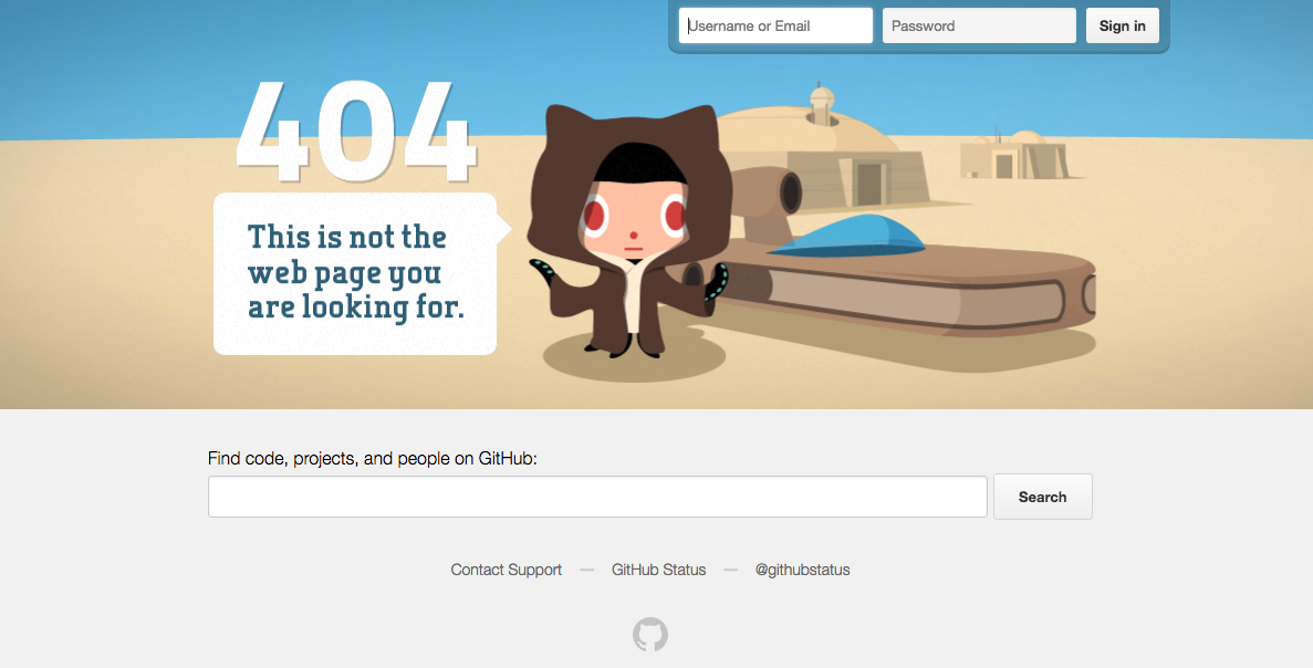
If all else fails, state the obvious. Super simple, but just as on brand.


Emirates

Everyone loves a good pun, right? The beauty of Emirates’ 404 result is that it puts their people on the page and capitalizes on a very obvious but on brand, pun-filled message.

Emirates.png

eHarmony

Another superb example of how your 404 page’s message can wittily relate back to your organization’s core message.


NPR 

Now there’s a lot more text on NPR’s 404 page than most, but it totally works. They do a lot here: in addition to giving you an alternative way to find what you’re looking for, they work in a little foolproof humor and even point you to a few other articles.


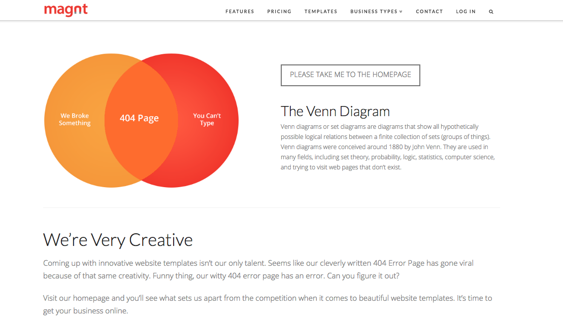
Magnt

There’s two elements on this page that we absolutely love:

1)   It puts some of the onus on the visitor - after all, 404s aren’t always the website’s fault!

2)   They’ve maximized on every single opportunity and managed to turn their 404 page into a sales pitch for their product


A couple of 404 basics…

 Now that we’ve taken a look at a few great examples, it’s time to create your own awesome 404 page. Daring 404 page designs aren’t for everyone, but even the most basic of templates must include:

Key links - make it easy for visitors to navigate their way back to live pages on your site. Ideally, you should make sure your main navigation bar is prominent on your 404 pages.

Branding - just because your 404 page isn’t a page you intentionally want to drive traffic to, doesn’t mean it isn’t important. Keep the look and feel of it consistent to that of your site so people know you’re still close by.


 Hue & Tone Creative: Custom design and marketing

When it comes to web design, we know what we’re doing. For help creating a killer 404 page or an entire website, make the first move toward better web marketing today: 336-365-8559 or hannah@hueandtonecreative.com.

12 tips for a successful webinar

If done right, webinars are a great way to engage your audience, add credibility to your name, build meaningful relationships, and raise your brand awareness. But if things go poorly, you’ll be funneling a lot of time and energy into a failed presentation. 

Not sure what “getting it right” looks like? Well, we’ve put 12 tips together to help guide the creation of your webinar.  

12 tips for a successful webinar  |  Hue & Tone Creative


1. Make sure the speaker’s engaging 

If you’re expecting your audience to tune in for 10, 20, 45 or 50+ minutes, make sure the person delivering the webinar has a voice for it. You need someone who has an enthusiastic tone and, most importantly, is clear with their delivery. 


2. Sound out the sound quality 

There’s nothing more annoying than trying to intently listen to something that’s too quiet, keeps crackling, or has irritating background noise behind it. Do a few test runs before you go live so that you can ensure your sound quality is top notch.


3. Don’t forget about the design

As with any collateral you produce, your webinar slide design needs to be high-quality and on brand. Use easy to read brand typefaces, don’t cram too much on one slide, and don’t go overboard on graphics or photos. 


4. Analyze the length

There’s no golden rule when it comes to the length of your webinar. If you’ve got past recordings to learn from, see what time people tend to drop off and take it from there. If this is your first ever webinar, we would suggest never going over 60 minutes. 


12 tips for a successful webinar  |  Hue & Tone Creative

5. Rehearse, rehearse, rehearse

No matter how confident you are with your delivery skills, always do a test run. Fine tune the order of the slides, practice tongue-twisting lines, and work out all the glitch with your transitions –it’s better to work these things out now rather than later.   

It’s a good idea to have someone sit in on the practice run too - their fresh perspective might help you uncover issues you hadn’t previously picked up on.


6. Keep it conversational

Unless you’re delivering your webinar to robots, keep it conversational. It’ll make it easier for people to keep up with and digest, and itwill bring that all-important human element to it.


7. Introduce Q&As

Allowing a forum for Q&A’s is a great way to involve your audience, keep them engaged, and provide them with key takeaways that are tailored to them. 


8. Speak in second person

Refer to your audience as ‘you’. This’ll help submerge them into what you’re saying, build interaction, and make the entire webinar feel as though it’s being delivered to them on an individual level.


9. Bring it to life

Refer to real-life experiences throughout your webinar. In doing this, you’ll instantly make the information more relatable –and, the power of storytelling often makes details easier to remember.


10. Keep mobile in mind 

When you’re doing your test run, bear in mind that people might be watching your webinar on either their desktop, tablet, or mobile. So, make sure it works and streams easily on all types of devices. 


11. Your personal plug 

Don’t forget to mention your product or service at least one point - after all, the goal (whether now or in the future) is a sale. Just make sure you don’t go overboard. If your pitch is toosales-y you run the risk of listeners zoning out.


12. Don’t forget time differences

Last but not least, if you’re targeting people from different countries or time zones, factor these variances into the date and time you’re hosting your webinar –no matter what you’re sharing, people probably won’t wake up at 2am to see it. 


Hue & Tone Creative: Marketing for Greensboro, NC and beyond

If you feel like your webinar isn’t connecting, we can help you take your content to the next level. We can work with you on every marketing project, no matter what the format. To get an idea of what we can do, see some of the projects we’ve worked on in the past or get in touch.

Pros and cons: DIY Web Design vs. Hiring a Web Designer
Pros and Cons: DIY Web Design Vs. Hiring a Web Design  |  Hue & Tone Creative

We’ve all seen commercials for web builders like Wix, Squarespace, and Wordpress. They lead with a promise of creating a great website at lightning fast speed... even if you have no previous experience. It almost sounds a little too good to be true, right? 

It all depends on your needs. While web site builders make it easier than ever for non-designers to pull together their own website, they don’t work for everyone. If you’re a tech savvy business owner who needs a simple site, they might be a great option. But, if you’re tech-challenged, short on time, or in need of a more custom site you probably need to consider hiring a web designer.

Anyone can point out a website they like or select a template – but designers are the ones who can identify and execute all the elements needed for an on-brand, functional website. From color palettes and font pairings to white space and photography, there are some things a novice just won’t be able to execute on their own. 

Before you decide which route to take, let’s run through some of the pros and cons of DIYing or outsourcing your design: 


Outsourcing design: pros

Professional end product

There’s no denying that the end result of hiring a web designer is inevitably going to be stronger than what you’ll be able to create on your own. A strong website design will inevitably help you achieve your website goal, no matter if it’s more email opt-ins, a higher conversion rate, or more brand exposure.  

Functionality aside, did you know that 75% of consumers judge a brand’s credibility based on their site’s design? Web users are savvy, and they can sniff out a homemade website from a mile away – which in the long run could translate to a lot of missed opportunities. 
 

Saves you time and stress

Pulling together a list of your website needs and handing it over to a third party saves you immeasurable amounts of time and stress. You’ll be able to skip the hassle of doing background research, brainstorming concepts, refining ideas, finding your way around unknownsoftware, and making endless tweaks to the site. 

You can simply put your wish-list together, pass it on, and then get on with the rest of your to-do list while your designer handles the creative.
 

It’s a long term investment

Every business’ end goal is to generate revenue. But every good business owner knows that sometimes you have to spend money to make money. While you’ll pay a greater upfront cost to hire a web designer, you’re going to be walking away with a high quality final product that will serve your business for years to come. 

Creating your website yourself has the potential to open you up to issues with data security, mobile responsiveness, search optimization, and more – which long-term could lead to spending more than the cost of hiring a web designer.  


Pros and Cons: DIY Web Design Vs. Hiring a Web Design  |  Hue & Tone Creative

Outsourcing design: cons

It’s more expensive

The price you pay will vary from designer-to-designer (we would estimate anywhere from $500-$8,000 based on the complexity of your site) but it’s certainly more expensive than what a DIY tool will cost you. If you’re a brand new business or start-up with a limited marketing budget, the cost of hiring a web designer may feel prohibitive.  

Although we’ve listed this as a con, we urge you to think of the bigger picture, and your return on investment down the line.
 

Less insider info about your business

Every business has their own way of working, their own personal preferences, and their own knowledge of what’s worked in the past. Understandably, an outsider won’t possess nearly as much knowledge about your business as what you have. It make take a few meetings to educate them on the ins and outs of your business so that they’re able to create an effective website for you. 

If you feel like your designer isn’t listening or doesn’t have the time to talk through the backstory of your business, we suggest finding someone else who will. 
 

Finding the right fit

You do your research, talk to a number of potential designers, and still you feel like you can’t find the right fit. Keep on looking! 

Settling for the wrong designer is going to cost you more time and money in the long run, so be sure to do your research and settle on a clear scope of work before agreeing to anything. 

A good designer should ask you a lot of questions before providing a quote, should explain the process to you, be able to answer your questions, and will outline a clear scope before the project kicks off. If you feel like you’re in the dark about what you’ve agreed to or you feel like they just don’t get your business, then we suggest looking elsewhere. 

Ask for referrals, get the designer to provide ample work samples, and check out the quality of their online presence to get a good idea of their working style and final products. 


DIY design: pros

Save money

There are lots of online tools that let you create artwork for free, or offer additional features for a low fee. Either way, it’s likely to be cheaper than onboarding a designer. 
 

Total control

Working with a designer means having to make compromises based on their expertise, and we’ve seen first-hand how hard this can be for some business owners. If you think you’ll be unable to work with an outside party on your website, you may want to consider keeping the project in house. 


DIY design: cons

Compromised quality

Design is a skill like any other. The same way you can’t waltz onto a construction site and expect to be a builder, you can’t start using software and expect to be a designer.

Imagine you had to build a brick wall right now. Now imagine what the end result would look like. Compare that to what a professional mason would be able to build. The world of design is no different.
 

brooke-lark-609902-unsplash.jpg

More time, more limits

We’ve already mentioned that there are various cheap and/or free design tools around. But with their cost-saving benefits come limitations – both on what free software can do and what you’ll be able to execute with your limited skill set. 

There’s only so much you can do on basic design tools, and by limiting the flexibility of your designs, you’re essentially putting a cap on the potential quality of your finished product.


Tunnel vision

After working solo on your marketing for so long, you think you know exactly what works best and what your customers want. In some cases this might be true, but in a lot of cases there’s value for bringing in a fresh perspective – especially someone who is a marketing expert. Bringing in a web designer will help you get a fresh perspective and some new ideas. 

An expert designer will be able to take your marketing materials to a new level that you’ll never be able to execute with in house design, making you more competitive and more likely to stand out from the crowd. 
 

Loss of expertise

Last but not least, is the loss of experienced, tried and tested expertise. Let’s stick with our construction analogy. If someone asked you to build a skyscraper, you wouldn’t know where to start, or what best practices you need to follow, would you? Nor would you be expected to.

Professional designers have spent years mastering their trade. They’re hot on the heels of current and emerging trends. They’ve had past success and failures to learn from. And, they’ll be able to translate your ideas into something that works well for you while still fitting in with current trends. 

What does all that mean for you? A stand-out final website.


Hue & Tone Creative: Web Design for the Triad

Now convinced you need to hire someone to help with your new website? Give us a call so we can see if we're a good fit for designing your new site or sprucing up your existing one. From web mockups to executing the final design, we want to be your go to partner for all things web and design.

Marketing Trend Alert: Data Visualization
Marketing Trend Alert: Data Visualization  |  Hue & Tone Creative

We’re officially in a data-driven era. Decisions are made on it. Purchases are persuaded by it. And trust is gained through it. But what is data visualization? Where do its benefits lie? And how do you make data visualization truly effective? 
 

What is data visualization?

Qualitative data is information about qualities; information that can't actually be measured. Some examples of qualitative data are the softness of your skin, the grace with which you run, and the color of your eyes.

Quantitative data is information about quantities; that is, information that can be measured and written down with numbers. Some examples of quantitative data are your height, your shoe size, and the length of your fingernails.

In its simplest form, data visualization is the representation of data in a pictorial or graphical format. Displaying information this way allows readers to grasp complex concepts with less effort and makes it easier to summarize a large of data quickly.

Data visualization can be used for both qualitative and quantitative data, but some common business uses include:

  • Breaking down market research results

  • Sharing customer insights and/or feedback

  • Displaying geographical variances

  • Detailing a timeline of events and/or activities

  • Presenting internal trading reports

Data visualization: the benefits

Your data is only as good as its interpretation, which is where visualization is key. For you visualized data to be successful it should have: 

Aesthetically pleasing results: lines and lines of numbers with the odd word interspersed never looks good -- nor does it read well. Data visualization removes the need for all the numbers and brings your pages to life with eye-catching graphics.

Digestible takeaways: data can be a minefield to understand and take several read throughs to understand. By presenting it visually, your audience can quickly and easily skim and digest the information you’ve given them.

Easier processing: by presenting your information visually, you’re upping the chances that people will understand and remember it.


Types of data visualization

When it comes to picking a type of visualization that’s right for your data, there’s no end to the choices. If you're looking for a jumping off point, we've compiled this list of different data styles for you to research and explore: 

Hierarchical

  • General tree visualization

  • Dendrogram

  • Radial tree

  • Wedge stack graph

  • Hyperbolic tree

Network

  • Matrix

  • Node-link diagram

  • Dependency graph

  • Hive plot

  • Alluvial diagram

  • Subway map

Geographical

  • Choropleth

  • Cartogram

  • Dot distribution map

  • Proportional symbol map

  • Dasymetric map

Time-related

  • Timeline

  • Time series

  • Connected scatter plot

  • Gantt chart

  • Arc diagram

  • Stream graph

Multi-dimensional

  • Pie chart

  • Histogram

  • Tag cloud

  • Bar chart

  • Tree map

  • Bubble chart

  • Waterfall chart

Data visualization examples

So, now that we’ve explored the benefits and types, let’s take a look at some great data visualization examples in practice.


Bubble cloud

Image via Explorer.uk

Image via Explorer.uk

Looks more engaging than a load of words and values dumped in a paragraph, right?


Tag cloud

Image via 4th World Movement

Tag clouds are a great way to bring word-frequency data to life. Like with this example, they can be extra effective if you use your creativity to mould your data into the shape of the topic, too.


Subway map

Image via Concept Draw

Image via Concept Draw

Subway maps aren’t just for subways...This type’s a great way to attract attention because, odds are, visitors won’t be expecting to find a subway map on your site!


Timeline

Image via PoppyField.org

Image via PoppyField.org

This is a superb example of how a timeline (or really any chart) doesn’t have to be plain to be effective. With a few crafty tweaks, you can brand your charts and infographics to fit your brand! 


Looking for us to dive deeper on data visualization? Or, maybe you want to hear about another topic completely? Leave us a comment letting us know what you would like us to blog about!


Hue & Tone Creative: your marketing partner

Need your own custom infographics, charts, or presentations? We can help with all that and more! We'll help you define your brand and create tailored marketing materials so you can impress each and every one of your stakeholders. To get started, just shoot us an email explaining your needs: hannah@hueandtonecreative.com.

Web Basics: What is web hosting?

Web hosting. We hear those words a lot, but how many of us actually know what it is? Well if you don’t, then look no further. We’ve cut out the jargon and waved goodbye to all that techy mumbo jumbo as we take a quick look at the basics of web hosting. 
 

What is web hosting?  |  Hue & Tone Creative


Web hosting vs domains

When it comes to web hosting and domains there can be a bit of confusion between the two. We like to break it down like this: 
 

Web hosting: This would be your house, because it’s the space where everything is stored.

Without web hosting there wouldn’t be any websites. It’s the physical location that your website (and everything it entails) sits, and it ensures that your site maintains a sturdy connection to the internet -- without that connection, people are unable to access any of the files on your site (which, in layman’s terms, means you have no website!).

Some examples of web hosting companies include InMotion, 1&1, HostGator, GoDaddy, Wix and Weebly.


Domain: This is the equivalent of your address, because it’s the location your host can be found.

It’s not a physical entity, it’s just the series of characters that make up your site’s unique location. So, the same way you’d enter an address and ZIP code to get to your end destination, you enter your domain name into the search bar to get to your website.

Some of the most popular domain name providers out there are GoDaddy, Hover, Dynadot, Google Domains and Namecheap.


Where should you buy web hosting from?

When it comes to choosing the right web host for you, there are a lot of solid contenders out there. To help you along your way, here are the top five as rated by the experts over at Techradar.


Web host

InMotion

Voted

Best overall shared web hosting

Selling points

Wordpress hosting, business hosting, web design services, and 24/7 US-based support


1&1

Runner-up overall shared web hosting

Baremetal servers, free SSL certificate, secure hacker protection, and email marketing


Best ‘cheap’ option on the market

Unmetered bandwidth, unmetered disk space, money back guarantee (45 days) and $150 search credit


Good all-round service

SEO services, free domain, database backup/restore, and unmetered bandwidth


Wordpress’ #1 preferred partner

Unmetered bandwidth, WooCommerce hosting, Free domain, 24/7 US-based support


What does all that terminology mean?

We just threw a bunch of terminology at you -- but since this is a beginner's guide to web hosting, let's go ahead and break it down: 
 

Bare metal servers: The term ‘bare metal’ refers to a hard disk, and so a bare metal server is when a computer system or network’s virtual machine is installed directly on to hardware.

SSL certificate: In its simplest form, an SSL certificate is a public-facing, digital document that tells people a site is secure. It also lets you know that the company that says they own the website you're accessing legitimately owns it. 

Bandwidth: Bandwidth is the amount of site content and visitor traffic a server can transfer in a certain amount of time.

Unmetered bandwidth: A hosting plan with unmetered traffic. The price you pay each month does not depend on the amount of traffic (data) sent to and from your server during the month

Unmetered disk space: Disk space is the amount of data you can store on a web server. The amount of disk space you need will vary depending on the size of your site. Similar to unmetered bandwidth, unmetered disk space means you are given an unlimited amount of disk space. 

SEO: Search engine optimization (SEO) is the online practice of increasing the amount of traffic you get through to your website via organic search results, like Google. Some hosting companies offer services to help you improve your SEO.


Questions about what any of these terms mean? Leave them below in the comments -- we'll be happy to help clear up any questions you have! 


Hue & Tone Creative: Web Design Services

Once you've secured your domain and hosting, let us help you bring your site alive with a great design and intuitive user experience. Get in touch today to see how we can support your website’s set-up.

Google Speed Update: What you need to know
Your website shouldn't leave people staring at their watch.

Your website shouldn't leave people staring at their watch.

It’s no secret that speed is central to user experience -- and slow load times translate to a higher bounce rate and less traffic. Think about it: How long did you wait around last time a page wasn’t loading? In addition to annoying users, a delayed page speed means users will read less once the page does load.

With all that in mind, it comes as no surprise that in June 2018 page speed will officially become a ranking factor in mobile search results. The algorithm update was announced in January and has been named the ‘Speed Update’.


Wait a second, isn’t speed already a factor? 

Why, yes, it’s true that page speed has been a ranking factor since 2009 – but, it’s never been an official factor for mobile ranking speed. According to a blog post by Google on the topic: “Although speed has been used in ranking for some time, that signal was focused on desktop searches...Starting in July 2018, page speed will be a ranking factor for mobile searches.”


What Google has said

If you’re already in a panic, take a deep breathe, because Google has said the new algorithm will “only affect pages that deliver the slowest experience to users, and it will only affect a small percentage of queries.” (source)

Google has also repeatedly stated that the intent behind a user’s query will still be the strong ranking factor -- so if a website has a slow page, but the content of that page is relevant and high in quality, it may still rank highly regardless.

But, how fast are we talking? In a Google Webmaster video, Maile Ohye, states that “2 seconds is the threshold for e-commerce website acceptability.At Google, we aim for under a half second.”

It’s no secret that over the last two years Google has been implementing a mobile first strategy that prioritizes mobile-optimized sites. The Speed Update just takes this initiative a step further by prioritizing speed, which is key to mobile responsiveness. 


What you need to do

In preparation for the Speed Update, Google has recommended a number of resources to help gauge where your website’s performance is at.

1. Chrome User Experience ReportChrome User Experience will give you intel on how real-world Chrome users experience popular destinations on the web, and the factors that shape and contribute to their final user experience.

2. LighthouseLighthouse is an open-source, automated tool for improving the quality of web pages. You can run it against any web page, public or requiring authentication. It has audits for performance, accessibility, progressive web apps, and more.

With each audit (which only takes between 60 to 90 seconds), you’ll receive a document detailing what’s important to fix, and how you can fix it. Suggestions could range to anything from oversized and unoptimized images, to unused CSS rules and render-blocking scripts.

3. PageSpeed InsightsAnother one of Google’s powerful speed tools, PageSpeed Insights will analyze your page and present you with a page speed rating, optimization score (out of 100), page load distributions, page stats and optimization suggestions. 

The recommendations might range from things like prioritizing visible content and leveraging browser cashing, to eliminating render-blocking Javascript and CSS in the above-the-fold content. 


What's next

Once you've made all the updates possible you'll need to monitor your search rankings. Keep in mind that because the update is entirely algorithmic, there’s no tool that will just simply show you which pages have been dinged – after you make all the adjustments you can to increase page speed, you’ll have to keep an eye on your mobile rankings to make sure your site isn’t taking a hit.

Looking for even more resources to get your page up to speed? We’ll leave you with this list to check out: 


Hue & Tone Creative

Do all these terms look like gibberish to you? Bring in an expert -- let us help you get your web presence up to speed (literally). We can help with everything from branding and email campaigns to social media and your web presence.

10 ways to make B2B blogs more enjoyable

When it comes to business to business (B2B) marketing, blogging can be a valuable tool. Your blog is a great place to showcase your knowledge and dive in-depth on your products, in a way that you wouldn’t able to in a quick tweet or status update. 

The downside is that B2B marketing has a reputation for being boring – and, unfortunately, in our experience a lot of the content we see lives up to that expectation. There’s a common misconception that blogs targeted towards other businesses need to have a straightforward or corporate feel. While we don’t believe you should compromise your professionalism, we believe it’s possible to share your knowledge without putting everyone to sleep. 

If you’re looking to give your business marketing a more approachable feel, we suggest you check out these tips to keep your marketing focused, but fun, for the reader. We believe that B2B marketing done right might even be what helps set you apart from a competitor! 


10 Ways to Make B2B Blogs More Enjoyable  |  Hue & Tone Creative


1.  Talk like a human

No matter how interested a potential customer is in your topic, talking like a robot is going to lead to people clicking off your website. Type like you talk, keep it simple, and don’t be afraid to push the conventional boundaries -- i.e. don’t let that red squiggly line stop you from experimenting with your words!

One caveat? Just make sure your meaning and professionalism aren’t lost in too much slang. If you wouldn’t say something in the workplace, don’t type it on the blog. 


2.  Don’t forget the fun factor

Business owners, directors, and managers still have a sense of humor, so don’t sap all the fun out of your blogs. Adding fun anecdotes or playful pictures into your blogs can help them feel more relatable. 


3.  Don’t baffle them with jargon

Getting lost in the jargon of a blog is never productive. Ever. Even though you’re addressing to other experts in your field, you’ll want to talk in simple terms and only use jargon when it’s needed. You never want to assume every reader knows what you do, so be sure to explain terms on the first instance you use them.


4.  Don’t publish a wall of text

Stay away from clunky chunks of text -- they’re not enjoyable to look at or read. Use subheadings, pull quotes, and succinct paragraphs to make your text easier to browse. Even if you’re publishing a whitepaper, there’s no reason not to give your readers a pleasant and intuitive experience. 


5.  Mix up your mediums

Remember, blogs don’t always have to be written like an article. Try out creating an infographic or recording a video blog. You can also consider publishing presentations or papers – it’s content you’ve already created, and chances are if it was worth presenting about it’s a relevant topic. Don’t reinvent the wheel if you don’t have to, just share the work you’ve already done! 


6.  Use images creatively

In need of some fresh photos? We’ve complied a list of FREE stock photo sites

If your blog is long, add a few images in along the way so that it’s not too text heavy. Be creative with your choice of images, and try to refrain from using the same handful of stock photos repeatedly. 


7.  Keep it concise

Business owners are busy people, so the last thing they want is to have to read through three paragraphs of mumbo jumbo before actually getting to the relevant information. Get to the point early on and it’ll be a more enjoyable read all round.


8.  Use examples

Examples can be a great way to show off how you can help. Using real life scenarios are often more relatable to potential customers and give you a chance to show off your results and solutions. So, instead of explaining, start showing what you can do!


9. Sentence structures

Writing is a craft. Not everyone’s good at it -- nor are they expected to be. But when you’ve got a good writer on board, they can make even dullest topics enjoyable. Something as simple as mixing up sentence structures can quickly ramp up the readability-factor.


10.  Reader participation

Whether it’s adding a quick poll half way through a post or inviting readers to leave a comment at the end, getting your audience involved with your blog is another way to get them more invested in the content. 


Hue & Tone: Your partner in B2B Content Creation 

Need a helping hand to elevate your blogs to the next level? Here at Hue & Tone Creative, we’ve got you covered from the right words right to the perfect picture. Contact us today to learn more about our design and marketing services.

How to design a user-friendly form (and still get the information you need)
How to design a user-friendly form (and still get the information you need)  |  Hue & Tone Creative

Forms are essential for gathering user’s information in a smart and efficient way. Getting them wrong means a poor user experience and abandoned leads – which translates to missed opportunities and lost revenue. 

Because the formatting and design of your forms has a direct impact on how well they convert, we’ve collated some top tips to make sure your forms are performing as effectively as possible.  


1.  Form length: Always question the why

How long should a good form be? The more fields you give a user to fill out, the less likely someone will be to complete it. However, the more information a lead is willing to give, the more likely they are to be a qualified lead. Like most questions of quality versus quantity, the key is to strike a balance. 

For every question you have in your form, take a moment and really ask yourself why do I need this detail at this stage of the user’s journey? If some of the information can wait until later on in the buyer’s journey, consider leaving it out in an effort to streamline your form.


2.  Page placement

When adding a form to your website, it’s important to place the form near the top of the page. Visitors shouldn’t have to scroll to get to your form – and if they do, chances are they won’t fill the form out. 


3. Tailor the keyboard

In this day and age all forms need to be mobile responsive. But, did you know you can also take user experience a step further by customizing keyboard layouts? 

This one’s only for mobile or tablet forms, but we thought it deserved its own shout out. To make the user’s life eveneasier, you can code your site so that the keyboard changes each time a user clicks on a new field. For example, the keyboard will default to digits when they’re filling out their phone number. 

For more on how to do that, check out this Treehouse article


4.  Time saving tactics

Users are accustomed to a quick and easy sign-up process – nothing should slow them down from filling out the form you provided. To make sure their experience is as streamlined as possible, make sure you’re abiding by these tips: 

  • If the user has already provided you with information, make sure you’re pre-populating any fields you can.

  • Instead of waiting until users click “submit,” make sure to highlight errors or overlooked fields as soon as users click on to the next field. Boxes with incorrect information should be highlighted in red straight away – that way users won’t be stuck scrolling through a form trying to figure out what needs to be fixed.

  • If what you’re asking might be unclear, be sure to add descriptive information or a tip call out near what you’re asking. If a user gets stuck, you can be sure they’ll abandon the form.

  • If there’s no way around using a lengthy form, give users an option to save their information so that they can return and complete it at a later date. And, if this is the case, be sure to automate email reminders that will nudge them to come back and complete the form.


5. Submit button

Once the form is filled out, the last major factor for form success is the “submit” button. While labeling this button “submit” seems like an obvious choice, it may not be the best choice. 

According to Hubspot, landing pages with buttons labeled “Submit” actually have lower conversion rates than those that use other wording. Consider buttons that relate back to your initial offer, or sound less committal than "Submit." Try out things like: "Go," "Download your free e-book," or "Get Started." 


Further reading:  

Looking for a more resources on how to create effective forms and successfully convert leads? We’ll leave you with these three suggestions for further reading: 


Hue & Tone Creative: Greensboro Web, Design, and Social

No matter what your marketing needs, we've got your back. Take a look at all of the services we offer and then get in touch -- we'll work with you to set up a custom marketing solution that addresses all your needs.