
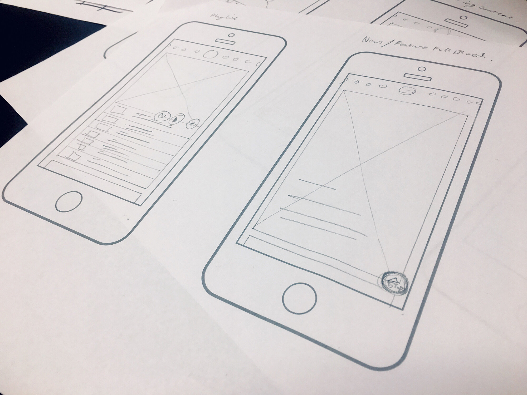
7 tips for successful app design and development
The difference between a successful app design and a failure isn’t just an app that looks sleek and well-designed. When it comes down to it what makes an effective app is user experience.
Before we get into specific design tips, it’s worth sharing our biggest development tip of all: focus your app on doing one thing well. Overloading your app with features makes it hard to market to potential users. Home in on the one thing you want your app to do really well, and once you’ve achieved success there you can begin to add on additional features.
Once you’ve determined the sole focus of your app, you’ll be able to determine who your audience is and design for them. But no matter what your target demographic, there’s a few design considerations you’ll want to keep in mind during the development process.

1. Keep navigation simple
If your app has a narrow focus, this tip will be easy to execute. You want to keep your app navigation streamlined and intuitive for users. Limit the number of options people have available and use common terms and design elements. Avoid thinking outside of the box on your navigation design – you want to stick to easily recognizable symbols.
Most importantly, navigation should be available at ALL times, not just when you think the user might need it.
2. Accessibility is important
Designing an accessible interface means thinking about how people with vision loss, hearing loss, and other disabilities will use your app.
For example, don’t make red and green the only indicator of a successfully filled out form. Add an “x” next to incorrect fields and a check mark by correct fields to serve as additional visual indicator so that people with red/green color blindness can still easily and successfully use your app. Similarly, consider adding transcripts to video or sound clips to aid those with hearing loss.
3. Use familiar icons
Familiar icons work best when designing an app with widespread use. Use a magnifying glass to represent your search feature, a house to represent your home page, a printer to represent printing. Whatever you’re trying to communicate, your icons should have universal recognition from users – icon design is simply not the place to get creative.
In addition to familiar visual icons, stick with simple text labels. Use intuitive terms like “Home, Search, and Back” to avoid confusing users.
4. Minimize user input and error
No one would willing choose to write a novel on their phone – it’s hard to see, hard to type and people typically end up misspelling a lot of words.
If your app includes a form or survey element, be sure to keep it as short as possible. Think hard about what fields you really need to include and ask the bare minimum you can without losing effectiveness.
Make sure you use smart features (like autocomplete) to help reduce user error and ensure accuracy. You’ll also want to make sure the correct keyboard type will pop up when a user goes to fill out a form – they shouldn’t have to navigate to their number keyboard when filling out a phone number, the numeric keyboard should just automatically pop up.
5. Respect platform guidelines
Each mobile operating system has a set of standard guidelines to help you provide a high-quality app. Your app users are already familiar with the standard operating guidelines of each system, so it’s important to keep your design in line with customary procedures.
Keep in mind that these guidelines constantly evolve – it’s important to stay on top of the ever-changing trends and guidelines for mobile app design.
6. Include screen titles
Users often forget what page they’re on, or they might just not have a good sense of where they’re at in the app. Including a simple title at the top of the page is a great way for users to get a better sense of the app and helps avoid them repeatedly navigating to the same page.
And as an added bonus, screen titles often give a page design a polished look!
7. Keep branding consistent
Your mobile app should share similar characteristics with your main website. In addition to being an important extension of your branding, visual inconsistency may lead users to be suspicious of your app or cause them confusion.
You not only want to match the look of your app to the rest of your branding, but you also want to keep elements in the app cohesive throughout your interface. For example, typefaces, buttons, and colors should be consistent on every page of the app. Every element should have both a native and branded feel to encourage user trust.
About Hue & Tone Creative
Hue & Tone helps businesses of all sizes build credibility and connection with intentional design. Whether you’re looking to create a mobile app or a traditional website, we’re here to help your business grow through thoughtful design. Contact us to get started.