You see a Squarespace template, you love it, you start playing with the fonts... and suddenly you don't love it quite so much. No worries -- it happens to everyone!
Although it may be tempting to stick with the default settings of your template, taking the time to select the right fonts adds depth and personality to your site. With over 600 font options through Google and nearly 1,000 on Adobe Typekit, picking the perfect combo can feel almost impossible.
We're here to take the guesswork out of selecting the perfect Squarespace font combination - here's 7 suggestions to revive your favorite template:

Merriweather & Roboto
This classic and modern mix of serif and sans serif fonts is perfect for any business.

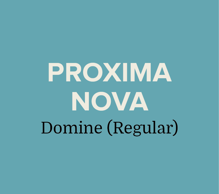
Domine & Skolar Sans
Need a clean no-fuss combination? Domine and Skolar pairs nicely with strong graphics.
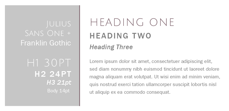
Julius Sans One + Franklin Gothic
Franklin Gothic is classic, readable, and approachable -- but add Julius Sans One in and you've got an edgy clean feel.

Rift Soft & Vendetta
Looking for a sophisticated pairing for an upscale brand? The sleek style of Rift keeps Vendetta from feeling too stuffy.

Essones & Futura
This duo feel playful and approachable. We love this serif & sans serif mix for boutiques, portfolios, and blogs.

Park Lane & Tenso
This crisp and versatile combo would work well for real estate, bistros, and trendy salons.

Lust Script + Sofia Pro
Feeling a little edgy? Mixing in Lust Script takes this font palette to the next level.
branding + web services in greensboro: Hue & Tone
Looking for a web designer in Greensboro, Winston Salem or the surrounding areas? Hue & Tone is a creative graphic design agency specializing in logo design, web design, social media management, and more. Give us a call if you’re interested in a custom, branded website that truly tells your story.