Posts in Design
12 great free Google fonts

Looking for more inspo? Here’s our list of MUST download free Google fonts.

12 Great Free Google Fonts  |  Hue & Tone Creative

Google’s got around 915 fonts in its directory. Having a wide selection is great, but this can be a lot to sort through. You’ll probably be able to find the perfect font for your piece, but where do you even start?! 

Aside from the fact that Google Fonts are free, millions of people turn to Google fonts for its simplicity, easy-to-implement set-up, and high quality selection. The fact that a number of these fonts are available for print use is another great bonus. If this is your first time using Google to pick a font, you can find step-by-step instructions on the ‘how’ here.

To save you a bit of time scrolling through pages and pages of typography, here are 12 of our favorite freebies.


Popular choices

Numbers don’t lie. The first six on our list were the most viewed fonts over the last seven days, 30 days, 90 days, and year. 

12 Great Free Google Fonts  |  Hue & Tone Creative

1. Roboto, by Christian Robertson

Roboto’s a sans-serif font and comes in 12 different styles (thin, thin italic, light, light italic, regular, regular italic, medium, medium italic, bold, bold italic, black, and black italic). 

It’s known for its natural reading rhythm and features friendly, open curves.


12 Great Free Google Fonts  |  Hue & Tone Creative

2. Open Sans, by Steve Matteson 

Another sans-serif font, Open Sans has 10 styles to choose from. It’s featured on Google’s sites, and in print/web adverts. This font is endorsed by some of the biggest brands out there.


12 Great Free Google Fonts  |  Hue & Tone Creative

 3. Lato, by Łukasz Dziedzic

When creating Lato, Dziedzic wanted to come up with something transparent enough for body text while comprising unique traits for larger sizes; and he did just that.

With semi-rounded details and strong, structural entities, Lato oozes warmth, stability and seriousness all in one.


12 Great Free Google Fonts  |  Hue & Tone Creative

 4. Oswald, by Vernon Adams, Kalapi Gajjar, and Alexei Vanyashin

Originally created by Vernon Adams, Oswald has seen a number of interactions over the years based on user feedback.

It was designed to be appropriate for use across desktop computers, laptops and mobile devices and comes with six different styles - extra-light, light, regular, medium, semi-bold, and bold.


12 Great Free Google Fonts  |  Hue & Tone Creative

5. Slabo, by John Hudson

Slabo has just two weights. What’s unique about this one is that it’s specifically designed to be used at a certain size -- either 27px or 13px depending on your piece.


12 Great Free Google Fonts  |  Hue & Tone Creative

6. Roboto Condensed, by Christian Robertson

Part of the Roboto and Roboto Slab family, Roboto Condensed refuses to compromise. Its letters are freely positioned to settle into their natural width without encroaching on their neighbors, and it adds impact to body and heading copy alike. 


Hidden gems

Our next batch of fonts are just as easy to use and read but are less well-used, giving you chance to create something a little different.

12 Great Free Google Fonts  |  Hue & Tone Creative

7. Arvo, by Anton Koovit

Best suited to heading and sub-headings, Arvo’s a slightly more edgy font with tints of contrast. Available in regular, regular-italic, bold and bold-italic, you can tailor its impact to your tastes and needs too.


12 Great Free Google Fonts  |  Hue & Tone Creative

8. Bree Serif, by TypeTogether 

Charming, original and versatile by nature, Bree Serif was an instant hit when it first came onto the scene back in 2008 -- and we can see why.


12 Great Free Google Fonts  |  Hue & Tone Creative

9. Sanchez, by Daniel Hernandez

Sanchez is a slab-serif typeface and it’s simple, scannable, and distinguishable. It might not be for everyone but if it fits your organizations feel it can be a solid design choice.


12 Great Free Google Fonts  |  Hue & Tone Creative

10. Hammersmith One, by Sorkin Type

Low in contrast, unique in style, and subtle in curves Hammersmith One was built specifically for web-use. Although it does still work well to smaller sizes, it’s perhaps best limited to titles, sub-headings, and short intro paragraphs.


12 Great Free Google Fonts  |  Hue & Tone Creative

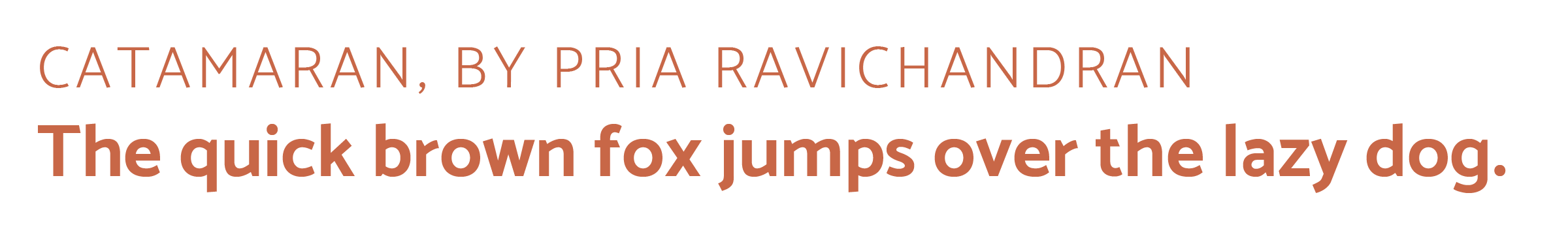
11. Catamaran, by Pria Ravichandran 

With nine different text weights Catamaran’s incredibly versatile and, in the designer’s own words, “strikes a balance between typographic conventions and that bit of sparkle.”


12 Great Free Google Fonts  |  Hue & Tone Creative

12. Playfair Display, by Claus Eggers Sørensen

Used across millions of websites worldwide, this transitional font’s functional and stylistic and pairs well with Georgia for body text. Other popular couplings include a few of our already mentioned Google Fonts: 

  • Lato

  • Roboto

  • Raleway

  • Oswald

  • Open Sans Condensed


Hue & Tone Creative: Your Font Partners

Finding the right font for your website, flyer or social media advert can be really tough -- we get that. If you’re struggling to find a font that gels with your work, we can help. Get in touch at hannah@hueandtonecreative.com or (336) 365-8559 to see how.

Making the most of Adobe Fonts’ features
Making the most of Adobe Fonts’ features  |  Hue & Tone Creative

The right font can work wonders for your brand by helping you connect with potential customers, hold peoples’ attention, and convey the right mood or feeling. But the wrong font can do quite the opposite -- allowing letters to get lost, making words difficult to digest, and alienating your artwork from your brand.


First off, What is Adobe Fonts?

In a nutshell, Adobe Fonts (previously Adobe Typekit) is a library of 1,000s of free and paid-for fonts for people to use directly on their website, sync with their Creative Cloud subscription, or both.

If Adobe’s your go-to for design work you’re probably already familiar with Fonts, but are you getting the most out of what it has to offer? Whether you’re a newbie or not, it’s got lots of features to help you save time and personalize your fonts -- and we’ll be covering our favorite features in this post.

Top tip: if you’re after even more recommendations, here are some of our favorites too.

1. Get a headstart with recommendations

If you’re a beginner at type design, Adobe has a recommendation tool to help you decide on fonts that are best suited for paragraphs or headings.

For those that are new to the font-selection world, you need something that’s easily legible across various mediums at a small size for paragraph copy, and for headings you can be more adventurous with bigger, bolder and more decorative styles -- that are still readable, of course.

2. Save time and filter fonts 

With so much choice at your fingertips scrolling through endless styles can be a pretty tedious and time-consuming task.,If you’ve got a good idea of what you’re after, cut out what you don’t want by filtering specific properties, like: 

  • Weight - the thickness of the stroke

  • Width - the width of the actual letters

  • X-height - the ratio of lowercase letter height to uppercase letter height

  • Contrast - the ratio of thick and thin strokes

  • Standard or caps only - i.e. fonts that use lower and uppercase letters, or fonts that only use capital letters

  • Default figure style - choose between Oldstyle (more old-fashioned) or Lining (more modern) for your numbers

Making the most of Adobe Fonts’ features  |  Hue & Tone Creative


3. Use the right font availability

What’s the difference? Web fonts are used directly on your site, and synced fonts are imported to your Typekit for in-program use on things like Photoshop and Illustrator. Discover how to install fonts here.

Whether your artwork’s for print or web should determine the font you use, which means it’s important you’re clear on the end-use from the outset.

To make choosing the right font easy Adobe differentiates between web fonts and synced fonts, so make sure you pick one from the right category.

4. Test your chosen font

Adobe’s ‘type tester’ feature allows you to see how your chosen font(s) look online before you add them to your kit and invest time into updating your design work.

To put this feature into practice, just head to the main browsing page where it says “Use fonts” and then click the “Web” tab when a pop-up appears. If you like what you see all that’s left to do is to add the font to your Typekit.

5. Use contextual alternates

Sometimes, certain glyphs can be a bit intrusive or distracting and the last thing you want is to jar readers as they’re scanning your copy -- but Adobe’s contextual alternates (calt) feature can help you overcome this.

It’s particularly useful when using script typefaces and it works by replacing default glyphs with better-performing alternatives.

Need help? You can find more about line and character spacing here.

6. Experiment with your spaces

If you’ve selected your font but you’re not 100% happy with the spaces between characters, lines and paragraphs, remember, you don’t have to settle with what you’re given as standard. To create something that gels perfectly with your page experiment with your gaps by opening the ‘Text properties’ box and playing around with the spacing options.


Hue & Tone Creative: Your partners in design

Still confused about what font to pick? If some (or all) of this post went over your head, we can help! Design is our forte and we’re known for helping organizations find their perfect font -- without fail. Drop us a line on hannah@hueandtonecreative.com to find out more.

6 ways to spruce up your email signature

How many emails do you reckon most people receive a day? 20? 40? 60? All wrong. On average, we receive 77 legitimate emails every single day, along with 19 spammy ones too.

Of those 98 emails though, how many do you think put much more than a second’s thought into their email signature? Not many. They’re a commonly missed, free marketing opportunity. 

By leveraging that space at the foot of your email you could:

  • Drive more traffic to your site

  • Increase your social following

  • Promote current or upcoming sales, referral schemes, etc.

  • Boost your inbound leads

Want your email signature to start making money for you? We don’t blame you. Whether it’s a company email to target prospects or employee correspondence to an existing client, here’s how to do it.

_t20_294nR6.jpg


1. Basic contact details

  • Your full name

  • Your contact number

  • Your email address

  • The company’s name

  • The company's website

  • The company’s postal address

These are the absolutely basics, but you’d be surprised by how many people sign off their emails with none, like this:

6 ways to spruce up your email signature | Hue & Tone Creative

For starters, it doesn’t exactly ooze professionalism. But it also blocks the recipient from quickly learning more about you and your company. In a dog eat dog world it’s all about ease, so save your readers a click or two by serving them all your information on a plate.

Added bonus: it’ll also save you time by reducing the number of people who respond asking questions like ‘What’s your phone number’ or ‘Do you have a website?’.


2. Inject a bit of color 

Color attracts attention, solidifies your branding, and just looks better. Be honest, which looks more eye-grabbing out of these two?


Example 1:

Image via rocketseed.com

Image via rocketseed.com

Example 2:

6 ways to spruce up your email signature | Hue & Tone Creative


3. Include your logo

Not sure about your logo? See if you need a refresh here.

Your logo is your organization’s footprint. It should be on your site, social media profiles, business cards, digital ads, flyers and…your email signature.

Whether you’re contacting new prospects or lifelong suppliers, placing your logo at the foot of your email will enable them to quickly and easily recognize where you’re from and add a layer of trust to what you’re sending. 


4. Add your social links

By including social media icons and linking out to your feeds you’ll:

a) increase your social following
b) give recipients an opportunity to learn more about you
c) add credibility to your email (people will see you’re a legit business…with legit branding)

If you’re going to point people to your social profiles though, remember to make sure you’re regularly updating them. Sending someone to a Facebook page that hasn’t seen a new post in 12 months is a wasted lead.


6 ways to spruce up your email signature | Hue & Tone Creative

5. Spread your tagline 

Okay so you’re probably thinking this is an awful lot to fit in your email signature, but don’t worry, if you get the design right it won’t look over the top.

Your tagline is a snappy summary of what your company is all about. It’s something to be proud of and it’s something to shout from the rooftops. So, do just that by seizing the opportunity in your email signature.

The benefit? People will instantly get a very good idea of your values and understand what to expect from you.


6. Promote any sales or schemes

Last but not least, if you’ve got a current or upcoming flash sale, referral scheme, or discount offer, let everyone you email know about it. Even if you only get one more referral or purchase from it, it’s worth it, because it doesn’t cost you a single cent. 


Hue & Tone Creative: Your partners in email marketing

Worried your email signature’s going to start looking more clumsy than qualified? When it comes to creating professional, slick, and stylish designs we know what will get your audience ticking. Contact the team at (336) 365-8559 or hannah@hueandtonecreative.com to see how we can collaborate. 

3 cross-sell email templates that convert

Picture this: you head to your local sports store to grab a new pair of sneakers. One of the assistants comes over and asks if you need help. You accept. While showing you the shoes, they point out their range of high-performance socks, insoles, and foam rollers. 

You walk out of the shop with the shoes you originally came for…and a three-pack of new socks too.

You probably didn’t realize it at the time, but you were just the subject of up-selling and cross-selling in person.

This tactic works well in person, but it works just as well online. There’s endless potential sales out there to seize -- but if you’re not grabbing these cross-sell opportunites with both hands, your business’ bottom line could be missing out.

To help improve the chance of upselling, we’ve compiled three proven cross-sell templates for you to tweak and use.

3 cross sell email templates that convert  |  Hue & Tone Creative

Opportunity #1: Right after a sale

Your very first cross-sell opportunity comes right after a new customer has made a purchase. We recommend sending out a thank you email — while you’re still fresh in the customer’s mind, offer them some complementary products.

For example, if you’re a DIY company and someone’s just bought a gallon of paint, why not highlight your paint brush, roller, and trays range? If they don’t already have them, odds are they’ll need them very soon… 

Sticking with the paint example, here’s some sample copy:


Hi [insert name],

Thanks a bunch for choosing us for your next DIY project. 

Your order’s been sent to the warehouse and should be on your doorstep in the next 2-3 business days.

If you need some more tools for the job, check out our range of [paint brushespaint rollers, and paint trays]

If there’s anything else we can help you with, get in touch with our customer service team on [insert number].

Thanks again,

[Company X] team


Opportunity #2: when asking for a review

It’s good practice to check in with customers down the line and ask for a review. The review itself will not only help you attract more new customers, but it could help you improve your product or service too.

So, if you’re already doing this, take the opportunity to kill two birds with one stone and steer them towards some more of your offerings. Here’s how you could do it:


Hi [insert name]

Thanks for shopping with us recently. 

Here at [company name] we take what you think to heart, and we’re always looking for ways to build on what we’ve got. If you have just a minute to spare, we’d love to hear what you thought about your recent purchase. 

>LEAVE A REVIEW< 

If you liked what you got, these might just be up your street too:

[Reel of relevant product names and images]

We look forward to hopefully seeing what you say soon.


Thanks,

[Company X] team

3 cross sell email templates that convert  |  Hue & Tone Creative


Opportunity #3: promotional pitch

Your cross-sell efforts don’t always have to piggyback onto another of your email activities. You can also send emails when you have a sale happening, you want to promote a new product, or offer a discount on a certain service. You can send cross-sell pitches whenever you want, just make sure you don’t bombard your database with emails — and be sure to keep the products or service offers relevant.

Here’s an example to steal some inspiration from:

Hi [insert name]

So, you’ve taken out our [insert service name] service, but have you ever considered our [insert service name] offering too?

If the answer’s yes then now’s the time to make your move, because we’re exclusively offering 15% off to existing customers!

By taking out our [insert service name]service, you’ll benefit from:

  • Benefit #1

  • Benefit #2

  • Benefit #3

  • Benefit #4

To claim your discount today, just use the code SUMMER2019 at checkout.

Thanks,

[Company X] team 


Hue & Tone: Email Design and Marketing

So, you’ve got the words, but do you have the design? Don’t worry if not, we can help you create kickass email templates that complement your content and encourage customers to re-convert. Interested? Then get in touch at (336) 365-8559 or hannah@hueandtonecreative.com.

4 event emails that’ll increase attendance rates
event emails that’ll increase attendance rates | Hue & Tone Creative

Organizing an event is no easy feat -- it’s time intensive, resource intensive, and financially intensive. So, if you’re investing your efforts into pulling an event together, you’ll want to make sure you’re squeezing every bit of benefit out of it as you can.

If your attendance levels aren’t as high as you’d hoped, hopefully, this four-stage email marketing plan will help you hit your event’s overarching key performance indicators (KPIs).


Phase #1: the invite

First things first, you need to pique peoples’ interest, and to do this, you need to feed them with the facts that will benefit them. What will they come away knowing that they don’t know now? How will this information benefit them? And what do you have to offer that others don’t? 

And, of course, as with any email, this all needs to be said in as few words as possible; easier said than done, we know.


The template 

Hi [insert name],

Do you want to build your business’ brand awareness? Attract more people to your site? Overtake your competitors? And increase that all-important profit margin?

Yes, yes, yes, and yes?

Then you NEED to come to our next event: [insert event name].

This event is being hosted by [insert speaker’s name] and he/she brings a whole load of knowledge to the table. He/she’s:

  • Reason #1 (e.g. number of years’ experience)

  • Reason #2 (e.g. qualifications)

  • Reason #3 (e.g. big brands they’ve helped)

Interested? Here are the details:

  • Date:XX/XX/XXXX

  • Time:XX.XX

  • Duration:XX hours

  • Location:XXXXXXXX


To secure your spot today, just RSVP to this email and let us know how many of you will be joining us.

Thanks,

[Company X] team


event emails that’ll increase attendance rates | Hue & Tone Creative

Phase #2: confirmation 

This one doesn’t need to be long at all, but don’t leave people guessing; let them know - right away - they’ve successfully signed up to your event. It’s a nice added touch, shows your professionalism, and saves them accidentally signing up twice.


The template

Hi [insert name],

Thanks for signing up for our [insert event name]event!

We’re really looking forward to meeting you there and we can’t wait for you to see what we’re all about. 

We’ll touch base with you again soon, but if you need anything from us between now and then, get in touch with our team at [insert number].


Thanks again,

 [Company X] team


Phase #3: Keep them keen 

Once you’ve got a bunch of people on board, let them know they’ve not slipped off your radar – and, as an added bonus, arm them with even more valuable information. We suggest sharing content like a blog article or guide that is relevant to the topic(s) covered in the event.


The template

Hi [insert name],

It’s only one week until our [insert event name]event - eek! We hope you’re as excited as we are for the big day.

To give you a flavor of what’s to come, we’ve put together a free guide on [insert event topic(s)]for you - just click hereto read it.

See you very soon!

Thanks,

[Company X] team


Phase #4: the reminder

The fourth and final stage of your pre-event build-up is your reminder. This one is important because, let’s be honest, everyone’s human and we all forget things now and then - especially at work when we’ve got to-do lists as long as our arm! So, give your attendee list a polite prod the day before. That’s how you can ensure your event is fresh on their mind.


The template

Hi [insert name],

We can’t wait to see you tomorrow!

To save you crawling through your emails, here’s all the info you need to get to the venue:

  • Location:XXXXXXXX

  • Time:XX.XX

  • Duration:XX hours

  • Directions:XXXXXXXXXXX

See you tomorrow, 

[Company X] team


Hue & Tone Creative: Let’s work together

If you need help with your email event marketing, presentation graphics, branding, business cards, or more, that’s exactly what we’re here for. Get in touch at (336) 365-8559 or hueandtonecreative.com to see what exactly we can do for you.

4 common web design mistakes - and how to fix them

You can have the best product on your shelves, the best customer service around, the best words on your webpages, and the best advice on your blogs, but, if your website’s design isn’t up to par it can all fall flat. 

Getting your website’s aesthetics just right can be a tough nut to crack - especially if it’s not your area of expertise. Small mistakes here and there can wreak havoc with your conversion rate. Many of these web design blunders are easily avoidable – or can be quickly corrected. 

4 Common Web Design Mistakes -- and how to fix them  |  Hue & Tone Creative

All you need is the knowledge about how to correct them, and then you can get your design quickly back on track. If you’re not sure where you might be going wrong, here are four common mistakes we come across and how to overcome them:

1. Hidden contact details

Getting people to land on your website is one half of the battle, getting people to take action is the other. So, make it as easy as possible for visitors to find your form, email, or number.

All too often, organizations leave their contact details buried in their footer or three links deep into their navigation, making it hard to get in touch. 

The fix: Task someone who doesn’t know your site inside and out with tracking down your contact details. If they report back it took them more than a second or two, it’s time to look at your placement. A couple of easy-to-see suggestions include: 

  • At the top right of your main navigation bar, so it’s instantly visible on every page

  • Within your main navigation bar, clearly labelled - something like ‘Contact us’ or ‘Get in touch’

2. Cluttered pages

4 Common Web Design Mistakes -- and how to fix them  |  Hue & Tone Creative

The phrase “less is more” couldn’t be more true when it comes to designing a clean and easy to navigate web page. Lots of sites out there are guilty of cramming each and every page with images, buttons, text, and widget – but all these elements are competing for your visitor’s attention and can quickly become overwhelming. 

People don’t know where to look, what to read, or what’s most important, and they certainly can’t skim your content - all of which can be a big turn-off.

The fix: Go through your website page-by-page and really question what the value of each element is. If there isn’t a motivation behind a certain element, go ahead and remove it. Once you’ve whittled your on-page items down to the essentials, start strategizing about each page’s hierarchy. Make sure you’re incorporating clear call to actions and plenty of whitespace.

Shameless plug: hiring a designer might help with this.

3. Fatal contact forms

Complicated contact forms can be fatal to your conversion rates. If you’ve got lines and lines of fields to fill in, there’s a good chance your visitors will take one look, race to the back button, and exit your site altogether. After all, time is of the essence for everyone on your website or social media. 


The fix: Similar to your site’s pages, go through all your forms field-by-field to see what info is and isn’t needed. For example, you probably don’t need a prospect’s address until they’re further down the funnel – so don’t ask for it, because it could deter people from filling out your form.

In most cases, we recommend keeping forms to just a name and email address. Often, even just an email address field will suffice. 

By the end of this process you should be left with concise, tidy forms, and a clear plan for your data collection strategy.

After some extra advice? Here’s more on how to design a user-friendly form.

4. Absent search boxes

Quick tip: Another quick and easy workaround could be Google Custom Search.

If your site’s relatively big (more than 10 - 20 pages including regular pages, products, blogs, etc.) it’s probably a good idea to add a search box. It makes your site easier to navigate and ensures people will be able to find the content they’re looking for. No more worrying about people leaving the site because the blog post they were looking for was buried in your archives! 


The fix: The solution will depend on your CMS. Some will have a search box feature built-in for you to download, but for other platforms you might have to source a developer to help create a custom one. 


Hue & Tone Creative: Your Website Design Expert

If you’ve not got the time or experience to give your website’s design the attention it needs, then we’re here to give it the TLC it deserves. To see what we can do for you, get in touch today at (336) 365-8559 or hannah@hueandtonecreative.com.

Inbound marketing: 8 tips for design that converts
Inbound marketing: 8 tips for design that converts  |  Hue & Tone Creative

Are your inbound marketing efforts failing to secure the numbers you projected? Are you confident in your concept and scratching your head to figure out where it’s going wrong? Well, perhaps it’s time to look in the direction of your design. 

Design possesses the power to convert spectators into engaged customers. It’s the first and last thing people see when engaging with your business. And it should be a key focus when working to increase your conversions.

So, without further ado, here are eight design tips to give your inbound conversion rate a nudge in the right direction.

1. Hick’s Law

Hick’s Law is a popular theory that suggests the time it takes someone to make a decision is directly proportionate to the number of possible choices they have. So, in layman’s terms, the more options you give your visitors, the less likely they are to perform the desired action.

To implement this theory, take a look at your site’s design and structure and ask yourself (and honestly answer!) whether you’ve got too much going on. If the answer’s yes, see how you can hone things down to give consumers one or two key choices. 


2. Don’t be afraid of white space

To a degree, the phrase “less is more” couldn’t be truer. Don’t cram your designs with color, text, and imagery out of the fear of being ‘bland’. White space can contribute to clean and clear designs that emphasize the content you want visitors to focus on… which, in turn, increases conversions. 


3. Choose your colors carefully

Color can evoke emotion. Emotion can result in action. Action can result in conversion. Use contrast to ensure your text, headlines and call to actions stand out, and experiment with your color choices to see which returns the best results.


4. Remember the 8-second rule 

It’s true what they say, the human attention span is less than that of a goldfish - a mere eight seconds, in fact. That means you’ve got limited time to grab a visitor’s attention.

Think about using: 

  • Large and snappy headlines

  • Eye-catching imagery

  • Clear call to actions

  • Power words


5. Use real faces

Using natural imagery and real people can improve your brand’s authenticity and in turn portray you as more trustworthy, human, and familiar. 

If you’ve got an ‘About us’ section with a breakdown of your employees, put a photo of them next to their bio. And, instead of buying stock photos for everything, consider organizing a photoshoot that shows off your product or office. 


6. Quality is key

Poor quality pictures don’t make a good first impression. They reflect badly on your brand and lead onlookers to associate the quality of your imagery with the quality of your product or service - after all, if you can’t master your pictures, how can you follow through on the other things your website promises? Now we know that’s not necessarily true, but it’s a conclusion people can jump to.

If you’ve got pictures on your site that are pixelated, distorted or just plain tacky, it’s time to go ahead and replace them.


7. Optimize your forms

Having trouble designing a form that converts? We can help with that

When it comes to conversions, your forms are key – because it’s where the action takes place. So, don’t let yourself fall flat at the final hurdle. Keep your form simple and concise, include a clear CTA, make sure the fields are clearly labelled, and use a large submit button. 

To see where there’s room for improvement, we suggest trying out some A/B testing (more on that here).


8. Don’t leave out your logo

This one might seem obvious, but it’s not unheard of for people to overlook the most obvious element of their website.   

Whether it’s a landing page, flyer, brochure, business card or online ad, you need to always include your logo. That’s how you reinforce your branding for people – and while it doesn’t have to be the focal point of your page, it does need to be strategically placed so people know where they are and who’s talking to them.


Hue & Tone Creative: Marketing in Greensboro

Don’t have the magic touch when it comes to design? Not need to worry, that’s where our creative team comes in. To see what we can do for you, get in touch today at (336) 365-8559.

Typography for beginners
Typography for Beginners  |  Hue & Tone Creative

Some web pages and brochures good… and some look terribly unprofessional. If you’re new to graphic design or typesetting it can be hard to determine what makes someone’s branding look good or bad.  

If you’re a beginner – or you’re attempting to brand your own business -- there’s a number of type rules you can follow to give brand a polished look. Following these simple rules will help even the most amateur designer get their webpages and print assets in tip top shape!


1. Less is more when it comes to typeface

If you’re looking for some font pairing inspiration, head over to these two posts about pairing fonts on Squarespace (here and here). 

Choosing the right typeface is key. Get it right, and you’ll set yourself up for stylish, simple and easy-to-read assets. But get it wrong, and you’ll end up with illegible, cluttered and unappealing pages. 

Simple fonts should be used for main body copy, and decorative typefaces should be used sparingly for things like subheadings.

The golden rule in the design world is to stick to a maximum of three fonts in any given piece of artwork - whether that is a website page, social media banner, or hardcopy flyer. However, whittling your fonts down to two can sometimes be even better. 

If you stick to just one or two fonts, you can use varying weights to create a more refined look. 


2. Use a sensible hierarchical structure

Following a logical hierarchy helps to give your site’s pages a clear flow and effortlessly guides readers through the structure of the website. Let’s compare and contrast two examples to give you a better idea of what we mean: 

Good content formatting.png

Exhibit A is a bad example. The website’s name, navigation bar, subheadings, and main body copy are all the same font size. Now there are two issues with that – first, it gives readers no visual indication where they should start reading or what’s most important to look at. Secondly, it makes it really difficult for the reader to skim through the copy.
 

Now, let’s contrast an example of a solid hierarchical structure. The page’s title, navigation bar, subheadings and copy are clearly defined with varying font points, making it much easier on the viewer’s eye.


3. Be creative with contrast

Typography for Beginners  |  Hue & Tone Creative

Being creative is part of being a designer. Now we know we said earlier you should stick to two to three font combinations per project, but that doesn’t mean you can’t mix up your styling by playing around with things like the font’s size, weight, color and style.

Whether you emphasize a key word with italics, change the color of a subead to something more bold, or bump up a term in your tagline to a size that’s more eye-catching, there are endless ways to create contrast within your copy.


4. Keep your alignment neat and tidy

Alignment applies to all your on-page elements - like body text, titles, logos, images, and menu bars. When it comes to alignment, everything should be connected in one way or another. For example, you might want your logo to align with your main navigation bar, your body copy to align with your page’s title, and your images to align with your body copy.

Well thought-out alignment will help prevent your page from becoming disjointed and ensure all your assets create well-measured sizes and distances between each other.


5. Don’t be a stranger to whitespace

Don’t fall into the trap of thinking you need to fill everynook and cranny on your page. Creating whitespace around your words can be incredibly powerful, can help draw attention to text, and will aid you in achieving a simple and trendy look. 


6. Choose your colors carefully

Last but not least is your color choice. The right colors can make or break the look and readability of your copy – there’s nothing worse than colors that make your words a strain to read.

When it comes to color, there are three key components: 

  • Hue - the shade of the color

  • Saturation - the brilliance of the color

  • Value - the lightness or darkness of the color

Source &gt;

When it comes to choosing your colors, the aim of the game is to make your text as easy as possible to read. It’s as simple as that.


Hue & Tone Creative: Let’s work together

Feeling overwhelmed with information? If you’re not a designer, knowing and deciding what does and doesn’t work is easier said than done. If you need a hand with your typesetting - or any other area of design, get in touch with our team today at (336) 365-8559.

Inbound marketing: 8 tips for design that converts
Inbound marketing: 8 tips for design that converts  |  Hue & Tone Creative

Are your inbound marketing efforts failing to secure the numbers you projected? Are you confident in your concept and scratching your head to figure out where it’s going wrong? Well, perhaps it’s time to look in the direction of your design.  

Design possesses the power to convert spectators into engaged customers. It’s the first and last thing people see when engaging with your business. And it should be a key focus when working to increase your conversions.

So, without further ado, here are eight design tips to give your numbers a nudge in the right direction.


1. Hick’s Law

Hick’s Law is a popular theory that suggests the time it takes someone to make a decision is directly proportionate to the number of possible choices they have. So, in Layman’s terms, the more options you give your visitors, the less likely they are to perform the desired action.

To implement this theory, take a look at your site’s design and structure and ask yourself (and honestly answer!) whether you’ve got too much going on. If the answer’s yes, see how you can hone things down to give consumers one or two key choices. 


2. Don’t be afraid of white space 

To a degree, the phrase “less is more” couldn’t be truer. Don’t cram your designs with color, text, and imagery out of the fear of being ‘bland’. White space can contribute to clean and clear designs that emphasize the content you want visitors to focus on… which, in turn, increases conversions. 


3. Choose your colors carefully

Color can evoke emotion. Emotion can result in action. Action can result in conversion. Use contrast to ensure your text, headlines and call to actions stand out, and experiment with your color choices to see which returns the best results.


4. Remember the 8-second rule

It’s true what they say, the human attention span is less than that of a gold fish - a mere eight seconds, in fact. That means you’ve got limited time to grab a visitor’s attention. 

Think about using: 

  • Large and snappy headlines

  • Eye-catching imagery

  • Clear call to actions

  • Power words


5. Use real faces

Using natural imagery and real people can improve your brand’s authenticity and in turn portray you as more trustworthy, human, and familiar. 

If you’ve got an ‘About us’ section with a breakdown of your employees, put a photo of them next to their bio. And, instead of buying stock photos for everything, consider organizing a photoshoot that shows off your product or office. 


6. Quality is key

Poor quality pictures don’t make a good first impression. They reflect badly on your brand and lead onlookers to associate the quality of your imagery with the quality of your product or service - after all, if you can’t master your pictures, how can you follow through on the other things your website promises? Now we know that’s not necessarily true, but it’s a conclusion people can jump to.

If you’ve got pictures on your site that are pixelated, distorted or just plain tacky, it’s time to go ahead and replace them.


7. Optimize your forms

Having trouble designing a form that converts? We can help with that

When it comes to conversions, your formsare key – because it’s where the action takes place. So, don’t let yourself fall flat at the final hurdle. Keep your form simple and concise, include a clear CTA, make sure the fields are clearly labelled, and use a large submit button.

To see where there’s room for improvement, we suggest trying out some A/B testing (more on that here).


8. Don’t leave out your logo

This one might seem obvious, but it’s not unheard of for people to overlook the most obvious element of their website.  

Whether it’s a landing page, flyer, brochure, business card or online ad, you need to always include your logo. That’s how you reinforce your branding for people – and while it doesn’t have to be the focal point of your page, it does need to be strategically placed so people know where they are and who’s talking to them.


Hue & Tone Creative:

Feeling like these design changes are outside of your expertise? Not to worry, that’s where our creative team comes in! To see what we can do for you, get in touch today at hannah@hueandtonecreative.com

Free Download: Valentine's Day Cards

We’re posting our blog a day early this week to help you prepare for Valentine’s Day!

 If you’re short on time – or if you’re just looking for something a little more creative than what you can buy in the store — than we’ve got three bright and bold designs for you to select from.

All cards can be printed on standard 8.5 x 11 paper so you can easily print them at home or in your office! No email is required, just click on your favorite card, print it out, and give it to your sweetie.

Happy downloading!

Greeting Card Mockup Psd 02.jpg
Greetings-card-free-mockup-by-mockupcloud.jpg


Greetings-card-free-mockup-by-mockupcloud.jpg

Hue & Tone Creative: Your Design partner

Looking for your own custom designs? Whether it’s a greeting card or an entire rebrand, we love working on all things type, color, and design related. Let’s discuss how we can work together — contact us here.

Our Favorites: More Great Free Fonts to Download

Finding the perfect font is no easy feat. For starters, there’s an unfathomable number of options to choose from. Even once you select a font, there’s a ton of variables that can interfere with what does and doesn’t work - do you need the font for print or digital? Are you designing something colorful or monochromatic? Are you laying the font over an image or putting it on a blank background? The the list of potential factors goes on and on!

What’s worse, is that many popular fonts require purchasing a license — one that can often be quite pricey. We’ve already compiled lists of our favorite Adobe Typekit fonts (free if you have an Adobe CC license) and our favorite Google Fonts. But if none of those are speaking to you, we’ve pulled together another list of ten great free and easy to download fonts.


1. Hansief

Hansief is a simple and bold typeface offering a unique vintage feel. It comes with two styles - regular and rough - enabling it to easily adapt to a range of design settings. Download here.


2. Tuesday Night

For those pieces that need an elegant, classy and handcrafted touch, look no further than Tuesday Night. Download here.


3. Mr Grieves

 If you’re after something with a bit of texture, then Mr Grieves has you covered. It’s rough, ready, and raring to grab your audience’s eye. Download here.


4. Bosk 

A handmade brush font by nature, Bosk lends itself very well to artwork in need of that personal and custom feel. Better yet, it’s multilingual and comes with more than 400 characters, so you won’t struggle for choice. Download here.


5. Oraqle Script

Talking of choice, enter Oraqle Script. It’s got uppercase, lowecase, numerals, punctuation and multilingual characters, and also includes things like ligatures, stylistic alternate characters and swashes. Modern, striking and full of texture, it ticks all the boxes. Download here.


6. THE BOLD FONT

 If there’s one thing The Bold Font absolutely oozes, it’s trendiness. It’s streamlined and ideal for anything from logos and packaging to social posts and on-page headings. Download here.


7. Nikoleta

Simple, slim, refined and commanding, Nikoleta is good to go for things like posters, headlines and online ads. Download here.


8. Old Growth

Inspired by the old growth forests of the west coast, Old Growth is fairly new which opens up the door to testing something relatively untried and really standing out. In the words of the creator, it’s perfect for branding, quotes, headlines and more. Download here.


9. Buffalo

Now this one’s definitely different, but different is by no means bad. While we wouldn’t suggest overusing this one, we think it’s the perfect pick for key headlines and accents. Download here.


10. Bodoni XT

For those after more of a classic feel, Bodoni XT offers the right balance between traditional and on-trend. It’s also readable, making it a good fit for longer chunks of text. Download here.


Hue & Tone Creative: YOUR Graphic Design PARTNER

Whether it’s a complete overhaul of your branding, a one-off social media ad, an eye-catching business card, or a logo refresh, we’ve got the expertise you need to make your branding pop. Contact us at (336) 365-8559 or hannah@hueandtonecreative.com to see how we can start working together.

Best 404 pages: Designs that stand out

In an ideal world, your website visitors would never find themselves faced with a 404 page. But, suffice it to say, this isn’t an ideal world — people type things in wrong, links break, and technical difficulties happen.

Although your first plan of action should be ensuring there are no broken links on your site in the first place, there are ways you can make the most of a bad situation. If a visitor finds themselves facing a 404 page, you can turn their irritation into an opportunity to entertain them, sell yourself, or provide them with valuable resources.

Here’s a few people we think will delight their customers with their weird and wonderful 404 pages:

Pixar

It’s clean. It’s simple. It’s on-brand. It’s a complete over-exaggeration of the reaction you probably had. And in our opinion, it completely works.

Pixar.png

Bluepath 

Funny and relevant: the best combination! Bluepath’s a data strategy company, so they aptly designed a data-driven map to show their lost visitors where they stood.

BluePath.png

Lego

Like Pixar, Lego let their 404 page serve as an extension of their existing brands. They capitalized on a few favorite characters to illustrate the situation visitors have found themselves in. 

Lego.png

HubSpot

Not every brand necessarily has a set of iconic characters to bring their 404 page to life. But, as HubSpot have shown, this doesn't have to stop you from having a bit of fun.

They’ve also smartly reinforced their audience’s love of their services and cleverly tried to redirect them to a handful of other, selected pages - win, win!


GitHub

If all else fails, state the obvious. Super simple, but just as on brand.


Emirates

Everyone loves a good pun, right? The beauty of Emirates’ 404 result is that it puts their people on the page and capitalizes on a very obvious but on brand, pun-filled message.

Emirates.png

eHarmony

Another superb example of how your 404 page’s message can wittily relate back to your organization’s core message.


NPR 

Now there’s a lot more text on NPR’s 404 page than most, but it totally works. They do a lot here: in addition to giving you an alternative way to find what you’re looking for, they work in a little foolproof humor and even point you to a few other articles.


Magnt

There’s two elements on this page that we absolutely love:

1)   It puts some of the onus on the visitor - after all, 404s aren’t always the website’s fault!

2)   They’ve maximized on every single opportunity and managed to turn their 404 page into a sales pitch for their product


A couple of 404 basics…

 Now that we’ve taken a look at a few great examples, it’s time to create your own awesome 404 page. Daring 404 page designs aren’t for everyone, but even the most basic of templates must include:

Key links - make it easy for visitors to navigate their way back to live pages on your site. Ideally, you should make sure your main navigation bar is prominent on your 404 pages.

Branding - just because your 404 page isn’t a page you intentionally want to drive traffic to, doesn’t mean it isn’t important. Keep the look and feel of it consistent to that of your site so people know you’re still close by.


 Hue & Tone Creative: Custom design and marketing

When it comes to web design, we know what we’re doing. For help creating a killer 404 page or an entire website, make the first move toward better web marketing today: 336-365-8559 or hannah@hueandtonecreative.com.

The beginner's toolkit to hiring a graphic designer

Completely devoid of design sense? Struggling to put in words why others should support your business? It may be time to bring some outside help in. Whether you’re thinking about hiring an agency, graphic designer, or web designer, there’s a few things you need to know before hiring outside help.

We’ve pulled together some of our best articles from over the last year to help answer some of the big questions you’ll run into when hiring outside help.

Whether you’re a new business just getting off the ground, your business is suddenly growing, or you’ve just realized you’re in too deep — we’ve got an article here for you.

Best post if you’re just getting started: The essentials: Must have marketing assets for new businesses |  Hue & Tone Creative

Best post if you’re just getting started: The essentials: Must have marketing assets for new businesses

You know you need the basics like a logo and business cards – but what other marketing assets should you make a priority? We’re here to tell you what you need it, why you need it, when you need it, and how you get it.


Best post if you’re looking into doing a rebrand: 7 reasons why you should invest in a professional logo design

Your logo is an integral part of your brand. It identifies you. It distinguishes you. And it creates consistency across everything you do. This post breaks down how a professional can design a logo that has meaning, purpose and power.

7 reasons why you should invest in a professional logo design  |  Hue & Tone Creative

15+questions+to+ask+your+designer+before+hiring+them+++|++Hue+&+Tone+Creative.jpeg

Best post if you’re in the process of finding a designer: 15 Questions to ask your designer before hiring them

Entrusting your business’s online presence to a trained professional is an excellent choice.  However, before journeying any further, there’s something you must consider: you’re the boss. Like with any other hire, it’s your responsibility to find the right talent to perform the task. Here are 15 questions you should ask a designer before shouting, in boss-like fashion, “you’re hired!”


Best post if you might need website help: Pros and Cons: DIY Web Design vs. Hiring a Web Designer

You’re in need of a new website, but you’re not sure if you should take a stab at it yourself or hire outside help. It all depends on your needs. While web site builders make it easier than ever for non-designers to pull together their own website, they don’t work for everyone. If you’re a tech savvy business owner who needs a simple site, they might be a great option. But, if you’re tech-challenged, short on time, or in need of a more custom site you probably need to consider hiring a web designer.

Pros and Cons: DIY Web Design vs. Hiring a Web Designer  |  Hue & Tone Creative

What’s the difference between a graphic designer and a developer?   |  Hue & Tone Creative

Best post if you already know you need website help: What’s the difference between a graphic designer and a developer?

As online tools make it easier for people to learn new skills there’s been more and more overlap between the jobs of graphic designer and developer. Although they are experiencing more and more of each other’s worlds, there are still several clear-cut differences between the skillsets of graphic designers and developers — so, who do you need to hire?  


Best post no matter who you are: How to give honest feedback without frustrating your designer

If you do it right, giving feedback won’t be perceived as negative. In fact, it’s an important part of the design process – and it’s something that your designer is anticipating. But giving feedback in an unproductive way can lead to an overall unproductive relationship between you and the creative you hired. 

How to give honest feedback without frustrating your designer  |  Hue & Tone Creative

Hue & Tone: Your new marketing partner

You probably made it to this blog post because you’re considering hiring an outside designer. We’d love to throw our hat in the ring! 🎩🙋🏻‍♀️No matter who you are or what stage your business is at, we’d love to sit down and tell you why we’re the right marketing partner for you. Let’s set something up: 336-365-8559.

Marketing Trend Alert: Data Visualization
Marketing Trend Alert: Data Visualization  |  Hue & Tone Creative

We’re officially in a data-driven era. Decisions are made on it. Purchases are persuaded by it. And trust is gained through it. But what is data visualization? Where do its benefits lie? And how do you make data visualization truly effective? 
 

What is data visualization?

Qualitative data is information about qualities; information that can't actually be measured. Some examples of qualitative data are the softness of your skin, the grace with which you run, and the color of your eyes.

Quantitative data is information about quantities; that is, information that can be measured and written down with numbers. Some examples of quantitative data are your height, your shoe size, and the length of your fingernails.

In its simplest form, data visualization is the representation of data in a pictorial or graphical format. Displaying information this way allows readers to grasp complex concepts with less effort and makes it easier to summarize a large of data quickly.

Data visualization can be used for both qualitative and quantitative data, but some common business uses include:

  • Breaking down market research results

  • Sharing customer insights and/or feedback

  • Displaying geographical variances

  • Detailing a timeline of events and/or activities

  • Presenting internal trading reports

Data visualization: the benefits

Your data is only as good as its interpretation, which is where visualization is key. For you visualized data to be successful it should have: 

Aesthetically pleasing results: lines and lines of numbers with the odd word interspersed never looks good -- nor does it read well. Data visualization removes the need for all the numbers and brings your pages to life with eye-catching graphics.

Digestible takeaways: data can be a minefield to understand and take several read throughs to understand. By presenting it visually, your audience can quickly and easily skim and digest the information you’ve given them.

Easier processing: by presenting your information visually, you’re upping the chances that people will understand and remember it.


Types of data visualization

When it comes to picking a type of visualization that’s right for your data, there’s no end to the choices. If you're looking for a jumping off point, we've compiled this list of different data styles for you to research and explore: 

Hierarchical

  • General tree visualization

  • Dendrogram

  • Radial tree

  • Wedge stack graph

  • Hyperbolic tree

Network

  • Matrix

  • Node-link diagram

  • Dependency graph

  • Hive plot

  • Alluvial diagram

  • Subway map

Geographical

  • Choropleth

  • Cartogram

  • Dot distribution map

  • Proportional symbol map

  • Dasymetric map

Time-related

  • Timeline

  • Time series

  • Connected scatter plot

  • Gantt chart

  • Arc diagram

  • Stream graph

Multi-dimensional

  • Pie chart

  • Histogram

  • Tag cloud

  • Bar chart

  • Tree map

  • Bubble chart

  • Waterfall chart

Data visualization examples

So, now that we’ve explored the benefits and types, let’s take a look at some great data visualization examples in practice.


Bubble cloud

Image via Explorer.uk

Image via Explorer.uk

Looks more engaging than a load of words and values dumped in a paragraph, right?


Tag cloud

Image via 4th World Movement

Tag clouds are a great way to bring word-frequency data to life. Like with this example, they can be extra effective if you use your creativity to mould your data into the shape of the topic, too.


Subway map

Image via Concept Draw

Image via Concept Draw

Subway maps aren’t just for subways...This type’s a great way to attract attention because, odds are, visitors won’t be expecting to find a subway map on your site!


Timeline

Image via PoppyField.org

Image via PoppyField.org

This is a superb example of how a timeline (or really any chart) doesn’t have to be plain to be effective. With a few crafty tweaks, you can brand your charts and infographics to fit your brand! 


Looking for us to dive deeper on data visualization? Or, maybe you want to hear about another topic completely? Leave us a comment letting us know what you would like us to blog about!


Hue & Tone Creative: your marketing partner

Need your own custom infographics, charts, or presentations? We can help with all that and more! We'll help you define your brand and create tailored marketing materials so you can impress each and every one of your stakeholders. To get started, just shoot us an email explaining your needs: hannah@hueandtonecreative.com.

4 reasons why your non-profit should be using Canva
4 reasons why your non-profit should be using Canva  |  Hue & Tone Creative

Canva’s an online design tool, and it’s used by millions of people around the world to help create professional-looking presentations, posters, social media images, menus and more. (You can preview their templates here). 

While we whole heartedly believe that there’s no substitute for professional design, we know it’s not always in the budget for every company or every project. Canva is a good solution if you’re working on a tight budget or pinched for time. 

In fact, we often set our non-profit or small business clients up with Canva templates so that they can enjoy branded templates without having to keep us on retainer. It may sound like bad business sense on our part – but we believe in supporting businesses of all sizes, with all different types of budgets. 

If you’re not familiar with Canva, we’ve put together a few reasons it’s worth exploring:


1.  It gives you inspiration

If you’re not a designer by trade, you’re probably stumped on where to begin when it comes to designing a graphic. Luckily, Canva is brimming with layouts for you to choose from, eliminating the need for a grand creative vision. 

Not having to start with a blank page can save you invaluable time, spark ideas you might not have originally considered, and help you complete the project with a higher quality end result.


2.  Professional looking pieces (for a fraction of the cost)

Because the layouts on Canva are put together by skilled designers, the overall look and feel of your projects will inevitably be more professional -- and in most instances for free!

Canva offers three pricing options, all of which are likely to prove more cost-effective than outsourcing the task to an agency. But remember, by forgoing the input of a designer by trade, you’ll be losing out on all their extra expertise, ideas, and drive (even if you are saving a dollar or two!), so consider the pros and cons carefully.


PACKAGE TYPE

Canva


Canva for Work

Canva Enterprise 

FEATURES

Simple drag and drop editor

Collaborate, design and edit with your team

Teams with 30+ members 

PRICE

Free Forever


$12.95 per month


Contact for a quote


3.  You don’t need to be an expert

There’s a plethora of design tools out there, and some are easier to use than others. Fortunately, Canva falls within the ‘easy to use’ category.

With hundreds of self-explanatory templates to choose from, simple drag and drop functionalities, and the option to access photos within the app, it’s super intuitive, so that even a novice can pick it up in no time.


4.  Filled with features

We won’t bother to list them all for you (you can head over to the Canva site for that), but here’s a few of our favorite features: 

  • Pre-defined social media image sizes, so you can be sure your streams look super slick

  • An option to set color palettes tailored to your business’ branding

  • The ability to organize photo and project folders within the app so that you can access them from any device

  • Advanced export options, including the capability to export your artwork as animated GIF


A word of warning

Canva is great – and we encourage you to test it out. But, we always push people to create consistency where possible. Whether this means using consistent colors or getting a designer to create custom elements to import is up to you. Just because Canva has endless options doesn’t mean you should use them all! Creating a cohesive look with your overall brand is important no matter what tools you use to get there. 

Now, go get creating!


Hue & Tone Creative: Your non-profit marketing partner

While Canva’s a great design tool for a DIY projects, sometimes there's no substitute for a real design expert. That's where we come in. Whether it’s a letterhead, leaflet, social media banner, or flyer, we’ve got what it takes to take your visuals to the next level. Contact us today to learn more about our special non-profit rates!

6 branding mistakes to avoid

Branding is made up of the values that guide you, the visuals that communicate who you are, and the language you use to communicate with your customers. 

If you’re a regular reader, the number one thing you’ve probably learned from our blog is how important branding is. That’s because it’s essential to attracting, converting, and keeping your customers. It builds loyalty, brand recognition, and acts as a touchstone for consumers. 

We believe branding should be flexible and fun. And, while consistency is important, that doesn’t mean all of your assets should be identical. No matter what your industry or offering, there's a few things we think you should avoid. Here’s our top six: 
 

6 branding mistakes to avoid  |  Hue & Tone Creative


1.  Sea of sameness

Think outside of the box and make sure your logo, values, and messaging differentiate you from what’s already out there.  

Everyone has competitors -- and chances are they sell similar or identical products/services. Don’t fall into the trap of trying to imitate what they do! Work with a designer to create a strong brand identity for yourself and then stick with it. It may take time, but you want to establish your identity separate from the competition. 


2. Behind the times

Don’t let your branding give off a less-than-contemporary vibe. In the customer’s eyes outdated branding translates to inferior products and subpar service. 

Just because you went through the branding process when you first started your business, that doesn’t mean you’re set for life. Your business’ branding should be periodically reviewed and tweaked to reflect the constantly evolving digital landscape.


3. Inconsistency

Consistency is key. Your market needs to be able to identify you across every channel and it’s counterproductive to have an entirely different look and feel across different mediums. Whether it’s on social media, direct mail, a billboard ad, or website banner, your brand should be instantly recognizable across everything you produce. If it’s not, you could miss out on brand awareness and the benefits of an omni-channel campaign.


4.  It’s not all about you

When you’re establishing your branding, it’s imperative to remember that what you’re aiming for isn’t about you and your personal preferences -- it’s about your potential customers or clients, so try to avoid getting too personal. 

Just because a color isn’t your favorite, doesn’t mean it won’t connect with your potential customers. If you're having trouble separating your emotions from the process, consider putting some data behind your decisions by conducting market research to gain valuable guidance.


5.  Lack of clarity

Your branding should quickly and effortlessly communicate what you do -- and it should easily grab your potential customer’s attention. In a world where time is a highly valued commodity, it’s essential you snag people’s attention quickly.

If your branding’s unclear, you run the risk of not being memorable…which may send them running to your competitors. 


6. Not following through

Never, ever make false promises. If you are a delivery company and your tagline is “always on time,” make sure you’re always on time! If you fail to deliver on your promises, your branding is irrelevant, and you leave yourself open to complaints and lost customers


Hue & Tone: Branding for the Piedmont Triad

Branding doesn't have to be hard -- in fact, with the right people in your corner it can actually be fun! Let us turn marketing into something you enjoy doing -- not something you dread. We can help you with everything from your initial branding to your day-to-day social media needs.

Logo Love: 5 of the best big brand redesigns

Most brands, no matter how big or small, evolve their logo at one point or another. It might be a subtle redesign to get on trend, or it might be a total overhaul. No matter how thorough of a rebrand you're looking to do, just make sure the reason you do it is solid -- you don't want to be that company constantly confusing people with a new name or logo. 

A few of the reasons we think you should consider a redesign?

  • It was a DIY project

  • Your business has evolved, but your logo hasn't

  • It uses dated design trends

  • Your company is about to make significant changes

  • It needs to be simplified

In our opinion, a good logo update maintains the integrity of the original brand, while evolving the look. Your first logo will rarely be your last -- and as long as the thought process behind your redesign is strong, there’s no reason not to periodically enhance or revamp your logo. 

To get a better idea of why people update their look, let's look to a few big brands: 

1. Nike

Nike’s refresh couldn’t be a better demonstration that less is more. No color. No words. Just an instantly recognizable, worldwide tick.

Image source: fastsigns.com

Image source: fastsigns.com

2.  Amazon

A rebrand brought on by business changes, Amazon's logo is a great example of a clever design. While Amazon's first version wasn’t exactly irrelevant to Amazon’s name, its current logo is a true reflection of what it stands for.

With a smile for its happy customers pointing to their A-Z offering, there’s a lot that can be learned from Amazon’s slick rebranding.

 
Image source: contested.wordpress.com
 

3.  BBC

Since its inception, the BBC has developed a multifaceted brand. Having many different branches of business means needing a highly versatile and adaptable logo. 

Their simple three box logo coordinates well with other fonts, gels with any color, and has mass appeal. 

 
BBC_logo_(pre97).svg.png


Image sources: tvforum.uk and wikimedia.org

Image sources: tvforum.uk and wikimedia.org


4. Instagram

Instagram’s old logo was incredibly retro -- we'll leave it up to you if that's good or bad. Some folks certainly liked it, because they received a decent amount of pushback when they revealed their updated logo. 

Many compared its background to something seen in WordArt, but it’s since proven that it’s less paint shop and more pro. It’s simple, funky and modern; everything Instagram is as a platform.

 
Image source: obviousgroup.co.uk

Image source: obviousgroup.co.uk


5.  Spotify

Spotify’s logo was fairly streamlined before, but their rebrand took it to the next level. By sticking to one vibrant color and scrapping the gradient, they've stayed in line with design trends while still maintaining the integrity of their brand. 

 
Image source: osmanassem.com

Image source: osmanassem.com


Hue & Tone Creative: Your brand partner

Let us focus on telling your story, so that you can focus on what you do best: running your business. We're your own personal marketing department -- and will handle everything from your brand launch to daily social media needs. If you need to lighten your workload, we're here to help -- reach out today.

Color Stories: City Views

It only takes one visit to a city to figure out if you’re someone who belongs in the city or the country. The commotion either overwhelms or inspires you -- and the beauty of the city is truly in the eye of the beholder. 

In the past, we’ve explored color schemes found in nature, but what about those of us who are inspired by a more urban space? 

To further explore the aesthetic and inspiration found in an urban environment, we’ve snagged Unsplash photos from cities all over the world. Cities are so much more than grey and concrete – and the colors we’ve pulled from these images prove that. 

Color Stories: City Views  |  Hue & Tone Creative

French and Fancy

The facades in France evoke a feminine and understated feel. The landscaping and waterways provide a rich pop of color that reminds you nature isn’t far away. 


Color Stories: City Views  |  Hue & Tone Creative

Tonal in Taiwan 

Rich hues of purple, red, and orange light up a dreary day in Taipei City. Dusty lilac is an unexpected alternative to the grey and black of street top.


Color Stories: City Views  |  Hue & Tone Creative

Hazy in Hong Kong

These muted colors complement a monochromatic backdrop filled with metal, glass, and concrete. We think they would be perfect for a stylized flat lay photo shoot.


Color Stories: City Views  |  Hue & Tone Creative

The lights of Shanghai 

Soothing and subdued, these blue and purple hues reflect a city full of light. A pop of light pink provides some much needed contrast and depth to this color story. 


Color Stories: City Views  |  Hue & Tone Creative

Sunset in the City

Sunsets are beautiful anywhere, but this faint coral and rich turquoise scheme is one of the best mother nature has to offer… maybe the best color inspiration blends city and nature?  


Color Stories: City Views  |  Hue & Tone Creative

Stockholm Swatches

These earthy buildings evoke thoughts of rich spice. Paired with a soothing background of pale blue and seafoam, this color scheme is as dynamic as it is beautiful. 


Color Stories: City Views  |  Hue & Tone Creative

Radiant in Radio City 

These illuminated hues create a sharp contrast against dark grey and black. For a fun and youthful scheme, New York City is where it’s at. 


CREATIVE PROFESSIONALS IN GREENSBORO AND WINSTON SALEM

Need a second opinion on your brand colors? We can help with that. We're experts in color, type, branding and design -- and we can help you refresh or retool your branding to make sure it's the best reflection of your business. Reach out if you're ready to get started: hannah@hueandtonecreative.com or 336-365-8559.

How to give honest feedback without frustrating your designer

You’ve chosen your designer, you’ve briefed them on your needs, reached an agreement on terms, and you’re eager to see what they’ve come up! Then, their name lands in your inbox along with the much anticipated attachments – but then you click to find that...they’re not quite what you were after. Now what?

If you do it right, giving feedback won’t be perceived as negative. In fact, it’s an important part of the design process – and it’s something that your designer is anticipating. But giving feedback in an unproductive way can lead to an overall unproductive relationship between you and the creative you hired. 

As designers, we’re here to let you know that we’re used to feedback – we even enjoy it because it helps us do our job better. But, it can be frustrating when clients are constantly giving you negative feedback and not giving you the information you need to do your job properly. 

It’s easy for miscommunications to happen – especially if you’ve never worked with a designer before. But with just a few small tweaks to your approach we believe you can communicate with your designer better than ever – and land on a superb final product! 
 

How to give honest feedback to your designer  |  Hue & Tone Creative


Step back and ask questions

Before mindlessly shooting off negative feedback, take some time to marinate on what they sent you. Let them know you received the proofs and are putting together some notes. Then, go through the examples and guidelines you provided your designer. What varies from what you asked for? What’s in line with what you asked for (even if it’s not your favorite)? 

Put together a list of questions to better understand where your designer is coming from. The answers to your questions may change your mind on a certain concept or help you distinguish the direction you want to go. 

Creating an open dialogue will go a long way in helping you both understand each other’s point of view. 


Be professional, calm and controlled

We know it can be hard to stay calm when you feel like a project isn’t going right – but like any other professional situation it’s important to stay calm. Keep your communication -- whether it’s over the phone or on email – calm and clear is key. Be sure to politely explain why what they’ve produced isn’t quite up your alley.

Just saying “I don’t like it,” “it’s not what I asked for,” or “it’s not for me” isn’t constructive, and it doesn’t give your designer a fair chance to fix it. So, be as specific as you can so that they can understand what does and doesn’t work. That way they’ll be able to take your feedback and turn it into a stronger second draft. 

If you can, show them examples of the kind of thing you dolike from other organizations, so that they have a solid idea of the kind of design they need to be working toward. 


Explaining the why

When you’re highlighting elements of a project you’re not quite keen on, explaining the why is super important. Whether it’s because it goes against the guidelines you sent them, it’s too similar to what you’ve done in the past (and found to be ineffective), or it aligns too closely with one of your major competitors, give them a bit of context to help them understand the thinking behind your rationale.

Keep in mind, your designer has probably spent a lot of time on what you’re seeing – if you don’t like it, there was clearly a miscommunication – and it’s on both of you to fix it!


Keep it in perspective

Perfection takes time. Just because they didn’t deliver exactly what you wanted the first time around, don’t hold it against them, patronize, or start micro-managing them. You hired a designer because you don’t know how to do it yourself – so stand back and let them do their work. Keep in mind they are an expert at what they do – just because you don’t like something doesn’t mean it’s not quality work. 

Their job is to bring your vision to life. Your job is to equip them with the information they need to understand your vision.


Put your personal preference to one side

When you’re critiquing their work, remember that design is often a personal preference. Be sure to separate your personal taste from your brand image. A designer might be able to see the bigger picture in a way you can’t – so just because it doesn’t connect with you doesn’t mean it won’t connect with your target demographic. The taste of your audience is probably going to be different than yours, so be sure to talk through your designer’s rationale before shooting down a concept – they might know something you don’t.


Balance negatives with positives

It’s the old compliment sandwich trick. And this tip isn’t just to make them feel better! As we touched on earlier, the positives will help them really get a feel for what you dolike so that they can keep developing quality concepts. 

If there really aren’t any positives, you can still be complimentary about their work, but just be clear that it’s not right for your brand or this particular project. If this is the case, be crystal clear you’d like to see a totally new direction – don’t try to sugar coat it too much or they probably won’t realize that what they showed you is a complete wash. 


Keep in mind what you agreed too 

Be conscientious of when you’re asking to go above and beyond the terms of your contract. If you agreed to three rounds of revisions, you may need to pay an additional fee to go beyond that. 

Both parties of this contract are on equal footing – it’s not an employee/employer relationship. 

You can’t expect free revisions just because you don’t like something. If they’ve met the terms of the contract and you still don’t have something you like you may need to renegotiate. Keep in mind the contract is in place to protect both parties. 

Checking in on time and expectations can go a long way in demonstrating that you respect a designer’s time. It’s a great way to show you value their work, even if you haven’t come to a final product yet. 


Remember...

Rome wasn’t built in a day -- if you want a rushed job, give a rushed timeframe. It’s important you give your designer time to go back to the drawing board and really take everything in you’ve said so that you can keep working toward a high quality final product. 


Hue & Tone Creative: Your creative team

Let us help you get your project designed right! We're ready to communicate with you on your marketing needs -- whether they're big or small. To take a look at what we've done in the past, be sure to check out our design portfolio. Don't see the type of samples you're looking for? Get in touch, we can email you additional work samples!

How to design a user-friendly form (and still get the information you need)
How to design a user-friendly form (and still get the information you need)  |  Hue & Tone Creative

Forms are essential for gathering user’s information in a smart and efficient way. Getting them wrong means a poor user experience and abandoned leads – which translates to missed opportunities and lost revenue. 

Because the formatting and design of your forms has a direct impact on how well they convert, we’ve collated some top tips to make sure your forms are performing as effectively as possible.  


1.  Form length: Always question the why

How long should a good form be? The more fields you give a user to fill out, the less likely someone will be to complete it. However, the more information a lead is willing to give, the more likely they are to be a qualified lead. Like most questions of quality versus quantity, the key is to strike a balance. 

For every question you have in your form, take a moment and really ask yourself why do I need this detail at this stage of the user’s journey? If some of the information can wait until later on in the buyer’s journey, consider leaving it out in an effort to streamline your form.


2.  Page placement

When adding a form to your website, it’s important to place the form near the top of the page. Visitors shouldn’t have to scroll to get to your form – and if they do, chances are they won’t fill the form out. 


3. Tailor the keyboard

In this day and age all forms need to be mobile responsive. But, did you know you can also take user experience a step further by customizing keyboard layouts? 

This one’s only for mobile or tablet forms, but we thought it deserved its own shout out. To make the user’s life eveneasier, you can code your site so that the keyboard changes each time a user clicks on a new field. For example, the keyboard will default to digits when they’re filling out their phone number. 

For more on how to do that, check out this Treehouse article


4.  Time saving tactics

Users are accustomed to a quick and easy sign-up process – nothing should slow them down from filling out the form you provided. To make sure their experience is as streamlined as possible, make sure you’re abiding by these tips: 

  • If the user has already provided you with information, make sure you’re pre-populating any fields you can.

  • Instead of waiting until users click “submit,” make sure to highlight errors or overlooked fields as soon as users click on to the next field. Boxes with incorrect information should be highlighted in red straight away – that way users won’t be stuck scrolling through a form trying to figure out what needs to be fixed.

  • If what you’re asking might be unclear, be sure to add descriptive information or a tip call out near what you’re asking. If a user gets stuck, you can be sure they’ll abandon the form.

  • If there’s no way around using a lengthy form, give users an option to save their information so that they can return and complete it at a later date. And, if this is the case, be sure to automate email reminders that will nudge them to come back and complete the form.


5. Submit button

Once the form is filled out, the last major factor for form success is the “submit” button. While labeling this button “submit” seems like an obvious choice, it may not be the best choice. 

According to Hubspot, landing pages with buttons labeled “Submit” actually have lower conversion rates than those that use other wording. Consider buttons that relate back to your initial offer, or sound less committal than "Submit." Try out things like: "Go," "Download your free e-book," or "Get Started." 


Further reading:  

Looking for a more resources on how to create effective forms and successfully convert leads? We’ll leave you with these three suggestions for further reading: 


Hue & Tone Creative: Greensboro Web, Design, and Social

No matter what your marketing needs, we've got your back. Take a look at all of the services we offer and then get in touch -- we'll work with you to set up a custom marketing solution that addresses all your needs.