Friday links: simple icons, presentation design and your business story

Hello Friday, once again! I'm looking forward to wrapping up work for the week and welcoming some friends to town for a visit. 

Hope you are looking forward to something fun over the weekend as well -- but until that happens, here are some links to get you through the rest of the work week.  

One | We'll start this week's roundup with a resource: this set of minimal social icons. Not too much, just enough. 

Two | Looking to create a logo? Here's a good set of tips -- accessible without being too basic. 

Three | These adorable black and gold patterns (my alma mater's colors!) are 100% free.

Four | Something a little different: a crash course in presentation design

Five | Veering away from design into business...and a topic I've thought about a lot: how to blend your personal story into your brand/business story.  

That's it for this week! Have a fabulous weekend and I'll see you again on Tuesday.  

Our Work: Comprehensive branding for CSDHH

I've been so excited for this particular post! It was tough to wait until the work was complete and ready to share.

Our Work: Comprehensive branding for CSDHH -- Hue & Tone Creative

I could keep leading up to it forever, so I'll cut myself off. Here's a look at the website and comprehensive branding we created for CSDHH, a fantastic nonprofit that -- as the acronym suggests -- provides communication services for the Deaf and Hard of Hearing. 

CSDHH just celebrated its 40th anniversary, but had never been branded -- so this was a true start-from-scratch situation, which was a fun challenge to take on. They wanted natural, earth-toned branding that didn't go straight for the obvious -- things like hands or ears. 

The solution: the repeating motif of keys, which represent with the right level of subtlety that this is an organization that's unlocking doors and breaking down barriers for the Deaf and Hard of Hearing community. CSDHH's new tagline -- Opening Doors, Connecting People -- brings that theme full-circle. 

Our Work: Comprehensive branding for CSDHH -- Hue & Tone Creative

Now after 40 years of service to the community, CSDHH has clean, comprehensive branding that communicates, subtly but clearly, what they're about as an organization. That was a cool thing to be a part of -- and it was even better to get to know the people of CSDHH. My gratitude to them for allowing me to be a part of the process, and more than that, for all they do for this community!

If you have questions about your organization's branding, I'd love to talk. Email me at hannah@hueandtonecreative.com, or you can click the contact tab here.

Friday Links: State of graphic design and a few freebies

And just like that, it's Friday again. To help you transition from the weekday hustle to weekend relaxation (you really should relax) -- here are a few links I've been loving this week!  

State of graphic design and a few freebies -- Hue & Tone Creative

 One | I'm all about these (free!) hand-drawn vector stripes & patterns

Two | Here's a good cheat sheat on the file types you'll likely encounter in design work. 

Three | Another super-usable post: how to establish a brand identity for your small business. This is solid advice. 

Four | A little less resource-oriented & more on the "interesting to know" side: the state of graphic design in 2015. 

Five | We'll close this week with another freebie -- these gorgeous brushstroke vectors.  

This week's posts: 

This week's music: Spotify Morning Productivity playlist  

Have a great weekend! I'll see you here on the blog on Tuesday.


What We're Working On: Lead Your City & co//ab anniversary
What We're Working On: Lead Your City & co//ab anniversary -- Hue & Tone Creative

One of my favorite parts of being a business owner is the opportunity to get involved in the community. Today, I want to share two upcoming community events I've gotten to take part in.

First is the Lead Your City Summit hosted by SynerG, an organization for Greensboro's young professionals. A little more information on the event, directly from the organizers: 

Join the synerG Young Professionals for Lead Your City – a summit that will bring together Community Leaders & Activists to help young professionals GROW their leadership skills, BUILD on their ideas, SERVE the community and CONNECT their network.

Hue & Tone donated a custom-designed resume for one attendee! I'm excited to work with the winner and create a resume that helps them reach their goals. 

The second event is the one-year anniversary of co//ab, a flexible coworking space in Greensboro. Again, here's a little more about the event directly from the folks at co//ab:

co//ab will have its one-year anniversary this November and we want YOU to help us celebrate. Join us on November 16th at 5:30pm (immediately following the monthly Idea Slam @ 4pm) for a night of food, drinks, and ping pong. Sign up to challenge local "celebrities" in a ping pong tournament you won't want to miss! 

For co//ab, I designed event collateral that uses bright, clean colors and imagery to get the spirit of the event across (see the image above for an example).

If you're in Greensboro, come out to these two events! You can register for the Lead Your City Summit here, and the co//ab anniversary here.


Hue & Tone Tips: Easy, do-it-yourself stock photography

I have a confession to make: when I post on the Hue & Tone Instagram, I don't actually reach out to snap a photo of the office supplies (in branded colors) already artfully arranged on my desk. Those are stock photos -- at least in the sense that I shot them all in one batch and stockpiled them for later. But I didn't have to spend a ton of money on them, since I took them myself.

If you want to keep your business photography on-brand and avoid spending a ton of $$ on stock photos, here are a few tips I've picked up from trial-and-error experience.

Hue & Tone Tips: Easy, do-it-yourself stock photography -- Hue & Tone Creative

Buy props that match your brand.

This doesn't have to be expensive -- if you go with office props like we did, check out the dollar section at Target and the clearance sections of office supply stores. And, in my case, none of these are solely a prop...I just kept an eye out, when I was buying functional office supplies, for a few that matched Hue & Tone's bright look.

Hue & Tone Tips: Easy, do-it-yourself stock photography -- Hue & Tone Creative

Get outside.

Unless you have professional lighting equipment or a ton of well-placed windows, heading outdoors is your best bet for well-lit, appealing photos that don't require a lot of editing. Wait for a sunny day, pack up your supplies, pick a spot without too much shade and head out for a photoshoot.

Hue & Tone Tips: Easy, do-it-yourself stock photography -- Hue & Tone Creative

Use a solid background.

Keep it clean and sharp by shooting props arranged on a solid-color background. I used a sheet of white posterboard and it worked out great -- just make sure to use the matte side so you don't wind up with a glare in your photos.

Hue & Tone Tips: Easy, do-it-yourself stock photography -- Hue & Tone Creative

Get creative.

Bring a bunch of different props and shoot them in every angle and combination you can dream up. Write something out. Try neat lineups and jumbled-up piles. You'll want variety, and you'll have to take a ton of photos for every one you'll actually like, so give yourself options!

Hue & Tone Tips: Easy, do-it-yourself stock photography -- Hue & Tone Creative

Keep it simple + make minimal edits.

For me, at least, clean, uncomplicated photos were easier to shoot on the front end, and easier to use in a variety of projects. This meant staying away from over-complicated setups and keeping the post-shoot Photoshop party to a minimum -- just brightening and sharpening where it was needed.

If this isn't for you, there are some good places to find royalty-free, non-cheesy stock photography. But, personally, I find that creating my own on-brand, simple stock photography is the way to go. If you decide to try it out, I'd love to know how it goes! hannah@hueandtonecreative.com, or comment below.

Friday Links: Twitter chats, font pairing, and Squarespace love

Hello, friends! It's been another full, busy week here at Hue & Tone and, now that it's coming to a close, I'm sharing some links I've been loving once again.

Friday Links: Twitter chats, font pairing, and Squarespace love -- Hue & Tone Creative

One | The impact of having an active social presence for your business is huge...but not everyone's naturally inclined to be a "sharer." I love this post on ways to train your brain to think social.

Two | Along the same lines as the link above, social media is best when you're genuinely using it as a tool to collaborate and learn from others...not a way to blast your own message without listening. Twitter chats are a great way to get started.

Three | The Hue & Tone website runs on Squarespace, and I'm a huge fan. Here's a good summary of the reasons why.

Four | Running a small business doesn't happen without its fair share of cold calls -- and cold emails. So, how to do it right? Personalize, be brief, and establish purpose.

Five | Here's a great -- and beautifully presented -- primer on the "art and science" of pairing the right fonts.

Recap of this week's blog posts: 

Have a great weekend! 

Hue & Tone Tips: Small changes that'll make a big difference in your visual branding
Hue & Tone Tips: Small changes that'll make a big difference in your visual branding -- Hue & Tone Creative

I've said this a time or two on the blog -- your organization's visual brand is really, really important. In most cases, it's your first chance to make an impression on a potential customer or client, some of whom aren't going to take a risk on your business or organization if you don't have professional, cohesive branding.

If you're interested in a more in-depth look at the importance of branding, including how-tos on establishing your brand, you can check out my branding series. Today, though, I want to offer a few quick action steps that will improve your branding in a big way, without requiring a huge time investment. 

Invest in good-quality photography. 

Using clear, bright, well-composed photos -- rather than the "just okay" photography most organizations wind up with-- instantly elevates the quality of any branding collateral. This might mean investing in professional photography services or equipment, but it could be as simple as getting outside with your smart phone and a white-posterboard background and taking advantage of some good, natural light.

If you've seen that font before, stay away from it!

When you're choosing a logo font, go the extra mile and look for a font that's not commonly used by other organizations in your niche. This is often as simple as avoiding the default fonts on your computer (for a few places to download free or inexpensive fonts, check out Tuesday's blog post). 

Add texture to your graphics.

Particularly in graphics involving text, it's easy to think type and color are the only elements you need to pull in. But those flat graphics don't draw the eye. Even the simplest graphics need some form of texture to create visual interest -- take a look at the Hue & Tone post graphics for an example. 

Establish a consistent look on social media.

If you post graphics on social media, have an idea of which fonts, colors, and textures you're going to use in that space. These should be consistent with your overall brand identity. If there's a certain type of content you post often -- quotes, for example, or opening and closing dates for your business -- you can develop a consistent graphic template for that content and rotate in colors and textures. 

What's worked for you as you work to brand & define your business? Let me know in the comments. If you have questions about your branding, or want to discuss ideas, drop me a line here.


Hue & Tone Favorites: Free (or cheap) graphic design resources
Hue & Tone Favorites: Free (or cheap) graphic design resources -- Hue & Tone Creative

At first glance, design seems expensive. You have to buy $300 fonts and high-end photography equipment and expensive suites of software if you're going to create anything attractive, right? 

Actually, not really. I try to communicate to clients that there are plenty of free and cheap resources available to help them maintain a consistent brand, without pulling in a designer for every edit. 

Here are a few of my favorites: 

DaFont & Google Fonts | In almost every case, it's unnecessary to drop top dollar on type. These are two great sources for free fonts - DaFont is hugely varied and frequently updated, while Google Fonts is your best source for a clean, high-quality web font.

Canva | This web app bills itself as "the easiest design program in the world" -- and it's completely free. When I'm working with clients who don't have access to professional design software, I'll whip up a few Canva templates so they can update graphics easily.

Graphic Burger | Need a simple line icon (or a background texture, or even a logo template)? It's here, and it's free for personal and commercial use. 

Creative Market | This site offers free or very cheap (in the $2 range) graphic assets -- think textures, brushes, presets, etc. Sign up for an account to receive regular emails with deals and free downloads. 

Adobe Single-App Subscriptions | You can now purchase a single-app Adobe Creative Cloud membership for as little as $30 a month, giving you access to a professional-grade design application like Illustrator, InDesign, or Photoshop. If I had to pick one, I'd go with Illustrator, but it all depends on the type of work you're doing.

Again, design can seem like an expensive pursuit, but with a little creativity, you can find the tools you need without breaking the bank.

What are your favorite design tools? Let me know in the comments below.


Monday Links: Type, design and a free font

Happy Monday! I'm back with another roundup of links we've been loving around the Hue & Tone office...

Hue & Tone Creative -- Monday favorite links

One | Designers and design-minded people aren't the only ones who notice good design out in the world. This is a beautiful summary of the way type and lettering affect our daily lives.

Two | Quick freebie: I love this brush-style font, which is free to download.

Three | Speaking of fonts, brush up with this simple guide to pairing them effectively in your designs.

Four | Have a long drive coming up or just like to listen while you work? Try one of these 20 podcasts for creative entrepreneurs

Five | I love creating infographics, but creating an effective layout is tougher than it looks. Here's another simple, smart design resource to help you master visual arrangement.

Hope you've all had a fantastic start to the week!

Our Work: Creating Community Week (print and web)

I've mentioned our work for Revolution Mill, a historic redevelopment site in Greensboro offering office and event space, a restaurant and (soon) residential.  Here's a look at the print and web collateral we created for Creating Community Week, a series of events aimed at sharing the vision of Revolution Mill with the public.

Print and web collateral for Revolution Mill Creating Community Week -- Hue & Tone Creative

A few notes about the work: 

  • The design needed some visual and textual continuity, which is why we developed the seal-style logo you see here.
  • A consistent (but not rigid) color scheme of red and teal adds to the continuity between each piece.
  • The look here is consistent but not uniform, as the audience for each event varied -- from residents of the surrounding neighborhood to creatives/ad agencies to CEOs and community officials.

Let us know what you think! We'll be back tomorrow with a few links to end the week.

    Mood Board: She Who Dares

    Here's a visual representation of where my mind is lately: 

    Constantly focused on the wild risk and dare of running a business. 

    Accentuated by bold color and pattern (in complementary combos, of course).

    All topped off with a hint of sparkle.

    Hue & Tone Creative - 'she who dares, wins' mood board

    Hue & Tone Creative - 'she who dares, wins' mood board

    Sources: One | Two | Three


    Friday Links: Fostering creativity, boosting productivity and more

    Hello, Friday! I'm currently in the office wrapping things up for the week...which usually means scheduling social posts, wrapping up larger projects and a few last client phone calls and meetings. I won't say I never work on the weekends (if I said that, it wouldn't be true) but I do try to reserve some weekend time for recharging. 

    As another weekend begins, here are a few links I've been loving this week...

    Hue & Tone: Links to end the week part two

    Hue & Tone: Links to end the week part two

    One | I've mentioned this before, but I'm really interested in creativity and how it works when you need to be creative on a regular basis -- not just after sparks of inspiration. I loved this article explaining how Pixar fosters creativity and good ideas among its staff. 

    Two | There's a lot of great advice out there to help you harness social media for your business...there's also a lot of really bad advice, something this article sums up well. (You REALLY don't need an account on every platform. Or a post with 15 hashtags.) 

    Three | This is a great roundup on apps to boost your productivity as a freelancer. We'll definitely be trying a few of these.

    Four | Finding the best creative solution to a problem definitely requires a lot of brainstorming. If that's not something you're used to, this is a good way to get started

    Five | You need a brand, not just a logo. Here's why.

    Wishing you all an excellent weekend! We'll be back here on the blog next week. 

    Free Phone & Desktop Wallpapers: Take the Risk

    Here's a lesson that keeps coming home to me, in my business, in my life and in the work I create:

    Nothing good happens if you're holding back. Taking risks isn't comfortable. It isn't easy. But it's where all the good stuff happens.

    If you, like me, need to remember that it's worth it to take the leap...here are two backgrounds, sized for mobile and desktop, so you can keep that truth in front of you. Just click the images to download! 

    Have any requests for our next freebie? Let me know in the comments! 

    Have a wonderful rest of the week, and if the opportunity arises...take the risk.


    Client Spotlight: Meghan's Resume

    While I spend a lot of time working on branding (and accompanying collateral) for businesses, nonprofits, and other organizations, I also really enjoy developing branding, logos, resumes and websites for individuals. 

    This week's Client Spotlight (a first for the Hue & Tone blog!) shows what we created for Meghan, a young professional whose career transition required a branding about-face. 

    Client Spotlight: Meghan's Resume -- Hue & Tone Creative

    Who She Is: A twenty-something working in journalism -- and searching for a role outside that field.

    What She Needed: The resume Meghan had been using was colorful, bold, and nontraditional. It worked just fine in her creative field, but was too much for many of the companies and organizations on her "to apply" list. She needed something that was clean and conservative -- without looking like a resume template.

    What We Delivered: Meghan's new resume features muted colors, clean typefaces, and simple lines. The result is a look that's appropriate for any industry, while still standing out from the rest of the stack. I'm happy to report that it helped her land her dream job in government.

    The takeaway? It's easy to think, especially if you work in a creative industry, that colors and branding in general are off-limits. That's not the case. Making strategic decisions about branding, informed by your knowledge of the industry you're targeting, will help you achieve your career goals. I've seen it happen time and time again!

    What decisions have you made about your personal brand? Does it serve your goals & purpose? If you're not sure, let's connect.

    Friday Links: Resume cuts, Greensboro from above, and more
    Hue & Tone Creative - Friday Favorites links 

    Hello and happy Friday! It's been a crazy week here at the Hue & Tone offices...but I'm winding down and getting ready for a (hopefully) relaxing weekend. 

    Before I say goodbye for the week, here are a few things I've been reading/viewing/loving lately...

    One | When I'm designing resumes, the most frequent feedback I give is to make cuts! This post offers some good advice on what to keep and what to cut from your resume.

    Two | This gorgeous video makes me proud (as always) to call Greensboro home (and home to my business). 

    Three | Elizabeth Gilbert (of Eat, Pray Love fame) shares eleven ways to think intelligently about creativity in this great TED talk.

    Four | You may have noticed that our posting schedule has changed substantially since we started this blog. And that's okay. 

    Five | Ever wondered what makes some social posts take off, while some sink? Here's a nice overview from one of our favorite social media scheduling tools, Buffer.

    What are your weekend plans? Do you have any great links to share? Let me know in the comments below.

    Hue & Tone Favorites: Quotes About Design + Creativity

    The thing about doing creative work for a living is, there's no such thing as waiting around for your muse. You can't take a break while you wait for an idea to hit. Your work should be inspired, but you can't sit around and wait for inspiration. 

    That's not to say that you can't seek out inspiration, though. Making a point to consume good work created by others keeps me inspired and ready to create, whether it's digital and print design, visual art in a gallery...really, any work done passionately and well.

    Along those same lines, I can't say I don't enjoy a good inspirational quote or two. If you're a maker for a living, and find yourself in need of inspiration, here are a few of my favorite quotes about creativity and design.

    Hue & Tone Creative: Favorite quotes about design and creativity

    Hue & Tone Creative: Favorite quotes about design and creativity

    "Everything is designed. Few things are designed well." -Brian Reed

    "Simplicity is about subtracting the obvious and adding the meaningful." -John Maeda

    "Design is the application of intent - the opposite of happenstance, and an antidote to accident." -Robert L. Peters

    "You can't use up creativity. The more you use, the more you have." -Maya Angelou

    "Eventually everything connects - people, ideas, objects. The quality of the connections is the key to quality." -Charles Eames

    "Your ego can become an obstacle to your work. If you start believing in your greatness, it is the death of your creativity." -Marina Abramovic 

    "An artist paints, dances, draws, writes, designs, or acts at the expanding edge of consciousness. We press into the unknown rather than the known. This makes life lovely." -Julia Cameron

    "If no one's doing the creative work that you want to do, do it yourself." -Kate Baldwin

    "Design is an opportunity to continue telling the story, not just to sum everything up." -Tate Linden

    "Be a yardstick of quality. Some people aren't used to an environment where excellence is expected." -Steve Jobs

    What are some of your favorite quotes about creativity? Where do you turn when you need some inspiration in your work? Let me know in the comments below.


    A Beginner's Guide to Finding a Job: Interview Tips
    Hue & Tone Creative - A Beginner's Guide to Finding a Job

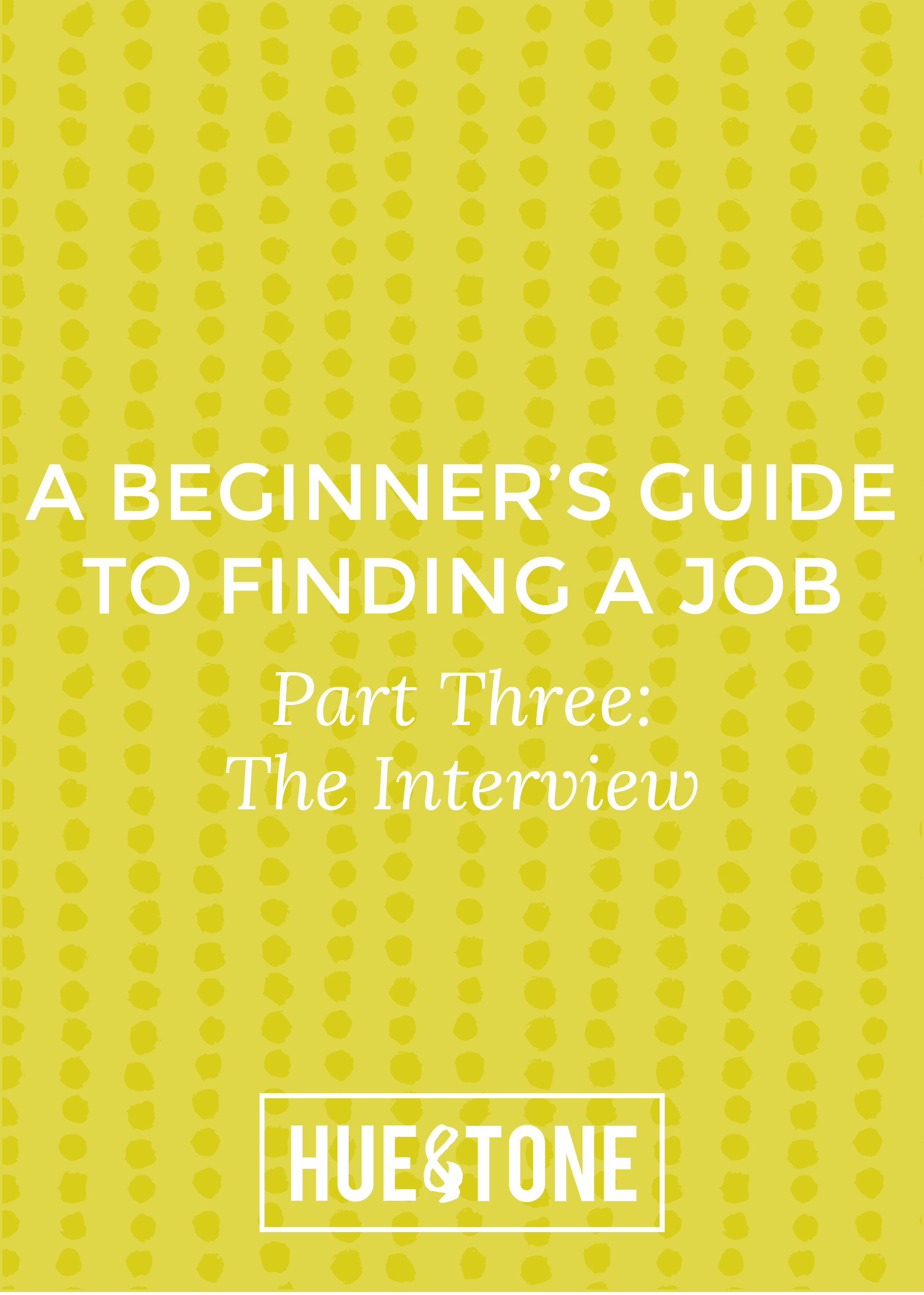
    If you read our Beginner's Guide to Finding a Job series this summer, you may be wondering what happened to Intern Kelly.

    Kelly's tips and tricks for the job search worked well -- so well that she found and accepted her first post-grad job! We're sharing the final post in Kelly's series here today.

    It covers all aspects of the interview preparation process. And if there's one aspect of pre-freelance life I remember most vividly, it's job interviews. 

    They can be completely nervewracking...but I've learned that being completely, carefully prepared is the best possible way to stave off nerves. There's no such thing as being too prepared for an interview. 

    Kelly's tips, which cover everything from initial prep to follow-up, are below. 

    Whether you have a phone, Skype, or face-to-face interview, being confident and prepared is crucial. In most cases, phone interviews are the first step in landing a face-to-face interview—so it’s important to nail it! Here are a few ways to make sure the interview process goes smoothly: 

    1. Prepare.

    Know your stuff. Research the company before the interview so that you're comfortable discussing the services, culture, and expectations of the company. During my own job search, these questions were often asked right out of the gate -- usually during phone interviews. 

    2. Ask questions.

    Make sure to ask questions during the interview process.  Asking questions demonstrates your genuine interest in the potential position and your engagement with the process, and shows the interviewer you're eager to learn more. A few of my favorite questions to ask are: 

    What are the biggest challenges the person in this position will face?

    What would a successful first year in the position look like?

    What are the qualities someone in this position need to succeed?

    3. Show off your previous work.

    For phone or Skype interviews, attach a link to your online portfolio when you confirm the interview time, or when you send your resume.  Print out samples for in person interviews – it’s always better to be overly prepared, and having printed samples can help guide the conversation if you find yourself forgetting your accomplishments.

    4. Look the part.

    Interviewers will take in how you look before you even start talking – and Skype interviews are no exception! It is important to look your best. While the attire that's considered professional varies depending on the industry, for men it generally involves wearing a tailored suit, with nice shoes.  A dark colored suit will also do the trick for women, with a short close-toed heel. When in doubt, wear business professional dress, pay attention to what others in your industry are wearing, and keep makeup and jewelry to a minimum.  

    5. Follow up.

    Chances are you won’t be the only one interviewing for a position – don’t let the interviewer forget about you! Immediately after your interview, jot down notes in the car about your conversation. Nothing is too insignificant – write down everything from position specifics and project details to the names of your interviewer's children. While these smaller details may not be useful in the short-term, you’ll be glad you have them if you go back for a second interview or end up getting the position. Add your interviewer on LinkedIn and follow-up with a well-thought-out email.

    Thanks for following along with this series! If you're an interviewing pro, I'd love to know your tips. What calms your pre-interview jitters? What's your answer for "what's your biggest weakness"? Let me know in the comments below. 

    Branding Refresh: Hue & Tone's brighter, cleaner new look

    As my small business grows, I have a better understanding of who we are and who we’re trying to reach. When I founded Hue & Tone, I went with muted, simple colors – but quickly found that this very basic palette was limiting.

    Hue & Tone’s refreshed branding is cleaner, brighter, and better represents who we are and what we do – without being such an overhaul that we’ve become unrecognizable. A wider range of colors and textures, along with an expanded font palette, offer visual flexibility and do a better job of telling our story.

    Check out the before and after here: 

    Branding Refresh: Hue & Tone's brighter, cleaner new look -- Hue & Tone Creative

    Branding Refresh: Hue & Tone's brighter, cleaner new look -- Hue & Tone Creative

    How do you feel about your business's branding? Does it tell your story well, or is it time for a refresh?

    What we've been working on...

    You may have noticed that we haven't been around much on the blog lately. Our days have been filled to the brim -- packed with social media scheduling, logo design, video shoots, client meetings, and a few cups of coffee to keep it moving along. 

     It has been harried and busy and interesting and fun. On a serious note, I'm grateful for the opportunity to support organizations and individuals as they sort through the puzzle of explaining who they are to their audiences. It's my favorite kind of work and I'm glad I get to do it every day. 

    Moving on, though, I wanted to share a little of what I've been working on since I last spent time in this space.

    What we've been working on... -- Hue & Tone Creative

    Downtown Greensboro banners

    Front

    Front

    Back

    Back

    I've loved making a home in Greensboro, NC. It's one of those cities that's the perfect size -- big enough that there's plenty to do, small enough to know your neighbors -- and there are great things happening downtown. I partnered with the City of Greensboro to design these banners, which augment the city's placemaking efforts and establish the feel of downtown Greensboro for visitors and locals alike.

    Action Greensboro print ad

    This ad captures the spirit of Action Greensboro, which harnesses the energy of local business, education and government to strengthen the economy and ensure a great quality of life in Greensboro. This design needed to be clean and simple, while still capturing the verve and vibrancy of the work.

    Social Media - Revolution Mill

    I'm lucky to call Revolution Mill my home away from home (it's the location we chose for Hue & Tone's offices). Revolution Mill is a new live/work/play development in downtown Greensboro; the site has a rich history and is on the National Register of Historic Places. Social media for this client has to strike a balance; we need to highlight the great opportunities at Revolution Mill now (from studio, office, and event space to restaurant concepts and residential coming soon) while remaining grounded in the history of the space and sharing the story of preservation that's happening. 

    I'd love to know -- what projects have you been working on lately?