Posts tagged Branding
Client Spotlight: Stubbs Mobile PT
Lauren Stubbs, Owner of Stubbs Mobile PT

Lauren Stubbs, Owner of Stubbs Mobile PT

For our first client spotlight of the year, we’re excited to share a fresh branding project for a brand-new business. We partnered up with Stubbs Mobile Physical Therapy in late 2020 to develop a custom logo and corresponding visual brand elements. Owner, Lauren Stubbs, recently started this mobile concierge physical therapy practice as a response to COVID-19 pandemic. Many outpatient physical therapy practices pivoted to include telehealth and some started offering PT at home, but Lauren jumped at the opportunity to make a fully mobile and telehealth practitioner available to the Triad for years to come.

Stubbs Mobile PT brings physical therapy to your home or private workspace to save you time and unnecessary hassle – all while keeping you safer than a traditional office setting. Being outside of insurance, Stubbs Mobile PT also offers preventative physical therapy services including an Annual Wellness Visit, Health Coaching, or Evaluation and Treatment before you have an injury (i.e. if something "just doesn't feel quite right"). Their goal is to provide top-quality service with longer appointment times and one-on-one individualized care so that you are feeling, moving, and living your best as soon as possible. 

We connected with Lauren while teaching Launch Greensboro’s Marketing 101 class. After discussing the importance of marketing and branding, she wanted to start things off strong with a bold and eye-catching brand. Knowing that a standout look would be crucial to marketing her business, we wanted a logo that would translate flawlessly to polo shirts, sprinter vans, and client swag. 

In the initial branding stages, it was clear Lauren was looking for a pictorial mark to accent her logo type and wanted to emphasize a feeling of movement and energy. Friendly, attentive, trustworthy and proactive are just a few of the words that were used to describe the desired look and feel of Stubbs Mobile PT’s future branding. 

One of our favorite stages of the branding process, a mood board helps ensure we’re on the same page as our client. By assigning visuals to the words we’ve been using, we can begin to home in on a feel for the future brand. 

After presenting three mood board options, we refined Lauren’s favorite to have an even more high-energy and vibrant feel. Lauren had mentioned aquas and blues during our initial branding kick-off, and we ended up tailoring her favorite option to include two shades of blue. The final product? A look that hinged on vibrant colors and energetic scenes. Healthy eating, movement, and the outdoors are central to Lauren’s business and we wanted to reflect that from the very early stages of the process.  

StubbsMoodboard.jpg

After narrowing down Lauren’s favorite mood board concept, it was time to move on to the logo design phase. Ultimately, we went through 4 rounds of initial concepts, and four rounds of color options to narrow down the exact look and feel. 

Many of the initial concepts incorporated kettle bell imagery, hearts, play or motion. After some brainstorming, we landed on the wording concept of “pressing play.” Used with various action phrases, this tagline could be targeted to a wide range of clients. You’ll see the main logo incorporates the phrase “Press play on being pain free.” 

 
Horizontal.png
 

The final logo uses pops of bright oranges, aqua, and yellow – all anchored by a deep blue. These colors pop on any timeline, and the graphic mark adds an element of action. The graphic mark is a take on a press play symbol – which ties into the tagline and lends itself well to use on social media. When working in tandem, all these elements create an action-packed look that’s sure to be eye catching and memorable. 

Untitled-7-01.png

We’re thrilled with how this rebrand went, and we’re not the only ones. Hear firsthand from business owner, Lauren Stubbs, about the process: 

“I really enjoyed the entire process of working with Hannah at Hue & Tone Creative. Being a first-time entrepreneur, I knew little about the branding process. Hannah guided me through it with confidence and understanding... even when decision-making was tough because she had created multiple amazing logo options. If I could have two logos I would, because that's how great both of the final options were. Despite the Hue & Tone office and my home office being less than 1 mile apart, we went through the entire process virtually (due to COVID-19). The virtual experience didn't detract from the branding process, but I loved knowing we were both members of the same community. Knowing our proximity, ties to Launch Greensboro, and both being women business owners, gave me a sense of connection even though we never met in-person. Supporting small and local businesses, whether walking distance in downtown Greensboro or in the greater Triad area is a central tenet of Stubbs Mobile PT. Being able to work with someone locally yielded excellent results and I'm extremely excited about launching my new look. In fact, in the few weeks since we've unveiled our new logo we've already received positive comments on social media!”


Want to learn more about Lauren’s business? Head over to her website to learn more! Or, follow her on Instagram here for regular PT, fitness, and movement tips!

Graphic Design Trends for 2021

In 2021, we anticipate companies messaging will be all about authenticity and simplicity. As brands become more and more social media savvy, the competition is becoming even fiercer. In addition to looking for eye-catching graphics, consumers are more conscious than ever of trying to support ethical brands that align with their values. 

What makes a brand stand out has become about more than just a company’s products and marketing – it’s also about the cause a brand represents and the lifestyle they support. 

After a long year of trying to fight for attention and having to pivot business models, we anticipate that many brands are in for another intense year. Many scrappy businesses were able to distinguish themselves in 2020, and we think pulling to the forefront in 2021 will hinge on strong and distinctive marketing. 


1. Authentic Representation + Socially Conscious Design

Graphics featuring “Stop the spread” and “Black Lives Matter” messaging took center stage in 2020, and we foresee this trend continuing well into 2021 (and, hopefully, beyond). Whether it’s putting an activist message front and center or paying closer attention to representation, brands are being held more accountable for their role in our culture. In addition to socially conscious messaging, marketers are paying closer attention to the representation in their work and featuring a wider array of races, sizes, and ages in their advertising. 

As brands rally around a cause, we suggest making sure the cause makes sense for your brand – and feels authentic. The only thing worse than tone-deaf messaging is the overwrought and inauthentic messaging that comes from a brand trying to co-opt a cause to turn a profit. 

2. Gold, Terrazzo, and Texture 

The trending textures we anticipate in 2021 are similar to what we saw in 2020. When it comes to home décor, gold and an all-white aesthetic have been reigning for years – in 2021 we anticipate gold will continue to trend… but with hints of soft pinks, dark navy, and other pops of color. We also think terrazzo will continue to appeal in millennial-targeted product photography. 

3. Muted Color Palettes

Bright colors and intense duotones have been reigning since early 2017. That’s why we anticipate a shift toward more muted color palettes this year. 

Muted colors are soothing – they can also evoke feelings of nostalgia, safety, comfort, and nature. We saw many health brands using a more muted scheme in 2020, but we think the trend will reach a wider array of industries this year. 


4. Data & Text Heavy Video

Working remotely has ushered in a new phase of more text heavy video design. In addition to clearly communicating a message, these videos work well for people using smaller teams, working remote, or those on a limited budget. 

We see this shift toward text heavy video also working well with current data trends. Gone are the days of complicated infographics – these days big, bold, simple statistics reign. They’re easily shareable and grab people’s attention on the ever-more-crowded internet. 

5. Black and white branding

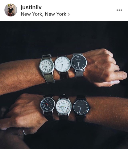
Black and white branding allows product photography to really stand out. This isn’t a new trend, but it’s certainly something we’re seeing an uptick in. Clean, minimal branding is a great way to stand out from the noise and colorful landscape of social media. As products try to distinguish themselves from the crowd, we think we’ll see more and more colorless branding in 2021. 

Screen Shot 2021-01-08 at 9.15.28 AM.png

6. Dark Mode

This trend relates back to designing for accessibility and ease of use – something we covered in more detail in 2020

Dark mode has been gaining reach in online product advertising this year – and we think this shift is going to impact brand design trends in 2021. Apps and operating systems are all offering dark mode options and these dark mode user interfaces help highlight design elements. It’s worth considering how the dark mode experience impacts your users and then tweaking your designs accordingly. 

For example, white fonts on a dark background tend to appear bolder –  does that impact the way people interact with your app? Do your design elements work well at all screen brightness’s?


7. Authentic Photography

Genuine messaging isn’t the only authentic content audiences are looking for – they’ve also got an eye for spotting posed or ersatz stock photography. 

We’ve been a long-time proponent of investing in a branded stock photography shoot. Take a few hours to collect shots that will represent your business for the year to come – you’ll invest a bit more than you will for a stock photo subscription, but the result will be authentic photos that you can use across all of your digital and print advertising.

A few examples of more authentic stock photography from Twenty20.

A few examples of more authentic stock photography from Twenty20.

noah_t20_W7rj3Y.jpg

Hue & Tone: Your partner in design for 2021

Realizing your brand needs to get with the times? Let’s use more impactful marketing to make 2021 your highest grossing year yet. Reach out to set up an initial consultation now.

Everything you should include in your brand guide

Quick tip: Brand guidelines coming in at over 50 pages? Consider creating an abbreviated version that can serve as a quick reference guide.

Brand guides are essentially an instruction manual for how to communicate both your visual and written brand. Depending on the size of your organization, your brand guide may come in at 100+ pages, or you may decide to utilize a more simplified sheet style. No matter how complex your brand guidelines are, we advocate for making them as clear and easy to understand as possible. 

Remember, branding is the personality of a commodity and your brand guide serves to translate that brand to outside parties. You want to include everything needed to communicate the feelings and expectations that are connected to the goods, services and even people your brand represents (read more on that here). 

Further reading: If you want to learn more about all the marketing collateral your new business should consider, check out this post.

If you’re unsure what you should include, we’ve put together the reference guide below. If you’re hiring an outside agency or freelancer to compile your brand elements, this quick reference guide will help you determine everything you should expect to be included. 

Everything you should include in your brand guide  |  Hue & Tone Creative

The basics:

Brand Story/Mission/Vision: First up, you’ll want to tell people what your brand is all about. This might come in the form of a vision statement, positioning statement, elevator pitch – or, maybe it’s a more fully formed brand story. No matter the form, it’s important to give people background information about your company.  

Quick tip: Always include a table of contents in your brand guide. Trust us, every agency or freelancer that has to use your brand guide will thank you. 

Key messaging: Have a tagline or key message you repeat over and over? This can be word for word phrases or simply big picture ideas you want to see repeated.

Personality: List out all the characteristics of your brand by describing the feeling and impression people will have when they interact with you. One way to do this is to make a list of things that your brand is, and a list of things that it is not. These words will help set the tone for your copy writing and guide the written communication of your brand.

All logo variations: Once you’ve carefully outlined the personality and verbal tone of your brand, it’s time to move on to the visuals. The first (and most obvious) thing you’ll want to include is your logo. But, don’t stop there, be sure to include every version of your logo including horizontal uses, vertical, watermarks, and special stamp versions. 

Logo usage: Once you’ve outlined the logo variations you have, you’ll want to give guidance on how to use them. How close can your logo be to other elements? Is there a minimum size it should be printed in? What version of your logo do you use where? Are there limits on what colors it can be printed in? Think through all the digital and print uses of your logo and do your best to carefully outline the rules for each potential use. 

Color Palette: Outline all the colors that can be used in your brand – this includes your primary and secondary color palettes. Be sure to include guidance on how/when to use each color. For easy reference, include the Pantone, RGB, CMYK, and Hex codes for each color. 

Font Palette (for web and print): Once you’re done with colors, outline which fonts should be used where. We suggest including an example of the fonts in use, details on where people can get the fonts, and any restrictions on kerning, alignment, leading, and color usage. If your fonts are expensive and you don’t plan to provide a license to every external party, we suggest including easily accessible open source alternatives. This will up the chances that your brand guidelines are followed and increase the ease of use.  

Image Guidelines:
Whether you purchase stock photos or have your own brand photography, it’s important to include visual examples of acceptable and unacceptable photography. How should photos be edited? How should your staff or customers be represented? What kind of office environment do you want to portray? 

Sample collateral: Even after you’ve outlined all these basic elements, it’s important to show examples of your visual brand in action. The interaction of all these elements together will be valuable samples that designers will need if you want them to emulate your brand closely. The more collateral examples you can include, the better idea they will have of how your brand should look. We suggest including a letterhead, business card, sample ads, website screenshots, vehicle wraps, promotional swag, and social media ads or posts.  

Include point of sales and packaging examples in your brand guide.

Include point of sales and packaging examples in your brand guide.

Suggested inclusions

Now that we’ve covered the basics, we want to point out a handful of other items you should consider including in your brand guide. Here’s a list of our suggested inclusions:  

Target Audience: This is a valuable inclusion if you ever plan to outsource your marketing. Don’t be afraid to dive into nitty gritty information about your target demographics – this will be invaluable for anyone targeting ads or creating a media plan.

Additional graphic elements: Do you have additional graphic elements besides your logo? For example, do you have an iconic swoosh or divider bar? Include additional guidance on how to use each of these supplementary elements. 

Icon sets: Have a standardized set of icons you use on print or social media collateral? Include the full set of vectorized icons so designers can easily grab and use them. Include usage guidelines and make it clear whether it’s okay for people to create additional icons or not. 

Campaign graphics: Does your business have spinoff brands, specific subsidiaries, holiday campaigns, or additional product lines? Including a snapshot of any ancillary brands will give designers or agencies a more holistic picture of your entire brand.  

Packaging/Store Signage: Do you sell a physical product? Include samples of the packaging, as well as examples of point of sale signage, sample displays and sample promotions. 

Sample social media posts: Including more in-depth illustrations of how your visuals and verbiage are paired together on social media can provide valuable guidance on how you like to communicate with your audience. 

Video/Motion Graphics: If video – prerecorded or live – is a major part of your marketing plan, you’ll want to create some guidelines for how and where it should be shot. Talk about content, tone, guidelines for overlaying text, backgrounds, and filters.

Customer Service Examples: Your brand is a conversation, and your customers need to get to know you as a brand. Including examples of your outward facing dialogue can help get your whole company on the same page about how they should be communicating. 

Website: Is there a phrase or product you never want to see featured on your homepage? Do you have a specific plan for what first time visitors need on your website? Consider getting into more detail about what you should and shouldn’t include on your website. 


This list is by no means exhaustive, but we hope it provides a solid jumping off point for brainstorming your brand guide. See something we should include on this list but didn’t? Drop us a comment and let us know what you think is crucial for a comprehensive brand guide.


Hue & Tone Creative: Your branding partner

Completely overwhelmed by this list? We get it. We’ve worked with numerous businesses to establish clear branding and brand guidelines – and we’d like you to be the next business we support. We can help you get all your visual brand elements organized and easy to use – whether you’re starting from scratch or want to build around an existing brand. 

How to find your voice on social media (and why it matters)
How to find your voice on social media (and why it matters)  |  Hue & Tone Creative

The internet is a crowded space and it can be hard to make your brand stand out. But one of the best ways to stand out is to create authentic connections on social media. 

A key element in forging these genuine connections is establishing your brand voice. Your brand voice makes your brand feel like a person that your customers can connect with and allows you to build a deeper relationship with your audience. No one likes to feel like their favorite company thinks of them as just a dollar sign – and when people feel valued by your brand, they tend to spend more and be more loyal.  

Formalizing this brand voice in a set of guidelines ensures everyone posting from your account is using a consistent tone to communicate with the audience. This ensures that you stay on brand in even the stickiest customer service situations… and they can even help you turn an aggrieved customer into a loyal follower. 

Finding your social media voice is not one thing, but rather a set of defined characteristics that come together to establish your overall brand voice. 

  • Character: Who does your brand sound or talk like? Are you an expert informing a customer, or do you talk to a client like they are your friend? 

  • Tone: What is the general vibe of your brand? How does your voice change based on audience, situation, and channel?  Are you fluffy or direct, personal or professional? 

  • Language: What kind of words do you use often? What kind of words do you try to avoid? Do you speak in a complex and jargon-filled way or do you like to keep things more simple? 

  • Purpose: Why are you on social media? Do you want to engage, inform, sell… or something else altogether? 

Why social media voice matters 

Creating a consistent tone lets people get to know your brand and allows you to build a strong relationship with customers and clients. Delighted customers talk positively about your brand, which means them creating new content, driving leads your way, and spreading your brand message. 

Establishing your voice can be complicated and require some trial-and-error. Unlike tracking your web analytics, this marketing project won’t be a one and done task. If something isn’t connecting with people, don’t be afraid to do more research and reorient your tactics. 


Steps to get started 

How to find your voice on social media (and why it matters)  |  Hue & Tone Creative

Stumped on where to get started? Here are a few simple steps to get you going when developing your brand guidelines. 

  1. Research your audience’s habits online. What platforms do they use, what words do you see often, and what do they seem to value? 

  2. Examine your existing brand guidelines. What brand resources do you have to work with? Do your guidelines for print work for social media? Do these words fit with what you’re seeing from your audience?

  3. Determine your purpose. What do you want to do for your audience online? How will you achieve these goals? 

  4. Brainstorm words you want your audience to associate with your company. Make a list of adjectives you want your audience to use – and then words that you think will help elicit those feelings.

A few tips as you develop your voice 

Now that you’ve got a jumping off point, here’s a few additional tips to keep in mind as you put your brand voice to work online. 

  • Define your audience. It’s important to keep in mind that certain types of messaging resonate with certain audiences. Taking your audiences communication style, interests, and online behavior into account will help you better connect with them. Be sure to explore how your customers act online before solidifying your brand voice. 

  • Be transparent and admit mistakes. Instead of trying to hide mistakes, use transparency and openness to your benefit. Admitting when you make mistakes and letting people see behind the scenes at your business will build trust and loyalty from your customers. 

  • Trust your customers. Whatever you do, don’t delete comments from people who are criticizing you – this will just make them angrier and may push them to launch a full-scale campaign against your brand. Instead, comment on their posts and show your other customers how reasonable and responsive you are. Your customers are smart enough to distinguish between a rightfully aggrieved customer and a lunatic. 

  • Keep it consistent. If your brand voice isn’t usually funny, don’t suddenly try to make a joke. Trust is built through keeping a consistently high-quality presence. Think of your brand like a person – you don’t want to leave users feeling like your personality is anxiety inducing or erratic. 

  • Be clever with purpose. It’s okay to be clever or sassy with your social media voice, but only if it fits your brand. Don’t try to emulate Wendy’s unless there’s a well rationalized reason for it. Use funny or clever responses sparingly – and be aware that they may fall flat (and create a secondary issue). 

  • Don’t forget it’s a conversation. Social media shouldn’t be used to talk at your audience – it should be used to communicate directly with them. Authentic interactions can create lifelong loyal customers – and ignored messages can lose them. 

  • Take customer service seriously. Put time into developing a plan for customer service and responding to inquiries. Ensure consistency and timeliness by creating sample responses for your team and empowering them to take action when there is a valid complaint. 

  • No platform is exempt from your brand voice. Your brand voice isn’t just important in your posts – it should be consistent across every element of social media. This includes Facebook message replies (including the automated ones), calls to action, Instagram captions, direct messages, cover photos, bios, and post graphics/visuals. 

  • Keep responses usable. Responses to people’s questions or inquiries shouldn’t be long or overly complex – keep in mind that users are most likely responding from their mobile device. Answers or responses to people should be short, to the point, and easily accessible. 


 Hue & Tone Creative: Social Media in Greensboro, NC

Completely stumped about how to connect with your audience? Let us take the work out of it. We can help you put a social media strategy in place – or we can take over the posting and day-to-day management of your channels. Reach out to learn more about what kind of plans we offer. 

8 simple color palettes for any brand
8 simple color palettes for any brand  |  Hue & Tone Creative

Picking the right color palette is important — whether you’re looking to refresh your logo or just design a social media graphic, selecting the right hues can have a huge impact on the effectiveness of your graphic. Certain colors evoke feelings of action, while others are often identified with calm and serenity.

In a past post, we covered what color theory is and why it’s important to consider it during the design process. Today, we’re putting the rules of color theory into practice with a handful of sample color schemes.

These 8 color schemes are suitable for a wide range of businesses and can serve as a frame of reference for what colors connect with what customers. Copy these colors directly or use them as a jumping off point for designing your own scheme!

For interior design businesses

Light, neutral colors provide a versatile canvas for any room you want to showcase.


Artboard 10purple2.jpg

For businesses who deal with women’s health

Make your female clientele feel cared for with soothing hues of purple. A dusty mauve grounds this scheme, keeping it from feeling too girly.


For businesses who want to give off a corporate feel

If you’re in a corporate or service business, you can never go wrong with basic blues. A pop of orange adds contrast and elevates this scheme to feel more modern.


Artboard 8purple2.jpg

For businesses whose clients are tweens

When appealing to a younger clientele, keep things fun and vibrant with lilac, an aqua blue, and a pear green.


For businesses who deal with art

If you deal with an elevated clientele, these unexpected shades are neutral yet a bit adventurous. Earthy and understated.


For businesses who deal with tech

If you’re looking for something bold and clean, yellow and a deep grey speaks to an action oriented and bold brand.


For businesses whose clients are young kids

If you work with young kids, keep it fun and bright with azure blue, a grassy green and a vivid red.


For businesses whose clients go outside

If you sell outdoor equipment or experiences, branch out from earthy browns and greens and dig into some more unexpected colors. Burgundy, a muted Prussian blue, and a papaya orange are an unexpected but organic combination.


Hue & Tone Creative: Your branding partner

Looking to develop just the right color scheme for your brand? Don’t leave the process of selecting the perfect colors up to chance. Bring in our expert team and we’ll ensure you create a brand that connects with your customers. From naming your business to creating a polished website, Hue & Tone is here to help. Book an initial consultation now to get started.

7 Logo Mistakes to Avoid

It’s easy to spot a bad logo once it’s been created, but what should you be on the lookout for before the design process even begins? 

We see poorly designed logos every day – sometimes as a result of shoddy design work and sometimes as a result of miscommunication between client and designer. No matter what the reason, it’s important to know what makes a good quality logo before the design process even begins. 

If you’re just beginning to consult with a designer – or, you’re a novice designer just getting into brand design – we’ve got 7 common mistakes for you to look out for. 

two-colleagues-creative-graphic-designer-working-on-color-selection-and-drawing-on-graphics-tablet-at_t20_4bjNbR.jpg

1. Not considering black and white

If your logo relies heavily on gradients, 3-D effects or a specific color then you’re setting yourself up for failure. No element of your logo should only be distinguishable or in context when the logo is in full color. A properly designed logo will have a strong form and be recognizable as your brand even when printed in black and white. 

You don’t want to embroider your logo on hundreds of shirts only to find that it’s no longer identifiable. If you make sure to create a black and white version of your logo in the very early stages of the branding process, you’ll save yourself from any unhappy surprises down the road.


2. Not designing for all formats 

Every good logo needs to work for something as large as a billboard, but should also be able to printed on something as small as a lapel pin. 

Your logo should be future-proofed – meaning that no matter where it needs to be printed in the future, it will still work well. If your business needs a new branded product, you shouldn’t need to engage a designer to update the logo to make sure it works well on a new product. 

 However, designing for all formats may mean that you have multiple variations of your logo. That doesn’t mean your main logo isn’t effective, it just means that your designer has thought through all the possible applications and designed something that will work for every medium. 

3. Getting too trendy 

A properly designed logo might not look exactly like everyone else’s – and that’s a good thing. Your designer should be creating an original graphic based on your business and it’s unique appeal to customers. 

While you might want an ultra-sleek mark that mirrors what you see Google or Facebook doing, that doesn’t mean it’s the right look for your business. Your logo should be distinct and unique to your business and you shouldn’t get caught up in what everyone else is doing. If you do, chances are you’ll have to update things a few years down the road when the rest of the design hivemind sets its sights on a new trend. 


4. Utilizing raster images 

A professional logo requires professional software – any logo you’re able to create using freeware or that is delivered to you in a JPEG format isn’t going to work down the road. 

When you engage a designer be sure you request your logo in a .EPS or .Ai format – these are vector file formats, meaning they can be scaled to ANY size down the road. Beware, a Photoshop file is a raster image, meaning there’s a limit to the size it can be scaled. 

5. Tacky symbols and excessive inclusions 

There’s no need to include copyright symbols, “LLC”, “Inc.” or registration symbols in your logo. They clutter up the final design and are often distracting from the rest of the logo. Other than on tax forms, you should leave these designators out.  

7 Logo Mistakes to Avoid  |  Hue & Tone Creative

6. Not investing in a quality designer

Whether you hold a contest, ask a friend to design your logo, or utilize somewhere like Fiverr, you can expect to get what you paid for…. or didn’t pay for. 

Logos are important, which is why they typically cost thousands of dollars. If you don’t budget accordingly, you can expect to cost yourself money down the road when you run into problems with your file formats, scaling… or even issues like plagiarism. 


7. Creating a logo, but not a brand 

While your logo may be a crucial building block for your brand, it’s not your whole brand. Don’t make the mistake of stopping the design process after your logo has been created, because it’s just one piece of the puzzle.

A well thought out set of brand colors, typography, alternate marks, and brand symbols are all crucial to creating a full brand identity. Before you engage a designer, make sure they can help you with the whole branding process and don’t intend to send you on your way with just a logo.  

We suggest asking for a brand guide or brand sheet that outlines all the elements of your brand and how to use each. 


Hue & Tone Creative: Your logo and branding partner 

Your logo is a major investment – so pick the right design firm to invest in. Hue & Tone Creative is a boutique design firm specializing in all things visual, and we would love to partner up with you on your next big rebrand. 

How to create great images for shoppable posts

New to shoppable posts? Head over to our step-by-step guide here.

Month-over-month and year-over-year, more and more consumers are making purchases directly on social media. One digital marketing company found that in the last 12 months, there’s been a 38% increase in the number of users who placed high importance on being able to discover and purchase products directly through Facebook, Instagram, and Pinterest.

When it comes to social shopping and visual content, here are a few stats you need to know:

  • 91% of brands agree visual content creates more engaging shopping experiences

  • 86% say their imagery enhances their discoverability

  • 73% said visual content increases conversions

  • 77% confirmed it deepened brand trust

How to create great images for shoppable posts  |  Hue & Tone Creative

Allowing users to buy directly on social media should be part of an integrated, multi-platform approach. When used in conjunction with good data, well-targeted ads, and great organic social content, you’re sure to have a winning strategy in place. 

One of the most important elements of that winning strategy is strong images. And, while the guidelines for each social platform are a little different, there’s one thing that’s true across every platform: high quality photography is a must. 

With that in mind, read below for details on how to tailor your images to each platform. 


Facebook

Regardless of what you’re selling, there are a couple of requirements your images must follow:

1. Each product must be supported by at least one image

2. The photo you use has to be of the product itself -- no creative interpretation allowed!

Once you’ve met those two guidelines, we also recommend you:

  • Make sure your images are easy to understand and that they capture the whole of the product. That’s not to say you’ll be penalized if the corner of your wallet is cropped out of the picture, but clarity is key and consumers want to see exactly what they’ll be buying. 

  • Use an image resolution of 1024px x 2024px or higher for a clear display resolution.

  • If you’re worried your images don’t have a cohesive look, consider placing your photo on a white background. It’s a clean and simple approach that works well for almost every product.

  • Take shots of your product in real-life scenarios. For example, someone wearing a handbag gives an idea of scale and also provides the opportunity to show off your brand aesthetic. It’s a win-win!

  • Use the following image ratios to ensure your ad will display properly: 

    • Ad images on the computer: 470 x 246 pixels.

    • Images of ads for mobile: 560 x 292 pixels.

    • Images in ads with a vertical column: 254 x 113.


Instagram

Next up is Instagram – and whether you’re dabbling in shoppable posts or stories here’s what you need to know to ensure your images convert:

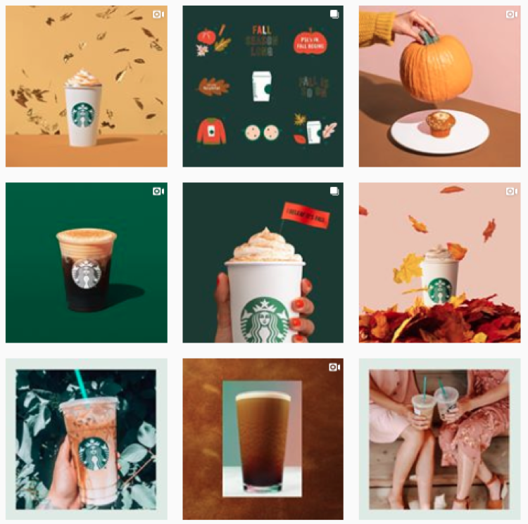
  •  Consistency is key so make sure your photos reflect your brand’s personality. Users should instantly know it’s you when they scroll by! For example, here are two feeds that have a clear and recognizable look: 

Hubspot

Hubspot

Starbucks

Starbucks

  •  Brush up on different composition techniques and experiment with them in your shoots. You’ll want to establish your own style over time, but if you’re just getting started there’s a few things that are usually a hit on social: 

    • Rule of thirds: Divide your photo into thirds (horizontally and vertically) and sit your product on the intersecting lines. More on that here

    • Rule of odds: Put five bracelets in the frame instead of four, it’s usually more appealing. 

    • Negative space: Ensure the space surrounding the product takes up more space than the product itself. 

    • Centered composition: Place your product in the middle of the frame. This will ensure your image crops well no matter where it’s being previewed. 

  • Play with your exposure until your photos find the right balance. Or, play around with under and over exposure to give your images a signature style!

Pinterest 

Need tips on creating a branded look? We can help with that – check out this post

On Pinterest, image quality reigns! Like Pinterest, Instagram is a visual platform – but Pinterest offers even less context than an Instagram post. Think of your picture as the preview for your whole webpage – even though you can create a long pin, you’ll want to get key text and a few grabby images up above the fold. 

  • Pinterest recommends a 2:3 aspect ratio (ex: 1000 x 1500 pixels). Other ratios may cause your Pin to truncate and may negatively impact performance.

  • Just like Instagram, you’ll want to bring consistency to your feed by establishing clear and consistent branding. 

  • The images you pick should help people understand why your product or idea is the right fit for them. Pick images that show context and bring your topic to life. Clearly show how someone might use your product, try your project, etc.

  • Text overlay can make your Pins stand out, adds context, and enhances your message. Keep text concise so it’s easy for people to read on their phones.


Hue & Tone: Let’s Get Social Together

Need help overhauling the look of your social media? Whether it’s your creating custom images or finding the perfect photo, we’ve got the solution that fits your needs. Get in touch at (336) 365-8559 or hannah@hueandtonecreative.com to find out more.

Brand your social media images like a pro

We are living in the Golden Age of social media. Today, you can post a picture of your artisan avocado toast on Instagram, pin your imaginary dream wedding, or simply tweet about whatever random thing your cat just did. Although these things can seem silly, social media is incredibly powerful if used the right way. Utilizing social media is especially fantastic for brands -- you can reach audiences around the world or just expand your reach locally.
 

1.     Who are you?

Before you start posting, it is crucial to have a clear sense of your brand. Is your look sleek, modern, and polished? Are you bold, artistic, and experimental? Taking the time to research and understand who you are as a brand allows you create a look that is entirely your own.

If you’re feeling a little stumped a mood board is a great way to start your research. Use Pinterest, Photoshop, or even a paper collage to gather whatever images speak to your brand. Anytime you feel lost for inspiration, go back to your mood board as a reminder of what your brand represents.
 

2.     Color & Fonts

In addition to color, your brands choice of fonts and lettering are also important. Anthropologie often uses fonts that look handwritten to capture the whimsy of their merchandise. Alternatively, Target uses clean minimalistic lettering that pairs well with the brand’s simple and crisp aesthetic.
 

3.     Filters & Photo Editing

Along with ready to use filters, adjusting your brightness and saturation can make your images more eye catching. Bright clean images with bold pops of color are perfect for brands with a youthful and playful aesthetic.

Muted colors with strong saturated hues work well for brands with a modern sophisticated style.

Although filters are fun to use, you don’t want your social media accounts to look like a confused medley of styles. Pick a look and stick to it.

One last tip,

It’s easy to obsess about achieving perfection, but it’s ok to mess up. You might discover a filter you like better or find some unexpected inspiration. Growing, learning, and evolving is much more valuable than staying predictable and stagnant. Have fun and don’t be afraid! 

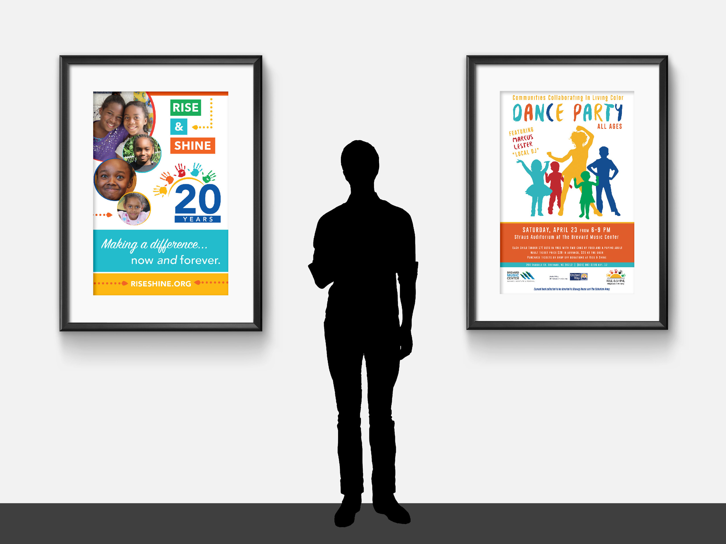
Client Spotlight: Rise & Shine, 20 years of making a difference

We know, we know -- we’ve highlighted Rise & Shine before… but when your clients just keep doing great work, it never gets old showing it off.

Throughout 2016, Rise & Shine has been hosting a series of events to celebrate and raise awareness for their organization. An afterschool program with a mission of promoting racial justice and equality, we loved being able to collaborate on collateral that's helping drive their mission forward.

All of our work for Rise & Shine features bright colors, eye-catching layouts, and vibrant photography of the program participants. We work to keep the focus on the facts and figures that demonstrate the program's efficacy, as well as highlight the organization's values. 

Take a look at the colorful collateral below!


Below, starting clockwise at top left: One-page infographic (front + back), homepage web slider, event program,  Facebook graphics, and bookmark.


Below, left: Booth signage
Below, right: Event poster for the "In Living Color" Dance Party


Below: Local Movie Theater Ad


Working with non-profits is a passion of ours, and we're always eager to dive into a new partnership. If your organization's marketing needs a boost, don't hesitate to reach out to us!

Friday Links: Surprises + Simple Strategies

This week we couldn’t decide on just one topic, so we have a little bit of everything -- from taking pictures to social media facts and standing out -- we’ve got something for everyone this week.

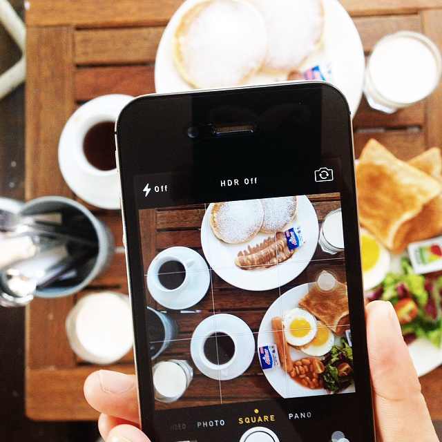
One | Taking pictures with your smartphone can be a pain (trust us, we know!), but these 17 tips and tricks will help you take better iPhone pictures. It’s amazing the results you can get with just a few simple tricks!

Two | Did you know that your biggest advocate on Twitter is most likely someone with a low number of followers? This is just one of the 10 most surprising social media facts

Three | “Look around you right now, I guarantee you can see at least one brand mark somewhere.” Ever wonder how big brands leave a lasting impression? Creating a brand that is consistent and thoughtfully executed will leave a lifetime mark. Here are 12 simple strategies all memorable brands use.

Four | Over the course of the day, almost 5 million pins are shared on Pinterest! So... now you’re probably wondering “How can I stand out and make sure people are seeing my pins?” Implement these 4 simple tweaks to help stand out.

Five | If you checked out our post earlier this week, you know we talked about GSO inspiration. And, we couldn’t resist adding one more local business to our list! Vivid Interiors (located Downtown) has been sharing some of their favorite Hygge and West wallpapers on their blog. Not only would they look great in your home or office, but these snapshots also make cute iPhone wallpapers!

If you’re in Greensboro this weekend, check out the 100 for 100 art sale or National Trails Day. See you on the blog Tuesday!

Hue & Tone Tips: Small changes that'll make a big difference in your visual branding
Hue & Tone Tips: Small changes that'll make a big difference in your visual branding -- Hue & Tone Creative

I've said this a time or two on the blog -- your organization's visual brand is really, really important. In most cases, it's your first chance to make an impression on a potential customer or client, some of whom aren't going to take a risk on your business or organization if you don't have professional, cohesive branding.

If you're interested in a more in-depth look at the importance of branding, including how-tos on establishing your brand, you can check out my branding series. Today, though, I want to offer a few quick action steps that will improve your branding in a big way, without requiring a huge time investment. 

Invest in good-quality photography. 

Using clear, bright, well-composed photos -- rather than the "just okay" photography most organizations wind up with-- instantly elevates the quality of any branding collateral. This might mean investing in professional photography services or equipment, but it could be as simple as getting outside with your smart phone and a white-posterboard background and taking advantage of some good, natural light.

If you've seen that font before, stay away from it!

When you're choosing a logo font, go the extra mile and look for a font that's not commonly used by other organizations in your niche. This is often as simple as avoiding the default fonts on your computer (for a few places to download free or inexpensive fonts, check out Tuesday's blog post). 

Add texture to your graphics.

Particularly in graphics involving text, it's easy to think type and color are the only elements you need to pull in. But those flat graphics don't draw the eye. Even the simplest graphics need some form of texture to create visual interest -- take a look at the Hue & Tone post graphics for an example. 

Establish a consistent look on social media.

If you post graphics on social media, have an idea of which fonts, colors, and textures you're going to use in that space. These should be consistent with your overall brand identity. If there's a certain type of content you post often -- quotes, for example, or opening and closing dates for your business -- you can develop a consistent graphic template for that content and rotate in colors and textures. 

What's worked for you as you work to brand & define your business? Let me know in the comments. If you have questions about your branding, or want to discuss ideas, drop me a line here.


Branding Refresh: Hue & Tone's brighter, cleaner new look

As my small business grows, I have a better understanding of who we are and who we’re trying to reach. When I founded Hue & Tone, I went with muted, simple colors – but quickly found that this very basic palette was limiting.

Hue & Tone’s refreshed branding is cleaner, brighter, and better represents who we are and what we do – without being such an overhaul that we’ve become unrecognizable. A wider range of colors and textures, along with an expanded font palette, offer visual flexibility and do a better job of telling our story.

Check out the before and after here: 

Branding Refresh: Hue & Tone's brighter, cleaner new look -- Hue & Tone Creative

Branding Refresh: Hue & Tone's brighter, cleaner new look -- Hue & Tone Creative

How do you feel about your business's branding? Does it tell your story well, or is it time for a refresh?

A Beginner's Guide to Finding a Job (Part 1): Brand Yourself

Hi everyone! Kelly Roberts here -- aka Intern Kelly -- I am a recent graduate of The University of North Carolina at Greensboro and am currently looking for my first "real" job. Through my internship at Hue & Tone I am learning tips and tricks for becoming a more competitive job applicant. Over the next few weeks I'll be updating you on my progress through the blog, so feel free to follow along! 

Intern Kelly -- Hue & Tone Creative
Finding a Job, Part One: Brand Yourself -- Hue & Tone Creative

1.   Reflect on who you are and what you have to offer.
This calls for self-reflection time. This can be very challenging, because there can be many different things that make you, you. It is important to establish the things that you enjoy, and are good at. Not just professionally, but personally as well. What are your best skills? Honesty is key, stay true to yourself – and when in doubt, ask those around you what stands out to them.  

2.   Build a personal website.
Build a site filled with blog entries, a record of your professional endeavors, and work samples. I cannot express the importance of this enough! Especially in the creative industry, it is important to have a portfolio of your work – and an Internet portfolio is the way to go. This gives potential employers the opportunity to get a feel for who you are before bringing you in for a face-to-face interview. It is one thing to tell potential employers about your successful work, but it is another to actually show them.

3.    Clean up your social media accounts.
Make sure you’re projecting a professional persona online. By changing your privacy settings on Twitter, Instagram, and Facebook you can control who can view your posts, pictures, and thoughts. You want to make sure that the way you are presenting yourself on social media is a good reflection of you as a professional. Most importantly, don’t forget to keep your experience up to date on your LinkedIn.

4.   Understand the expectations of your industry.
Each professional industry has its own rules, which your personal brand should follow. Do plenty of research to find out who the major players in your industry are, how much color you should use on your resume, and what kind of salary you should expect. Don’t hesitate to reach out to a favorite professor as you explore your field – they’re there to help. As you build your brand, broadcast a physical appearance that balances your personal style and the expectations associated with the industry or career you plan to pursue.

5.   Use social media to market your new online brand.
Once you have established your brand, you own the right to flaunt it! Use social media to your advantage – post Facebook statuses and tweets letting your followers know that you are in the job market. Brag about your specialties and abilities, and pay the extra money to update your LinkedIn profile! 

6.   Network in-person.
Technology is awesome for making and keeping connections; however, it does not replace face-to-face time. Facial expressions, tone of voice, and body language are just a few of the things that make a huge difference in a conversation. Relationships typically grow stronger when you interact with someone in-person, it’s often easier to relate to them and it shows you're invested in getting to know them as well.

Stay tuned for next week's blog post on how to make your resume stand out from the crowd. Have a question in the meantime? Email me at kerober2@gmail.com

Branding (Part 3): Creating a consistent brand on social media

Note: Today’s installment of the branding series is a guest post from Meghan Frick

You probably don’t need to be told that social media’s a powerful tool for your business – whatever your business is. And social media is important for your business for the same reasons it’s such a force in your personal life – it’s a way to build real friendships and networks, based around pretty much anything.

At its core and at its best, social media is about relationships. You are in the best position to strengthen your business when you are building genuine relationships with potential clients, customers, and partners.

That’s easier to do when your social media accounts are tied together with a consistent visual and editorial brand. When you post and when you interact with other users, people should know – seamlessly, easily – who they’re interacting with. Here are a few easy ways to strengthen your social branding.

1. Brand your images

Watermarking the photos you post to social media is a simple way to include a visual reminder of your business and what it stands for in nearly every post. Here’s how we do this at my day job. There are a ton of different options for branding your photos, but we accomplished this effect by converting our logo into a Photoshop brush preset.

Tip: Unless you’re a photography business – meaning your images are the product you sell – don’t make your watermark so obtrusive that it would deter other users from sharing your images. In most industries, you want people sharing your images on social! The brand is more of a visual cue than a banner proclaiming “this is mine!” 
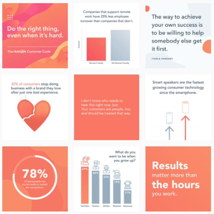
2. Take advantage of valuable real estate

Any social media account you create comes with some built-in real estate that allows you to communicate your visual brand. Think cover photos, profile images, “about” sections, etc. Don’t let these go to waste. For your cover images, create collages or sharp, appealing graphics. Use sections like your Twitter bio to point to other content, like your most recent blog post or your business’s other social-media accounts. Never leave a profile picture or a bio blank – be strategic in your use of these “built-in” sections.
3. Pay careful attention to consistency of quality

Put another way: if you’re going to put it out there, make it good. Shoot and select sharp photos. Carefully proof your writing – and, if you’re prone to mistakes, let someone else comb through it too. Develop a consistent editorial style (for example, refer to yourself and your business in the same way; no fluctuating between I and we). Develop a reasonable consistency of written tone – many accounts do well with a decidedly untraditional tone, but you don’t want to switch between that and super-seriousness.

I’ll end with a warning, though.

I approach social media – even for business purposes – with an attitude of “inspiration, not rules.” If I’m tweeting live and don’t have time to brand a photo, I post the photo anyway. If a slightly blurry image reflects an exceptional moment, I sharpen it up as much as I can in Photoshop…and then I post it anyway. You don’t want to seem canned, and you don’t want your branding efforts to detract from real communication and opportunities to share what you and your organization are all about.

How do you brand your social media accounts? How has social media been valuable to you as a professional? Let us know in the comments!

Meghan Frick is a communications and social media specialist for the Georgia Department of Education by day, and a blogger and freelancer by night. Connect with her on Twitter, Instagram, or her blog.

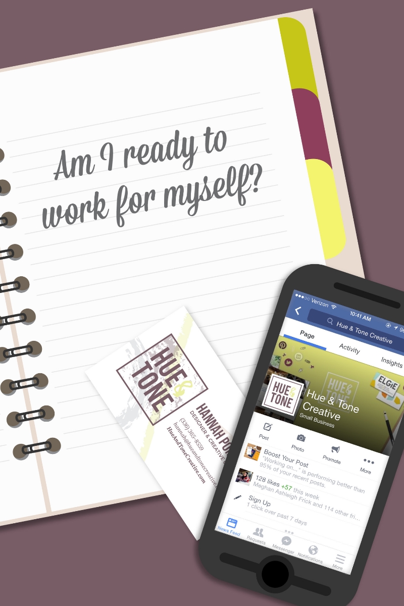
Are You Ready to Work for Yourself? 5 Questions to Ask
hue&tone_workforyourself

Working for yourself full-time can be a great thing. There’s nothing like striking out on your own to develop your skills, and the freedom you’ll gain over your time, income, and opportunities is incomparable.  

Still, working for yourself is hard – in ways you don’t always imagine when you’re starting out. So how do you know if you’re ready? Start by asking yourself these five questions.

Why am I doing this?

What’s going on in your life that makes you want to take the leap? And if all those situations suddenly changed – if you had a brand-new boss, a raise, and a corner office – would you still want to work for yourself? Pay attention to your answer. You should be ready to make a commitment that lasts through changing circumstances.

How long could I realistically live on the savings I’ve built up?

Figure out how much you think you’ll need…then double it. Particularly in creative industries – where you’re offering a service, rather than a product – the line from successful client acquisition to actually seeing a check in your bank account can be a long one.

Am I ready for EVERY aspect of owning a business?

Making a living from the creative work you love doing is great. But remember that you’ll also have a whole new list of responsibilities aside from the creative stuff. Make sure you’re ready to handle more complicated taxes, find a space (or work from home), and – of course – get out there and find some clients.

What’s unique about me? How can I brand that?

You know you’re a great copywriter/graphic designer/web developer. Remember, though – there are a lot of talented creatives out there. What sets you apart? How can you cohesively and visually represent – aka brand – the things you alone can offer?

Who’s in my corner?

Although you may now be a business of one, success doesn’t happen alone. Think about the network you’ve built over the years…who do you know whose skills are the perfect complement to yours? Now’s the time to brainstorm the partnerships you can build based on those relationships.

Need help figuring out how to brand your services? I’m all ears! Drop me a line: hannah@hueandtonecreative.com.