Want to see what inspiration we found a little closer to home? Check out these moodboards from around Greensboro!
Late last year we did a series of moodboards featuring vignettes and color inspiration from around Greensboro. It wasn’t hard to find inspiration in our surroundings then, but this time we looked a little further from home for our latest color series… and we think you’ll quickly see why. This set of swatches was inspired by photos we took on a week long-trip to Los Angeles in late June.
While in LA, we visited art museums, parks, lakes, and lots of great restaurants. These color schemes are just a glimpse of the diverse scenery we experienced, and we know we’ll be reflecting back on this trip for inspiration for months to come.
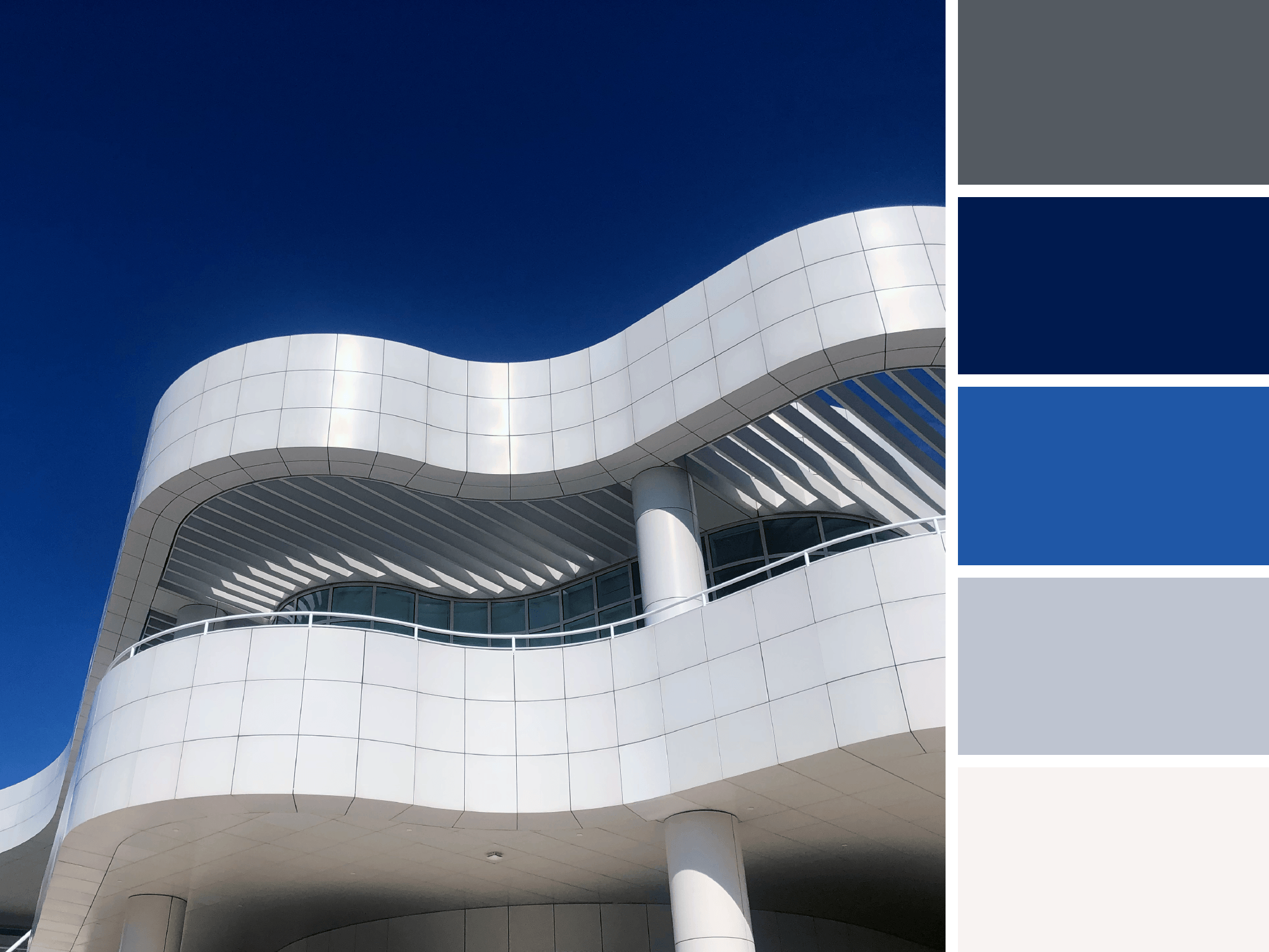
Getty Greys
A work of art in itself, the cool greys and whites of The Getty contrast a saturated and cloudless sky.
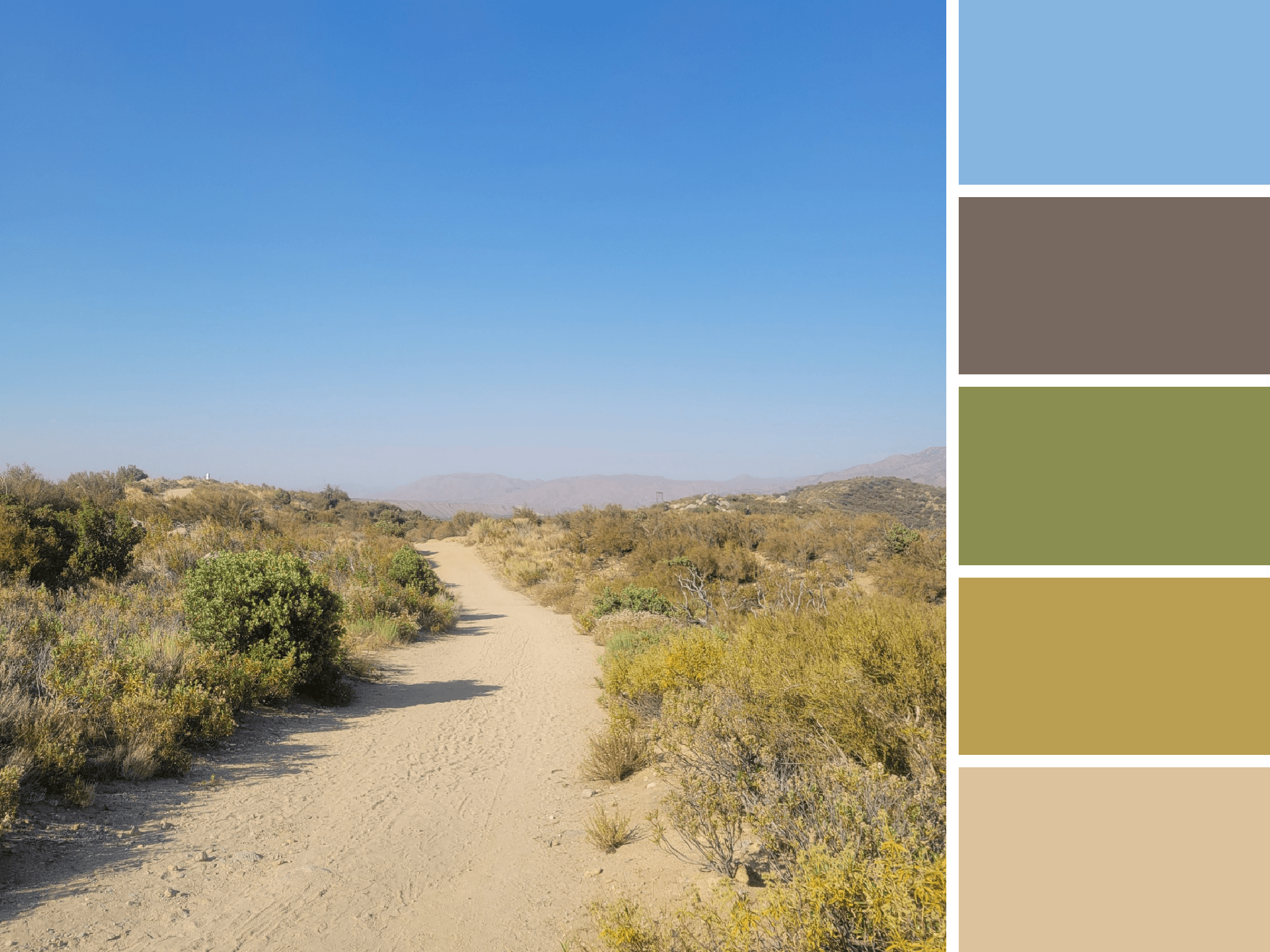
PCT Palette
This glimpse of the Pacific Crest Trail is rich with subdued greens and yellow. This palette fuses the hues of the desert sky with those from scrubby foliage.
Mismatched and Multicolored
A study in contradiction, we take inspiration from marrying the colors of this Barbie dream house with the more subdued tones that surround it.
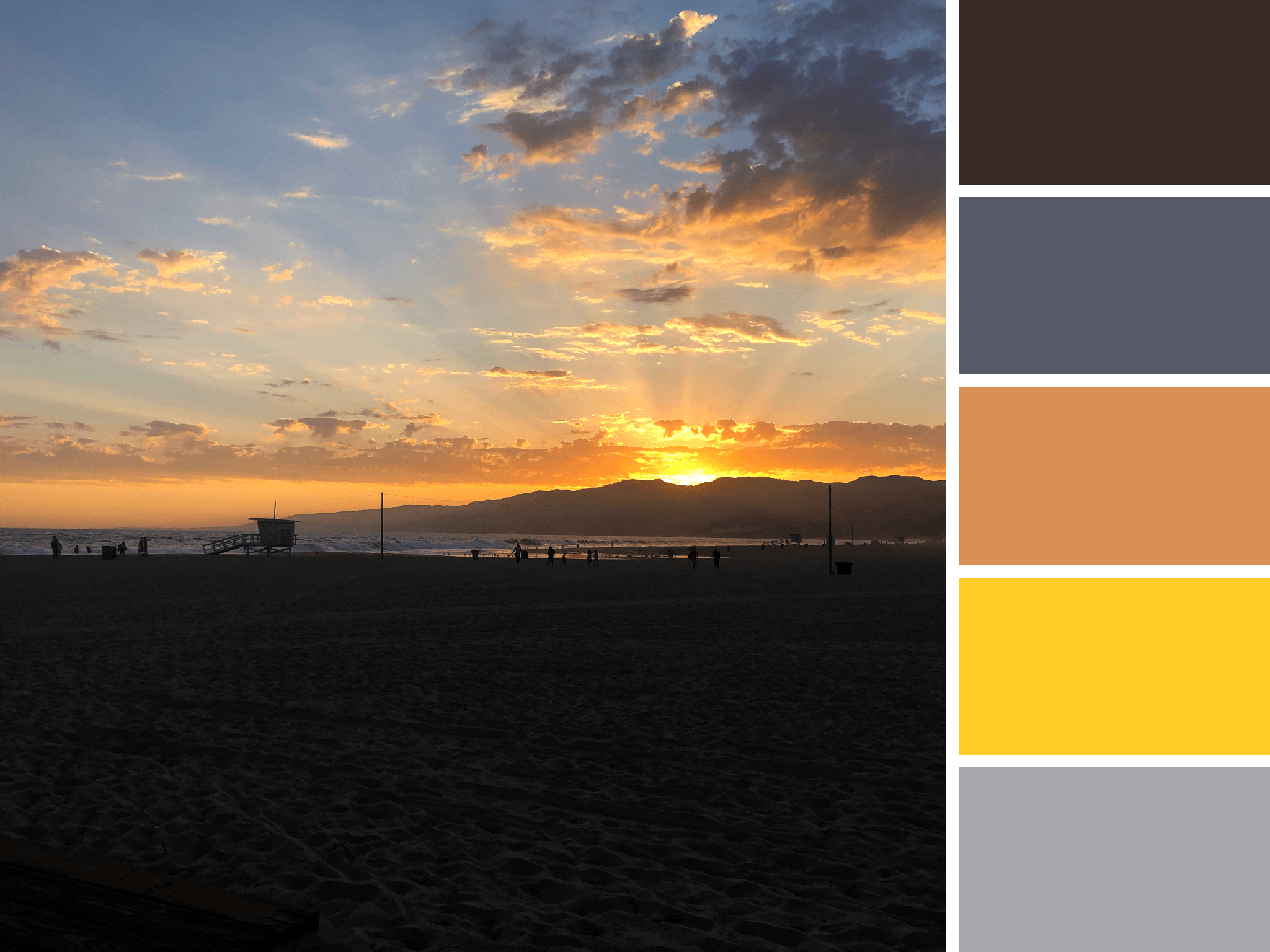
Santa Monica Sunset
As the sun set over Santa Monica, the sky was cast with vivid yellows and light oranges.
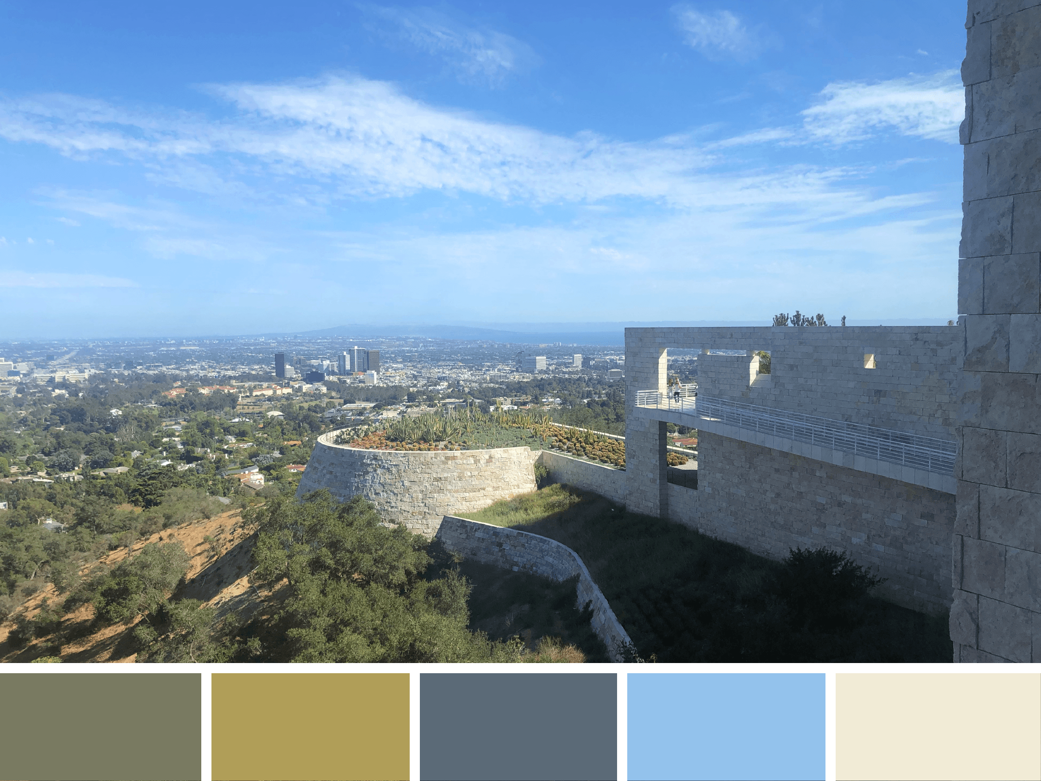
Plant life panorama
The greenery of The Getty’s cactus garden intermixes with the warm greys of downtown LA and the soothing tone of the travertine tile.
Curated Color
Spotted at LACMA, this work by Do Ho Suh is a 1:1 scale apartment sculpture is made of polyester fabric and stainless steel tubes. Soft colors create a ghostly and ethereal work of art.
Hollyhock Hues
Frank Lloyd Wright’s Hollyhock House is adorned by stylized hollyhocks on roof finials, furniture, art glass windows, and the ornamental bands of cast-concrete on the structure’s exterior. The real life flower lends a pop of bright pink to this otherwise tranquil scene from Barnsdall Art Park.
HUE & TONE CREATIVE: Let’s find what inspires you
Whether you’re based in Greensboro or beyond, we’ll help breathe new inspiration into your brand. Let us help you refresh your visual branding, website, and print collateral today. Schedule a meeting to get your next project started.


