5 tips for your LinkedIn business page

LinkedIn is by far the biggest lead-generating platform for businesses -- and it has been for quite some years. While Twitter (12.73%) and Facebook (6.73%) have their place, the professional networking site brings in 80% of all B2B social media leads.

Wondering why you’re yet to see this type of return from your page? It could be because you’re not maximizing all the opportunities it offers. As well as the standard tips — posting regularly, liking other people’s stuff, and replying to comments — there’s lots more that can be done to:

  • Improve your engagement

  • Boost your brand’s awareness

  • Increase your followers

  • Generate more leads

  • Secure more conversions

There’s no point in doing something if you’re not going to do it right though, so here are five pointers to help you get the most out of your LinkedIn page.

5 tips for your LinkedIn business page  |  Hue & Tone Creative

Tip 1: Follow the 1-3-1 rule

In general, social media accounts should follow the rules of thirds: 1/3 promoting your product or services, 1/3 interacting with others, and 1/3 sharing industry news.

Now you don’t have to take these numbers as gospel, but the point is, don’t just make your page all about you. For every post you create that’s centred around something you sell or you’ve written, share a couple of valuable pieces or tips from around the web before you make it all about you again.

For example:

  • Post #1: an interesting stat from a third-party source 

  • Post #2: an article from your blog

  • Post #3: a promotional post about an upcoming sale

  • Post #4: a link to your latest whitepaper

  • Post #5: a thought-provoking read from a relevant author

Tip 2: Use tracking links

When you do link back to your site use a custom URL so you know it’s come from your LinkedIn page, that way you can start to get an understanding of what type of posts a) drive people back to your site and b) convert.

Not sure how? Here’s a campaign URL builder to help you.


Tip 3: Focus on the first line 

The first few words of your posts determine whether or not people stick around and read the rest or carry on scrolling, so if you want to keep people engaged make it all about them.

For example, instead of saying “We’ve got 10 tips on how to train for a marathon” say “ Here’s how you can smash your marathon training 10 different ways.”

If you’ve lured your audience in that doesn’t mean you can start going off on a tangent though. Make your updates short and sweet and keep the desired end action in mind throughout. For example, if it’s for someone to read more about service X, do you give them ample encouragement and resources to do just that?


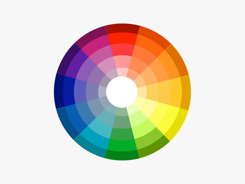
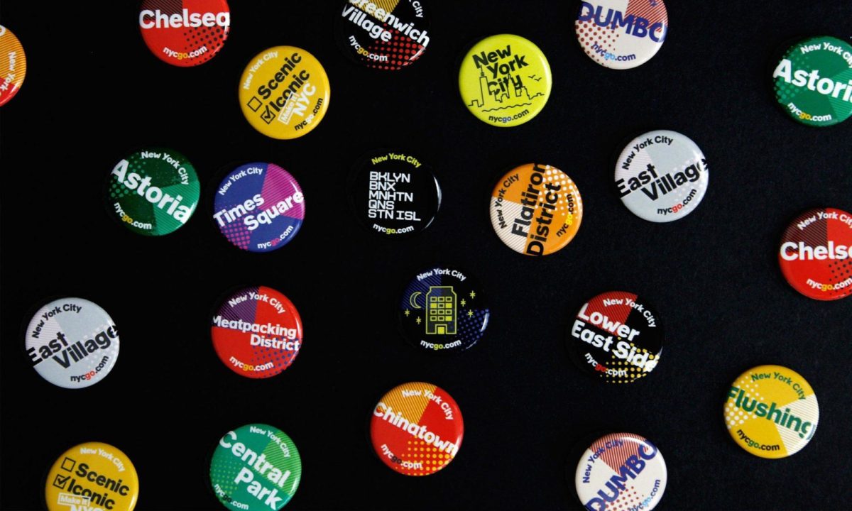
4. Incorporate visual elements

Did you know? Video posts are five times more likely to get comments.

You’re probably sick of hearing about this one but it’s so important and something many businesses forget to do. Complementing your words with a catchy image or video helps to bring your feed to life, grab your audience’s attention, and give people an instant flavor of what your posts are about.

And remember, neither has to cost a fortune. You can make smart looking videos on your smartphone nowadays (find out how herehere and here) and there are a whole load of free photo sites out there (Pixabay and Unsplash just to name two). 


5. Optimize your page

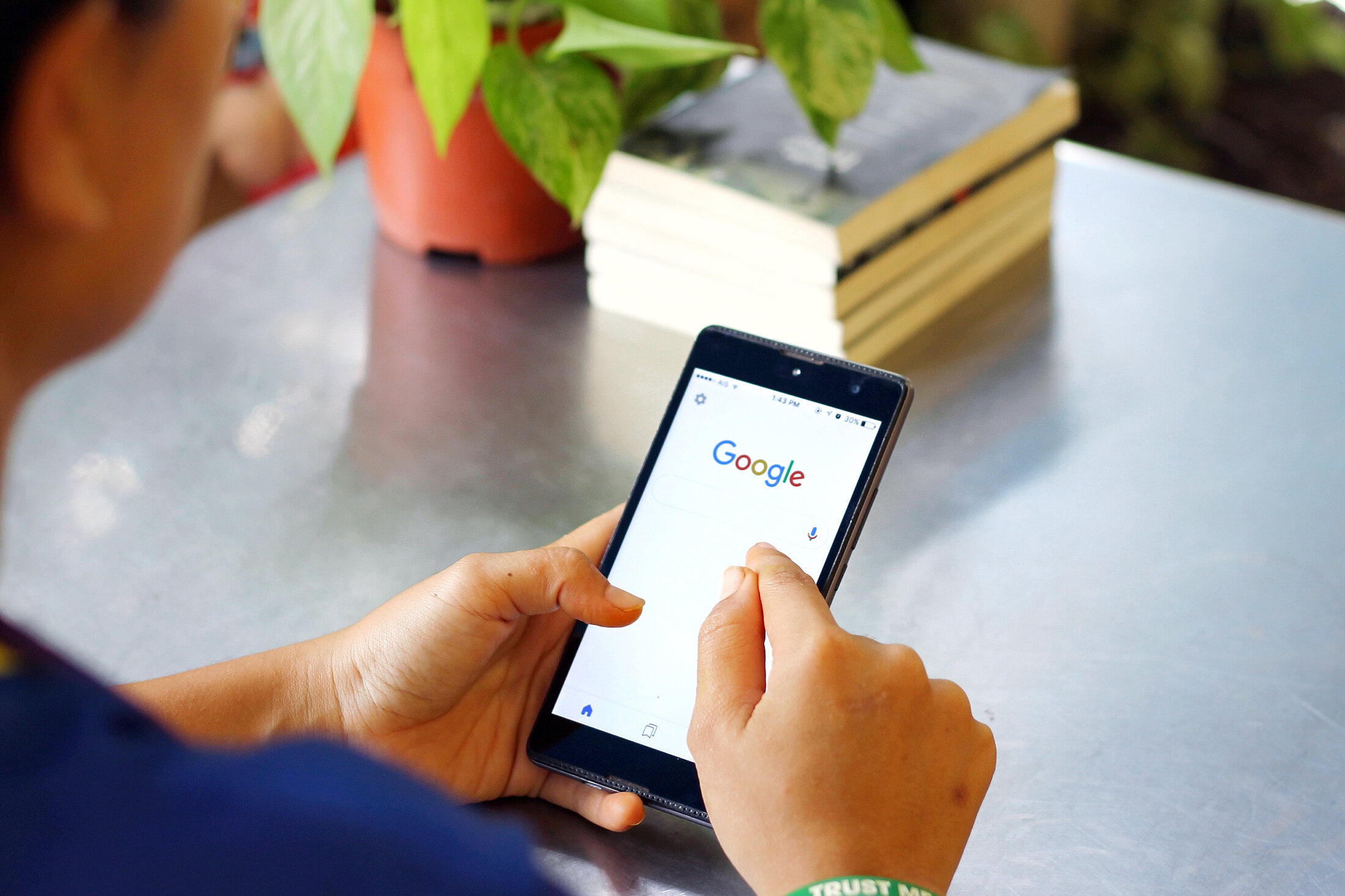
The same way Google ranks your website’s content, LinkedIn ranks your company page based on the information you include — especially in your ‘About Us’ section. So, take your time to write something compelling and remember to include key terms people are likely to search for.


Hue & Tone Creative: Your Marketing Partners

With a million other things on your to-do list, giving your LinkedIn page the TLC it needs can soon slip off the radar -- we get that and we can help. Whether you need support with your words, images, or the whole platform, get in touch at hannah@hueandtonecreative.com or (336) 365-8559 to see what we can do for you. 

Halloween Color Schemes

October is one of the eeriest times of year: Halloween, colder temperatures, the time change, end of year tax prep… it’s all pretty frightening. While most people associate this time of year with black and orange, there’s a much wider color palette we think you should consider for this spooky season.

If you’re looking for a color scheme to spruce up your latest seasonal advertisement or your creepy social media graphics, consider pulling swatches from one of these boards. In addition to the traditional orange and black we’re pulling in earth tones and shades of purple, green, red, white, and yellow. We’re even playing around with a few pops of pink! 

Artboard 1.jpg

Sinister Skies

Nothing evokes a Spooktacular feeling quite like a cloudy night sky. In this color scheme, a classic pumpkin orange pairs with goldenrod, a deep red, and an inky blue. 


Saturated Skeletons

These bright colors aren’t something you would usually associate with Halloween – but the dayglo orange and pink speak to the vibrant lights of a late night party. 


Artboard 12.jpg

Haunted Hues

Warm glowing lights illuminate the windows of this haunted mansion — the charred stone and cloudy sky inspire a more muted palette of deep orange and dark blue. With it’s toned down colors, this palette will work well for all of fall.


Macabre Mask

Pops of rich pink and teal stipple this haunting Day of the Dead face paint. The strong contrast between the deep black and accent colors creates an evocative calavera design.


Pale Pumpkins

You don’t have to use orange and black for halloween — and pumpkins don’t even have to be orange! These washed out hues show a different take on a classic halloween symbol.


Artboard 17.jpg

Frightening Forest

At first this image just looks shades of blue - but peer a little closer and you’ll see deep magenta and rich greens. Who knows what else might be lurking behind these colorful trees…


Artboard 18.jpg

Eldritch Eyes

Black cats are synonymous with bad luck, making them the perfect emblem for All Hallows Eve. Different shades of grey pepper his fur and his haunting green eyes will stay with you for days to come.


Hue & Tone Creative: Design work for every season

Not up for the work of creating your own holiday campaign? Whether you’re scrambling for last minute Halloween graphics or working on your winter campaign, we’re here to create the perfect imagery for you. Contact us to get started!

How to get the most out of Google My Business

Google My Business is a super useful (and free!) tool which helps build credibility and visibility in organic search results by pulling your organization’s name, address, number, hours, and reviews when searchers are looking for your business – or a business in your category. 

How to get the most out of Google My Business  |  Hue & Tone Creative

Are you a Google My Business newbie? Then you might find this back to basics blog helpful first.

Given 50% of smartphone consumers visit a store within a day of their local search (and 18% of them make a purchase) Google Business is not a sales tool you want to miss out on. Having a Google Business account and updating it effectively is a low investment, effective way to leverage technology to your advantage. 

There’s no use having an account just for the sake of it though. If you want to get results you need to optimize it as best you can so we’ve come armed with tips to help you do just that.


1. Make sure all your info is complete

That includes your location, opening hours, business category and contact details. If you don’t have your location set-up, you’ll be harder for local searchers to stumble across. And, remember absent or incorrect business categories can hinder your ranking opportunities. 

Although a lack of hours and contact details won’t impact your visibility, they will make it more difficult for people to take that next step — and even small typos or minor missing information could equate to a potential lost customer.


2. Act on your reviews

Along with your location, reviews are a key ranking factor that help Google understand how people rate your business. So, make a point of asking customers to leave a review and respond when they do — whether it’s good or bad.

Don’t worry, leaving a review is incredibly easy, all people have to do is:

  • Google your business

  • Tap on your Google My Business listing

  • Click the ‘write a review’ button

  • Write the review

friday_t20_bk0gO6.jpg

3. Answer questions - promptly

People can now ask questions on your listing for either you or members of the public to answer, and unanswered queries don’t exactly look great. Make a point of regularly checking in to see if any new questions have popped up and if they have, use it as an opportunity to really show off your expertise. 

Added bonus: Answering questions will help keep your profile active which can help improve your listing rank.


4. Use Google posts

Google posts let you highlight extra information (like upcoming events and special offers) and will redirect people directly to your website — which could help give your click-through rate a boost.

A few things worth noting:

  • These posts pop-up immediately in your listing

  • They’re removed from the default view after seven days or after the event date has passed

  • You can’t schedule or bulk upload posts

5. Invest in your images

According to Google, businesses whose listings have photos receive 42% more requests for driving directions and 35% more clicks through to their site.

The moral of the story? Add high-quality, relevant images. We suggest uploading a mix of photos — for example, if you’re a bakery, you might want to add images of your:

  • Storefront/seating areas

  • Products

  • Kitchen

  • Customers 

Worried your photos look lackluster? Here are 10 tips on how to take professional-looking photos on your iPhone.


Hue & Tone Creative: Your Strategic Business Partners

Whether you need help with your words or your images we’re here to assist you. To see how we can help take your Google My Business listing to the next level (or just get it set up) get in touch at hannah@hueandtonecreative.com or (336) 365-8559.

How often should you blog? (And, a big change to our posting schedule)
How Often Should You Blog?  |  Hue & Tone Creative

Be sure to read to the bottom of this post to learn more about why we’re switching up our blogging frequency!


Here at Hue & Tone Creative, we’re big proponents of blogging. We believe it’s one of the best ways to connect and grow your potential audience…and in turn, your revenue. 

Blogging gives you a regular (and free) platform to discuss your ideas, your business, and your expertise. By amplifying your content on social media (which is also free!) you’ve got the beginnings of a very successful marketing toolkit.  

The most important thing we tell people about blogging is that it’s part of playing the long game – if you don’t see big results immediately, stick with it. Even if you’re doing everything right, it can take months, even years, to see a big return on blogging. 

The more you blog, the more traffic you will see – and the more opportunities you will have to connect with your audience. Over time, you’ll get to know what they want and what questions they have.  

Still not convinced you need to make the long-term investment that is blogging? Growing your audience isn’t the only reason should post regularly, you’ll also: 
 

  • Earn more exposure/SEO Benefits: As you post more, you gain new opportunities to show up in search queries. Every time you blog you create additional pages. Additional pages tell Google what your site is all about and helps them know who they should serve your site to. 

  • Share your knowledge: Your readers might not be ready to hire you yet – but your blog will help keep your name front of mind and you’ll be the first person they call when they are ready to buy. 

  • Try out new ideas: While evergreen content provides your blog with longevity, sharing exciting new ideas and concepts on your blog can spark excitement with your audience. 

  • Help educate your clients and customers: Save yourself the time of constantly having to explain things by creating an easy to reference database for your audience. 

  • Build your professional network: Blogging is a great way to connect with potential clients/customers, other leaders in your industry, and community figures. 

  • Get to know your target audience: As your blog audience grows, you’ll get more and more questions from your target audience, which can help you shape and grow your future offerings. 

How Often Should You Blog?  |  Hue & Tone Creative


Blogging Frequency 

Once you’ve decided that you want to invest time into blogging, you have to decide how often you’ll be posting. Maintaining a regular frequency is important because it offers your readers consistency, and also helps with your internal organization. 

But, how often you should post is a very personal decision – one that should be informed by your industry, and how much time you have available to write quality content.  

Many businesses experience a boost in their profitability once they’ve amped up their blogging efforts, but other business owners may find they get more leads when they spend their time marketing their posts through social (while blogging less often). 

Ilfusion explains why blogging more is typically considered to be more effective:

“In general, the more blog posts you publish, the better the chances of capturing more traffic. Research shows that companies who blog 3 to 5 times a month, or around once a week, get twice the web traffic than those who don’t blog at all. This doesn’t conclude the ideal number of blog posts per month; rather, it bolsters the fact that, overall, businesses who commit to posting regularly on their blogs tend to reap the biggest rewards in terms of web traffic. The more you post, the more exposure your blog gets—and, over time, the results continue to pay out as your blog builds more traffic and consequently boosting your SEO ranking.”

Blogging frequently (more than once a week) is only a valuable use of your time if you can maintain high-quality content, avoid repetitive topics, and continually appeal to your target audience.  

About four years ago, we started out by blogging twice a week. Once we had built up a valuable backlog of content (after about six months) we moved to posting once a week – and we’ve maintained that frequency for a little over three years. 

Now, we’re planning to make the shift to blogging every other week. We’ll still be bringing you valuable content on everything marketing, graphic design, and social media related – but we’ll only be posting about twice a month. This will allow us to put more time into each post, so you can expect longer, more in-depth posts starting the first week of October, 2019. 

Curious why we’ve made this choice? There are a few big reasons that pushed us to make this decision:

  • We need more time to focus on client work: Our calendar is booking a few months out these days, and we want to free up as much time as possible to focus on the projects we’ve got booked. 

  • We want our blogs to be the highest quality possible: Less posts means we’ll be able to produce higher quality (and more in-depth) content. 

  • We want more time to spend on content promotion: Writing less gives us more time to focus on marketing and promotion for both new and old content.

Now that we’ve explained our rationale behind how often we post, tell us: How often do you blog? What drove the decision behind your posting frequency?  


Hue & Tone Creative: Marketing, Design, and Beyond

Need help getting your social media and blog calendar on the right track? We’re here for that! We don’t write your copy – we help you develop your strategy. From social media to blogging we’ll help you determine everything from the right posting frequency to the topics you should be posting about. Contact us to get started.

How color affects your brand
How Color Affects Your Brand  |  Hue & Tone Creative

Whether you’re a real estate agent, hairdresser, baker, or jeweler, color plays a big part in your brand, because it affects how you attract and connect with customers. 


What’s color psychology?

It’s the relationship between colors and human behavior — for example, does a yellow logo elicit more trust? Or does grey packaging make people more likely to purchase your product? 

Color psychology explains the meaning behind why people (in and out of the business world) prefer certain hues over others. It also takes into account individual color biases when deciding on a specific color — like upbringing, gender, location, and values.


Why is it important? 

Color evokes feelings and emotions — and feelings and emotions can make or break sales. Take the time to get it right and your organization could benefit from:

  1. Standing out from the competition 

  2. Positioning itself the way it wants to be perceived 

  3. Influencing how customers digest and interpret your information 

  4. Improving credibility and trustworthiness


Colors and their meaningS

How Color Affects Your Brand  |  Hue & Tone Creative

Red

Feelings: excitement, passion, danger, energy and action

In the color psychology world, red is seen as the most intense color for creating strong emotions and attracting attention -- which is why a lot of businesses use it for their ‘Buy Now’ buttons. 

Tip: Because red can be associated with danger it’s best to use it sparingly.


How Color Affects Your Brand  |  Hue & Tone Creative

Orange 

Feelings: creativity, adventure, enthusiasm, success and balance

Orange is also an impactful color but on a less overwhelming scale, so it can often be used in larger doses without becoming overbearing. Because of its eye-grabbing nature, a lot of businesses use orange for call-to-actions.


How Color Affects Your Brand  |  Hue & Tone Creative

Yellow

Feelings: happiness, positivity, optimism, summer, warnings

Centered around the sun, our emotions around yellow are largely upbeat and summery. But, on rare occasions, yellow can be construed as dangerous too (think construction zones).

Exploring some color scheme options? Check out a few of our mood boards herehere, and here.


How Color Affects Your Brand  |  Hue & Tone Creative

Pink

Feelings: femininity, playfulness, immaturity, and unconditional love

Because of its connotations, pink is mostly used by companies who predominantly target females -- big name brands that follow suit include Barbie and Victoria’s Secret. Remember it can reflect immaturity though, so it’s important to choose the tone and quantity of pink carefully.


How Color Affects Your Brand  |  Hue & Tone Creative

Green

Inspired by nature? We’ve got some inspiration here.

Feelings: growth, fertility, health, and generosity

As far as color psychology goes, green is tightly associated with nature and money, and is commonly used by health and fitness businesses. It does have its negative ties though, like envy.


How Color Affects Your Brand  |  Hue & Tone Creative

Blue

Feelings: stability, harmony, peace, calm, and trust

Linked to the sea and sky, blue has a lot of security-related emotions attached to, making it a go to choice for retailer’s guarantee icons, certificates, or shipping icons. On the other end of the spectrum, it can also be connected with depression and coldness. 

Tip: With blue, the tone you choose will make a world of difference in the vibe you give off, so take your time to make sure you pick the right one. We suggest doing a little research on the specific shades of blue to take your color psychology research a step further!


How Color Affects Your Brand  |  Hue & Tone Creative

Purple

Feelings: power, nobility, luxury, wisdom, and spirituality

Purple is packed with royal vibes and is tightly linked to connotations of wealth, extravagance, and pride. Be careful with how much you use this one, because too much can leave people with an impression of frustration or even arrogance. 

With purple it’s all about the shade, tint, and hue you use: 

  • Light purple = feminine energy and delicacy

  • Dark purple = feelings of gloom, sadness, and frustration

  • Bright purple = riches and royalty


How Color Affects Your Brand  |  Hue & Tone Creative

White/Black 

White

Feelings: innocence, goodness, cleanliness, and humility

White can bring mental clarity, promote feelings of fresh beginnings, and encourage positive thoughts; which is why many businesses use it as the backdrop for product shoots. 

It likely goes without saying that black text on a white background is the number one readability combo, but just be mindful that too much white can leave a sterile and cold impression.


Black

Feelings: mystery, power, elegance, and sophistication

Too much black can be overwhelming and give off negative emotions -- like sadness and anger, but just the right amount can evoke strong doses of the right kind. Think strength, authority, and seriousness.


How Color Affects Your Brand  |  Hue & Tone Creative

Grey 

Feelings: neutrality, balance, and timelessness.

Balance is key if you’re dabbling with grey and less can often be more — stick to using it for things like fonts, headers, and graphics is a safe bet. Large quantities can be quite dull and bring out the connotations of depression and loss, so make sure to pick your placement wisely.


How Color Affects Your Brand  |  Hue & Tone Creative

Brown 

Feelings: comfort, security, wholesomeness, and honesty

Symbolizing earth, wood, and stone, brown is all about nature and can correspond with feelings of comfort, security, warmth, and stability.

You probably don’t tend to see brown used in large volumes, because it can be considered a bit boring. In small doses, brown can serve as a great alternative to cooler grays, and can evoke a feeling of warmth and security.


Hue & Tone Creative: Colors are our specialty

Whether you need to rebrand, are looking to launch a social media campaign, or design a billboard, we’ll help you find the color that evokes the right emotion. Want to learn more about how we might work together? Get in touch at hannah@huetonecreative.com or (336) 365-8559.

How to improve your designs using color theory
How to improve your designs using color theory  |  Hue & Tone Creative

Be honest, how many times have you sat and stared at your screen experimenting with endless color pairings only to realize three hours later you’re no further down the line? 

Frustrating, isn’t it?

Well, designers don’t hit the jackpot just by luck, they use what’s called color theory. Color theory is a term used to describe the collection of rules and guidelines regarding the use of color in art and design – and it is defined as a theory because it cannot be proven.  

Color theory is a science and art in it’s own right – but even non-artists can gain a basic understanding of color theory to better understand how to make a pleasing design. Knowing which colors play well together and the effects specific colors have on a majority of people is a valuable expertise no matter what your field.

What’s color theory?

Image via dulux.co.nz

Image via dulux.co.nz

The color wheel is a tried and tested blend of art and science that show you which hues go well together. The color wheel we use today is based off Isaac Newton’s 1666 color wheel which shows the relationship between colors. Sir Isaac Newton created the color wheel based on his experiments with prisms that led to the theory that red, yellow and blue were the primary colors from which all other colors are derived.

Now we’ll dive into a breakdown of how to use the color wheel for your own branding and design projects. By following these simple rules, you can shave hours off your next color-picking expedition and end up with a better-looking final product!


Complementary

Image via Canva.

Image via Canva.

Any two colors that sit on opposite sides of the color wheel -- like blue and yellow or pink and green, for example. Complementary colors are high in contrast and impact and work together to create bright results.


Monochromatic

Image via Canva.

Image via Canva.

Want a headstart? We’ve got lots of great color themes to choose from here.

These are shades of the same color and result in subtle and harmonious finishes. While monochromatic combinations are great for creating a consistent feel another color will need to be brought into the mix to add another layer to your work -- otherwise, everything will start blending into one another.


Analogous

Image via Canva.

Image via Canva.

Tip: to prevent that from happening pick one of the three for your dominant color and then use the other two as accents.

Any three colors that sit side-by-side on the color wheel -- like orange, yellow and green. On the plus side, these can be really versatile combinations, but on the downside, if you don’t manage them right they can soon become a bit tooin your face.


 Triadic

Image via Canva.

Image via Canva.

Make sure you get your proportions right for this one! Triadic colors sit at three evenly spaced intervals on the wheel and hit that right balance between contrast and versatility.


Tetradic

Image via Canva.

Image via Canva.

Similar to the above but this time across fourevenspaces. If you’re going with this option just remember the more colors you use the harder it’ll be to balance what’s on your palette -- and less can certainly be more sometimes. 

To avoid overwhelming people, as with analogous combinations, pick one color as your dominant and use the rest as accents. 


4 good-to-know color wheel facts

1. It’s made up of 12 colors: red, orange, yellow, chartreuse green, green, spring green, cyan, azure, blue, violet, magenta and rose.

2. It can be split into three color types:

  • Primary: colors that create pure white light when blended together (red, green and blue)

  • Secondary: the result of mixing two primary colors, i.e. green and blue make cyan

  • Tertiary: there are six in total and they’re the byproduct of combining a primary and secondary color

3. The two halves of the wheel make up warm (purple through to yellow) and cool (blue through to green) colors. 

4. If you add black, grey or white to any base hue you can create shades, tints and tones of any color:

  •  Shades darken the color and are made by adding black

  • Tints lighten and are conceived by adding white

  • Tones create a subtle version of the original color when white and black (or grey) are added


Hue & Tone Creative: Your partners in color

If this blog post left you feeling more confused than clear, why not hand the hard part over? We’re design experts through and through so you can trust us to find the perfect pairings for you. Interested? Get in touch on hannah@hueandtonecreative.com or (336) 365-8559.

10 creative swag ideas that will get you seen

In the world of events, corporate swag is becoming more of an expectation than a nice-to-have nowadays, but, with almost every organization out there opting for the staple tote bag or a safe ballpoint pen, how do you stand out from the crowd? 

By doing something different. Whether you’re hosting a conference or running an end-of-summer giveaway we’ve racked our brains to come up with 10 swag ideas that break the norm and keep your swag out of recycling bin. 

No matter what item you opt for, remember the goal is to strike the right balance between splatting your branding over it and creating something useful or trendy that people will actually want to keep.


1. Cookie-cutter

10 creative swag ideas that will get you seen | Hue & Tone Creative

There’s two great options here -- either use a more standard shape (like a heart, star, or gingerbread man) and customize the cutter itself with your colors and logo OR make the shape symbolic to your brand --  such as your logo or a representation of it.

If it fits your brand you could even bring out seasonal iterations of your cookie cutter for Thanksgiving, Christmas, Halloween, Valentine’s Day or Easter.


2. Lunch box

We all need to transport our food in something snazzy -- so why not give people a great lunch box that just happens to boast your logo? This custom container will be seen by all their colleagues and hopefully spark a discussion about your brand over lunch.

If you’re looking to take your trendiness to the next level, consider a branded Bento Box instead! 


3. Stress ball 

Because who doesn’t get stressed from time-to-time?

Not that we’ve not done any research to back this theory up, but there’s certainly a chance that relieving stress while seeing your logo could help people exude positive feelings towards your organization… isn’t that exactly what we’re after? 

10 creative swag ideas that will get you seen | Hue & Tone Creative


Tip: 
If you really want to spark a conversation think outside the box and go for something really unusual -- think avocadoes sipping a pina colada kind of out there!


4. Pool float 

Why not hit the pool with your favorite clients or customers? Whether you go for a flamingo, donut, your logo or something super simple, a custom pool float gives you a wide swath of realty to show your branding off.


5. Reusable straw

Being environmentally friendly has never been more important than it is now so do your part for the planet and your brand image by creating custom stainless steel or silicone straws. You can put them in a branded travel pouch or paint your branding across the whole thing... the color of the straw, your logo on the end, the whole thing! 


6. Christmas tree ornament 

T’is the season to...get your brand in everyone’s homes. If you want this one to work remember to get the right balance between your branding and festive vibes -- if it’s too much of the former and not enough of the latter you might not make it onto the tree.


7. Golf kit 

They say the golf course is where business is done, right? Get your brand in the middle of the conversation with some bespoke tees orballs.


8. Umbrella

On a rainy day your branded umbrella could offer up as much advertising space as a small billboard -- but for a fraction of the cost. This one’s super practical too, making your odds of securing a spot in someone’s handbag all the more likely. 


9. Bottle stoppers

Simple, small, but extremely useful -- and something people would probably be very grateful not having to spend their own money on. You won’t have a great deal of space to work with though, so remember to be sensible with the dimensions you havegot.

Or, consider upgrading to a custom corkscrew and bottle stopper set… all in a handy travel case! 


10. Customized Pop Sockets

When’s the last time you or anyone you know left the house without their phone? Exactly. People don’t go anywhere without it nowadays and, if you get it right, your Pop Socket could be with them every step of the way; opening you up to lots of new eyes every day. 


Hue & Tone Creative: Your Marketing Partners

If you’ve decided you need swag but you’re left with a big design-sized hole in your plans then we’re here to help bridge that gap. Get in touch at hannah@hueandtonecreative.com or (336) 365-8559 to get the ball rolling today. 

Real estate: marketing tips to win more business

In every city there are tons of realtors vying for the same business and that makes getting customers to seal the deal that much harder -- so don’t put yourself at a disadvantage by missing prime marketing opportunities.

For example, listings with high quality photos sell at or above their listed price 44% of the time? And, that 70% of homeowners prefer to list with someone who uses video marketing?

These five simple but seriously effective tips you could start sticking it to your competitors and winning more business right now.

Real estate: marketing tips to win more business | Hue & Tone Creative


1. Make your properties easy to share

New to social? Here are a whole load of real estate-specific tips.

By adding social sharing buttons (Facebook, Twitter, Pinterest and Instagram) to all your listings. Even if only a handful of searchers go ahead and share you’ll potentially open yourself up to 100s, if not 1,000s, of new prospects -- for free. 

Remember to make your sharing buttons super easy to see and use, because the harder you make it to find them the more chance people will click away from your site without taking action. 

2. Set up a referral program

Let past customers market for you by incentivizing them to recommend you to their friends with something like a $200 referral fee. If you decide to start a referral program remember to:

  • Make it clear the fee’s only applicable if the person they referred actually buys or sells with you

  • Promote your scheme across your email, social media and website campaigns, as well as on-site and in-person too


3. Support the community

Whether it’s a local athletics club, school or charity, get your name out there and support the community with some good old-fashioned sponsorship. 

Not only will you boost your brand’s awareness, but you’ll show people you’re a company who cares too -- and that can do wonders for your reputation, putting you a cut above your competition.


4. Don’t just use images

Not sure where to start? Check out part onetwo and three of how to make professional videos on your iPhone.

With the starting stat in mind, think about branching out into the video world for your listings. It’ll:

  •  Give you a chance to show your personality

  • Cater to what you know people want

  • Better showcase your listings

  • Give you a competitive advantage (if your competition’s not already taking the lead)


5. Partner with a local organization

If you don’t ask you don’t get. So, see if you can open yourself up to new audiences by teaming up with, say, your local coffee shop and asking if you can buy them a new set of takeout containers with your branding on the front.

They’ll benefit from the free supplies and you’ll benefit from more exposure. Just remember to include key information like your:

  • Name

  • Logo

  • Contact details 

And make sure the end finish looks top-notch -- after all, the quality of your marketing materials says an awful lot about your business, so if you’re going to do something (and want awesome results), do it properly. 


Hue & Tone Creative: Your Marketing Partners

The problem with all of the above? It requires time, resources, and expertise you might not have in-house. But don’t worry, we can fill those gaps for you. Get in touch at hannah@hueandtonecreative.com or (336) 365-8559 to see how.

8 cities with great branding

Think branding is just a logo? Think again — let us break it down for you here.

Behind every good-looking package or ad is a carefully investigated backstory, fastidiously selected colors, and meticulously outlined brand guidelines. While branding businesses is nothing new, businesses aren’t the only entities that need high-quality branding. Cities, townships, and entire countries have also begun branding their space in an effort to lure in tourists, new citizens, and potential business. 

8 cities with great branding  |  Hue & Tone Creative

Elements of place branding can include culture, visual symbols, slogans, mission, vision and values.

No matter what size your city is, branding can help put your place on the map. From America all the way over to Australia, here’s a look at some of the best: 

1. NYC

Milton Glaser’s ‘I <3 NY’ artwork is inarguably one of the most iconic city graphics around, but their branding doesn’t stop at one iconic t-shirt.

Bellweather was in charge of creating NYCgo’s official identity – and it reflects NYC’s personality with it’s bright colors, diversity and motion. Attracting more than 60 million visitors a year, the city clear doesn’t have a tourism problem – but this diverse and complex brand brings a life and continuity to the city’s visuals. 

Images via Bellweather and logoworks.com


2. Melbourne

Developed by Landor, Melbourne’s logo is fresh, energetic, and memorable. Despite being around for a few years, this brand still feels modern and fresh — the sign of a well thought out and designed identity. Encompassing a wide variety of colors and patterns this vibrant brand is a reflection of all that Melbourne life has to offer.

Images via Landor.


3. Paris

Paris’ most memorable brand doesn’t come from city government, but rather from their tourism organization, the Paris Convention and Visitors Bureau. Grapheine’s typographic masterpiece subtly incorporates the French capital’s most famous landmark. And, in our opinion, everything about the color, spacing, and typography are expertly executed… in addition to making Paris look pretty cool!

 Images via Graphiene.


4. I Amsterdam

Renowned for sex, drugs, and canals, this 2004 campaign helped put Amsterdam back on the map for more than just a fun weekend away. This branding effort was born out of an effort to appeal not only to tourists, but also to those already living in the area.

Despite simple graphics, Kesselskramer’s message is incredibly complex and versatile.

Images via Kesselskramer.


5. Las Vegas

Funky, fun and full of color, Pink Kitty Creative’s city government branding depicts everything Las Vegas stands for in one: bright lights, late nights, and lots of laughter. While we find the “City of” typography a bit weak, we enjoy the color palette and playfulness of the logo. 


6. London

London has a lot of rich roots and landmarks. From Big Ben and the London Eye to the monarchy and 2012 Olympics, London is known for a lot of things — but lacks a central message. Their latest rebranding, which was led by Saffron, cleverly includes a taste of the River Thames with the royal red of the union jack. It’s very simple yet incredibly commanding. 

From Saffron’s website: “So, people pick up their ideas about London from books, television, social media and a wide variety of other influences – none of which can be controlled and many of which are misleading. Rocked by the financial crisis, security threats and even street riots London needed a concerted effort to bounce back and regain its confidence as the world’s leading global city.”

Images via Saffron


7. Porto

Redesigned by White Studio in 2014, Porto’s branding is bold, unique and intricate. Without even stepping foot in Portugal, you can get a feel for the vibrance and life that the city has. It gives people a real feel for what the city is about – and the creativity 

 Images from underconsideration.


8. Colorado

Designed in-house to showcase how spectacular the state is, Colorado’s ‘C’ symbolizes their strength and friendliness while simultaneously bringing their famous and stunning backdrops into the frame. This is a recent rebrand (rolled out in July 2019) so while we’re cautiously optimistic about what the entire brand will look like, we’re holding our breath until full brand guidelines are released.


Hue & Tone Creative: City Branding Partners

Let’s make your place stand out. Whether you’re a city, state, business, or charity, we can help. Get in touch at (336) 365-8559 or hannah@hueandtonecreative.com to start your rebranding journey today. We’ll get everything from your new logo to print collateral overhauled — on time and on budget.

12 great free Google fonts

Looking for more inspo? Here’s our list of MUST download free Google fonts.

12 Great Free Google Fonts  |  Hue & Tone Creative

Google’s got around 915 fonts in its directory. Having a wide selection is great, but this can be a lot to sort through. You’ll probably be able to find the perfect font for your piece, but where do you even start?! 

Aside from the fact that Google Fonts are free, millions of people turn to Google fonts for its simplicity, easy-to-implement set-up, and high quality selection. The fact that a number of these fonts are available for print use is another great bonus. If this is your first time using Google to pick a font, you can find step-by-step instructions on the ‘how’ here.

To save you a bit of time scrolling through pages and pages of typography, here are 12 of our favorite freebies.


Popular choices

Numbers don’t lie. The first six on our list were the most viewed fonts over the last seven days, 30 days, 90 days, and year. 

12 Great Free Google Fonts  |  Hue & Tone Creative

1. Roboto, by Christian Robertson

Roboto’s a sans-serif font and comes in 12 different styles (thin, thin italic, light, light italic, regular, regular italic, medium, medium italic, bold, bold italic, black, and black italic). 

It’s known for its natural reading rhythm and features friendly, open curves.


12 Great Free Google Fonts  |  Hue & Tone Creative

2. Open Sans, by Steve Matteson 

Another sans-serif font, Open Sans has 10 styles to choose from. It’s featured on Google’s sites, and in print/web adverts. This font is endorsed by some of the biggest brands out there.


12 Great Free Google Fonts  |  Hue & Tone Creative

 3. Lato, by Łukasz Dziedzic

When creating Lato, Dziedzic wanted to come up with something transparent enough for body text while comprising unique traits for larger sizes; and he did just that.

With semi-rounded details and strong, structural entities, Lato oozes warmth, stability and seriousness all in one.


12 Great Free Google Fonts  |  Hue & Tone Creative

 4. Oswald, by Vernon Adams, Kalapi Gajjar, and Alexei Vanyashin

Originally created by Vernon Adams, Oswald has seen a number of interactions over the years based on user feedback.

It was designed to be appropriate for use across desktop computers, laptops and mobile devices and comes with six different styles - extra-light, light, regular, medium, semi-bold, and bold.


12 Great Free Google Fonts  |  Hue & Tone Creative

5. Slabo, by John Hudson

Slabo has just two weights. What’s unique about this one is that it’s specifically designed to be used at a certain size -- either 27px or 13px depending on your piece.


12 Great Free Google Fonts  |  Hue & Tone Creative

6. Roboto Condensed, by Christian Robertson

Part of the Roboto and Roboto Slab family, Roboto Condensed refuses to compromise. Its letters are freely positioned to settle into their natural width without encroaching on their neighbors, and it adds impact to body and heading copy alike. 


Hidden gems

Our next batch of fonts are just as easy to use and read but are less well-used, giving you chance to create something a little different.

12 Great Free Google Fonts  |  Hue & Tone Creative

7. Arvo, by Anton Koovit

Best suited to heading and sub-headings, Arvo’s a slightly more edgy font with tints of contrast. Available in regular, regular-italic, bold and bold-italic, you can tailor its impact to your tastes and needs too.


12 Great Free Google Fonts  |  Hue & Tone Creative

8. Bree Serif, by TypeTogether 

Charming, original and versatile by nature, Bree Serif was an instant hit when it first came onto the scene back in 2008 -- and we can see why.


12 Great Free Google Fonts  |  Hue & Tone Creative

9. Sanchez, by Daniel Hernandez

Sanchez is a slab-serif typeface and it’s simple, scannable, and distinguishable. It might not be for everyone but if it fits your organizations feel it can be a solid design choice.


12 Great Free Google Fonts  |  Hue & Tone Creative

10. Hammersmith One, by Sorkin Type

Low in contrast, unique in style, and subtle in curves Hammersmith One was built specifically for web-use. Although it does still work well to smaller sizes, it’s perhaps best limited to titles, sub-headings, and short intro paragraphs.


12 Great Free Google Fonts  |  Hue & Tone Creative

11. Catamaran, by Pria Ravichandran 

With nine different text weights Catamaran’s incredibly versatile and, in the designer’s own words, “strikes a balance between typographic conventions and that bit of sparkle.”


12 Great Free Google Fonts  |  Hue & Tone Creative

12. Playfair Display, by Claus Eggers Sørensen

Used across millions of websites worldwide, this transitional font’s functional and stylistic and pairs well with Georgia for body text. Other popular couplings include a few of our already mentioned Google Fonts: 

  • Lato

  • Roboto

  • Raleway

  • Oswald

  • Open Sans Condensed


Hue & Tone Creative: Your Font Partners

Finding the right font for your website, flyer or social media advert can be really tough -- we get that. If you’re struggling to find a font that gels with your work, we can help. Get in touch at hannah@hueandtonecreative.com or (336) 365-8559 to see how.

Making the most of Adobe Fonts’ features
Making the most of Adobe Fonts’ features  |  Hue & Tone Creative

The right font can work wonders for your brand by helping you connect with potential customers, hold peoples’ attention, and convey the right mood or feeling. But the wrong font can do quite the opposite -- allowing letters to get lost, making words difficult to digest, and alienating your artwork from your brand.


First off, What is Adobe Fonts?

In a nutshell, Adobe Fonts (previously Adobe Typekit) is a library of 1,000s of free and paid-for fonts for people to use directly on their website, sync with their Creative Cloud subscription, or both.

If Adobe’s your go-to for design work you’re probably already familiar with Fonts, but are you getting the most out of what it has to offer? Whether you’re a newbie or not, it’s got lots of features to help you save time and personalize your fonts -- and we’ll be covering our favorite features in this post.

Top tip: if you’re after even more recommendations, here are some of our favorites too.

1. Get a headstart with recommendations

If you’re a beginner at type design, Adobe has a recommendation tool to help you decide on fonts that are best suited for paragraphs or headings.

For those that are new to the font-selection world, you need something that’s easily legible across various mediums at a small size for paragraph copy, and for headings you can be more adventurous with bigger, bolder and more decorative styles -- that are still readable, of course.

2. Save time and filter fonts 

With so much choice at your fingertips scrolling through endless styles can be a pretty tedious and time-consuming task.,If you’ve got a good idea of what you’re after, cut out what you don’t want by filtering specific properties, like: 

  • Weight - the thickness of the stroke

  • Width - the width of the actual letters

  • X-height - the ratio of lowercase letter height to uppercase letter height

  • Contrast - the ratio of thick and thin strokes

  • Standard or caps only - i.e. fonts that use lower and uppercase letters, or fonts that only use capital letters

  • Default figure style - choose between Oldstyle (more old-fashioned) or Lining (more modern) for your numbers

Making the most of Adobe Fonts’ features  |  Hue & Tone Creative


3. Use the right font availability

What’s the difference? Web fonts are used directly on your site, and synced fonts are imported to your Typekit for in-program use on things like Photoshop and Illustrator. Discover how to install fonts here.

Whether your artwork’s for print or web should determine the font you use, which means it’s important you’re clear on the end-use from the outset.

To make choosing the right font easy Adobe differentiates between web fonts and synced fonts, so make sure you pick one from the right category.

4. Test your chosen font

Adobe’s ‘type tester’ feature allows you to see how your chosen font(s) look online before you add them to your kit and invest time into updating your design work.

To put this feature into practice, just head to the main browsing page where it says “Use fonts” and then click the “Web” tab when a pop-up appears. If you like what you see all that’s left to do is to add the font to your Typekit.

5. Use contextual alternates

Sometimes, certain glyphs can be a bit intrusive or distracting and the last thing you want is to jar readers as they’re scanning your copy -- but Adobe’s contextual alternates (calt) feature can help you overcome this.

It’s particularly useful when using script typefaces and it works by replacing default glyphs with better-performing alternatives.

Need help? You can find more about line and character spacing here.

6. Experiment with your spaces

If you’ve selected your font but you’re not 100% happy with the spaces between characters, lines and paragraphs, remember, you don’t have to settle with what you’re given as standard. To create something that gels perfectly with your page experiment with your gaps by opening the ‘Text properties’ box and playing around with the spacing options.


Hue & Tone Creative: Your partners in design

Still confused about what font to pick? If some (or all) of this post went over your head, we can help! Design is our forte and we’re known for helping organizations find their perfect font -- without fail. Drop us a line on hannah@hueandtonecreative.com to find out more.

75 great promotional words to use
75 great promotional words to use  |  Hue & Tone Creative

The words you use have a direct impact on the actions people take. They’re the difference between someone looking at your advert and thinking “hmm, sounds interesting” and “wow, I’m going to give them a call right now.”

Needless to say, every single organization out there is striving for the latter. 

Take a look at this line for example:

  1. Start earning money today

  2. Start making money today

Both deliver the same message, but the second is more impactful. Why? Because making money sounds simpler than earning it, and in a dog eat dog world where everything’s about maximizing profit - easily, that’s exactly what people are after.

Boosting your conversion rates really could be as simple as tweaking the odd word here and there, so, let today be the day you go through your websiteoffline collateral and online adverts and see where you could be making the most of stronger alternatives.


Words that create reassurance

If you want to convert a prospect into a customer you need to give them a reason to believe what you’re saying and trust what you’re selling. So, here are some words that incite just that:

  1. Promise

  2. Guarantee

  3. Risk-free

  4. Unconditional

  5. Proven

  6. Tried and tested

  7. Protected


Words that create a sense of urgency

Whether you’ve got a promotion that’s due to expire or you just want to encourage your audience to buy now, these words will give them a nudge in the right direction. One thing worth mentioning though is not to over-use these kinds of words, if you do, over time, they’ll lose their effectiveness. 

7. Now

8. Last chance

9. Flash sale

10. Call today

11. Quick

12. Expires

13. Soon

14. Immediately

15. Hurry

16. Ending

17. Going-fast

18. Limited

19. Last

20. Don’t miss out

75 great promotional words to use  |  Hue & Tone Creative


Words that promote ease

People are busy. They don’t have time to faff around and they want products and services that make their life easier, so let them know yours does just that with words like:

21. Easy

22. Simple

23. No-fuss

24. Hassle-free

25. Smooth

26. Painless

27. Straight-forward


Words that invoke value

As a society, we’re a demanding bunch; we don’t just want ease, we want value for money and deals too. You can cater for all these needs with words like:

29. Bargain

30. Free

31. Discount

32. Freebie

33. Sale

34. Value

35. Save

36. Buy one, get one

37. Elite

38. Premium

39. Effective

40. Popular

41. Market-leading

42. Best-seller


Words that give off a personal touch

People aren’t naive. When you send out a promotional email they know they’re not the only one on the receiving end of it, but that doesn’t mean you can’t still make it personal. Here are a few words to achieve this:

43. Invite-only

44. Hand-crafted

45. Just for you

46. You told us

47. We thought you might like

48. Thank you


Words that offer exclusivity

It’s a time-old problem, people want what they can’t have. As soon as we know something’s off the table we want it more, and the same goes for the world of business. Make your products and/or services more desirable by saying things like: 

49. Secret

50. Rare

51. Few

52. Limited edition

53. Unique

54. Select

55. One-off

56. One of a kind

57. Sought-after


Words that promote luxury 

If you’re offering something lavish and your target market’s after the finer things in life, here’s how to up-sell what’s on your shelf:

58. State-of-the-art

59. Luxury

60. Finest

61. Delux

62. Plush

63. Magnificent


Words that inspire 

Saying your service’s ‘really great’ is hardly inspiring, is it? You need attention-grabbing words that motivate people to want to take action, like:

64. Mind-blowing 

65. Incredible

66. Remarkable

67. Life-changing

68. Amazing

69. The new way to…

70. The new you


Words that create curiosity

Finally, if you want to pique people’s interest, stop them in their tracks, and lure them into what you’re saying, start with:

71. Introducing

72. Coming soon

73. Did you know…

74. Discover

75. Stop 


Hue & Tone Creative: Campaign experts

So you’ve got the promotional words you need, but do you know what to put before and after them to make your next campaign really work for you? No? Don’t worry, we can help with that. Get in touch at hannah@hueandtonecreative.com or (336) 365-8559 to see how.

All About Email Marketing

Check out all our email marketing posts here.

Over the last few months, email marketing has been the topic of our most popular blogs — and with a low up front investment and great conversion rate, we can see why.

We’ve compiled a few of our favorite email marketing blogs into an easy to reference list. From the basics of what kind of emails to send to templates for upselling emails, we hope you’ll find what you need here.

Don’t see what you’re looking for? Leave us a comment letting us know what we should post about!

Email Basics

4 types of emails you need to be sending

You can send a wide variety of different emails to your marketing list, but if you’re just getting started with email marketing, there’s a few types of emails we suggest you start with. These four types are all great to engage both new customers and old leads.

Learn more here >

4+types+of+emails+you+need+to+be+sending++|++Hue+&+Tone+Creative.jpeg

How+to+write+a+subject+line+that+gets+clicks+|+Hue+&+Tone+Creative.jpeg

How to write a subject line that gets clicks

If you’re struggling to see the click through rate your campaigns need to succeed, we’ve got a bank of ideas to help give them a boost.

Get the details here >


6 reasons to send a company newsletter

Newsletters can, and should be, a staple lead-generating part of your marketing activity. They add credibility. They add value. And, most importantly, they add revenue to your books.

Read it here >

6+reasons+to+send+a+company+newsletter++|++Hue+&+Tone+Creative.jpeg

_t20_294nR6-2.jpg

6 ways to spruce up your email signature

By leveraging your email signature you could drive more traffic to your site, increase your social following and promote current or upcoming sales.

Learn more here >


Email Templates

If you’re just getting started with email campaigns, these quick and customizable templates will help you get things off on the right foot.

3 cross-sell emails that convert

There’s endless potential sales out there to To help improve the chance of upselling, we’ve compiled three proven cross-sell templates for you to tweak and use.

Get the templates here >

3+cross+sell+email+templates+that+convert++|++Hue+&+Tone+Creative-2.jpeg

event+emails+that’ll+increase+attendance+rates+|+Hue+&+Tone+Creative.jpeg

4 event emails that will increase attendance rates

If your attendance levels aren’t as high as you’d hoped this four-stage email marketing plan will help you hit your event’s overarching key performance indicators.

Learn more here >


4 free welcome template emails

According to Salesforce’s benchmark study, welcome emails are the third most popular type of email sent by businesses. If done right, they engage new customers straight away by prompting recipients to start the next stage in their customer journey.

Learn more here >

4+Free+Welcome+Email+Templates++|++Hue+&+Tone+Creative-2.jpeg

Hue & Tone Creative: your Email Marketing Partners

Need a hand writing or designing your very own emails? Look no further - we’ve got you covered from content development to design. To discuss our email services and more, contact us at (336) 365-8559 or hannah@hueandtonecreative.com.

Improve your LinkedIn engagement by following these steps
twenty20_b8bdcee6-5261-42ef-962b-ddae20688226.jpg

More than 500 million people use LinkedIn every single day. On average, two professionals join the platform every second. Two-fifths of B2B social media leads come from LinkedIn. And 91 percent of executives rate it as their first choice for professionally relevant insights. 

What does all that mean? It means that there are a whole lot of people and organizations who are thirsty for your content and ready to connect.

But too often, LinkedIn users prioritize quantity over quality. Here’s one common misconception:

More posts = more visibility = more leads.

 Wrong. 

Your mindset should alwaysbe quality over quantity. After all, you’d rather have one post a week that generates 15 leads than seven a week that return nothing, right?

Here are some pointers to help you create lead-winning LinkedIn posts.

Tip 1: Don’t always include links

They take people away from the platform and LinkedIn doesn’t like that, and if LinkedIn doesn’t like something their algorithm is more likely to penalize your post. 

Remember, this also applies to videos. Instead of pointing people to your YouTube page upload it as a native video to please the platform you’re publishing on. 

New to videos? Here’s how to get started on your smartphone.


Tip 2: Focus on your length

The general consensus among users and LinkedIn professionals is that longer posts tend to perform better, so don’t be afraid of using your full 1,300 character limit. 

Not sure what to talk about? Steal some ideas here.


Improve your LinkedIn engagement by following these steps  |  Hue & Tone Creative

Tip 3: Use emojis

They stand out from the rest of your text and catch people’s attention as they’re scrolling down. But remember, moderation is key. Going emoji crazy every other word will just a) make your post hard to read, b) turn people off, and c) look a little childish.


Tip 4: Like what you post 

Of course you like it, that’s why you published it! But that’s not the reason. Liking your own comments and posts can help spread your content further around the platform.


Tip 5: Give a little, get a lot

Don’t expect an encore of engagement if you don’t ever do the same to others. Like and comment on other people’s posts and they’ll be more likely to return the favor.


Tip 6: Stick to text-only

Keep it simple with text-only posts. On average, they earn more comments and views than their image and video counterparts. 


Tip 7: Speak directly to your audience

Refrain from starting your post with words like “we” and “I”. Some better alternatives include:

  • You

  • Your

  • How to

They put the focus onto the reader and show it’s all about helping them.


Tip 8: People do business with people

Give your audience a bit of insight into who you are and what you’re about - just be careful not to let these posts overpower your lead-generating ones.


Tip 9: Pick the right time

Sprout Social says the best time to post on LinkedIn is either between 9-10am or at 12pm on Wednesday...but don’t get too derailed by that. Different audiences have different behaviors, so before you get too stuck in a routine that may or may not be working do a bit of trial and error to see what works best for you.


 Hue & Tone: Social Media and Graphic Design

Whatever stage of social experience you have, whichever platform’s you are on and no matter what your goals may be, we’ve got the ingredients you need for social media success. Drop us a line on hannah@hueandtonecreative.com or give us a call on (336) 365-8559 to start improving your engagement today.

How to write a meta description that gets clicked
Be bold and stand out from the crowd with a good meta description.

Be bold and stand out from the crowd with a good meta description.

When you’re creating an email campaign you probably put a lot of thought into your subject lines, right? Because you want as many people as possible to open them.

Well, when you write a blog post or product page, do you put just as much effort into your meta description?

No? Then you might as well just tell organic visitors to check out the next search result down.

What’s a meta description?

A meta description is a snippet of text (usually around 155 characters) that appears below your page’s title in search results. It advertises the content on that page and it’s your chance to tell people why they need to click through to your site - and not your competitors. 

Time and time again though, people leave their meta descriptions down to chance, banking on Google picking a killer excerpt from their page. But, if you want to smash your SEO targets, that just won’t do. 

A properly put together meta description can:

  • Improve organic click-through rates

  • Increase SEO-lead visits

  • Reduce bounce rates

  • Support conversion targets

How to write a click-worthy meta description

1. Keep an eye on your length: Make sure all your important information is in the first 155 characters. After that, there’s a good chance whatever you write will get truncated and no-one will see it. As with any type of writing, short, snappy and to-the-point wins every time.


2. Inspire action: Let searchers know what they’ll walk away with if they enter your site by clearly communicating key benefits and inducing a sense of urgency. 

For example, if it’s a blog on ‘Why meta descriptions are important’ don’t just start summarizing the page’s content, dive straight in with the benefits, a bit like this:


Increase your organic traffic, leads and conversions today by understanding and implementing the power of your page’s meta descriptions.


3. Include a call-to-action (CTA): Remember, your meta description is your sales pitch for the page it’s linked to, so make use of CTAs like you would with any other type of advert. Phrases like ‘learn more’, ‘get it now, ‘come on in’, and ‘try for free’ ought to do the trick.


4. Use relevant keywords: Don’t go keyword crazy by adding keywords into every other word because you think keywords are the answer to your keyword problems. See what we did there? Keep it natural. 

Generally speaking, Google’s more likely to use a meta description that includes text that matches all or part of a searcher’s query. 

As an added bonus, they’ll also highlight corresponding keywords making your listing even more compelling, like this:

Meta-description-bold-keywords.png

 5. Make sure it matches your content: Luring people into your site with misleading meta descriptions won’t work; Google’s smarter than that and they’ve been known to penalize people for it.

It’s not just for Google’s sake though. Enticing visitors in under false pretences will just irritate them and result in more bounces straight back out as soon as they realize they’ve been taken for a ride, and that won’t do your reputation any favors.


Hue & Tone Creative: greensboro graphic design

If you know what you need to do but you don’t have the manpower to do it, we can help. We’re pros when it comes to creating copy and design that converts. Get in touch with the team at (336) 365-8559 or hannah@hueandtonecreative.com to take the first step.

6 ways to spruce up your email signature

How many emails do you reckon most people receive a day? 20? 40? 60? All wrong. On average, we receive 77 legitimate emails every single day, along with 19 spammy ones too.

Of those 98 emails though, how many do you think put much more than a second’s thought into their email signature? Not many. They’re a commonly missed, free marketing opportunity. 

By leveraging that space at the foot of your email you could:

  • Drive more traffic to your site

  • Increase your social following

  • Promote current or upcoming sales, referral schemes, etc.

  • Boost your inbound leads

Want your email signature to start making money for you? We don’t blame you. Whether it’s a company email to target prospects or employee correspondence to an existing client, here’s how to do it.

_t20_294nR6.jpg


1. Basic contact details

  • Your full name

  • Your contact number

  • Your email address

  • The company’s name

  • The company's website

  • The company’s postal address

These are the absolutely basics, but you’d be surprised by how many people sign off their emails with none, like this:

6 ways to spruce up your email signature | Hue & Tone Creative

For starters, it doesn’t exactly ooze professionalism. But it also blocks the recipient from quickly learning more about you and your company. In a dog eat dog world it’s all about ease, so save your readers a click or two by serving them all your information on a plate.

Added bonus: it’ll also save you time by reducing the number of people who respond asking questions like ‘What’s your phone number’ or ‘Do you have a website?’.


2. Inject a bit of color 

Color attracts attention, solidifies your branding, and just looks better. Be honest, which looks more eye-grabbing out of these two?


Example 1:

Image via rocketseed.com

Image via rocketseed.com

Example 2:

6 ways to spruce up your email signature | Hue & Tone Creative


3. Include your logo

Not sure about your logo? See if you need a refresh here.

Your logo is your organization’s footprint. It should be on your site, social media profiles, business cards, digital ads, flyers and…your email signature.

Whether you’re contacting new prospects or lifelong suppliers, placing your logo at the foot of your email will enable them to quickly and easily recognize where you’re from and add a layer of trust to what you’re sending. 


4. Add your social links

By including social media icons and linking out to your feeds you’ll:

a) increase your social following
b) give recipients an opportunity to learn more about you
c) add credibility to your email (people will see you’re a legit business…with legit branding)

If you’re going to point people to your social profiles though, remember to make sure you’re regularly updating them. Sending someone to a Facebook page that hasn’t seen a new post in 12 months is a wasted lead.


6 ways to spruce up your email signature | Hue & Tone Creative

5. Spread your tagline 

Okay so you’re probably thinking this is an awful lot to fit in your email signature, but don’t worry, if you get the design right it won’t look over the top.

Your tagline is a snappy summary of what your company is all about. It’s something to be proud of and it’s something to shout from the rooftops. So, do just that by seizing the opportunity in your email signature.

The benefit? People will instantly get a very good idea of your values and understand what to expect from you.


6. Promote any sales or schemes

Last but not least, if you’ve got a current or upcoming flash sale, referral scheme, or discount offer, let everyone you email know about it. Even if you only get one more referral or purchase from it, it’s worth it, because it doesn’t cost you a single cent. 


Hue & Tone Creative: Your partners in email marketing

Worried your email signature’s going to start looking more clumsy than qualified? When it comes to creating professional, slick, and stylish designs we know what will get your audience ticking. Contact the team at (336) 365-8559 or hannah@hueandtonecreative.com to see how we can collaborate. 

Everything you need to know about your site’s bounce rate
Don’t let people say “peace” to your web page.

Don’t let people say “peace” to your web page.

Your website traffic isn’t quite where you hoped it would be. You were way off last month’s email sign-up target. Your conversion rates are looking a little lackluster. And your blogroll of posts just isn’t getting read. Sound familiar?

When numbers aren’t being met most people jump straight to loading more money into PPC or churning out an extra email campaign a week. But have you ever tried putting the spotlight on your bounce rate? 

Get this metric right and you’ll set yourself up for the ultimate business journey: more traffic > more conversions > more money. Get it wrong though, and you may as well just point your visitors to your competitor’s site.


What does bounce rate mean?

The term bounce rate refers to the number of people who enter your site - either from Google, a social media ad, email campaign or otherwise, and exit before exploring any of your website’s other content. 

For example, someone types “real estate advice Greensboro” into Google. They land on a blog about house-hunting tips. After they’ve finished reading it, they hit the back button or close out of the browser without clicking through to any others pages. They’ve ‘bounced’ right back out.

Now you know what it is, to help you keep your bounce rate low and conversions high, we’ll be looking at:

  • How it’s calculated

  • How to find it

  • Analyzing your data

  • What a high and low bounce rate means

  • How to improve your numbers

  • Tracking your progress

So, let’s get started.

How is bounce rate calculated? 

The formula’s simple: the number of one-page visits on your site divided by the total number of visitors.

For Example: Yesterday, 2,000 people landed on your website’s homepage. Of those visitors, 700 left without interacting with any other of your site’s pages. Your homepage’s bounce rate would be 35%.

How to find your bounce rate

You can quickly and easily access the bounce rate of any or all of your site’s page on Google Analytics. Here’s how:

  1. Sign-in to your account and select the site you want to look at.

  2. From the homepage, you’ll see your site-wide bounce rate straight away:

3. To delve deeper and see your bounce rate for individual pages, head to the menu down the left of the screen and go to Behavior > Site Content > All Pages / Content Drilldown / Landing Pages. Once you’ve done that, you should see a screen a bit like this: 

Google-Analytics-site-pages.png

Within here you can start to get specific and fiddle with things like the date range, acquisition type, URLs, device, browser, location, gender, age, and more.

For a really detailed look at all the ways you can slice up your data, check out this in-depth guide.

bounce_t20_x6KY7l.jpg

Diving into the stats

Numbers are only the start of what you need to know — once you’ve located your bounce rate data, you need to root around to discover some trends and see what is and isn’t working for you. When you’re investigating your page numbers, ask yourself things like:

  • Does the time of day impact bounce rates?

  • Do certain sections of the site receive higher bounce rates than others?

  • Does social media traffic receive higher bounce rates than organic?

  • Are there any on-page patterns across low-performing pages?

After you’ve armed yourself with this type of intel you’ll be ready to start putting plans in place to boost your numbers - but we’ll talk about that in more detail a little later on.

What does a high or low bounce rate mean?

What constitutes a ‘good’ bounce rate varies from industry-to-industry and site-to-site. Here’s a rough guideline of what’s accepted as the norm though:

Type of website: Benchmark average bounce rate %

  • Content websites: 40 - 60%

  • Lead Generation: 30 - 50%

  • Blogs: 70 - 98%

  • Retail Sites: 20 - 40%

  • Service Sites: 10 - 30%

  • Landing Pages: 70 - 90%


And here are some figures by industry:

Bounce-rate-by-industry.png
 

High bounce rates

Generally speaking, high bounce rates aren’t great. Think about it, if you were consumed by something you’d seen or read on someone’s site, you’d probably poke your nose around a few more pages, right? Well, that should be the aim of every single page of your site, and a high bounce rate could be a sign you’re not delivering. 

If you’re not sure where to start looking, here are a few things that could be contributing to your numbers:

  1. Slow page load times - according to research, a two-second delay can equate to a 100%+ increase in bounce rate.

  2. You’ve provided the visitor with everything they could possibly want and need on that one page alone. To see if this is likely to be true, check out the ‘Average time on page’ stats.

    If visitors have spent a decent amount of time on the page (say a couple of minutes) then they probably did spend the time needed to digest everything and get what they need. If it’s low though, say 10 - 15 seconds, they probably didn’t get past the first paragraph.

  3. Luring people in with misleading title tags and/or meta descriptions and not giving them what they’re actually looking for.

  4. Technical errors. If a visitor lands on a 404 page, for example, there’s not much encouraging them to stick around.

  5. If the content on your page(s) is weak people will bounce straight back out and look for a stronger alternative - which is why quality is so important.

  6. Poor user experiences (UX) can also be a deterrent. Whether you’re bombarding visitors with adverts, pop-up surveys, and/or subscription options, or your navigation set-up isn’t intuitive, both will make it harder to keep people on your site.

Low bounce rates

While low bounce rates on the whole are a good indicator your page(s) are performing well, if it’s suspiciously low (say 10%) it could be a sign there’s a technical error - usually, duplicate analytic codes are the cause.

What are duplicate analytic codes? 

Basically, this just means you have two sets of the same code on your site which results in two page view requests. The effect is Google Analytics then thinks two separate actions took place, disqualifying it from being called a bounce. 

Of course, you should celebrate successes and take credit where credit’s due, but just remember, if something looks too good to be true, it usually is.


How to improve your bounce rate

If you’ve identified a site-wide or specific-page problem with your bounce rate, here are 10 tips to give it a nudge in the right direction.

  1.  Make your content more readable by looking at things like your font, paragraphs, and quantity of text.

  2. Don’t bombard people with interstitials. They’re irritating.

  3. Make your next desired action glaringly obvious. If visitors can’t see your call-to-action, they’re unlikely to click it.

  4. Take a look at your design and branding. If your site looks naff, people might assume your brand’s naff.

  5. Target the right keywords and write compelling - and accurate - meta descriptions. If you’re enticing the wrong type of organic traffic to your site, it’ll instantly impact your bounce rate.

  6. Revisit your email, social, referral etc. databases, and make sure you’re attracting the right visitors. You can have the best website in the world, but if you’re not reaching your target market it won’t work.

  7. Take whatever steps are required to reduce your page load speed; people don’t have time to sit around and wait.

  8. Make sure every single element of your website oozes quality. If it’s not adding value, get rid of it.

  9. Set any external links to open in new windows to minimize the risk of visitors not returning to your content.

  10. Invest in a mobile-friendly site. Desktop versions can be a pain in the ass to navigate around on mobile, and that’s a one-way ticket to losing visitors. 

  11. Introduce relevant landing pages that target high volume keywords. According to a study by HubSpot, companies with 40+ landing pages earn 12x more leads than those with five or less.

Track your progress 

Last but by no means least, don’t forget to track and analyze any changes you make. This will help you further hone in on what does and doesn’t work – then you can harness what you learn to improve other pages of your site.

 To keep your analysis orderly, it might be worth setting up a spreadsheet and recording things like:

  • The URL of the page(s) you’re working on

  • Bounce rates before any on or off-page modifications

  • The date any changes were made

  • What changes were made

  • The bounce rate after your tweaks - just make sure you leave yourself a meaningful amount of time to get a true picture of whether or not it’s helped

 Try not to get too caught up on industry averages either. When determining what success means for you, keep on top of peaks and troughs and focus on your trends over time.


Hue & Tone Creative: Marketing for Greensboro and Beyond

Need some support with your site’s bounce rate? We’ve got you covered from every angle. Get in touch with the team at (336) 365-8559 or hannah@hueandtonecreative.com to see how our design, content, and campaign services could help. 

3 cross-sell email templates that convert

Picture this: you head to your local sports store to grab a new pair of sneakers. One of the assistants comes over and asks if you need help. You accept. While showing you the shoes, they point out their range of high-performance socks, insoles, and foam rollers. 

You walk out of the shop with the shoes you originally came for…and a three-pack of new socks too.

You probably didn’t realize it at the time, but you were just the subject of up-selling and cross-selling in person.

This tactic works well in person, but it works just as well online. There’s endless potential sales out there to seize -- but if you’re not grabbing these cross-sell opportunites with both hands, your business’ bottom line could be missing out.

To help improve the chance of upselling, we’ve compiled three proven cross-sell templates for you to tweak and use.

3 cross sell email templates that convert  |  Hue & Tone Creative

Opportunity #1: Right after a sale

Your very first cross-sell opportunity comes right after a new customer has made a purchase. We recommend sending out a thank you email — while you’re still fresh in the customer’s mind, offer them some complementary products.

For example, if you’re a DIY company and someone’s just bought a gallon of paint, why not highlight your paint brush, roller, and trays range? If they don’t already have them, odds are they’ll need them very soon… 

Sticking with the paint example, here’s some sample copy:


Hi [insert name],

Thanks a bunch for choosing us for your next DIY project. 

Your order’s been sent to the warehouse and should be on your doorstep in the next 2-3 business days.

If you need some more tools for the job, check out our range of [paint brushespaint rollers, and paint trays]

If there’s anything else we can help you with, get in touch with our customer service team on [insert number].

Thanks again,

[Company X] team


Opportunity #2: when asking for a review

It’s good practice to check in with customers down the line and ask for a review. The review itself will not only help you attract more new customers, but it could help you improve your product or service too.

So, if you’re already doing this, take the opportunity to kill two birds with one stone and steer them towards some more of your offerings. Here’s how you could do it:


Hi [insert name]

Thanks for shopping with us recently. 

Here at [company name] we take what you think to heart, and we’re always looking for ways to build on what we’ve got. If you have just a minute to spare, we’d love to hear what you thought about your recent purchase. 

>LEAVE A REVIEW< 

If you liked what you got, these might just be up your street too:

[Reel of relevant product names and images]

We look forward to hopefully seeing what you say soon.


Thanks,

[Company X] team

3 cross sell email templates that convert  |  Hue & Tone Creative


Opportunity #3: promotional pitch

Your cross-sell efforts don’t always have to piggyback onto another of your email activities. You can also send emails when you have a sale happening, you want to promote a new product, or offer a discount on a certain service. You can send cross-sell pitches whenever you want, just make sure you don’t bombard your database with emails — and be sure to keep the products or service offers relevant.

Here’s an example to steal some inspiration from:

Hi [insert name]

So, you’ve taken out our [insert service name] service, but have you ever considered our [insert service name] offering too?

If the answer’s yes then now’s the time to make your move, because we’re exclusively offering 15% off to existing customers!

By taking out our [insert service name]service, you’ll benefit from:

  • Benefit #1

  • Benefit #2

  • Benefit #3

  • Benefit #4

To claim your discount today, just use the code SUMMER2019 at checkout.

Thanks,

[Company X] team 


Hue & Tone: Email Design and Marketing

So, you’ve got the words, but do you have the design? Don’t worry if not, we can help you create kickass email templates that complement your content and encourage customers to re-convert. Interested? Then get in touch at (336) 365-8559 or hannah@hueandtonecreative.com.

4 event emails that’ll increase attendance rates
event emails that’ll increase attendance rates | Hue & Tone Creative

Organizing an event is no easy feat -- it’s time intensive, resource intensive, and financially intensive. So, if you’re investing your efforts into pulling an event together, you’ll want to make sure you’re squeezing every bit of benefit out of it as you can.

If your attendance levels aren’t as high as you’d hoped, hopefully, this four-stage email marketing plan will help you hit your event’s overarching key performance indicators (KPIs).


Phase #1: the invite

First things first, you need to pique peoples’ interest, and to do this, you need to feed them with the facts that will benefit them. What will they come away knowing that they don’t know now? How will this information benefit them? And what do you have to offer that others don’t? 

And, of course, as with any email, this all needs to be said in as few words as possible; easier said than done, we know.


The template 

Hi [insert name],

Do you want to build your business’ brand awareness? Attract more people to your site? Overtake your competitors? And increase that all-important profit margin?

Yes, yes, yes, and yes?

Then you NEED to come to our next event: [insert event name].

This event is being hosted by [insert speaker’s name] and he/she brings a whole load of knowledge to the table. He/she’s:

  • Reason #1 (e.g. number of years’ experience)

  • Reason #2 (e.g. qualifications)

  • Reason #3 (e.g. big brands they’ve helped)

Interested? Here are the details:

  • Date:XX/XX/XXXX

  • Time:XX.XX

  • Duration:XX hours

  • Location:XXXXXXXX


To secure your spot today, just RSVP to this email and let us know how many of you will be joining us.

Thanks,

[Company X] team


event emails that’ll increase attendance rates | Hue & Tone Creative

Phase #2: confirmation 

This one doesn’t need to be long at all, but don’t leave people guessing; let them know - right away - they’ve successfully signed up to your event. It’s a nice added touch, shows your professionalism, and saves them accidentally signing up twice.


The template

Hi [insert name],

Thanks for signing up for our [insert event name]event!

We’re really looking forward to meeting you there and we can’t wait for you to see what we’re all about. 

We’ll touch base with you again soon, but if you need anything from us between now and then, get in touch with our team at [insert number].


Thanks again,

 [Company X] team


Phase #3: Keep them keen 

Once you’ve got a bunch of people on board, let them know they’ve not slipped off your radar – and, as an added bonus, arm them with even more valuable information. We suggest sharing content like a blog article or guide that is relevant to the topic(s) covered in the event.


The template

Hi [insert name],

It’s only one week until our [insert event name]event - eek! We hope you’re as excited as we are for the big day.

To give you a flavor of what’s to come, we’ve put together a free guide on [insert event topic(s)]for you - just click hereto read it.

See you very soon!

Thanks,

[Company X] team


Phase #4: the reminder

The fourth and final stage of your pre-event build-up is your reminder. This one is important because, let’s be honest, everyone’s human and we all forget things now and then - especially at work when we’ve got to-do lists as long as our arm! So, give your attendee list a polite prod the day before. That’s how you can ensure your event is fresh on their mind.


The template

Hi [insert name],

We can’t wait to see you tomorrow!

To save you crawling through your emails, here’s all the info you need to get to the venue:

  • Location:XXXXXXXX

  • Time:XX.XX

  • Duration:XX hours

  • Directions:XXXXXXXXXXX

See you tomorrow, 

[Company X] team


Hue & Tone Creative: Let’s work together

If you need help with your email event marketing, presentation graphics, branding, business cards, or more, that’s exactly what we’re here for. Get in touch at (336) 365-8559 or hueandtonecreative.com to see what exactly we can do for you.

4 common web design mistakes - and how to fix them

You can have the best product on your shelves, the best customer service around, the best words on your webpages, and the best advice on your blogs, but, if your website’s design isn’t up to par it can all fall flat. 

Getting your website’s aesthetics just right can be a tough nut to crack - especially if it’s not your area of expertise. Small mistakes here and there can wreak havoc with your conversion rate. Many of these web design blunders are easily avoidable – or can be quickly corrected. 

4 Common Web Design Mistakes -- and how to fix them  |  Hue & Tone Creative

All you need is the knowledge about how to correct them, and then you can get your design quickly back on track. If you’re not sure where you might be going wrong, here are four common mistakes we come across and how to overcome them:

1. Hidden contact details

Getting people to land on your website is one half of the battle, getting people to take action is the other. So, make it as easy as possible for visitors to find your form, email, or number.

All too often, organizations leave their contact details buried in their footer or three links deep into their navigation, making it hard to get in touch. 

The fix: Task someone who doesn’t know your site inside and out with tracking down your contact details. If they report back it took them more than a second or two, it’s time to look at your placement. A couple of easy-to-see suggestions include: 

  • At the top right of your main navigation bar, so it’s instantly visible on every page

  • Within your main navigation bar, clearly labelled - something like ‘Contact us’ or ‘Get in touch’

2. Cluttered pages

4 Common Web Design Mistakes -- and how to fix them  |  Hue & Tone Creative

The phrase “less is more” couldn’t be more true when it comes to designing a clean and easy to navigate web page. Lots of sites out there are guilty of cramming each and every page with images, buttons, text, and widget – but all these elements are competing for your visitor’s attention and can quickly become overwhelming. 

People don’t know where to look, what to read, or what’s most important, and they certainly can’t skim your content - all of which can be a big turn-off.

The fix: Go through your website page-by-page and really question what the value of each element is. If there isn’t a motivation behind a certain element, go ahead and remove it. Once you’ve whittled your on-page items down to the essentials, start strategizing about each page’s hierarchy. Make sure you’re incorporating clear call to actions and plenty of whitespace.

Shameless plug: hiring a designer might help with this.

3. Fatal contact forms

Complicated contact forms can be fatal to your conversion rates. If you’ve got lines and lines of fields to fill in, there’s a good chance your visitors will take one look, race to the back button, and exit your site altogether. After all, time is of the essence for everyone on your website or social media. 


The fix: Similar to your site’s pages, go through all your forms field-by-field to see what info is and isn’t needed. For example, you probably don’t need a prospect’s address until they’re further down the funnel – so don’t ask for it, because it could deter people from filling out your form.

In most cases, we recommend keeping forms to just a name and email address. Often, even just an email address field will suffice. 

By the end of this process you should be left with concise, tidy forms, and a clear plan for your data collection strategy.

After some extra advice? Here’s more on how to design a user-friendly form.

4. Absent search boxes

Quick tip: Another quick and easy workaround could be Google Custom Search.

If your site’s relatively big (more than 10 - 20 pages including regular pages, products, blogs, etc.) it’s probably a good idea to add a search box. It makes your site easier to navigate and ensures people will be able to find the content they’re looking for. No more worrying about people leaving the site because the blog post they were looking for was buried in your archives! 


The fix: The solution will depend on your CMS. Some will have a search box feature built-in for you to download, but for other platforms you might have to source a developer to help create a custom one. 


Hue & Tone Creative: Your Website Design Expert

If you’ve not got the time or experience to give your website’s design the attention it needs, then we’re here to give it the TLC it deserves. To see what we can do for you, get in touch today at (336) 365-8559 or hannah@hueandtonecreative.com.