Posts tagged Color Theory
8 simple color palettes for any brand
8 simple color palettes for any brand  |  Hue & Tone Creative

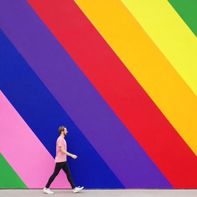
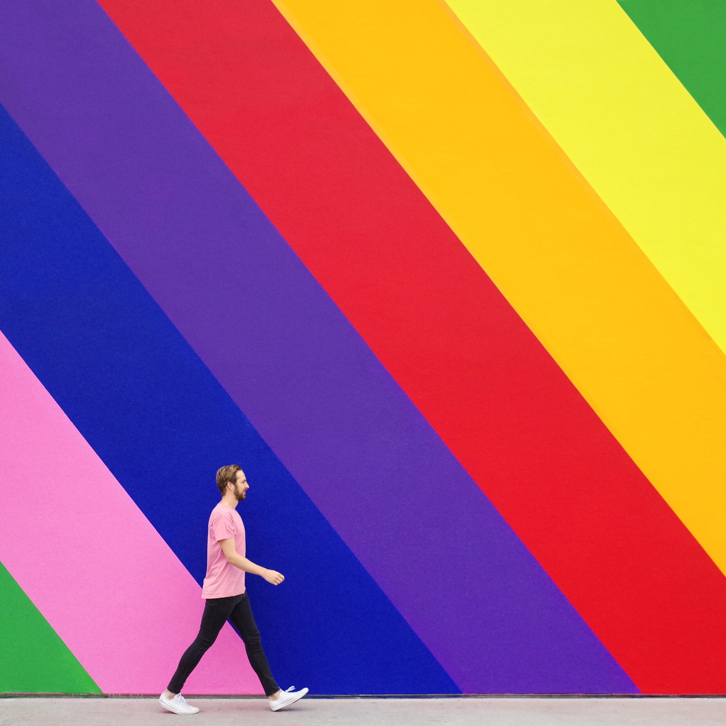
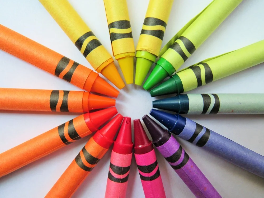
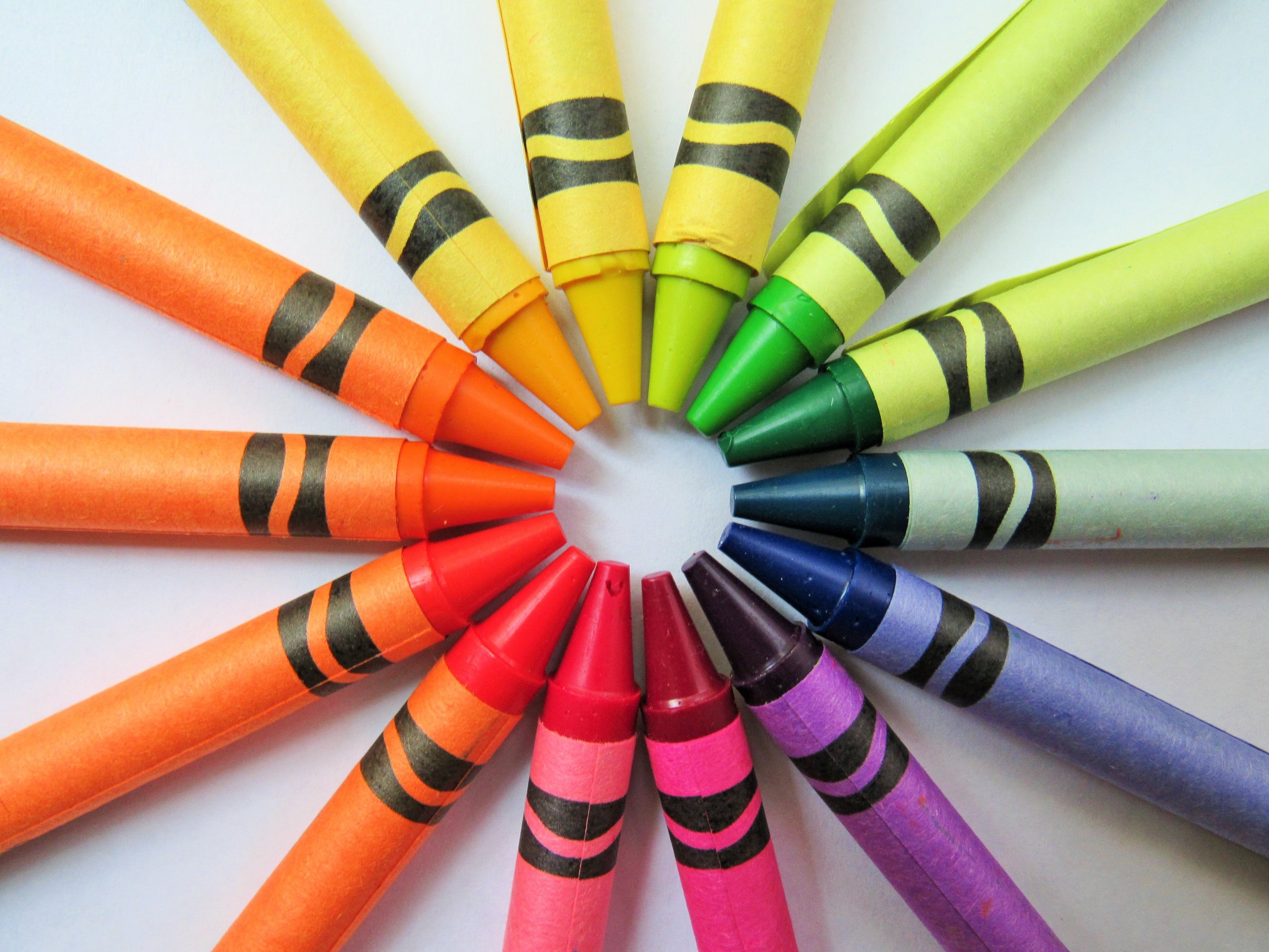
Picking the right color palette is important — whether you’re looking to refresh your logo or just design a social media graphic, selecting the right hues can have a huge impact on the effectiveness of your graphic. Certain colors evoke feelings of action, while others are often identified with calm and serenity.

In a past post, we covered what color theory is and why it’s important to consider it during the design process. Today, we’re putting the rules of color theory into practice with a handful of sample color schemes.

These 8 color schemes are suitable for a wide range of businesses and can serve as a frame of reference for what colors connect with what customers. Copy these colors directly or use them as a jumping off point for designing your own scheme!

For interior design businesses

Light, neutral colors provide a versatile canvas for any room you want to showcase.


Artboard 10purple2.jpg

For businesses who deal with women’s health

Make your female clientele feel cared for with soothing hues of purple. A dusty mauve grounds this scheme, keeping it from feeling too girly.


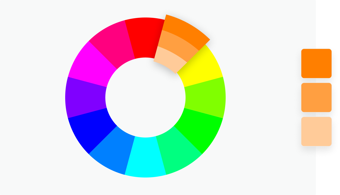
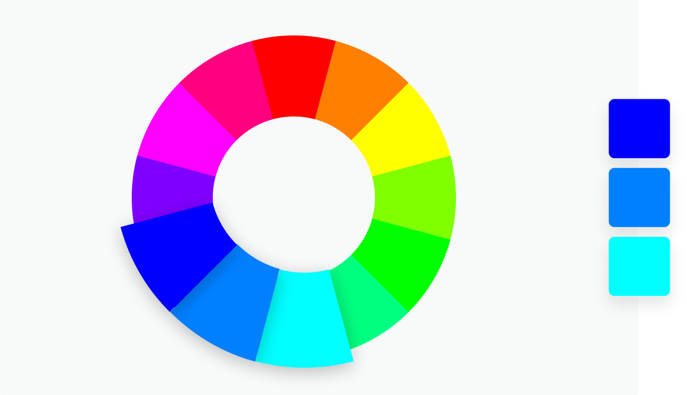
For businesses who want to give off a corporate feel

If you’re in a corporate or service business, you can never go wrong with basic blues. A pop of orange adds contrast and elevates this scheme to feel more modern.


Artboard 8purple2.jpg

For businesses whose clients are tweens

When appealing to a younger clientele, keep things fun and vibrant with lilac, an aqua blue, and a pear green.


For businesses who deal with art

If you deal with an elevated clientele, these unexpected shades are neutral yet a bit adventurous. Earthy and understated.


For businesses who deal with tech

If you’re looking for something bold and clean, yellow and a deep grey speaks to an action oriented and bold brand.


For businesses whose clients are young kids

If you work with young kids, keep it fun and bright with azure blue, a grassy green and a vivid red.


For businesses whose clients go outside

If you sell outdoor equipment or experiences, branch out from earthy browns and greens and dig into some more unexpected colors. Burgundy, a muted Prussian blue, and a papaya orange are an unexpected but organic combination.


Hue & Tone Creative: Your branding partner

Looking to develop just the right color scheme for your brand? Don’t leave the process of selecting the perfect colors up to chance. Bring in our expert team and we’ll ensure you create a brand that connects with your customers. From naming your business to creating a polished website, Hue & Tone is here to help. Book an initial consultation now to get started.

How color affects your brand
How Color Affects Your Brand  |  Hue & Tone Creative

Whether you’re a real estate agent, hairdresser, baker, or jeweler, color plays a big part in your brand, because it affects how you attract and connect with customers. 


What’s color psychology?

It’s the relationship between colors and human behavior — for example, does a yellow logo elicit more trust? Or does grey packaging make people more likely to purchase your product? 

Color psychology explains the meaning behind why people (in and out of the business world) prefer certain hues over others. It also takes into account individual color biases when deciding on a specific color — like upbringing, gender, location, and values.


Why is it important? 

Color evokes feelings and emotions — and feelings and emotions can make or break sales. Take the time to get it right and your organization could benefit from:

  1. Standing out from the competition 

  2. Positioning itself the way it wants to be perceived 

  3. Influencing how customers digest and interpret your information 

  4. Improving credibility and trustworthiness


Colors and their meaningS

How Color Affects Your Brand  |  Hue & Tone Creative

Red

Feelings: excitement, passion, danger, energy and action

In the color psychology world, red is seen as the most intense color for creating strong emotions and attracting attention -- which is why a lot of businesses use it for their ‘Buy Now’ buttons. 

Tip: Because red can be associated with danger it’s best to use it sparingly.


How Color Affects Your Brand  |  Hue & Tone Creative

Orange 

Feelings: creativity, adventure, enthusiasm, success and balance

Orange is also an impactful color but on a less overwhelming scale, so it can often be used in larger doses without becoming overbearing. Because of its eye-grabbing nature, a lot of businesses use orange for call-to-actions.


How Color Affects Your Brand  |  Hue & Tone Creative

Yellow

Feelings: happiness, positivity, optimism, summer, warnings

Centered around the sun, our emotions around yellow are largely upbeat and summery. But, on rare occasions, yellow can be construed as dangerous too (think construction zones).

Exploring some color scheme options? Check out a few of our mood boards herehere, and here.


How Color Affects Your Brand  |  Hue & Tone Creative

Pink

Feelings: femininity, playfulness, immaturity, and unconditional love

Because of its connotations, pink is mostly used by companies who predominantly target females -- big name brands that follow suit include Barbie and Victoria’s Secret. Remember it can reflect immaturity though, so it’s important to choose the tone and quantity of pink carefully.


How Color Affects Your Brand  |  Hue & Tone Creative

Green

Inspired by nature? We’ve got some inspiration here.

Feelings: growth, fertility, health, and generosity

As far as color psychology goes, green is tightly associated with nature and money, and is commonly used by health and fitness businesses. It does have its negative ties though, like envy.


How Color Affects Your Brand  |  Hue & Tone Creative

Blue

Feelings: stability, harmony, peace, calm, and trust

Linked to the sea and sky, blue has a lot of security-related emotions attached to, making it a go to choice for retailer’s guarantee icons, certificates, or shipping icons. On the other end of the spectrum, it can also be connected with depression and coldness. 

Tip: With blue, the tone you choose will make a world of difference in the vibe you give off, so take your time to make sure you pick the right one. We suggest doing a little research on the specific shades of blue to take your color psychology research a step further!


How Color Affects Your Brand  |  Hue & Tone Creative

Purple

Feelings: power, nobility, luxury, wisdom, and spirituality

Purple is packed with royal vibes and is tightly linked to connotations of wealth, extravagance, and pride. Be careful with how much you use this one, because too much can leave people with an impression of frustration or even arrogance. 

With purple it’s all about the shade, tint, and hue you use: 

  • Light purple = feminine energy and delicacy

  • Dark purple = feelings of gloom, sadness, and frustration

  • Bright purple = riches and royalty


How Color Affects Your Brand  |  Hue & Tone Creative

White/Black 

White

Feelings: innocence, goodness, cleanliness, and humility

White can bring mental clarity, promote feelings of fresh beginnings, and encourage positive thoughts; which is why many businesses use it as the backdrop for product shoots. 

It likely goes without saying that black text on a white background is the number one readability combo, but just be mindful that too much white can leave a sterile and cold impression.


Black

Feelings: mystery, power, elegance, and sophistication

Too much black can be overwhelming and give off negative emotions -- like sadness and anger, but just the right amount can evoke strong doses of the right kind. Think strength, authority, and seriousness.


How Color Affects Your Brand  |  Hue & Tone Creative

Grey 

Feelings: neutrality, balance, and timelessness.

Balance is key if you’re dabbling with grey and less can often be more — stick to using it for things like fonts, headers, and graphics is a safe bet. Large quantities can be quite dull and bring out the connotations of depression and loss, so make sure to pick your placement wisely.


How Color Affects Your Brand  |  Hue & Tone Creative

Brown 

Feelings: comfort, security, wholesomeness, and honesty

Symbolizing earth, wood, and stone, brown is all about nature and can correspond with feelings of comfort, security, warmth, and stability.

You probably don’t tend to see brown used in large volumes, because it can be considered a bit boring. In small doses, brown can serve as a great alternative to cooler grays, and can evoke a feeling of warmth and security.


Hue & Tone Creative: Colors are our specialty

Whether you need to rebrand, are looking to launch a social media campaign, or design a billboard, we’ll help you find the color that evokes the right emotion. Want to learn more about how we might work together? Get in touch at hannah@huetonecreative.com or (336) 365-8559.

How to improve your designs using color theory
How to improve your designs using color theory  |  Hue & Tone Creative

Be honest, how many times have you sat and stared at your screen experimenting with endless color pairings only to realize three hours later you’re no further down the line? 

Frustrating, isn’t it?

Well, designers don’t hit the jackpot just by luck, they use what’s called color theory. Color theory is a term used to describe the collection of rules and guidelines regarding the use of color in art and design – and it is defined as a theory because it cannot be proven.  

Color theory is a science and art in it’s own right – but even non-artists can gain a basic understanding of color theory to better understand how to make a pleasing design. Knowing which colors play well together and the effects specific colors have on a majority of people is a valuable expertise no matter what your field.

What’s color theory?

Image via dulux.co.nz

Image via dulux.co.nz

The color wheel is a tried and tested blend of art and science that show you which hues go well together. The color wheel we use today is based off Isaac Newton’s 1666 color wheel which shows the relationship between colors. Sir Isaac Newton created the color wheel based on his experiments with prisms that led to the theory that red, yellow and blue were the primary colors from which all other colors are derived.

Now we’ll dive into a breakdown of how to use the color wheel for your own branding and design projects. By following these simple rules, you can shave hours off your next color-picking expedition and end up with a better-looking final product!


Complementary

Image via Canva.

Image via Canva.

Any two colors that sit on opposite sides of the color wheel -- like blue and yellow or pink and green, for example. Complementary colors are high in contrast and impact and work together to create bright results.


Monochromatic

Image via Canva.

Image via Canva.

Want a headstart? We’ve got lots of great color themes to choose from here.

These are shades of the same color and result in subtle and harmonious finishes. While monochromatic combinations are great for creating a consistent feel another color will need to be brought into the mix to add another layer to your work -- otherwise, everything will start blending into one another.


Analogous

Image via Canva.

Image via Canva.

Tip: to prevent that from happening pick one of the three for your dominant color and then use the other two as accents.

Any three colors that sit side-by-side on the color wheel -- like orange, yellow and green. On the plus side, these can be really versatile combinations, but on the downside, if you don’t manage them right they can soon become a bit tooin your face.


 Triadic

Image via Canva.

Image via Canva.

Make sure you get your proportions right for this one! Triadic colors sit at three evenly spaced intervals on the wheel and hit that right balance between contrast and versatility.


Tetradic

Image via Canva.

Image via Canva.

Similar to the above but this time across fourevenspaces. If you’re going with this option just remember the more colors you use the harder it’ll be to balance what’s on your palette -- and less can certainly be more sometimes. 

To avoid overwhelming people, as with analogous combinations, pick one color as your dominant and use the rest as accents. 


4 good-to-know color wheel facts

1. It’s made up of 12 colors: red, orange, yellow, chartreuse green, green, spring green, cyan, azure, blue, violet, magenta and rose.

2. It can be split into three color types:

  • Primary: colors that create pure white light when blended together (red, green and blue)

  • Secondary: the result of mixing two primary colors, i.e. green and blue make cyan

  • Tertiary: there are six in total and they’re the byproduct of combining a primary and secondary color

3. The two halves of the wheel make up warm (purple through to yellow) and cool (blue through to green) colors. 

4. If you add black, grey or white to any base hue you can create shades, tints and tones of any color:

  •  Shades darken the color and are made by adding black

  • Tints lighten and are conceived by adding white

  • Tones create a subtle version of the original color when white and black (or grey) are added


Hue & Tone Creative: Your partners in color

If this blog post left you feeling more confused than clear, why not hand the hard part over? We’re design experts through and through so you can trust us to find the perfect pairings for you. Interested? Get in touch on hannah@hueandtonecreative.com or (336) 365-8559.