
How color affects your brand
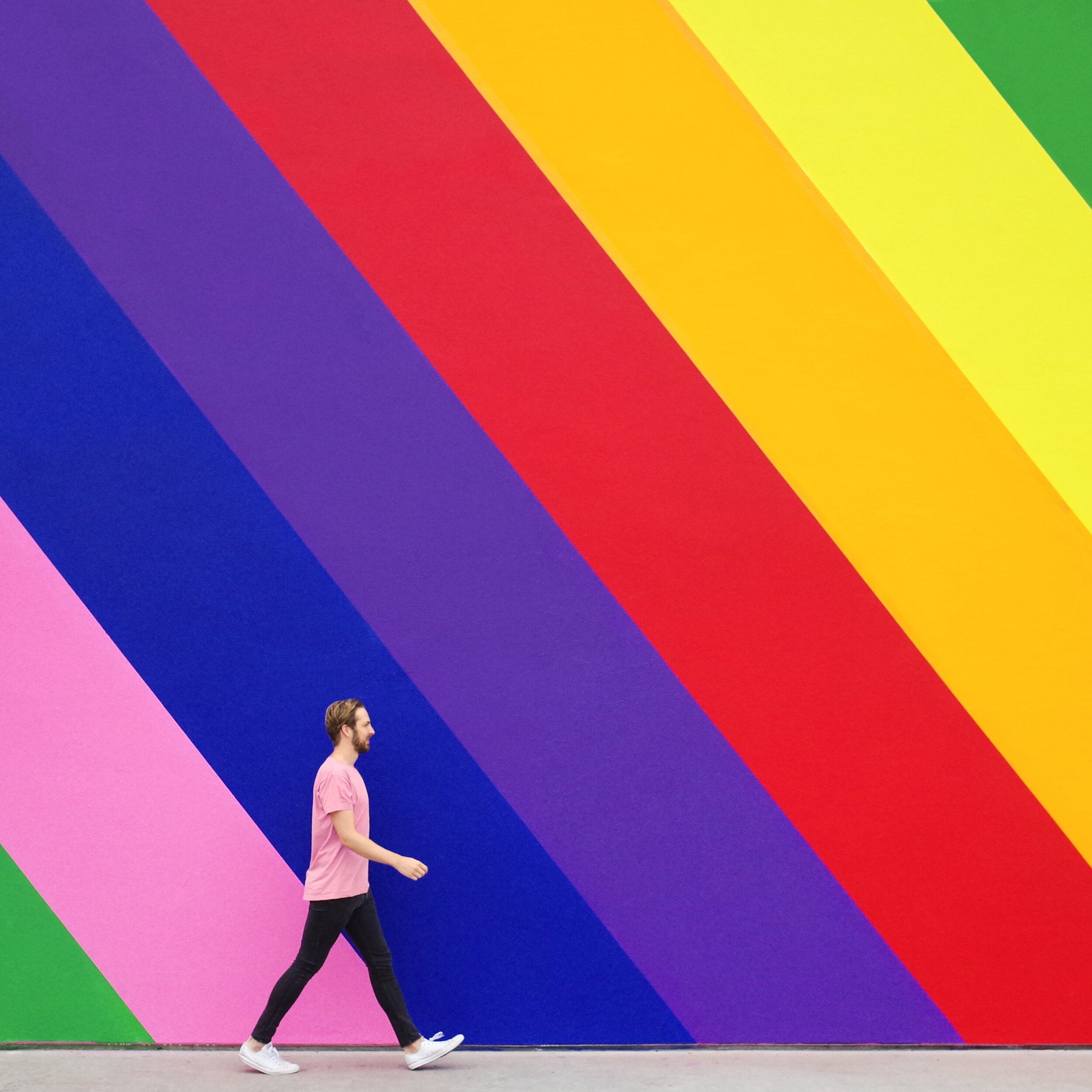
Whether you’re a real estate agent, hairdresser, baker, or jeweler, color plays a big part in your brand, because it affects how you attract and connect with customers.
What’s color psychology?
It’s the relationship between colors and human behavior — for example, does a yellow logo elicit more trust? Or does grey packaging make people more likely to purchase your product?
Color psychology explains the meaning behind why people (in and out of the business world) prefer certain hues over others. It also takes into account individual color biases when deciding on a specific color — like upbringing, gender, location, and values.
Why is it important?
Color evokes feelings and emotions — and feelings and emotions can make or break sales. Take the time to get it right and your organization could benefit from:
Standing out from the competition
Positioning itself the way it wants to be perceived
Influencing how customers digest and interpret your information
Improving credibility and trustworthiness
Colors and their meaningS

Red
Feelings: excitement, passion, danger, energy and action
In the color psychology world, red is seen as the most intense color for creating strong emotions and attracting attention -- which is why a lot of businesses use it for their ‘Buy Now’ buttons.
Tip: Because red can be associated with danger it’s best to use it sparingly.

Orange
Feelings: creativity, adventure, enthusiasm, success and balance
Orange is also an impactful color but on a less overwhelming scale, so it can often be used in larger doses without becoming overbearing. Because of its eye-grabbing nature, a lot of businesses use orange for call-to-actions.

Yellow
Feelings: happiness, positivity, optimism, summer, warnings
Centered around the sun, our emotions around yellow are largely upbeat and summery. But, on rare occasions, yellow can be construed as dangerous too (think construction zones).
Exploring some color scheme options? Check out a few of our mood boards here, here, and here.
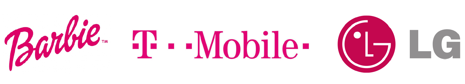
Pink
Feelings: femininity, playfulness, immaturity, and unconditional love
Because of its connotations, pink is mostly used by companies who predominantly target females -- big name brands that follow suit include Barbie and Victoria’s Secret. Remember it can reflect immaturity though, so it’s important to choose the tone and quantity of pink carefully.

Green
Inspired by nature? We’ve got some inspiration here.
Feelings: growth, fertility, health, and generosity
As far as color psychology goes, green is tightly associated with nature and money, and is commonly used by health and fitness businesses. It does have its negative ties though, like envy.

Blue
Feelings: stability, harmony, peace, calm, and trust
Linked to the sea and sky, blue has a lot of security-related emotions attached to, making it a go to choice for retailer’s guarantee icons, certificates, or shipping icons. On the other end of the spectrum, it can also be connected with depression and coldness.
Tip: With blue, the tone you choose will make a world of difference in the vibe you give off, so take your time to make sure you pick the right one. We suggest doing a little research on the specific shades of blue to take your color psychology research a step further!
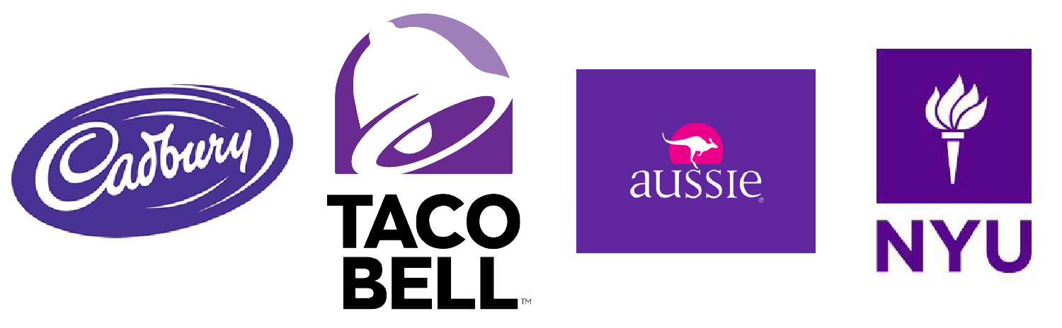
Purple
Feelings: power, nobility, luxury, wisdom, and spirituality
Purple is packed with royal vibes and is tightly linked to connotations of wealth, extravagance, and pride. Be careful with how much you use this one, because too much can leave people with an impression of frustration or even arrogance.
With purple it’s all about the shade, tint, and hue you use:
Light purple = feminine energy and delicacy
Dark purple = feelings of gloom, sadness, and frustration
Bright purple = riches and royalty
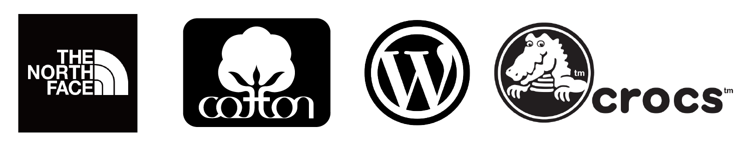
White/Black
White
Feelings: innocence, goodness, cleanliness, and humility
White can bring mental clarity, promote feelings of fresh beginnings, and encourage positive thoughts; which is why many businesses use it as the backdrop for product shoots.
It likely goes without saying that black text on a white background is the number one readability combo, but just be mindful that too much white can leave a sterile and cold impression.
Black
Feelings: mystery, power, elegance, and sophistication
Too much black can be overwhelming and give off negative emotions -- like sadness and anger, but just the right amount can evoke strong doses of the right kind. Think strength, authority, and seriousness.

Grey
Feelings: neutrality, balance, and timelessness.
Balance is key if you’re dabbling with grey and less can often be more — stick to using it for things like fonts, headers, and graphics is a safe bet. Large quantities can be quite dull and bring out the connotations of depression and loss, so make sure to pick your placement wisely.

Brown
Feelings: comfort, security, wholesomeness, and honesty
Symbolizing earth, wood, and stone, brown is all about nature and can correspond with feelings of comfort, security, warmth, and stability.
You probably don’t tend to see brown used in large volumes, because it can be considered a bit boring. In small doses, brown can serve as a great alternative to cooler grays, and can evoke a feeling of warmth and security.
Hue & Tone Creative: Colors are our specialty
Whether you need to rebrand, are looking to launch a social media campaign, or design a billboard, we’ll help you find the color that evokes the right emotion. Want to learn more about how we might work together? Get in touch at hannah@huetonecreative.com or (336) 365-8559.