Posts in Type/Fonts
Designing the Perfect Business Card for 2020
Designing the perfect business card for 2020  |  Hue & Tone Creative

The old adage that you don’t get a second chance to make a first impression holds particular relevance when applied to the world of business.

Company representatives are continually vying for the attention of prospective clients and business cards are widely regarded as a quintessential tool for both seasoned pitchers and entry-level rookies, as they strive to broker deals with new customers.

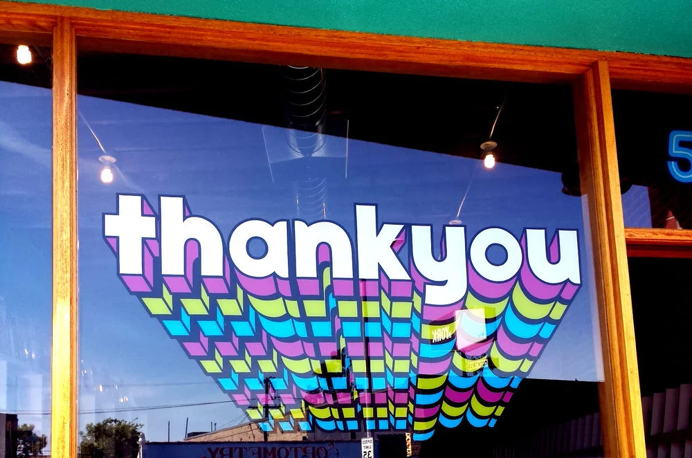
The lure of a well-designed business card shouldn’t be underestimated; a suave, stylish product can instantly grab the attention of a prospective client, while an uninspiring, drab design will be confined to the trash.

Despite digital platforms dramatically altering how businesses communicate, the popularity of business cards has shown no signs of stagnating. There are a staggering 27 million business cards printed daily, with many acknowledging their capability to successfully connect businesses with clients when designed in a compelling, engaging way.


How Can Business Card Design Instill Client Confidence?

Want your logo to convey a feeling of creativity? Color can help you do that. Find out what colors convey a what emotion here.

Trust is an indispensable element to any business relationship - if a brand doesn’t convey reliability, then this will have a detrimental impact on conversion rates.

A well-designed business card has the potential to set the tone for how you treat your customers, what your business is like, and how you professionally conduct yourself.

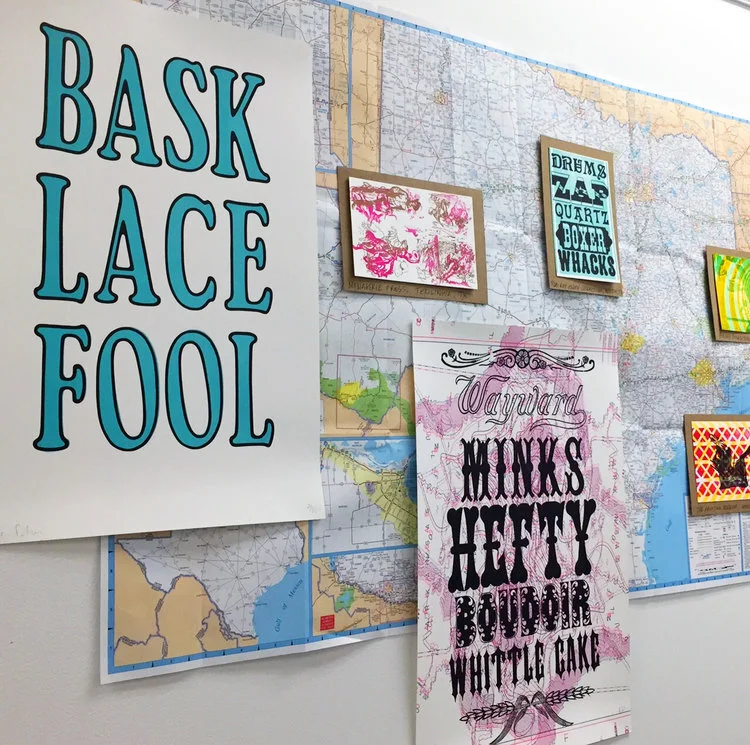
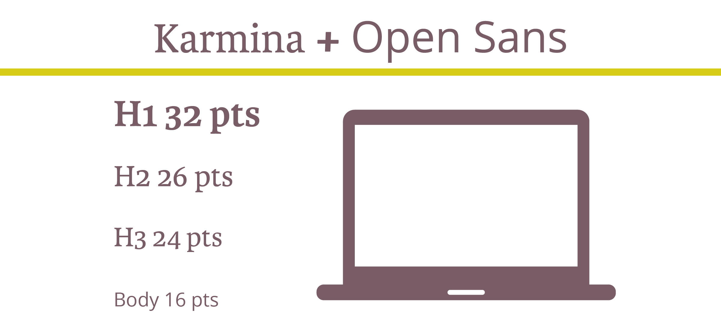
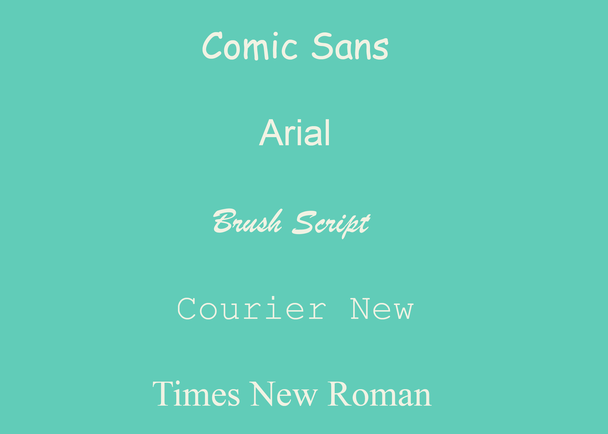
When considering the design of a business card, meticulously plan each detail and consider how they reflect both you and your core values. For instance, what are the connotations of the coloring and fonts used? Is the typeface reflective of your personality?

Every detail should hold relevance, communicating to your intended audience what they can expect, should they decide to join forces and collaborate with your firm. 


2020 Business Card Design Trends

While business cards of yesteryear paid homage to simplistic ideas, modern-day entrepreneurs and professionals are continually opting to embrace a variety of cutting-edge designs, using their business cards as a medium to convey their brand identity, as well as communicate their personal contact information.

Research has indicated that over 80% of business cards get thrown away in less than one week, a quandary that can be rectified by paying attention to emerging design trends.

With a whole host of designs available for your company to choose from in 2020, here are a select few that are sure to catch the eye of potential clients at networking events and meetings this year.


Interactive Business Cards 

The days whereby business people are forced to settle for a conventional business card are long gone, with many embracing an interactive alternative.

While contact details are undoubtedly the most significant part of a business card, offering an interactive product is a wonderful opportunity to convey your character, ingenuity, and flair.

From branded seed pouches for gardening companies to perforated designs for divorce lawyers, there are a variety of ways that an interactive card can represent your craft - all it takes is a sprinkle of imagination! 

Designing the perfect business card for 2020  |  Hue & Tone Creative

QR Business Cards 

In 2019, a mind-blowing 5 billion people owned a mobile phone, with many gaining access to the QR code feature.

Given the dramatic growth of digital culture, more companies are deciding to incorporate QR codes into their designs and acknowledging the benefits a QR business card brings to the table.

QR codes enable the distribution of essential information to customers while saving space on the card itself; more information is offered in digital format, without compromising the sleek design. For example, by simply scanning the code, clients can gain access to informative videos about the services that a company offers.

A common downside associated with business cards is the difficulties associated with tracking their effectiveness or their impact on the customer journey. However, QR codes can be tracked with a series of online tools, providing valuable insight into audience behaviors, etc. This data can then be evaluated and used to influence future marketing campaigns, and so forth.

With mobile phone users on-screen time amounting to an average of 35 days per year, stats such as this bode particularly well for businesses who are bridging the gap between reality and the virtual world.


Perforated Cards

The business world is shaped by competition, so what better way to oust your rivals than offer customers an immediate business incentive upon receiving your business card?

A quirky design that’ll grab the attention of potential clientele, perforated cards are split into two parts and are a fantastic way to entice customers with introductory coupon offers that can be torn, without compromising the essential information printed on the other half of the card.


Deviate from the Norm… 

Rule of thumb dictates that business cards are traditionally rectangular, but in the world of design, rules are made to be broken.

Previous years have seen designers create cards that come in a range of shapes and sizes. These alternative designs are set to continue into 2020 and introducing subtleties within your design can introduce an elegance that’ll set your business card apart from the competition.

For instance, rounded edges give a card a sophisticated finish, while a more daring die-cut can make your card particularly striking. 

Furthermore, simple amendments to orientation can make a notable difference, presenting an opportunity to experiment with new typefaces and formats.


Minimalism 

While some may favor the innovative approach when designing their new business cards, a legion of traditionalists will argue: Why fix something that isn’t broken?

A design trend popular during the 20th Century, minimal business cards have survived the test of time and continue to prove popular amongst many businesses, so much so, that this design trend is expected to continue into 2020.

Minimalistic business cards convey key messages in a condensed, yet effective manner. This design is often used to increase visibility and readability, whilst also creating a sense of intrigue, in turn, prompting potential clients to get in touch for more information.


Hue & Tone Creative: Your Business Design Partners

Whether you're a traditionalist or an innovator in need of inspiration, Hue and Tone Creative has a wealth of creativity, ready to be unleashed. Call (336) 365-8559 or email hannah@hueandtonecreative.com and we'll be delighted to help you get your brand back on track. 

8 cities with great branding

Think branding is just a logo? Think again — let us break it down for you here.

Behind every good-looking package or ad is a carefully investigated backstory, fastidiously selected colors, and meticulously outlined brand guidelines. While branding businesses is nothing new, businesses aren’t the only entities that need high-quality branding. Cities, townships, and entire countries have also begun branding their space in an effort to lure in tourists, new citizens, and potential business. 

8 cities with great branding  |  Hue & Tone Creative

Elements of place branding can include culture, visual symbols, slogans, mission, vision and values.

No matter what size your city is, branding can help put your place on the map. From America all the way over to Australia, here’s a look at some of the best: 

1. NYC

Milton Glaser’s ‘I <3 NY’ artwork is inarguably one of the most iconic city graphics around, but their branding doesn’t stop at one iconic t-shirt.

Bellweather was in charge of creating NYCgo’s official identity – and it reflects NYC’s personality with it’s bright colors, diversity and motion. Attracting more than 60 million visitors a year, the city clear doesn’t have a tourism problem – but this diverse and complex brand brings a life and continuity to the city’s visuals. 

Images via Bellweather and logoworks.com


2. Melbourne

Developed by Landor, Melbourne’s logo is fresh, energetic, and memorable. Despite being around for a few years, this brand still feels modern and fresh — the sign of a well thought out and designed identity. Encompassing a wide variety of colors and patterns this vibrant brand is a reflection of all that Melbourne life has to offer.

Images via Landor.


3. Paris

Paris’ most memorable brand doesn’t come from city government, but rather from their tourism organization, the Paris Convention and Visitors Bureau. Grapheine’s typographic masterpiece subtly incorporates the French capital’s most famous landmark. And, in our opinion, everything about the color, spacing, and typography are expertly executed… in addition to making Paris look pretty cool!

 Images via Graphiene.


4. I Amsterdam

Renowned for sex, drugs, and canals, this 2004 campaign helped put Amsterdam back on the map for more than just a fun weekend away. This branding effort was born out of an effort to appeal not only to tourists, but also to those already living in the area.

Despite simple graphics, Kesselskramer’s message is incredibly complex and versatile.

Images via Kesselskramer.


5. Las Vegas

Funky, fun and full of color, Pink Kitty Creative’s city government branding depicts everything Las Vegas stands for in one: bright lights, late nights, and lots of laughter. While we find the “City of” typography a bit weak, we enjoy the color palette and playfulness of the logo. 


6. London

London has a lot of rich roots and landmarks. From Big Ben and the London Eye to the monarchy and 2012 Olympics, London is known for a lot of things — but lacks a central message. Their latest rebranding, which was led by Saffron, cleverly includes a taste of the River Thames with the royal red of the union jack. It’s very simple yet incredibly commanding. 

From Saffron’s website: “So, people pick up their ideas about London from books, television, social media and a wide variety of other influences – none of which can be controlled and many of which are misleading. Rocked by the financial crisis, security threats and even street riots London needed a concerted effort to bounce back and regain its confidence as the world’s leading global city.”

Images via Saffron


7. Porto

Redesigned by White Studio in 2014, Porto’s branding is bold, unique and intricate. Without even stepping foot in Portugal, you can get a feel for the vibrance and life that the city has. It gives people a real feel for what the city is about – and the creativity 

 Images from underconsideration.


8. Colorado

Designed in-house to showcase how spectacular the state is, Colorado’s ‘C’ symbolizes their strength and friendliness while simultaneously bringing their famous and stunning backdrops into the frame. This is a recent rebrand (rolled out in July 2019) so while we’re cautiously optimistic about what the entire brand will look like, we’re holding our breath until full brand guidelines are released.


Hue & Tone Creative: City Branding Partners

Let’s make your place stand out. Whether you’re a city, state, business, or charity, we can help. Get in touch at (336) 365-8559 or hannah@hueandtonecreative.com to start your rebranding journey today. We’ll get everything from your new logo to print collateral overhauled — on time and on budget.

12 great free Google fonts

Looking for more inspo? Here’s our list of MUST download free Google fonts.

12 Great Free Google Fonts  |  Hue & Tone Creative

Google’s got around 915 fonts in its directory. Having a wide selection is great, but this can be a lot to sort through. You’ll probably be able to find the perfect font for your piece, but where do you even start?! 

Aside from the fact that Google Fonts are free, millions of people turn to Google fonts for its simplicity, easy-to-implement set-up, and high quality selection. The fact that a number of these fonts are available for print use is another great bonus. If this is your first time using Google to pick a font, you can find step-by-step instructions on the ‘how’ here.

To save you a bit of time scrolling through pages and pages of typography, here are 12 of our favorite freebies.


Popular choices

Numbers don’t lie. The first six on our list were the most viewed fonts over the last seven days, 30 days, 90 days, and year. 

12 Great Free Google Fonts  |  Hue & Tone Creative

1. Roboto, by Christian Robertson

Roboto’s a sans-serif font and comes in 12 different styles (thin, thin italic, light, light italic, regular, regular italic, medium, medium italic, bold, bold italic, black, and black italic). 

It’s known for its natural reading rhythm and features friendly, open curves.


12 Great Free Google Fonts  |  Hue & Tone Creative

2. Open Sans, by Steve Matteson 

Another sans-serif font, Open Sans has 10 styles to choose from. It’s featured on Google’s sites, and in print/web adverts. This font is endorsed by some of the biggest brands out there.


12 Great Free Google Fonts  |  Hue & Tone Creative

 3. Lato, by Łukasz Dziedzic

When creating Lato, Dziedzic wanted to come up with something transparent enough for body text while comprising unique traits for larger sizes; and he did just that.

With semi-rounded details and strong, structural entities, Lato oozes warmth, stability and seriousness all in one.


12 Great Free Google Fonts  |  Hue & Tone Creative

 4. Oswald, by Vernon Adams, Kalapi Gajjar, and Alexei Vanyashin

Originally created by Vernon Adams, Oswald has seen a number of interactions over the years based on user feedback.

It was designed to be appropriate for use across desktop computers, laptops and mobile devices and comes with six different styles - extra-light, light, regular, medium, semi-bold, and bold.


12 Great Free Google Fonts  |  Hue & Tone Creative

5. Slabo, by John Hudson

Slabo has just two weights. What’s unique about this one is that it’s specifically designed to be used at a certain size -- either 27px or 13px depending on your piece.


12 Great Free Google Fonts  |  Hue & Tone Creative

6. Roboto Condensed, by Christian Robertson

Part of the Roboto and Roboto Slab family, Roboto Condensed refuses to compromise. Its letters are freely positioned to settle into their natural width without encroaching on their neighbors, and it adds impact to body and heading copy alike. 


Hidden gems

Our next batch of fonts are just as easy to use and read but are less well-used, giving you chance to create something a little different.

12 Great Free Google Fonts  |  Hue & Tone Creative

7. Arvo, by Anton Koovit

Best suited to heading and sub-headings, Arvo’s a slightly more edgy font with tints of contrast. Available in regular, regular-italic, bold and bold-italic, you can tailor its impact to your tastes and needs too.


12 Great Free Google Fonts  |  Hue & Tone Creative

8. Bree Serif, by TypeTogether 

Charming, original and versatile by nature, Bree Serif was an instant hit when it first came onto the scene back in 2008 -- and we can see why.


12 Great Free Google Fonts  |  Hue & Tone Creative

9. Sanchez, by Daniel Hernandez

Sanchez is a slab-serif typeface and it’s simple, scannable, and distinguishable. It might not be for everyone but if it fits your organizations feel it can be a solid design choice.


12 Great Free Google Fonts  |  Hue & Tone Creative

10. Hammersmith One, by Sorkin Type

Low in contrast, unique in style, and subtle in curves Hammersmith One was built specifically for web-use. Although it does still work well to smaller sizes, it’s perhaps best limited to titles, sub-headings, and short intro paragraphs.


12 Great Free Google Fonts  |  Hue & Tone Creative

11. Catamaran, by Pria Ravichandran 

With nine different text weights Catamaran’s incredibly versatile and, in the designer’s own words, “strikes a balance between typographic conventions and that bit of sparkle.”


12 Great Free Google Fonts  |  Hue & Tone Creative

12. Playfair Display, by Claus Eggers Sørensen

Used across millions of websites worldwide, this transitional font’s functional and stylistic and pairs well with Georgia for body text. Other popular couplings include a few of our already mentioned Google Fonts: 

  • Lato

  • Roboto

  • Raleway

  • Oswald

  • Open Sans Condensed


Hue & Tone Creative: Your Font Partners

Finding the right font for your website, flyer or social media advert can be really tough -- we get that. If you’re struggling to find a font that gels with your work, we can help. Get in touch at hannah@hueandtonecreative.com or (336) 365-8559 to see how.

Making the most of Adobe Fonts’ features
Making the most of Adobe Fonts’ features  |  Hue & Tone Creative

The right font can work wonders for your brand by helping you connect with potential customers, hold peoples’ attention, and convey the right mood or feeling. But the wrong font can do quite the opposite -- allowing letters to get lost, making words difficult to digest, and alienating your artwork from your brand.


First off, What is Adobe Fonts?

In a nutshell, Adobe Fonts (previously Adobe Typekit) is a library of 1,000s of free and paid-for fonts for people to use directly on their website, sync with their Creative Cloud subscription, or both.

If Adobe’s your go-to for design work you’re probably already familiar with Fonts, but are you getting the most out of what it has to offer? Whether you’re a newbie or not, it’s got lots of features to help you save time and personalize your fonts -- and we’ll be covering our favorite features in this post.

Top tip: if you’re after even more recommendations, here are some of our favorites too.

1. Get a headstart with recommendations

If you’re a beginner at type design, Adobe has a recommendation tool to help you decide on fonts that are best suited for paragraphs or headings.

For those that are new to the font-selection world, you need something that’s easily legible across various mediums at a small size for paragraph copy, and for headings you can be more adventurous with bigger, bolder and more decorative styles -- that are still readable, of course.

2. Save time and filter fonts 

With so much choice at your fingertips scrolling through endless styles can be a pretty tedious and time-consuming task.,If you’ve got a good idea of what you’re after, cut out what you don’t want by filtering specific properties, like: 

  • Weight - the thickness of the stroke

  • Width - the width of the actual letters

  • X-height - the ratio of lowercase letter height to uppercase letter height

  • Contrast - the ratio of thick and thin strokes

  • Standard or caps only - i.e. fonts that use lower and uppercase letters, or fonts that only use capital letters

  • Default figure style - choose between Oldstyle (more old-fashioned) or Lining (more modern) for your numbers

Making the most of Adobe Fonts’ features  |  Hue & Tone Creative


3. Use the right font availability

What’s the difference? Web fonts are used directly on your site, and synced fonts are imported to your Typekit for in-program use on things like Photoshop and Illustrator. Discover how to install fonts here.

Whether your artwork’s for print or web should determine the font you use, which means it’s important you’re clear on the end-use from the outset.

To make choosing the right font easy Adobe differentiates between web fonts and synced fonts, so make sure you pick one from the right category.

4. Test your chosen font

Adobe’s ‘type tester’ feature allows you to see how your chosen font(s) look online before you add them to your kit and invest time into updating your design work.

To put this feature into practice, just head to the main browsing page where it says “Use fonts” and then click the “Web” tab when a pop-up appears. If you like what you see all that’s left to do is to add the font to your Typekit.

5. Use contextual alternates

Sometimes, certain glyphs can be a bit intrusive or distracting and the last thing you want is to jar readers as they’re scanning your copy -- but Adobe’s contextual alternates (calt) feature can help you overcome this.

It’s particularly useful when using script typefaces and it works by replacing default glyphs with better-performing alternatives.

Need help? You can find more about line and character spacing here.

6. Experiment with your spaces

If you’ve selected your font but you’re not 100% happy with the spaces between characters, lines and paragraphs, remember, you don’t have to settle with what you’re given as standard. To create something that gels perfectly with your page experiment with your gaps by opening the ‘Text properties’ box and playing around with the spacing options.


Hue & Tone Creative: Your partners in design

Still confused about what font to pick? If some (or all) of this post went over your head, we can help! Design is our forte and we’re known for helping organizations find their perfect font -- without fail. Drop us a line on hannah@hueandtonecreative.com to find out more.

Typography for beginners
Typography for Beginners  |  Hue & Tone Creative

Some web pages and brochures good… and some look terribly unprofessional. If you’re new to graphic design or typesetting it can be hard to determine what makes someone’s branding look good or bad.  

If you’re a beginner – or you’re attempting to brand your own business -- there’s a number of type rules you can follow to give brand a polished look. Following these simple rules will help even the most amateur designer get their webpages and print assets in tip top shape!


1. Less is more when it comes to typeface

If you’re looking for some font pairing inspiration, head over to these two posts about pairing fonts on Squarespace (here and here). 

Choosing the right typeface is key. Get it right, and you’ll set yourself up for stylish, simple and easy-to-read assets. But get it wrong, and you’ll end up with illegible, cluttered and unappealing pages. 

Simple fonts should be used for main body copy, and decorative typefaces should be used sparingly for things like subheadings.

The golden rule in the design world is to stick to a maximum of three fonts in any given piece of artwork - whether that is a website page, social media banner, or hardcopy flyer. However, whittling your fonts down to two can sometimes be even better. 

If you stick to just one or two fonts, you can use varying weights to create a more refined look. 


2. Use a sensible hierarchical structure

Following a logical hierarchy helps to give your site’s pages a clear flow and effortlessly guides readers through the structure of the website. Let’s compare and contrast two examples to give you a better idea of what we mean: 

Good content formatting.png

Exhibit A is a bad example. The website’s name, navigation bar, subheadings, and main body copy are all the same font size. Now there are two issues with that – first, it gives readers no visual indication where they should start reading or what’s most important to look at. Secondly, it makes it really difficult for the reader to skim through the copy.
 

Now, let’s contrast an example of a solid hierarchical structure. The page’s title, navigation bar, subheadings and copy are clearly defined with varying font points, making it much easier on the viewer’s eye.


3. Be creative with contrast

Typography for Beginners  |  Hue & Tone Creative

Being creative is part of being a designer. Now we know we said earlier you should stick to two to three font combinations per project, but that doesn’t mean you can’t mix up your styling by playing around with things like the font’s size, weight, color and style.

Whether you emphasize a key word with italics, change the color of a subead to something more bold, or bump up a term in your tagline to a size that’s more eye-catching, there are endless ways to create contrast within your copy.


4. Keep your alignment neat and tidy

Alignment applies to all your on-page elements - like body text, titles, logos, images, and menu bars. When it comes to alignment, everything should be connected in one way or another. For example, you might want your logo to align with your main navigation bar, your body copy to align with your page’s title, and your images to align with your body copy.

Well thought-out alignment will help prevent your page from becoming disjointed and ensure all your assets create well-measured sizes and distances between each other.


5. Don’t be a stranger to whitespace

Don’t fall into the trap of thinking you need to fill everynook and cranny on your page. Creating whitespace around your words can be incredibly powerful, can help draw attention to text, and will aid you in achieving a simple and trendy look. 


6. Choose your colors carefully

Last but not least is your color choice. The right colors can make or break the look and readability of your copy – there’s nothing worse than colors that make your words a strain to read.

When it comes to color, there are three key components: 

  • Hue - the shade of the color

  • Saturation - the brilliance of the color

  • Value - the lightness or darkness of the color

Source &gt;

When it comes to choosing your colors, the aim of the game is to make your text as easy as possible to read. It’s as simple as that.


Hue & Tone Creative: Let’s work together

Feeling overwhelmed with information? If you’re not a designer, knowing and deciding what does and doesn’t work is easier said than done. If you need a hand with your typesetting - or any other area of design, get in touch with our team today at (336) 365-8559.

Our Favorites: More Great Free Fonts to Download

Finding the perfect font is no easy feat. For starters, there’s an unfathomable number of options to choose from. Even once you select a font, there’s a ton of variables that can interfere with what does and doesn’t work - do you need the font for print or digital? Are you designing something colorful or monochromatic? Are you laying the font over an image or putting it on a blank background? The the list of potential factors goes on and on!

What’s worse, is that many popular fonts require purchasing a license — one that can often be quite pricey. We’ve already compiled lists of our favorite Adobe Typekit fonts (free if you have an Adobe CC license) and our favorite Google Fonts. But if none of those are speaking to you, we’ve pulled together another list of ten great free and easy to download fonts.


1. Hansief

Hansief is a simple and bold typeface offering a unique vintage feel. It comes with two styles - regular and rough - enabling it to easily adapt to a range of design settings. Download here.


2. Tuesday Night

For those pieces that need an elegant, classy and handcrafted touch, look no further than Tuesday Night. Download here.


3. Mr Grieves

 If you’re after something with a bit of texture, then Mr Grieves has you covered. It’s rough, ready, and raring to grab your audience’s eye. Download here.


4. Bosk 

A handmade brush font by nature, Bosk lends itself very well to artwork in need of that personal and custom feel. Better yet, it’s multilingual and comes with more than 400 characters, so you won’t struggle for choice. Download here.


5. Oraqle Script

Talking of choice, enter Oraqle Script. It’s got uppercase, lowecase, numerals, punctuation and multilingual characters, and also includes things like ligatures, stylistic alternate characters and swashes. Modern, striking and full of texture, it ticks all the boxes. Download here.


6. THE BOLD FONT

 If there’s one thing The Bold Font absolutely oozes, it’s trendiness. It’s streamlined and ideal for anything from logos and packaging to social posts and on-page headings. Download here.


7. Nikoleta

Simple, slim, refined and commanding, Nikoleta is good to go for things like posters, headlines and online ads. Download here.


8. Old Growth

Inspired by the old growth forests of the west coast, Old Growth is fairly new which opens up the door to testing something relatively untried and really standing out. In the words of the creator, it’s perfect for branding, quotes, headlines and more. Download here.


9. Buffalo

Now this one’s definitely different, but different is by no means bad. While we wouldn’t suggest overusing this one, we think it’s the perfect pick for key headlines and accents. Download here.


10. Bodoni XT

For those after more of a classic feel, Bodoni XT offers the right balance between traditional and on-trend. It’s also readable, making it a good fit for longer chunks of text. Download here.


Hue & Tone Creative: YOUR Graphic Design PARTNER

Whether it’s a complete overhaul of your branding, a one-off social media ad, an eye-catching business card, or a logo refresh, we’ve got the expertise you need to make your branding pop. Contact us at (336) 365-8559 or hannah@hueandtonecreative.com to see how we can start working together.

The essentials: must have marketing assets for new businesses
Get your new business of to the best start possible with the right marketing materials!

Get your new business of to the best start possible with the right marketing materials!

So, you’ve decided to start a business. You know you need the basics like a logo and business cards – but what other marketing assets should you make a priority?

Marketing materials can encompass everything from websites and letterheads to social media graphics and promotional videos. If you’re just starting out in the small business world, chances are your budget is probably a little tight – but skimping when you start up can mean unnecessary spending down the road.

Think about it: you pick the first business name you think up and print up a bunch of business cards, letterheads, and pens. A few weeks later, you’re hearing from your customers that they can’t remember your business name. Now you’ve confused people, still have to pay for proper branding, and you’ve got to pay to reprint materials you could have gotten right from the start. 

The good news is that we’re here to tell you what you need it, why you need it, when you need it, and how you get it. We hope this run down of essential marketing materials helps empower you when you’re hiring a graphic designer or marketing agency.

Here’s what you need to successfully get your business off the ground:
 

1. Brand Values

Because no physical products come out of this stage of the branding process, it’s often rushed or disregarded – but this is one of the most important stages, and it will influence everything you do from here on out. Your brand values are the set of principles that will dictate every aspect of your business, including the look, messaging, and customer service approach.

Here’s what you’ll want to define:

  • Values: what does your business stand for?

  • Objectives: where do you want to be in 1, 5, or 10 year’s time?

  • Customer personas: who are your talking to and what do they care about?

  • Tone of voice: how will you talk to your customers? And why?

  • Proposition: what will you do for your customers? And how will you benefit them?

  • Tagline/mission statement: how can your brand’s essence be summed up into as few words as possible?

Taking the time to properly develop your brand values will allow you to properly train your workforce and will help you communicate your brand to third parties. We suggest asking your marketing team for a brand book or set of written guidelines that you could hand off to an outside team.

The essentials: Must have marketing assets for new businesses  |  Hue & Tone Creative


2. Brand Identity

Now it’s time to develop the look and feel of your brand. This is where you’ll work with a designer to create a logo and everything that goes with it. You’ll want to come out of this stage with:

  • Primary logo: as well as any alternative logo formats you might need for packaging, online use, or small sizes

  • Logo usage guidelines: what is the smallest size your primary logo should be printed? What do you do when you can only print your color in one logo? Make sure your designer provides you with guidelines for every situation you might encounter.

  • Font palette: what fonts are you going to use on print, web, and in Microsoft Office?

  • Color Palette: what primary and secondary colors will complement your look, logo ad tone?

  • Graphic elements: anything needed to complete your print and web designs.

  • Sample usage: make sure your designer provides examples of how all these elements will come together to create your signature look.


3. Build a winning website

We talk a lot about the importance of a well designed and properly optimized website, so we won’t waste a lot of space here talking through why you need one. Instead, we’ll run through a few key considerations when it comes to building it:

  • Get to the point: you’ve got a limited time to capture visitors’ attention, so get your message across clearly and effectively on every page.

  • Contemporary: outdated websites make your brand look instantly aged and untrustworthy. Take the time to get your website looking slick, and outsource it to a specialist if you need to.

  • Architecture: once you start adding menus and pages, they can be a right pain to change down the line. To make sure you’ve got a great user experience from the outset, map out your site’s architecture before you start building it.

  • Search engine optimization (SEO): with a reputation for being the cheapest marketing method around, it’s crucial that you build and write your website with SEO at the forefront of your mind.

  • Contact: make your call to actions and contact information crystal clear.

  • Host: choose a content management system that’s reliable. Personally, we would recommend Squarespace – here’s why.

  • Domain: be sure to match your domain name to your business’ name.

4. Social media

Did you know, 70% of the US population have at least one social media profile? That’s a whole lot of potential customers to capture.

We suggest selecting just 2-3 platforms to get started on – especially if you’re handling your social media in house. To effectively leverage social media, there’s a few things you’ll need to do:

  • Only use high resolution profile and background images (pixilated pictures make you look untrustworthy and out of touch)

  • Write a succinct and enticing bio

  • Link back to your website

  • Include contact details

  • Keep an eye on your inbox/direct messages

  • Commit to regularly posting

  • Reply to those who engage with you

  • Interact with relevant people and/or profiles

Maintaining social media should be a daily job – if it’s not, you’re not doing it right. We suggest creating a content calendar to stay organized. And, make sure you have a set of templates on hand to save time when you need to create a quick Facebook graphic. 

5. Blogs

Investing in content marketing comes with endless benefits. A well maintained blog boosts your SEO efforts, helps you build backlinks and brand awareness, generates leads, adds brand value, and ups engagement.

Just remember the golden rule: the content you’re publishing must be quality. Churning out subpar articles won’t get you far -- if it even gets you anywhere. Here are a few general post types to get you going:

  • Videos

  • Infographics

  • Webinars

  • Tutorials

  • Whitepapers

  • Presentations

  • ‘How to’ guides

  • Buzzfeed-style listicles

With good content, you need good images. If you’re not in the position to fork out money for sites like iStock and Shutterstock, consider Unsplash, Pixabay and Pexels for good, free alternatives. 
 

The essentials: Must have marketing assets for new businesses  |  Hue & Tone Creative

6. Templates

Next up is templates. The extent of this list will vary depending on the nature of your business, but below is an idea of the types of templates we suggest you think about:

  • Email campaigns - sales, welcome, thank you, updates, or otherwise

  • Newsletters

  • Direct mail

  • Job descriptions

  • Email signatures

  • Powerpoint presentations

  • Social media graphics

  • Letterhead/memos

Your logo should feature on each and every one of them -- which is why it’s important to have a logo that sits well in different settings, and your brand’s look, feel and tone should be encapsulated too. Remember though, your templates don’t need to be uniform to be consistent.

7. Print collateral

We’ve been carrying on about online a lot -- and rightly so! -- but don’t forget about good old offline advertising. Depending on your industry, things like physical brochures and business cards can be an important asset.

If you’re investing in printed materials, remember to:

  • Do your research: spending a bit of time selecting a quality printer.

  • Don’t compromise: poor quality paper reflects badly on your business.

  • Don’t rush: if there’s a proofreading mistake that’s your fault there’s no going back -- without throwing money down the drain.

  • Keep it consistent: print materials still needs to mirror your online presence.

  • Think of the bigger picture: think about how you can make print materials evergreen so that you don’t have to reprint regularly. Consider what really needs a date and what could go without one.

  • Get the right amount of copies: you can easily order more, so don’t go print crazy and order 1000s of copies unless you’re absolutely certain they’ll be used. But, you usually get a discount the more you order, so don’t be afraid to print some extras.


Need a little help?

Getting all your marketing assets together can feel really daunting -- I know, I’ve been there! But here at Hue & Tone Creative, there’s a lot we can help you with. From logo design and letterhead to web design and social media management, get in touch to see how we can support your business’ success.

7 (more!) Squarespace font pairings

There’s no denying that deciding which fonts work well together can be (to put it bluntly) an absolute nightmare - but the benefits of fiddling around far outweigh the pain of getting there.

Finding the perfect font pairing can make a massive difference to the look and feel of your website. It changes the way the words on screen gel with your design. It alters the way visitors scan over your copy. And it can impact the overall tone you give off. So it really is key that you hit the nail on the head.

We’ve already shared 7 Squarespace font pairings and, back due to popular demand, now we’re here to give you seven more!

7 (more!) Squarespace font pairings  |  Hue & Tone Creative

Trebuchet MS + Adobe Garamond Pro

Trebuchet’s instantly easy-to-read style coupled with Adobe’s slightly old school slant effortlessly keeps pages engaging.


7 (more!) Squarespace font pairings  |  Hue & Tone Creative

Source Sans Pro + Raleway

Source Sans in simple and sleek -- pair it with Raleway and you’ve got yourself a modern combo!


Artboard 5@2x-8.png

Alfa Slab One + Titillium Web

This font combination isn't for everyone, but Alfa Slab’s bold presence coupled with Titillium’s techno vibe provides a structured, forward-looking style. 


7 (more!) Squarespace font pairings  |  Hue & Tone Creative

Playfair Display SC + Livory

Get straight to the point with Livory's imposing page presence and Playfair's easy-on-the-eye curls.


7 (more!) Squarespace font pairings  |  Hue & Tone Creative

Acier Bat Text Solid + Sanchez

What happens when you combine sharp points and straight edges? This. It’s different, but who said different’s bad?


7 (more!) Squarespace font pairings  |  Hue & Tone Creative

Adrianna + Work Sans

Both wide in style, Adrianna and Work Sans provide a really easy-to-read package.


7 (more!) Squarespace font pairings  |  Hue & Tone Creative

TextBook New + Tondo Signage

Tondo’s stocky style makes it unideal for chunky blocks of text, but paired with TextBook New it’s ideal for shorter snippets that need snippets that need to catch the reader’s eye.


BRANDING + WEB SERVICES IN GREENSBORO: HUE & TONE

Looking for a web designer in Greensboro, Winston Salem or the surrounding areas? Hue & Tone is a creative graphic design agency specializing in logo design, web design, social media management, and more. Give us a call if you’re interested in a custom, branded website that truly tells your story.

What does Branding really mean?
ian-dooley-337259.jpg

When the term branding enters a conversation, the word logo usually isn’t far behind. The words have become almost synonymous. Of course, branding is more than the creation of a company’s logo. So, what does branding really mean?


The Definition:

The term changes definitions depending upon whom you consult. For discussion’s sake, we’ll use the Business Dictionary’s version which states “[branding is] the process involved in creating a unique name and image for a product in the consumers' mind, mainly through advertising campaigns with a consistent theme.” Branding is the personality of a commodity. It’s the feelings and expectations that are connected to goods, services and even people based on lived experience and marketing efforts.


The Purpose & Importance:

Businesses use branding for numerous reasons including attracting new customers, securing loyalties, that result in repeat and longtime patrons, and to differentiate themselves from competitors.   

If a business is able to accomplish the above list, it’s safe to assume that it’s at least competitive. With effective branding, it may even be positioned well enough to charge more than market rivals. This increase in value is based largely on consumer perception and is referred to as brand equity. Judging a book, product or service by its metaphoric cover can be extremely advantageous for a company when public opinion is favorable.


How it’s Done:

Going back to our working definition that branding is the process involved in creating a unique name and image for a product, person, or service, keep in mind that there are aspects of this cultivation which are entirely controllable. These include, but aren’t limited to, logos, color schemes, public statements, written communications, social media, packaging, websites, and advertisements. Marketing, public relations, and design firms spend their time becoming masters in these areas, so you may consider using a professional here. So often, companies with quality commodities and excellent reputations find themselves in with injured brands do to ill-advised marketing moves.


The Fairy and Cautionary Tales:

Most people are familiar with the controversial Pepsi campaign starring Kendall Jenner. During a time where clashes between Human Rights protestors and police were constantly in the media and the topic of much debate, Pepsi wanted to weigh in with a message of collaboration. Unfortunately, concerns of police brutality and violent discord were seemingly solved by Jenner handing an officer an ice-cold Pepsi. People were outraged for many reasons. Some felt Pepsi had made too light of serious matters, others railed against Pepsi using a national crisis as a means to sell more soda. Pepsi soon pulled the ad, apologized, and certainly learned from the branding debacle. The lesson here may be to align your brand with matters in the proximity of one’s wheelhouse.

Contrarily, one can take a devastating and embarrassing event like infidelity and use it to boost a brand. Beyoncé, upon discovering her famous husband was allegedly unfaithful, created an album cathartically working through her personal issues. Lemonade went on to become the highest-selling individual album of 2016 globally, according to the International Federation of the Phonographic Industry. The admission helped Beyoncé’s brand by reinforcing her image as a smart and incredibly powerful female force.


Questions to ask Yourself:

  • What message do you want your product or service to convey in the public’s mind?

  • What distinguishes your product or service from anything or anyone else on the market?

  • Are you consistently stacking up to public expectation?

  • In what ways (beyond performance) can you demonstrate that you are what you say you are?

  • Are you choosing marketing opportunities and strategies that align with your current brand identity?

These questions focus not only on what businesses say and do, but also on how people respond to those messages. In this way, branding is quite interactive. It’s not a business cultivating images of self that customers credulously accept, but a continuous dialogue between consumers and companies.


MARKETING & GRAPHIC DESIGN IN GREENSBORO

Starting a new business? Don’t dive in without a little help from the creative experts. From business card design and logos, to social media marketing, Hue & Tone Creative can help you connect with your customers and creating a lasting impression.

Must download free Google Fonts
Must Download Free Google Fonts  |  Hue & Tone Creative

Whether you’re designing a resumé for the job of your dreams, sending out invitations to a gala, or creating a sleek new business card, using the right fonts will help you grab someone's attention and accurately communicate your brand.
 

Google Fonts has 847 fonts to sort through, so we’ve rounded up some favorites for you to browse. And remember, all of these fonts are free and open source, so there’s no need to worry about potential licensing hiccups. You’re free to use the fonts for any project, whether it’s a personal blog or a commercial campaign.


Sans Serif

You can never have too many sans serif font options. These versatile fonts are great for logos, headlines, and graphics. 


Serif

Give Times New Roman a break and swap it for something more modern.


Slab Serif

Looking for a typeface that packs a punch? Try a slab serif.

 Want even more fonts? Keep the downloading going by syncing some of our favorites from Adobe Typekit.


Professional Creative Services in Greensboro, NC

Don’t have an eye for design? We can give your brand the creative touch it needs. From email campaigns and logos to everything else in between, Hue & Tone Creative can help your brand stand out.

The Optimal Font Size for Web, MailChimp, and Mobile

Earlier this month, Twitter rolled out a new font. Unfortunately, not everyone was a fan

Twitter’s switch from Helvetica Neue, to Segue left users complaining that the slender new font was hard to read and caused way too much eye-strain.

Like Twitter, most businesses are bound to make mistakes when it comes to using the right fonts and sizes. Instead of fumbling through and learning from trial and error, do yourself a favor by learning a few of the best font-size secrets. 

Artboard 3test.png

Websites

Whether you’re designing an online shop, portfolio, or blog, it’s crucial that your fonts look clean, appealing, and easy to read.

For best readability, we recommend that you keep your headers and buttons between 30-32 pts and sub headers between 18-26 pts. Body text usually looks best when it’s between 12-16 pts. 


The Optimal Font Size for Web, MailChimp, and Mobile  |  Hue & Tone Creative

Looking to compare email marketing platforms? Here’s a rundown on a few of our favorites.

MailChimp

Email marketing isn’t going away anytime soon. In fact, email is 40 times more successful at bringing in leads than Twitter or Facebook.

One of our personal email marketing tools, MailChimp, recommends that you keep your body text between 14-16 pts. 16 is best for short emails between 2-3 sentences, while 14 pts us better for more lengthy emails.


The Optimal Font Size for Web, MailChimp, and Mobile  |  Hue & Tone Creative

Mobile

According to MailChimp, it’s best to stick to the “one eyeball, one thumb, and arm’s length” rule when it comes to font sizes. Basically, your viewers should be able to see and scroll through the entire email with ease and clarity. 

With this guide in mind, your body fonts should be between 12-16 pts and your links, CTA, and buttons should be between 34-36 pts.


One last note…

When it comes to selecting fonts, the most important thing is to pick an easily readable font. When in doubt, go back to basics. If you stick to a plain serif or sans serif and use these size guidelines, you'll be on your way to finding the perfect typography for your next web project! 


Web & Blog Design in Greensboro, NC

Not seeing much traffic or engagement on your website? It’s probably time for an upgrade! From landing pages to business blogs, Hue & Tone Creative can help you create a site that matches your style and helps reel in leads. 

Must-have Adobe Typekit Fonts

If you use Adobe’s Creative Cloud suite, then you’re probably no stranger to Typekit. With over 1,000 options at your fingertips, choosing the right font can be a challenge.

At a loss for which fonts to use? We’ve rounded up a collection of our must-sync fonts.


Serif

These serifs give a sophisticated feel to resumes, business cards, and printed media. 

Slab Serif

Need a font that stands out? These bold slab serifs are perfect for headlines.


Sans Serif

We love these sleek sans serif fonts for blogs, websites, and everything in between.


Web & Graphic Design Services in Greensboro: Hue & Tone Creative

Does your brand need a Spring refresh? Hue & Tone Creative will help you update your look. From email campaigns and web design, to presentation graphics and business cards, we’re here to help you put your best foot forward. Contact us today to learn more about our creative services -- 336-365-8559.
7 Squarespace Font Pairings
7 Squarespace Font Pairings  |  Hue & Tone Creative

You see a Squarespace template, you love it, you start playing with the fonts... and suddenly you don't love it quite so much. No worries -- it happens to everyone!

Although it may be tempting to stick with the default settings of your template, taking the time to select the right fonts adds depth and personality to your site. With over 600 font options through Google and nearly 1,000 on Adobe Typekit, picking the perfect combo can feel almost impossible.

We're here to take the guesswork out of selecting the perfect Squarespace font combination - here's 7 suggestions to revive your favorite template: 

Merriweather + Roboto Condensed  |  Squarespace Font Pairings  |  Hue & Tone Creative

Merriweather & Roboto

This classic and modern mix of serif and sans serif fonts is perfect for any business. 


Skolar Sans + Domine  |  Squarespace Font Pairings  |  Hue & Tone Creative

Domine & Skolar Sans

Need a clean no-fuss combination? Domine and Skolar pairs nicely with strong graphics. 


Julius Sans One + Franklin Gothic  |  Squarespace Font Pairings  |  Hue & Tone Creative

Julius Sans One + Franklin Gothic

Franklin Gothic is classic, readable, and approachable -- but add Julius Sans One in and you've got an edgy clean feel.


Rift Soft + Vendetta  |  Squarespace Font Pairings  |  Hue & Tone Creative

Rift Soft & Vendetta

Looking for a sophisticated pairing for an upscale brand? The sleek style of Rift keeps Vendetta from feeling too stuffy. 


Essonnes + Futura  |  Squarespace Font Pairings  |  Hue & Tone Creative

Essones & Futura

This duo feel playful and approachable. We love this serif & sans serif mix for boutiques, portfolios, and blogs. 


Park Lane + Tenso  |  Squarespace Font Pairings  |  Hue & Tone Creative

Park Lane & Tenso

This crisp and versatile combo would work well for real estate, bistros, and trendy salons. 


Lust Script + Sofia Pro  |  Squarespace Font Pairings  |  Hue & Tone Creative

Lust Script + Sofia Pro

Feeling a little edgy? Mixing in Lust Script takes this font palette to the next level. 


branding + web services in greensboro: Hue & Tone

Looking for a web designer in Greensboro, Winston Salem or the surrounding areas? Hue & Tone is a creative graphic design agency specializing in logo design, web design, social media management, and more. Give us a call if you’re interested in a custom, branded website that truly tells your story.
Most Outdated Web Design Trends
Stop boring your visitors with bad web design...

Stop boring your visitors with bad web design...

Like chain wallets, spiked hair, and jelly shoes, many web design effects have come into fashion and then disappeared, never to be seen again. As design technology continues to develop, so do consumers’ opinions of what constitutes a strong, professional design aesthetic. Here are 7 outdated effects we’re happy to say goodbye to.


Drop Shadows

The drop shadow was one of the 90s’ most beloved Photoshop effects. With the click of a mouse, web designers could make big blocks of text appear “fancy” and defined. Unfortunately, when applied to a large area of text, drop shadows made websites uncomfortable to read and difficult to browse. Thankfully, designers have moved on to more minimal font-enhancing effects.


Outdated Fonts

Many fonts which were once very popular now serve as bright red flags that a website was created by someone with very little design experience. Comic Sans is widely recognized as one of the world’s worst fonts, as well as Papyrus, Curlz, and Bradley Hand. Even “normal” fonts such as Times New Roman or Arial can make a website appear unprofessional since, as Microsoft Word default fonts, they indicate “lazy” font selection.


Bevel, Emboss, and Gloss

Bevel and Emboss were once extremely popular Photoshop tools which could be used to create a stylish “3D” appearance. Flash-forward a few decades later, and the effect is now more cringeworthy than impressive. Bevel and emboss were supplanted by the “Gloss” effect, which was used to make web buttons imitate shiny plastic or glass. Nowadays, designers have mostly moved onto more subtle choices to create attractive buttons that beg to be clicked. 


Adobe Flash Intros

Once upon a time, Adobe Flash intro videos like this one were all the rage. Nowadays, however, such videos have become internet dinosaurs. Not only do visitors tend to find them irritating, Flash videos are not supported on most mobile devices and can even hurt a website’s search engine rankings.


Auto-Play ads/music

Auto-play, which has been described as “the most hated digital advertising tactic,” is not yet completely eradicated, but should be. Few things are more alarming than opening a new webpage and being assaulted with a loud advertisement or blast of music. Sadly, many companies still insist on treating their visitors’ ears with everything from loud sales pitches to soft jazz.


Lack of Mobile Optimization

The biggest mistake modern companies are making in terms of web design is lack of mobile optimization. With smartphones and other mobile devices quickly becoming the preferred method of internet access for the majority of consumers, it’s more important than ever for websites to be mobile-friendly. Google itself says that more Google searches are performed on mobile devices than on computers, so if your website isn’t legible when shrunk to fit a smaller screen, you’re missing out on a huge market opportunity.


Professional Greensboro Web Design Company

If your company website features any of the above trends, perhaps it’s time for an update. A professional graphic designer at Hue & Tone Creative can help create a visually pleasing, modern design that guides people to focus on your products and services, not the platform on which you offer them. If you’re interested in logo redesign, website design, or another creative branding service, give us a call today for a free website audit.
12 Inspiring Font Combination

Whether you’re designing a resume, website, or even a graphic for social media, choosing the right fonts can make a good design even better.  However, the seemingly endless font options available at our disposal can make choosing the right ones a little tricky.

To help alleviate a little stress and confusion, we put together a brief guide on font pairing. 

If you’re interested in the complexities of font typography, you can learn more here. But, if you're just looking to learn a few basics, start with these guidelines: 

  • Try combing a serif with a sans serif.
  • Stick to 2-3 fonts, any more than that can be distracting.
  • Designate rolls to your fonts. Keep headings, subheadings, or body text consistent.
  • Vary the weight to achieve visual hierarchy.
  • Contrast is key! Try not to select fonts that are too similar.
  • Don’t pick fonts that clash with your aesthetic.

Now that you have some basics down, here are a few of our favorite combinations:

Most of the font examples we used below are from Font Squirrel, but you can also find some free or inexpensive downloads from these sites:

These are just a few of our suggestions, so don’t be afraid to branch out and try something different. There are seemingly endless font combinations to choose from! Play around and try out different combinations until you find what works best for you.

What are your favorite font pairings? Let us know in the comments!

Resume Design: Get noticed

Last week we went over all the basics of writing a killer resume. Now that your resume is written to impress, it's time to work on a knockout design.  

Selecting the right font, color, and composition can be an intimidating task, especially when your dream job is on the line. To help relieve some resume-design stress, we’ve compiled some tips and examples to help you get started. 


Personal brand

Before you begin designing your resume, you need to do some thinking about your personal brand. Your resume is more than just a piece of paper, it’s a glimpse into who you are as an employee. Are you neat and organized? Expressive and creative? Show it off! Create a strong, well-organized resume that showcases your personality and sets you apart from the competition. 


Fonts

When selecting a font, it’s crucial to choose something that’s professional and easy to read. Some fonts that seem fine at first glance may be difficult to read when they're used for a full page of text.

Best Fonts: Garamond, Helvetica, Garamond, Proxima Nova, Georgia, Gill Sans MT, and Calibri are all great choices. 

examples-02.jpg

Stay Away from: Zapfino, Brush Script, Trajan Pro, Courier (looks like you typed up your resume on a typewriter), Comic Sans (Never use Comic Sans!)

Arial & Times New Roman aren’t bad, they’re just overused. We recommended choosing something less predictable. It’s best to stick to 9 - 12pt. font for the body of your resume, but feel free to go bigger for headings and subheadings. 

Don’t be afraid to use more than one font! It adds interest and helps highlight different sections of your resume.  Just make sure to use no more than 2 (3 max) and keep it consistent. Use the same font for the body, headings, and subheadings, respectively.  

Layout

Regardless of the style and design you choose, keep your resume to one page!

Constantly looking at screens has changed the way people read. People tend to scan the entire page rather than read top to bottom. Use bolded text to make important aspects of the resume stand out.

To maintain your one page resume format, you can use columns to save on space and keep your content organized. We also recommend staggering your font sizing help highlight different aspects. Try using 12 pts. for headings, 11 pts. for the subheadings, and 9 pts. for the body text. 


Color

A pop of color is a great way to make your resume standout. While we don’t recommend one color over another, we do recommend that you chose a hue that isn’t distracting or unprofessional. A hot pink resume worked for Elle Woods, but it probably won’t work out well if you’re applying for an accounting position.          


Icons

Depending on the position you’re applying for, you may want to use icons to add some interest to your resume. Social media icons can help give your resume a contemporary look and highlight your contact information. Check out our Big List of Icons for some free downloads.

If you need a little help to get your design jumpstarted, check out this slideshow of resumes we've done for inspiration!  

Once you’ve crafted the perfect resume, make sure that you have alternative files available. You don't want to risk having your resume tossed aside because no one can open the file! 

Now that we’ve broken down some resume-design tips, it’s time for you to get started! Play around with different layouts and styles until you find what works best to express your personality as a candidate.

Looking for further reading? 

Type: A brief guide on typography

What do Chanel, Target, and Harley Davidson have in common? They all use Helvetica. This versatile Swiss typeface speaks to us every day. It’s on street signs, album covers, paper coffee cups, and even the shopping bags of our favorite stores.

Helvetica is just one of many expressive typefaces available to us today. If you’re a business owner that needs an introduction or a designer in need of a brief refresher to typography and font selection, we’ve put together a little guide. We won’t get too in depth- just some basics of typography, different type families, and some recommendations on our favorite typefaces. Sound good? Let’s jump in!


Typography

Typography is the art of arranging letters and characters in creative ways without impacting legibility. Typography isn’t just selecting an interesting font, it’s the art of adjusting the size, spacing, and placement of text in creative ways that captures the viewer’s attention. (source).

Typefaces vs Fonts

One common misconception is that typefaces and fonts are the same thing. The key difference is that font is what you use and a typeface is the creative style you see. In the early days of manual printing, individual metal blocks were used to print each character. If you wanted to use the typeface Baskerville, you would need to purchase the font in the desired point size, style, and weight separately.

Leading, Kerning & Tracking

Leading is the vertical spacing of lines of text. When dealing with several lines of text, you may need to adjust the leading. Kerning is the spacing between two letters to produce an aesthetically pleasing result. You never want your viewer to struggle to decipher tight letters that are smashed together, or to see loose awkward spacing that distracts from the message you’re trying to convey. Not to be confused with kerning, tracking is the adjustment of spacing throughout an entire word.  


Type Categories

Because of its rich and lengthy history, there are several different type families. We’ve included a few examples, but if you’re eager to learn about more in detail, you can read more here.  

SERIF:

SANS SERIF: 

SLAB SERIF: 

Serif

Typefaces in this family utilize serifs, which are the small decorative lines attached to the stroke of a letter. Serifs are like extensions or finishing strokes at the end of characters. Serifs are often used in print media like books, magazines, and newspapers.  Some examples of this type are: Garamond, Times New Roman, and Baskerville. 


Sans Serif

In the early 1900’s, San Serif was criticized as being ugly because they lacked the elegance of the classic Serif style.


Derived from the French word sans, meaning “without”, this typeface does not use decorative finishing strokes associated with its formal counterpart. Because of its simplicity and clarity, Sans Serif typefaces are usually used for websites, signage, and government documents. A popular example that is used almost universally is Helvetica. 

Slab or Square Serif

Developed in the early 19th century, this style implies a heavy block-like serif. Slab Serifs are more geometric in style and have a strong square-like appearance than traditional Serif fonts. Rockwell, Aleo, and Courier New are a few examples of this mechanistic style.


In the early 19th century, Slab Serif was extremely popular for newspapers. The bold style was eye-catching and held up well is mass printing. 


Our Favorite typefaces

There are endless styles to choose from. Here are some of our favorite styles that we think would work well for different areas.

Parlour

We love this rustic and masculine typeface, and think it would be perfect for menswear brands, barbershops, and tattoo shops. 

Hermes

This style is a popular choice for designers because it’s minimalistic, yet strong.

Oraniembaum

We like the retro feel of this stylish serif typeface, and think it would be great for blogs, headlines, or logos.

ADAM

Clean and easy to read, this modern San Serif style provides a futuristic feel to websites and logos.

Knubi

This serif typeface is delicate yet memorable. It would work well for magazines, brochures, books, and most printed media.

Zefani

Zefani has a sophisticated feel and would be perfect for luxury projects.

Rockwell

This thick slab serif is a great choice for eye-catching titles and headlines.  
 

Korneuburg Slab

We love the old world feel of this eye-catching serif typeface. 
 

Julep

We love this versatile typeface, and think it would be perfect choice for fashion brands, coffee shops, or bakeries.
 

Moderne Sans

This typeface was inspired by 1920’s typography. This minimalistic style pairs well with images. 


Shepia

This script adds a fun vintage feel to fashion labels, signage, packaging, and logos. We like that this typeface isn’t gender specific, so it would work well for both menswear and women’s fashion. 


Not sure where to find different typefaces? We’ve got you covered. Here are a few of our favorite sources- several of them offer free downloads:

Dafont

Visual Hierarchy

Hype For Type
 

Great typography can elevate the quality of a design and transform it into something remarkable. It takes time, patience, and a lot of trial and error to develop this skill, so don’t get discouraged! Play around with spacing, placement, and color until you find the best fit for you.  Don’t try to force it - great typography speaks for itself.

What do you want to know about typography? Leave a comment! 


SOURCES:
Source 1  |  Source 2  |  Source 3  |  Source 4  |  Source 5  |  Source 6  |  Source 7  |  Source 8  |  Source 9

Type Rules! The Designer’s Guide to Professional Typography, by Ilene Striver