Posts tagged Free Fonts
Making the most of Adobe Fonts’ features
Making the most of Adobe Fonts’ features  |  Hue & Tone Creative

The right font can work wonders for your brand by helping you connect with potential customers, hold peoples’ attention, and convey the right mood or feeling. But the wrong font can do quite the opposite -- allowing letters to get lost, making words difficult to digest, and alienating your artwork from your brand.


First off, What is Adobe Fonts?

In a nutshell, Adobe Fonts (previously Adobe Typekit) is a library of 1,000s of free and paid-for fonts for people to use directly on their website, sync with their Creative Cloud subscription, or both.

If Adobe’s your go-to for design work you’re probably already familiar with Fonts, but are you getting the most out of what it has to offer? Whether you’re a newbie or not, it’s got lots of features to help you save time and personalize your fonts -- and we’ll be covering our favorite features in this post.

Top tip: if you’re after even more recommendations, here are some of our favorites too.

1. Get a headstart with recommendations

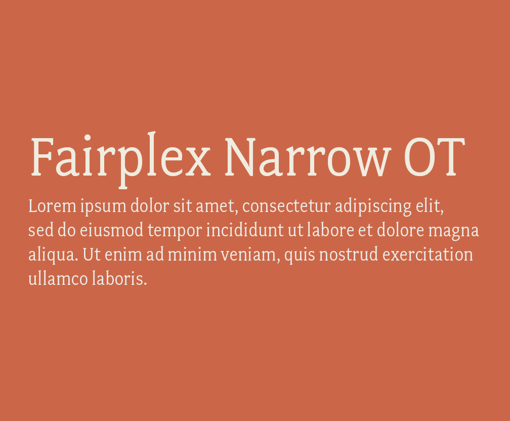
If you’re a beginner at type design, Adobe has a recommendation tool to help you decide on fonts that are best suited for paragraphs or headings.

For those that are new to the font-selection world, you need something that’s easily legible across various mediums at a small size for paragraph copy, and for headings you can be more adventurous with bigger, bolder and more decorative styles -- that are still readable, of course.

2. Save time and filter fonts 

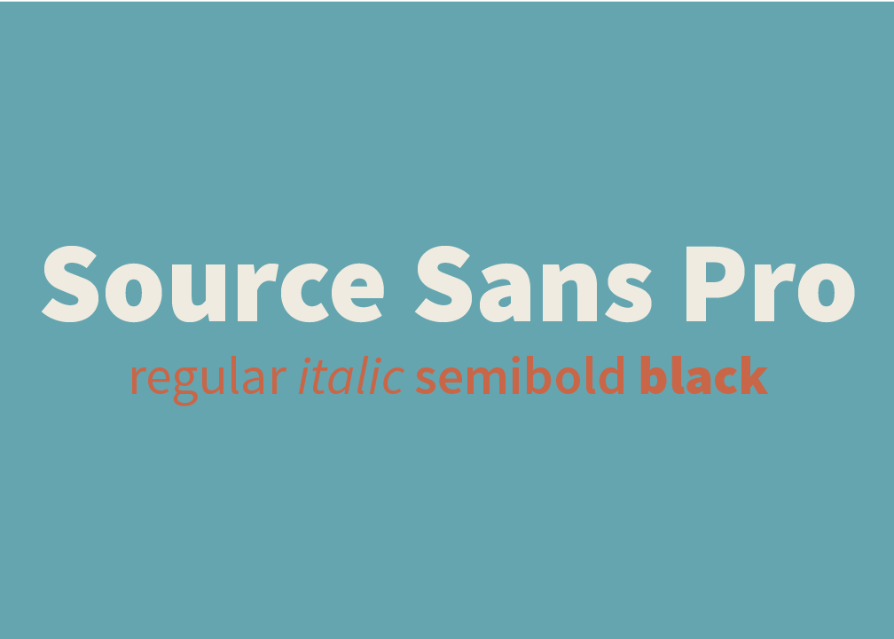
With so much choice at your fingertips scrolling through endless styles can be a pretty tedious and time-consuming task.,If you’ve got a good idea of what you’re after, cut out what you don’t want by filtering specific properties, like: 

  • Weight - the thickness of the stroke

  • Width - the width of the actual letters

  • X-height - the ratio of lowercase letter height to uppercase letter height

  • Contrast - the ratio of thick and thin strokes

  • Standard or caps only - i.e. fonts that use lower and uppercase letters, or fonts that only use capital letters

  • Default figure style - choose between Oldstyle (more old-fashioned) or Lining (more modern) for your numbers

Making the most of Adobe Fonts’ features  |  Hue & Tone Creative


3. Use the right font availability

What’s the difference? Web fonts are used directly on your site, and synced fonts are imported to your Typekit for in-program use on things like Photoshop and Illustrator. Discover how to install fonts here.

Whether your artwork’s for print or web should determine the font you use, which means it’s important you’re clear on the end-use from the outset.

To make choosing the right font easy Adobe differentiates between web fonts and synced fonts, so make sure you pick one from the right category.

4. Test your chosen font

Adobe’s ‘type tester’ feature allows you to see how your chosen font(s) look online before you add them to your kit and invest time into updating your design work.

To put this feature into practice, just head to the main browsing page where it says “Use fonts” and then click the “Web” tab when a pop-up appears. If you like what you see all that’s left to do is to add the font to your Typekit.

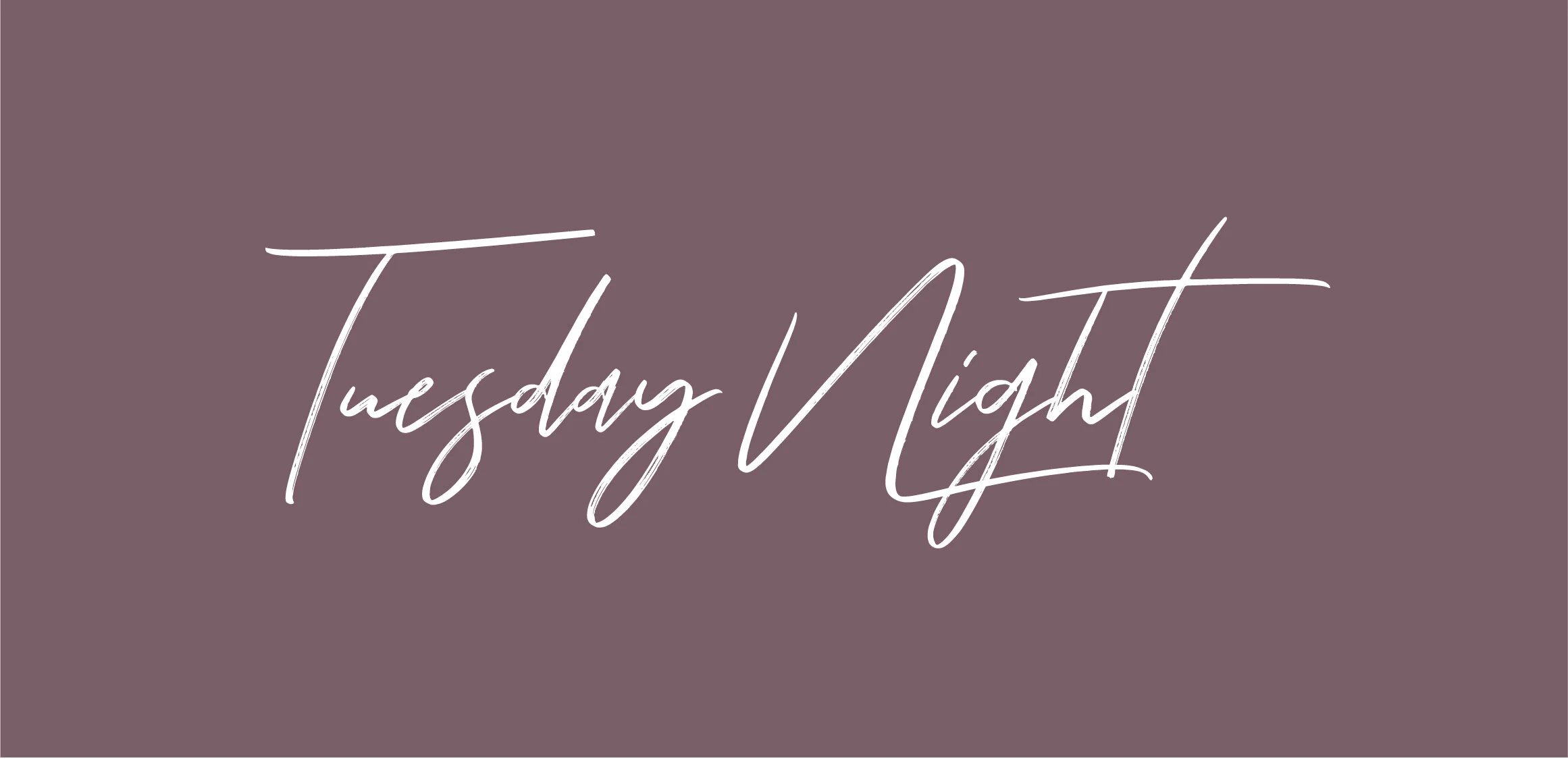
5. Use contextual alternates

Sometimes, certain glyphs can be a bit intrusive or distracting and the last thing you want is to jar readers as they’re scanning your copy -- but Adobe’s contextual alternates (calt) feature can help you overcome this.

It’s particularly useful when using script typefaces and it works by replacing default glyphs with better-performing alternatives.

Need help? You can find more about line and character spacing here.

6. Experiment with your spaces

If you’ve selected your font but you’re not 100% happy with the spaces between characters, lines and paragraphs, remember, you don’t have to settle with what you’re given as standard. To create something that gels perfectly with your page experiment with your gaps by opening the ‘Text properties’ box and playing around with the spacing options.


Hue & Tone Creative: Your partners in design

Still confused about what font to pick? If some (or all) of this post went over your head, we can help! Design is our forte and we’re known for helping organizations find their perfect font -- without fail. Drop us a line on hannah@hueandtonecreative.com to find out more.

Our Favorites: More Great Free Fonts to Download

Finding the perfect font is no easy feat. For starters, there’s an unfathomable number of options to choose from. Even once you select a font, there’s a ton of variables that can interfere with what does and doesn’t work - do you need the font for print or digital? Are you designing something colorful or monochromatic? Are you laying the font over an image or putting it on a blank background? The the list of potential factors goes on and on!

What’s worse, is that many popular fonts require purchasing a license — one that can often be quite pricey. We’ve already compiled lists of our favorite Adobe Typekit fonts (free if you have an Adobe CC license) and our favorite Google Fonts. But if none of those are speaking to you, we’ve pulled together another list of ten great free and easy to download fonts.


1. Hansief

Hansief is a simple and bold typeface offering a unique vintage feel. It comes with two styles - regular and rough - enabling it to easily adapt to a range of design settings. Download here.


2. Tuesday Night

For those pieces that need an elegant, classy and handcrafted touch, look no further than Tuesday Night. Download here.


3. Mr Grieves

 If you’re after something with a bit of texture, then Mr Grieves has you covered. It’s rough, ready, and raring to grab your audience’s eye. Download here.


4. Bosk 

A handmade brush font by nature, Bosk lends itself very well to artwork in need of that personal and custom feel. Better yet, it’s multilingual and comes with more than 400 characters, so you won’t struggle for choice. Download here.


5. Oraqle Script

Talking of choice, enter Oraqle Script. It’s got uppercase, lowecase, numerals, punctuation and multilingual characters, and also includes things like ligatures, stylistic alternate characters and swashes. Modern, striking and full of texture, it ticks all the boxes. Download here.


6. THE BOLD FONT

 If there’s one thing The Bold Font absolutely oozes, it’s trendiness. It’s streamlined and ideal for anything from logos and packaging to social posts and on-page headings. Download here.


7. Nikoleta

Simple, slim, refined and commanding, Nikoleta is good to go for things like posters, headlines and online ads. Download here.


8. Old Growth

Inspired by the old growth forests of the west coast, Old Growth is fairly new which opens up the door to testing something relatively untried and really standing out. In the words of the creator, it’s perfect for branding, quotes, headlines and more. Download here.


9. Buffalo

Now this one’s definitely different, but different is by no means bad. While we wouldn’t suggest overusing this one, we think it’s the perfect pick for key headlines and accents. Download here.


10. Bodoni XT

For those after more of a classic feel, Bodoni XT offers the right balance between traditional and on-trend. It’s also readable, making it a good fit for longer chunks of text. Download here.


Hue & Tone Creative: YOUR Graphic Design PARTNER

Whether it’s a complete overhaul of your branding, a one-off social media ad, an eye-catching business card, or a logo refresh, we’ve got the expertise you need to make your branding pop. Contact us at (336) 365-8559 or hannah@hueandtonecreative.com to see how we can start working together.

Must download free Google Fonts
Must Download Free Google Fonts  |  Hue & Tone Creative

Whether you’re designing a resumé for the job of your dreams, sending out invitations to a gala, or creating a sleek new business card, using the right fonts will help you grab someone's attention and accurately communicate your brand.
 

Google Fonts has 847 fonts to sort through, so we’ve rounded up some favorites for you to browse. And remember, all of these fonts are free and open source, so there’s no need to worry about potential licensing hiccups. You’re free to use the fonts for any project, whether it’s a personal blog or a commercial campaign.


Sans Serif

You can never have too many sans serif font options. These versatile fonts are great for logos, headlines, and graphics. 


Serif

Give Times New Roman a break and swap it for something more modern.


Slab Serif

Looking for a typeface that packs a punch? Try a slab serif.

 Want even more fonts? Keep the downloading going by syncing some of our favorites from Adobe Typekit.


Professional Creative Services in Greensboro, NC

Don’t have an eye for design? We can give your brand the creative touch it needs. From email campaigns and logos to everything else in between, Hue & Tone Creative can help your brand stand out.

Must-have Adobe Typekit Fonts

If you use Adobe’s Creative Cloud suite, then you’re probably no stranger to Typekit. With over 1,000 options at your fingertips, choosing the right font can be a challenge.

At a loss for which fonts to use? We’ve rounded up a collection of our must-sync fonts.


Serif

These serifs give a sophisticated feel to resumes, business cards, and printed media. 

Slab Serif

Need a font that stands out? These bold slab serifs are perfect for headlines.


Sans Serif

We love these sleek sans serif fonts for blogs, websites, and everything in between.


Web & Graphic Design Services in Greensboro: Hue & Tone Creative

Does your brand need a Spring refresh? Hue & Tone Creative will help you update your look. From email campaigns and web design, to presentation graphics and business cards, we’re here to help you put your best foot forward. Contact us today to learn more about our creative services -- 336-365-8559.