

In 2021, we anticipate companies messaging will be all about authenticity and simplicity. As brands become more and more social media savvy, the competition is becoming even fiercer. In addition to looking for eye-catching graphics, consumers are more conscious than ever of trying to support ethical brands that align with their values.
What makes a brand stand out has become about more than just a company’s products and marketing – it’s also about the cause a brand represents and the lifestyle they support.
After a long year of trying to fight for attention and having to pivot business models, we anticipate that many brands are in for another intense year. Many scrappy businesses were able to distinguish themselves in 2020, and we think pulling to the forefront in 2021 will hinge on strong and distinctive marketing.
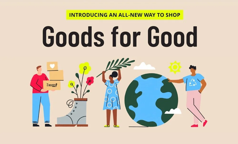
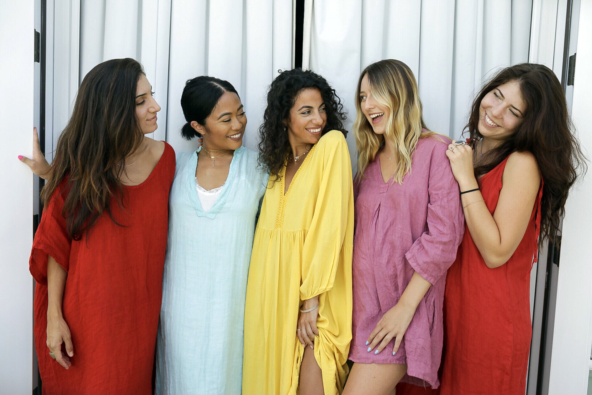
1. Authentic Representation + Socially Conscious Design
Graphics featuring “Stop the spread” and “Black Lives Matter” messaging took center stage in 2020, and we foresee this trend continuing well into 2021 (and, hopefully, beyond). Whether it’s putting an activist message front and center or paying closer attention to representation, brands are being held more accountable for their role in our culture. In addition to socially conscious messaging, marketers are paying closer attention to the representation in their work and featuring a wider array of races, sizes, and ages in their advertising.
As brands rally around a cause, we suggest making sure the cause makes sense for your brand – and feels authentic. The only thing worse than tone-deaf messaging is the overwrought and inauthentic messaging that comes from a brand trying to co-opt a cause to turn a profit.


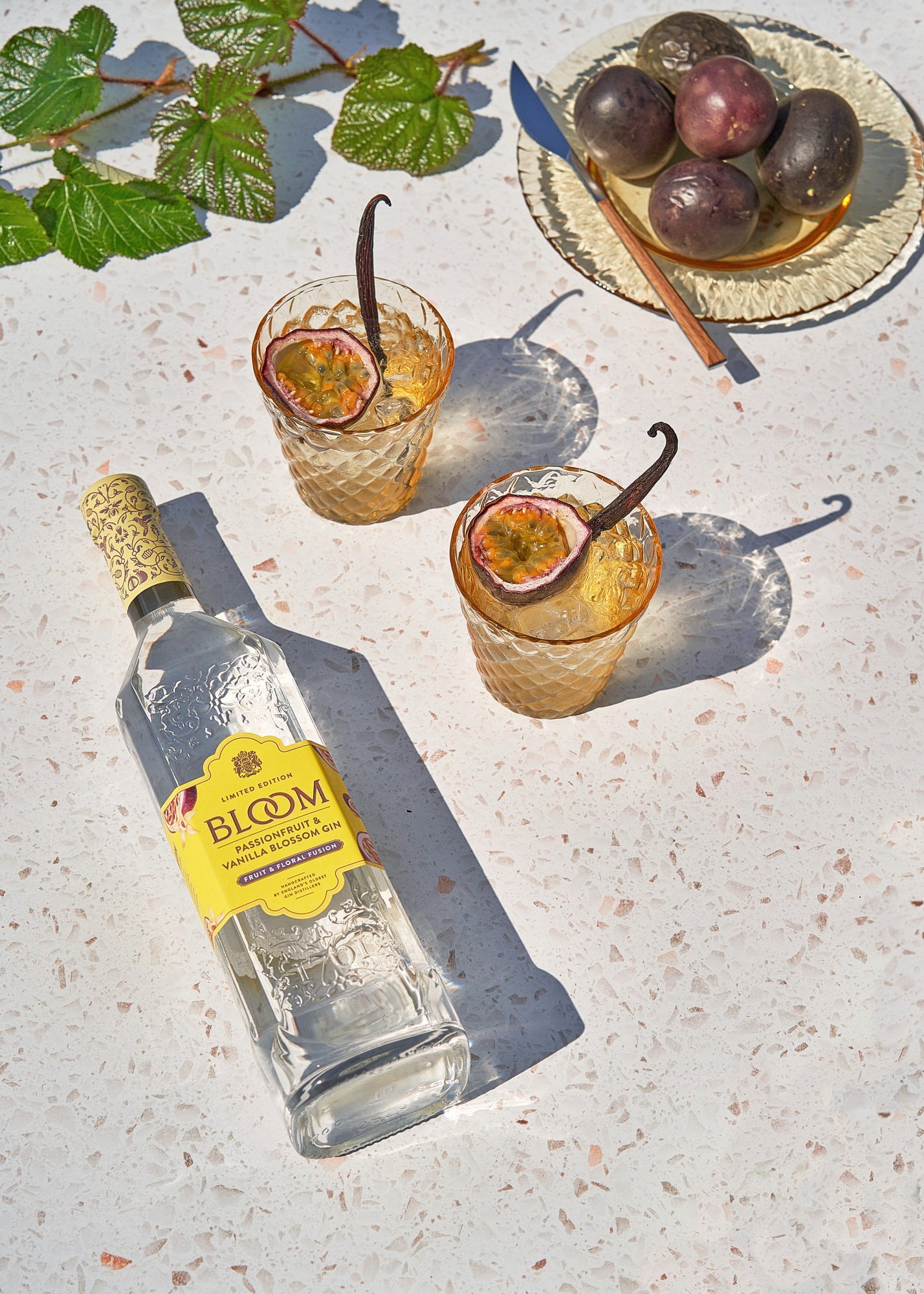
2. Gold, Terrazzo, and Texture
The trending textures we anticipate in 2021 are similar to what we saw in 2020. When it comes to home décor, gold and an all-white aesthetic have been reigning for years – in 2021 we anticipate gold will continue to trend… but with hints of soft pinks, dark navy, and other pops of color. We also think terrazzo will continue to appeal in millennial-targeted product photography.

3. Muted Color Palettes
Bright colors and intense duotones have been reigning since early 2017. That’s why we anticipate a shift toward more muted color palettes this year.
Muted colors are soothing – they can also evoke feelings of nostalgia, safety, comfort, and nature. We saw many health brands using a more muted scheme in 2020, but we think the trend will reach a wider array of industries this year.
4. Data & Text Heavy Video
Working remotely has ushered in a new phase of more text heavy video design. In addition to clearly communicating a message, these videos work well for people using smaller teams, working remote, or those on a limited budget.
We see this shift toward text heavy video also working well with current data trends. Gone are the days of complicated infographics – these days big, bold, simple statistics reign. They’re easily shareable and grab people’s attention on the ever-more-crowded internet.
5. Black and white branding
Black and white branding allows product photography to really stand out. This isn’t a new trend, but it’s certainly something we’re seeing an uptick in. Clean, minimal branding is a great way to stand out from the noise and colorful landscape of social media. As products try to distinguish themselves from the crowd, we think we’ll see more and more colorless branding in 2021.


6. Dark Mode
This trend relates back to designing for accessibility and ease of use – something we covered in more detail in 2020.
Dark mode has been gaining reach in online product advertising this year – and we think this shift is going to impact brand design trends in 2021. Apps and operating systems are all offering dark mode options and these dark mode user interfaces help highlight design elements. It’s worth considering how the dark mode experience impacts your users and then tweaking your designs accordingly.
For example, white fonts on a dark background tend to appear bolder – does that impact the way people interact with your app? Do your design elements work well at all screen brightness’s?
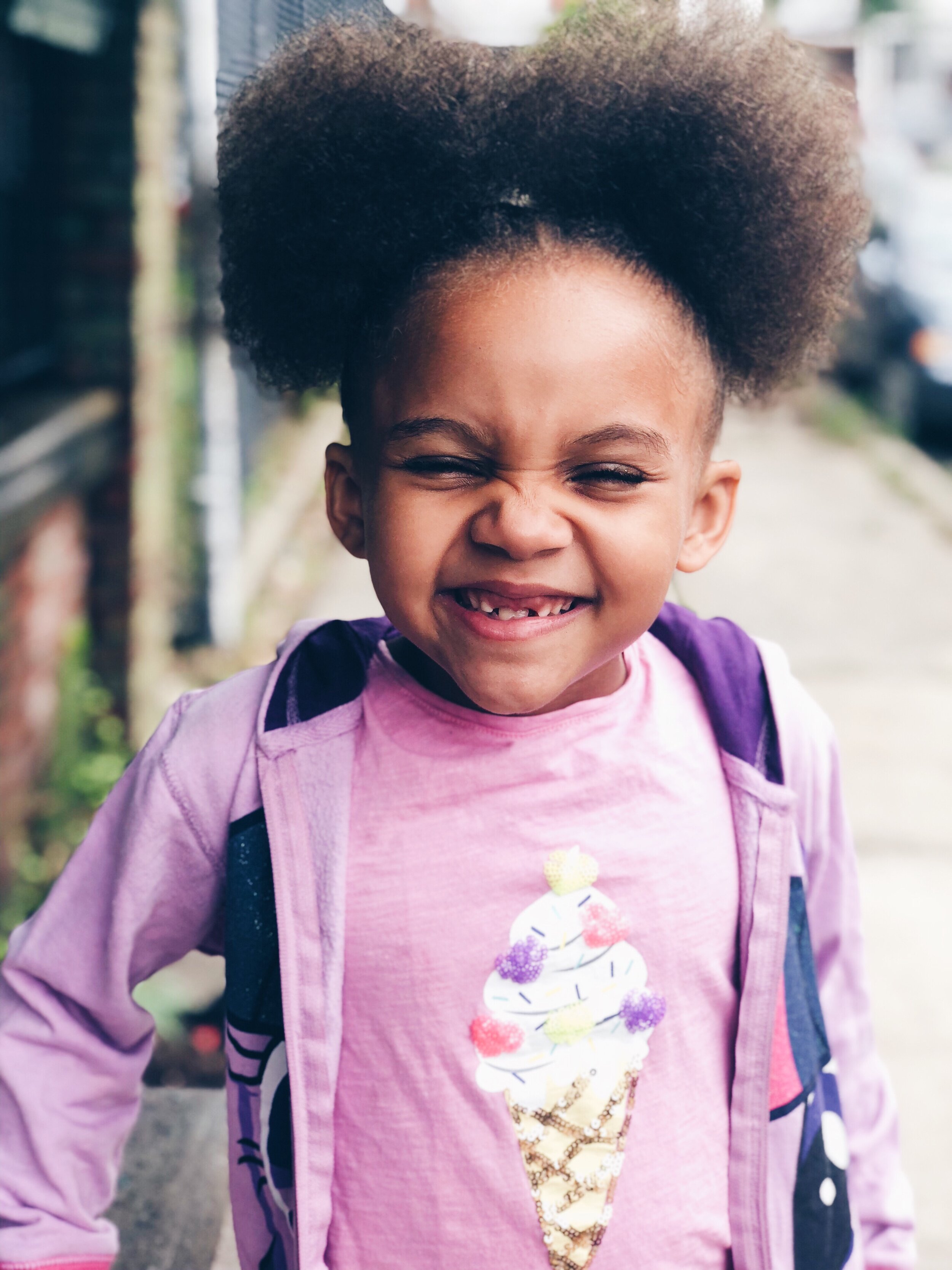
7. Authentic Photography
Genuine messaging isn’t the only authentic content audiences are looking for – they’ve also got an eye for spotting posed or ersatz stock photography.
We’ve been a long-time proponent of investing in a branded stock photography shoot. Take a few hours to collect shots that will represent your business for the year to come – you’ll invest a bit more than you will for a stock photo subscription, but the result will be authentic photos that you can use across all of your digital and print advertising.
A few examples of more authentic stock photography from Twenty20.
Hue & Tone: Your partner in design for 2021
Realizing your brand needs to get with the times? Let’s use more impactful marketing to make 2021 your highest grossing year yet. Reach out to set up an initial consultation now.