
How to improve your designs using color theory
Be honest, how many times have you sat and stared at your screen experimenting with endless color pairings only to realize three hours later you’re no further down the line?
Frustrating, isn’t it?
Well, designers don’t hit the jackpot just by luck, they use what’s called color theory. Color theory is a term used to describe the collection of rules and guidelines regarding the use of color in art and design – and it is defined as a theory because it cannot be proven.
Color theory is a science and art in it’s own right – but even non-artists can gain a basic understanding of color theory to better understand how to make a pleasing design. Knowing which colors play well together and the effects specific colors have on a majority of people is a valuable expertise no matter what your field.
What’s color theory?
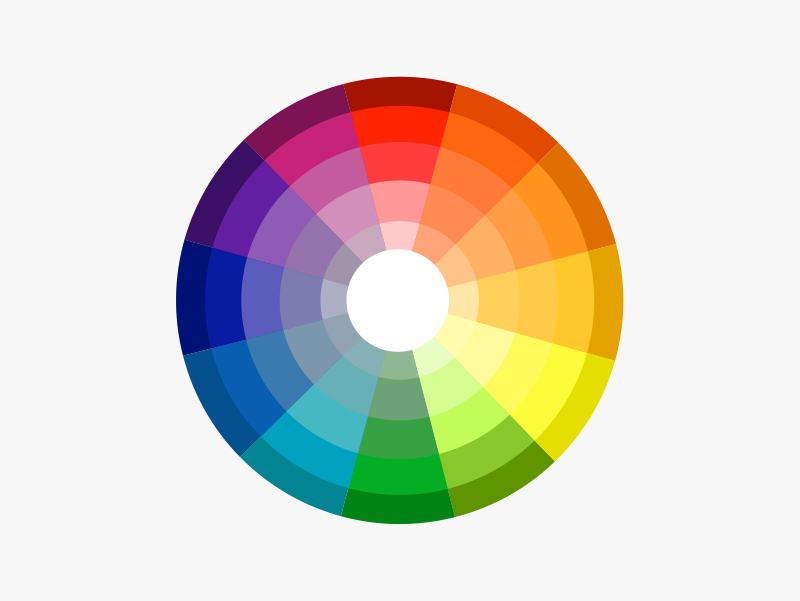
Image via dulux.co.nz
The color wheel is a tried and tested blend of art and science that show you which hues go well together. The color wheel we use today is based off Isaac Newton’s 1666 color wheel which shows the relationship between colors. Sir Isaac Newton created the color wheel based on his experiments with prisms that led to the theory that red, yellow and blue were the primary colors from which all other colors are derived.
Now we’ll dive into a breakdown of how to use the color wheel for your own branding and design projects. By following these simple rules, you can shave hours off your next color-picking expedition and end up with a better-looking final product!
Complementary
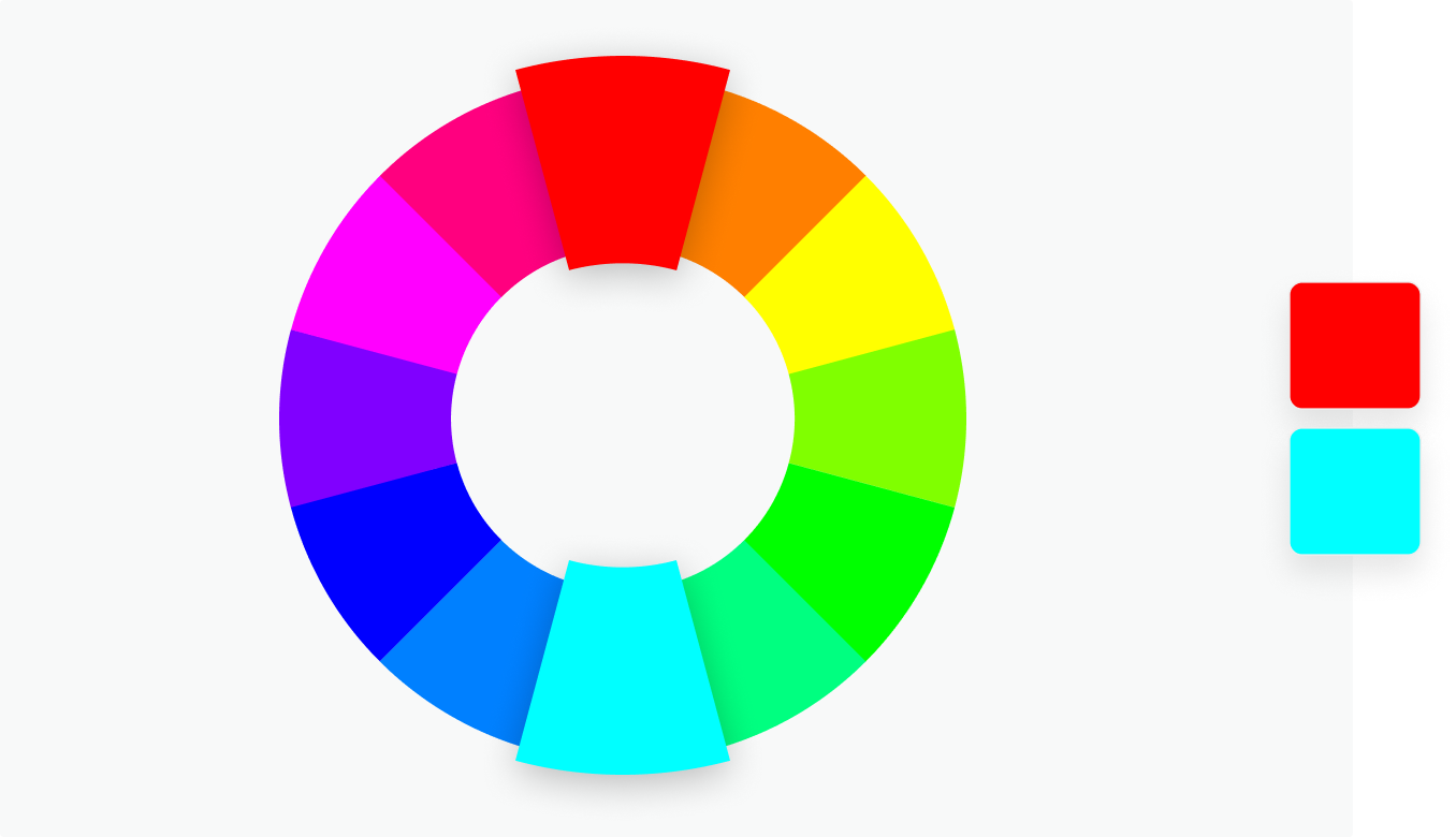
Image via Canva.
Any two colors that sit on opposite sides of the color wheel -- like blue and yellow or pink and green, for example. Complementary colors are high in contrast and impact and work together to create bright results.
Monochromatic
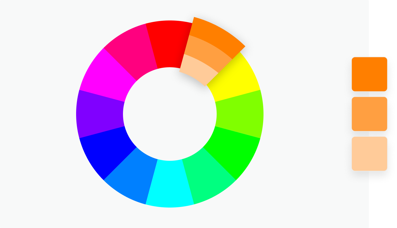
Image via Canva.
Want a headstart? We’ve got lots of great color themes to choose from here.
These are shades of the same color and result in subtle and harmonious finishes. While monochromatic combinations are great for creating a consistent feel another color will need to be brought into the mix to add another layer to your work -- otherwise, everything will start blending into one another.
Analogous
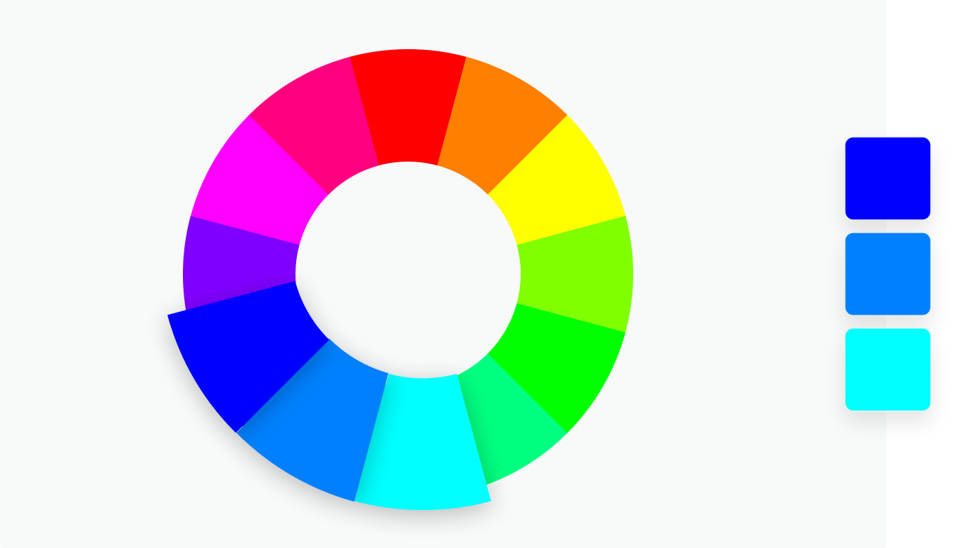
Image via Canva.
Tip: to prevent that from happening pick one of the three for your dominant color and then use the other two as accents.
Any three colors that sit side-by-side on the color wheel -- like orange, yellow and green. On the plus side, these can be really versatile combinations, but on the downside, if you don’t manage them right they can soon become a bit tooin your face.
Triadic

Image via Canva.
Make sure you get your proportions right for this one! Triadic colors sit at three evenly spaced intervals on the wheel and hit that right balance between contrast and versatility.
Tetradic

Image via Canva.
Similar to the above but this time across fourevenspaces. If you’re going with this option just remember the more colors you use the harder it’ll be to balance what’s on your palette -- and less can certainly be more sometimes.
To avoid overwhelming people, as with analogous combinations, pick one color as your dominant and use the rest as accents.
4 good-to-know color wheel facts
1. It’s made up of 12 colors: red, orange, yellow, chartreuse green, green, spring green, cyan, azure, blue, violet, magenta and rose.
2. It can be split into three color types:
Primary: colors that create pure white light when blended together (red, green and blue)
Secondary: the result of mixing two primary colors, i.e. green and blue make cyan
Tertiary: there are six in total and they’re the byproduct of combining a primary and secondary color
3. The two halves of the wheel make up warm (purple through to yellow) and cool (blue through to green) colors.
4. If you add black, grey or white to any base hue you can create shades, tints and tones of any color:
Shades darken the color and are made by adding black
Tints lighten and are conceived by adding white
Tones create a subtle version of the original color when white and black (or grey) are added
Hue & Tone Creative: Your partners in color
If this blog post left you feeling more confused than clear, why not hand the hard part over? We’re design experts through and through so you can trust us to find the perfect pairings for you. Interested? Get in touch on hannah@hueandtonecreative.com or (336) 365-8559.