Web Design Trends to Leave in 2017

The song, It’s so Hard to Say Goodbye to Yesterday was originally recorded for the 1975 film, Cooley High. It’s a real tear jerker and may make for fitting music as we bid farewell to design trends that can’t join us in the new year. Honestly, the list itself isn’t sad at all. It’s actually solid advice regarding 4 web design trends to leave in 2017.

Design Trends to Leave in 2017  |  Hue & Tone Creative

Before we get to the list, let’s quickly discuss why this purge is so necessary. Two letters: UX. UX or User experience refers to a person’s feelings and impressions about using a particular product, system or service. In this case, your website. To keep this experience simple, logical and enjoyable, these 4 web designs must be left behind.
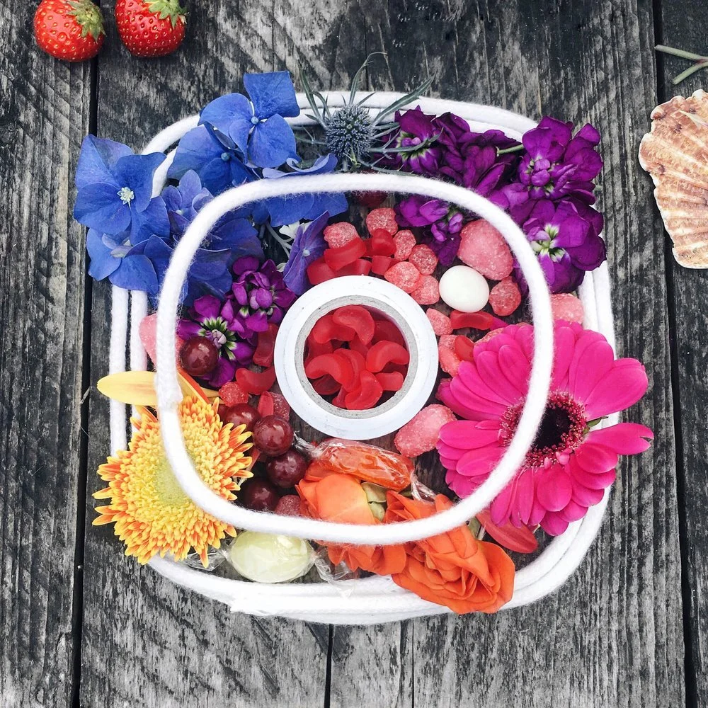
 

#1. Skeuomorphism

The design concept that merges our real-life perception or characteristics of an object with its digital equivalent. A good example of this is the original Instagram logo; a life-like image of a camera that has since changed to a simpler, semi-flat design. Flat and semi-flat designs have a minimalistic feel and seem to be preferred more widely by web audiences. For this we say adieu to skeuomorphism. 


#2. Hero Images as the whole Story

Hero images are large images that take the place of traditional banners and are generally overlaid with text. Don’t get me wrong, they look amazing. They are captivating, they are alluring and signal substance. The problem is, some websites are little more than these images with no accompanying meaningful content. Perfectly fine for a webpage used for contact information or a place to describe a single product. However, hero images are not enough to tell the whole story about a business and its products or services. Coca-Cola is a great example of how to use hero Images while still boasting a site full of relevant and substantive content. Easy to say arrivederci to hero images as the entire story.


#3. Tight Spacing

Sometimes, full breakups aren’t necessary. A little space goes a long way at rekindling a quenched flame. White space in particular, could vastly improve the look and feel of your website. This can be accomplished pretty easily. Sites that are text heavy can add space between lines and letters, enhancing readability. Similarly, those with lots of products to display should take a hint from Amazon.com which uses grid layout design. The online superstore has successfully employed this design to organize their many products. In either case, the user experience is upgraded. We can happily say adios to tight spacing. 


#4. Sliders and Carousels

These are not the same, but are similar design techniques. They each involve the movement of images in either a sliding or rotating fashion. Neither, according to a Nielsen Norman Group study, were found to be effective conversion tools. A point made many times over the years, but appears on this list due to an even greater downside. The designs could negatively impact your SEO or search engine optimization. While the use of sliders and carousels aren’t automatic SEO killers, the risk to your website’s ranking is real and may not be worth taking that chance. Either, enlist the help of a professional website builder or try something else. Videos are a great alternative to both these elements and may be a better way to tell your story. Let us say Gooday to sliders and carousels. 


Companies in the know wisely improve their websites to increase user satisfaction. This includes, but is not limited to the way the site appears on mobile or desktop devices, how easily and intuitively one can navigate the site, and the overall functionality and feel when engaging with the website. The 4 web design trends to leave behind, tend to interfere with these aims in one way or another. It may not be so hard to say goodbye after all.


WEB DESIGN IN GREENSBORO AND BEYOND

Guilty of using all these things on your website? We can help pull you out of the past!
Hue & Tone Creative will help get your web presence up to speed. Be sure to check out our design portfolio to see clients we’ve helped in the past -- and then give us a call if you’d like us to build you a modern website that truly tells your story.

EPS, AI and PDF files and Other Life Mysteries Solved

As another year comes to a close, it’s common to reflect upon our existence and the world at large. What’s the meaning of life, are we alone in the universe and what’s the difference between EPS, AI and PDF files? The first two questions are worth pondering, but in this marketing dimension, the latter inquiry is of much greater importance. Let’s take a closer look at these formats and hopefully solve at least one mystery of the world.
 

EPS, AI and PDF files and Other Life Mysteries Solved  |  Hue & Tone Creative

Encapsulated PostScript or EPS predates AI and PDF files. It and the other file formats can contain any combination of graphics, text and images. The different components comprising an EPS file are communicated in a programming language called PostScript that describes the objects in and the layout of a page. An EPS file internally contains this programming language which accounts for its main benefit: compatibility.


EPS has cross-platform compatibility which means it can be shared between Mac and PCs. While a EPS can be accessed on a Mac automatically, if in Windows, it requires graphic software like Adobe Illustrator, Inkscape and Corel Draw to open and edit this type of file. Also, if the file is print ready, meaning no changes need to be made, an EPS file can be sent directly to a PostScript printer without compatibility issues and to most imagesetters. It’s the original file format for complex designs and is still used by graphic designers and publishing professionals currently. However, it’s been gradually supplanted by AI and to a greater extent, PDF files. Here’s why:


AI or Adobe Illustrator Artwork files are vector based graphics contained in a single page. While AI files have many of the same attributes as EPS, AI is an application-native format. This means that it is designed to be understood by the software that created it. In this case, Adobe Illustrator. AI files can still be imported by other programs like Freehand or CorelDraw, but when doing so, it omits any Adobe Illustrator-specific content it doesn’t understand. Simply put, AI file formats function most optimally in Adobe Illustrator, because they were literally made for each other. Contrarily, EPS wasn’t created for any particular application. This file type is an exchange format where the intent is for it to be openable by multiple applications. Think tailored suit vs one-size-fits-all pant. While EPS is compatible with more applications than AI, the entirety of the information contained, doesn’t always translate into the chosen application. This problem led to the creation of the PDF.


PDF or Portable Document Format is described as the successor of EPS. The PDF was the first file format that enabled a document to be shared electronically while retaining its original formatting. No matter what application is used, you’re able to transfer electronic versions of these documents anywhere, and view and print them on any machine. It allows the exact presentation and exchange of documents, independent of software, hardware, or operating system. Unlike EPS, it translates exactly no matter what. And contrary to AI, it’s not limited by its application of origin.


The file type you use should depend on the project at hand, the tools in your box and you and your team’s preferences. EPS, AI and PDF files all have their unique advantages given the context and you may find yourself using each of these throughout your work.  While there are still larger life questions we all want answered, at least this one can be crossed off the list.


CREATIVE EXPERTS IN THE TRIAD

Can't figure out your mess of files? Not sure what the printer is asking you for? No worries, we'll get your businesses branding back on the right track -- we specialize in branding and collateral design. Whether you need to refresh your existing brand or start from scratch, we've got your back. Contact us if you're ready to stop stressing about your visual identity.

5 Thankworthy Tips for Better Holiday Content
5 Thankworthy Tips for Better Holiday Content  |  Hue & Tone Creative

Macy’s Thanksgiving Parade, The Starbucks Holiday Cup, and the NFL’s Thanksgiving Games are all examples of how companies capitalize on the Holiday Season. You may be wondering how your business can get in the holiday game. If you’re not yet prepared to spend millions on gigantic floating turkeys or interested in joining the controversial cup circuit, you could simply create season-specific content for your darling customers and clients. Below are 5 thankworthy tips to generate more interesting holiday content for your website and social media outlets.


1. Customization is Key.

Your customers’ likes and dislikes, locations, and values, etc., should dictate what you’re posting on a normal basis. Likewise, it’s helpful information for the direction of your holiday content. For local clients, contributing a calendar of nearby holiday events would be beneficial. If your base is smorgasbord of religious beliefs and practices, then focusing on shared values like gratitude and family could aid in promoting holiday cheer without offending anyone. If you don’t quite know the makeup of your patrons, see our helpful guide to creating customer personas. The point is to customize your content for your audience which will have them coming back for more helpings through the holidays and beyond.


2. A little Industry Anyone?

Your content should fit your industry. Gift guides, product reviews, stories regarding your company’s philanthropic pursuits are all popular methods and sources for holiday driven content. Whatever you choose, it should be industry-based. A recipe app could of course feature holiday inspired recipes like red velvet cake or Cajun turkey tips, whereas the Goodwill could, more relevantly, post about finding the perfect holiday look or ways to tailor donations toward holiday needs. Injecting your content with juicy business/industry-specific information will have your customers salivating for more.


3. Help Me, Please!

The holidays are a time for many decisions to be made. What should I cook, how should I decorate, what are the best gifts of 2017 and where should I shop? With so many options to choose from, having a trusted advisor to hep navigate such choices is gold. Do you have information regarding high-demand products or data concerning online shopping vs. in-store purchasing? If so, create posts sharing your expert knowledge. Providing valuable holiday information will delight your clients and could prompt them to share the useful data and your awesome posts with countless others.


4. Picture This.

We’re all familiar with the adage “pictures are worth 1,000 words,” therefore, don’t limit your holiday posts to just text.  Use this time to display compelling images and heartwarming videos about your company. Showcase photos of your office decorated for the holidays or a video of your employees at the annual toy-drive. If your company doesn’t personally participate in these practices, highlight other organizations and businesses who do. Promote vendors, sister companies and other business affiliates by posting videos and pictures of their holiday experiences. It’s a great way of saying thank you to them and to drive some holiday traffic your way.


5. Give Thanks.

Speaking of thanks, some companies like to use the season to highlight the people who make it all possible – their staff.  Who doesn’t like to be appreciated? Create posts that show your employees in festive wear, acknowledging their contributions or cutting a rug at a company party. Create contests for customers and clients regarding the best-looking turkey or ugliest holiday sweater and post submissions on your site. Get others involved by asking for votes. Show the people who matter most that you care and create some buzzworthy holiday content at the same time.


The truth is, there are literally thousands of ways to create interesting holiday content for your site. The challenge is doing so in a way that’s relevant and valuable to those you serve. Honor them this holiday season by providing content that places their needs, wants and contributions at the top of the list.


SOCIAL MEDIA MARKETING IN GREENSBORO, NC

Content stale? That's what we're here for! Whether you’re looking to increase your views or simply need a break from handling your account, Hue & Tone Creative has you covered for all things social.

To Squarespace or not to Squarespace? The small business’s question.

According to the SBA, small businesses account for a whopping 99.7% of U.S. employer firms. If you’re thinking of starting your own small business or maybe you already have, how do you emerge as the peacock amongst all the other peacocks with the showiest feathers? Well, an aesthetically pleasing and user-friendly website would certainly help. In this DIY climate, only one website builder springs to mind: Squarespace. This week, we’ll explore why Squarespace is the best choice for small businesses.

To Squarespace or not to Squarespace?  |  Hue & Tone Creative

We’ve all heard or seen the commercials for Squarespace, the self-proclaimed “all-in-one solution for anyone looking to create a beautiful website.” And beautiful it is. Squarespace’s landing page is like a mini trip to an art museum. The evocative photographs, set against sleek and colorful backdrops, coupled with drag-and-drop functionality, easily marks its self as the preeminent option. Once there, you’re thrilled and delighted to press the Create A Site button.
 

Inside, you’ll find that Squarespace’s versatility is unmatched. The site currently boasts more than 70 different templates. After exploring and choosing the design of your liking, you can begin adding your own content. One caveat, Squarespace’s polished designs only go so far. Be sure to use high-quality photos when swapping out placeholder images. One of the allures of Squarespace is its sleek, professional design, but even that won’t make up for low quality, grainy photographs.

Squarespace has done a phenomenal job with creating beautiful spaces that you can tailor to fit your needs. Do play around with templates if you can’t seem to settle on just one.  Once you begin customizing, Squarespace provides you the option of previewing other templates without losing earlier work. You can experience what your site looks like with a banner overlay, or at various scale sizes, or with numerous navigation choices, or utilizing page animation or displaying a slideshow. And these are just a few of the design options available to you. Like what you see? Great! Let’s talk pricing: 

Screen Shot 2017-11-15 at 8.11.40 AM.png

Squarespace has the simplest pricing plans than any other web builder; with only two total. $12 per month for personal websites, billed annually or $16 paid month to month, and $18 per month for businesses, billed annually or $26 paid month to month. Two additional pricing plans are available if you want an online store. Your hosting and a custom domain name are included with the purchase of an annual membership and that’s certainly a plus.


Other web builders offer free plans, but with limited features, and sub-domain names. Squarespace permits you to try their service for a 14-day trial, but once expired, you’ll need to choose a paid membership to continue service. All things considered, Squarespace’s pricing is competitive with other web builders and the value you receive is undeniable. It has the tools to set any small business apart by adorning it in the most beautiful of feathers and allowing it to really strut its stuff. 


WEB DESIGN IN GREENSBORO AND BEYOND

Loving Squarespace, but not sure what to include on your website? Or maybe your homepage is just looking a little flat? Hue & Tone Creative will help get your web presence up to speed. Be sure to check out our design portfolio to see clients we’ve helped in the past -- and then give us a call if you’d like us to build you a custom, modern website that truly tells your story.

Think Before You Tweet: How Free Speech Can injure Your Brand
Think Before You Tweet: How Free Speech Can injure Your Brand  |  Hue & Tone Creative

The following article is a guest contribution from Tamika M. Page. 


Twitter debuted March 21, 2006 when co-founder Jack Dorsey posted the inaugural Tweet which read, "just setting up my twttr."  While Jack was off launching what is arguably one of the biggest communications technologies of the last century, which currently averages about 328 million monthly active users according to Statista, an online statistics company, I was somewhere in the world learning the importance of thinking before I spoke.  Journey with me, if you will, back to Atlanta circa 2001.
 

At an early morning yard sale, I enthusiastically remarked to a potential customer that she looked like a lady basketball coach. She wasn’t flattered. In fact, she gave me a strange look, put down the candle sticks she had been eyeing and walked away obviously offended. Needless to say, I lost the sale. After fighting the urge to yell, “hey lady, that was a compliment,” I decided to ask some trusted advisors what they thought of the strange exchange. The results were mixed. My Grandmother heard genuine praise while my best friend stared at me in shock; as if I’d lost my mind for uttering the thought aloud. My brother laughed for what seemed like five minutes while my mentor gave me a copy of The Berenstain Bears Forget Their Manners.  How was it possible for one statement to spur multiple and varying reactions?


Meanings get lost in translation.

What I was attempting to express was that this lady had an athletic physique, a beautiful haircut and reminded me of the late, great Pat Summitt, coach for Tennessee Lady Vols. However, my meaning was somehow lost in translation. Why? Well, this woman and I had two different world-views, or lenses through which we viewed the world. What I meant was not at all what she heard. It seems this plays out repeatedly on Twitter. Every week some high-profile individual is reprimanded, or a company is hit with a wave of backlash for an uninhibited Tweet. While my impulsivity cost me, at most, seven dollars, these professionals and companies lose big when they quickly and, oftentimes, thoughtlessly take to social media with their opinions, jokes and grievances.


Your Tweet could be interpreted as an official declaration of war.

Think Before You Tweet: How Free Speech Can injure Your Brand  |  Hue & Tone Creative

After President Trump exercised his First Amendment right via Twitterverse, North Korea’s Foreign Minister, Ri Young Ho, responded with the following, “Since the United States declared war on our country, we will have every right to make all self-defensive counter measures.”
 

You could lose your job, at least for a couple of weeks.

Take the case of ESPN’s Jemele Hill who Tweeted her opinion on how the public should respond to Jerry Jones’s threat to bench any Cowboy’s player who didn’t stand during the National Anthem. ESPN accused Hill of violating the company’s social media guidelines for a second time and suspended her for two weeks. Hill is lucky when one considers other celebs like Gilbert Gottfried who lost his endorsement with Aflac after posting Tweets making light of Japan’s 2011 tsunami.

Think Before You Tweet: How Free Speech Can injure Your Brand  |  Hue & Tone Creative


You could lose customers and respect.

Home Depot quickly parted ways with a social media representative who posted a racially insensitive Tweet targeting African Americans from the brand’s Twitter account. The company decided to Tweet apologies, sans their media rep. When they directed one of these apologies specifically to Al Sharpton, Jesse Jackson, and the NAACP, it only made matters worse.


3 Ways to Avoid Twitter Faux Pas

1.     When in doubt, don’t: We all have a little voice inside us that nags right when we’re about to say or do something that might lead to unwanted trouble. If you possess the slightest inclination that your post may be inappropriate or could be misconstrued as such, don’t Tweet it out. It’s much easier to refrain than to retract.
 

2.     Never go to bed angry or Tweet that way either: Acting from anger is seldom a good idea. Typically, we behave in ways we later regret. Therefore, instead of Tweeting in this state, go for a walk, take deep breaths, do the stanky leg, whatever. The point is to delay expression until you’ve calmed down. This can potentially save your relationship as well as your reputation.


3.     Ask for Help: Consult a firm that specializes in multimedia communications. You may know construction or cakes or calligraphy, but framing your company’s messages perfectly is a specialty in itself. Outsourcing this all-important task will protect your brand and frees you to focus on what you do best.


_MG_2369 (2).JPG

Meet the writer:

Tamika Page works as a marketing assistant and instructor in Atlanta, GA. Her first words were “increase market share.” Although her first words were far less remarkable than previously stated, she does have extensive experience in helping small businesses grow and discover their unique identities.

Want to chat with Tamika directly? TamikaMPage@gmail.com

Color Stories: Flat Lay Finds

If you loved iSpy as a kid, these eclectic flat lays are going to catch your eye...eye for detail that is! 

Flat lays not only make great Instagram posts, but they can also be great design inspiration. A stylized color scheme is part of what makes a good flat lay eye-catching social media gold... as opposed to just a pile of junk on a white background. 

We grabbed a few of our favorite flat lays from Twenty20 and let them inspire 6 unique color schemes! 

Color Stories: Flat Lay Finds  |  Hue & Tone Creative

Sixties Citrus

This color story is looking to make a statement -- 60’s inspired citrus hues pair with a pop of electric strawberry for a modern look that will practically knock your go-go boots off!


Fall Bazaar

An unexpected spin on fall, a muted rosewood hue pairs with a pink that packs a peppy punch. A pale olive and citron pull together this surprising style.


Color Stories: Flat Lay Finds  |  Hue & Tone Creative

Punchy Post-its

Earthy sage pairs with a bright salmon and a goldenrod yellow... these post-it notes inspired a color scheme almost good enough to eat! 


Artboard 2Events.png

Neon Stamp Collection

We pulled these punchy colors out of a dynamic stamp collection. If you’ve seen our logo you know we’re obsessed with citron – add a luscious grape color, a toned down teal, and a calming grey and you’ve got a girly, but fresh, color scheme.


Color Stories: Flat Lay Finds  |  Hue & Tone Creative

Colorful Cars

Whether you’re a racecar driver or an everyday commuter, we bet this color scheme really revs your engine!


Color Stories: Flat Lay Finds |  Hue & Tone Creative

Beige Business

The most muted of the group, this flat lay takes business style to a new place. Soft lavender, navy, and pistachio green give these guys a serene look during a hectic day at their make-believe office.


CREATIVE PROFESSIONALS IN GREENSBORO AND WINSTON-SALEM

Logo looking a little flat? Website lacking pop? We'll get your businesses branding on the right track -- we specialize in logo design, branding, and collateral development. Reach out if you're ready to make your brand stand out: hannah@hueandtonecreative.com or 336-365-8559.

Tools to discover your most relevant keywords
Tools to discover your most relevant keywords  |  Hue & Tone Creative

When it comes to finding the right potential customers, utilizing the correct keywords in your paid search and web content will help you increase your leads.

While it can be tempting to just make educated guesses about the right keywords, it's crucial to take the time and research what will be most effective. But, before we highlight a few handy tools for keyword discovery, it's important to understand what that there's a few different type of keywords. 


Long-tail Keywords

One of the most effective types of keywords is a long-tail keyword. A long-tail keyword is a highly detailed phrase made up of three to four words. Although long-tail keywords are usually searched for less often than their shorter counterparts, they tend to bring in a high conversion rate because they are so specific.

For example, someone looking for "organic gluten-free birthday cakes" are more likely to find your bakery and place an order then someone who just typed in "buy cake" and just wants any old birthday cake that's available.


Local Keywords

Think about times when you’ve searched for services or businesses like hair salons, dentists, or a place for decent pizza. You’re automatically going to weed out a business that isn’t anywhere near you.

If you own a small business, it’s important to get the word out to your local clients through geo-targeting. Instead of only using keywords like “animal hospital,” get more specific with words like “animal hospital in Greensboro, NC.”

While local keywords often have lower search volume, they often have higher conversion rates. Long-tail local keywords will deliver even less traffic, but chances are these visitors are really serious about finding a business. For example, "animal hospital greensboro open 24-7" has a good chance of capturing someone looking for a midnight pet emergency. 

One word of warning? Don't shoot yourself in the foot by casting too wide of a net. Stick to the location of your brick and mortar store and a few surrounding counties -- don't try to capture the whole state or you'll just end up reducing your potential to rank for your actual location. 


Keyword Planner

One of the best ways to discover keywords is through the free Keyword Planner in Google AdWords. Using this tool, you can search through relevant phrases and terms related to your business and see how often they are searched through Google. The Keyword Planner also allows you to research historical statistics and predict the click rate of potential words before you add them into your AdWords plan.


Google Trends

Not utilizing Google AdWords? You can still give Google Trends a try. This is when it's time to make an educated guess about what you think your keywords would be. Start with things like your products or services and check the popularity of one or multiple keywords at a time by searching them on the site. You can narrow down the trends even further by searching in a specific region, state, or span of time.

Tools to discover your most relevant keywords  |  Hue & Tone Creative

For instance, the amount of people looking for “pumpkin patches” in Greensboro and Winston-Salem increased dramatically around September 24th of this year. Google Trends also provided some suggestions for related topics and search terms like “farm,” “maze,” and “pumpkin patch near me.” 

If you're looking to do something like holiday advertising or capture the back to school crowd, being able to track these types of trends can help you predict when your ads will be most effective. 


Moz Keyword Explorer

Moz Keyword Planner has a great analysis and keyword suggestion feature for marketers. If you’re on a budget, the site offers 20 free search queries every month, with the option to upgrade by purchasing the premium plan.

Another helpful feature of this tool is how it breaks down each search term by monthly volume, priority, difficulty, and organic CTR. This will help give you an idea of how competitive it will be to gain clicks -- and how much it will cost. 


keywords --> COntent

After you've done your keyword research, you're probably ready to get out there and buy some ads or bid on some keywords and start driving traffic to your site. But don't forget one of the most important ways that you can build authority -- through your blogging and site content! 

Make sure to write about topics you want to rank for and let your newly discovered keywords influence your blogging. As you might remember from this blog, Google knows what you're blogging about and they rank you accordingly, so don't fall into the trap of only paying for traffic. Strong, organic content can bring you some of the best traffic around! 


Marketing and Social Media Experts in the Triad

Looking for to develop your brand? Hue & Tone is a creative graphic design agency specializing in logo design, web design, social media management, and more. Be sure to check out our portfolio to see clients we’ve helped in the past, or give us a call if you're ready to get started building your brand.

Intro to HTML: Must Know Tags for Beginners
Into to HTML  |  Hue & Tone Creative

If you’re not familiar with HTML, making even small tweaks to your website or custom MailChimp template can be a struggle. HTML is a complicated language and you won’t become an expert overnight – however, you can master a few basics that will make it easier to tweak templates, build web pages, and control your online presence.

This is by no means meant to be a comprehensive guide to HTML, but rather an introduction with some of the most basic tags you’ll need to customize your in-house marketing campaigns. 


What is HTML?

Let’s start with the most basic question – “what is HTML?”

Hypertext markup language (HTML) is a standardized system for tagging text files to achieve font, color, graphic, and hyperlink effects. You use specific tags to customize each element of a web page.

Check it out for yourself: Open up a well-designed site in Chrome, right click, and select "Inspect Element." You’ll be able to get a look behind-the-scenes at how the site was coded. 


HTML Elements

HTML elements are individual components of your webpage that are made up of a start tag <example> and an end tag </example >.

Here’s an example of what a simple HTML page might look like:

<!DOCTYPE html>
<html>
<head>
<title>Page Title</title>
</head>
<body>

<h1>Sample heading</h1>
<p>A sample paragraph would go here.</p>

</body>
</html>


Note the <html> tag at the very top.

This element specifies the language the webpage or document is written in. Without this tag your computer won’t know how to process all the code that follows it. It’s important to realize that browsers do not display the HTML tags, but they use them to render the content of the page.


The Basics

<body>
The visible part of the HTML document is between <body> and </body>.

Your body tag is the first element content tag that you can open after you’ve opened your initial html tag.


<head>
This tag is one of the content elements that can be opened within your body tag. You can vary the size of your headings and subheadings by specifying whether you want <h1>, <h2>, <h3>, <h4>, <h5>, or <h6>.

<h1> defines the most important heading. <h6> defines the least important heading.


<p>
Used for formatting paragraphs of text. Just to be clear, the paragraph tag defaults to which ever style you already have assigned to your style sheet.


<a>
HTML links are defined with the <a> tag.

For example:
<a href="hueandtonecreative.com">You would put the text you want to be hyperlinked here. </a>


<img>
To incorporate an image into your page you’ll want to use an <img> tag -- the source file (src), alternative text (alt), width, and height can all be defined.

Example here:
<img src="hueandtonelogo.jpg" alt="hueandtonecreative.com" width="210" height="210">


Always remember to close your tags. Anytime you open a tag <example> you should close it after you’ve defined all your content </example>. 


Style Elements

<style>
Your style tags help you specify which colors and fonts are used for your headings, paragraphs, etc.


Here’s a few examples:

You could format size like this:

<h1 style="font-size:300%;">This is a heading</h1>
 

Color like this:

<h1 style="color:blue">This is where the text you want stylized goes. </h1>
 

Or both like this:

<h1 style="color:blue;"font-size:300%">This is where the text you want stylized goes.</h1>


Formatting Elements

Formatting assist with the aesthetics of your webpage, kind of like the style elements we mentioned earlier. The main difference between the two is that your formatting elements deal with text effects.

<b>
Used to make specific text bold.

<i>
Used for italicizing text.

<marked>
Highlights text.

<small>
Makes specific text smaller. 


Helpful Resources

Learning HTML isn’t the easiest task, so here are a few tools to help you become a pro in no time!

  • Treehouse is an online coding school specializing in front end web development, JavaScript, IOS, and Python. Learn from over 1,000 video tutorials, quizzes, and coding challenges. There’s a free trial for first time users.

  • Lynda is a digital learning library where you can learn skills for business, design, marketing, and web development.

  • HTML Dog offers free online tutorials in HTML, CSS, and JavaScript. There are specific tutorials for every level of learning: beginner, intermediate, and advanced.


One last note…

Becoming proficient in HTML takes time and consistent practice, so don’t get discouraged if it doesn’t come easy to you! Be patient and try to set obtainable goals for yourself.


Web and Graphic Design in Greensboro and beyond.

Clueless on how to build a website or create a logo? We’ve got you covered! Eye catching landing pages that help reel in leads to business cards that leave a lasting impression, Hue & Tone Creative is here for all of your marketing needs.

7 Essentials for a Killer Facebook Page
7 Essentials for a Killer Facebook Page  |  Hue & Tone Creative

Simply getting your business on Facebook doesn’t guarantee any kind of social media success. To really reach people and build a following you’ll need a top-notch profile that will grab attention and pull customers in… but how do you make that happen?

Keeping up with Facebook’s latest features can feel like a full time job. But no matter how many features are available, there’s a few elements you should never ignore.

We’ve put together our 7 essentials for a killer Facebook page that will take your page from bland to BAM!

1.    Fill out the basics

Before you get focused on the visuals, make sure that all of your business information has been filled out correctly. This means making sure your address, hours, web link, and business description are all filled out properly.


2.  Simple + strong profile picture

Keep it simple when uploading your profile picture – stick to your logo or a professional headshot. Make sure your image is properly formatted (square) and is high resolution. Nothing makes a worse impression than a blurry image!


3. A distinctive cover photo

When it comes to choosing your cover photo, make sure that your image enhances your profile picture without distracting from it. Your cover photo should show off your products, relate to your services, or communicate your company’s values/mission.

A properly sized cover photo will be formatted to 820px X 312px for desktop or 640px X 360px for mobile.

Can’t communicate everything in one photo? You can also play around with a video cover photo!


4. Direct Your Visitors

You can enhance your Facebook page by selecting a Call to Action (CTA) button to go at the top of your page (it overlays over your cover photo). You can select one of 7 options that will take your customers to the landing page of your choice. The button options are:

  • Buy Now

  • Shop Now

  • Sign Up

  • Call Now

  • Contact Us

  • Send Message

  • Send Email


5. Gather Reviews

Make it a regular part of your customer interactions to ask for Facebook and Google Business reviews. Send a follow-up note to happy customers, put a link on receipts, or offer discounts for people who leave you a review!

Collecting a lot of positive reviews can provide credibility to a new page – and they’re a great way to distinguish yourself in a crowded market! 


6. Set up an auto reply message

56% of shoppers prefer using Facebook Messenger over calling a customer service number when they have an issue. Set up an autoreply message for your page so that people who reach out will get an immediate reply!

But, you ask, what should it say? We suggest using autoreply to set expectations for when you’ll get back to your computer, letting people know where to view FAQ, or to provide alternate ways of getting in touch.

It’s impossible to be monitoring your page messages around the clock, but having an informative autoreply message will ensure customers feel like they’re getting top notch service…whether you’re available or not!


7. Keep your timeline fresh

Need ideas on what to post on Facebook? We’ve got you covered.

This may seem like an obvious one – but posting high quality, engaging content is key to creating engaged followers. It’s key to post often and consistently. Be sure to incorporate visual content like photos, videos, gifs, and infographics to help boost your interaction! 


Were these 7 essentials not enough? Download our comprehensive Facebook checklist for even more tips and to-do’s, and before you know it you’ll have more comments than you can even respond to!


Social Media Marketing in Greensboro, NC

Have you hit a plateau for likes and follows? We can fix that! Whether you’re looking to increase your views or simply need a break from handling your account, Hue & Tone Creative has you covered for all things social.

Mood Boards: Falling into Fall

October is finally here and we’re ready for all things fall. It’s time to trade in our summer sandals for boots, grab our favorite cardigan, and eat ridiculous amounts of pumpkin flavored baked goods.

In the spirit of the new season, we’ve put together a little collection of autumn inspired mood boards: 

Mood Boards: Falling into Fall  |  Hue & Tone Creative

Pumpkin Spice

Yes, we know all things pumpkin spice are a bit overrated, but we couldn’t resist! It just wouldn’t be fall without it.


Mood Boards: Falling into Fall  |  Hue & Tone Creative

Ember

This color scheme was inspired by the warm glow of seasonal candles and the relaxing crackle of a campfire. 


Mood Boards: Falling into Fall  |  Hue & Tone Creative

Woodland Escape

There’s nothing better than going on a walk on a crisp autumn day. We love the feel of a cool morning breeze and the sound of leaves as they crunch with each step. 


Mood Boards: Falling into Fall  |  Hue & Tone Creative

Cozy Cabin

Fall is the perfect time to enjoy freshly picked apples and endless mugs of hot chocolate. 


Mood Boards: Falling into Fall  |  Hue & Tone Creative

Autumn Leaves

Our final board was inspired by the simple beauty of the changing leaves. A soft touch of yellow and green add a subtle dash of color to chocolate brown.


What do you love most about fall? Let us know in the comments!


Social Media Marketing & Graphic Design in Greensboro, NC

New season, new look. Fall is the perfect time to give your brand a little refresh. From business cards to websites, Hue & Tone Creative can help give your brand’s look an upgrade.

How to Create Customer Personas
How to Create Customer Personas  |  Hue & Tone Creative

Successful marketing takes more than coming up with eye catching advertising schemes and posting frequently on social. It’s about making a genuine connection with your customers – and to do that, you have to know who your customers are!

Customer personas (also called buyer personas) are detailed representations of your customers’ demographics, likes, dislikes, traits, and buying behaviors. Keep in mind that these traits are not made up, you need to discover them through comprehensive research.

Digging into the data and discovering who frequents your business will help you develop more effective marketing materials, allow you to boost sales, and make you an all around more effective business owner. 

Whether you’re a brand new business or a company that’s been around for a while, understanding who your clients are and how they shop will go a long way in building a stronger business. 


Focus on the Good & Bad

While life would be easier if we only focused on the positives, being a business owner means taking in the whole picture. In order to have a strong and thorough understanding of your brand, you need to be familiar with both your strengths and weaknesses.

If you’ve had negative customer experiences in the past, reach out to those clients and learn how you can avoid it in the futures. Unfortunately, not everyone will be in love with your company, but you can still use their constructive feedback to pinpoint who you should be focusing your marketing efforts on and what you need to improve in the future.

Alternatively, if you have your top customers who are always liking your social posts, and praising your products, find out what they love about your company, how they prefer to shop, and what they expect from your brand.

Understanding your ideal customers and customers that aren’t interested in your company can help you pinpoint who you should target and who to avoid. 


Creating Your Personas

When it comes to building your personas, the more details you include, the better they become. Here are a few areas to focus on:

­­­

  • Age

  • Income

  • Education level

  • Location

  • Occupation

  • Goals

  • Challenges

  • Values

  • Likes & Dislikes

  • Favorite brands

  • Hobbies

  • How they discovered your brand

  • Favorite social media accounts

  • How often they shop

Your personas should provide a glimpse into who your customers are and how they think.


Now, let’s pretend that we own an organic juice bar. Here's what two of our personas might look like: 

 
How to Create Customer Personas  |  Hue & Tone Creative


From looking at the profiles of our two fictional customers, we’re able to better understand what they’re looking for in a brand. We also have a better idea of how they’d prefer to receive information.

When it comes to making personas of your own, don’t be afraid to reach out to people. Past customers and followers on social are the best ways to find information. Get creative by sending out email surveys, creating Facebook polls, or simply conducting phone interviews. Just be sure to offer an incentive for their feedback and time. Gift certificates, freebies, or discount codes all work well.

Now, get building those buyer profiles! Or, leave us a question below if you need more information.


Graphic Design & Creative Marketing in Greensboro, NC

Need a second opinion on your current marketing strategy? We can help! Whether you need to spruce up your landing page or create a more engaging email campaign, Hue & Tone Creative can help your brand that extra touch it needs to stand out.

5 Must Answer Questions for Any New Brand
5 MUST ANSWER QUESTIONS FOR ANY NEW BRAND  |  Hue & Tone Creative

It’s no secret, strong branding is one of the keys to successful marketing. In fact, 69% of marketers insist that branded content is more compelling than advertising through mail or PR.

When it comes to newer businesses, understanding your own brand will help set you apart from your more seasoned competitors. If you’re totally new to branding or you're just trying to figure out who "you" are, grab a note pad and answer these five essential questions.


1.    What’s your brand story?

From years of hard work to happy accident, every company and product gets its start somewhere. How did your brand get its start? Is there a story that’s uniquely yours? Think of ways to share your humble beginnings and make your company memorable.


2.    Describe your ideal customer?

The most important aspect of opening a business is finding and keeping leads. Taking the time to thoroughly research your target customer will help keep your brand’s aesthetic, feel, and marketing strategies aligned with the wants and needs of your audience.

Because no two customers are alike, we recommend creating personas for three different shoppers. Make detailed lists describing their: age, profession, income, hobbies, where they live, likes, dislikes, etc.


3.    What 5 words describe your brand?

In the early stages of branding, you can never make too make lists! We suggest brainstorming as many words or adjectives that you can think of that define you.

When you can’t think of any more, look over the words you came up with and whittle down your list until only the 5 most meaningful words remain.


4.    What product or services do you want to be known for?

77% of people choose a product because of its brand name. Think about that statistic the next time you reach for a Post-It or a Band-aid!

Like Nike sneakers and Tazo tea, every successful business has a well-known product. When people hear the name of your brand, what will be the first thing they think of? 

It's important to define your signature product or services... before your customer defines it for you. 


5.    What brands do your customers love? 

This can include your direct competitors or brands that are completely unrelated to you. For example, if you’re opening an organic soy candle store, you may have customers that enjoy buying products from Whole Foods, Anthropologie, Etsy, or Earth Fare.

Check out what colors, words, and imagery they use to figure out where you'll fit in with your competition. 


Do you have more branding questions that we didn’t go over? Ask us in the comments!


Marketing & Graphic Design in Greensboro, NC & Beyond

Gearing up for the launch of a new product or business? Don’t dive in without a little help from the creative experts. From business card design and logos, to social media marketing, Hue & Tone Creative can help you connect with your customers and creating a lasting impression.

How to Curate Your Instagram Feed
We all want our feed to look like this!

We all want our feed to look like this!

Ever stumble across a gorgeous Instagram feed and suddenly come down with a major case of account envy? We’ve all been there.

Creating a lust-worthy Instagram account is more than just slapping on a filter and a handful of hashtags. It’s about telling a story and understanding your own unique style.

Whether you’re trying to revamp your feed for yourself or your brand, we’ll give you the scoop on how to create an account your followers will love. 


Choose a Theme

Found the perfect filter or editing settings? Keep your feed cohesive by using it on your other images. 

All successful Instagram accounts have something in common. They all have a look. Finding your own theme takes a lot of research and self-discovery, so don’t get discouraged if it takes some time to get your feed where you want it to be.

Start by studying your favorite Instagram accounts, creating color stories on Pinterest, or simply writing down a list of adjectives that describe your brand. Think about what emotions you want your followers to feel when they scroll through your feed and brainstorm how you can express that visually.

For instance, a feed for a yoga studio could use relaxing colors, natural light, or motivational quotes. An account for a café might use vibrant colors or flat lays of ingredients... Once you get rolling the ideas are endless!

After you’ve decided on a style, use that as a guideline for all your future posts. 


Spice it Up

Now that you’ve found your look, keep your interesting by varying what you post. No one wants to follow an account that posts virtually the same images all the time.

Get creative by telling your story in different ways:

  • Piece a mosaic of individual images

  • Celebrate a holiday

  • Change your setting

Still need more examples of what to post? We’ve got even more ideas to help you get inspired.


Quality over Quantity

Never post a subpar picture just for the sake of likes. It’s much better to have a small number of great images than hundreds of blah ones. Always post high quality images that reflect your brand’s vibe and overall style. If it doesn’t fit your look, don’t post it.


Pro tip: Use a social media scheduler to help you preplan your Instagram content. We recommend giving Buffer or Hootsuite a try! 


Try an App

Although Instagram has a huge array of filters to choose from, don’t be afraid to venture outside of the app! There are tons of (mostly free) photo editing apps on the market with beautiful color stories and editing features.

VSCO- subtle effects and presets

1967- filters with a vintage feel

Foodie- perfect for lovers of food photography

A Color Story- lovely collection of filters and light effects

Adobe Lightroom- a high quality on the go photo editor


One last takeaway…

Creating a cohesive look takes time so don’t rush the process! Post frequently and try not to overthink it. 


Social Media Marketing in Greensboro, NC

Running out of ideas on what to post? Can’t seem to increase your number of followers? Take a breather and leave it to the experts. Whether you’re trying to get the word out for an event or are preparing to launch a hot new product, Hue & Tone Creative can help you ramp up likes, retweets, and mentions on all of your social channels.

Must download free Google Fonts
Must Download Free Google Fonts  |  Hue & Tone Creative

Whether you’re designing a resumé for the job of your dreams, sending out invitations to a gala, or creating a sleek new business card, using the right fonts will help you grab someone's attention and accurately communicate your brand.
 

Google Fonts has 847 fonts to sort through, so we’ve rounded up some favorites for you to browse. And remember, all of these fonts are free and open source, so there’s no need to worry about potential licensing hiccups. You’re free to use the fonts for any project, whether it’s a personal blog or a commercial campaign.


Sans Serif

You can never have too many sans serif font options. These versatile fonts are great for logos, headlines, and graphics. 


Serif

Give Times New Roman a break and swap it for something more modern.


Slab Serif

Looking for a typeface that packs a punch? Try a slab serif.

 Want even more fonts? Keep the downloading going by syncing some of our favorites from Adobe Typekit.


Professional Creative Services in Greensboro, NC

Don’t have an eye for design? We can give your brand the creative touch it needs. From email campaigns and logos to everything else in between, Hue & Tone Creative can help your brand stand out.

The Optimal Font Size for Web, MailChimp, and Mobile

Earlier this month, Twitter rolled out a new font. Unfortunately, not everyone was a fan

Twitter’s switch from Helvetica Neue, to Segue left users complaining that the slender new font was hard to read and caused way too much eye-strain.

Like Twitter, most businesses are bound to make mistakes when it comes to using the right fonts and sizes. Instead of fumbling through and learning from trial and error, do yourself a favor by learning a few of the best font-size secrets. 

Artboard 3test.png

Websites

Whether you’re designing an online shop, portfolio, or blog, it’s crucial that your fonts look clean, appealing, and easy to read.

For best readability, we recommend that you keep your headers and buttons between 30-32 pts and sub headers between 18-26 pts. Body text usually looks best when it’s between 12-16 pts. 


The Optimal Font Size for Web, MailChimp, and Mobile  |  Hue & Tone Creative

Looking to compare email marketing platforms? Here’s a rundown on a few of our favorites.

MailChimp

Email marketing isn’t going away anytime soon. In fact, email is 40 times more successful at bringing in leads than Twitter or Facebook.

One of our personal email marketing tools, MailChimp, recommends that you keep your body text between 14-16 pts. 16 is best for short emails between 2-3 sentences, while 14 pts us better for more lengthy emails.


The Optimal Font Size for Web, MailChimp, and Mobile  |  Hue & Tone Creative

Mobile

According to MailChimp, it’s best to stick to the “one eyeball, one thumb, and arm’s length” rule when it comes to font sizes. Basically, your viewers should be able to see and scroll through the entire email with ease and clarity. 

With this guide in mind, your body fonts should be between 12-16 pts and your links, CTA, and buttons should be between 34-36 pts.


One last note…

When it comes to selecting fonts, the most important thing is to pick an easily readable font. When in doubt, go back to basics. If you stick to a plain serif or sans serif and use these size guidelines, you'll be on your way to finding the perfect typography for your next web project! 


Web & Blog Design in Greensboro, NC

Not seeing much traffic or engagement on your website? It’s probably time for an upgrade! From landing pages to business blogs, Hue & Tone Creative can help you create a site that matches your style and helps reel in leads. 

Mood Boards: Home Sweet Home

We have a confession to make...  We have a bit of an addiction to browsing home decor on Pinterest. But instead of adding to our already over flowing “dream home” board, this week we decided to channel our energy into some shareable content!

If you love day dreaming about how you're going to decorate your house, this little collection of "Home Sweet Home" moodboards is just for you!

Moodboards: Home Sweet Home  |  Hue & Tone Creative

Victorian

During the Victorian era, plain jane décor was a major faux pas. Burgundy, burnt orange, and teal hues create a modern spin on the classic style. 


Artboard 2@5x.png

Ranch

For this color scheme, we were inspired by golden fields of wheat and rustic simplicity.  


Moodboards: Home Sweet Home  |  Hue & Tone Creative

Colonial

Our collection wouldn’t be complete without one of the most popular American styles. Lemon zest, forest green, and robin’s egg blue add a nice contrast to a black and white canvas.


Moodboards: Home Sweet Home  |  Hue & Tone Creative

Cottage

We know it’s cheesy, but we’ve always loved Miss Honey’s teeny tiny cottage in Matilda. For this shabby chic palette, we chose muted shades reminiscent of tea roses, ivy, and aged stone.


Moodboards: Home Sweet Home  |  Hue & Tone Creative

Spanish

For this rich scheme, we combined warm hues like papaya and goldenrod with a bold hint of sapphire.


What’s the style of your dream house? Share it in the comments!


Creative Services & Graphic Design in Greensboro, NC

In a creative slump? Take a break and leave it to the pros! Whether you’re looking to spice up a lackluster landing page or create a lookbook for your brand, Hue & Tone can add an artistic touch to any project.

How to Become a Hashtag Pro (and specific hashtags for your industry)
HOW TO BECOME A HASHTAG PRO (AND SPECIFIC HASHTAGS FOR YOUR INDUSTRY)  |  Hue & Tone Creative

Everyone knows that hashtags and pictures go together like PB&J. But not everyone knows how to correctly utilize hashtags.  When it comes to helping people find your company and products on Instagram, hashtags can play a big role -- but only if you're using the right ones. 

Today, we're going to run through the two main types of hashtags, and then cover how to find and use them properly.


Types

Before you start collecting hashtags, it’s important to understand which ones you should be using. There are two main types to choose from: community and branded hashtags.

Community hashtags are popular on Instagram, but they don’t really have anything to do with brands. For instance, #tbt or #cat could be used by anybody, it’s not exclusive to a company. These are great for helping people discover your profile -- but you'll want to be specific and primarily use hashtags that directly relate to the mission of your brand.

Unlike community hashtags, branded hashtags are for… you guessed it, brands! Usually companies use a consistent tag featuring their name, but you could also make one for a promotion, competition, or product launch.

Branded hashtags are awesome for supporting user-generated content campaigns (UGC) because they help people connect with you and show their love for your brand. 


Where to Find Hashtags

Although it would be easy to throw on a couple of hashtags and call it a day, you really need to your homework if you want to be discovered. 

Save your hashtags tags in Google Docs or a spread sheet so that you have on hand when you need them. 

We recommend thinking like your audience. Dig around and find out which influencers and hashtags are popular with your followers. It also helps to zero in on the more specific community hashtags because they have a smaller following. For example, #artistsoninstagram has over 3 million posts, but if you narrow it down to #inkdrawing, you have about 820,000 posts to compete with. Less competition = more exposure for you.

Speaking of competition, it may also help to scope out what tags they’re using. If they’re posts are getting a crazy amount of attention, hunt around for the right hashtags to spark some likes on your own page. 


Instagram Pro tip

Keep your post clutter free by hiding your hashtags. 

  1. Open Notes in your phone.

  2. Type a dot and hit return (Repeat this process 5 times).

  3. Add all the hashtags you want to use after the 5th dot.

  4. Copy all the dots and hashtags.

  5. After you post your picture in Instagram, hit the comment button and paste all your dots and hashtags.

  6. When you look back at your post, all the tags should be hidden!


Need a few hashtag ideas to help you get started? Here are some popular ones for some of the top industries and the Triad:

Fitness:
#fitlife
#getoutside
#eatclean
#fitspo
#fitnessgoals 

Greensboro & the Triad:
#gso
#gbo
#sogso
#wsnc
#gatecity

 Marketing:
#digitalmarketing
#advertising
#entrepreneurship
#influencermarketing
#marketingstrategy

Restaurants:
#delicious
#locallygrown
#eatlocal
#treatyoself
#hungry

Nonprofits:
#volunteer
#change
#dogood
#socialgood
#socialimpact


Social Media Marketing in the Triad: Hue & Tone Creative

Does managing all your social media accounts feel like a chore? We can give you a hand! Whether you’re looking to expand your list of followers or boost your amount of likes, the digital marketing pros at Hue & Tone Creative can give your accounts the attention they need.

Increase Your Video Reach (Part 3, Great Mobile Video)
INCREASE YOUR VIDEO REACH (PART 3, GREAT MOBILE VIDEO)  |  Hue & Tone Creative

Think about the last time you watched something. Did you sit back on the couch and grab the remote, or did you reach for the phone in your pocket?

The days of devouring media solely on a TV screen are long gone. In fact, the total number of videos uploaded in the last 30 days dramatically surpasses the amount of content produced by major U.S. networks in the past 30 years.

With all those videos out there, how do you get eyes on your own content?

This week for Part 3 of our Great Mobile Video series, we’ll show you how to your iPhone videos to stand out on three major platforms.   


YouTube

YouTube’s search engine is massive, so getting noticed in a sea of competing content boils down to the work you put into your SEO.

To help your videos pop up more often in search results, put time and effort into your metadata (title, description, tags, category, and thumbnail).

TITLE
Your title should be no more than 60 characters long, but keep in mind that mobile users will only see about 26 characters of that.  

Avoid using “clickbait” titles to draw in views. An example? “This will change your life forever!” about a video showing off a new mop. Come up with a title that’s catchy, but honest… or you risk annoying your viewers and forfeiting subscribers.

Organize your videos into playlists. It will entice viewers to watch more of your content. 

DESCRIPTION
Because only 2-3 lines of text (about 100 characters) are shown in the description of your videos during searches, put the most important info first. Mobile users won’t see your description at all, only your title.

TAGS
Spend time researching relevant tags (Google’s Keyword planner is a great tool to use). Make sure that you only use tags that have to do with your video. Irrelevant tags could cause you to land in trouble with Google.

CATEGORY
Make sure to choose the right category based on your viewers’ demographics. We recommend visiting YouTube’s Creator Academy to make sure that your selection is the right fit for your brand.

CREATE A CLEVER THUMBNAIL
An eye-catching thumbnail can help your videos stand from competing search results. Think of your thumbnail as a little snapshot of what your video is about. Stick to a simple scheme like an image from your video paired with bold title. Canva is a great tool to use if you’re not savvy with Photoshop. 


Facebook

Think YouTube is the leading video viewing platform? Well, that’s sort of true…

On average, 45% of people watch over an hour of YouTube or Facebook videos every week. Focusing on one over the other could cause you to miss out on a lot of potential leads.

While you may be tempted to simply share your YouTube link on Facebook, studies show that uploading videos directly to Facebook can increase your share rate dramatically. In fact, when compared to YouTube links, native Facebook videos perform 10x better and receive higher levels of engagement.

Sidebar: Because 85% of Facebook are viewed without sound, make sure that you have your subtitles enabled.

The uploading process it pretty similar to YouTube’s, choose a descriptive title and a compelling thumbnail to draw in views. We highly recommend spending time on your actual post. Only 400 characters of your post will share when people are scrolling through their feeds, so choose your words wisely.

Investing in a Facebook campaign is another great way to amp up your views. Check out our guide for more details. 


Instagram

Before your video debuts, drum up excitement by mixing in teasers with your normal content. 

When it comes to Instagram views, hashtags are your best friend. Using at least one hashtag will bring in 12.6% more engagement that not using any. Just try not to go overboard. The rule of thumb is to choose relevant hashtags that are consistent with your brand, and are easily discoverable by new viewers.

Advertise your video in your bio with a compressed link. You can promote the video further in your other posts by stating “link in bio” at the bottom of the captions.

If you have influencers or special guests featured in your video, make sure to tag their page and have your participants do the same for you. This makes it easier for their viewers to discover your brand. 


One final takeaway…

When you get started with video, don’t obsess over your amount of views. Results take time. Instead, focus on producing and uploading high quality videos regularly, so that you can build up a following and increase your brand awareness overtime.


Hue & Tone Creative: Social Media Marketing in the Triad

Looking to launch an ad campaign or ramp up your social media presence? Get started with the pros! From social media management to email campaigns, the creative thinkers at Hue & Tone Creative can help bring your brand’s story to life.

How to Edit Your Video (Part 2, Great Mobile Video)
Grab a cup of coffee and get ready to edit together a viral video!&nbsp;

Grab a cup of coffee and get ready to edit together a viral video! 

We’re back after taking a week off from the blog!  Two weeks ago, we shared some filming basics (you can catch up on Part 1 here). Now we’re jumping into the must-know stuff about editing video.

Let’s go ahead and dive in head first! 


Edit on a computer

Although there are plenty of video editing apps to choose from, editing on a computer is the key to producing quality professional videos.

iMovie is the perfect starter program for beginners, but its features can be a little limited.  It’s a great place to start -- you can use filters, voiceovers, and a small array special effects. But you might be a little limited when it comes to visual effects, audio editing, and graphic integrations. (It’s also the only cheap/free option on this list!)

Need an app for spontaneous videos? Magisto and Adobe Premiere Clip are free and perfect for on-the-go projects:

Adobe Premiere Pro is one of the leading cross-platform video-editing programs on the market. Because it’s used by film makers, journalists, and broadcasters, Premiere Pro is perfect for high quality professional content. Virtually every type of film or file type is compatible and can be exported to any screen and format. Premiere Pro also works seamlessly with other Adobe programs like Illustrator and After Effects – great for integrating custom titles.

Final Cut Pro X is a high quality professional program from Apple. Like Premiere Pro, Final Cut specializes in advanced techniques and 4K video. And, we personally find it to be a little more beginner friendly than Adobe Premiere. You can also purchase title and animation templates directly through Apple Motion rather than editing them in separate Adobe programs.


A final tip? No matter which software you use, make sure to back up your files! Nothings worse than losing all your hard work to a corrupt file or technical hiccup. If you’re really looking to make video a big part of your marketing take the safe route and invest in a cloud plan or external hard drive. 


Consider the Viewer

The obvious goal of your video is to be shared. When you’re editing, focus on what you want your audience to see, think, and feel.

The best way to spark your creativity? Go watch other people’s videos and see what’s trending!

Are you trying to spark an emotional response? Sharing a clever hack? How you present your material makes a difference in how it’s received by others. Think of your video as a story, with a clear beginning, middle, and ending. If you’re viewers are confused by what they’re watching, they’ll move on to something else.

Studies show that the average viewer’s attention starts to dwindle after 8.25 seconds. To keep your viewers engaged, trying to break up talk-heavy scenes with visuals or infographics. You can also shake up static scenes by varying your camera angles. 


Cut out the fluff

You have a limited amount of time to hold your viewer’s attention and communicate your message. If your video if veering off-topic, cut it down. There’s no point filling your video with irrelevant content.

Make sure to scan your video for mistakes, “ums”, awkward little moments where you may have lost your train of thought (it happens to everyone). Cutting on specific words can help transition to a different topic and make the video flow evenly. 


Tailor for social

Your video’s length really depends on which platform you’re uploading to. Keep this little guideline in mind before you start filming. Save intros/outros for YouTube videos. There’s no need to use them for shorter social media videos.

Facebook: 1 minute

Twitter: 45 seconds

YouTube: 2 Minutes

Instagram: 30 seconds


Add Some Music

Want to use some subtle background music? Here’s a list of sites that offer music with a Creative Commons license.  Just be sure to double check the terms before you use a song. 

Music can add a nice touch and help set the tone of your movie, but make sure to watch the volume! Background music should enhance the scene, not overpower it.


Create a Silent Video

No, not a Charlie Chaplin inspired silent film (although, that may be a fun idea). We mean a soundless video.

Videos on Facebook and Instagram autoplay without the sound, so it’s important to edit with that feature in mind. No one wants a loud video to start playing when they’re standing in line at Starbucks or sneakily browsing Facebook during a boring meeting (don’t do that, BTW).

Using strong visual elements like bright colors, bold fonts, and graphics will help your audience get the gist of what your video’s about when it’s muted.

You can also add captions with iMovie, Premiere Pro, or Facebook Live. Just watch your placement and make sure to use a crisp bold font that’s easy to read at any size.


That’s it for this week’s installment! Check back next week for Part 3 of our mobile video series…we’ll be giving you a run down on how to get more views!


Social Media Marketing in Greensboro and Winston Salem

Struggling to get noticed on social? We can fix that! From social media management to email campaigns, Hue & Tone creative can help boost your engagement and help create a loyal following. We can also help you come up with a plan to creatively incorporate video into your daily social schedule!

6 Pro Tips for a Great iPhone Video (Part 1, Great Mobile Video)

It’s no secret, video marketing isn’t going away anytime soon. In fact, by 2019, video will make up over 80% of online consumer traffic.

While anyone can pull out their iPhones and start filming, quality videos take effort.

Not sure where to begin? Our 6 pro tips can help you make a video worth watching.

6 Pro Tips for Great iPhone Video  |  Hue & Tone Creative

1.    Find A Location

While spontaneous videos can work well for social, it’s better to go for a more professional approach for advertising videos and promotional content.  Find a private area where you can focus and feel comfortable. You don’t want your filming to be interrupted by noisy traffic or someone yelling on their phone.

Choose a quiet space alone without any distractions. Want to film outside? Choose your day wisely. Wind is audio’s worst enemy.


2.    Check Your Lighting

Whether you’re filming inside or outside, terrible lighting can ruin an otherwise great video.

Never film directly in front of a window! You’ll wind up looking like a creepy silhouette. 

If you’re shooting outside, indirect lighting is your friend! The best times for filming are typically in the early morning or late afternoon while the lighting is still soft.

Filming inside requires a little more setup than outdoor videos. To make up for a dim space, it’s important to add additional lighting.

You don’t need to blow your budget for great lighting. At just under 60 bucks, this lighting kit is perfect.

Filming near a well-lit window works well in a pinch. Try to avoid shooting under fluorescent lights. They’re way too harsh and super unflattering on camera. 


3. Clean Your Lens

Have you ever watched a video and gotten super distracted by a weird smudge on the screen? We have. Don’t be that person. You want your audience to focus on you, not your dirty screen.


4. Lock Your Exposure & Focus

On an iPhone, your focus and exposure adjusts automatically. While this is great for pictures, it can make a video super choppy and blurry.  

To fix this, focus your camera by tapping and holding the screen. After a few seconds, the AE/AF button will pop up.


5. Film Horizontally

Although most Snaps and Instagram Stories are shot vertically, this is a major don’t for phone videos. Shooting horizontally will ensure that you don’t have any awkward rotation problems when people are watching your video.

And, make sure not to mix vertical and horizontal shots – it’s an editing nightmare!


6. Invest in a Tripod & Mic

Even if you try to hold your phone as steady as possible, you’re still going to end up bumpy shots. We highly suggest buying a tripod. Trust us, it makes all the difference! 

Here are a few options that won’t break the bank:

Along with having a smooth and steady shot, clear audio is essential. Buying a external microphone will ensure that you’re sound isn’t compromised. We personally love our Lavalier mic because it’s travel-friendly and works for phones, laptops, and tablets.

For under $20 you can also by a fuzzy microphone cover to help block out wind and background noise. This 5 pack from eBoot is practically a steal.


We'll be taking next week off from blogging... but be sure to keep an eye out the following two Wednesday's -- we'll be posting two more installments on how to get great mobile video! You’ll be going viral in no time!


Hue & Tone Creative: Social Media Management in Greensboro, NC

Need second opinion on your current social strategy? Ask the experts. From compelling email campaigns to social media account management, Hue & Tone Creative is here to cover all your marketing needs.