Posts tagged Inbound Marketing
6 steps for building a strong referral program
6 steps for building a strong referral program  |  Hue & Tone Creative

If you have a great product, your customers will help do the marketing for you – but often you have to provide them with an incentive program to help compensate for their time. A referral program is a deliberate, systematic way of getting people to make referrals to your business. Having a clearly outlined program will help consistency and tact take center stage – and ensure no current customers are turned off by your ask for their help. 

Referrals can come from just about anywhere – existing customers, friends and family, or even a social media testimonial. Having an established system to help you harness the power of these referrals is key to building word of mouth and customer loyalty. 


Decide how much a customer is worth 

Not sure what kind of metric you should be looking for from a referral program? Start by aiming for a 10% conversion rate.

Before you start developing the specifics of your referral program, it’s important to identify what you hope to get out of it. First, figure out what a typical customer is worth. Your referral program should help you build a continual pipeline of new customers – each of which you’ll be obtaining at a lower cost than a traditional customer acquisition.  

Having a concrete figure for customer acquisition costs allows you to determine how much money to sink into building a referral program – as well as how much to spend marketing it. 

Establish your incentive structure

Now that you’ve identified the cost of acquiring a typical customer, it’s time to do a little math on incentives. Don’t limit yourself to just cash incentives – studies actually show that non-cash incentives are 24% more effective at boosting effectiveness (source).

In addition to a typical cash incentive system, consider offering coupons, service upgrades, free swag, gift cards, donations to charities, or access to exclusive products. 

Pinpoint what you’ll be offering to both the referrer and referral – this should be a mutually beneficial ask to ensure everyone walks away with an even more positive view of your brand.  

6 steps for building a strong referral program  |  Hue & Tone Creative

Develop quality collateral 

Putting time into developing quality referral materials and messaging around your new program is a must. Your messaging should: 

  • Feel Personal 

  • Cleary explain the benefit to the customer and their friend

  • Have easy to understand directions

  • Offer a clear explanation of the steps

The easier you make it to refer people the better. Give your customer multiple options for how to share – Facebook, Twitter, email, or a direct link. Offer a pre-filled message to them so they don’t have to do anything but click a button.  

It’s also important to ensure that your referral program is being consistently marketed among your different platforms. Use consistent language across your CTAs, blogs, emails, newsletters, and product updates. 

Track what’s working

Once you’ve got your messaging and incentive structure in place, it’s time to integrate analytics and tracking to monitor its effectiveness. If you’re shopping around for referral program software, this is definitely something you’ll want to dive into before purchasing. At a minimum, you’ll want to track: 

  • Who referred who

  • When they were referred 

  • Whether they were converted or not

  • How many links get shared 

  • How many links get clicked 

  • A/B testing effectiveness

  • Where customers tend to drop off in the referral program 

Make sure your whole team is up to date 

Now that you’ve put time into developing a quality referral program, it’s time to make sure everyone is on the same page. Sit down with sales, marketing, and support staff and make sure the whole team is aligned around the goals and vision for your referral program. 

Can they clearly explain incentives? Have they been well trained on any new software? Do they have leeway to offer additional benefits to top referrers? Get everyone up to speed so they can answer questions in real time. 


Don’t forget to say “thank you!” 

Once your program has launched, be sure to take the time to thank your referrers for helping you out! Even though you’re providing them with an incentive already, it never hurts to personally thank them for their support. 


Avoid stagnation 

Once your regular customer incentive program is up and running, consider future ways to keep things fresh or to expand your program. Here’s a few special promotions to consider or incorporate in the months and years to come: 

  • Customer Tiers: Now that you have a strong plan in place for one-time referrals, it’s time to start thinking about how to harness the power of regular or high-value customers. Creating tiers is a way to offer continual incentives as customers continue to offer you valuable leads. Each tier can have its own unique benefits so that customers stay motivated. 

  • Seasonal Campaigns: Holiday discounts and annual sales can provide a special way to draw in new consumers. 

  • Contests: Host a giveaway where customers are entered only after providing a certain number of referrals. To ensure you maintain a high quality of leads, we suggest leads have to signup instead of just provide an email. This means your success will based on conversions rather than just random referrals. 


Hue & Tone Creative: Digital Marketing for the Triad and beyond

Want to take the guesswork out of developing your referral program? We’ll help you develop a program with a clear structure, sound business goals, and beautiful graphics. Ready to get started? Let’s set up a free 20 minute consultation to get to know each other. Make an appointment here.

Inbound marketing: 8 tips for design that converts
Inbound marketing: 8 tips for design that converts  |  Hue & Tone Creative

Are your inbound marketing efforts failing to secure the numbers you projected? Are you confident in your concept and scratching your head to figure out where it’s going wrong? Well, perhaps it’s time to look in the direction of your design. 

Design possesses the power to convert spectators into engaged customers. It’s the first and last thing people see when engaging with your business. And it should be a key focus when working to increase your conversions.

So, without further ado, here are eight design tips to give your inbound conversion rate a nudge in the right direction.

1. Hick’s Law

Hick’s Law is a popular theory that suggests the time it takes someone to make a decision is directly proportionate to the number of possible choices they have. So, in layman’s terms, the more options you give your visitors, the less likely they are to perform the desired action.

To implement this theory, take a look at your site’s design and structure and ask yourself (and honestly answer!) whether you’ve got too much going on. If the answer’s yes, see how you can hone things down to give consumers one or two key choices. 


2. Don’t be afraid of white space

To a degree, the phrase “less is more” couldn’t be truer. Don’t cram your designs with color, text, and imagery out of the fear of being ‘bland’. White space can contribute to clean and clear designs that emphasize the content you want visitors to focus on… which, in turn, increases conversions. 


3. Choose your colors carefully

Color can evoke emotion. Emotion can result in action. Action can result in conversion. Use contrast to ensure your text, headlines and call to actions stand out, and experiment with your color choices to see which returns the best results.


4. Remember the 8-second rule 

It’s true what they say, the human attention span is less than that of a goldfish - a mere eight seconds, in fact. That means you’ve got limited time to grab a visitor’s attention.

Think about using: 

  • Large and snappy headlines

  • Eye-catching imagery

  • Clear call to actions

  • Power words


5. Use real faces

Using natural imagery and real people can improve your brand’s authenticity and in turn portray you as more trustworthy, human, and familiar. 

If you’ve got an ‘About us’ section with a breakdown of your employees, put a photo of them next to their bio. And, instead of buying stock photos for everything, consider organizing a photoshoot that shows off your product or office. 


6. Quality is key

Poor quality pictures don’t make a good first impression. They reflect badly on your brand and lead onlookers to associate the quality of your imagery with the quality of your product or service - after all, if you can’t master your pictures, how can you follow through on the other things your website promises? Now we know that’s not necessarily true, but it’s a conclusion people can jump to.

If you’ve got pictures on your site that are pixelated, distorted or just plain tacky, it’s time to go ahead and replace them.


7. Optimize your forms

Having trouble designing a form that converts? We can help with that

When it comes to conversions, your forms are key – because it’s where the action takes place. So, don’t let yourself fall flat at the final hurdle. Keep your form simple and concise, include a clear CTA, make sure the fields are clearly labelled, and use a large submit button. 

To see where there’s room for improvement, we suggest trying out some A/B testing (more on that here).


8. Don’t leave out your logo

This one might seem obvious, but it’s not unheard of for people to overlook the most obvious element of their website.   

Whether it’s a landing page, flyer, brochure, business card or online ad, you need to always include your logo. That’s how you reinforce your branding for people – and while it doesn’t have to be the focal point of your page, it does need to be strategically placed so people know where they are and who’s talking to them.


Hue & Tone Creative: Marketing in Greensboro

Don’t have the magic touch when it comes to design? Not need to worry, that’s where our creative team comes in. To see what we can do for you, get in touch today at (336) 365-8559.

Inbound marketing: 8 tips for design that converts
Inbound marketing: 8 tips for design that converts  |  Hue & Tone Creative

Are your inbound marketing efforts failing to secure the numbers you projected? Are you confident in your concept and scratching your head to figure out where it’s going wrong? Well, perhaps it’s time to look in the direction of your design.  

Design possesses the power to convert spectators into engaged customers. It’s the first and last thing people see when engaging with your business. And it should be a key focus when working to increase your conversions.

So, without further ado, here are eight design tips to give your numbers a nudge in the right direction.


1. Hick’s Law

Hick’s Law is a popular theory that suggests the time it takes someone to make a decision is directly proportionate to the number of possible choices they have. So, in Layman’s terms, the more options you give your visitors, the less likely they are to perform the desired action.

To implement this theory, take a look at your site’s design and structure and ask yourself (and honestly answer!) whether you’ve got too much going on. If the answer’s yes, see how you can hone things down to give consumers one or two key choices. 


2. Don’t be afraid of white space 

To a degree, the phrase “less is more” couldn’t be truer. Don’t cram your designs with color, text, and imagery out of the fear of being ‘bland’. White space can contribute to clean and clear designs that emphasize the content you want visitors to focus on… which, in turn, increases conversions. 


3. Choose your colors carefully

Color can evoke emotion. Emotion can result in action. Action can result in conversion. Use contrast to ensure your text, headlines and call to actions stand out, and experiment with your color choices to see which returns the best results.


4. Remember the 8-second rule

It’s true what they say, the human attention span is less than that of a gold fish - a mere eight seconds, in fact. That means you’ve got limited time to grab a visitor’s attention. 

Think about using: 

  • Large and snappy headlines

  • Eye-catching imagery

  • Clear call to actions

  • Power words


5. Use real faces

Using natural imagery and real people can improve your brand’s authenticity and in turn portray you as more trustworthy, human, and familiar. 

If you’ve got an ‘About us’ section with a breakdown of your employees, put a photo of them next to their bio. And, instead of buying stock photos for everything, consider organizing a photoshoot that shows off your product or office. 


6. Quality is key

Poor quality pictures don’t make a good first impression. They reflect badly on your brand and lead onlookers to associate the quality of your imagery with the quality of your product or service - after all, if you can’t master your pictures, how can you follow through on the other things your website promises? Now we know that’s not necessarily true, but it’s a conclusion people can jump to.

If you’ve got pictures on your site that are pixelated, distorted or just plain tacky, it’s time to go ahead and replace them.


7. Optimize your forms

Having trouble designing a form that converts? We can help with that

When it comes to conversions, your formsare key – because it’s where the action takes place. So, don’t let yourself fall flat at the final hurdle. Keep your form simple and concise, include a clear CTA, make sure the fields are clearly labelled, and use a large submit button.

To see where there’s room for improvement, we suggest trying out some A/B testing (more on that here).


8. Don’t leave out your logo

This one might seem obvious, but it’s not unheard of for people to overlook the most obvious element of their website.  

Whether it’s a landing page, flyer, brochure, business card or online ad, you need to always include your logo. That’s how you reinforce your branding for people – and while it doesn’t have to be the focal point of your page, it does need to be strategically placed so people know where they are and who’s talking to them.


Hue & Tone Creative:

Feeling like these design changes are outside of your expertise? Not to worry, that’s where our creative team comes in! To see what we can do for you, get in touch today at hannah@hueandtonecreative.com

How to maximize your Black Friday marketing efforts

Black Friday officially marks the start to the holiday shopping season. It’s the kick off to what has turned into a four-day shopping frenzy – and whether you’re looking to capture Black Friday shoppers or Cyber Monday sales, you’ll have tons of consumers who are ready to jump on limited-time only deals. 

While this means the competition out there will be tough, it also means you’ve got a load of hungry consumers to target. If you’re gearing up to get in on the Black Friday or Cyber Monday action, here are five tips to help you make the most of your marketing.

How to maximize your Black Friday marketing efforts  |  Hue & Tone Creative

 1. Start it early

Don’t wait until the night before to advertise your Black Friday bargains. We’d recommend warming your audience up a week or two in advance so they: 

  • Know to come straight to you once your sale starts

  • Can start scouting out what items they might put in their basket

  • Can spread the word on your behalf


2. Be clear

People aren’t mind readers, so make it super easy for them to find out when your sale starts/ends, what the discounts will be, and which products or services they’ll apply to.

Drumming your Black Friday bonanza up to be something bigger and better than it is is a risky game to play. You run the risk of not only annoying customers on the day of, but also losing their long-term interest as well. 


3. Check your capacity 

If you’re lucky, your server will see a steep spike in traffic on and around Black Friday as consumers hunt through your site for the best deal. Make sure your systems can handle the increase in volume with ease - the last thing you want is your site or app crashing during peak buying times.


4. Take a targeted approach

Instead of sending out blanket marketing campaigns and hoping for the best, take the time to create a more tailored approach by digging into people’s behavior and targeting them based on past habits. 

Target people who have recently abandoned carts full of items that are now going on sale. It takes more time to set up, but if done right the results will be worth it. 


5. Make sure you standout 

Whatever medium you’re using - email, social media, direct mail, or otherwise, there’s a lot of competition out there. But it’s not only your competitors you’re competing against. 

You need to make sure your marketing collateral stands out from the stuff you typically send out so that recipients sit up, pay attention, and immediately click through to your website. Find the balance between an eye-catching Black Friday ad and your usual brand. It’s a great time to push the boundaries of your every day branding – just don’t lose your brand completely. 


Your Holiday Marketing Partner

Not sure where to start? Not a problem. Whether it’s support with your landing pages, social media strategy or email campaign, we’ve got you covered. For last minute Black Friday support, reach out to us at 336-365-8559 or hannah@hueandtonecreative.com.

Why you should (probably) be using Hubspot
Why you should (probably) be using Hubspot | Hue & Tone Creative

Should you be using Hubspot for your business? We’ll start by giving you a quick answer so that you know if this article is for you. 

We believe you’ll get a great ROI on using Hubspot for your business if you plan to spend a minimum of $2,000-$3,000 a month on digital marketing. 

Now, to back that up…what does Hubspot do?

Hubspot’s an all-encompassing marketing platform, and it provides businesses with the tools they need to optimize their inbound marketing efforts. 

In a nutshell, some of their software includes:

  • Email: the ability to create custom-made email templates, tailor subject lines to your audience, and conduct A/B tests to continue making improvements.

  • Blogging: helps you optimize your copy to aid with conversions and organic visibility, as well as keep your formatting consistent and clean.

  • Landing pages: allows you to easily build responsive landing pages, personalize their elements (like content, CTAs and forms), and analyze, test and optimize them to keep leveraging their conversion rate.

  • Marketing automation: saves you time by automating your email campaigns with the ability to tweak triggers, conditions and actions, so you’re contacting the right lead at the right time.

  • Lead management: with the click of a button, it enables you to see which leads you’ve contacted, when, and how they responded, to tailor future campaigns to their behavioral patterns. 

  • Analytics: with built-in analytics, reports and dashboards, it gives intelligent insights on all your inbound marketing efforts to see which channels are and aren’t working for you.

  • CMS: it enables you to build a responsive, SEO-friendly site, that’s fully integrated with all your marketing funnels.

  • Social media: you can seamlessly build your social presence by sharing your content from the same place you build your campaigns, and monitor how different social channels perform. 

  • SEO: with content strategy tools, search data stats, SEO tips as-you-type and reporting suites, it gives you all the tools needed to easily plan, optimize, and monitor your organic efforts.

  • Call to action (CTA): it provides you with a platform to design dazzling CTAs and see who’s actually clicking them. 

  • Ads: it takes the guesswork out of your Facebook and AdWords adverts with reports that prove your ROI – with precision.

And that’s just some of the major draws – they also provide a suite of service and sales tools, many of which are free add-ons. 

Lead customers the right way with Hubspot!

Lead customers the right way with Hubspot!

Really good resources

Beyond their software packages, Hubspot also has a large database of free resources that will help you stay plugged in to any emerging trends or best practices.

Our top five reasons why

When it comes to inbound marketing, Hubspot’s one of the leaders in the pack. There are countless reasons to couple up with them, but here are our top four: 

1. It’s an intuitive tool. While Hubspot’s interface is incredibly layered – and can be a little intimidating to first time users – it’s also designed incredibly well. Once you get a basic idea of where everything is at, you’ll be able to seamlessly navigate within the interface as you learn to master their tools.

2. Great free options. Hubspot’s CRM is always free, and many of their basic marketing tools are free as well. It’s a great way to get a hang of the tool and see if it works for you before you spend a single penny.

3. Superb support. In addition to the comprehensive database we previously mentioned, HubSpot’s online and phone support team is available for Service Hub and Enterprise users. 

4. An integrated approach. By letting you control the entire sales process from start to finish, Hubspot cuts out the need for multiple tools. In the long run this will save you time and make your day-to-day digital marketing more efficient. 

5. Detailed reporting. Intensive reporting allows you to see the details on everything from who your customers are, to what they’re viewing, where your customers came from, how your  content is preforming, how you stack up to the competition, and more.


Hue & Tone Creative: Digital Marketing for Greensboro, NC

Need to refresh your stale online ads? Give your Facebook a lift? Breathe new life into your website? We can do all that and more. We’ll rechart the course of your marketing strategy and help you increase the ROI on your digital efforts. Just give us a call to get started: 336-365-8559.

How to design a user-friendly form (and still get the information you need)
How to design a user-friendly form (and still get the information you need)  |  Hue & Tone Creative

Forms are essential for gathering user’s information in a smart and efficient way. Getting them wrong means a poor user experience and abandoned leads – which translates to missed opportunities and lost revenue. 

Because the formatting and design of your forms has a direct impact on how well they convert, we’ve collated some top tips to make sure your forms are performing as effectively as possible.  


1.  Form length: Always question the why

How long should a good form be? The more fields you give a user to fill out, the less likely someone will be to complete it. However, the more information a lead is willing to give, the more likely they are to be a qualified lead. Like most questions of quality versus quantity, the key is to strike a balance. 

For every question you have in your form, take a moment and really ask yourself why do I need this detail at this stage of the user’s journey? If some of the information can wait until later on in the buyer’s journey, consider leaving it out in an effort to streamline your form.


2.  Page placement

When adding a form to your website, it’s important to place the form near the top of the page. Visitors shouldn’t have to scroll to get to your form – and if they do, chances are they won’t fill the form out. 


3. Tailor the keyboard

In this day and age all forms need to be mobile responsive. But, did you know you can also take user experience a step further by customizing keyboard layouts? 

This one’s only for mobile or tablet forms, but we thought it deserved its own shout out. To make the user’s life eveneasier, you can code your site so that the keyboard changes each time a user clicks on a new field. For example, the keyboard will default to digits when they’re filling out their phone number. 

For more on how to do that, check out this Treehouse article


4.  Time saving tactics

Users are accustomed to a quick and easy sign-up process – nothing should slow them down from filling out the form you provided. To make sure their experience is as streamlined as possible, make sure you’re abiding by these tips: 

  • If the user has already provided you with information, make sure you’re pre-populating any fields you can.

  • Instead of waiting until users click “submit,” make sure to highlight errors or overlooked fields as soon as users click on to the next field. Boxes with incorrect information should be highlighted in red straight away – that way users won’t be stuck scrolling through a form trying to figure out what needs to be fixed.

  • If what you’re asking might be unclear, be sure to add descriptive information or a tip call out near what you’re asking. If a user gets stuck, you can be sure they’ll abandon the form.

  • If there’s no way around using a lengthy form, give users an option to save their information so that they can return and complete it at a later date. And, if this is the case, be sure to automate email reminders that will nudge them to come back and complete the form.


5. Submit button

Once the form is filled out, the last major factor for form success is the “submit” button. While labeling this button “submit” seems like an obvious choice, it may not be the best choice. 

According to Hubspot, landing pages with buttons labeled “Submit” actually have lower conversion rates than those that use other wording. Consider buttons that relate back to your initial offer, or sound less committal than "Submit." Try out things like: "Go," "Download your free e-book," or "Get Started." 


Further reading:  

Looking for a more resources on how to create effective forms and successfully convert leads? We’ll leave you with these three suggestions for further reading: 


Hue & Tone Creative: Greensboro Web, Design, and Social

No matter what your marketing needs, we've got your back. Take a look at all of the services we offer and then get in touch -- we'll work with you to set up a custom marketing solution that addresses all your needs.

Leading the Way: How to Generate More Leads on the Web

In 2015, there were a total of 205 billion emails sent and received. According to Marketing Charts, emails sent to Gmail users found that 68.4% of all incoming messages were classified as Promotions; marketing messages sent for the purpose of driving a purchase or conversion. Promotional emails and other forms of direct marketing are made possible when businesses obtain personal contact information. The more leads a company is able to capture increases their potential for a future sale or conversion. There’s a myriad of ways to generate more leads, but here are a few that can be done quickly through your website and social media without a lot of fuss.

Leading the Way: How to Generate More Leads on the Web  |  Hue & Tone Creative

Don’t Ask, Won’t Tell

First things first: ask for what you want. Sometimes, just having a place on your site dedicated to requesting a user’s contact info is enough. If you never make the request, you’re much less likely to capture the lead. A good place for such a request is a Landing Page.


Create a Landing Page

We love this example from VTL Design! 

We love this example from VTL Design

Basically, a landing page is a place on your site that allows you to capture a visitor's information; most typically through a lead form. More technically, it’s a web page that stands alone from the rest of your site and is created for a specific function. Maybe you’re promoting a webinar and are attempting to attract attendees or maybe you want visitors to subscribe to receive your newsletter. Normally, you can’t reach a landing page from your site’s main navigation menu. Your visitors either land on it or it pops up shortly after they arrive. A landing page allows you to put special requests front and center while capturing user data simultaneously if they choose to proceed.

Simple enough, right? Well, asking doesn’t guarantee a yes, but as stated earlier, you have to at least ask and the landing page is where you pop that question.


It’s not what you ask for, but how you ask for it.

“What’s your math,” is the most creative means by which I’ve heard a phone number solicited. The gentleman wanted something, but instead of asking the same way everyone else has, he got creative and, as a result, he got the digits. On your landing page, you have what’s called the Call to Action button or CTA. A CTA is the equivalent of a pickup line. Traditionally that line has been “Submit”. Research has shown that this word has a lower conversion rate than other phrases. Subscribe, Start Your Free Trial, Launch, Download Now, Create a Site, Get Your Free E-Book, Sign Up for Free are more successful alternatives just to name a few. While it makes sense that your conversion goal will dictate what you ask for, the world is your oyster in terms of how you can ask. So, get creative in your request and the lead may be yours.


Social Sharing is Caring

Does your company have a Twitter account, Facebook Page, Instagram, ect? If so, make sure to include social sharing buttons on your website. Visitors who don’t want to fork over contact information may opt to engage with you through these mediums. They can follow you and you can, in turn, follow your followers. It’s a way to gain instant leads. Not only will your social media promotions show up automatically in their feeds, you will have unfettered access to those interested in your service or product and access to their entire social network. Easy peazy.

A business’s success is dependent upon how successfully they attract and keep customers. Lead generation is an essential part of that task. Capitalize on the traffic coming to your site by extending an offer or making a request that may perpetuate the relationship. Don’t be afraid to make the first move. As leads increase, you’ll be happy you did.


WEB MARKETING IN GREENSBORO and WINSTON-SALEM

If your web traffic is stagnant, it's time to give Hue & Tone Creative and a call. We'll work together to help you get your content back on track and your website in front of new eyes. Want to learn what we can do? Give us a call.

How to Create Customer Personas
How to Create Customer Personas  |  Hue & Tone Creative

Successful marketing takes more than coming up with eye catching advertising schemes and posting frequently on social. It’s about making a genuine connection with your customers – and to do that, you have to know who your customers are!

Customer personas (also called buyer personas) are detailed representations of your customers’ demographics, likes, dislikes, traits, and buying behaviors. Keep in mind that these traits are not made up, you need to discover them through comprehensive research.

Digging into the data and discovering who frequents your business will help you develop more effective marketing materials, allow you to boost sales, and make you an all around more effective business owner. 

Whether you’re a brand new business or a company that’s been around for a while, understanding who your clients are and how they shop will go a long way in building a stronger business. 


Focus on the Good & Bad

While life would be easier if we only focused on the positives, being a business owner means taking in the whole picture. In order to have a strong and thorough understanding of your brand, you need to be familiar with both your strengths and weaknesses.

If you’ve had negative customer experiences in the past, reach out to those clients and learn how you can avoid it in the futures. Unfortunately, not everyone will be in love with your company, but you can still use their constructive feedback to pinpoint who you should be focusing your marketing efforts on and what you need to improve in the future.

Alternatively, if you have your top customers who are always liking your social posts, and praising your products, find out what they love about your company, how they prefer to shop, and what they expect from your brand.

Understanding your ideal customers and customers that aren’t interested in your company can help you pinpoint who you should target and who to avoid. 


Creating Your Personas

When it comes to building your personas, the more details you include, the better they become. Here are a few areas to focus on:

­­­

  • Age

  • Income

  • Education level

  • Location

  • Occupation

  • Goals

  • Challenges

  • Values

  • Likes & Dislikes

  • Favorite brands

  • Hobbies

  • How they discovered your brand

  • Favorite social media accounts

  • How often they shop

Your personas should provide a glimpse into who your customers are and how they think.


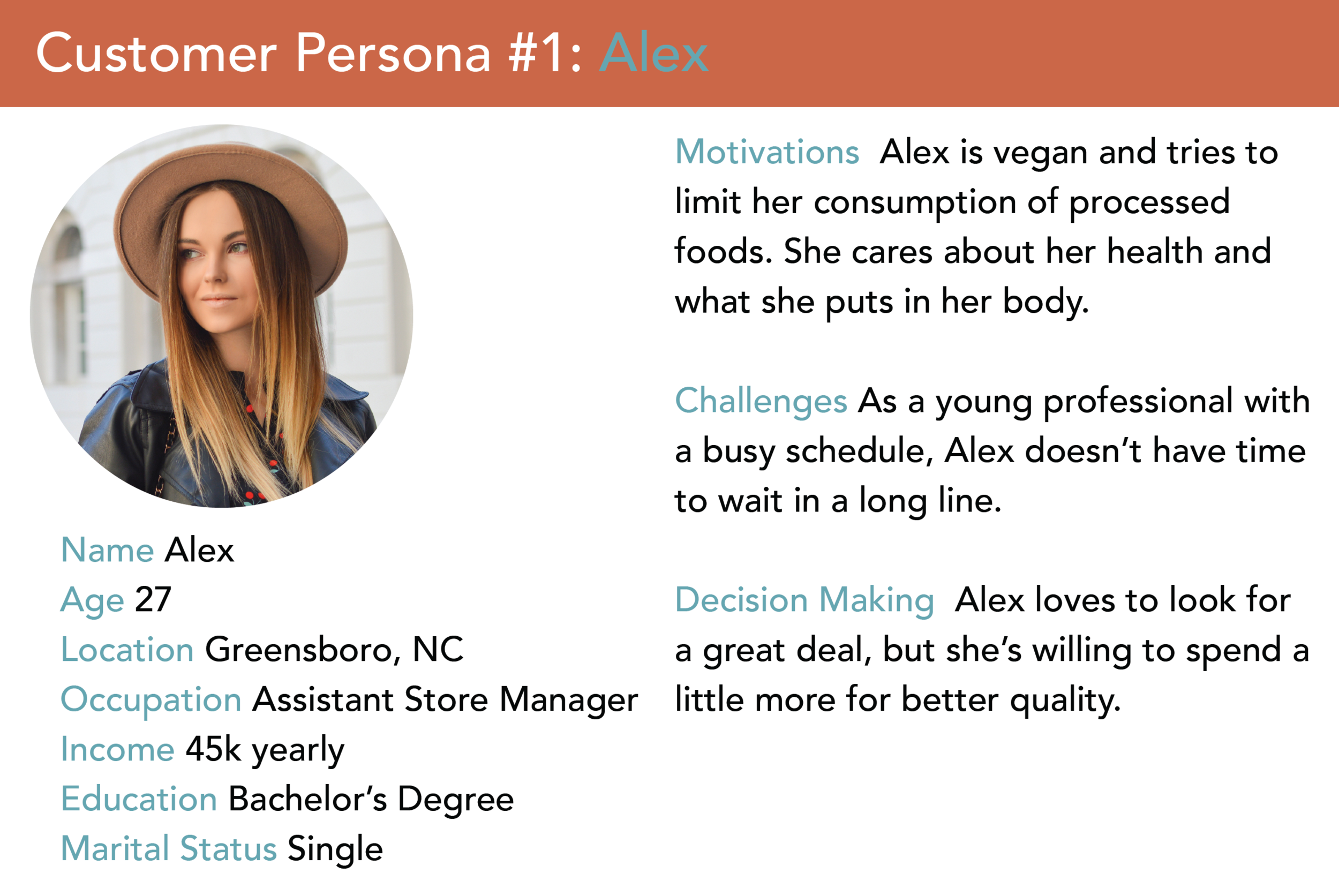
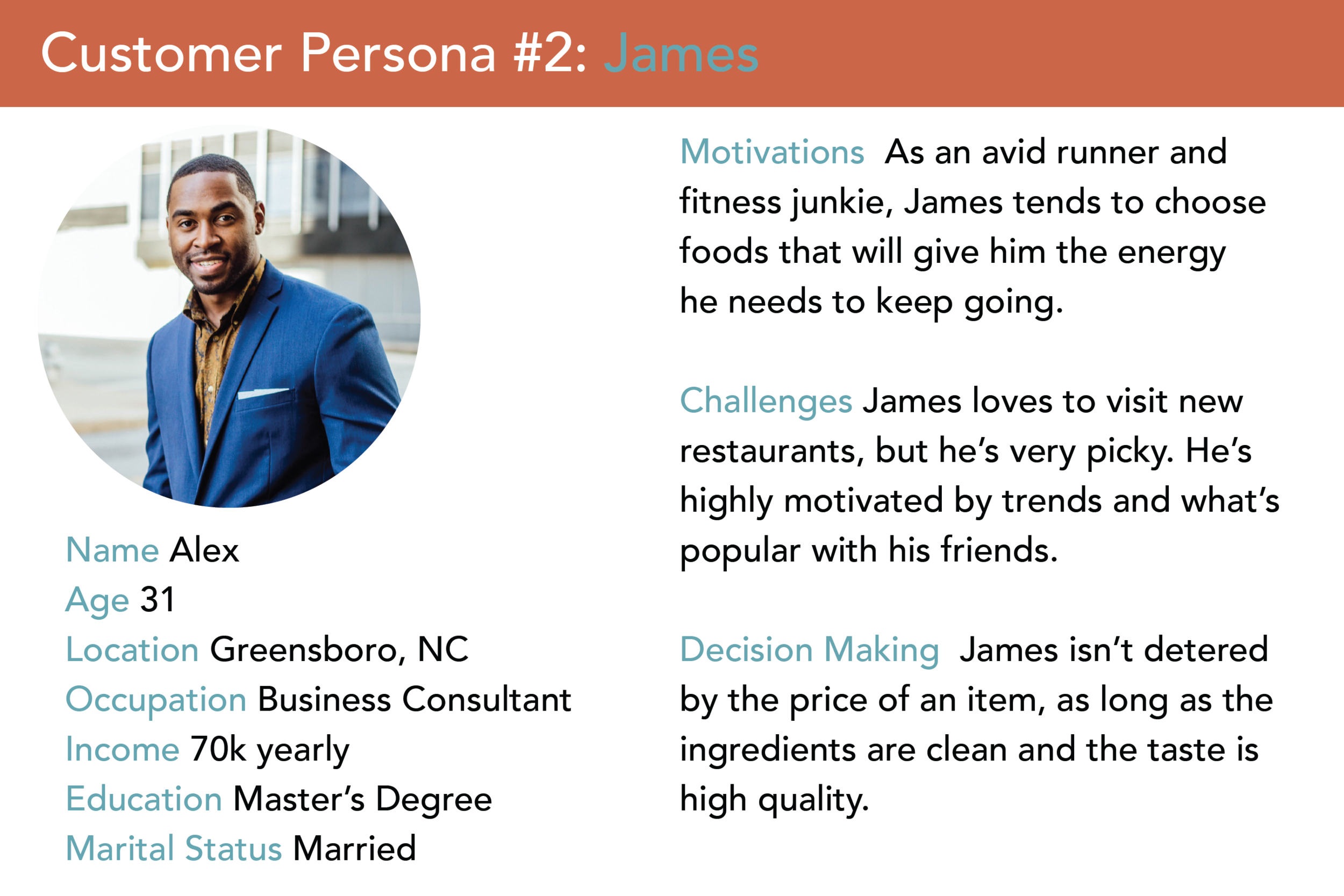
Now, let’s pretend that we own an organic juice bar. Here's what two of our personas might look like: 

 
How to Create Customer Personas  |  Hue & Tone Creative


From looking at the profiles of our two fictional customers, we’re able to better understand what they’re looking for in a brand. We also have a better idea of how they’d prefer to receive information.

When it comes to making personas of your own, don’t be afraid to reach out to people. Past customers and followers on social are the best ways to find information. Get creative by sending out email surveys, creating Facebook polls, or simply conducting phone interviews. Just be sure to offer an incentive for their feedback and time. Gift certificates, freebies, or discount codes all work well.

Now, get building those buyer profiles! Or, leave us a question below if you need more information.


Graphic Design & Creative Marketing in Greensboro, NC

Need a second opinion on your current marketing strategy? We can help! Whether you need to spruce up your landing page or create a more engaging email campaign, Hue & Tone Creative can help your brand that extra touch it needs to stand out.

4 Elements for a Killer Landing Page

When it comes to lead generation, landing pages count. A landing page gives your customers a clear why and how -- it tells them why they should care about your product and it gives them a clear next step to take.

Keep in mind that landing pages shouldn't look like your homepage. Where homepages are general and intended to appeal to everyone, landing pages are tailored to a specific type of customer. Homepage typically have multiple messages, where landing pages have one focused message.

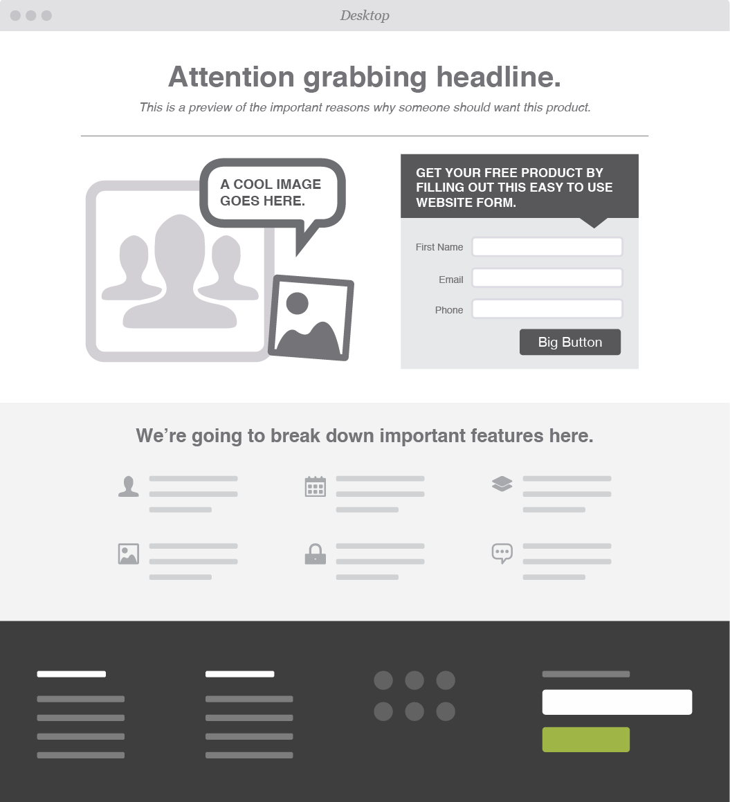
A special type of page means a special design. We've broken down our four must have elements for a lead generating landing page: 

Attention Grabbing Headline

The first thing your visitors see is your headline, so make sure to capture their attention and incentivize them to stay longer. Most people tend to skim over body text quickly, and will leave sites that aren’t relevant or seem too wordy.

To craft the most effective headline, keep these three principles in mind:

  • Share Information

  • Solve a Problem

  • Show Value

What are you selling? Why does your customer need this product/service? What can your customers gain/save? Write a headline that packs a punch and leaves your customer wanting more.


Call to Action

After you’ve effectively gotten your viewer’s attention and promoted your business, it’s crucial to capture their contact information and turn those visitors into leads.

Offer up discounts, free downloads, or exclusive offers -- the catch? All we need is your email address.

To keep your CTA from sounding too self-serving be sure to keep the focus on the customer. Try something like “Get your free coupon” instead of “Sign up for emails here.”


Form

Having a form to capture your customers information is a must. How else will you follow-up so you can turn someone into a potential customer? We suggest asking for as little information as you can get away with -- this ups the chances of someone filling out your form. 


Multiple target demographics? Create multiple, tailored landing pages so that you can effectively reach all of your customers.


Graphics

Eye-tracking studies have found that people pay more attention to information when it’s combined with relevant images. Pair your headline and body text with pictures or videos that will help your information stick.

If you choose to go the video route, make sure the videos load quickly aren’t too distracting to the overall composition of your landing page.


OPTIONAL: Testimonials & Endorsements

A great way to show value in your brand is by providing proof from actual human beings.

People tend to trust others they can relate to. Share feedback from influencers or previous customers. If your products have been featured in any noteworthy blogs, publications, or social media pages, show it off!


Web & Graphic Design in Greensboro, NC

Time to revamp your outdated site? Leave it to the experts! From product websites to landing pages, Hue & Tone can help you market your brand and leave a lasting impression.

Inbound Marketing: A Crash Course

If you’re like most, commercial breaks are usually spent browsing your phone or grabbing a quick snack before your favorite show comes back on. Banner ads and popups are quickly ignored, and you probably change the station quickly when you hear an annoying radio ad.

Purchase Funnel

  • Awareness: customer is aware of product or service

  • Interest: customer is going out of their way to seek the product

  • Desire: customer wants or aspires to brand/ product

  • Action: customer is planning to purchase product/ service

People have grown tired of traditional in-your-face marketing tactics. We can tell when a company is trying to get us to buy something. Seriously, who looks that excited about going to Walmart on Black Friday? In an effort to connect to consumers and gain trust, more and more businesses are utilizing inbound marketing. 


What is it?

Inbound marketing is the promotion of a business through blogs, newsletters, podcasts, social media, videos, and SEO. Inbound marketing is all about being found naturally. You want potential customers to come to you, rather than having to hunt for them yourself. Customers spread awareness about the brand by reblogging content, sharing posts, and discovering the company naturally during regular search inquiries.


Generating Leads

The main key to successful inbound marketing, is creating content tailored specifically to your target customer.  You then want to make sure to post content on the appropriate channel so that your potential lead can find it and become a customer. For example, if your target client is a parent looking for healthy recipes or school supplies, you wouldn’t want to post them on Tumblr, because those tips would probably never be found.


93% of buying cycles start with an online search and 66% of marketers are focusing on improving SEO and growing their organic presence.  


It’s crucial to do your research and to think like your customer. Where do they go for information? What social media platforms do they use? What key words would they use to search online? When and how often do they make a purchase? Understand your demographics and do your homework so that future leads can find your business organically and eventually become long term customers.


Inbound vs Outbound Marketing

Outbound marketing is quickly becoming outdated and costly. In fact, inbound marketing costs 62% less per lead and 79% of businesses with a blog report that they’ve experienced higher returns when using this marketing tactic.


4 Step Inbound Marketing Strategy

Inbound marketing may sound complicated and difficult to implement, but it can be fairly simple. We’ve broken down the 4 steps to help you get started.

#1. Attract: The best way to attract customers is through blogs, tailored SEO tactics, well-designed websites, and social media. 

Remarketing-Keep your visitors engaged by reminding them about a specific product they showed interest in. 

#2 Convert: After you gain exposure and traffic, the next step is to convert those visitors into customers. Make sure to provide many opportunities for potential customers to connect by providing their email address and contact information. Incentives help, as people are more likely to give out their information in exchange for a free download or a discount code.

#3 Close: Customer Relationship Management or CRM helps keep track of all of the contact information you collect, and allows you to tailor email and newsletters specifically to each customer. Complex and in depth software typically costs hundreds to thousands of dollars, but HubSpot offers a simple version for free. 

#4 Engage/Retain: Keep your customers wanting more by providing a great experience after they’ve made a purchase. Keep track of what products or features your customers respond best to, send out surveys, and continue to send personalized emails.


Hue & Tone Creative

Now that you have a basic understanding about inbound marketing, start working on your own strategy. Why spend time and unnecessary money hunting for possible leads, when you can help them come to you?  

Need tailored assistance with your inbound marketing campaign? Let’s team up! Reach out to Hue & Tone today: 336-365-8559 or hannah@hueandtonecreative.com.