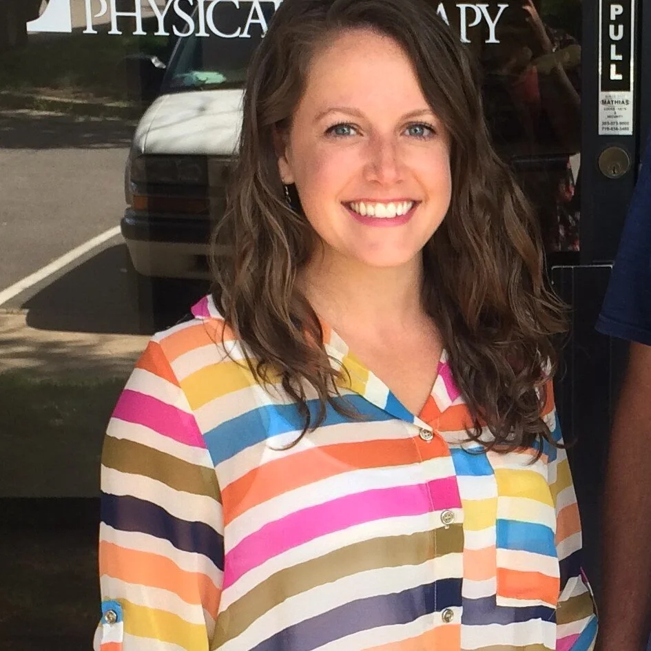
Lauren Stubbs, Owner of Stubbs Mobile PT
For our first client spotlight of the year, we’re excited to share a fresh branding project for a brand-new business. We partnered up with Stubbs Mobile Physical Therapy in late 2020 to develop a custom logo and corresponding visual brand elements. Owner, Lauren Stubbs, recently started this mobile concierge physical therapy practice as a response to COVID-19 pandemic. Many outpatient physical therapy practices pivoted to include telehealth and some started offering PT at home, but Lauren jumped at the opportunity to make a fully mobile and telehealth practitioner available to the Triad for years to come.
Stubbs Mobile PT brings physical therapy to your home or private workspace to save you time and unnecessary hassle – all while keeping you safer than a traditional office setting. Being outside of insurance, Stubbs Mobile PT also offers preventative physical therapy services including an Annual Wellness Visit, Health Coaching, or Evaluation and Treatment before you have an injury (i.e. if something "just doesn't feel quite right"). Their goal is to provide top-quality service with longer appointment times and one-on-one individualized care so that you are feeling, moving, and living your best as soon as possible.
We connected with Lauren while teaching Launch Greensboro’s Marketing 101 class. After discussing the importance of marketing and branding, she wanted to start things off strong with a bold and eye-catching brand. Knowing that a standout look would be crucial to marketing her business, we wanted a logo that would translate flawlessly to polo shirts, sprinter vans, and client swag.
In the initial branding stages, it was clear Lauren was looking for a pictorial mark to accent her logo type and wanted to emphasize a feeling of movement and energy. Friendly, attentive, trustworthy and proactive are just a few of the words that were used to describe the desired look and feel of Stubbs Mobile PT’s future branding.
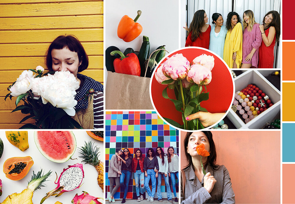
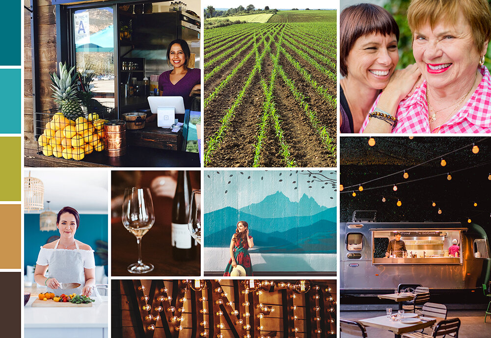
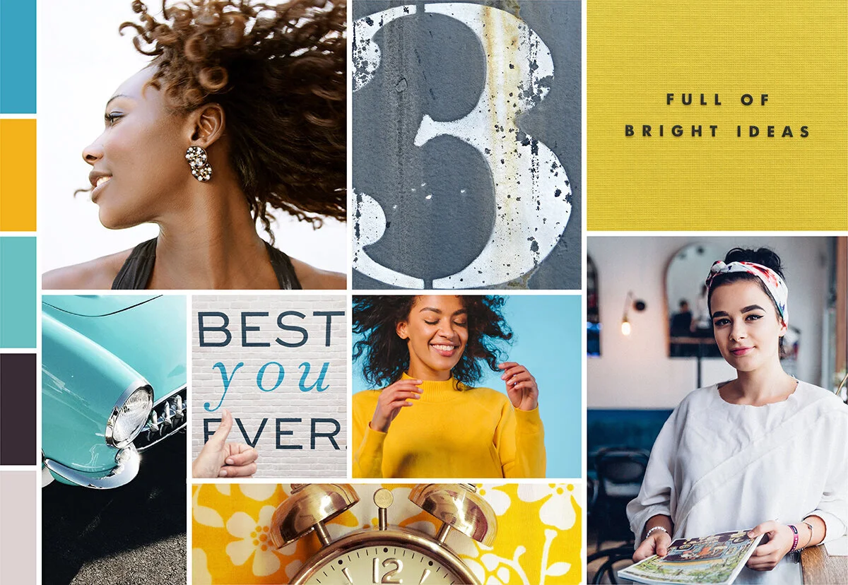
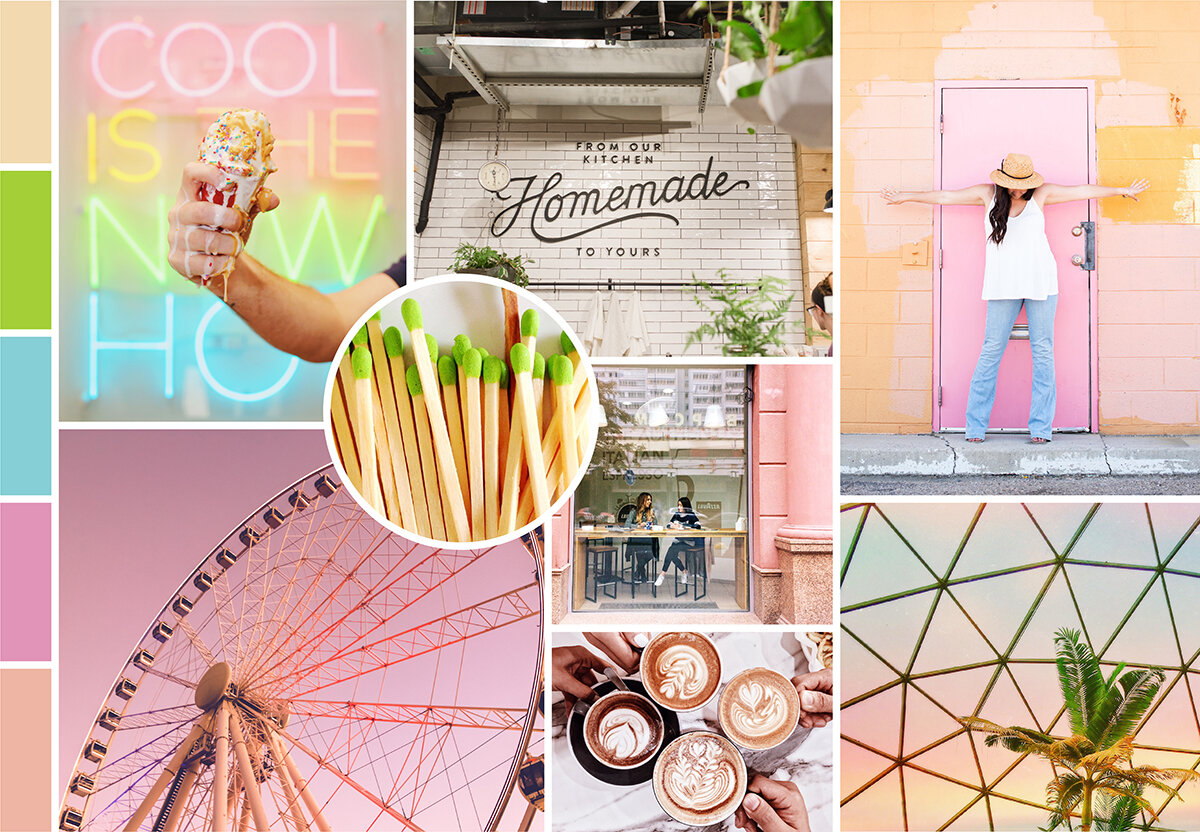
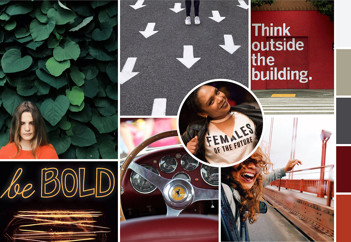
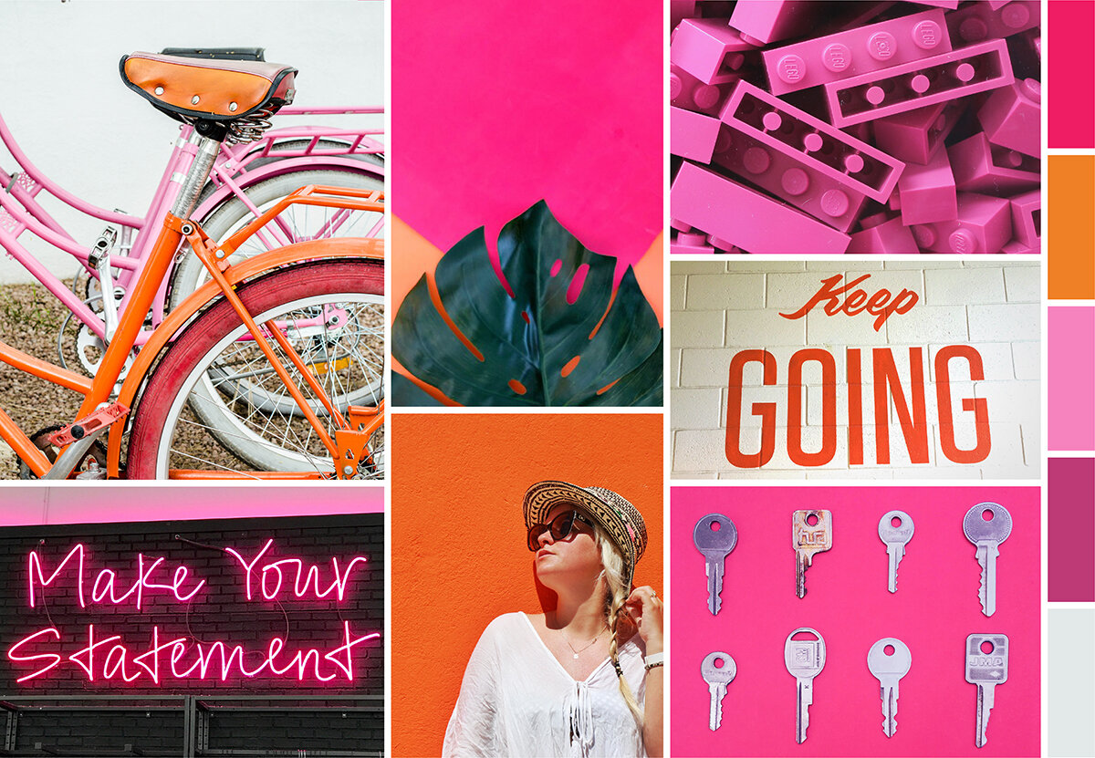
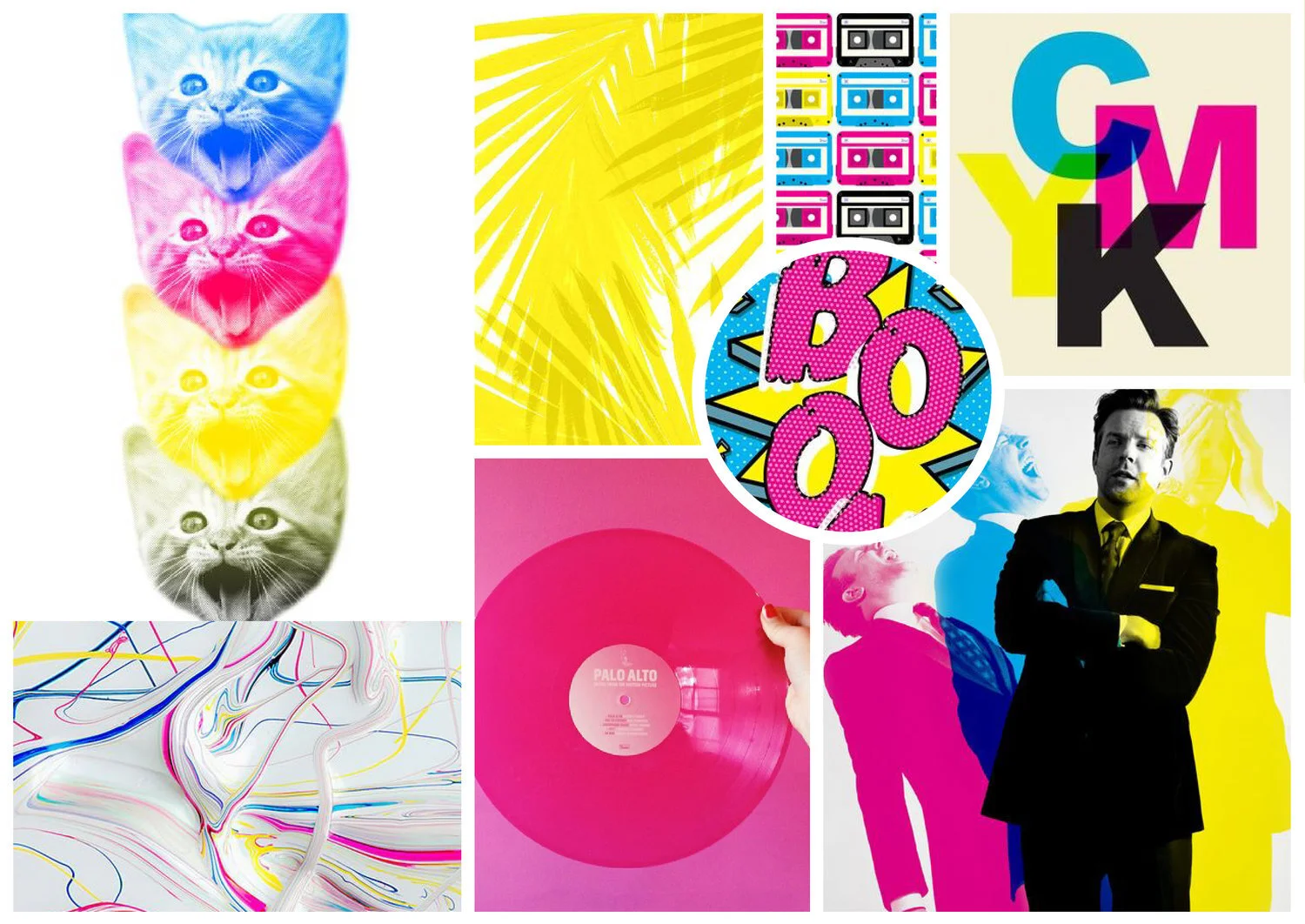
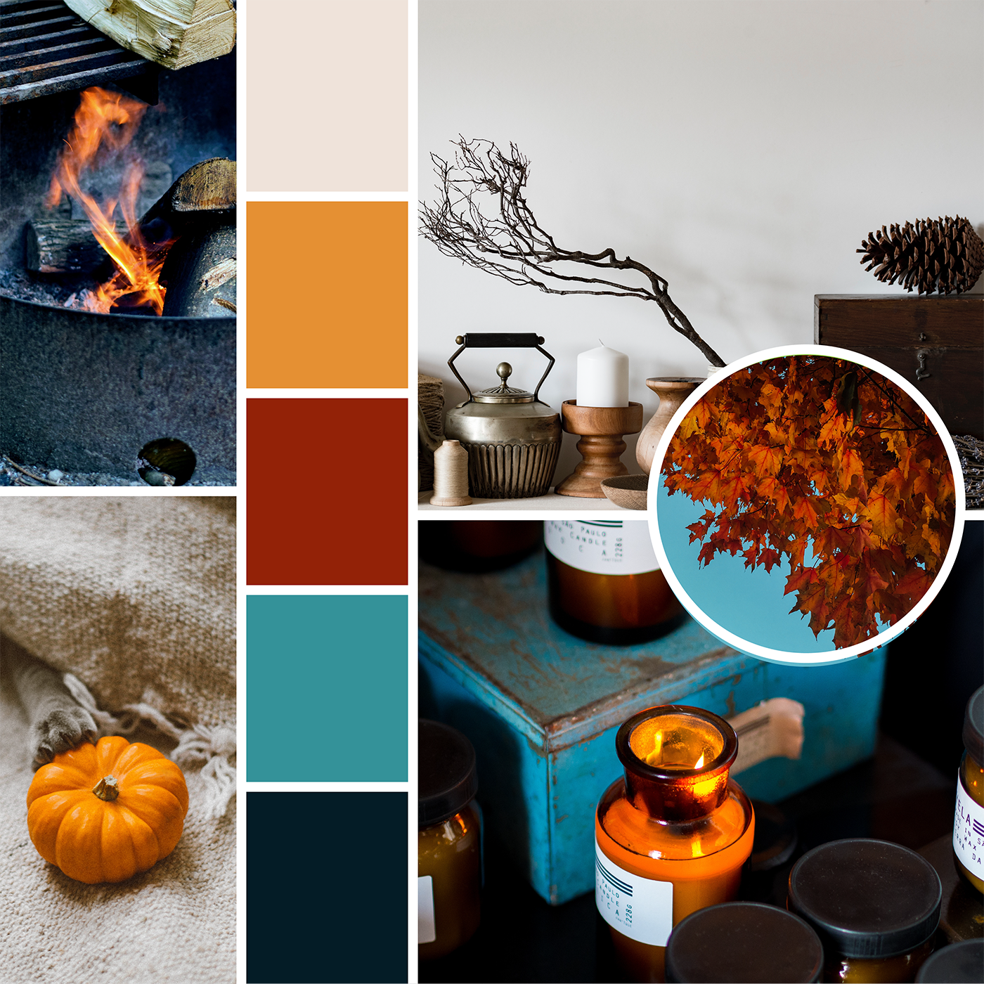
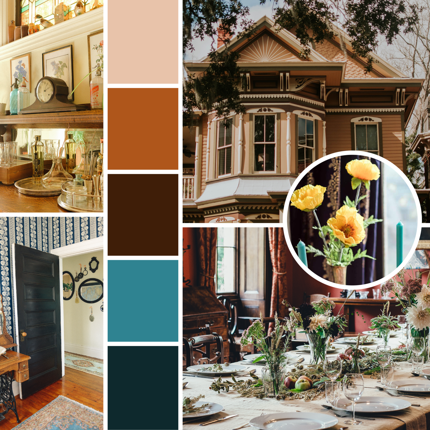
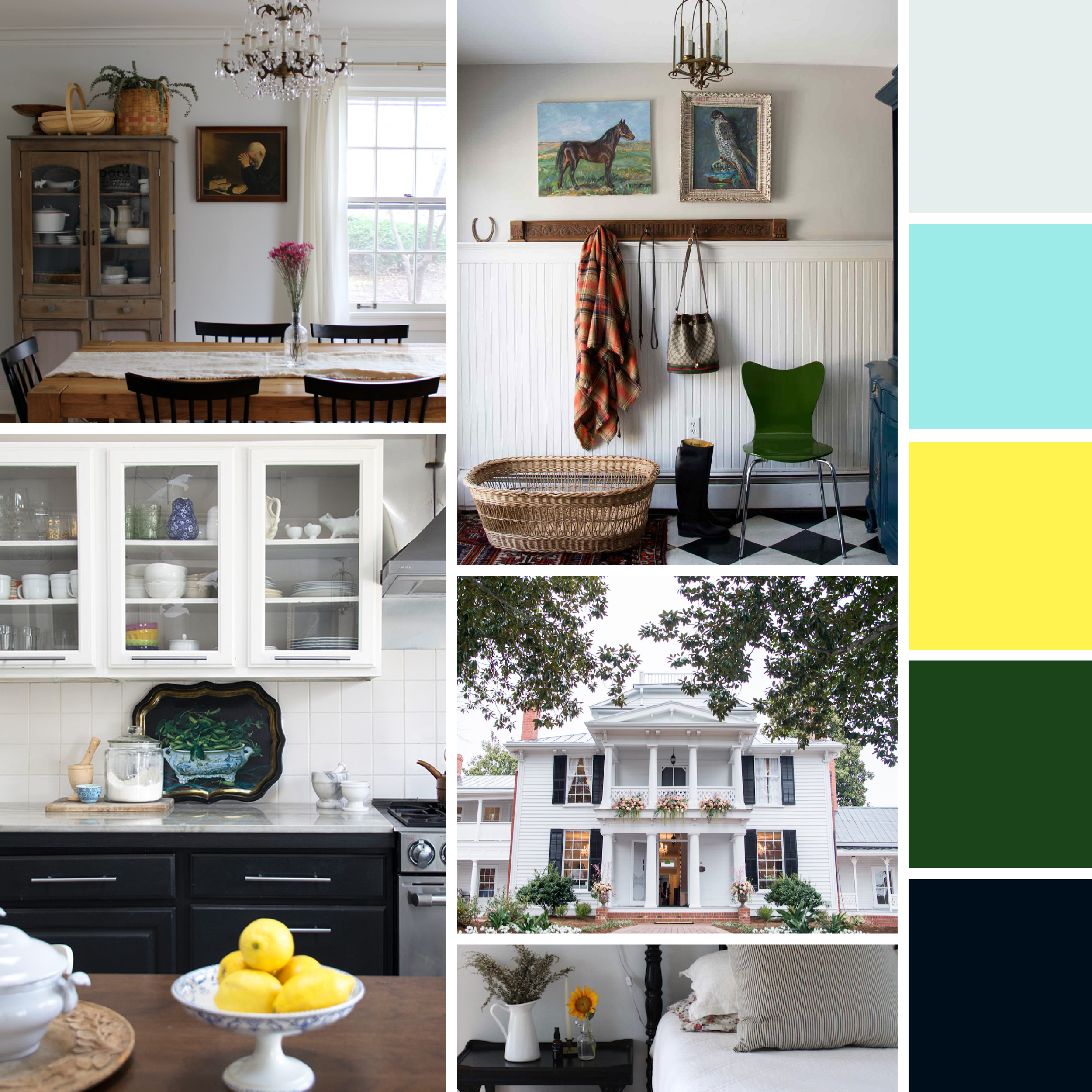
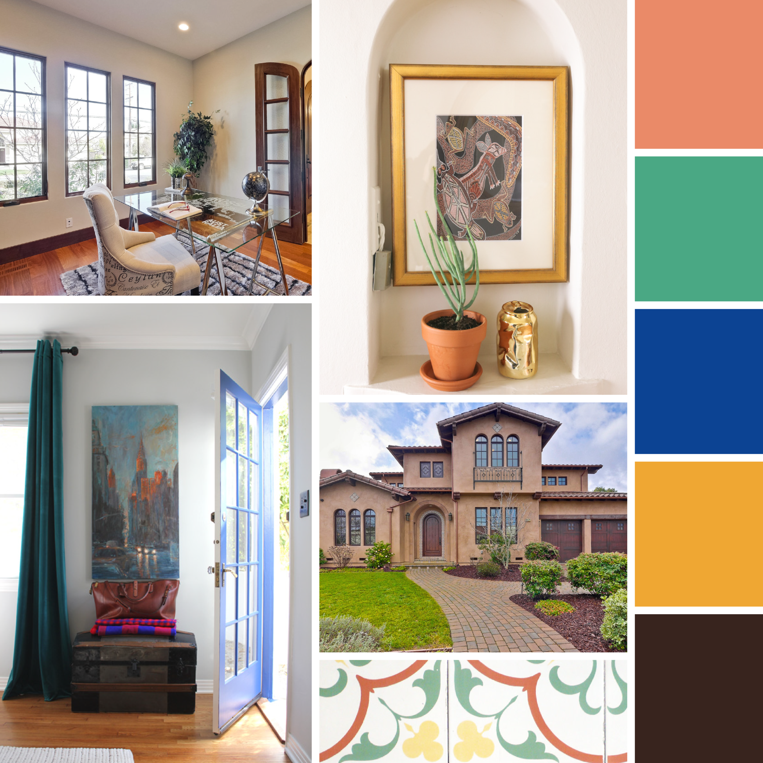
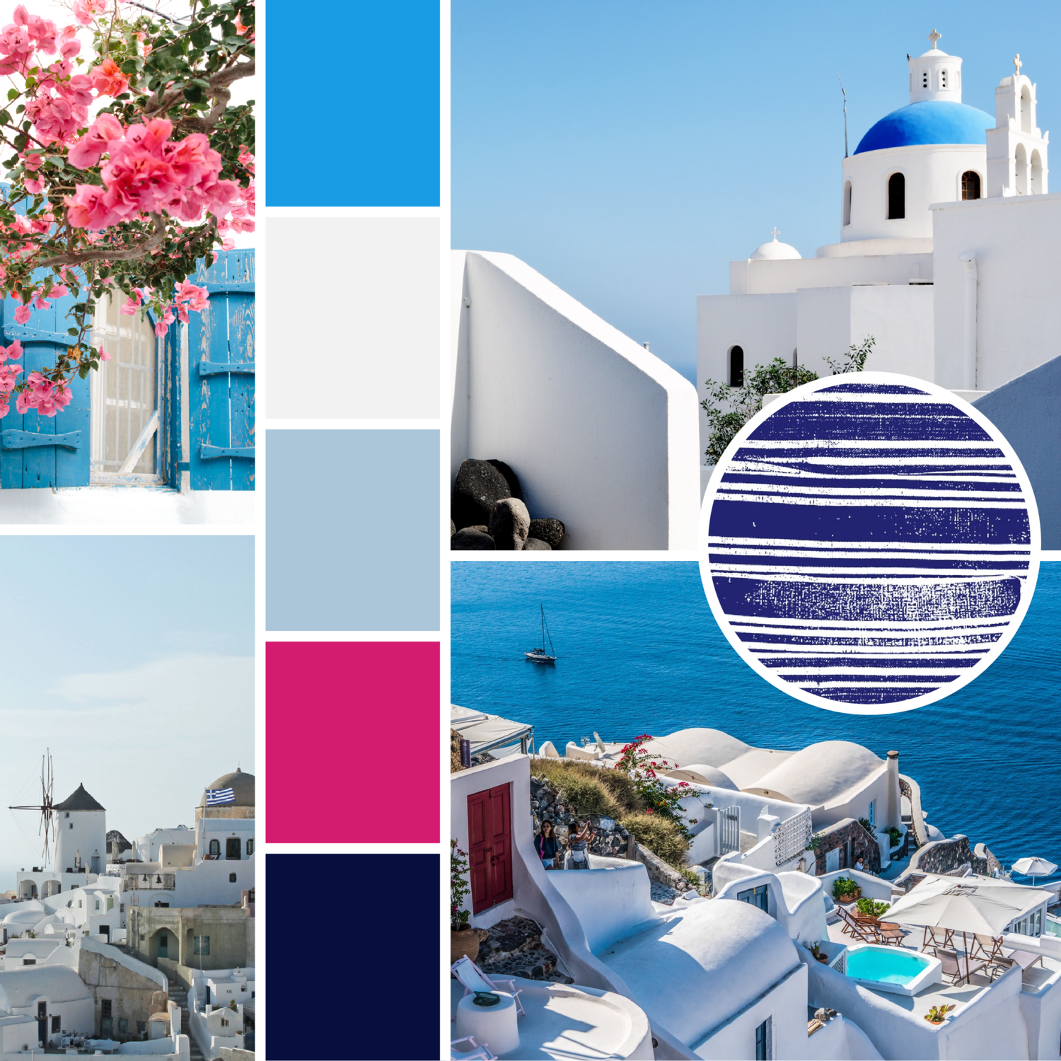
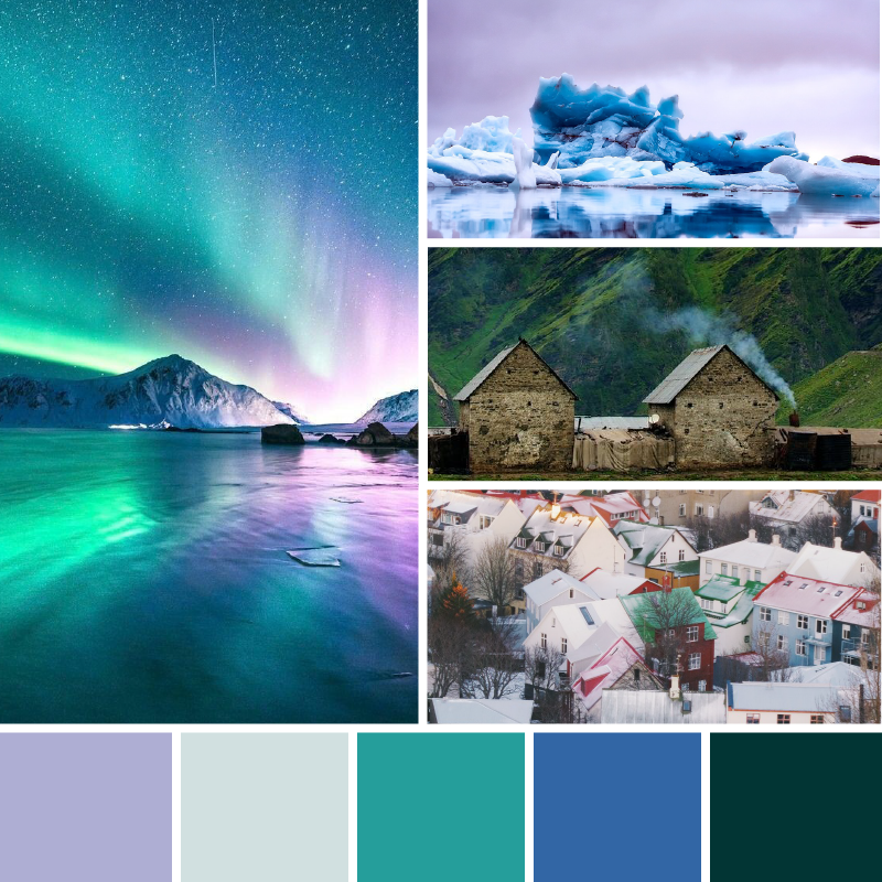
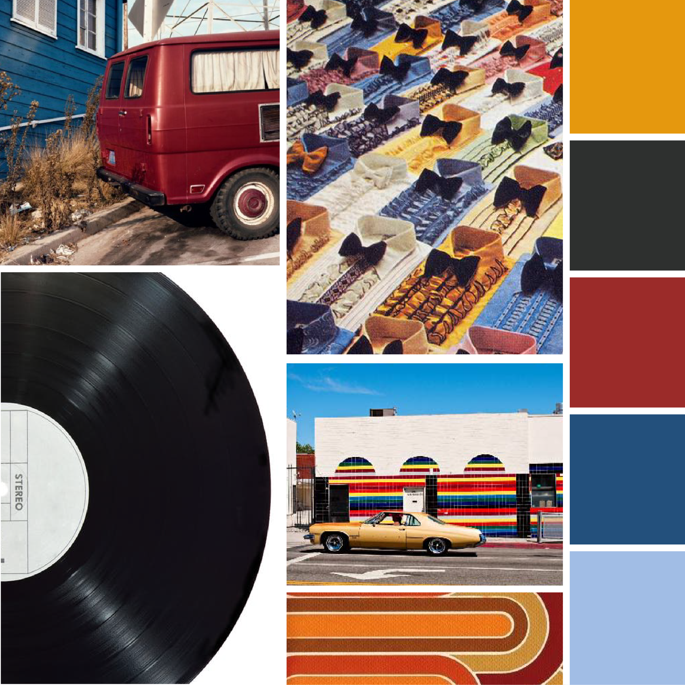
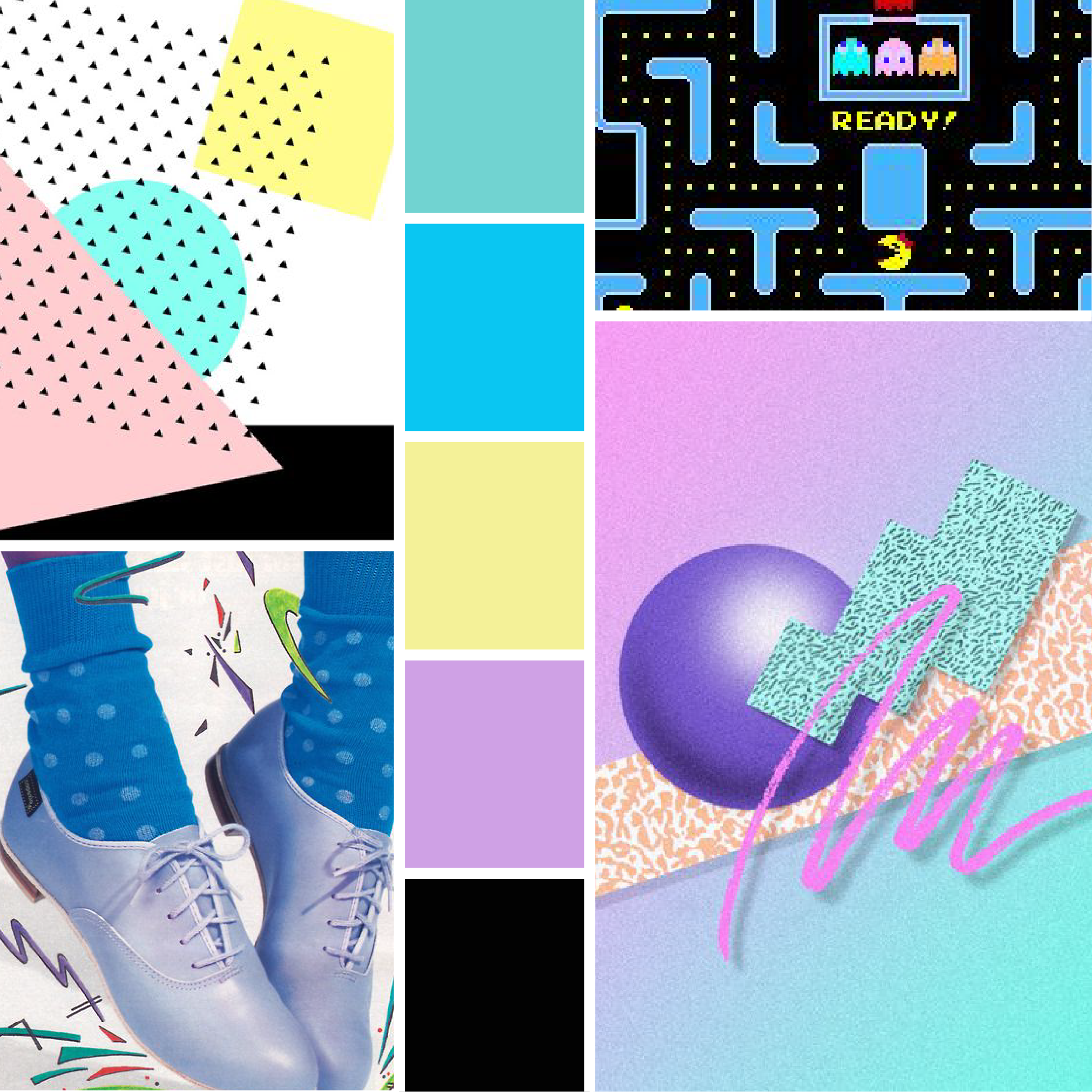
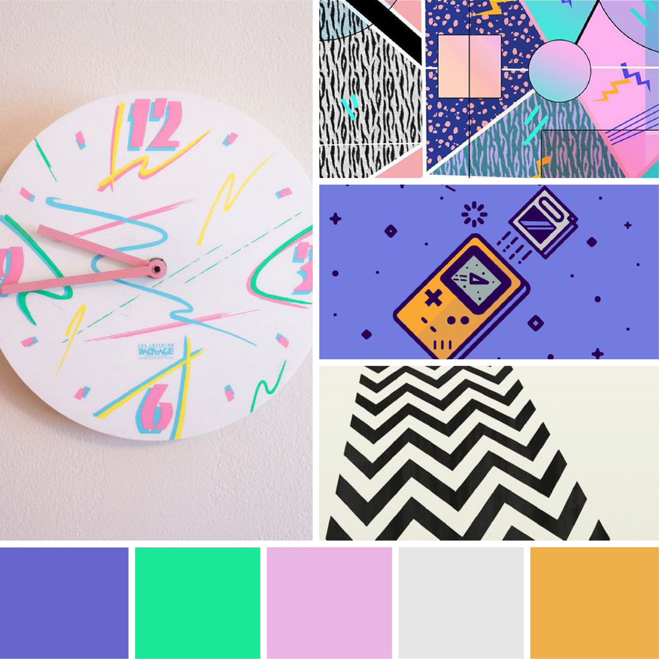
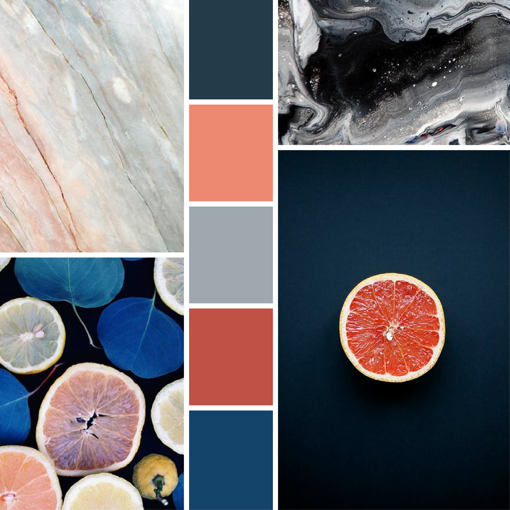
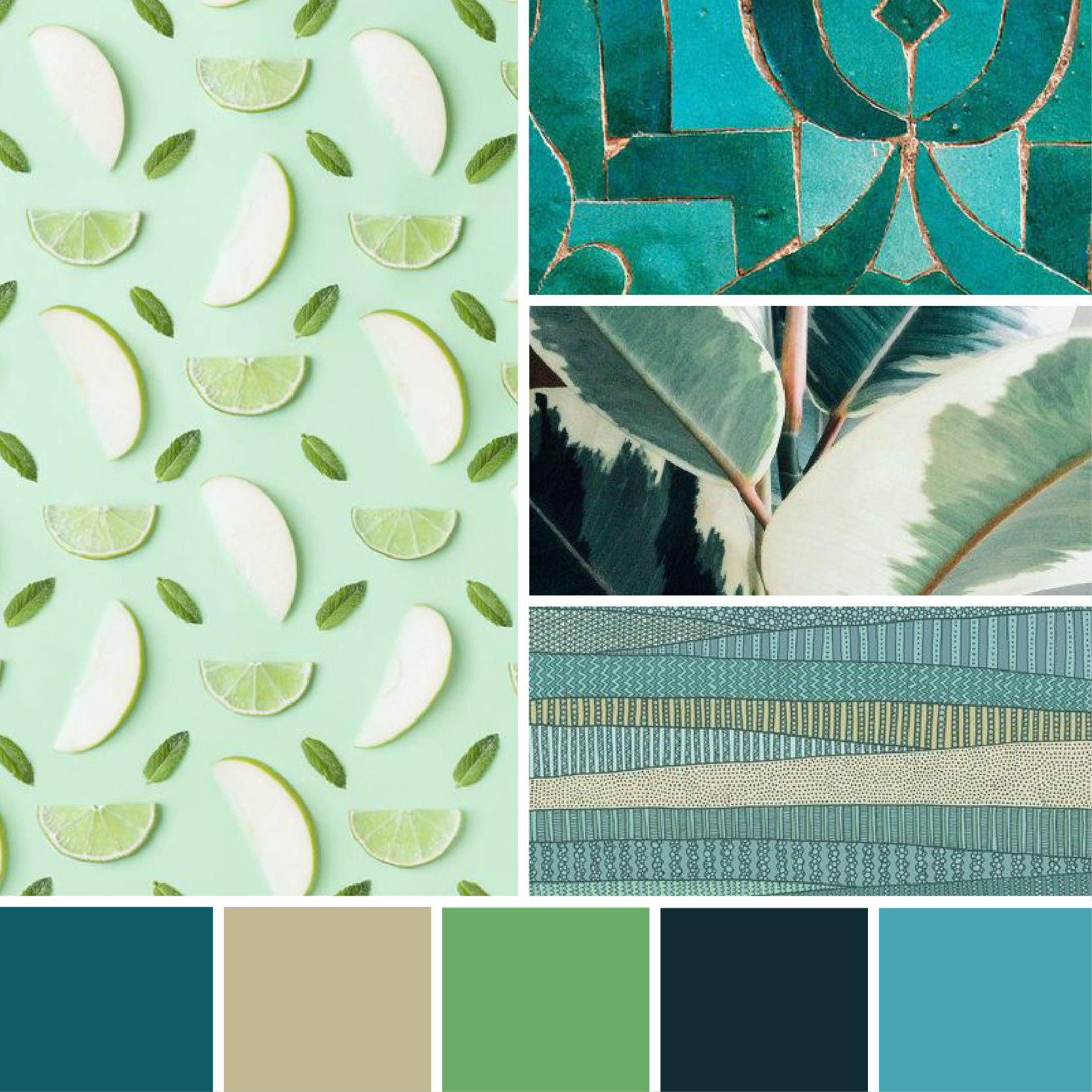
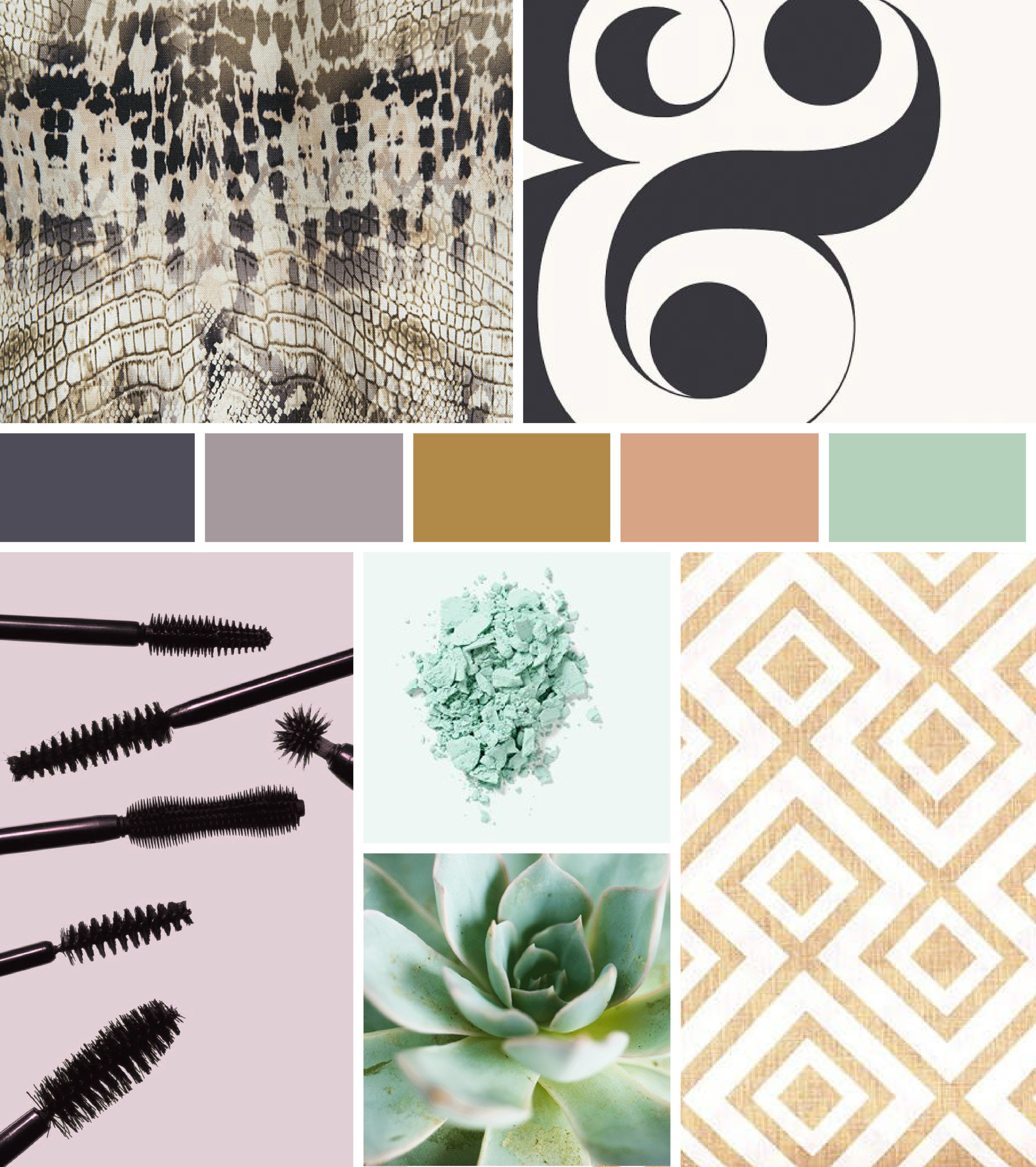
One of our favorite stages of the branding process, a mood board helps ensure we’re on the same page as our client. By assigning visuals to the words we’ve been using, we can begin to home in on a feel for the future brand.
After presenting three mood board options, we refined Lauren’s favorite to have an even more high-energy and vibrant feel. Lauren had mentioned aquas and blues during our initial branding kick-off, and we ended up tailoring her favorite option to include two shades of blue. The final product? A look that hinged on vibrant colors and energetic scenes. Healthy eating, movement, and the outdoors are central to Lauren’s business and we wanted to reflect that from the very early stages of the process.

After narrowing down Lauren’s favorite mood board concept, it was time to move on to the logo design phase. Ultimately, we went through 4 rounds of initial concepts, and four rounds of color options to narrow down the exact look and feel.
Many of the initial concepts incorporated kettle bell imagery, hearts, play or motion. After some brainstorming, we landed on the wording concept of “pressing play.” Used with various action phrases, this tagline could be targeted to a wide range of clients. You’ll see the main logo incorporates the phrase “Press play on being pain free.”

The final logo uses pops of bright oranges, aqua, and yellow – all anchored by a deep blue. These colors pop on any timeline, and the graphic mark adds an element of action. The graphic mark is a take on a press play symbol – which ties into the tagline and lends itself well to use on social media. When working in tandem, all these elements create an action-packed look that’s sure to be eye catching and memorable.

We’re thrilled with how this rebrand went, and we’re not the only ones. Hear firsthand from business owner, Lauren Stubbs, about the process:
“I really enjoyed the entire process of working with Hannah at Hue & Tone Creative. Being a first-time entrepreneur, I knew little about the branding process. Hannah guided me through it with confidence and understanding... even when decision-making was tough because she had created multiple amazing logo options. If I could have two logos I would, because that's how great both of the final options were. Despite the Hue & Tone office and my home office being less than 1 mile apart, we went through the entire process virtually (due to COVID-19). The virtual experience didn't detract from the branding process, but I loved knowing we were both members of the same community. Knowing our proximity, ties to Launch Greensboro, and both being women business owners, gave me a sense of connection even though we never met in-person. Supporting small and local businesses, whether walking distance in downtown Greensboro or in the greater Triad area is a central tenet of Stubbs Mobile PT. Being able to work with someone locally yielded excellent results and I'm extremely excited about launching my new look. In fact, in the few weeks since we've unveiled our new logo we've already received positive comments on social media!”