Posts in Color Schemes
Color Schemes: Los Angeles Colors

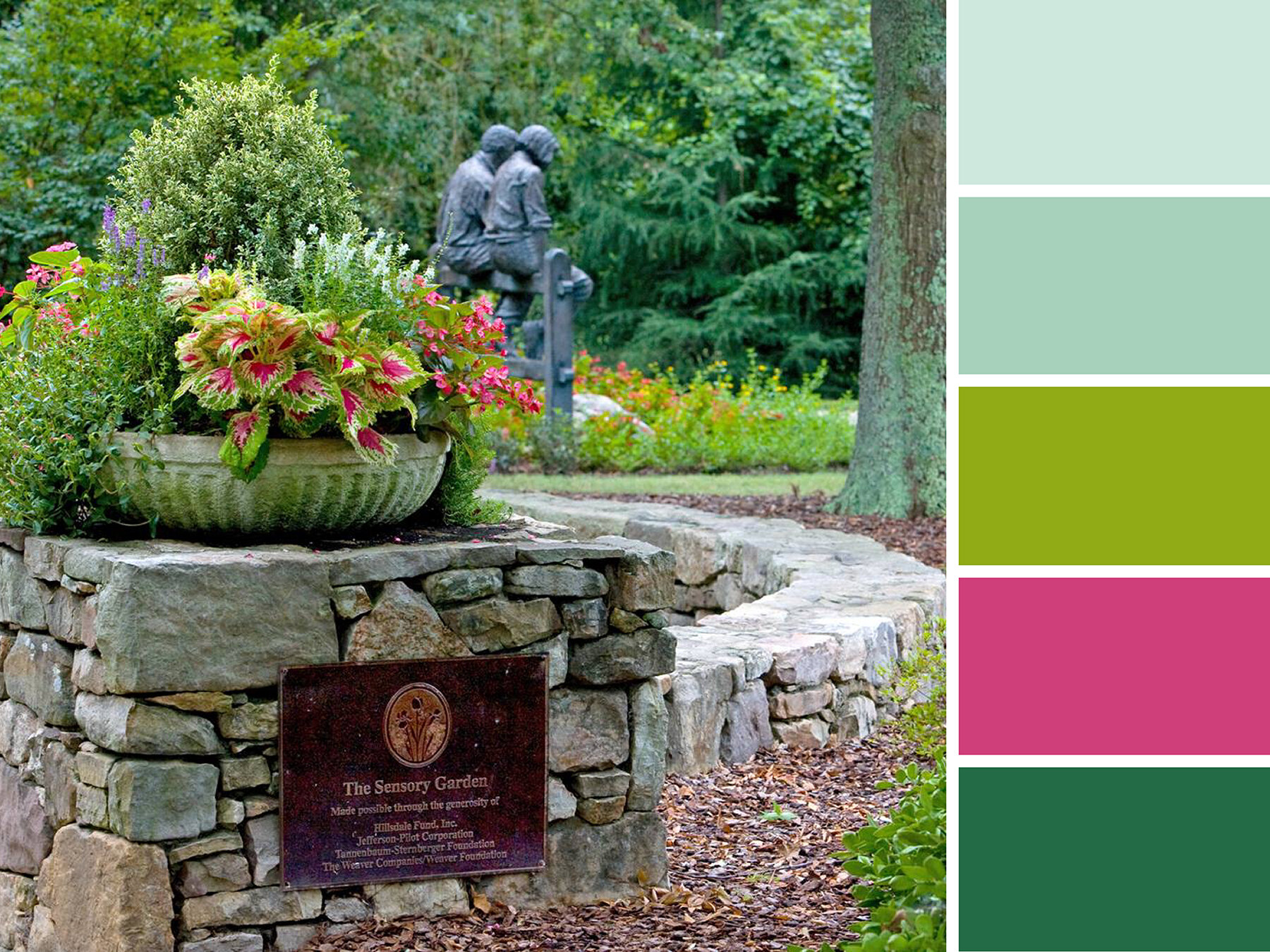
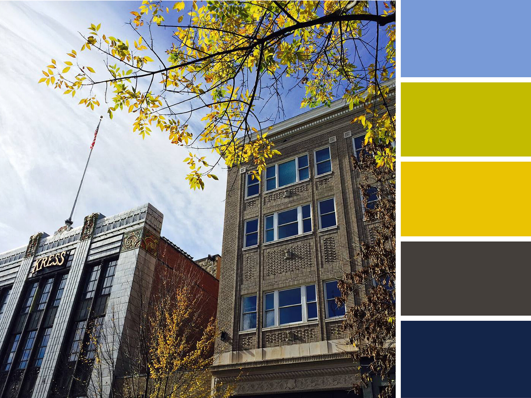
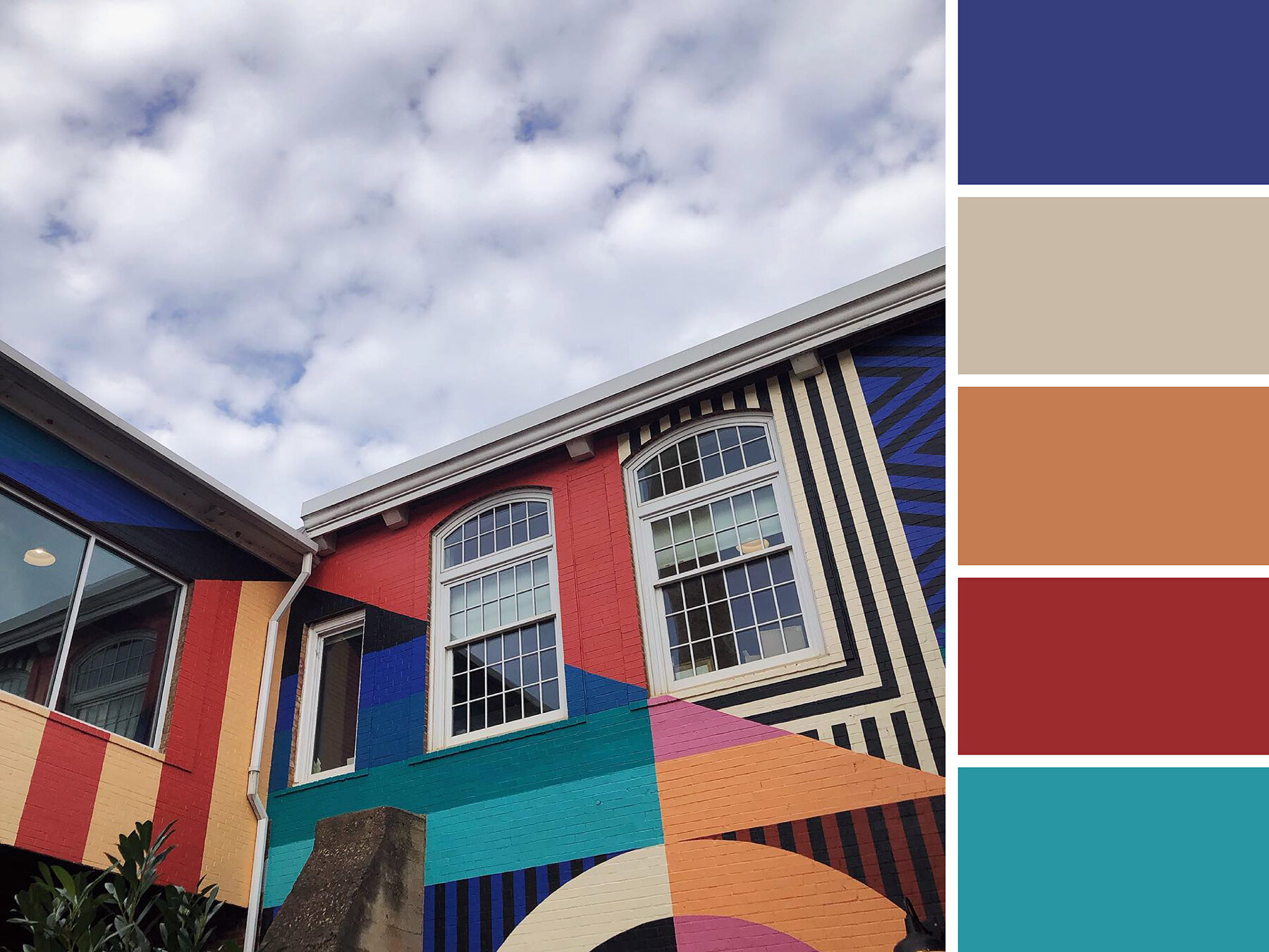
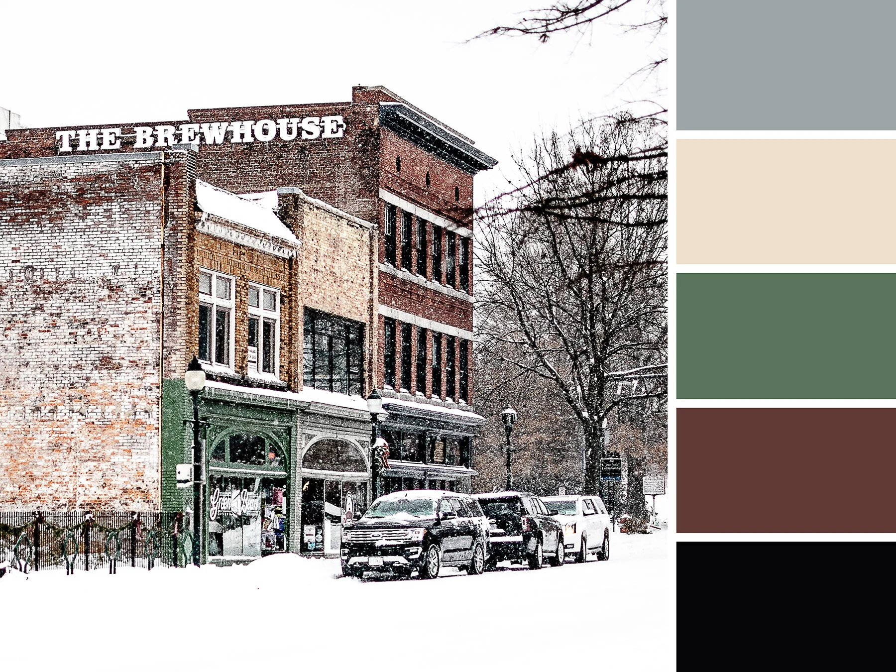
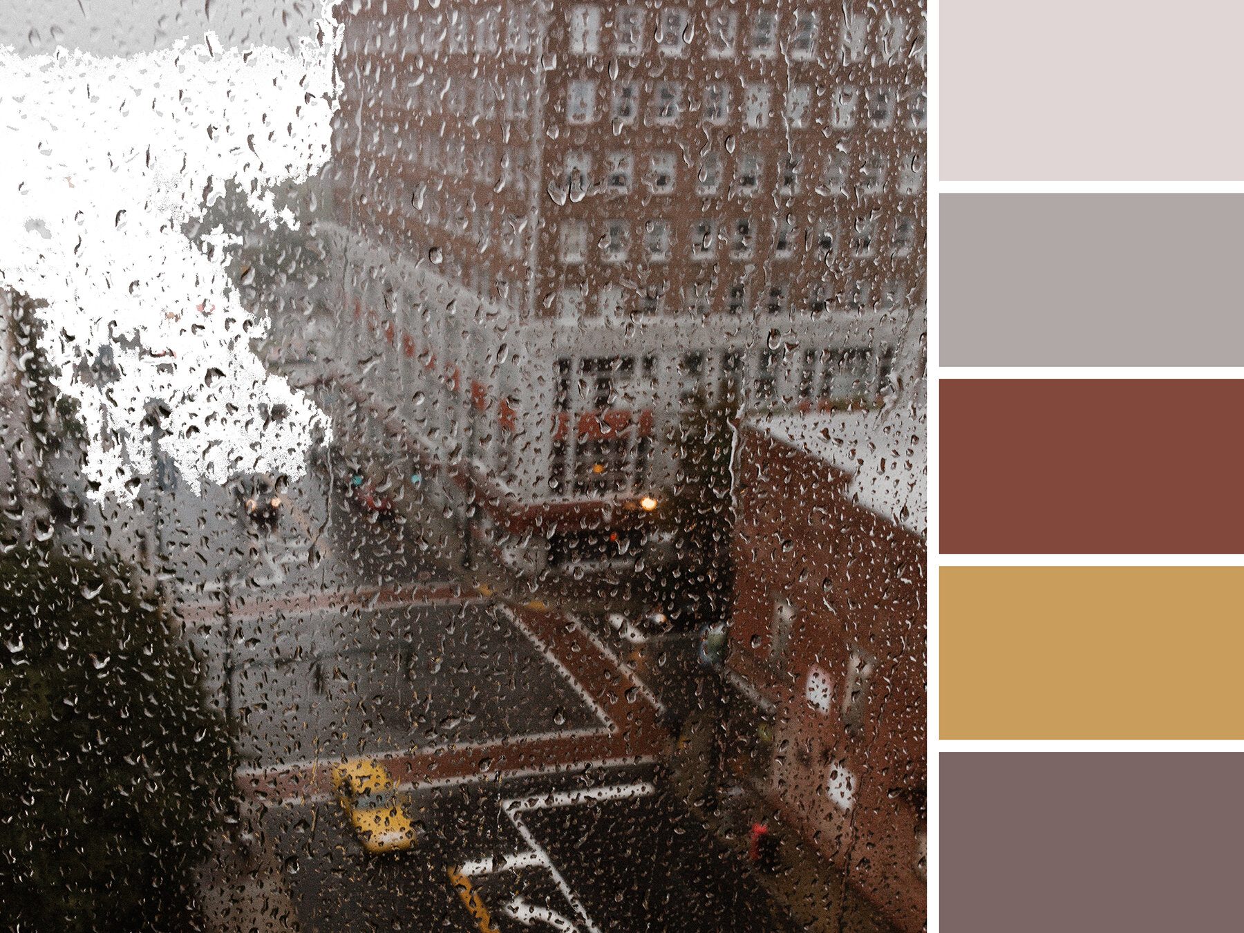
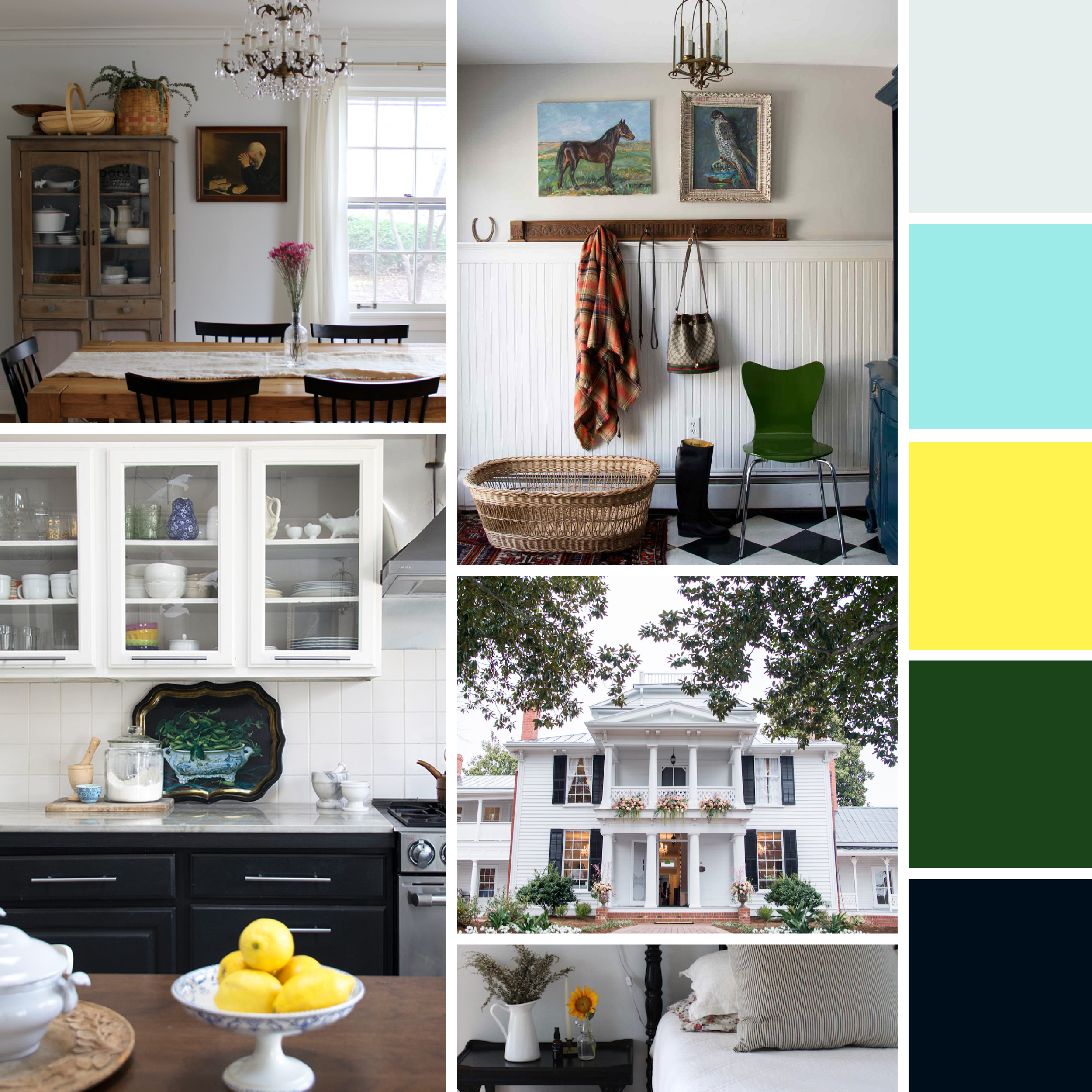
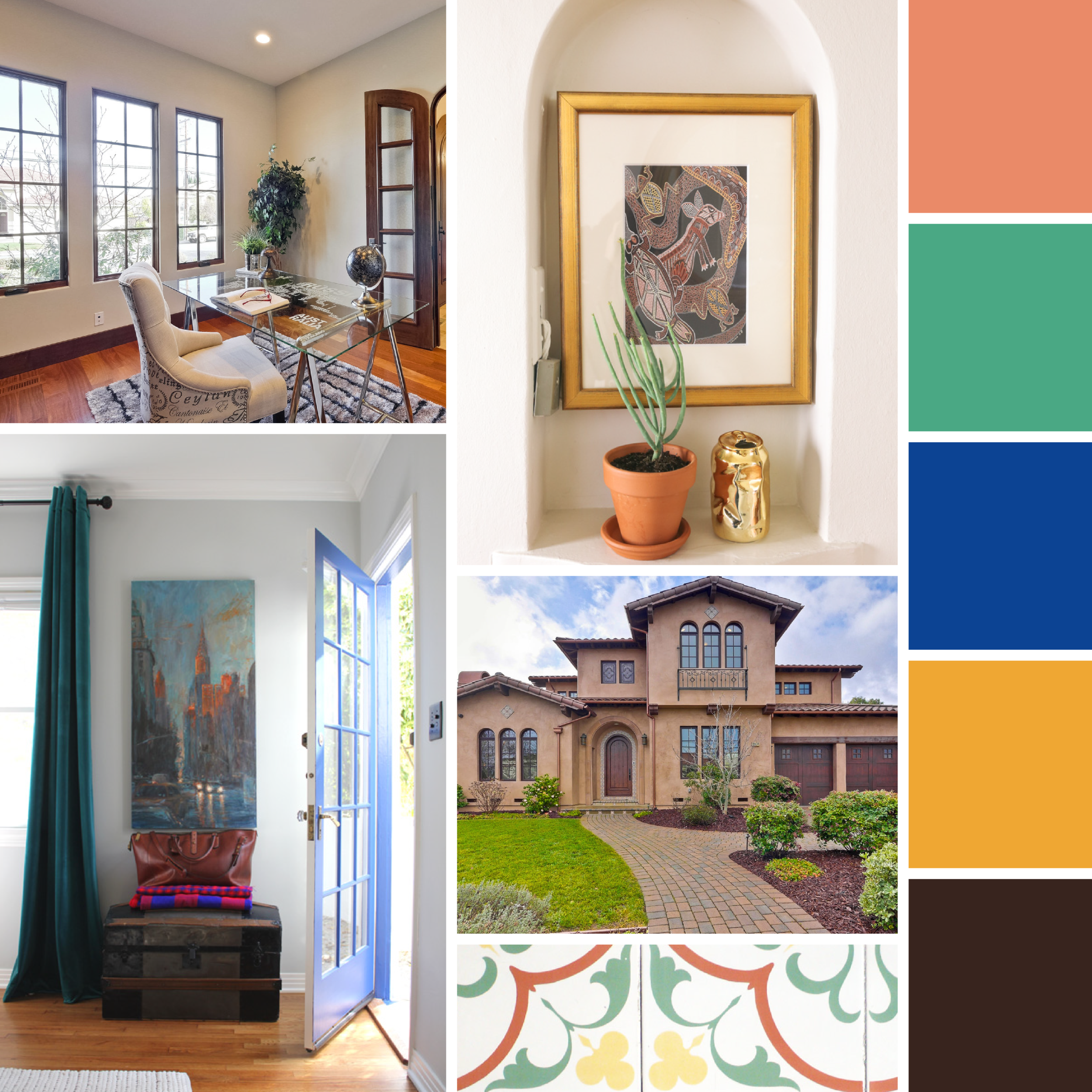
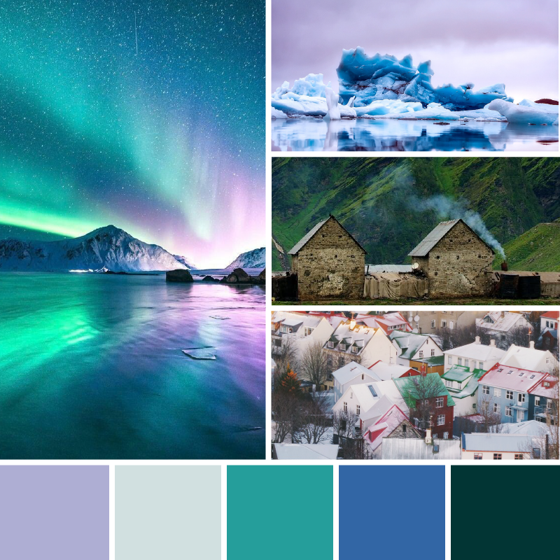
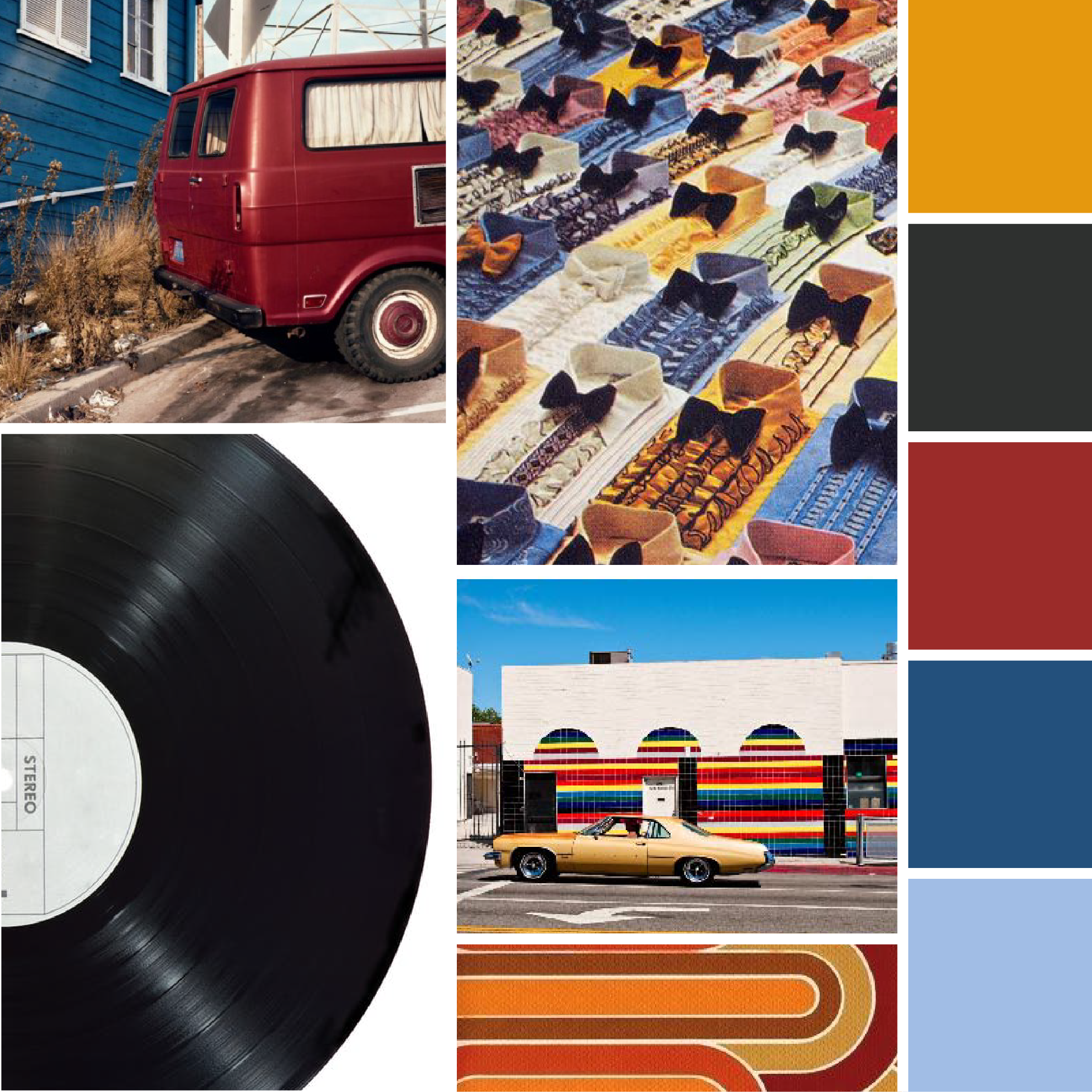
Want to see what inspiration we found a little closer to home? Check out these moodboards from around Greensboro

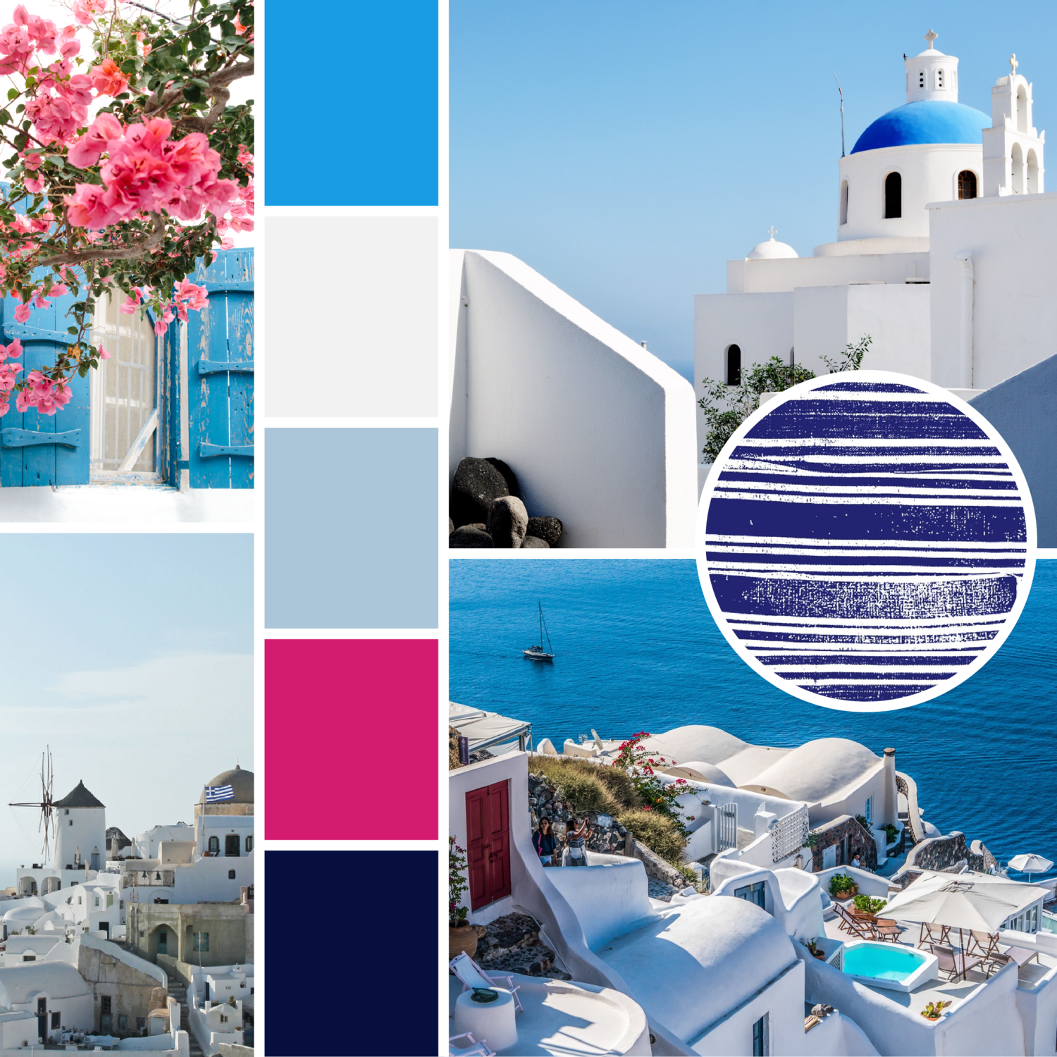
Late last year we did a series of moodboards featuring vignettes and color inspiration from around Greensboro. It wasn’t hard to find inspiration in our surroundings then, but this time we looked a little further from home for our latest color series… and we think you’ll quickly see why. This set of swatches was inspired by photos we took on a week long-trip to Los Angeles in late June. 

While in LA, we visited art museums, parks, lakes, and lots of great restaurants. These color schemes are just a glimpse of the diverse scenery we experienced, and we know we’ll be reflecting back on this trip for inspiration for months to come.
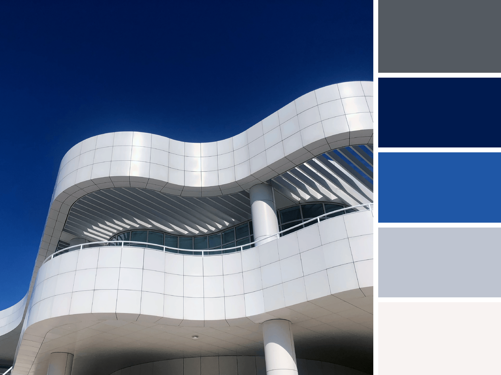
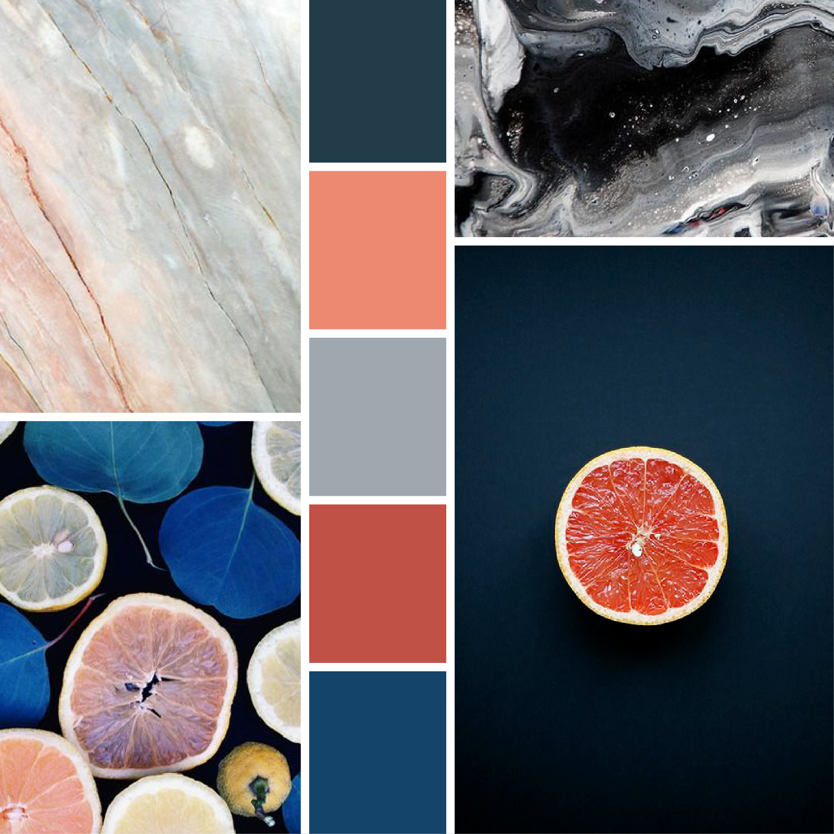

Artboard 1Final.png

Getty Greys

A work of art in itself, the cool greys and whites of The Getty contrast a saturated and cloudless sky.
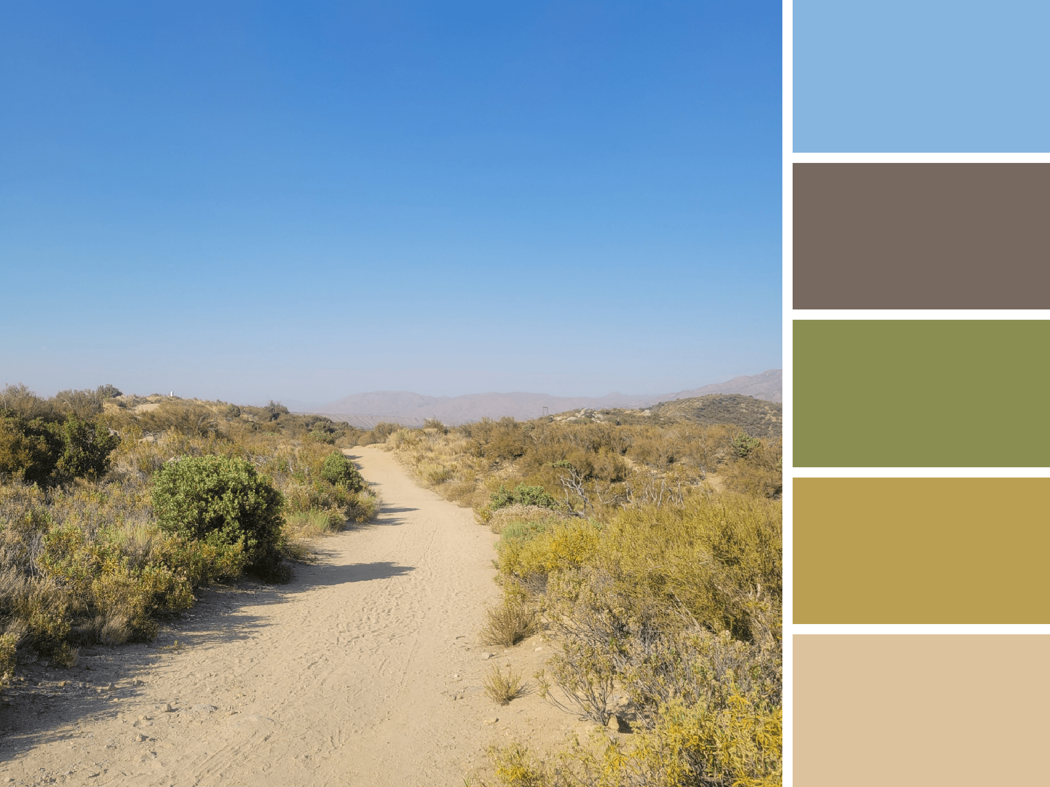
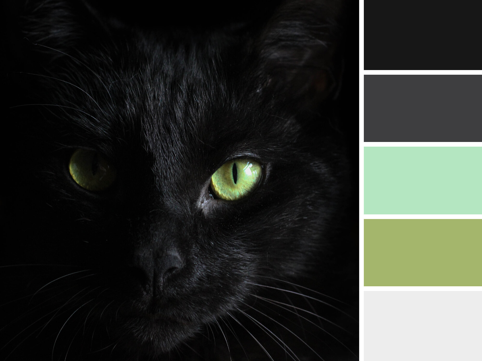
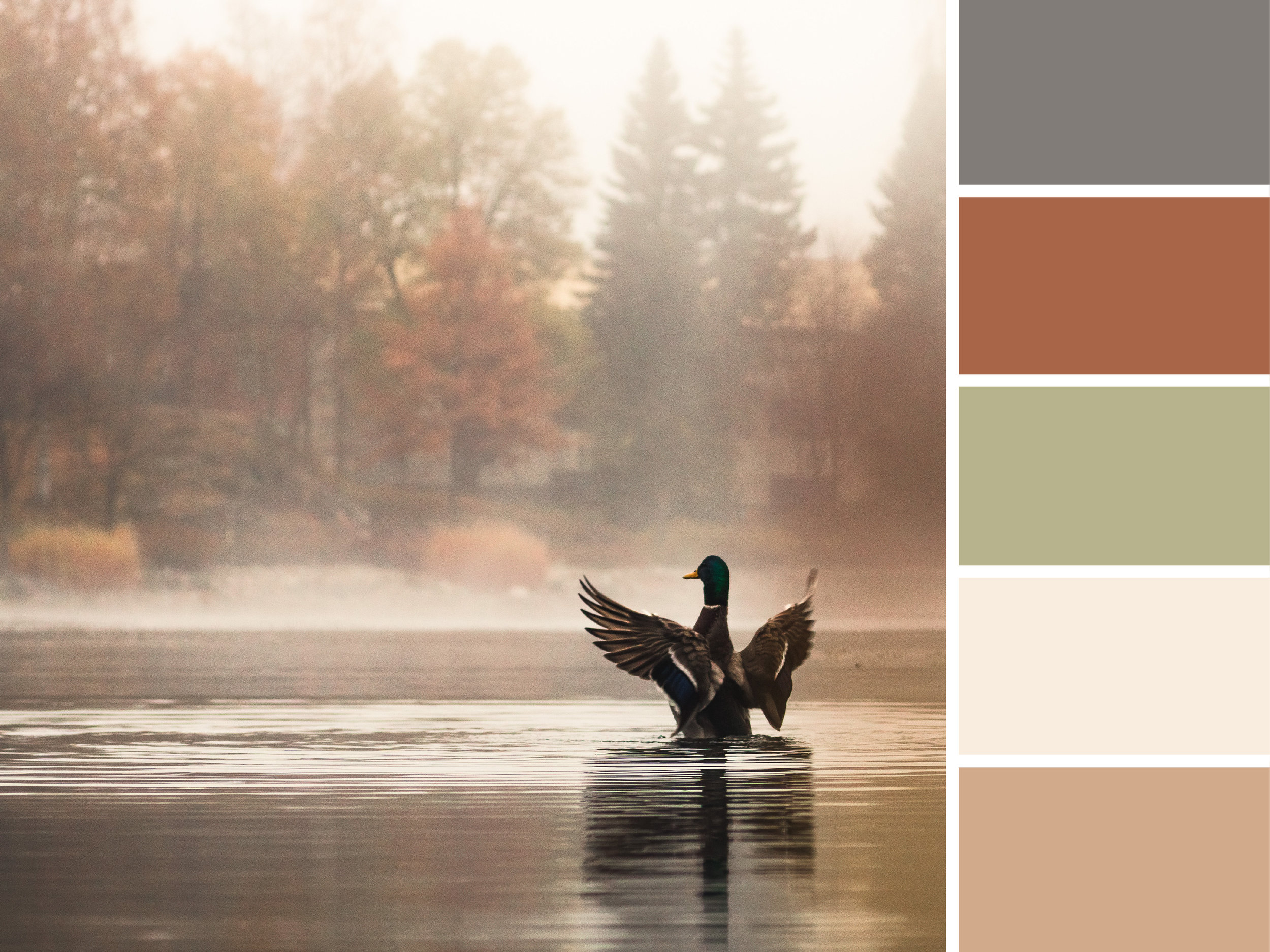
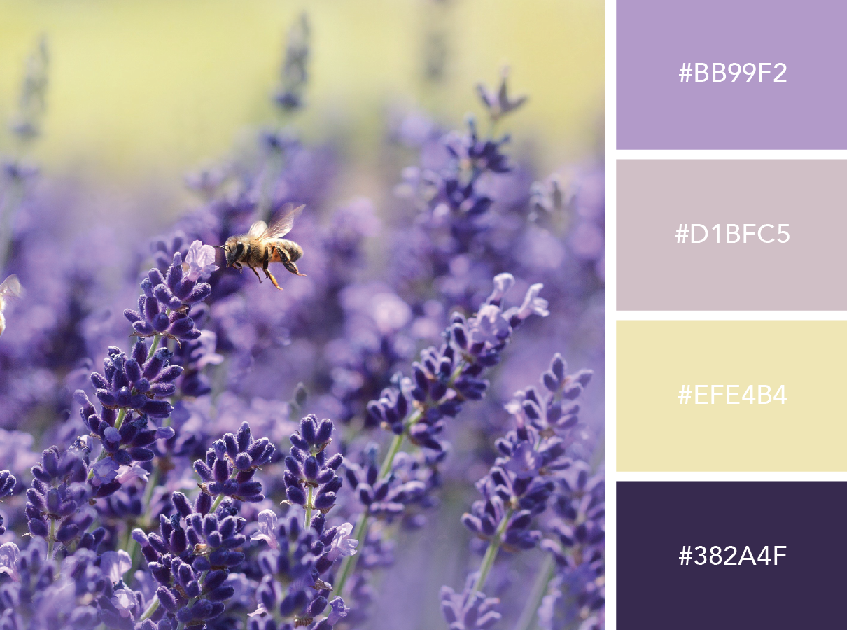

PCT Palette

This glimpse of the Pacific Crest Trail is rich with subdued greens and yellow. This palette fuses the hues of the desert sky with those from scrubby foliage.


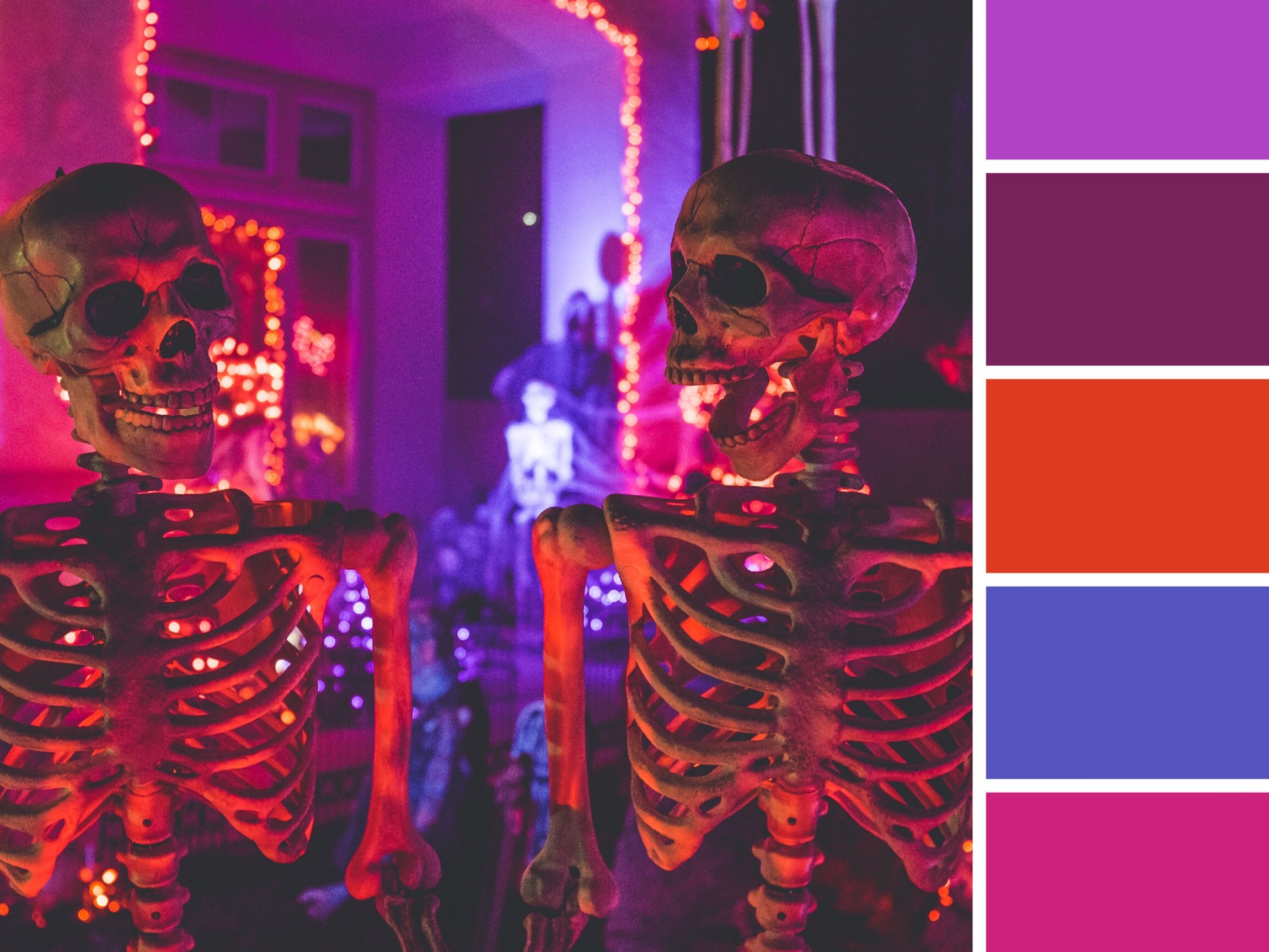
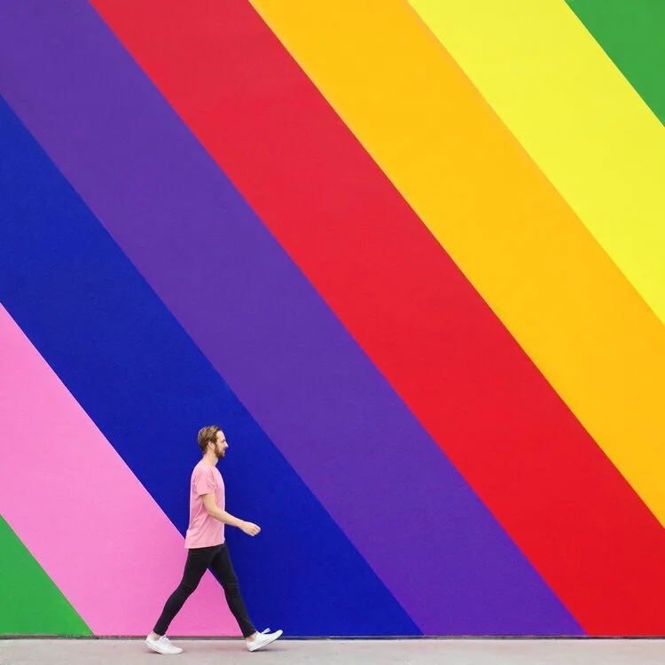
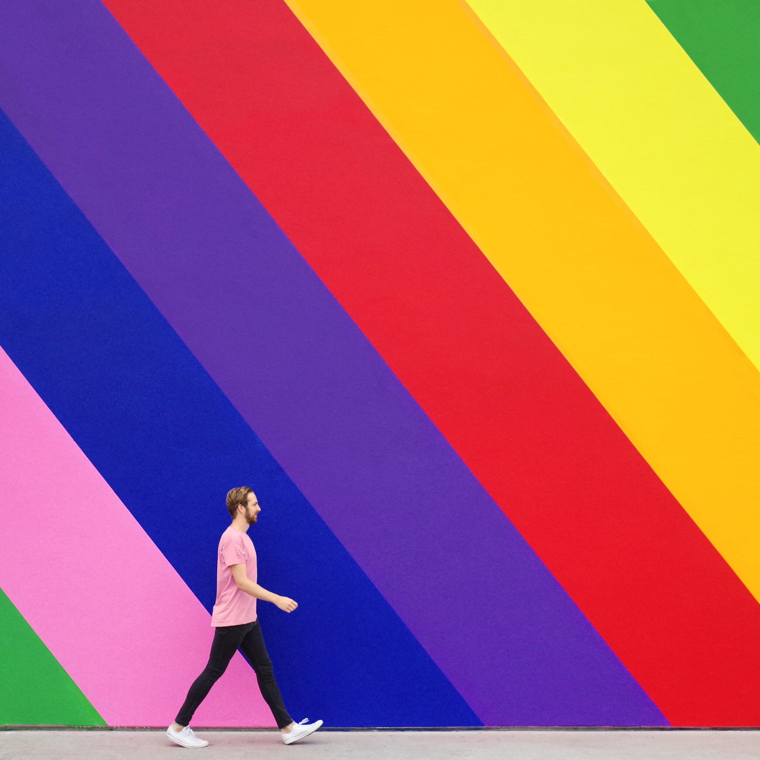
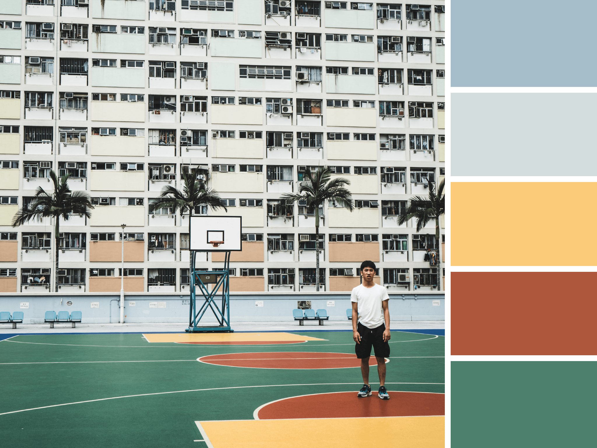
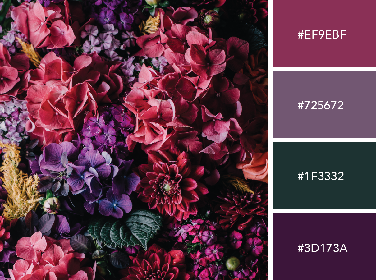
Mismatched and Multicolored

A study in contradiction, we take inspiration from marrying the colors of this Barbie dream house with the more subdued tones that surround it.
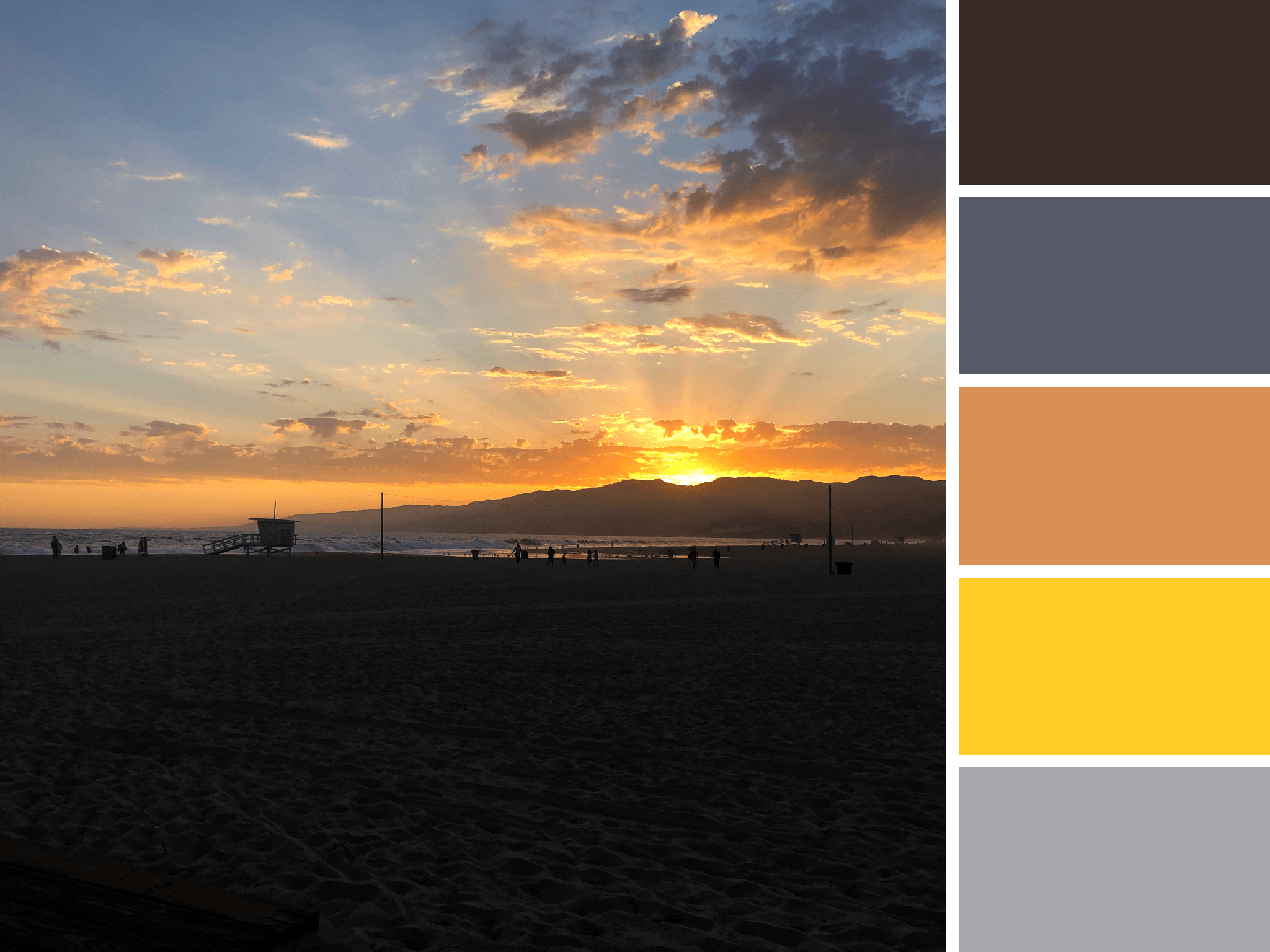
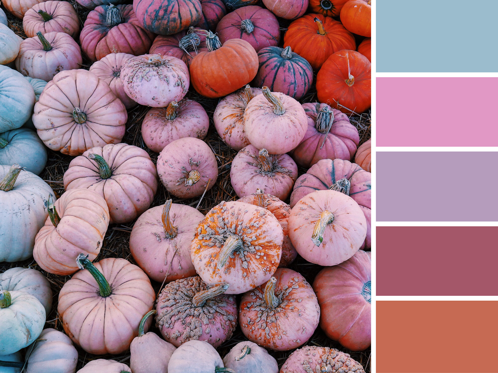

Artboard 15Final.png

Santa Monica Sunset

As the sun set over Santa Monica, the sky was cast with vivid yellows and light oranges.
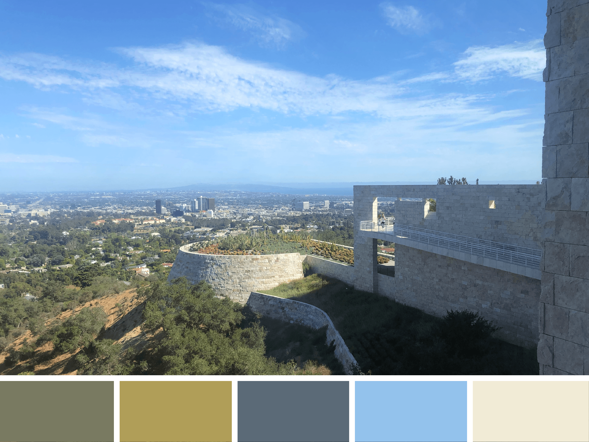
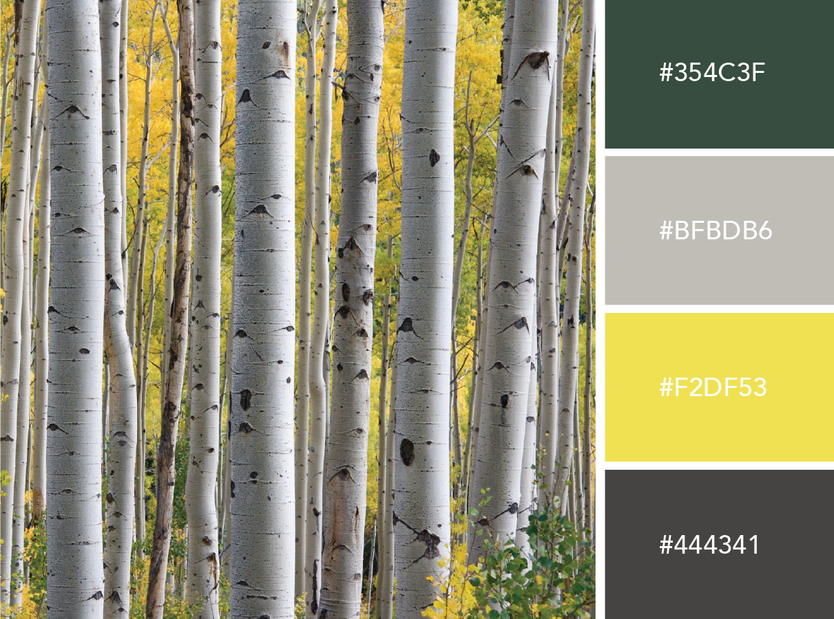

Plant life panorama

The greenery of The Getty’s cactus garden intermixes with the warm greys of downtown LA and the soothing tone of the travertine tile.
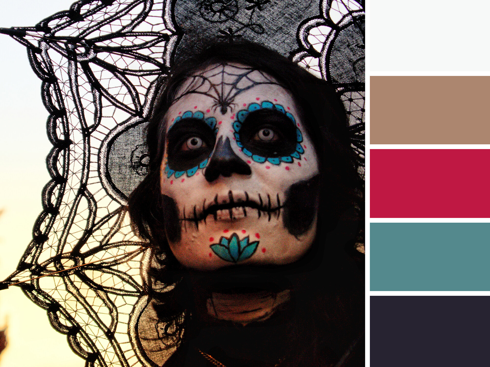

Curated Color

Spotted at LACMA, this work by Do Ho Suh is a 1:1 scale apartment sculpture is made of polyester fabric and stainless steel tubes. Soft colors create a ghostly and ethereal work of art.


Hollyhock Hues

Frank Lloyd Wright’s Hollyhock House is adorned by stylized hollyhocks on roof finials, furniture, art glass windows, and the ornamental bands of cast-concrete on the structure’s exterior. The real life flower lends a pop of bright pink to this otherwise tranquil scene from Barnsdall Art Park.


HUE & TONE CREATIVE: Let’s find what inspires you

Whether you’re based in Greensboro or beyond, we’ll help breathe new inspiration into your brand. Let us help you refresh your visual branding, website, and print collateral today. Schedule a meeting to get your next project started.

Color Schemes: Scenes from Greensboro

This week, we’re taking time out from talking marketing to celebrate a few vignettes from our city. From muted downtown streets to the Bicentennial Gardens, we’re finding color inspiration in some of our favorite Greensboro spots.

We’re big believers that every city offers inspiration – sometimes you just have to stop and notice it. With a bustling downtown and expansive trails, Greensboro offers the best of both city and nature views. No matter where you are in Greensboro, we guarantee that there’s a dynamic color scheme somewhere in your view.

Artboard 18.jpg

Dappled Depot

Soft blues, purples and pinks are diffused by the fog drifting in over the J. Douglas Galyon Depot in Downtown Greensboro. We love the soft hues of this nighttime scene.


 Botanical Brights 

Great for a short walk, quiet reflection, or reading on a comfy park bench, the Tanger Bicentennial Garden is one of our favorite spots in Greensboro. Rich colors line the pathways, and a variety compelling sculptures can be found tucked among the foliage. For more secluded scenery, pop right across the road to the Bog Garden. 


Clear Skies over Kress

Crisp blue skies highlight the pristine facades of the Kress and Meyers Buildings’ on South Elm Street. Changing leaves provide small touches of green and yellow to this palette.


Retro Revolution

Tucked in a quiet corner of Revolution Mill’s courtyard, this retro mural installation is a bright pop of color among a sea of brick. These colors are bright and muted all at once!


Artboard 12.jpg

Lite Brite LeBauer 

The sky is illuminated over LeBauer Park by Janet Echelman’s Where We Met installation. Our two downtown parks provide a great place to gather, celebrate, and play while immersing yourself in all the city has to offer. Bright colors are especially present in these fun and family-friendly spaces!


Artboard 2.jpg

South Elm Snow

On an all white day, the Green Bean’s bright facade offers a pop of color among an otherwise muted look at South Elm Street.


Guilford Grey 

On a rainy and grey day, the heart of downtown has mostly subdued tones to offer up. But this mood board is a favorite because you can see the Guilford Building in the upper right portion of the photo… can you spot us waving from our office windows in the top right corner? Just kidding…


Hue & Tone Creative: Inspiration and Color in Greensboro, NC

Whether you’re based in Greensboro or beyond, we’ll help breathe new inspiration into your brand. Let us help you refresh your visual branding, website, and print collateral today. Schedule a meeting to get your next project started.

8 simple color palettes for any brand
8 simple color palettes for any brand  |  Hue & Tone Creative

Picking the right color palette is important — whether you’re looking to refresh your logo or just design a social media graphic, selecting the right hues can have a huge impact on the effectiveness of your graphic. Certain colors evoke feelings of action, while others are often identified with calm and serenity.

In a past post, we covered what color theory is and why it’s important to consider it during the design process. Today, we’re putting the rules of color theory into practice with a handful of sample color schemes.

These 8 color schemes are suitable for a wide range of businesses and can serve as a frame of reference for what colors connect with what customers. Copy these colors directly or use them as a jumping off point for designing your own scheme!

For interior design businesses

Light, neutral colors provide a versatile canvas for any room you want to showcase.


Artboard 10purple2.jpg

For businesses who deal with women’s health

Make your female clientele feel cared for with soothing hues of purple. A dusty mauve grounds this scheme, keeping it from feeling too girly.


For businesses who want to give off a corporate feel

If you’re in a corporate or service business, you can never go wrong with basic blues. A pop of orange adds contrast and elevates this scheme to feel more modern.


Artboard 8purple2.jpg

For businesses whose clients are tweens

When appealing to a younger clientele, keep things fun and vibrant with lilac, an aqua blue, and a pear green.


For businesses who deal with art

If you deal with an elevated clientele, these unexpected shades are neutral yet a bit adventurous. Earthy and understated.


For businesses who deal with tech

If you’re looking for something bold and clean, yellow and a deep grey speaks to an action oriented and bold brand.


For businesses whose clients are young kids

If you work with young kids, keep it fun and bright with azure blue, a grassy green and a vivid red.


For businesses whose clients go outside

If you sell outdoor equipment or experiences, branch out from earthy browns and greens and dig into some more unexpected colors. Burgundy, a muted Prussian blue, and a papaya orange are an unexpected but organic combination.


Hue & Tone Creative: Your branding partner

Looking to develop just the right color scheme for your brand? Don’t leave the process of selecting the perfect colors up to chance. Bring in our expert team and we’ll ensure you create a brand that connects with your customers. From naming your business to creating a polished website, Hue & Tone is here to help. Book an initial consultation now to get started.

Halloween Color Schemes

October is one of the eeriest times of year: Halloween, colder temperatures, the time change, end of year tax prep… it’s all pretty frightening. While most people associate this time of year with black and orange, there’s a much wider color palette we think you should consider for this spooky season.

If you’re looking for a color scheme to spruce up your latest seasonal advertisement or your creepy social media graphics, consider pulling swatches from one of these boards. In addition to the traditional orange and black we’re pulling in earth tones and shades of purple, green, red, white, and yellow. We’re even playing around with a few pops of pink! 

Artboard 1.jpg

Sinister Skies

Nothing evokes a Spooktacular feeling quite like a cloudy night sky. In this color scheme, a classic pumpkin orange pairs with goldenrod, a deep red, and an inky blue. 


Saturated Skeletons

These bright colors aren’t something you would usually associate with Halloween – but the dayglo orange and pink speak to the vibrant lights of a late night party. 


Artboard 12.jpg

Haunted Hues

Warm glowing lights illuminate the windows of this haunted mansion — the charred stone and cloudy sky inspire a more muted palette of deep orange and dark blue. With it’s toned down colors, this palette will work well for all of fall.


Macabre Mask

Pops of rich pink and teal stipple this haunting Day of the Dead face paint. The strong contrast between the deep black and accent colors creates an evocative calavera design.


Pale Pumpkins

You don’t have to use orange and black for halloween — and pumpkins don’t even have to be orange! These washed out hues show a different take on a classic halloween symbol.


Artboard 17.jpg

Frightening Forest

At first this image just looks shades of blue - but peer a little closer and you’ll see deep magenta and rich greens. Who knows what else might be lurking behind these colorful trees…


Artboard 18.jpg

Eldritch Eyes

Black cats are synonymous with bad luck, making them the perfect emblem for All Hallows Eve. Different shades of grey pepper his fur and his haunting green eyes will stay with you for days to come.


Hue & Tone Creative: Design work for every season

Not up for the work of creating your own holiday campaign? Whether you’re scrambling for last minute Halloween graphics or working on your winter campaign, we’re here to create the perfect imagery for you. Contact us to get started!

How color affects your brand
How Color Affects Your Brand  |  Hue & Tone Creative

Whether you’re a real estate agent, hairdresser, baker, or jeweler, color plays a big part in your brand, because it affects how you attract and connect with customers. 


What’s color psychology?

It’s the relationship between colors and human behavior — for example, does a yellow logo elicit more trust? Or does grey packaging make people more likely to purchase your product? 

Color psychology explains the meaning behind why people (in and out of the business world) prefer certain hues over others. It also takes into account individual color biases when deciding on a specific color — like upbringing, gender, location, and values.


Why is it important? 

Color evokes feelings and emotions — and feelings and emotions can make or break sales. Take the time to get it right and your organization could benefit from:

  1. Standing out from the competition 

  2. Positioning itself the way it wants to be perceived 

  3. Influencing how customers digest and interpret your information 

  4. Improving credibility and trustworthiness


Colors and their meaningS

How Color Affects Your Brand  |  Hue & Tone Creative

Red

Feelings: excitement, passion, danger, energy and action

In the color psychology world, red is seen as the most intense color for creating strong emotions and attracting attention -- which is why a lot of businesses use it for their ‘Buy Now’ buttons. 

Tip: Because red can be associated with danger it’s best to use it sparingly.


How Color Affects Your Brand  |  Hue & Tone Creative

Orange 

Feelings: creativity, adventure, enthusiasm, success and balance

Orange is also an impactful color but on a less overwhelming scale, so it can often be used in larger doses without becoming overbearing. Because of its eye-grabbing nature, a lot of businesses use orange for call-to-actions.


How Color Affects Your Brand  |  Hue & Tone Creative

Yellow

Feelings: happiness, positivity, optimism, summer, warnings

Centered around the sun, our emotions around yellow are largely upbeat and summery. But, on rare occasions, yellow can be construed as dangerous too (think construction zones).

Exploring some color scheme options? Check out a few of our mood boards herehere, and here.


How Color Affects Your Brand  |  Hue & Tone Creative

Pink

Feelings: femininity, playfulness, immaturity, and unconditional love

Because of its connotations, pink is mostly used by companies who predominantly target females -- big name brands that follow suit include Barbie and Victoria’s Secret. Remember it can reflect immaturity though, so it’s important to choose the tone and quantity of pink carefully.


How Color Affects Your Brand  |  Hue & Tone Creative

Green

Inspired by nature? We’ve got some inspiration here.

Feelings: growth, fertility, health, and generosity

As far as color psychology goes, green is tightly associated with nature and money, and is commonly used by health and fitness businesses. It does have its negative ties though, like envy.


How Color Affects Your Brand  |  Hue & Tone Creative

Blue

Feelings: stability, harmony, peace, calm, and trust

Linked to the sea and sky, blue has a lot of security-related emotions attached to, making it a go to choice for retailer’s guarantee icons, certificates, or shipping icons. On the other end of the spectrum, it can also be connected with depression and coldness. 

Tip: With blue, the tone you choose will make a world of difference in the vibe you give off, so take your time to make sure you pick the right one. We suggest doing a little research on the specific shades of blue to take your color psychology research a step further!


How Color Affects Your Brand  |  Hue & Tone Creative

Purple

Feelings: power, nobility, luxury, wisdom, and spirituality

Purple is packed with royal vibes and is tightly linked to connotations of wealth, extravagance, and pride. Be careful with how much you use this one, because too much can leave people with an impression of frustration or even arrogance. 

With purple it’s all about the shade, tint, and hue you use: 

  • Light purple = feminine energy and delicacy

  • Dark purple = feelings of gloom, sadness, and frustration

  • Bright purple = riches and royalty


How Color Affects Your Brand  |  Hue & Tone Creative

White/Black 

White

Feelings: innocence, goodness, cleanliness, and humility

White can bring mental clarity, promote feelings of fresh beginnings, and encourage positive thoughts; which is why many businesses use it as the backdrop for product shoots. 

It likely goes without saying that black text on a white background is the number one readability combo, but just be mindful that too much white can leave a sterile and cold impression.


Black

Feelings: mystery, power, elegance, and sophistication

Too much black can be overwhelming and give off negative emotions -- like sadness and anger, but just the right amount can evoke strong doses of the right kind. Think strength, authority, and seriousness.


How Color Affects Your Brand  |  Hue & Tone Creative

Grey 

Feelings: neutrality, balance, and timelessness.

Balance is key if you’re dabbling with grey and less can often be more — stick to using it for things like fonts, headers, and graphics is a safe bet. Large quantities can be quite dull and bring out the connotations of depression and loss, so make sure to pick your placement wisely.


How Color Affects Your Brand  |  Hue & Tone Creative

Brown 

Feelings: comfort, security, wholesomeness, and honesty

Symbolizing earth, wood, and stone, brown is all about nature and can correspond with feelings of comfort, security, warmth, and stability.

You probably don’t tend to see brown used in large volumes, because it can be considered a bit boring. In small doses, brown can serve as a great alternative to cooler grays, and can evoke a feeling of warmth and security.


Hue & Tone Creative: Colors are our specialty

Whether you need to rebrand, are looking to launch a social media campaign, or design a billboard, we’ll help you find the color that evokes the right emotion. Want to learn more about how we might work together? Get in touch at hannah@huetonecreative.com or (336) 365-8559.

How to improve your designs using color theory
How to improve your designs using color theory  |  Hue & Tone Creative

Be honest, how many times have you sat and stared at your screen experimenting with endless color pairings only to realize three hours later you’re no further down the line? 

Frustrating, isn’t it?

Well, designers don’t hit the jackpot just by luck, they use what’s called color theory. Color theory is a term used to describe the collection of rules and guidelines regarding the use of color in art and design – and it is defined as a theory because it cannot be proven.  

Color theory is a science and art in it’s own right – but even non-artists can gain a basic understanding of color theory to better understand how to make a pleasing design. Knowing which colors play well together and the effects specific colors have on a majority of people is a valuable expertise no matter what your field.

What’s color theory?

Image via dulux.co.nz

Image via dulux.co.nz

The color wheel is a tried and tested blend of art and science that show you which hues go well together. The color wheel we use today is based off Isaac Newton’s 1666 color wheel which shows the relationship between colors. Sir Isaac Newton created the color wheel based on his experiments with prisms that led to the theory that red, yellow and blue were the primary colors from which all other colors are derived.

Now we’ll dive into a breakdown of how to use the color wheel for your own branding and design projects. By following these simple rules, you can shave hours off your next color-picking expedition and end up with a better-looking final product!


Complementary

Image via Canva.

Image via Canva.

Any two colors that sit on opposite sides of the color wheel -- like blue and yellow or pink and green, for example. Complementary colors are high in contrast and impact and work together to create bright results.


Monochromatic

Image via Canva.

Image via Canva.

Want a headstart? We’ve got lots of great color themes to choose from here.

These are shades of the same color and result in subtle and harmonious finishes. While monochromatic combinations are great for creating a consistent feel another color will need to be brought into the mix to add another layer to your work -- otherwise, everything will start blending into one another.


Analogous

Image via Canva.

Image via Canva.

Tip: to prevent that from happening pick one of the three for your dominant color and then use the other two as accents.

Any three colors that sit side-by-side on the color wheel -- like orange, yellow and green. On the plus side, these can be really versatile combinations, but on the downside, if you don’t manage them right they can soon become a bit tooin your face.


 Triadic

Image via Canva.

Image via Canva.

Make sure you get your proportions right for this one! Triadic colors sit at three evenly spaced intervals on the wheel and hit that right balance between contrast and versatility.


Tetradic

Image via Canva.

Image via Canva.

Similar to the above but this time across fourevenspaces. If you’re going with this option just remember the more colors you use the harder it’ll be to balance what’s on your palette -- and less can certainly be more sometimes. 

To avoid overwhelming people, as with analogous combinations, pick one color as your dominant and use the rest as accents. 


4 good-to-know color wheel facts

1. It’s made up of 12 colors: red, orange, yellow, chartreuse green, green, spring green, cyan, azure, blue, violet, magenta and rose.

2. It can be split into three color types:

  • Primary: colors that create pure white light when blended together (red, green and blue)

  • Secondary: the result of mixing two primary colors, i.e. green and blue make cyan

  • Tertiary: there are six in total and they’re the byproduct of combining a primary and secondary color

3. The two halves of the wheel make up warm (purple through to yellow) and cool (blue through to green) colors. 

4. If you add black, grey or white to any base hue you can create shades, tints and tones of any color:

  •  Shades darken the color and are made by adding black

  • Tints lighten and are conceived by adding white

  • Tones create a subtle version of the original color when white and black (or grey) are added


Hue & Tone Creative: Your partners in color

If this blog post left you feeling more confused than clear, why not hand the hard part over? We’re design experts through and through so you can trust us to find the perfect pairings for you. Interested? Get in touch on hannah@hueandtonecreative.com or (336) 365-8559.

Color Stories: Vintage Vibes

Traditionally, retro colors are all about less saturated hues that have a flat feel. This week we’re taking a little inspiration from the objects of yesteryear and reinterpreting them as modern, fresh color schemes that would work in today’s branding. 

In our eyes, retro and vintage are always in style – whether it’s a throwback to the 70s, 80s, or 90s, the past always serves as a great source of inspiration. We love a nostalgic look when it comes to product packaging, app design, or campaigns graphics. 

Mix these colors with some sleek sans serif fonts and minimal graphic elements, and you’ll have a brand that works perfectly today… even if it was inspired by yesterday. 

Carside Colors

Classic teal pairs well with these packaging inspired reds and oranges. It’s early day fast food meets a classic ride. 


Artboard 2white.jpg

Muted Motel

Forget blue and pink only working for a baby shower – these pale pinks and blues will want to make you stay the night at this vintage motel. The mix of so many soft hues lends itself perfectly to an upscale feel. 


Artboard 12white.jpg

Colorful Camera

A fun take on the Polaroid’s rainbow color scheme, these toned down swatches harken back to an age of roller rinks, disco, and, well…polaroids. 


Artboard 15white.jpg

Resplendent Radio

Bathed in blue light, this shot inspired a monotone musical scheme fit for any brand – past, present, and future. 


Artboard 16white.jpg

Primary Patches

Primary colors can be reinterpreted to fit any decade – and this patch inspired flat lay is no different. Soft grey and a pop of deep emerald help elevate the look.


Monotone Memories   

Browns and taupes may seem dull at first, but when applied fastidiously they can create an elevated look. This scheme is perfect for men’s brands or retro products that truly want to connect with the look of the past. 

Color Stories: Fall Looks for 2018

What can we say? We love fall! We know it’s still hotter than heck, but we can’t help but get excited about the impending pumpkin spice, fall leaves, and chunky sweaters. 

In fact, we also got really excited about fall last year on the blog ... and the year before … and the year before that. Basically, creating fall inspired mood boards is becoming a regular thing for us. However, this year we’re pushing ourselves to go beyond red, orange, and yellow to come up with a more out of the box set of fall palettes.  

We’ll admit, a few traditional fall colors worked their way into our mood boards – but overall we stuck to less traditional hues to keep things fresh. 

Take a look at what we came up with here – and, let us know which is your favorite in the comments!

Luscious Lake

The lake in this photo looks peaceful, but these deep colors evoke a feeling of something a little darker. Deep, rich jewel tones gives off a luscious feel. 


Moodboards_Urban-02.jpg

Crisp and Clean

Fall is all about baking and enjoying the outdoors. That’s why this tasty close up was a perfect fit for us. Cool greens and a muted ice blue speak to winter being right around the corner. 


Culinary Creativity

Family recipes abound in autumn, making it the best time to draw inspiration from your culinary supplies. Warm honey, flour, and a few kitchen tools informed this color scheme. 


Bold Bounty

This plenitude of heirloom tomatoes was perfect for a more primary color scheme. These brighter hues are a fun alternative to the soft side of fall. 


Moodboards_Urban-05.jpg

Dusty Detritus

Downed leaves make for some beautiful colors. We loved pulling inspiration from this fallen foliage. Muted lavender, subdued peach, and an understated charcoal have a soothing effect. 


Foggy Fowl

Soft lighting sets the mood here with creamy taupe, a soft sage, and a rusty brown.  


Design + Branding for Greensboro, NC and Beyond

Color scheme need an update? Brand feeling stale? Logo looking outdated? We can fix all of that -- and more! Based out of the Triad, our team can help you refresh and revitalize your flagging brand. More than just an outside team, we'll become your partner in all things visual and marketing related. Sound like what you're looking for? Give us a call.

Color Stories: City Views

It only takes one visit to a city to figure out if you’re someone who belongs in the city or the country. The commotion either overwhelms or inspires you -- and the beauty of the city is truly in the eye of the beholder. 

In the past, we’ve explored color schemes found in nature, but what about those of us who are inspired by a more urban space? 

To further explore the aesthetic and inspiration found in an urban environment, we’ve snagged Unsplash photos from cities all over the world. Cities are so much more than grey and concrete – and the colors we’ve pulled from these images prove that. 

Color Stories: City Views  |  Hue & Tone Creative

French and Fancy

The facades in France evoke a feminine and understated feel. The landscaping and waterways provide a rich pop of color that reminds you nature isn’t far away. 


Color Stories: City Views  |  Hue & Tone Creative

Tonal in Taiwan 

Rich hues of purple, red, and orange light up a dreary day in Taipei City. Dusty lilac is an unexpected alternative to the grey and black of street top.


Color Stories: City Views  |  Hue & Tone Creative

Hazy in Hong Kong

These muted colors complement a monochromatic backdrop filled with metal, glass, and concrete. We think they would be perfect for a stylized flat lay photo shoot.


Color Stories: City Views  |  Hue & Tone Creative

The lights of Shanghai 

Soothing and subdued, these blue and purple hues reflect a city full of light. A pop of light pink provides some much needed contrast and depth to this color story. 


Color Stories: City Views  |  Hue & Tone Creative

Sunset in the City

Sunsets are beautiful anywhere, but this faint coral and rich turquoise scheme is one of the best mother nature has to offer… maybe the best color inspiration blends city and nature?  


Color Stories: City Views  |  Hue & Tone Creative

Stockholm Swatches

These earthy buildings evoke thoughts of rich spice. Paired with a soothing background of pale blue and seafoam, this color scheme is as dynamic as it is beautiful. 


Color Stories: City Views  |  Hue & Tone Creative

Radiant in Radio City 

These illuminated hues create a sharp contrast against dark grey and black. For a fun and youthful scheme, New York City is where it’s at. 


CREATIVE PROFESSIONALS IN GREENSBORO AND WINSTON SALEM

Need a second opinion on your brand colors? We can help with that. We're experts in color, type, branding and design -- and we can help you refresh or retool your branding to make sure it's the best reflection of your business. Reach out if you're ready to get started: hannah@hueandtonecreative.com or 336-365-8559.

Mood Board: CMYK Inspired
Source 1  |  Source 2  |  Source 3  |  Source 4  |  Source 5  |  Source 6  |  Source 7

Source 1  |  Source 2  |  Source 3  |  Source 4  |  Source 5  |  Source 6  |  Source 7

If you work in the design or printing industry, you're probably familiar with the CMYK color mode. But for those who have never heard of it, the CMYK color model is a subtractive color model used in color printing. CMYK refers to the four inks used in some color printing: cyan, magenta, yellow, and key (black).

This color blending mode is responsible for most of the printed materials you see and interact with every day... that's why we thought it deserved a little attention! Even though we're surrounded by beautiful colors every day, we rarely stop and think about what goes in to them. 

This funky, pop-art inspired mood board is our visual ode to the CMYK printing process. We know it's nerdy... but, hey, what can we say -- we love design and color! 


Hue & Tone Creative: Color + design lovers

Does the idea of picking colors for your website stop you in your tracks? Or maybe you just can't tell the difference between two shades of blue? That's what we're here for. At Hue & Tone Creative, we can help with everything from logo design to web development to print collateral. Want to see what we've done for our other clients? Take a look at our portfolio.

Color Stories: Festive foliage

Snow covered garland, carefully crafted wreaths, eye catching poinsettias... The right greenery can usher the holiday spirit into any space! 

To get in to the holiday spirit, we've sorted through some of our favorite photos of Festivus-inspired greenery. These color stories take a closer look at some of our favorite foliage, from a close-up of a pine bough to an entire hillside of snowcapped trees. 

Color Stories: Festive foliage  |  Hue & Tone Creative

Open Invitation

A pop of rich red awakens an earthy green for an inviting color scheme... it's so rich it practically beckons you right in! 


Color Stories: Festive foliage  |  Hue & Tone Creative

Tranquil Terrain

Cool blues and purples paint the soothing and silent aftermath of a snow storm.


Color Stories: Festive foliage  |  Hue & Tone Creative

Delicate details

If you look closely enough, even the smallest detail is alive with color! This ornament inspired palette pairs a dusty plum with graphite and sage for a one-of-a-kind winter scheme.


Color Stories: Festive foliage  |  Hue & Tone Creative

Crisp Cranberry

This modern color pairing packs a bold punch with an accent of brilliant red. A nearly-black mahogany and cool greys accent this daring statement color.


Color Stories: Festive foliage  |  Hue & Tone Creative

Festive Fern

Deep earth tones take us back to nature in this rich and rugged color scheme. A pale blue pops on a backdrop of muted mahogany and soft brown.  


LOGO AND BRAND DESIGN IN GREENSBORO, NC

Need a custom holiday invite? A fresh brand to start 2018 off right? We've got you covered on all fronts. Hue & Tone specializes in logo design, branding, and collateral development. Reach out if you're ready to start the new year off right: hannah@hueandtonecreative.com or 336-365-8559.

Color Stories: Flat Lay Finds

If you loved iSpy as a kid, these eclectic flat lays are going to catch your eye...eye for detail that is! 

Flat lays not only make great Instagram posts, but they can also be great design inspiration. A stylized color scheme is part of what makes a good flat lay eye-catching social media gold... as opposed to just a pile of junk on a white background. 

We grabbed a few of our favorite flat lays from Twenty20 and let them inspire 6 unique color schemes! 

Color Stories: Flat Lay Finds  |  Hue & Tone Creative

Sixties Citrus

This color story is looking to make a statement -- 60’s inspired citrus hues pair with a pop of electric strawberry for a modern look that will practically knock your go-go boots off!


Fall Bazaar

An unexpected spin on fall, a muted rosewood hue pairs with a pink that packs a peppy punch. A pale olive and citron pull together this surprising style.


Color Stories: Flat Lay Finds  |  Hue & Tone Creative

Punchy Post-its

Earthy sage pairs with a bright salmon and a goldenrod yellow... these post-it notes inspired a color scheme almost good enough to eat! 


Artboard 2Events.png

Neon Stamp Collection

We pulled these punchy colors out of a dynamic stamp collection. If you’ve seen our logo you know we’re obsessed with citron – add a luscious grape color, a toned down teal, and a calming grey and you’ve got a girly, but fresh, color scheme.


Color Stories: Flat Lay Finds  |  Hue & Tone Creative

Colorful Cars

Whether you’re a racecar driver or an everyday commuter, we bet this color scheme really revs your engine!


Color Stories: Flat Lay Finds |  Hue & Tone Creative

Beige Business

The most muted of the group, this flat lay takes business style to a new place. Soft lavender, navy, and pistachio green give these guys a serene look during a hectic day at their make-believe office.


CREATIVE PROFESSIONALS IN GREENSBORO AND WINSTON-SALEM

Logo looking a little flat? Website lacking pop? We'll get your businesses branding on the right track -- we specialize in logo design, branding, and collateral development. Reach out if you're ready to make your brand stand out: hannah@hueandtonecreative.com or 336-365-8559.

Mood Boards: Falling into Fall

October is finally here and we’re ready for all things fall. It’s time to trade in our summer sandals for boots, grab our favorite cardigan, and eat ridiculous amounts of pumpkin flavored baked goods.

In the spirit of the new season, we’ve put together a little collection of autumn inspired mood boards: 

Mood Boards: Falling into Fall  |  Hue & Tone Creative

Pumpkin Spice

Yes, we know all things pumpkin spice are a bit overrated, but we couldn’t resist! It just wouldn’t be fall without it.


Mood Boards: Falling into Fall  |  Hue & Tone Creative

Ember

This color scheme was inspired by the warm glow of seasonal candles and the relaxing crackle of a campfire. 


Mood Boards: Falling into Fall  |  Hue & Tone Creative

Woodland Escape

There’s nothing better than going on a walk on a crisp autumn day. We love the feel of a cool morning breeze and the sound of leaves as they crunch with each step. 


Mood Boards: Falling into Fall  |  Hue & Tone Creative

Cozy Cabin

Fall is the perfect time to enjoy freshly picked apples and endless mugs of hot chocolate. 


Mood Boards: Falling into Fall  |  Hue & Tone Creative

Autumn Leaves

Our final board was inspired by the simple beauty of the changing leaves. A soft touch of yellow and green add a subtle dash of color to chocolate brown.


What do you love most about fall? Let us know in the comments!


Social Media Marketing & Graphic Design in Greensboro, NC

New season, new look. Fall is the perfect time to give your brand a little refresh. From business cards to websites, Hue & Tone Creative can help give your brand’s look an upgrade.

Mood Boards: Home Sweet Home

We have a confession to make...  We have a bit of an addiction to browsing home decor on Pinterest. But instead of adding to our already over flowing “dream home” board, this week we decided to channel our energy into some shareable content!

If you love day dreaming about how you're going to decorate your house, this little collection of "Home Sweet Home" moodboards is just for you!

Moodboards: Home Sweet Home  |  Hue & Tone Creative

Victorian

During the Victorian era, plain jane décor was a major faux pas. Burgundy, burnt orange, and teal hues create a modern spin on the classic style. 


Artboard 2@5x.png

Ranch

For this color scheme, we were inspired by golden fields of wheat and rustic simplicity.  


Moodboards: Home Sweet Home  |  Hue & Tone Creative

Colonial

Our collection wouldn’t be complete without one of the most popular American styles. Lemon zest, forest green, and robin’s egg blue add a nice contrast to a black and white canvas.


Moodboards: Home Sweet Home  |  Hue & Tone Creative

Cottage

We know it’s cheesy, but we’ve always loved Miss Honey’s teeny tiny cottage in Matilda. For this shabby chic palette, we chose muted shades reminiscent of tea roses, ivy, and aged stone.


Moodboards: Home Sweet Home  |  Hue & Tone Creative

Spanish

For this rich scheme, we combined warm hues like papaya and goldenrod with a bold hint of sapphire.


What’s the style of your dream house? Share it in the comments!


Creative Services & Graphic Design in Greensboro, NC

In a creative slump? Take a break and leave it to the pros! Whether you’re looking to spice up a lackluster landing page or create a lookbook for your brand, Hue & Tone can add an artistic touch to any project.

Mood Boards: Around the world

Summertime is just around the corner and we’ve been bitten by the travel bug.

To quench our recent wanderlust, we used some creative energy to build a few mood boards inspired by beautiful destinations around the world.

Ready? Let’s go!

Around the world moodboards  |  Hue & Tone Creative

Greece

Craving a trip to the sea? Relax on the warm shores of Mykonos and explore the winding cliffside villages of Santorini.


Around the world moodboards  |  Hue & Tone Creative

Italy

From famous works of art to incredible food, Italy never fails to impress. We channeled the country’s rich culture and ancient landmarks for this warm and earthy mood board.


Around the world moodboards  |  Hue & Tone Creative

Iceland

Even though the Northern Lights are most visible in the wintertime, summertime in Iceland is full of natural beauty.


Around the world moodboards  |  Hue & Tone Creative

The South of France

Fragrant lavender, picturesque beaches, and charming hillside villages helped inspire this airy color scheme.


Around the world moodboards  |  Hue & Tone Creative

England

Whether you’re wandering the busy city of London, or enjoying the simplicity of the countryside, England is full of things to do and places to visit.


Around the world moodboards  |  Hue & Tone Creative

Spain

Spain is the perfect destination for creative spirits and nomads alike. The vibrant streets and whimsical architecture sparked this bold and quirky palate.


Want even more inspiration? Revisit our past mood boards here.  


Creative Services & Graphic Design in Greensboro, NC

In need of a creative refresh? We’ve got you covered. From look books to blog design and everything in between, Hue & Tone can help bring your vision to life.

Color Stories: Inspired by Nature

Whether you’re revamping your resume or debuting a new logo, the colors you choose make a difference. With an endless library of colors at your disposal, it can be difficult to decide on the right combo.

Lately, we’ve been finding our inspiration in nature. The great outdoors is a bountiful source of *free* inspiration (and, the photos we used were free too)!

If you can't get away from your desk right this minute, turn to our nature inspired color schemes for your next project. Try out just one... or all of them! 

Neon Forest  |  Hue & Tone Creative

Neon Forest

This bold collection is perfect for trendsetters and influencers. Pair energetic colors with a charcoal brown for a crisp contrast.


Luscious Lavender  |  Hue & Tone Creative

Luscious Lavender

Not afraid to get a little girly? This playful purple match up is for you.


Salt & Seafoam  |  Hue & Tone Creative

Salt & Seafoam

Want to appeal to a wide audience? These cool tones feel calm and approachable.


Citrus Sunrise  |   Hue & Tone Creative

Citrus Sunrise

Feeling a little playful? This bright collection is perfect for a fun new culinary or children’s brand!


Desert Flower  |  Hue & Tone Creative

Desert Flower

This color scheme is perfect for spring! The feminine and playful combo works nicely for logos, business cards, or boutique packaging.


Vivid Autumn  |  Hue & Tone Creative

Vivid Autumn

These bold tones feel warm and confident -- but still modern.


Bold & Earthy  |  Hue & Tone Creative

Bold & Earthy

Looking for a natural palette that can appeal to a down-to-earth demographic? We've got just the thing. 


Pastel Sea  |  Hue & Tone Creative

Pastel Sea

Think pastels are a little too girly? Tone down the femininity with rich tones. This palette would add a modern touch to packaging or branding materials. 


Incandescent  |  Hue & Tone Creative

Incandescent

These subtle colors serve as a great foundation to help your work stand out. Give this palette a try for your next portfolio site. 


Soft & Whimsical  |  Hue & Tone Creative

Soft & Whimsical

This color scheme feels delicate yet subtly strong.


Creative Professionals in Greensboro and Winston Salem

Need a second opinion on your current creative project? We can help! From personal branding to web-design, Hue & Tone is here to help you make your brand pop.

Mood Boards: Blast from the Past

Lately, we’ve been feeling a little nostalgic. Since we don’t have a DeLorian to help us hop back in time, we decided to get a little creative.

Take a trip to the past with our collection of retro mood boards: 

1960’s 

Moodboards: Blast from the Past  |  Hue & Tone Creative

Listening to Pandora’s 60’s French Pop station helped put us in the mood to create our first board. We love the graphic prints and classic style of this iconic decade.


1970's

Moodboards: Blast from the Past  |  Hue & Tone Creative

While we like the look of ruffled shirts in the 70’s, we’re happy they haven’t made a comeback.


1980's 

Moodboards: Blast from the Past  |  Hue & Tone Creative

This bright color scheme may have fueled an 80’s movie marathon on Netflix… 


1990's

Moodboards: Blast from the Past  |  Hue & Tone Creative

90’s style has definitely found its way back in recent years. We’re loving these bold geometric patterns and energetic colors. 

What’s your favorite decade? Let us know in the comments!


Greensboro Graphic Design Company: Hue & Tone Creative

In need of a little inspiration? Hue & Tone can help supercharge your creativity. From graphic design to social media management, we’ve got you covered. 

Mood Boards: Autumn Inspiration

Autumn is (finally really) here! Many celebrate this change in season with chunky sweaters, holiday music, and pumpkin-spiced everything (seriously, why is everything flavored with pumpkin?!).

At Hue & Tone, we like to celebrate fall with a little visual inspiration.  Lately, we’re craving rich tones, warm textures, and natural aesthetics.  Want to peak into our minds? Check out our collection of mood boards below:

Blue & Citrus

We’ve been seeing a lot of navy and coral lately. Teal and grey provide a refreshing update to this color trend.


Rustic Warmth

This chilly autumn air makes our hearts long for a log cozy cabin, campfires, and misty morning sunrises. 

MoodBoard-02.jpg

Flora & Fauna

A change in temperature justifies a Netflix binge. Princess Elizabeth’s visit to Africa on The Crown inspired this prim and natural color scheme.  


Desert Rose

These hazy muted colors and cacti imagery make us want to take a road trip to the South West.


Pomegranate Wine

We’re loving deep plum hues paired with rich neutral textures.


Vibrant & Crisp

Playful green hues paired with geometric patterns. 


Muted Sea

Calm blues and soft neutrals.


What are your favorite color combos? Let us know in the comments!  

Mood Board: Everything isn't black and white

“Its not easy taking your own advice, accepting what you don't like hearing, & seeing the grey amongst the black & white.” 
― April Mae Monterrosa

During an especially busy week, it's important to remember that everything isn't black and white. This mood board is inspired by the idea that when it comes to a design problem there's no right or wrong answer -- only different potential solutions. 

MoodBoardBW-01.jpg

One  |  Two  |  Three  |  Four  |  Five  |  Six