Traditionally, retro colors are all about less saturated hues that have a flat feel. This week we’re taking a little inspiration from the objects of yesteryear and reinterpreting them as modern, fresh color schemes that would work in today’s branding.
In our eyes, retro and vintage are always in style – whether it’s a throwback to the 70s, 80s, or 90s, the past always serves as a great source of inspiration. We love a nostalgic look when it comes to product packaging, app design, or campaigns graphics.
Mix these colors with some sleek sans serif fonts and minimal graphic elements, and you’ll have a brand that works perfectly today… even if it was inspired by yesterday.
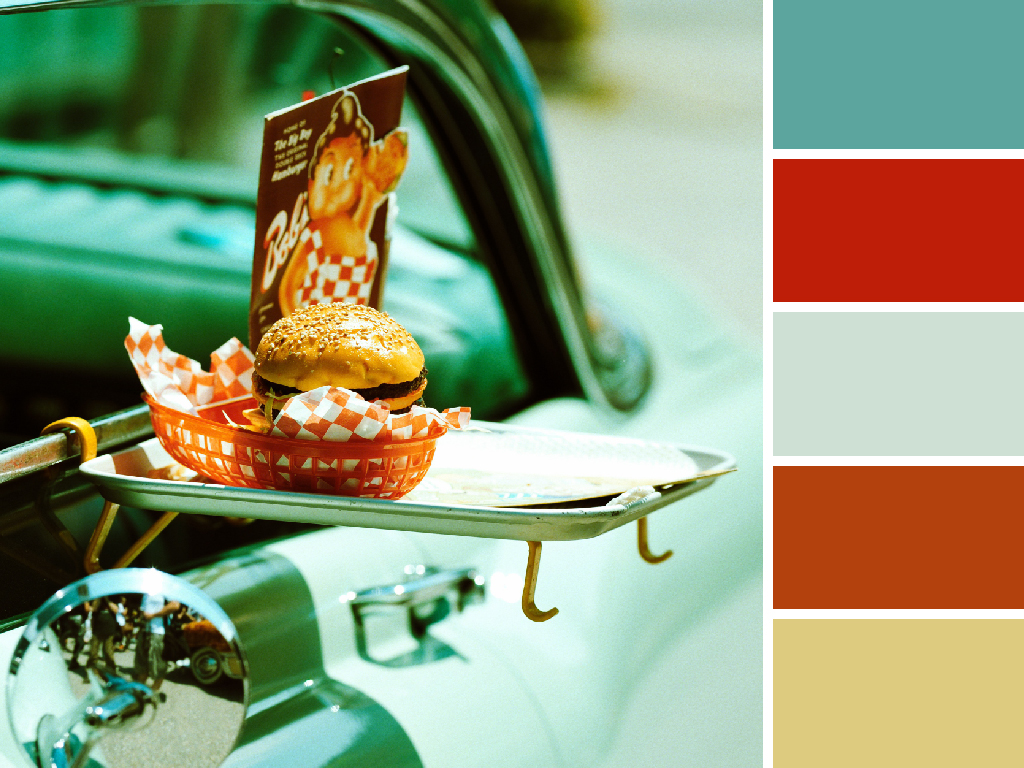
Carside Colors
Classic teal pairs well with these packaging inspired reds and oranges. It’s early day fast food meets a classic ride.

Muted Motel
Forget blue and pink only working for a baby shower – these pale pinks and blues will want to make you stay the night at this vintage motel. The mix of so many soft hues lends itself perfectly to an upscale feel.

Colorful Camera
A fun take on the Polaroid’s rainbow color scheme, these toned down swatches harken back to an age of roller rinks, disco, and, well…polaroids.

Resplendent Radio
Bathed in blue light, this shot inspired a monotone musical scheme fit for any brand – past, present, and future.

Primary Patches
Primary colors can be reinterpreted to fit any decade – and this patch inspired flat lay is no different. Soft grey and a pop of deep emerald help elevate the look.
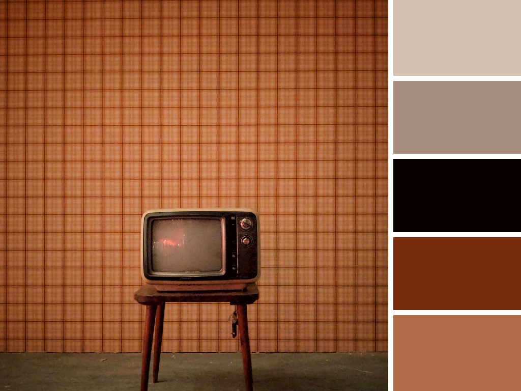
Monotone Memories
Browns and taupes may seem dull at first, but when applied fastidiously they can create an elevated look. This scheme is perfect for men’s brands or retro products that truly want to connect with the look of the past.