Last week we covered how to create a brand that stands out to consumers. This second installment in our 'Beyond the Logo' series maps out where you need to go after nailing down your logo.
Once you’ve established your brand, there’s still a lot to do to ensure success. Now that your brand is ready to go, it’s time to get it out there. For the sake of this blog, let’s assume you or your designer has narrowed down your logo, symbols, colors, fonts, etc...so, now that that's handled, it’s time to firm up how you’re going to use these elements.
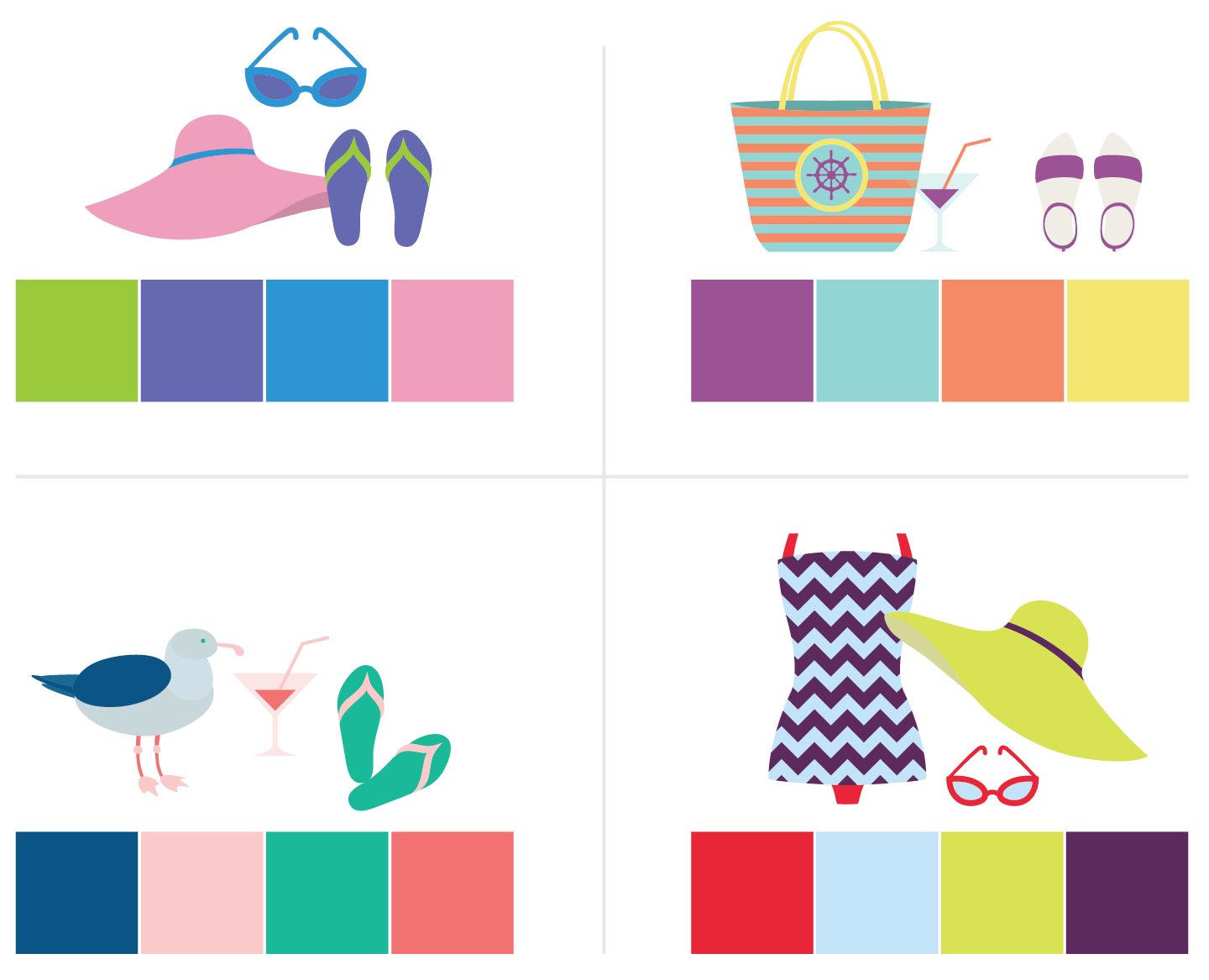
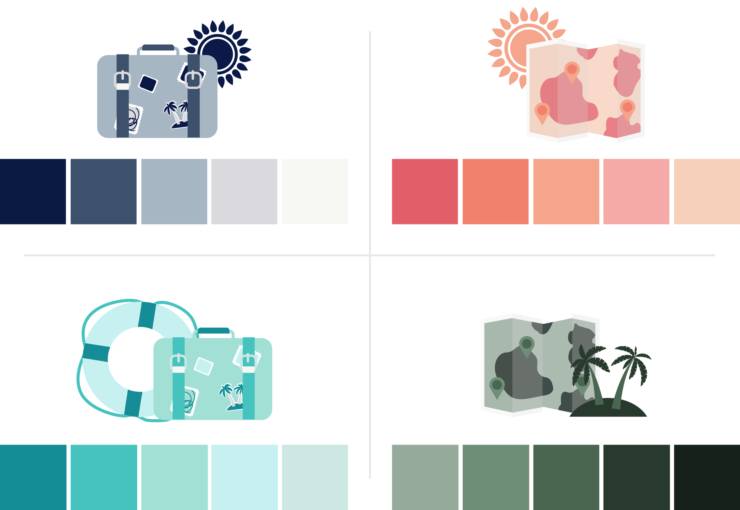
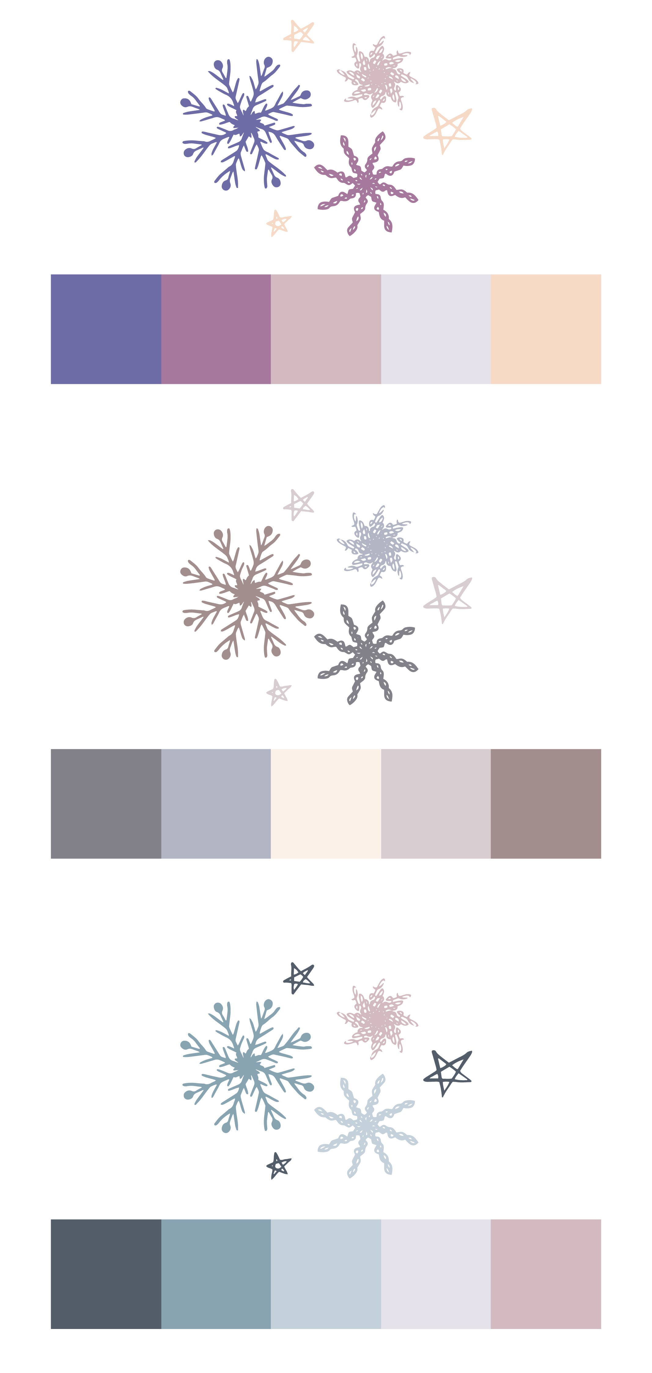
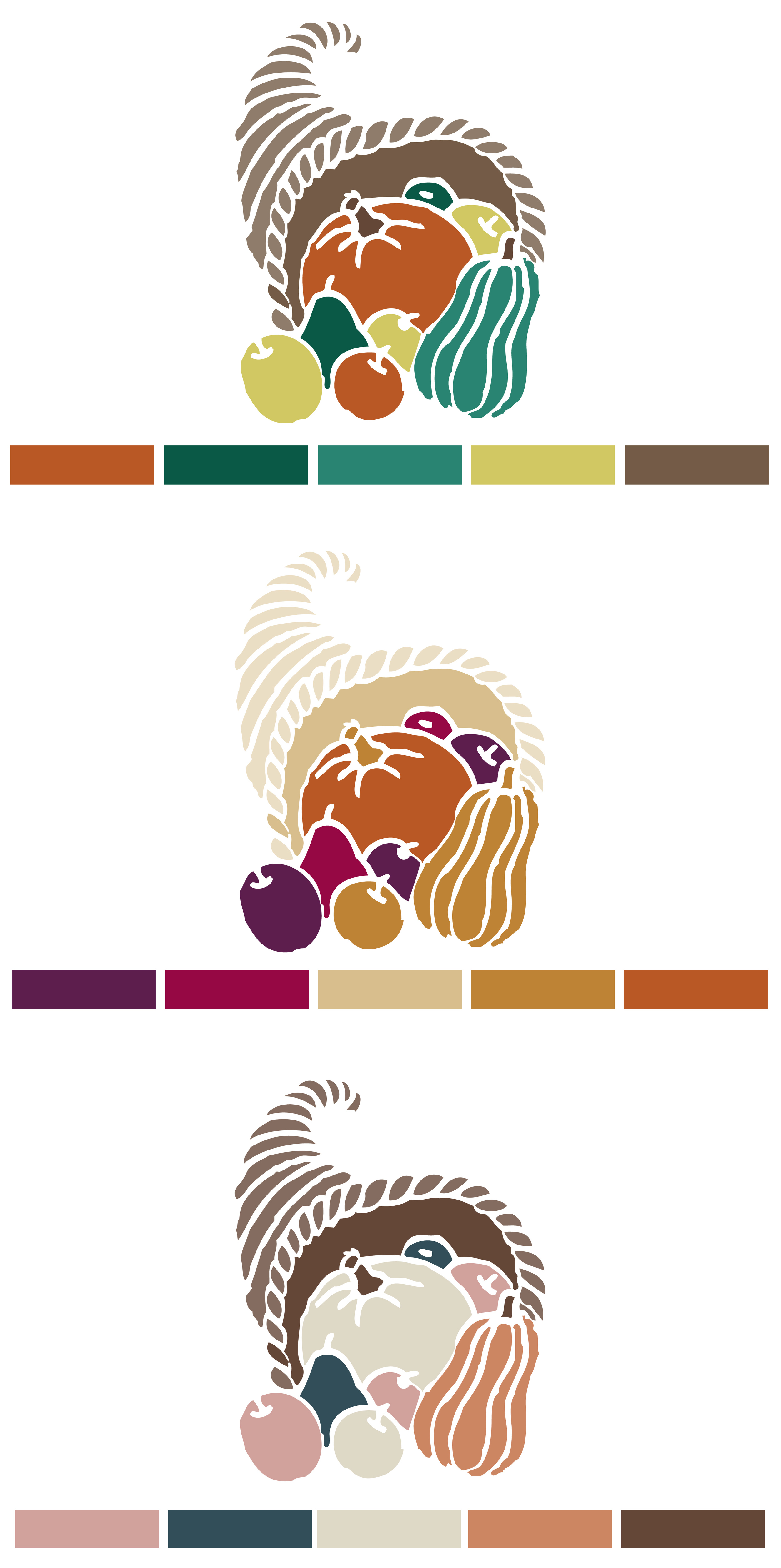
First things first, you need to develop a brand guide. By testing out the colors, patterns, and other design elements you’ve selected, you’ll be able see how they work in real life. Getting your brand guidelines in place before you start finalizing your collateral will save a ton of time and money in the long run.
Your brand guide should cover how you utilize all the colors, icons, and how the different brand elements interact with each other. This development stage is also a great time to test out your logo on different types of collateral (and make any tweaks if necessary). No matter what the medium, all of your brand elements should work together to create a consistent but interesting look.
With all your visual elements in place, it’s time to apply your brand identity to all of the necessary collateral. If you’re tempted to stagger your brand release to save money, think again. While it may seem tempting to do things like use up the old stationary before ordering the new one, it weakens your new message, and may confuse customers.
No detail is too small when it comes to your new branding. Be sure to consider everything, including:

- Website
- Business Cards
- Stationary
- Signage
- Product packaging
- Advertising
- Store signage
- Car wraps/vehicle signage
- Uniforms
- Swag (free giveaways like pens, koozies, coffee mugs, etc.)
- Video Intro/Motion Graphics
- Social Media Graphics
Once you’ve got everything branded -- it’s time to get your team up to speed. Managing your assets requires every player of your team to commit to your brand -- they need to be in it for the long haul if you want to continually convince customers of who you are.
The makeup of your company will greatly influence how you disperse your message. High level documents like a branding brief will work well to share your new identity with your marketing team. However, customer facing workers or people in sales positions will mostly likely benefit more from handbooks or documents that explain only the elements of the rebrand that are pertinent to them.
Finally, you’re ready to launch your brand to the public. There’s no one size fits all way to get your brand out there. Your goals will influence the appropriate course of action -- from social media campaigns to full out launches there’s a variety of ways to introduce your new brand. You’ll need to work with your creative team to determine what’s appropriate for your company and budget.
Keep in mind that what we just covered in this post can takes months to develop. Branding is a long process -- and it's a process that every ad agency handles differently. While we're a big fan of our own branding process, we know that it isn't going to work for everyone. If you're considering a rebrand we always recommend taking the time to meet with different agencies and learn about their process. Find someone that not only works for your budget, but is a great fit for your team!
Have questions? Ready to get your rebrand started? Get in touch with us at 336-365-8559 or hannah@hueandtonecreative.com.