Posts tagged resume design
Resume Design: Get noticed

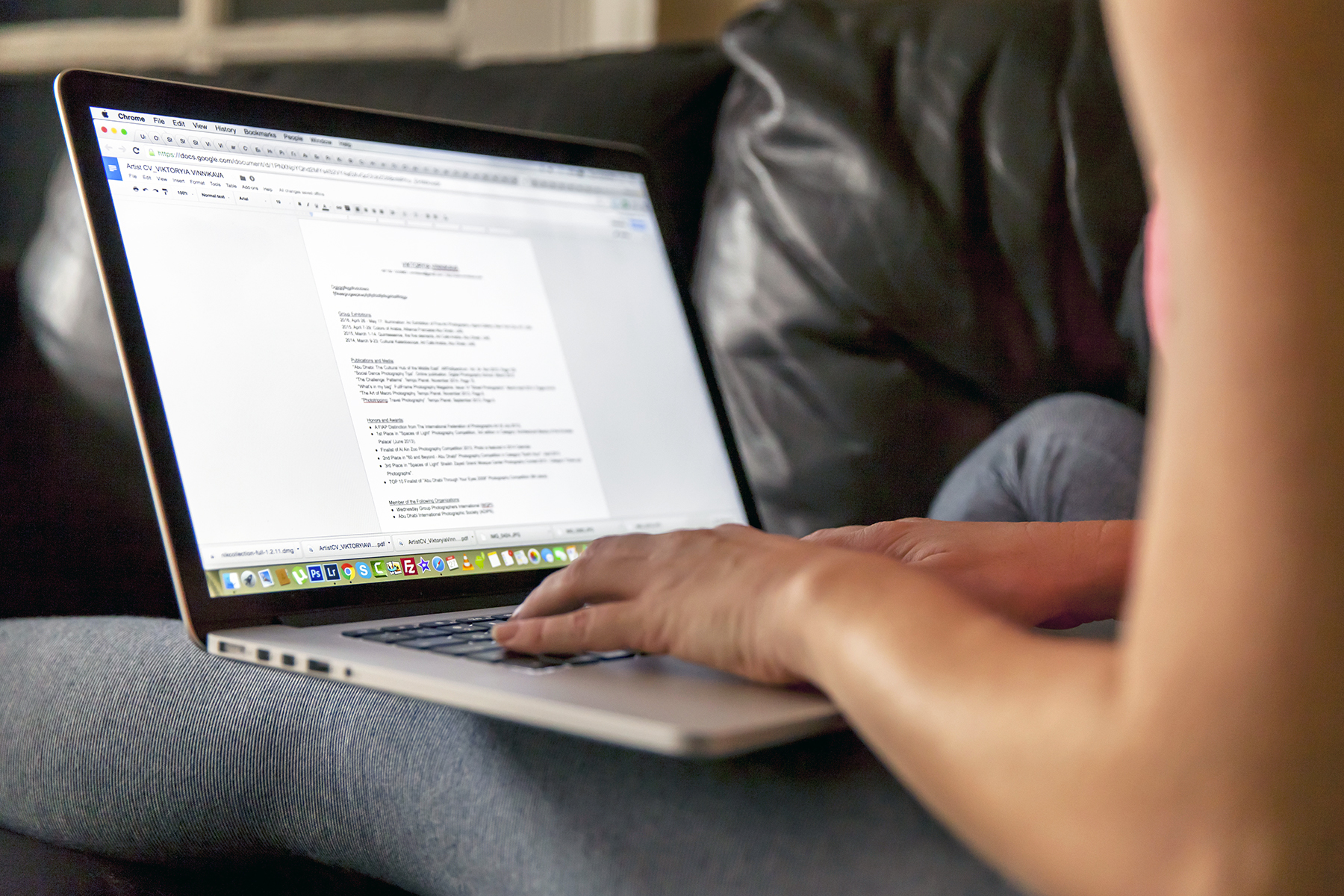
Last week we went over all the basics of writing a killer resume. Now that your resume is written to impress, it's time to work on a knockout design.  

Selecting the right font, color, and composition can be an intimidating task, especially when your dream job is on the line. To help relieve some resume-design stress, we’ve compiled some tips and examples to help you get started. 


Personal brand

Before you begin designing your resume, you need to do some thinking about your personal brand. Your resume is more than just a piece of paper, it’s a glimpse into who you are as an employee. Are you neat and organized? Expressive and creative? Show it off! Create a strong, well-organized resume that showcases your personality and sets you apart from the competition. 


Fonts

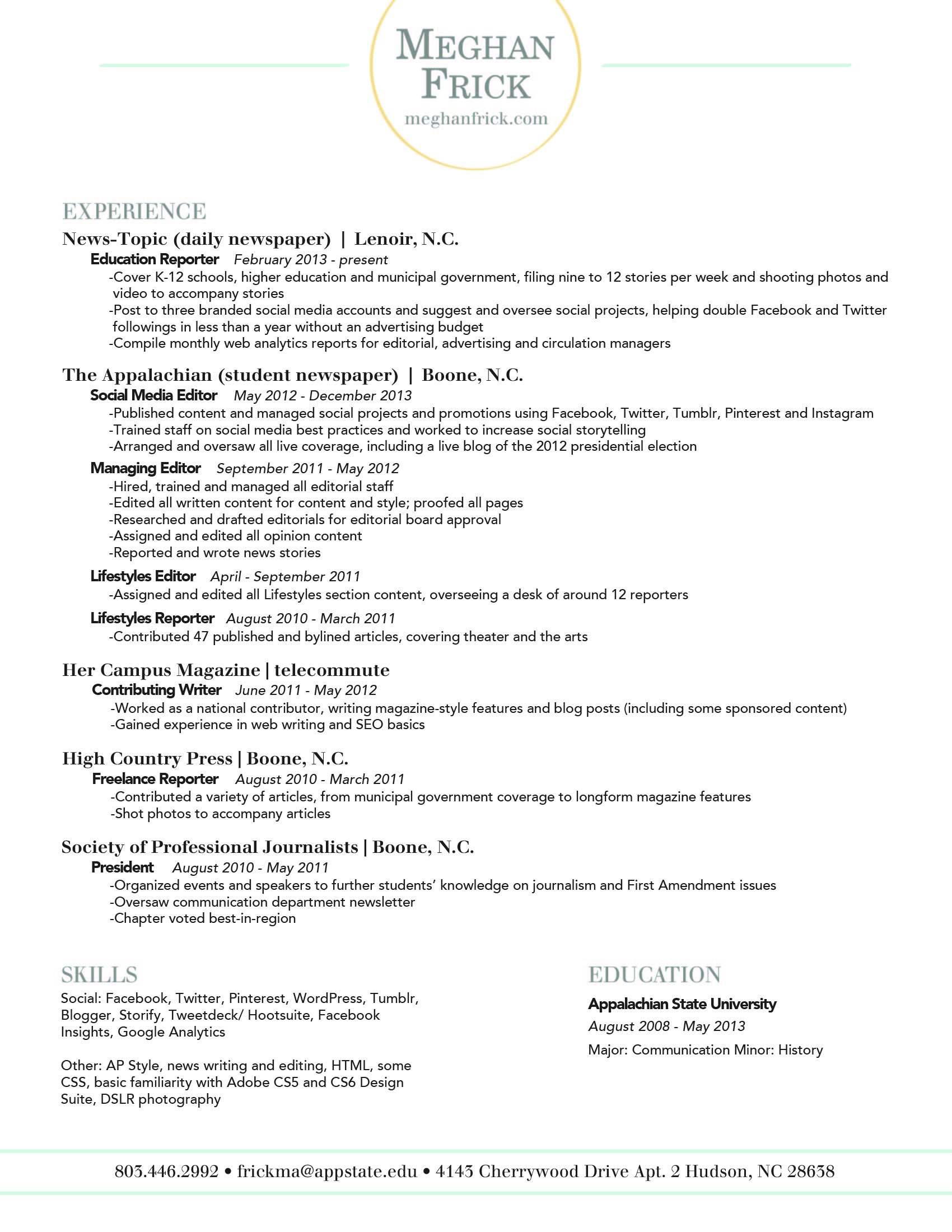
When selecting a font, it’s crucial to choose something that’s professional and easy to read. Some fonts that seem fine at first glance may be difficult to read when they're used for a full page of text.

Best Fonts: Garamond, Helvetica, Garamond, Proxima Nova, Georgia, Gill Sans MT, and Calibri are all great choices. 

examples-02.jpg

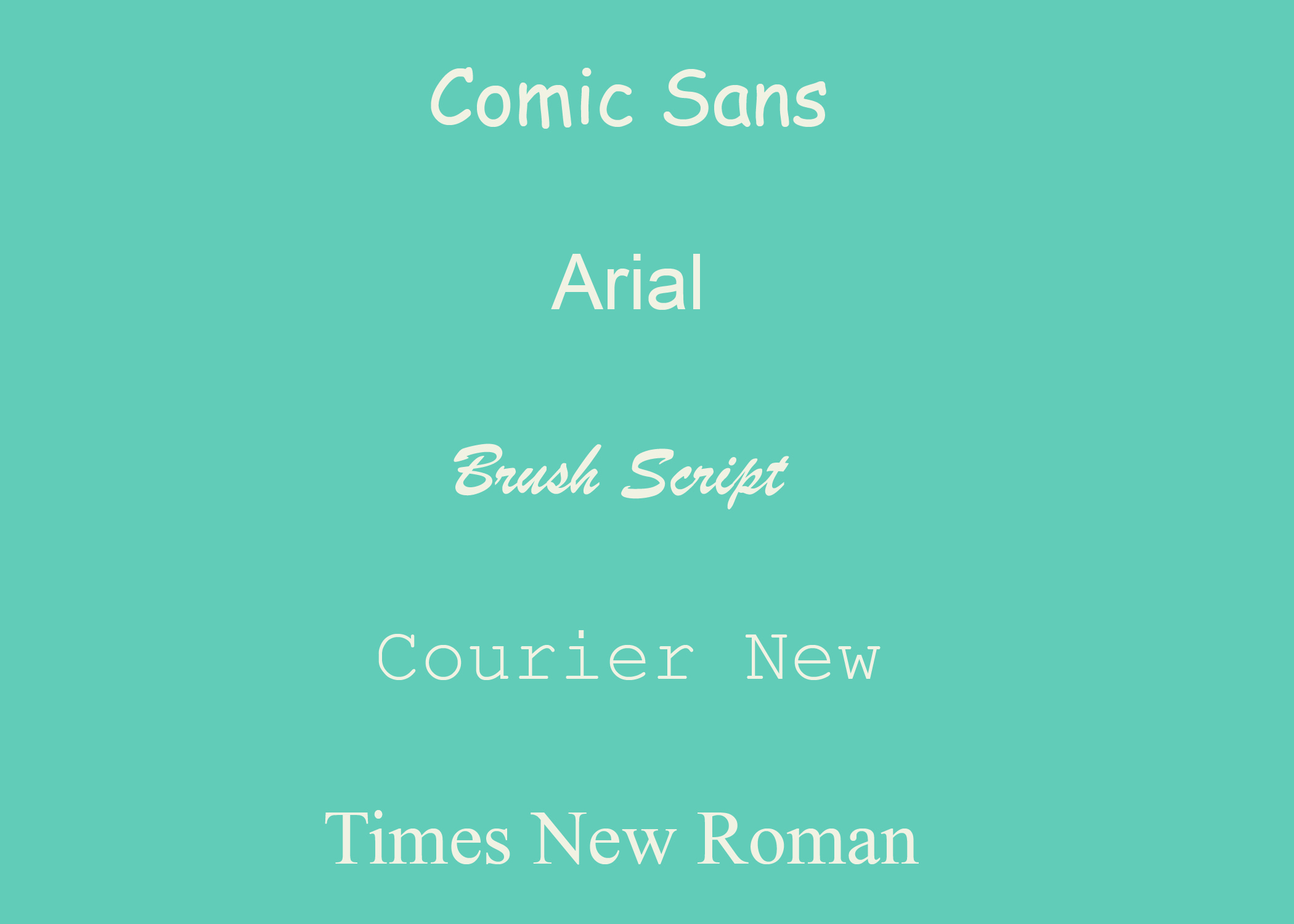
Stay Away from: Zapfino, Brush Script, Trajan Pro, Courier (looks like you typed up your resume on a typewriter), Comic Sans (Never use Comic Sans!)

Arial & Times New Roman aren’t bad, they’re just overused. We recommended choosing something less predictable. It’s best to stick to 9 - 12pt. font for the body of your resume, but feel free to go bigger for headings and subheadings. 

Don’t be afraid to use more than one font! It adds interest and helps highlight different sections of your resume.  Just make sure to use no more than 2 (3 max) and keep it consistent. Use the same font for the body, headings, and subheadings, respectively.  
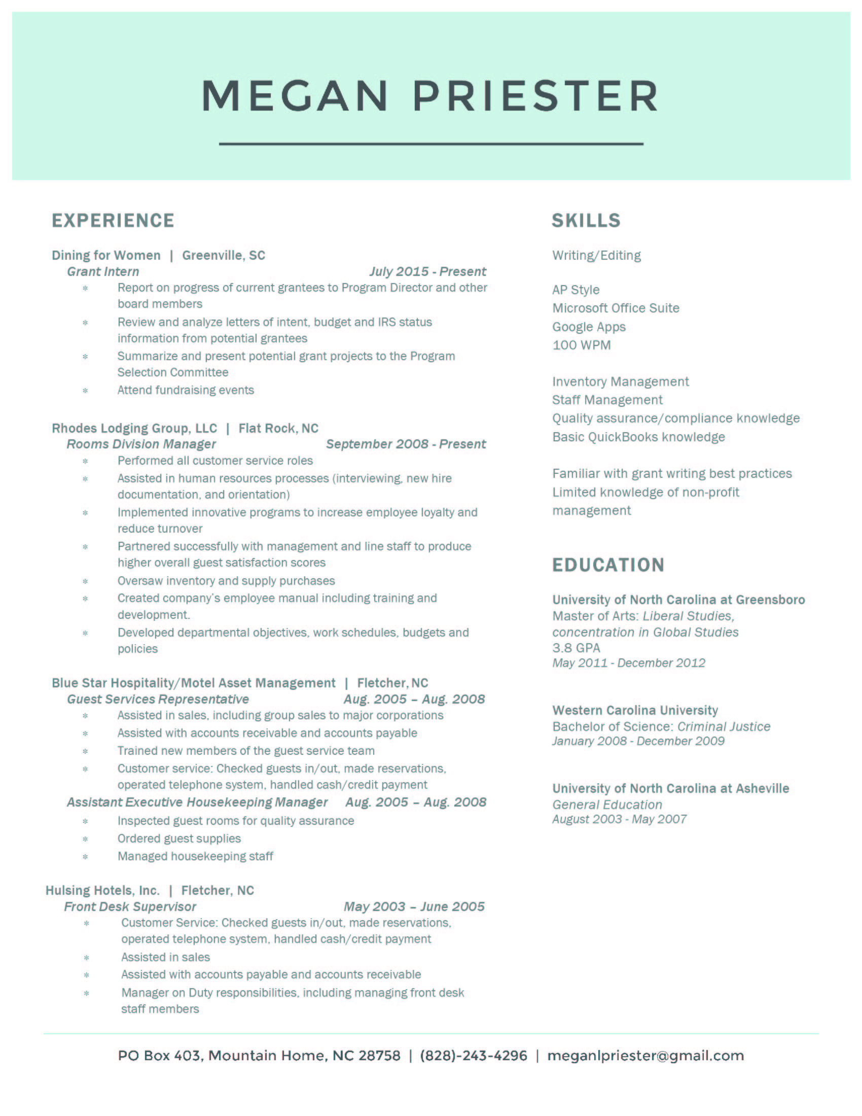
Layout

Regardless of the style and design you choose, keep your resume to one page!

Constantly looking at screens has changed the way people read. People tend to scan the entire page rather than read top to bottom. Use bolded text to make important aspects of the resume stand out.

To maintain your one page resume format, you can use columns to save on space and keep your content organized. We also recommend staggering your font sizing help highlight different aspects. Try using 12 pts. for headings, 11 pts. for the subheadings, and 9 pts. for the body text. 


Color

A pop of color is a great way to make your resume standout. While we don’t recommend one color over another, we do recommend that you chose a hue that isn’t distracting or unprofessional. A hot pink resume worked for Elle Woods, but it probably won’t work out well if you’re applying for an accounting position.          


Icons

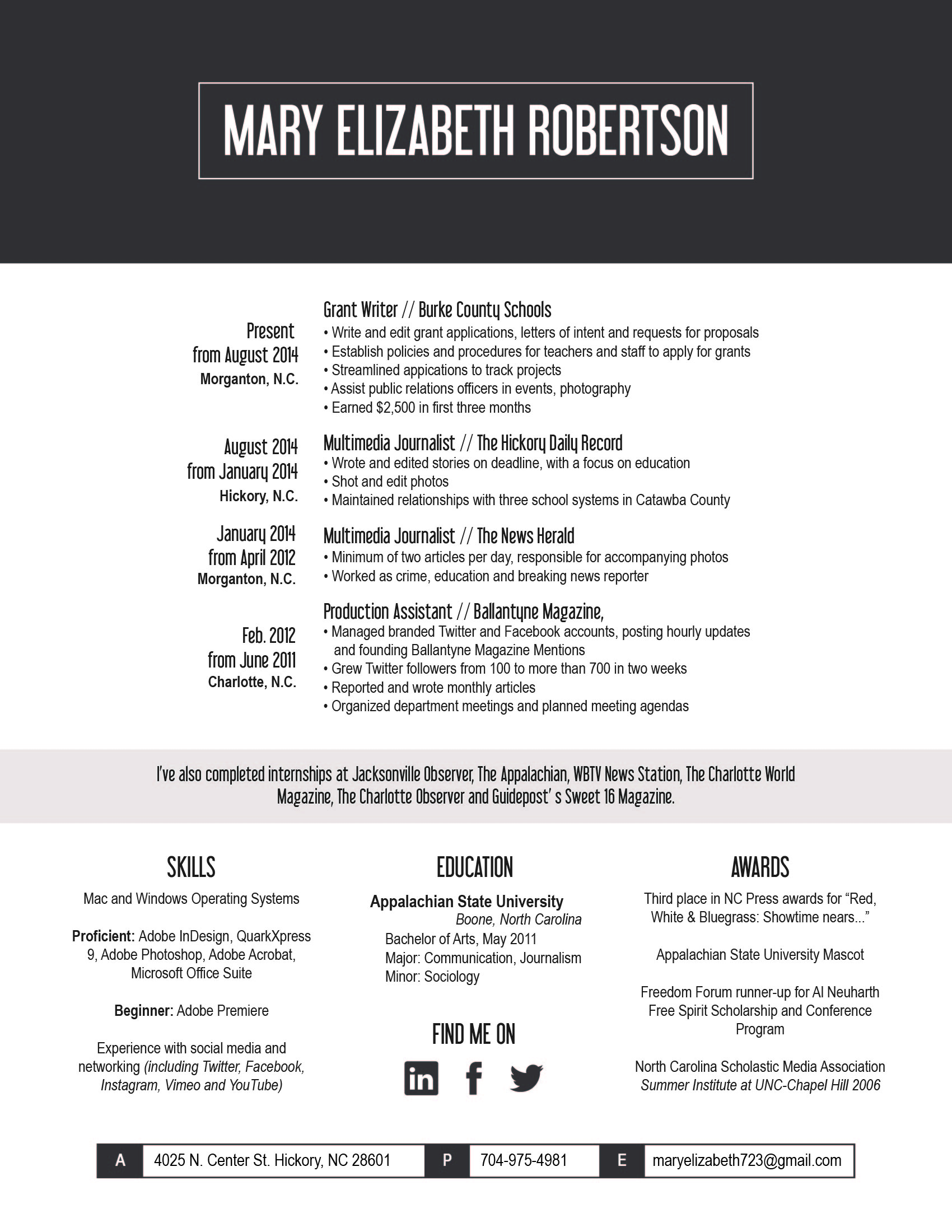
Depending on the position you’re applying for, you may want to use icons to add some interest to your resume. Social media icons can help give your resume a contemporary look and highlight your contact information. Check out our Big List of Icons for some free downloads.

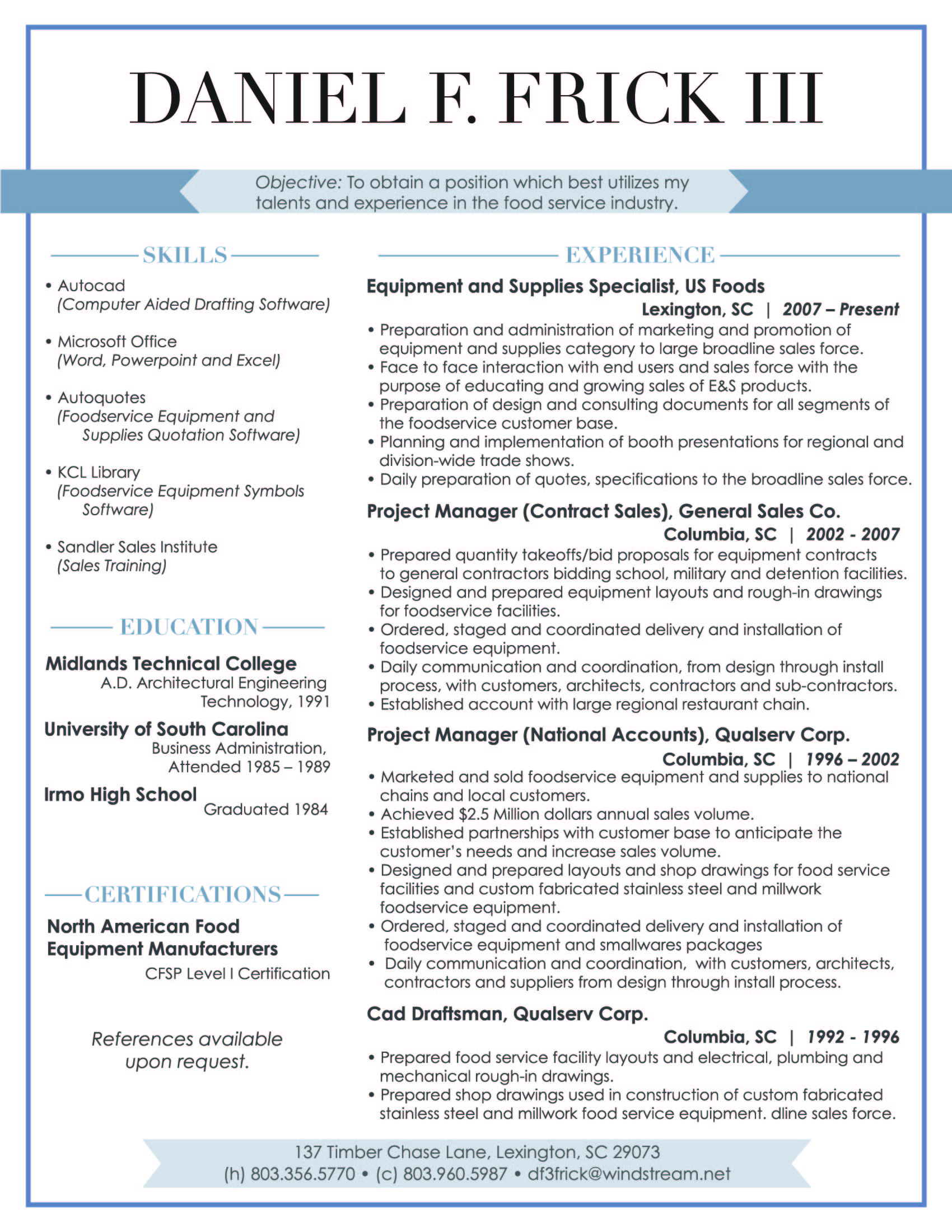
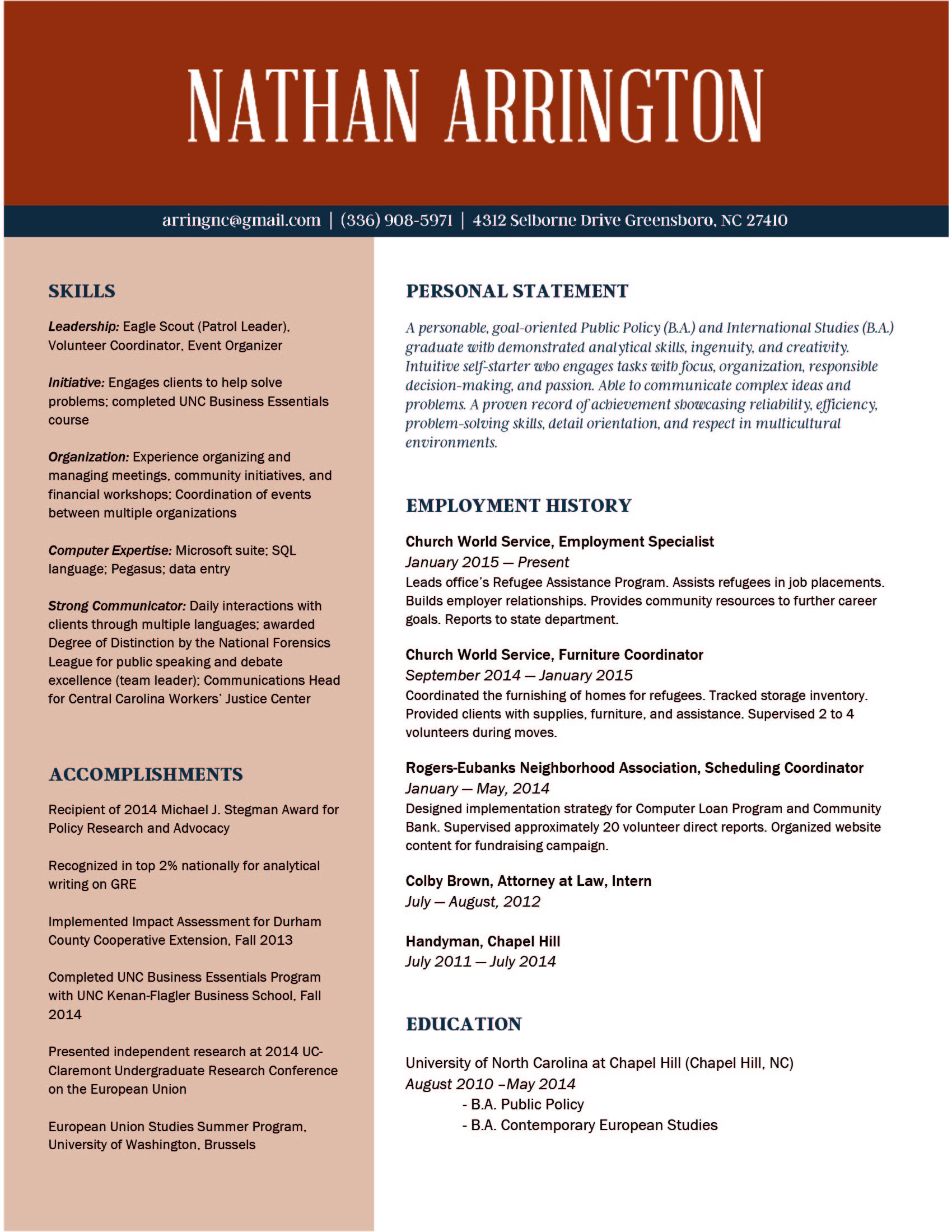
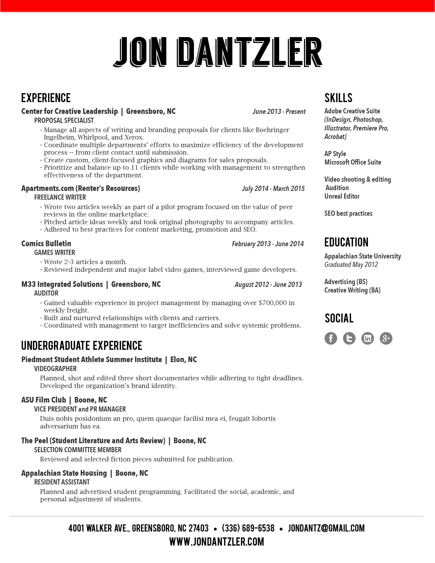
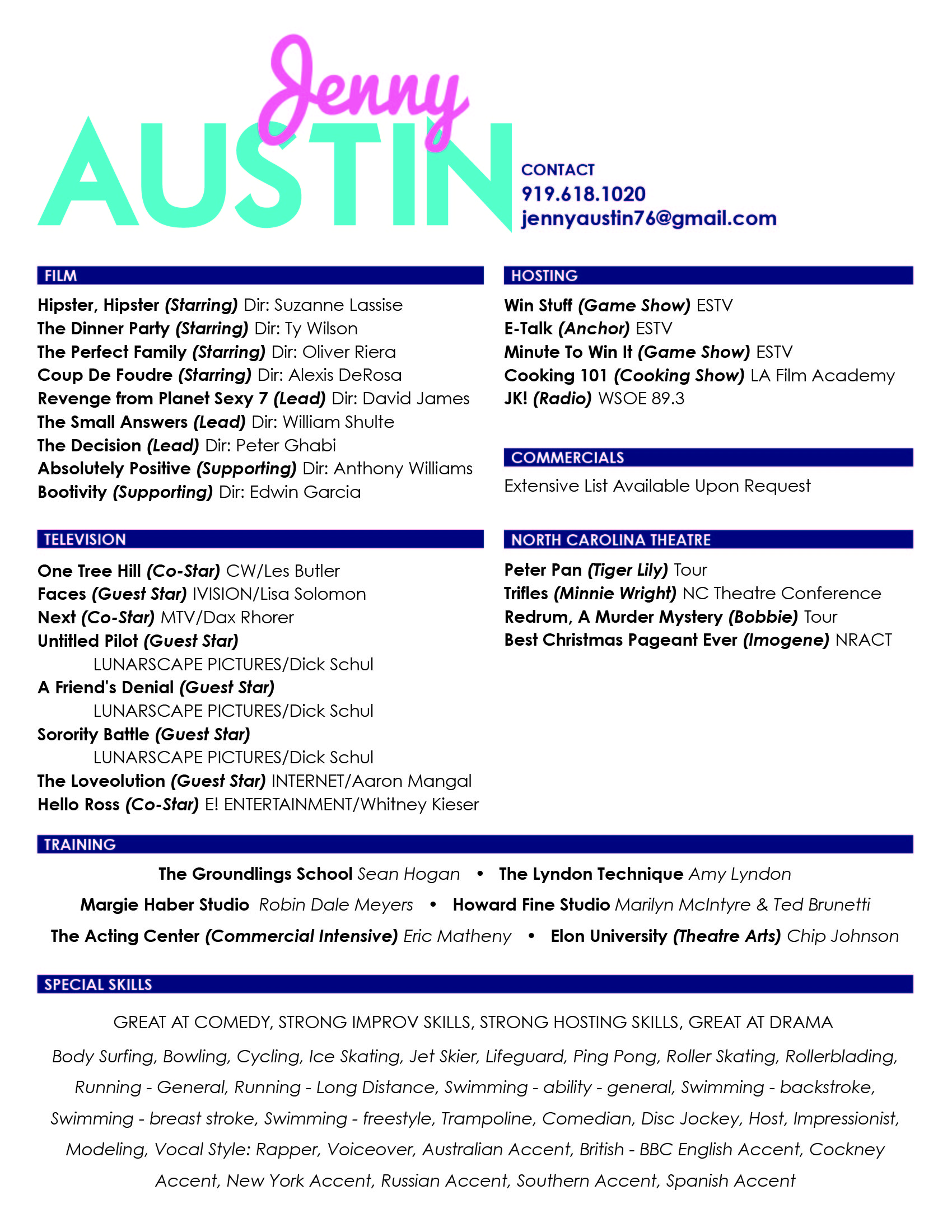
If you need a little help to get your design jumpstarted, check out this slideshow of resumes we've done for inspiration!  

Once you’ve crafted the perfect resume, make sure that you have alternative files available. You don't want to risk having your resume tossed aside because no one can open the file! 

Now that we’ve broken down some resume-design tips, it’s time for you to get started! Play around with different layouts and styles until you find what works best to express your personality as a candidate.

Looking for further reading? 

Do's + Don'ts of Resume Writing

Does the thought of drafting or updating your resume give you an instant headache and fill you with anxiety? Fear not! We’re breaking down the top do’s and don’ts to save you a little stress and help your resume stand out!

DO list relevant experience: Employers typically scan resumes quickly, so make sure to list your most relevant and recent experience at the top. Provide a few brief sentences on where you worked, what you did, and how long you were employed.

The more relevant a position is to what you're applying for the more detail you should include.

DON'T include everything: It’s great if you have a lot of experience, however your part-time barista job isn’t relevant if you’re applying to a position in advertising. Keep it basic and list what’s most important. 

If you need to include regular work experience to pad your resume, keep your description of the positions brief OR just list the positions with no description. Any employer can imagine what you did during your tenure at Burger King -- there's no need to try to tell them or make it sound more impressive then it was. 

DO list your skills: Including your skills helps set you apart from other candidates. Depending on the position you’re applying for, here are some basic skill sets to consider including:

  • Communication: public speaking, persuasion, negotiation
  • Interpersonal: responsible, works well with others, positive attitude
  • Management: leadership, team building, delegation
  • Planning: forecasting, problem solving, analyzing
  • Organization: goal setting, budgeting, punctuality

DON'T be too text heavy: Keep your content clean and easy to read. Employers typically scan for the important stuff, don’t give them giant paragraphs to sift through. You'll have time to elaborate on your experience and skills in the cover letter -- and, hopefully, in the interview. 

Make your resume stand out by writing a customized cover letter for the position. Check out some helpful tips on how to craft the perfect cover letter here.

DO create a separate list of references: Although you don’t want to include your references in the résumé itself, you want to make sure that you have a list readily available. 

DON'T have multiple pages: Your potential employer’s time is valuable, don’t waste it with a novel of a resume. Everyone tries to tell us why their the exception to this rule, but unless you have over 10-20 years of applicable experience, one page is all you need! And, even if you have over 20+ years of experience chances are that you should still stick to one page! 

DO include transferable skills: Transferable skills are the skills you’ve collected throughout your work history. Some skills include: multitasking, planning, delegating, and being a team player. They also include hard skills like using software (be specific), public speaking, and writing. If you’re applying for a job that might be a great fit even though you're underqualified, listing transferable skills can help a potential employer see your potential.  

Include some awesome action words like: renegotiated, integrated, drove, and accelerated. LinkedIn created a great list of potential words to use here.   

DON'T forget about typo’s!: Nothing will ruin an amazing resume faster than typos. This might seem like a no-brainer, but spellcheck saves lives (and jobs)!

DO quantify your accomplishments: “Increased sales by 100%” sounds a lot more impressive than “Increased sales”. Be specific and show what you bring to the table!

DON'T include an objective statement: Expert opinions vary on this subject, but the majority rule that objective statements are outdated.

DO list internships: If you have limited work history, listing relevant internships can help show that you have experience.

So, there you have it. Get working on the content of your resume, because next week we'll be covering how to design it! You’ll have an awesome resume in no time!

Have any questions? Ask us know in the comments

Client Spotlight: Meghan's Resume

While I spend a lot of time working on branding (and accompanying collateral) for businesses, nonprofits, and other organizations, I also really enjoy developing branding, logos, resumes and websites for individuals. 

This week's Client Spotlight (a first for the Hue & Tone blog!) shows what we created for Meghan, a young professional whose career transition required a branding about-face. 

Client Spotlight: Meghan's Resume -- Hue & Tone Creative

Who She Is: A twenty-something working in journalism -- and searching for a role outside that field.

What She Needed: The resume Meghan had been using was colorful, bold, and nontraditional. It worked just fine in her creative field, but was too much for many of the companies and organizations on her "to apply" list. She needed something that was clean and conservative -- without looking like a resume template.

What We Delivered: Meghan's new resume features muted colors, clean typefaces, and simple lines. The result is a look that's appropriate for any industry, while still standing out from the rest of the stack. I'm happy to report that it helped her land her dream job in government.

The takeaway? It's easy to think, especially if you work in a creative industry, that colors and branding in general are off-limits. That's not the case. Making strategic decisions about branding, informed by your knowledge of the industry you're targeting, will help you achieve your career goals. I've seen it happen time and time again!

What decisions have you made about your personal brand? Does it serve your goals & purpose? If you're not sure, let's connect.