
We’re officially in a data-driven era. Decisions are made on it. Purchases are persuaded by it. And trust is gained through it. But what is data visualization? Where do its benefits lie? And how do you make data visualization truly effective?
What is data visualization?
Qualitative data is information about qualities; information that can't actually be measured. Some examples of qualitative data are the softness of your skin, the grace with which you run, and the color of your eyes.
Quantitative data is information about quantities; that is, information that can be measured and written down with numbers. Some examples of quantitative data are your height, your shoe size, and the length of your fingernails.
In its simplest form, data visualization is the representation of data in a pictorial or graphical format. Displaying information this way allows readers to grasp complex concepts with less effort and makes it easier to summarize a large of data quickly.
Data visualization can be used for both qualitative and quantitative data, but some common business uses include:
Breaking down market research results
Sharing customer insights and/or feedback
Displaying geographical variances
Detailing a timeline of events and/or activities
Presenting internal trading reports
Data visualization: the benefits
Your data is only as good as its interpretation, which is where visualization is key. For you visualized data to be successful it should have:
Aesthetically pleasing results: lines and lines of numbers with the odd word interspersed never looks good -- nor does it read well. Data visualization removes the need for all the numbers and brings your pages to life with eye-catching graphics.
Digestible takeaways: data can be a minefield to understand and take several read throughs to understand. By presenting it visually, your audience can quickly and easily skim and digest the information you’ve given them.
Easier processing: by presenting your information visually, you’re upping the chances that people will understand and remember it.
Types of data visualization
When it comes to picking a type of visualization that’s right for your data, there’s no end to the choices. If you're looking for a jumping off point, we've compiled this list of different data styles for you to research and explore:
Hierarchical
General tree visualization
Dendrogram
Radial tree
Wedge stack graph
Hyperbolic tree
Network
Matrix
Node-link diagram
Dependency graph
Hive plot
Alluvial diagram
Subway map
Geographical
Choropleth
Cartogram
Dot distribution map
Proportional symbol map
Dasymetric map
Time-related
Timeline
Time series
Connected scatter plot
Gantt chart
Arc diagram
Stream graph
Multi-dimensional
Pie chart
Histogram
Tag cloud
Bar chart
Tree map
Bubble chart
Waterfall chart
Data visualization examples
So, now that we’ve explored the benefits and types, let’s take a look at some great data visualization examples in practice.
Bubble cloud
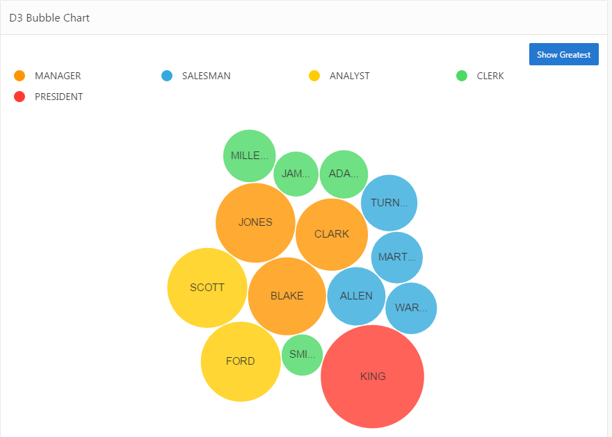
Image via Explorer.uk
Looks more engaging than a load of words and values dumped in a paragraph, right?
Tag cloud
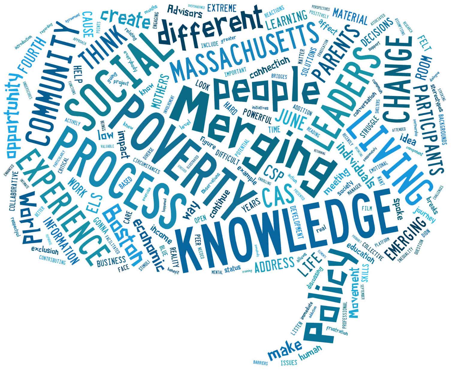
Image via 4th World Movement
Tag clouds are a great way to bring word-frequency data to life. Like with this example, they can be extra effective if you use your creativity to mould your data into the shape of the topic, too.
Subway map
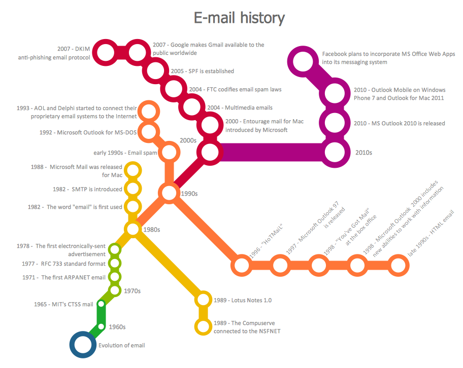
Image via Concept Draw
Subway maps aren’t just for subways...This type’s a great way to attract attention because, odds are, visitors won’t be expecting to find a subway map on your site!
Timeline
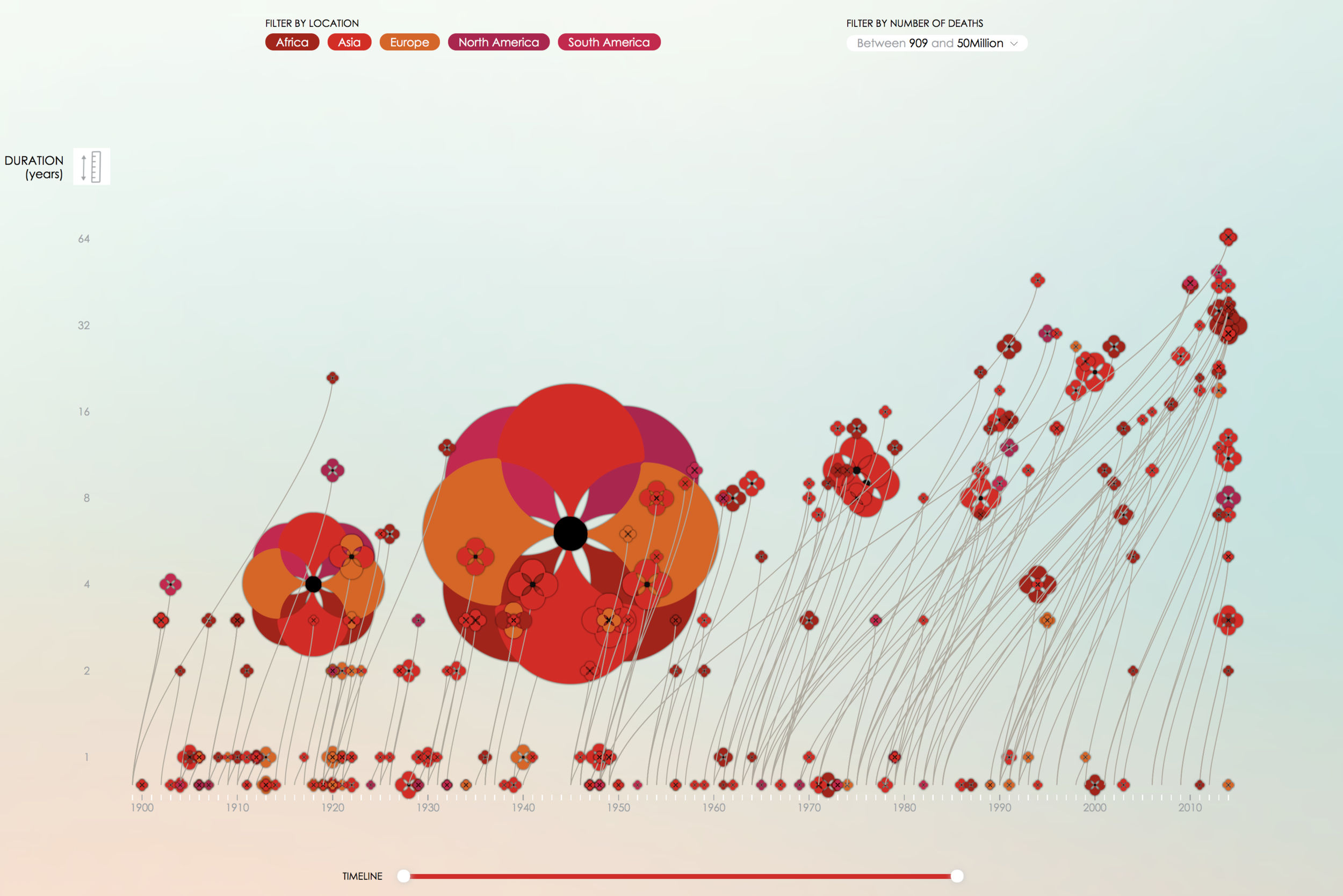
Image via PoppyField.org
This is a superb example of how a timeline (or really any chart) doesn’t have to be plain to be effective. With a few crafty tweaks, you can brand your charts and infographics to fit your brand!
Looking for us to dive deeper on data visualization? Or, maybe you want to hear about another topic completely? Leave us a comment letting us know what you would like us to blog about!
Hue & Tone Creative: your marketing partner
Need your own custom infographics, charts, or presentations? We can help with all that and more! We'll help you define your brand and create tailored marketing materials so you can impress each and every one of your stakeholders. To get started, just shoot us an email explaining your needs: hannah@hueandtonecreative.com.