Posts in Design
Client Spotlight: Rise & Shine, 20 years of making a difference

We know, we know -- we’ve highlighted Rise & Shine before… but when your clients just keep doing great work, it never gets old showing it off.

Throughout 2016, Rise & Shine has been hosting a series of events to celebrate and raise awareness for their organization. An afterschool program with a mission of promoting racial justice and equality, we loved being able to collaborate on collateral that's helping drive their mission forward.

All of our work for Rise & Shine features bright colors, eye-catching layouts, and vibrant photography of the program participants. We work to keep the focus on the facts and figures that demonstrate the program's efficacy, as well as highlight the organization's values. 

Take a look at the colorful collateral below!


Below, starting clockwise at top left: One-page infographic (front + back), homepage web slider, event program,  Facebook graphics, and bookmark.


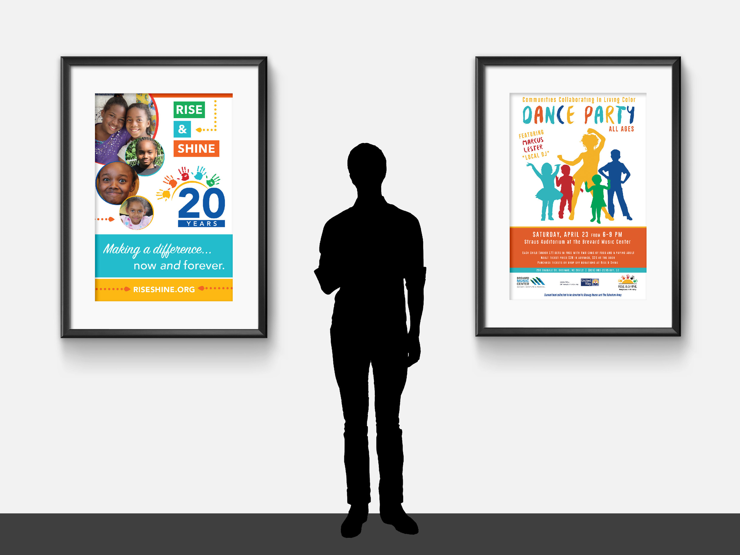
Below, left: Booth signage
Below, right: Event poster for the "In Living Color" Dance Party


Below: Local Movie Theater Ad


Working with non-profits is a passion of ours, and we're always eager to dive into a new partnership. If your organization's marketing needs a boost, don't hesitate to reach out to us!

Your guide to design jargon
Your guide to design jargon -- Hue & Tone Creative

Feeling more then a little confused when you're trying to communicate with your designer? We get that. As designers, we do our best to explain things to our clients -- but it's easy to make assumptions or run through things a little too quickly. 

We put together this handy to guide to help cut down on client + designer relationship miscommunication. There's seemingly no end to the amount of technical terms out there -- but these 39 terms will give you a solid footing to get the conversation rolling. So... get studying!  


Alignment: Can refer either to the position of elements within the margins, or the idea of placing items so that they line up in an organized way.

Ascender: Any part of a letter that extends beyond the rest of the word. Examples: “b” + “h”.

Descender: Any part of a letter that drops beyond the x height/baseline of a character set.

Asymmetrical: A design in which the graphic elements or text on each side of the central line have unequal visual weight. One visually large element could possibly be balanced out by a grouping of smaller elements on the other side. Asymmetrical balance is typically more interesting.

Bleed: In printing, the bleed is what goes beyond the margin of the edge of the sheet of paper before trimming. A full bleed design means there is no white border/margin, and the color/images will go all the way to the edge of the paper.

Branding: The collection of language, ideas, principles, and visual elements that represent a company or business to clients and consumers.

Body copy: The main text in an advertisement, brochure, or website. Body copy is longer than headlines and is meant to be easily readable.

Body font: The text formatting for the main content of a magazine, website, or other printed material. Body fonts will contrast with the headlines, and is typically easily readable.

CMYK: A color mode used for print purposes. CMYK stands for ‘Cyan, Magenta, Yellow, Key (black)’.

Display Type: Fonts with distinctive personality that often sacrifice some readability for the purpose of being unique and eye catching. Typically used for headlines.

DPI: A measurement of resolution for a printed image. Stands for dots per inch.

Element: Individual parts of a logo or design. An element can be a flourish, a border, or something like a headline or image.

Favicon: A small icon that’s associated with a specific web page or URL. A favicon is displayed in the browser's address bar or near the site name in a bookmark.

Hero image: A common term to describe an oversized banner image -- usually near the top of the web page.

Kerning: The process of adjusting the horizontal distance between letters.

Leading: The process of adjusting the vertical distance between lines of type.

Letterpress: A printing process that results in an impression/indented design being left in the paper.

Logo mark: A graphic symbol or emblem that represents a business, organization, or individual.


Logo type: Also known as a wordmark, a logotype is the name of the company designed in a visual way.

Lorem ipsum: Latin text that’s used to demonstrate the graphic elements in a document or visual.

Margins: Only shown in computer layout programs, margins are the space around the printable area of a document.

Mobile responsive: A web or email design that automatically adjusts it’s sizing, layout, and proportions when viewed on a mobile device.

Negative space: Simply an area on the page that doesn’t contain any design elements.

Opacity: An object's degree of opacity. The lower the opacity the more transparent an element is. 0% = completely invisible, 100% = opaque/fully visible.

Palette: A set of cohesive colors you use for a design, brand, or campaign.  

Pantone Colors: The Pantone Matching system (or PMS) is a set of over 700 standardized colors used in a variety of industries.

Pica: A unit of type size and line length equal to 12 points (about 1/6 inch or 4.2 mm).

Pixel: A minute area of illumination on a display screen, one of many from which an image is composed.

Printer-ready (or camera-ready): Files/artwork is ready to be printed.

Proof: Can refer to either a “concept proof” or “printed proof.” A concept proof is a rough drawn, incomplete, or early stage preview of a project that demonstrates the concept to a client. A printed proof is designed to demonstrate the exact final product -- and is great for catching any last minute mistakes!

Raster files: A raster image consists of a dot matrix structure. Most of the images you see on your computer are a raster image. They can easily be scaled down without a loss of quality, but not scaled up without looking pixelated. Common formats like JPEGs, PNGs, and GIFs are all raster images.

RGB: A color mode used primarily for web. Colors are mixed from red, green, and blue (RGB).

Sans Serif: Typefaces that don’t have serifs at the ends of the stroke (aka the little feet). In print sans serif fonts are typically used for headlines (not body text). Sans serif fonts are popular for display or web fonts.  

Serif: Short strokes that extend from the top or bottom of the long part of a letter.

Slab Serif: A thick, block like serif font. Can be either blocky or rounded.

Typeface: A set of letters, numbers, etc. all in the same style.

Vector file: Created using illustration software (like Adobe Illustrator). Creates clean, camera-ready art that can be scaled up infinitely and still maintain a clean look.

Visual Brand Identity: The collection of all the individual logos marks, graphics, photos, print collateral and web graphics that make up the visual appearance of your brand.

Wireframe: A rough outline used for planning a website’s structure and functionality. Outlines all functional elements of a website or web page.


Feeling more prepared for your next meeting? The next time you give your designer feedback, break out a few of these terms and watch the look on their face as they realize what a pro you are!

If you're looking for even more advice on how to work with a designer we've got these 8 tips to help you create a smoother working relationship

Mood Board: Peach in Paradise

It's been a week since we posted our spring-inspired color schemes and the approaching warm weather is still at the front of our mind... 

It's been a busy month, and we've needed an extra bit of inspiration. For us, that means browsing Pinterest + design books + local art galleries. Putting together a mood board allows us to draw on an image we find inspiring and see where it takes us... and that was exactly our process for this "Peach in Paradise" mood board!

MoodBoard-01.png

One  |  Two  |  Three  |  Four  |  Five  |  Six 

Where do you look for inspiration? Is there an image you want us to build a mood board around?

Friday Links: A few handy resources

Another Friday, another link roundup! Here's a few things that came in handy at Hue & Tone this week: 

FinalBlogGraphics-11.jpg

One  |  Looking for a last minute Valentine's Day card? Use these four free printables to design your own! The ombre XOXO print is our personal favorite.

Two  |  Typewolf is one of the best sources for everything typography + fonts. With carefully curated lists and resources, you’ll find everything from unique ‘top 10’ lists to font profiles (complete with mixing & match suggestions).

Three  |  Last week, we went in depth on our love of textures. If you’re looking for some textures to play around with in your designs check out this free sample pack.

Four  |  No matter what your goals, these eight inspirational TED Talks are a must watch.

Five  |  This week's mood board was one of our favorites! We've been reminding ourselves all week that there's no single answer to a design problem. 

We'll be back Tuesday with a fun, interactive freebie! 

Mood Board: Everything isn't black and white

“Its not easy taking your own advice, accepting what you don't like hearing, & seeing the grey amongst the black & white.” 
― April Mae Monterrosa

During an especially busy week, it's important to remember that everything isn't black and white. This mood board is inspired by the idea that when it comes to a design problem there's no right or wrong answer -- only different potential solutions. 

MoodBoardBW-01.jpg

One  |  Two  |  Three  |  Four  |  Five  |  Six 

Spotlight: Favorite Design Blogs

Working for yourself is not the same as working by yourself -- it takes a ton of meaningful connections with smart, creative people to make it happen. I'm all about in-person connections, but blogging provides a powerful way to learn from people all over who are walking a road similar to yours. 

With that in mind, today I wanted to share a few of my favorite design blogs! check these out if you're looking for new bloggers to follow. And, while you're at it, let's be blog friends. Follow Hue & Tone on Bloglovin'

1. Braid Creative 

The ladies of Braid Creative -- who obviously nailed the search for a fabulous name -- share smart, easily applicable tips on branding, entrepreneurship, and all things creative. 

Favorite Post: When Everyone is Doing the Same Thing

2. Paper & Oats 

Kelsey of Paper & Oats puts a bold, personal spin on posts about productivity and entrepreneurship, and is unapologetic about finding and sticking to her own creative niche. 

Favorite Post: Why I'm Scrapping All My Design Services 

3. Elembee 

When it comes to blogs about nitty-gritty topics like branding and design, there's fun and then there's comprehensive. Elembee is both. It's jam-packed with ideas but never a chore to read -- and the weekly emails are great, too! 

Favorite Post: It Will Never Be Good Enough. Do it Anyway. 

4. Love Plus Color

In addition to a clean, colorful blog design that makes my day every time I see it, Love Plus Color is a great stop for unique, easy-to-consume posts on all things visual. 

Favorite Post: The Mood Board Monday series

What are your favorite blogs? Bonus points if they focus on design, branding, or entrepreneurship.  

Happy Thanksgiving! | Fall/Thanksgiving Color Palettes

Since it's a holiday week, we'll be around a little less here on the blog...but I did want to share these Thanksgiving-themed color palettes with you. You really can do Thanksgiving without relying on a ton of oranges and browns. These palettes build in hints of turquoise, cranberry, and peach so they still look like the holiday, without blending in with every other Thanksgiving graphic out there.

Hue & Tone Creative - fall/Thanksgiving color palettes

Color Breakdowns: 

Image One: #b95825 | #0a5946 | #2b8472 | #d1c863 | #745b47

Image Two: #5d1e4d | #960844 | #d8be8d | #be8335 | #b95825

Image Three: #d1a29c | #324e59 | #ded8c8 | #cc8664 | #644737

Our Work: Comprehensive branding for CSDHH

I've been so excited for this particular post! It was tough to wait until the work was complete and ready to share.

Our Work: Comprehensive branding for CSDHH -- Hue & Tone Creative

I could keep leading up to it forever, so I'll cut myself off. Here's a look at the website and comprehensive branding we created for CSDHH, a fantastic nonprofit that -- as the acronym suggests -- provides communication services for the Deaf and Hard of Hearing. 

CSDHH just celebrated its 40th anniversary, but had never been branded -- so this was a true start-from-scratch situation, which was a fun challenge to take on. They wanted natural, earth-toned branding that didn't go straight for the obvious -- things like hands or ears. 

The solution: the repeating motif of keys, which represent with the right level of subtlety that this is an organization that's unlocking doors and breaking down barriers for the Deaf and Hard of Hearing community. CSDHH's new tagline -- Opening Doors, Connecting People -- brings that theme full-circle. 

Our Work: Comprehensive branding for CSDHH -- Hue & Tone Creative

Now after 40 years of service to the community, CSDHH has clean, comprehensive branding that communicates, subtly but clearly, what they're about as an organization. That was a cool thing to be a part of -- and it was even better to get to know the people of CSDHH. My gratitude to them for allowing me to be a part of the process, and more than that, for all they do for this community!

If you have questions about your organization's branding, I'd love to talk. Email me at hannah@hueandtonecreative.com, or you can click the contact tab here.

What We're Working On: Lead Your City & co//ab anniversary
What We're Working On: Lead Your City & co//ab anniversary -- Hue & Tone Creative

One of my favorite parts of being a business owner is the opportunity to get involved in the community. Today, I want to share two upcoming community events I've gotten to take part in.

First is the Lead Your City Summit hosted by SynerG, an organization for Greensboro's young professionals. A little more information on the event, directly from the organizers: 

Join the synerG Young Professionals for Lead Your City – a summit that will bring together Community Leaders & Activists to help young professionals GROW their leadership skills, BUILD on their ideas, SERVE the community and CONNECT their network.

Hue & Tone donated a custom-designed resume for one attendee! I'm excited to work with the winner and create a resume that helps them reach their goals. 

The second event is the one-year anniversary of co//ab, a flexible coworking space in Greensboro. Again, here's a little more about the event directly from the folks at co//ab:

co//ab will have its one-year anniversary this November and we want YOU to help us celebrate. Join us on November 16th at 5:30pm (immediately following the monthly Idea Slam @ 4pm) for a night of food, drinks, and ping pong. Sign up to challenge local "celebrities" in a ping pong tournament you won't want to miss! 

For co//ab, I designed event collateral that uses bright, clean colors and imagery to get the spirit of the event across (see the image above for an example).

If you're in Greensboro, come out to these two events! You can register for the Lead Your City Summit here, and the co//ab anniversary here.


Hue & Tone Favorites: Free (or cheap) graphic design resources
Hue & Tone Favorites: Free (or cheap) graphic design resources -- Hue & Tone Creative

At first glance, design seems expensive. You have to buy $300 fonts and high-end photography equipment and expensive suites of software if you're going to create anything attractive, right? 

Actually, not really. I try to communicate to clients that there are plenty of free and cheap resources available to help them maintain a consistent brand, without pulling in a designer for every edit. 

Here are a few of my favorites: 

DaFont & Google Fonts | In almost every case, it's unnecessary to drop top dollar on type. These are two great sources for free fonts - DaFont is hugely varied and frequently updated, while Google Fonts is your best source for a clean, high-quality web font.

Canva | This web app bills itself as "the easiest design program in the world" -- and it's completely free. When I'm working with clients who don't have access to professional design software, I'll whip up a few Canva templates so they can update graphics easily.

Graphic Burger | Need a simple line icon (or a background texture, or even a logo template)? It's here, and it's free for personal and commercial use. 

Creative Market | This site offers free or very cheap (in the $2 range) graphic assets -- think textures, brushes, presets, etc. Sign up for an account to receive regular emails with deals and free downloads. 

Adobe Single-App Subscriptions | You can now purchase a single-app Adobe Creative Cloud membership for as little as $30 a month, giving you access to a professional-grade design application like Illustrator, InDesign, or Photoshop. If I had to pick one, I'd go with Illustrator, but it all depends on the type of work you're doing.

Again, design can seem like an expensive pursuit, but with a little creativity, you can find the tools you need without breaking the bank.

What are your favorite design tools? Let me know in the comments below.