Posts in Design
Typography for beginners
Typography for Beginners  |  Hue & Tone Creative

Some web pages and brochures good… and some look terribly unprofessional. If you’re new to graphic design or typesetting it can be hard to determine what makes someone’s branding look good or bad.  

If you’re a beginner – or you’re attempting to brand your own business -- there’s a number of type rules you can follow to give brand a polished look. Following these simple rules will help even the most amateur designer get their webpages and print assets in tip top shape!


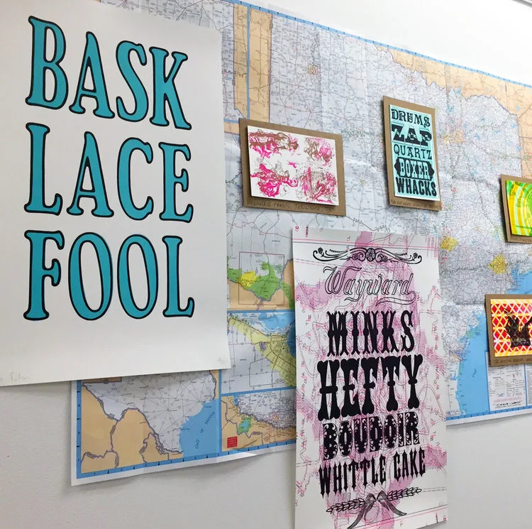
1. Less is more when it comes to typeface

If you’re looking for some font pairing inspiration, head over to these two posts about pairing fonts on Squarespace (here and here). 

Choosing the right typeface is key. Get it right, and you’ll set yourself up for stylish, simple and easy-to-read assets. But get it wrong, and you’ll end up with illegible, cluttered and unappealing pages. 

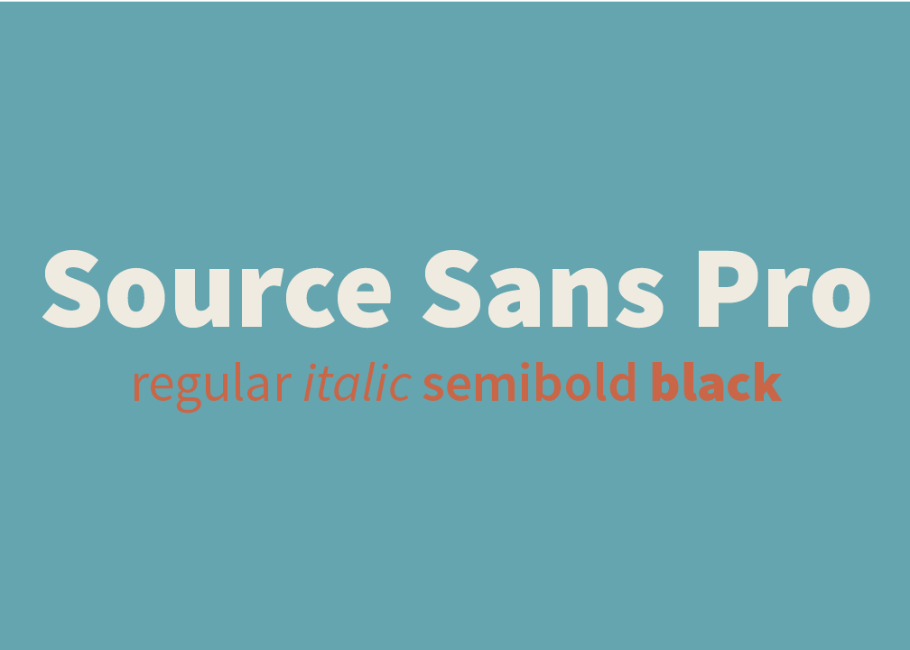
Simple fonts should be used for main body copy, and decorative typefaces should be used sparingly for things like subheadings.

The golden rule in the design world is to stick to a maximum of three fonts in any given piece of artwork - whether that is a website page, social media banner, or hardcopy flyer. However, whittling your fonts down to two can sometimes be even better. 

If you stick to just one or two fonts, you can use varying weights to create a more refined look. 


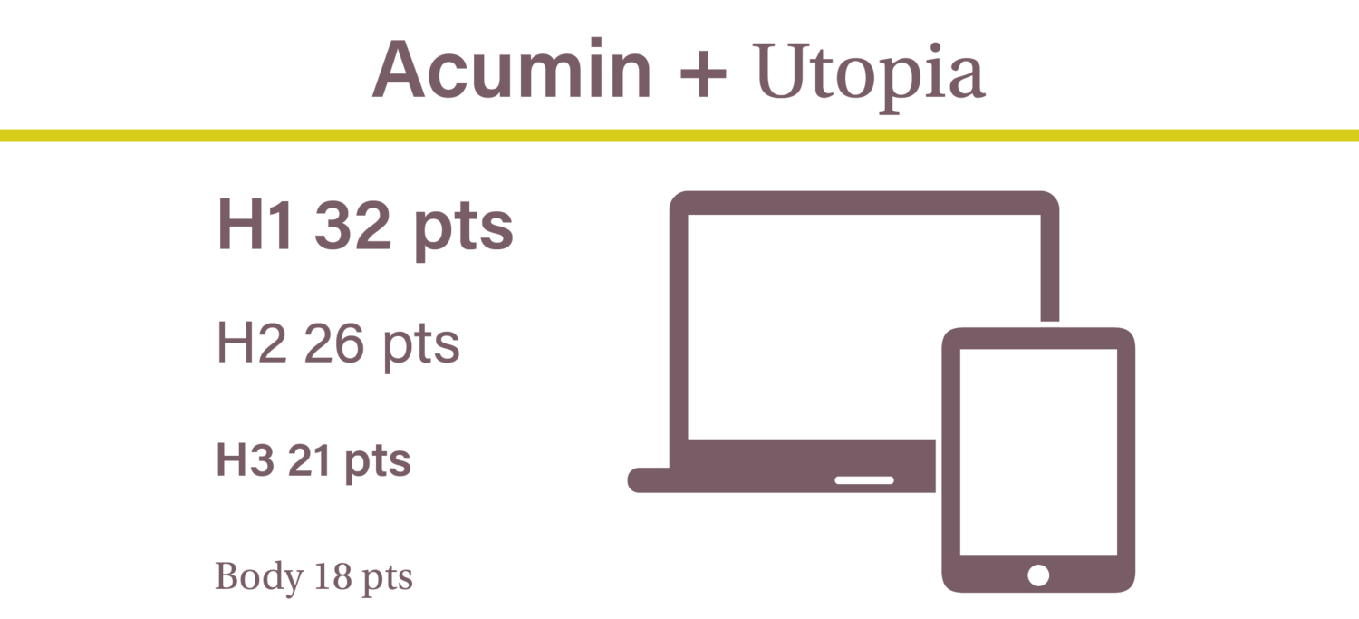
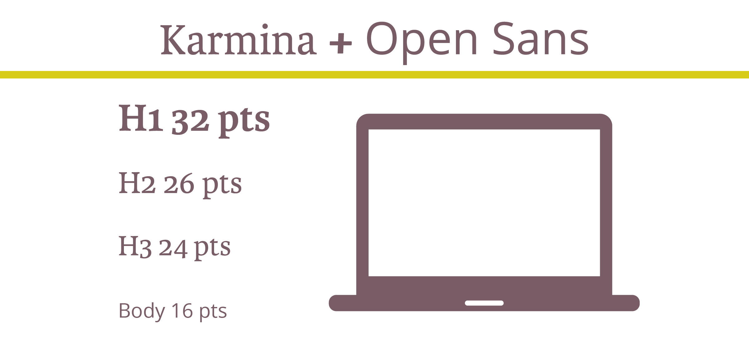
2. Use a sensible hierarchical structure

Following a logical hierarchy helps to give your site’s pages a clear flow and effortlessly guides readers through the structure of the website. Let’s compare and contrast two examples to give you a better idea of what we mean: 

Good content formatting.png

Exhibit A is a bad example. The website’s name, navigation bar, subheadings, and main body copy are all the same font size. Now there are two issues with that – first, it gives readers no visual indication where they should start reading or what’s most important to look at. Secondly, it makes it really difficult for the reader to skim through the copy.
 

Now, let’s contrast an example of a solid hierarchical structure. The page’s title, navigation bar, subheadings and copy are clearly defined with varying font points, making it much easier on the viewer’s eye.


3. Be creative with contrast

Typography for Beginners  |  Hue & Tone Creative

Being creative is part of being a designer. Now we know we said earlier you should stick to two to three font combinations per project, but that doesn’t mean you can’t mix up your styling by playing around with things like the font’s size, weight, color and style.

Whether you emphasize a key word with italics, change the color of a subead to something more bold, or bump up a term in your tagline to a size that’s more eye-catching, there are endless ways to create contrast within your copy.


4. Keep your alignment neat and tidy

Alignment applies to all your on-page elements - like body text, titles, logos, images, and menu bars. When it comes to alignment, everything should be connected in one way or another. For example, you might want your logo to align with your main navigation bar, your body copy to align with your page’s title, and your images to align with your body copy.

Well thought-out alignment will help prevent your page from becoming disjointed and ensure all your assets create well-measured sizes and distances between each other.


5. Don’t be a stranger to whitespace

Don’t fall into the trap of thinking you need to fill everynook and cranny on your page. Creating whitespace around your words can be incredibly powerful, can help draw attention to text, and will aid you in achieving a simple and trendy look. 


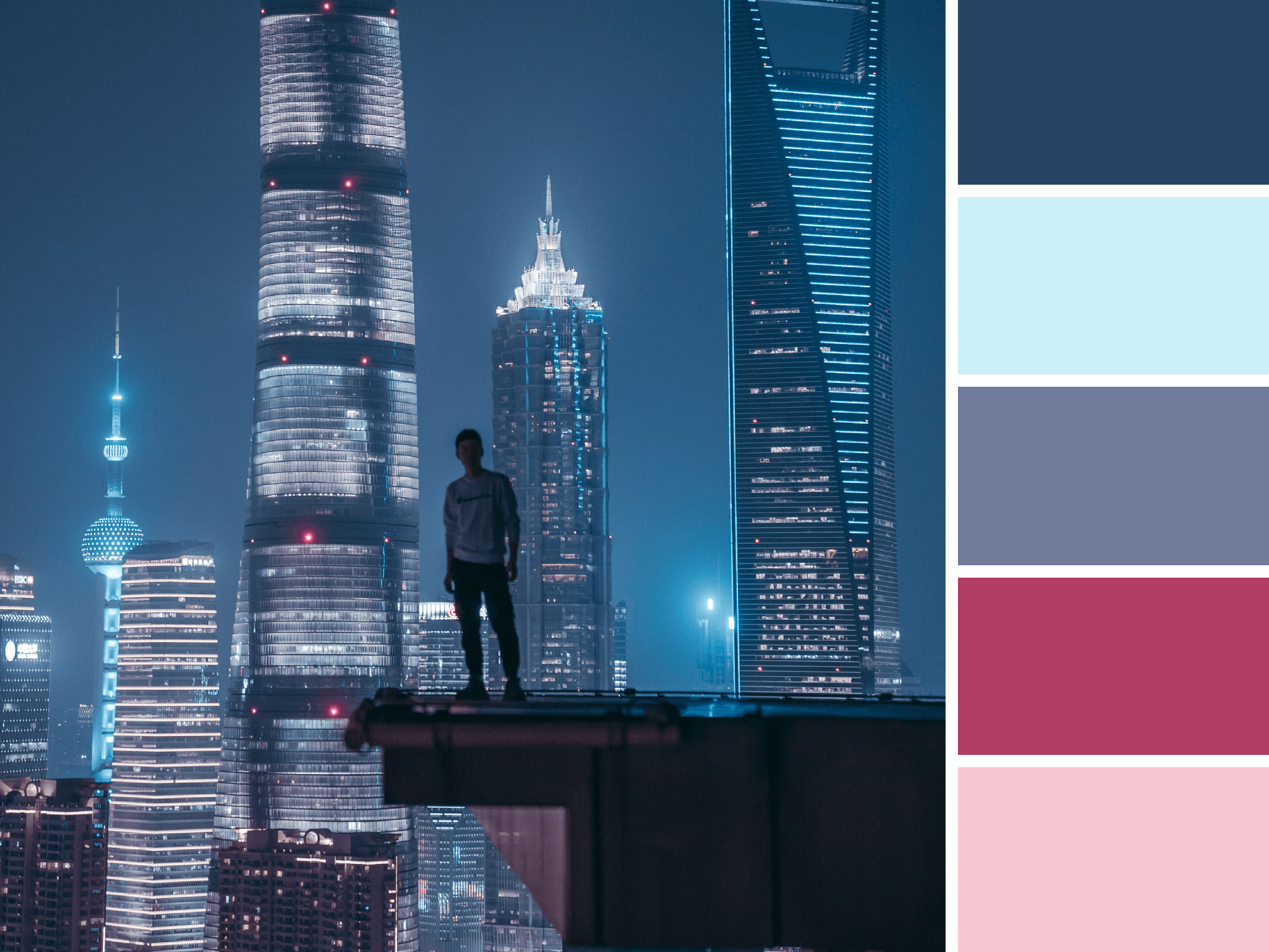
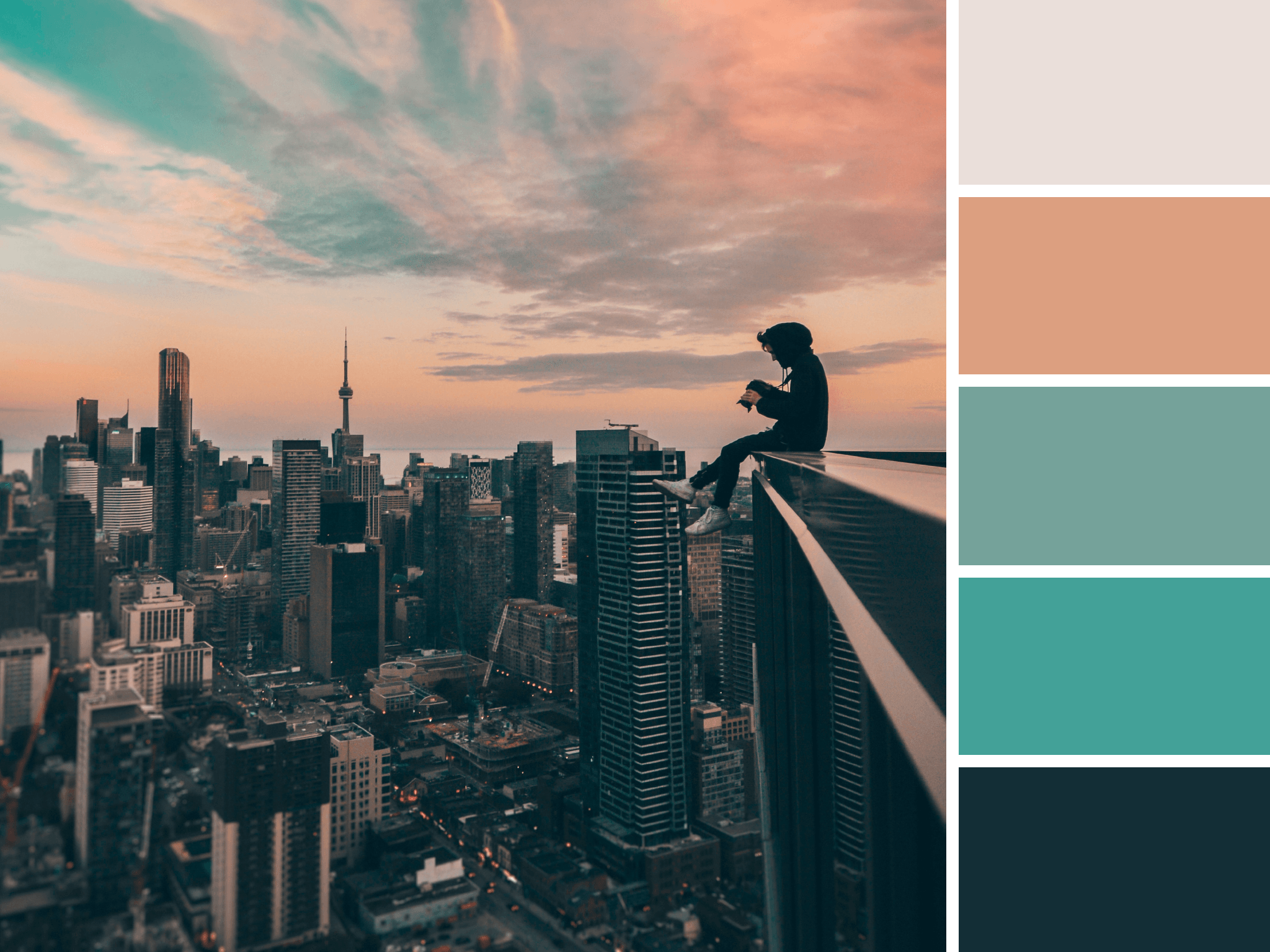
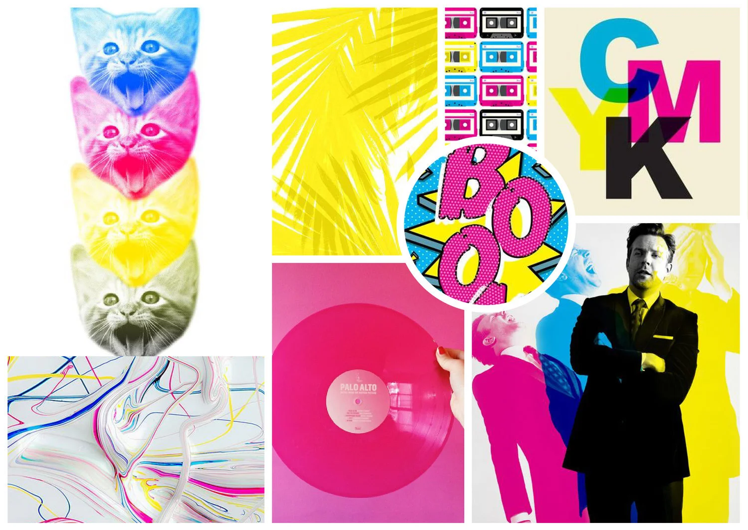
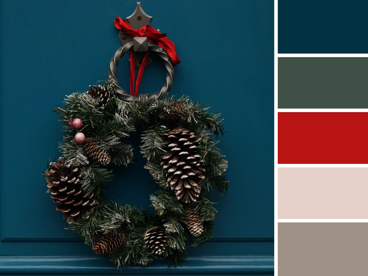
6. Choose your colors carefully

Last but not least is your color choice. The right colors can make or break the look and readability of your copy – there’s nothing worse than colors that make your words a strain to read.

When it comes to color, there are three key components: 

  • Hue - the shade of the color

  • Saturation - the brilliance of the color

  • Value - the lightness or darkness of the color

Source >

When it comes to choosing your colors, the aim of the game is to make your text as easy as possible to read. It’s as simple as that.


Hue & Tone Creative: Let’s work together

Feeling overwhelmed with information? If you’re not a designer, knowing and deciding what does and doesn’t work is easier said than done. If you need a hand with your typesetting - or any other area of design, get in touch with our team today at (336) 365-8559.

Inbound marketing: 8 tips for design that converts
Inbound marketing: 8 tips for design that converts  |  Hue & Tone Creative

Are your inbound marketing efforts failing to secure the numbers you projected? Are you confident in your concept and scratching your head to figure out where it’s going wrong? Well, perhaps it’s time to look in the direction of your design.  

Design possesses the power to convert spectators into engaged customers. It’s the first and last thing people see when engaging with your business. And it should be a key focus when working to increase your conversions.

So, without further ado, here are eight design tips to give your numbers a nudge in the right direction.


1. Hick’s Law

Hick’s Law is a popular theory that suggests the time it takes someone to make a decision is directly proportionate to the number of possible choices they have. So, in Layman’s terms, the more options you give your visitors, the less likely they are to perform the desired action.

To implement this theory, take a look at your site’s design and structure and ask yourself (and honestly answer!) whether you’ve got too much going on. If the answer’s yes, see how you can hone things down to give consumers one or two key choices. 


2. Don’t be afraid of white space 

To a degree, the phrase “less is more” couldn’t be truer. Don’t cram your designs with color, text, and imagery out of the fear of being ‘bland’. White space can contribute to clean and clear designs that emphasize the content you want visitors to focus on… which, in turn, increases conversions. 


3. Choose your colors carefully

Color can evoke emotion. Emotion can result in action. Action can result in conversion. Use contrast to ensure your text, headlines and call to actions stand out, and experiment with your color choices to see which returns the best results.


4. Remember the 8-second rule

It’s true what they say, the human attention span is less than that of a gold fish - a mere eight seconds, in fact. That means you’ve got limited time to grab a visitor’s attention. 

Think about using: 

  • Large and snappy headlines

  • Eye-catching imagery

  • Clear call to actions

  • Power words


5. Use real faces

Using natural imagery and real people can improve your brand’s authenticity and in turn portray you as more trustworthy, human, and familiar. 

If you’ve got an ‘About us’ section with a breakdown of your employees, put a photo of them next to their bio. And, instead of buying stock photos for everything, consider organizing a photoshoot that shows off your product or office. 


6. Quality is key

Poor quality pictures don’t make a good first impression. They reflect badly on your brand and lead onlookers to associate the quality of your imagery with the quality of your product or service - after all, if you can’t master your pictures, how can you follow through on the other things your website promises? Now we know that’s not necessarily true, but it’s a conclusion people can jump to.

If you’ve got pictures on your site that are pixelated, distorted or just plain tacky, it’s time to go ahead and replace them.


7. Optimize your forms

Having trouble designing a form that converts? We can help with that

When it comes to conversions, your formsare key – because it’s where the action takes place. So, don’t let yourself fall flat at the final hurdle. Keep your form simple and concise, include a clear CTA, make sure the fields are clearly labelled, and use a large submit button.

To see where there’s room for improvement, we suggest trying out some A/B testing (more on that here).


8. Don’t leave out your logo

This one might seem obvious, but it’s not unheard of for people to overlook the most obvious element of their website.  

Whether it’s a landing page, flyer, brochure, business card or online ad, you need to always include your logo. That’s how you reinforce your branding for people – and while it doesn’t have to be the focal point of your page, it does need to be strategically placed so people know where they are and who’s talking to them.


Hue & Tone Creative:

Feeling like these design changes are outside of your expertise? Not to worry, that’s where our creative team comes in! To see what we can do for you, get in touch today at hannah@hueandtonecreative.com

Free Download: Valentine's Day Cards

We’re posting our blog a day early this week to help you prepare for Valentine’s Day!

 If you’re short on time – or if you’re just looking for something a little more creative than what you can buy in the store — than we’ve got three bright and bold designs for you to select from.

All cards can be printed on standard 8.5 x 11 paper so you can easily print them at home or in your office! No email is required, just click on your favorite card, print it out, and give it to your sweetie.

Happy downloading!

Greeting Card Mockup Psd 02.jpg
Greetings-card-free-mockup-by-mockupcloud.jpg


Greetings-card-free-mockup-by-mockupcloud.jpg

Hue & Tone Creative: Your Design partner

Looking for your own custom designs? Whether it’s a greeting card or an entire rebrand, we love working on all things type, color, and design related. Let’s discuss how we can work together — contact us here.

Our Favorites: More Great Free Fonts to Download

Finding the perfect font is no easy feat. For starters, there’s an unfathomable number of options to choose from. Even once you select a font, there’s a ton of variables that can interfere with what does and doesn’t work - do you need the font for print or digital? Are you designing something colorful or monochromatic? Are you laying the font over an image or putting it on a blank background? The the list of potential factors goes on and on!

What’s worse, is that many popular fonts require purchasing a license — one that can often be quite pricey. We’ve already compiled lists of our favorite Adobe Typekit fonts (free if you have an Adobe CC license) and our favorite Google Fonts. But if none of those are speaking to you, we’ve pulled together another list of ten great free and easy to download fonts.


1. Hansief

Hansief is a simple and bold typeface offering a unique vintage feel. It comes with two styles - regular and rough - enabling it to easily adapt to a range of design settings. Download here.


2. Tuesday Night

For those pieces that need an elegant, classy and handcrafted touch, look no further than Tuesday Night. Download here.


3. Mr Grieves

 If you’re after something with a bit of texture, then Mr Grieves has you covered. It’s rough, ready, and raring to grab your audience’s eye. Download here.


4. Bosk 

A handmade brush font by nature, Bosk lends itself very well to artwork in need of that personal and custom feel. Better yet, it’s multilingual and comes with more than 400 characters, so you won’t struggle for choice. Download here.


5. Oraqle Script

Talking of choice, enter Oraqle Script. It’s got uppercase, lowecase, numerals, punctuation and multilingual characters, and also includes things like ligatures, stylistic alternate characters and swashes. Modern, striking and full of texture, it ticks all the boxes. Download here.


6. THE BOLD FONT

 If there’s one thing The Bold Font absolutely oozes, it’s trendiness. It’s streamlined and ideal for anything from logos and packaging to social posts and on-page headings. Download here.


7. Nikoleta

Simple, slim, refined and commanding, Nikoleta is good to go for things like posters, headlines and online ads. Download here.


8. Old Growth

Inspired by the old growth forests of the west coast, Old Growth is fairly new which opens up the door to testing something relatively untried and really standing out. In the words of the creator, it’s perfect for branding, quotes, headlines and more. Download here.


9. Buffalo

Now this one’s definitely different, but different is by no means bad. While we wouldn’t suggest overusing this one, we think it’s the perfect pick for key headlines and accents. Download here.


10. Bodoni XT

For those after more of a classic feel, Bodoni XT offers the right balance between traditional and on-trend. It’s also readable, making it a good fit for longer chunks of text. Download here.


Hue & Tone Creative: YOUR Graphic Design PARTNER

Whether it’s a complete overhaul of your branding, a one-off social media ad, an eye-catching business card, or a logo refresh, we’ve got the expertise you need to make your branding pop. Contact us at (336) 365-8559 or hannah@hueandtonecreative.com to see how we can start working together.

Best 404 pages: Designs that stand out

In an ideal world, your website visitors would never find themselves faced with a 404 page. But, suffice it to say, this isn’t an ideal world — people type things in wrong, links break, and technical difficulties happen.

Although your first plan of action should be ensuring there are no broken links on your site in the first place, there are ways you can make the most of a bad situation. If a visitor finds themselves facing a 404 page, you can turn their irritation into an opportunity to entertain them, sell yourself, or provide them with valuable resources.

Here’s a few people we think will delight their customers with their weird and wonderful 404 pages:

Pixar

It’s clean. It’s simple. It’s on-brand. It’s a complete over-exaggeration of the reaction you probably had. And in our opinion, it completely works.

Pixar.png

Bluepath 

Funny and relevant: the best combination! Bluepath’s a data strategy company, so they aptly designed a data-driven map to show their lost visitors where they stood.

BluePath.png

Lego

Like Pixar, Lego let their 404 page serve as an extension of their existing brands. They capitalized on a few favorite characters to illustrate the situation visitors have found themselves in. 

Lego.png

HubSpot

Not every brand necessarily has a set of iconic characters to bring their 404 page to life. But, as HubSpot have shown, this doesn't have to stop you from having a bit of fun.

They’ve also smartly reinforced their audience’s love of their services and cleverly tried to redirect them to a handful of other, selected pages - win, win!


GitHub

If all else fails, state the obvious. Super simple, but just as on brand.


Emirates

Everyone loves a good pun, right? The beauty of Emirates’ 404 result is that it puts their people on the page and capitalizes on a very obvious but on brand, pun-filled message.

Emirates.png

eHarmony

Another superb example of how your 404 page’s message can wittily relate back to your organization’s core message.


NPR 

Now there’s a lot more text on NPR’s 404 page than most, but it totally works. They do a lot here: in addition to giving you an alternative way to find what you’re looking for, they work in a little foolproof humor and even point you to a few other articles.


Magnt

There’s two elements on this page that we absolutely love:

1)   It puts some of the onus on the visitor - after all, 404s aren’t always the website’s fault!

2)   They’ve maximized on every single opportunity and managed to turn their 404 page into a sales pitch for their product


A couple of 404 basics…

 Now that we’ve taken a look at a few great examples, it’s time to create your own awesome 404 page. Daring 404 page designs aren’t for everyone, but even the most basic of templates must include:

Key links - make it easy for visitors to navigate their way back to live pages on your site. Ideally, you should make sure your main navigation bar is prominent on your 404 pages.

Branding - just because your 404 page isn’t a page you intentionally want to drive traffic to, doesn’t mean it isn’t important. Keep the look and feel of it consistent to that of your site so people know you’re still close by.


 Hue & Tone Creative: Custom design and marketing

When it comes to web design, we know what we’re doing. For help creating a killer 404 page or an entire website, make the first move toward better web marketing today: 336-365-8559 or hannah@hueandtonecreative.com.

The beginner's toolkit to hiring a graphic designer

Completely devoid of design sense? Struggling to put in words why others should support your business? It may be time to bring some outside help in. Whether you’re thinking about hiring an agency, graphic designer, or web designer, there’s a few things you need to know before hiring outside help.

We’ve pulled together some of our best articles from over the last year to help answer some of the big questions you’ll run into when hiring outside help.

Whether you’re a new business just getting off the ground, your business is suddenly growing, or you’ve just realized you’re in too deep — we’ve got an article here for you.

Best post if you’re just getting started: The essentials: Must have marketing assets for new businesses |  Hue & Tone Creative

Best post if you’re just getting started: The essentials: Must have marketing assets for new businesses

You know you need the basics like a logo and business cards – but what other marketing assets should you make a priority? We’re here to tell you what you need it, why you need it, when you need it, and how you get it.


Best post if you’re looking into doing a rebrand: 7 reasons why you should invest in a professional logo design

Your logo is an integral part of your brand. It identifies you. It distinguishes you. And it creates consistency across everything you do. This post breaks down how a professional can design a logo that has meaning, purpose and power.

7 reasons why you should invest in a professional logo design  |  Hue & Tone Creative

15+questions+to+ask+your+designer+before+hiring+them+++|++Hue+&+Tone+Creative.jpeg

Best post if you’re in the process of finding a designer: 15 Questions to ask your designer before hiring them

Entrusting your business’s online presence to a trained professional is an excellent choice.  However, before journeying any further, there’s something you must consider: you’re the boss. Like with any other hire, it’s your responsibility to find the right talent to perform the task. Here are 15 questions you should ask a designer before shouting, in boss-like fashion, “you’re hired!”


Best post if you might need website help: Pros and Cons: DIY Web Design vs. Hiring a Web Designer

You’re in need of a new website, but you’re not sure if you should take a stab at it yourself or hire outside help. It all depends on your needs. While web site builders make it easier than ever for non-designers to pull together their own website, they don’t work for everyone. If you’re a tech savvy business owner who needs a simple site, they might be a great option. But, if you’re tech-challenged, short on time, or in need of a more custom site you probably need to consider hiring a web designer.

Pros and Cons: DIY Web Design vs. Hiring a Web Designer  |  Hue & Tone Creative

What’s the difference between a graphic designer and a developer?   |  Hue & Tone Creative

Best post if you already know you need website help: What’s the difference between a graphic designer and a developer?

As online tools make it easier for people to learn new skills there’s been more and more overlap between the jobs of graphic designer and developer. Although they are experiencing more and more of each other’s worlds, there are still several clear-cut differences between the skillsets of graphic designers and developers — so, who do you need to hire?  


Best post no matter who you are: How to give honest feedback without frustrating your designer

If you do it right, giving feedback won’t be perceived as negative. In fact, it’s an important part of the design process – and it’s something that your designer is anticipating. But giving feedback in an unproductive way can lead to an overall unproductive relationship between you and the creative you hired. 

How to give honest feedback without frustrating your designer  |  Hue & Tone Creative

Hue & Tone: Your new marketing partner

You probably made it to this blog post because you’re considering hiring an outside designer. We’d love to throw our hat in the ring! 🎩🙋🏻‍♀️No matter who you are or what stage your business is at, we’d love to sit down and tell you why we’re the right marketing partner for you. Let’s set something up: 336-365-8559.

Marketing Trend Alert: Data Visualization
Marketing Trend Alert: Data Visualization  |  Hue & Tone Creative

We’re officially in a data-driven era. Decisions are made on it. Purchases are persuaded by it. And trust is gained through it. But what is data visualization? Where do its benefits lie? And how do you make data visualization truly effective? 
 

What is data visualization?

Qualitative data is information about qualities; information that can't actually be measured. Some examples of qualitative data are the softness of your skin, the grace with which you run, and the color of your eyes.

Quantitative data is information about quantities; that is, information that can be measured and written down with numbers. Some examples of quantitative data are your height, your shoe size, and the length of your fingernails.

In its simplest form, data visualization is the representation of data in a pictorial or graphical format. Displaying information this way allows readers to grasp complex concepts with less effort and makes it easier to summarize a large of data quickly.

Data visualization can be used for both qualitative and quantitative data, but some common business uses include:

  • Breaking down market research results

  • Sharing customer insights and/or feedback

  • Displaying geographical variances

  • Detailing a timeline of events and/or activities

  • Presenting internal trading reports

Data visualization: the benefits

Your data is only as good as its interpretation, which is where visualization is key. For you visualized data to be successful it should have: 

Aesthetically pleasing results: lines and lines of numbers with the odd word interspersed never looks good -- nor does it read well. Data visualization removes the need for all the numbers and brings your pages to life with eye-catching graphics.

Digestible takeaways: data can be a minefield to understand and take several read throughs to understand. By presenting it visually, your audience can quickly and easily skim and digest the information you’ve given them.

Easier processing: by presenting your information visually, you’re upping the chances that people will understand and remember it.


Types of data visualization

When it comes to picking a type of visualization that’s right for your data, there’s no end to the choices. If you're looking for a jumping off point, we've compiled this list of different data styles for you to research and explore: 

Hierarchical

  • General tree visualization

  • Dendrogram

  • Radial tree

  • Wedge stack graph

  • Hyperbolic tree

Network

  • Matrix

  • Node-link diagram

  • Dependency graph

  • Hive plot

  • Alluvial diagram

  • Subway map

Geographical

  • Choropleth

  • Cartogram

  • Dot distribution map

  • Proportional symbol map

  • Dasymetric map

Time-related

  • Timeline

  • Time series

  • Connected scatter plot

  • Gantt chart

  • Arc diagram

  • Stream graph

Multi-dimensional

  • Pie chart

  • Histogram

  • Tag cloud

  • Bar chart

  • Tree map

  • Bubble chart

  • Waterfall chart

Data visualization examples

So, now that we’ve explored the benefits and types, let’s take a look at some great data visualization examples in practice.


Bubble cloud

Image via Explorer.uk

Image via Explorer.uk

Looks more engaging than a load of words and values dumped in a paragraph, right?


Tag cloud

Image via 4th World Movement

Tag clouds are a great way to bring word-frequency data to life. Like with this example, they can be extra effective if you use your creativity to mould your data into the shape of the topic, too.


Subway map

Image via Concept Draw

Image via Concept Draw

Subway maps aren’t just for subways...This type’s a great way to attract attention because, odds are, visitors won’t be expecting to find a subway map on your site!


Timeline

Image via PoppyField.org

Image via PoppyField.org

This is a superb example of how a timeline (or really any chart) doesn’t have to be plain to be effective. With a few crafty tweaks, you can brand your charts and infographics to fit your brand! 


Looking for us to dive deeper on data visualization? Or, maybe you want to hear about another topic completely? Leave us a comment letting us know what you would like us to blog about!


Hue & Tone Creative: your marketing partner

Need your own custom infographics, charts, or presentations? We can help with all that and more! We'll help you define your brand and create tailored marketing materials so you can impress each and every one of your stakeholders. To get started, just shoot us an email explaining your needs: hannah@hueandtonecreative.com.

4 reasons why your non-profit should be using Canva
4 reasons why your non-profit should be using Canva  |  Hue & Tone Creative

Canva’s an online design tool, and it’s used by millions of people around the world to help create professional-looking presentations, posters, social media images, menus and more. (You can preview their templates here). 

While we whole heartedly believe that there’s no substitute for professional design, we know it’s not always in the budget for every company or every project. Canva is a good solution if you’re working on a tight budget or pinched for time. 

In fact, we often set our non-profit or small business clients up with Canva templates so that they can enjoy branded templates without having to keep us on retainer. It may sound like bad business sense on our part – but we believe in supporting businesses of all sizes, with all different types of budgets. 

If you’re not familiar with Canva, we’ve put together a few reasons it’s worth exploring:


1.  It gives you inspiration

If you’re not a designer by trade, you’re probably stumped on where to begin when it comes to designing a graphic. Luckily, Canva is brimming with layouts for you to choose from, eliminating the need for a grand creative vision. 

Not having to start with a blank page can save you invaluable time, spark ideas you might not have originally considered, and help you complete the project with a higher quality end result.


2.  Professional looking pieces (for a fraction of the cost)

Because the layouts on Canva are put together by skilled designers, the overall look and feel of your projects will inevitably be more professional -- and in most instances for free!

Canva offers three pricing options, all of which are likely to prove more cost-effective than outsourcing the task to an agency. But remember, by forgoing the input of a designer by trade, you’ll be losing out on all their extra expertise, ideas, and drive (even if you are saving a dollar or two!), so consider the pros and cons carefully.


PACKAGE TYPE

Canva


Canva for Work

Canva Enterprise 

FEATURES

Simple drag and drop editor

Collaborate, design and edit with your team

Teams with 30+ members 

PRICE

Free Forever


$12.95 per month


Contact for a quote


3.  You don’t need to be an expert

There’s a plethora of design tools out there, and some are easier to use than others. Fortunately, Canva falls within the ‘easy to use’ category.

With hundreds of self-explanatory templates to choose from, simple drag and drop functionalities, and the option to access photos within the app, it’s super intuitive, so that even a novice can pick it up in no time.


4.  Filled with features

We won’t bother to list them all for you (you can head over to the Canva site for that), but here’s a few of our favorite features: 

  • Pre-defined social media image sizes, so you can be sure your streams look super slick

  • An option to set color palettes tailored to your business’ branding

  • The ability to organize photo and project folders within the app so that you can access them from any device

  • Advanced export options, including the capability to export your artwork as animated GIF


A word of warning

Canva is great – and we encourage you to test it out. But, we always push people to create consistency where possible. Whether this means using consistent colors or getting a designer to create custom elements to import is up to you. Just because Canva has endless options doesn’t mean you should use them all! Creating a cohesive look with your overall brand is important no matter what tools you use to get there. 

Now, go get creating!


Hue & Tone Creative: Your non-profit marketing partner

While Canva’s a great design tool for a DIY projects, sometimes there's no substitute for a real design expert. That's where we come in. Whether it’s a letterhead, leaflet, social media banner, or flyer, we’ve got what it takes to take your visuals to the next level. Contact us today to learn more about our special non-profit rates!

6 branding mistakes to avoid

Branding is made up of the values that guide you, the visuals that communicate who you are, and the language you use to communicate with your customers. 

If you’re a regular reader, the number one thing you’ve probably learned from our blog is how important branding is. That’s because it’s essential to attracting, converting, and keeping your customers. It builds loyalty, brand recognition, and acts as a touchstone for consumers. 

We believe branding should be flexible and fun. And, while consistency is important, that doesn’t mean all of your assets should be identical. No matter what your industry or offering, there's a few things we think you should avoid. Here’s our top six: 
 

6 branding mistakes to avoid  |  Hue & Tone Creative


1.  Sea of sameness

Think outside of the box and make sure your logo, values, and messaging differentiate you from what’s already out there.  

Everyone has competitors -- and chances are they sell similar or identical products/services. Don’t fall into the trap of trying to imitate what they do! Work with a designer to create a strong brand identity for yourself and then stick with it. It may take time, but you want to establish your identity separate from the competition. 


2. Behind the times

Don’t let your branding give off a less-than-contemporary vibe. In the customer’s eyes outdated branding translates to inferior products and subpar service. 

Just because you went through the branding process when you first started your business, that doesn’t mean you’re set for life. Your business’ branding should be periodically reviewed and tweaked to reflect the constantly evolving digital landscape.


3. Inconsistency

Consistency is key. Your market needs to be able to identify you across every channel and it’s counterproductive to have an entirely different look and feel across different mediums. Whether it’s on social media, direct mail, a billboard ad, or website banner, your brand should be instantly recognizable across everything you produce. If it’s not, you could miss out on brand awareness and the benefits of an omni-channel campaign.


4.  It’s not all about you

When you’re establishing your branding, it’s imperative to remember that what you’re aiming for isn’t about you and your personal preferences -- it’s about your potential customers or clients, so try to avoid getting too personal. 

Just because a color isn’t your favorite, doesn’t mean it won’t connect with your potential customers. If you're having trouble separating your emotions from the process, consider putting some data behind your decisions by conducting market research to gain valuable guidance.


5.  Lack of clarity

Your branding should quickly and effortlessly communicate what you do -- and it should easily grab your potential customer’s attention. In a world where time is a highly valued commodity, it’s essential you snag people’s attention quickly.

If your branding’s unclear, you run the risk of not being memorable…which may send them running to your competitors. 


6. Not following through

Never, ever make false promises. If you are a delivery company and your tagline is “always on time,” make sure you’re always on time! If you fail to deliver on your promises, your branding is irrelevant, and you leave yourself open to complaints and lost customers


Hue & Tone: Branding for the Piedmont Triad

Branding doesn't have to be hard -- in fact, with the right people in your corner it can actually be fun! Let us turn marketing into something you enjoy doing -- not something you dread. We can help you with everything from your initial branding to your day-to-day social media needs.

Logo Love: 5 of the best big brand redesigns

Most brands, no matter how big or small, evolve their logo at one point or another. It might be a subtle redesign to get on trend, or it might be a total overhaul. No matter how thorough of a rebrand you're looking to do, just make sure the reason you do it is solid -- you don't want to be that company constantly confusing people with a new name or logo. 

A few of the reasons we think you should consider a redesign?

  • It was a DIY project

  • Your business has evolved, but your logo hasn't

  • It uses dated design trends

  • Your company is about to make significant changes

  • It needs to be simplified

In our opinion, a good logo update maintains the integrity of the original brand, while evolving the look. Your first logo will rarely be your last -- and as long as the thought process behind your redesign is strong, there’s no reason not to periodically enhance or revamp your logo. 

To get a better idea of why people update their look, let's look to a few big brands: 

1. Nike

Nike’s refresh couldn’t be a better demonstration that less is more. No color. No words. Just an instantly recognizable, worldwide tick.

Image source: fastsigns.com

Image source: fastsigns.com

2.  Amazon

A rebrand brought on by business changes, Amazon's logo is a great example of a clever design. While Amazon's first version wasn’t exactly irrelevant to Amazon’s name, its current logo is a true reflection of what it stands for.

With a smile for its happy customers pointing to their A-Z offering, there’s a lot that can be learned from Amazon’s slick rebranding.

 
Image source: contested.wordpress.com
 

3.  BBC

Since its inception, the BBC has developed a multifaceted brand. Having many different branches of business means needing a highly versatile and adaptable logo. 

Their simple three box logo coordinates well with other fonts, gels with any color, and has mass appeal. 

 
BBC_logo_(pre97).svg.png


Image sources: tvforum.uk and wikimedia.org

Image sources: tvforum.uk and wikimedia.org


4. Instagram

Instagram’s old logo was incredibly retro -- we'll leave it up to you if that's good or bad. Some folks certainly liked it, because they received a decent amount of pushback when they revealed their updated logo. 

Many compared its background to something seen in WordArt, but it’s since proven that it’s less paint shop and more pro. It’s simple, funky and modern; everything Instagram is as a platform.

 
Image source: obviousgroup.co.uk

Image source: obviousgroup.co.uk


5.  Spotify

Spotify’s logo was fairly streamlined before, but their rebrand took it to the next level. By sticking to one vibrant color and scrapping the gradient, they've stayed in line with design trends while still maintaining the integrity of their brand. 

 
Image source: osmanassem.com

Image source: osmanassem.com


Hue & Tone Creative: Your brand partner

Let us focus on telling your story, so that you can focus on what you do best: running your business. We're your own personal marketing department -- and will handle everything from your brand launch to daily social media needs. If you need to lighten your workload, we're here to help -- reach out today.

Color Stories: City Views

It only takes one visit to a city to figure out if you’re someone who belongs in the city or the country. The commotion either overwhelms or inspires you -- and the beauty of the city is truly in the eye of the beholder. 

In the past, we’ve explored color schemes found in nature, but what about those of us who are inspired by a more urban space? 

To further explore the aesthetic and inspiration found in an urban environment, we’ve snagged Unsplash photos from cities all over the world. Cities are so much more than grey and concrete – and the colors we’ve pulled from these images prove that. 

Color Stories: City Views  |  Hue & Tone Creative

French and Fancy

The facades in France evoke a feminine and understated feel. The landscaping and waterways provide a rich pop of color that reminds you nature isn’t far away. 


Color Stories: City Views  |  Hue & Tone Creative

Tonal in Taiwan 

Rich hues of purple, red, and orange light up a dreary day in Taipei City. Dusty lilac is an unexpected alternative to the grey and black of street top.


Color Stories: City Views  |  Hue & Tone Creative

Hazy in Hong Kong

These muted colors complement a monochromatic backdrop filled with metal, glass, and concrete. We think they would be perfect for a stylized flat lay photo shoot.


Color Stories: City Views  |  Hue & Tone Creative

The lights of Shanghai 

Soothing and subdued, these blue and purple hues reflect a city full of light. A pop of light pink provides some much needed contrast and depth to this color story. 


Color Stories: City Views  |  Hue & Tone Creative

Sunset in the City

Sunsets are beautiful anywhere, but this faint coral and rich turquoise scheme is one of the best mother nature has to offer… maybe the best color inspiration blends city and nature?  


Color Stories: City Views  |  Hue & Tone Creative

Stockholm Swatches

These earthy buildings evoke thoughts of rich spice. Paired with a soothing background of pale blue and seafoam, this color scheme is as dynamic as it is beautiful. 


Color Stories: City Views  |  Hue & Tone Creative

Radiant in Radio City 

These illuminated hues create a sharp contrast against dark grey and black. For a fun and youthful scheme, New York City is where it’s at. 


CREATIVE PROFESSIONALS IN GREENSBORO AND WINSTON SALEM

Need a second opinion on your brand colors? We can help with that. We're experts in color, type, branding and design -- and we can help you refresh or retool your branding to make sure it's the best reflection of your business. Reach out if you're ready to get started: hannah@hueandtonecreative.com or 336-365-8559.

How to give honest feedback without frustrating your designer

You’ve chosen your designer, you’ve briefed them on your needs, reached an agreement on terms, and you’re eager to see what they’ve come up! Then, their name lands in your inbox along with the much anticipated attachments – but then you click to find that...they’re not quite what you were after. Now what?

If you do it right, giving feedback won’t be perceived as negative. In fact, it’s an important part of the design process – and it’s something that your designer is anticipating. But giving feedback in an unproductive way can lead to an overall unproductive relationship between you and the creative you hired. 

As designers, we’re here to let you know that we’re used to feedback – we even enjoy it because it helps us do our job better. But, it can be frustrating when clients are constantly giving you negative feedback and not giving you the information you need to do your job properly. 

It’s easy for miscommunications to happen – especially if you’ve never worked with a designer before. But with just a few small tweaks to your approach we believe you can communicate with your designer better than ever – and land on a superb final product! 
 

How to give honest feedback to your designer  |  Hue & Tone Creative


Step back and ask questions

Before mindlessly shooting off negative feedback, take some time to marinate on what they sent you. Let them know you received the proofs and are putting together some notes. Then, go through the examples and guidelines you provided your designer. What varies from what you asked for? What’s in line with what you asked for (even if it’s not your favorite)? 

Put together a list of questions to better understand where your designer is coming from. The answers to your questions may change your mind on a certain concept or help you distinguish the direction you want to go. 

Creating an open dialogue will go a long way in helping you both understand each other’s point of view. 


Be professional, calm and controlled

We know it can be hard to stay calm when you feel like a project isn’t going right – but like any other professional situation it’s important to stay calm. Keep your communication -- whether it’s over the phone or on email – calm and clear is key. Be sure to politely explain why what they’ve produced isn’t quite up your alley.

Just saying “I don’t like it,” “it’s not what I asked for,” or “it’s not for me” isn’t constructive, and it doesn’t give your designer a fair chance to fix it. So, be as specific as you can so that they can understand what does and doesn’t work. That way they’ll be able to take your feedback and turn it into a stronger second draft. 

If you can, show them examples of the kind of thing you dolike from other organizations, so that they have a solid idea of the kind of design they need to be working toward. 


Explaining the why

When you’re highlighting elements of a project you’re not quite keen on, explaining the why is super important. Whether it’s because it goes against the guidelines you sent them, it’s too similar to what you’ve done in the past (and found to be ineffective), or it aligns too closely with one of your major competitors, give them a bit of context to help them understand the thinking behind your rationale.

Keep in mind, your designer has probably spent a lot of time on what you’re seeing – if you don’t like it, there was clearly a miscommunication – and it’s on both of you to fix it!


Keep it in perspective

Perfection takes time. Just because they didn’t deliver exactly what you wanted the first time around, don’t hold it against them, patronize, or start micro-managing them. You hired a designer because you don’t know how to do it yourself – so stand back and let them do their work. Keep in mind they are an expert at what they do – just because you don’t like something doesn’t mean it’s not quality work. 

Their job is to bring your vision to life. Your job is to equip them with the information they need to understand your vision.


Put your personal preference to one side

When you’re critiquing their work, remember that design is often a personal preference. Be sure to separate your personal taste from your brand image. A designer might be able to see the bigger picture in a way you can’t – so just because it doesn’t connect with you doesn’t mean it won’t connect with your target demographic. The taste of your audience is probably going to be different than yours, so be sure to talk through your designer’s rationale before shooting down a concept – they might know something you don’t.


Balance negatives with positives

It’s the old compliment sandwich trick. And this tip isn’t just to make them feel better! As we touched on earlier, the positives will help them really get a feel for what you dolike so that they can keep developing quality concepts. 

If there really aren’t any positives, you can still be complimentary about their work, but just be clear that it’s not right for your brand or this particular project. If this is the case, be crystal clear you’d like to see a totally new direction – don’t try to sugar coat it too much or they probably won’t realize that what they showed you is a complete wash. 


Keep in mind what you agreed too 

Be conscientious of when you’re asking to go above and beyond the terms of your contract. If you agreed to three rounds of revisions, you may need to pay an additional fee to go beyond that. 

Both parties of this contract are on equal footing – it’s not an employee/employer relationship. 

You can’t expect free revisions just because you don’t like something. If they’ve met the terms of the contract and you still don’t have something you like you may need to renegotiate. Keep in mind the contract is in place to protect both parties. 

Checking in on time and expectations can go a long way in demonstrating that you respect a designer’s time. It’s a great way to show you value their work, even if you haven’t come to a final product yet. 


Remember...

Rome wasn’t built in a day -- if you want a rushed job, give a rushed timeframe. It’s important you give your designer time to go back to the drawing board and really take everything in you’ve said so that you can keep working toward a high quality final product. 


Hue & Tone Creative: Your creative team

Let us help you get your project designed right! We're ready to communicate with you on your marketing needs -- whether they're big or small. To take a look at what we've done in the past, be sure to check out our design portfolio. Don't see the type of samples you're looking for? Get in touch, we can email you additional work samples!

How to design a user-friendly form (and still get the information you need)
How to design a user-friendly form (and still get the information you need)  |  Hue & Tone Creative

Forms are essential for gathering user’s information in a smart and efficient way. Getting them wrong means a poor user experience and abandoned leads – which translates to missed opportunities and lost revenue. 

Because the formatting and design of your forms has a direct impact on how well they convert, we’ve collated some top tips to make sure your forms are performing as effectively as possible.  


1.  Form length: Always question the why

How long should a good form be? The more fields you give a user to fill out, the less likely someone will be to complete it. However, the more information a lead is willing to give, the more likely they are to be a qualified lead. Like most questions of quality versus quantity, the key is to strike a balance. 

For every question you have in your form, take a moment and really ask yourself why do I need this detail at this stage of the user’s journey? If some of the information can wait until later on in the buyer’s journey, consider leaving it out in an effort to streamline your form.


2.  Page placement

When adding a form to your website, it’s important to place the form near the top of the page. Visitors shouldn’t have to scroll to get to your form – and if they do, chances are they won’t fill the form out. 


3. Tailor the keyboard

In this day and age all forms need to be mobile responsive. But, did you know you can also take user experience a step further by customizing keyboard layouts? 

This one’s only for mobile or tablet forms, but we thought it deserved its own shout out. To make the user’s life eveneasier, you can code your site so that the keyboard changes each time a user clicks on a new field. For example, the keyboard will default to digits when they’re filling out their phone number. 

For more on how to do that, check out this Treehouse article


4.  Time saving tactics

Users are accustomed to a quick and easy sign-up process – nothing should slow them down from filling out the form you provided. To make sure their experience is as streamlined as possible, make sure you’re abiding by these tips: 

  • If the user has already provided you with information, make sure you’re pre-populating any fields you can.

  • Instead of waiting until users click “submit,” make sure to highlight errors or overlooked fields as soon as users click on to the next field. Boxes with incorrect information should be highlighted in red straight away – that way users won’t be stuck scrolling through a form trying to figure out what needs to be fixed.

  • If what you’re asking might be unclear, be sure to add descriptive information or a tip call out near what you’re asking. If a user gets stuck, you can be sure they’ll abandon the form.

  • If there’s no way around using a lengthy form, give users an option to save their information so that they can return and complete it at a later date. And, if this is the case, be sure to automate email reminders that will nudge them to come back and complete the form.


5. Submit button

Once the form is filled out, the last major factor for form success is the “submit” button. While labeling this button “submit” seems like an obvious choice, it may not be the best choice. 

According to Hubspot, landing pages with buttons labeled “Submit” actually have lower conversion rates than those that use other wording. Consider buttons that relate back to your initial offer, or sound less committal than "Submit." Try out things like: "Go," "Download your free e-book," or "Get Started." 


Further reading:  

Looking for a more resources on how to create effective forms and successfully convert leads? We’ll leave you with these three suggestions for further reading: 


Hue & Tone Creative: Greensboro Web, Design, and Social

No matter what your marketing needs, we've got your back. Take a look at all of the services we offer and then get in touch -- we'll work with you to set up a custom marketing solution that addresses all your needs.

7 Reasons Why You Should Invest In A Professional Logo Design
7 Reasons Why You Should Invest In A Professional Logo Design  |  Hue & Tone Creative

Your logo is an integral part of your brand. It identifies you. It distinguishes you. And it creates consistency across everything you do.


Anybody can design any old logo. A professional can design a logo that has meaning, purpose and power. So, without further ado, here are our top seven cases for putting some investment behind your business’ logo.


1.  First impressions

You only have one shot to make a first impression, and a shoddy logo could shoot you in the foot. Put yourself in consumers’ shoes. If you’re looking to purchase a product or service and you stumble across a brand that has a logo that looks like it was made on Paint, it doesn’t set a very good tone for what’s behind the scenes.


2.  Relevancy

Telling a story through design takes a certain skill. A skill that not everyone (understandably!) has. From the colors, icons, images, fonts and sizes in your logo, to be truly impactful, every single element needs to have a purpose. And that, readers, is what a professional is paid to do.


3.  Trustworthy

The quality of your logo says a lot about you as a business. A poor logo can be construed as a poor brand, and we know that’s not the outcome you’re after.

Whether it’s a misaligned character, pixilated border or crazy color scheme, below par logos look inferior. High quality logos, on the other hand, give you an ora of professionalism, value and authority - all of which can give you one up over your competitors.


4.  Memorable

A strong logo is instantly identifiable. Whether it’s placed on a billboard, letterhead, social media or paid advert (and everything else in between!), it pulls peoples’ eyes to it, and it’s easily recognizable.

Professionals know that less can be more. That outrageous colors aren’t needed to attract attention. And that designs have to gel with a variety of settings. And they incorporate all of that into your finished product.


5.  Evergreen

As with almost everything in life, logos evolve. What might be spot on for your brand right now might feel slightly off in a few years - but that’s okay. You’ll not find many businesses out there that haven’t adapted their logo over the years, but the key is that they’re adaptable.

Entirely revamping your logo can damage your business’ brand awareness, which is why it’s more about continual tweaks than a complete do over. With a professional by your side, you’ll get a solid logo that’s designed to stand the test of time - bar the potential small touch ups now and then.


6.  Showcases your brand

Your logo is a pivotal part of your brand’s story and values. It’s your chance to let your personality shine through and showcase what you're all about! As an example, here are some of adidas’ logo milestones:

7 Reasons Why You Should Invest In  A Professional Logo Design.png

Same brand. Different logo. Completely contrasting messages.


7. Adaptable

Logos are needed left, right and centre. What might work perfectly fine on your website, might not necessarily sit right on your business card. That said, you absolutely don’t want two completely different versions that aren’t in-line with one another.

What you want, and need, is a few variations that fit in any given placement - for example, one that’s for a black background and one that’s for a white background - that are instantly associated with one another.

We could go on and on, but we’ll wrap it up at number seven. If you’re interested in sprucing up an existing logo or are a new brand starting from scratch, why not get in touch to see how we could help?


Hue & Tone Creative: Logo and Branding in the Triad

Are you now convinced that you need professional help with your logo design? We think we might just be the perfect people to help you out. From logos to branding, and everything in between, we can help you create a lasting impression. But if you're feeling a little unsure we'll let our design work speak for itself.

What's the difference between a graphic designer and a developer?
What's the difference between a graphic designer and a developer?   |  Hue & Tone Creative

Although graphic design and web development are two totally different jobs, there’s an increasing level of confusion between the two. 

As online tools make it easier for people to learn new skills there’s been more and more overlap between the two roles. Graphic designers want to dabble in the coding side of things, and developers are paying more attention to the visual elements.

Although they are experiencing more and more of each other’s worlds, there are still several clearcut differences between the skillsets of graphic designers and developers — and you should know what they are before hiring someone to take on your next web project. 


Graphic designers

Creativity

Graphic designers do what they do because they are creative (well, the good ones are, anyway!). They can see your vision from the get go, come up with concepts, and then mock-up your dream website. 

They’re able to illustrate or design anything you might need and are explicitly tuned in to the aesthetic side of things.


Attuned to detail

Unlike developers, graphic designers have a fine eye for things like fonts, sizes, colors and spacing. Because they don't have to focus on making your site work, they're free to hone in on the small details. They’ll perfect and refine every element of your site to meet brand guidelines and will ensure consistency with the rest of your brand.


Marketing awareness

In addition to a fine eye for design, a good graphic designer has a better understanding of marketing as a whole. They not only stay up-to-date on design trends, but they also have a solid understanding of what's going on in the industry so they can keep your brand collateral on trend. Whether it’s an online UX experience or offline advert, they’re responsible for ensuring their designs not only look good, but are built to convert.


Breadth of input

Last but not least, the role of a graphic designer spans far beyond a business’ website -- they can handle everything from creating a print campaign to simple things like re-sizing images. No matter what you need they'll be able to help you put together the entire package, not just your website. 


Developers
 

Make your website work

Where designer's jobs are creative, developer's jobs are technical. Developers can be split into two categories: front end and back end. In their simplest form, front end developers deal with the part of the website you can see. They typically write in languages like HTML, Javascript or CSS. Back end developers deal with servers, applications, and databases.  They work out the details of how and where your data gets stored. 


Technically driven

Developers are very analytically driven, they have a technical mindset and work behind the scenes to make graphic designers’ work live on a website. Each coding language has it's own set of rules and regulations, making their job more about memorization and problem solving than aesthetics. 


Carry the weight of your website

While developers don’t necessarily need to be creative, it falls on them to make sure the website actually works. Does it load quickly? Can you easily log-in and put things in your shopping cart? Is your billing information stored correctly? 

If pages, apps, or websites falter, it’s on developers to get them back up and running as fast as possible to ensure revenue isn’t lost.


So, who should you hire?

In the end, you need both to form a partnership.

Graphic designers and developers come as a package. Although their skills and role vary, they work in harmony to make sure end results are up to scratch.

Think of it like a production line. The graphic designer works on the visual stage, then passes their work onto the developer to encode, and then both work together to quality check the finished product.


Graphic Design for Greensboro, NC and beyond

Let us take the headaches out of creating your new website. Check out our design portfolio to see clients we've helped in the past, and then give us a call -- we can't wait to get the conversation started.

Mood Board: CMYK Inspired
Source 1  |  Source 2  |  Source 3  |  Source 4  |  Source 5  |  Source 6  |  Source 7

Source 1  |  Source 2  |  Source 3  |  Source 4  |  Source 5  |  Source 6  |  Source 7

If you work in the design or printing industry, you're probably familiar with the CMYK color mode. But for those who have never heard of it, the CMYK color model is a subtractive color model used in color printing. CMYK refers to the four inks used in some color printing: cyan, magenta, yellow, and key (black).

This color blending mode is responsible for most of the printed materials you see and interact with every day... that's why we thought it deserved a little attention! Even though we're surrounded by beautiful colors every day, we rarely stop and think about what goes in to them. 

This funky, pop-art inspired mood board is our visual ode to the CMYK printing process. We know it's nerdy... but, hey, what can we say -- we love design and color! 


Hue & Tone Creative: Color + design lovers

Does the idea of picking colors for your website stop you in your tracks? Or maybe you just can't tell the difference between two shades of blue? That's what we're here for. At Hue & Tone Creative, we can help with everything from logo design to web development to print collateral. Want to see what we've done for our other clients? Take a look at our portfolio.

Color Stories: Festive foliage

Snow covered garland, carefully crafted wreaths, eye catching poinsettias... The right greenery can usher the holiday spirit into any space! 

To get in to the holiday spirit, we've sorted through some of our favorite photos of Festivus-inspired greenery. These color stories take a closer look at some of our favorite foliage, from a close-up of a pine bough to an entire hillside of snowcapped trees. 

Color Stories: Festive foliage  |  Hue & Tone Creative

Open Invitation

A pop of rich red awakens an earthy green for an inviting color scheme... it's so rich it practically beckons you right in! 


Color Stories: Festive foliage  |  Hue & Tone Creative

Tranquil Terrain

Cool blues and purples paint the soothing and silent aftermath of a snow storm.


Color Stories: Festive foliage  |  Hue & Tone Creative

Delicate details

If you look closely enough, even the smallest detail is alive with color! This ornament inspired palette pairs a dusty plum with graphite and sage for a one-of-a-kind winter scheme.


Color Stories: Festive foliage  |  Hue & Tone Creative

Crisp Cranberry

This modern color pairing packs a bold punch with an accent of brilliant red. A nearly-black mahogany and cool greys accent this daring statement color.


Color Stories: Festive foliage  |  Hue & Tone Creative

Festive Fern

Deep earth tones take us back to nature in this rich and rugged color scheme. A pale blue pops on a backdrop of muted mahogany and soft brown.  


LOGO AND BRAND DESIGN IN GREENSBORO, NC

Need a custom holiday invite? A fresh brand to start 2018 off right? We've got you covered on all fronts. Hue & Tone specializes in logo design, branding, and collateral development. Reach out if you're ready to start the new year off right: hannah@hueandtonecreative.com or 336-365-8559.

Web Design Trends to Leave in 2017

The song, It’s so Hard to Say Goodbye to Yesterday was originally recorded for the 1975 film, Cooley High. It’s a real tear jerker and may make for fitting music as we bid farewell to design trends that can’t join us in the new year. Honestly, the list itself isn’t sad at all. It’s actually solid advice regarding 4 web design trends to leave in 2017.

Design Trends to Leave in 2017  |  Hue & Tone Creative

Before we get to the list, let’s quickly discuss why this purge is so necessary. Two letters: UX. UX or User experience refers to a person’s feelings and impressions about using a particular product, system or service. In this case, your website. To keep this experience simple, logical and enjoyable, these 4 web designs must be left behind.


#1. Skeuomorphism

The design concept that merges our real-life perception or characteristics of an object with its digital equivalent. A good example of this is the original Instagram logo; a life-like image of a camera that has since changed to a simpler, semi-flat design. Flat and semi-flat designs have a minimalistic feel and seem to be preferred more widely by web audiences. For this we say adieu to skeuomorphism. 


#2. Hero Images as the whole Story

Hero images are large images that take the place of traditional banners and are generally overlaid with text. Don’t get me wrong, they look amazing. They are captivating, they are alluring and signal substance. The problem is, some websites are little more than these images with no accompanying meaningful content. Perfectly fine for a webpage used for contact information or a place to describe a single product. However, hero images are not enough to tell the whole story about a business and its products or services. Coca-Cola is a great example of how to use hero Images while still boasting a site full of relevant and substantive content. Easy to say arrivederci to hero images as the entire story.


#3. Tight Spacing

Sometimes, full breakups aren’t necessary. A little space goes a long way at rekindling a quenched flame. White space in particular, could vastly improve the look and feel of your website. This can be accomplished pretty easily. Sites that are text heavy can add space between lines and letters, enhancing readability. Similarly, those with lots of products to display should take a hint from Amazon.com which uses grid layout design. The online superstore has successfully employed this design to organize their many products. In either case, the user experience is upgraded. We can happily say adios to tight spacing. 


#4. Sliders and Carousels

These are not the same, but are similar design techniques. They each involve the movement of images in either a sliding or rotating fashion. Neither, according to a Nielsen Norman Group study, were found to be effective conversion tools. A point made many times over the years, but appears on this list due to an even greater downside. The designs could negatively impact your SEO or search engine optimization. While the use of sliders and carousels aren’t automatic SEO killers, the risk to your website’s ranking is real and may not be worth taking that chance. Either, enlist the help of a professional website builder or try something else. Videos are a great alternative to both these elements and may be a better way to tell your story. Let us say Gooday to sliders and carousels. 


Companies in the know wisely improve their websites to increase user satisfaction. This includes, but is not limited to the way the site appears on mobile or desktop devices, how easily and intuitively one can navigate the site, and the overall functionality and feel when engaging with the website. The 4 web design trends to leave behind, tend to interfere with these aims in one way or another. It may not be so hard to say goodbye after all.


WEB DESIGN IN GREENSBORO AND BEYOND

Guilty of using all these things on your website? We can help pull you out of the past!
Hue & Tone Creative will help get your web presence up to speed. Be sure to check out our design portfolio to see clients we’ve helped in the past -- and then give us a call if you’d like us to build you a modern website that truly tells your story.

Must download free Google Fonts
Must Download Free Google Fonts  |  Hue & Tone Creative

Whether you’re designing a resumé for the job of your dreams, sending out invitations to a gala, or creating a sleek new business card, using the right fonts will help you grab someone's attention and accurately communicate your brand.
 

Google Fonts has 847 fonts to sort through, so we’ve rounded up some favorites for you to browse. And remember, all of these fonts are free and open source, so there’s no need to worry about potential licensing hiccups. You’re free to use the fonts for any project, whether it’s a personal blog or a commercial campaign.


Sans Serif

You can never have too many sans serif font options. These versatile fonts are great for logos, headlines, and graphics. 


Serif

Give Times New Roman a break and swap it for something more modern.


Slab Serif

Looking for a typeface that packs a punch? Try a slab serif.

 Want even more fonts? Keep the downloading going by syncing some of our favorites from Adobe Typekit.


Professional Creative Services in Greensboro, NC

Don’t have an eye for design? We can give your brand the creative touch it needs. From email campaigns and logos to everything else in between, Hue & Tone Creative can help your brand stand out.

The Optimal Font Size for Web, MailChimp, and Mobile

Earlier this month, Twitter rolled out a new font. Unfortunately, not everyone was a fan

Twitter’s switch from Helvetica Neue, to Segue left users complaining that the slender new font was hard to read and caused way too much eye-strain.

Like Twitter, most businesses are bound to make mistakes when it comes to using the right fonts and sizes. Instead of fumbling through and learning from trial and error, do yourself a favor by learning a few of the best font-size secrets. 

Artboard 3test.png

Websites

Whether you’re designing an online shop, portfolio, or blog, it’s crucial that your fonts look clean, appealing, and easy to read.

For best readability, we recommend that you keep your headers and buttons between 30-32 pts and sub headers between 18-26 pts. Body text usually looks best when it’s between 12-16 pts. 


The Optimal Font Size for Web, MailChimp, and Mobile  |  Hue & Tone Creative

Looking to compare email marketing platforms? Here’s a rundown on a few of our favorites.

MailChimp

Email marketing isn’t going away anytime soon. In fact, email is 40 times more successful at bringing in leads than Twitter or Facebook.

One of our personal email marketing tools, MailChimp, recommends that you keep your body text between 14-16 pts. 16 is best for short emails between 2-3 sentences, while 14 pts us better for more lengthy emails.


The Optimal Font Size for Web, MailChimp, and Mobile  |  Hue & Tone Creative

Mobile

According to MailChimp, it’s best to stick to the “one eyeball, one thumb, and arm’s length” rule when it comes to font sizes. Basically, your viewers should be able to see and scroll through the entire email with ease and clarity. 

With this guide in mind, your body fonts should be between 12-16 pts and your links, CTA, and buttons should be between 34-36 pts.


One last note…

When it comes to selecting fonts, the most important thing is to pick an easily readable font. When in doubt, go back to basics. If you stick to a plain serif or sans serif and use these size guidelines, you'll be on your way to finding the perfect typography for your next web project! 


Web & Blog Design in Greensboro, NC

Not seeing much traffic or engagement on your website? It’s probably time for an upgrade! From landing pages to business blogs, Hue & Tone Creative can help you create a site that matches your style and helps reel in leads.