Just a note: Because of the length of this post, we decided to publish it in two parts. You can find Part 1 of the series here.

Lead the way for your customers.
In Part 1 of our SEO Improvement Guide, we reviewed how to run a technical audit, conduct keyword research, and verify that your site is mobile-friendly. Now that you’ve gotten those three things under your belt, it’s time to start curating high quality content and improving your links.
Continue your SEO improvement journey below — you can pace these steps out, or you can do them all at once if you’re looking to super charge your SEO strategy as soon as possible.
July: Curate a content calendar
Regularly producing SEO-optimized content is critical to your organic strategy. In Google’s own words, your content needs to be:
Useful and informative
More valuable and useful than other sites
Credible
High-quality
Engaging
When searchers type in their query, Google scours the web to find the most useful and relevant results. If you don’t have anything on your site that fits the bill, quite simply, you won’t rank. That means less visibility, missed traffic, and lost visitors.
When we say content we don’t just mean the regular old blog post, either. Be creative. Test to see what works best with your audience. And don’t be afraid to experiment. Here are a few suggestions to get you going:
Articles
Guides
Videos
Webinars
Whitepapers
E-books
Case studies
Calculators
Infographics
Tutorials
News
How to create optimized content
1. Keywords
Using the keywords you collected in April, brainstorm content topics that’ll be picked up in search engines. When putting this list together, try to focus on long-tail keywords, avoid highly competitive terms, and remember to match your topic to your keyword.
It’s also important to take an audience-centric approach when spitballing your content titles. By this, we mean identifying your audience andthencreating the kind of content you know they wantto see.
2. Put it in a calendar
A content calendar itself won’t aid your rankings, however, we’d recommend creating one to save you time and to help you get in a groove of posting regularly. It doesn’t needn’t be anything fancy, dumping it in a Word or Excel document will do.
3. Friendly formatting
Make sure you lay your content out in a way that’s easy on the eye to ensure its readability and engagement. For example…

The good: This page is clearly divided with subheadings, the content is broken up with bullet points, and the paragraphs are short and digestible. It also has easy to see links.

The bad: These paragraphs, on the other hand, are overwhelming long and the lines are very close together. Combined, it’s quite a strain on the reader’s eye.
4. The technical stuff
A few best practices for the technical side of content creation include:
Don’t go overboard on keyword insertion - it’ll look spammy
Remember to include meta titles and descriptions - they’ll help to improve the number of people who click through from search results
Make sure your URL’s reflective of the content’s title
Link to other useful and relevant internal pages to improve your site’s architecture and encourage visitors to keep exploring

August: Implement a link-building plan
Link-building is arguably one of the most difficult aspects of SEO. But it can also be one of the most beneficial. It requires creativity, time, persistence and, more often than not, money.
There are several benefits that come hand-in-hand with link-building, like:
Improve your domain and page authority
Earn extra referral traffic
Give your brand’s visibility and authority a boost
Increase your exposure to other industry leaders
Raise your trust and credibility profile
And, of course, aid your rankings
Link-building tactics
If you’re new to the world of link-building and don’t know how to get your foot in the door, here are a few sample strategies to get you started:
1. Ask your network: If you’ve got a pool of customers, partners or suppliers who have an online presence, start close to home and ask them to promote you on their site. Something as simple as a partnership badge linking back to your website would do.
2. Build your blog: Your content strategy is a gold mine for links. Once you’ve established yourself as a reliable, industry authority, it’ll become a link-bait hub, and naturally earn you evergreen links by itself.
3. Go viral: Easier said than done, we know, but creating a piece of shareable content (like a meme or funny video, for example) is a sure fire way to bank yourself a bunch of backlinks.
4. Be newsworthy: Whether it’s commenting on something in the headlines or creating your own news - like commissioning a study or sharing a company announcement, jumping on something time sensitive will point the press and bloggers in your direction, and boost your odds of coverage in their publication.
September: Enhance your appearance in SERPS
There are a number of ways you can improve how you display in Search Engine Results Pages (SERPs), but here are just a handful:
Optimize your meta data
Make sure your page titles and meta descriptions are a) relevant, b) include keywords, and c) written in a way that entice searchers to click through. Remember to stick to the recommended character counts too, so that your text doesn’t get chopped off sooner than it should:
Page titles should be within 50 to 60 characters, and
Meta descriptions should sit between 150 and 170 characters

Add schema markup
In its simplest form, schema markup is micro data that can be added to your site’s HTML to enhance how search engines read and subsequently display your page in their results.
Correctly applying schema data can give you a competitive edge in SERPS by giving searchers more, useful information about your company, which can result in a greater number of click throughs. Some popular types of schema markup include:
Ratings and Reviews:

Image via moz.com
Organization markup:
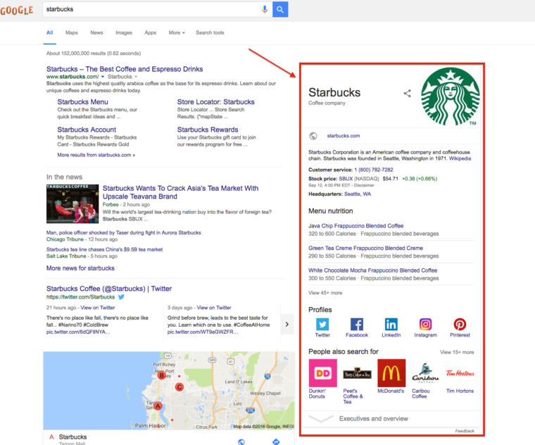
Image via searchenginejournal.com
Site navigation:
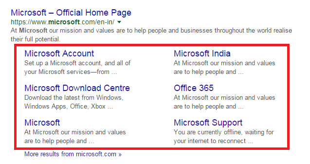
Image via monitorbacklinks.com
Video and media:

Image via technosoftwares.com
Adding schema markup might sound complicated, but you don’t actually need any coding skills to do it yourself. For step-by-step instructions on how to get started using Google Tag Manager, head over to this guide.
Alternatively, if you’re not entirely comfortable dabbling in schema markup yourself, employing the services of an SEO specialist or web developer is another option.
Hue & Tone Creative: Your Greensboro Marketing Solution
To see how we can fit into your SEO strategy and support your organic efforts, get in touch with our team at (336) 365-8559 or hannah@hueandtonecreative.com today.