Posts in Type/Fonts
12 Inspiring Font Combination

Whether you’re designing a resume, website, or even a graphic for social media, choosing the right fonts can make a good design even better.  However, the seemingly endless font options available at our disposal can make choosing the right ones a little tricky.

To help alleviate a little stress and confusion, we put together a brief guide on font pairing. 

If you’re interested in the complexities of font typography, you can learn more here. But, if you're just looking to learn a few basics, start with these guidelines: 

  • Try combing a serif with a sans serif.
  • Stick to 2-3 fonts, any more than that can be distracting.
  • Designate rolls to your fonts. Keep headings, subheadings, or body text consistent.
  • Vary the weight to achieve visual hierarchy.
  • Contrast is key! Try not to select fonts that are too similar.
  • Don’t pick fonts that clash with your aesthetic.

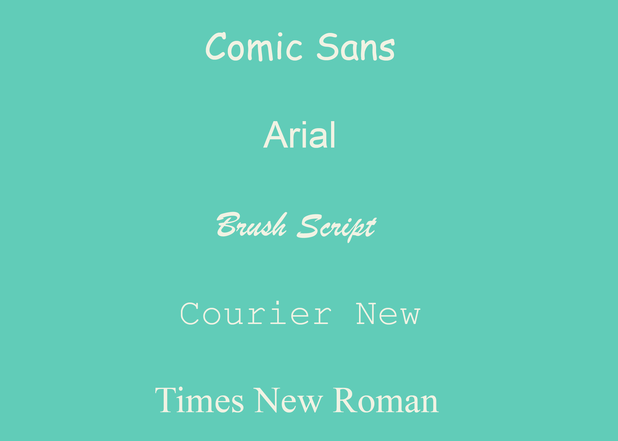
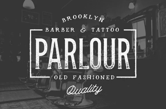
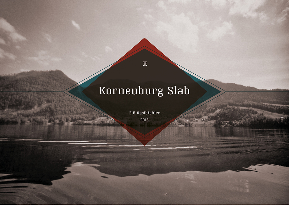
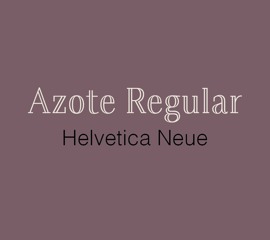
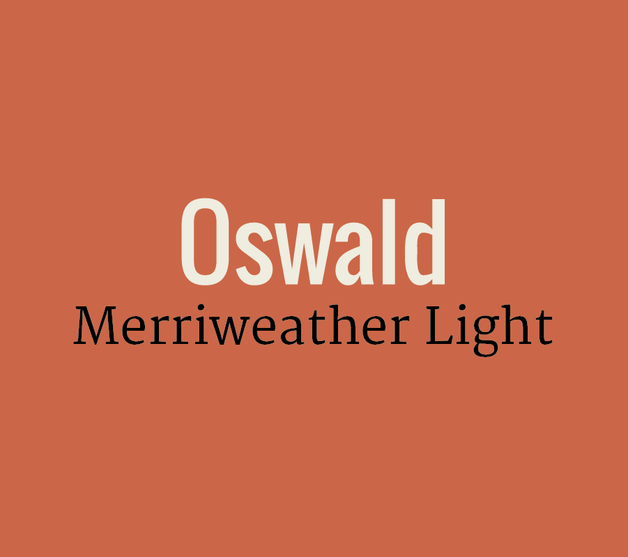
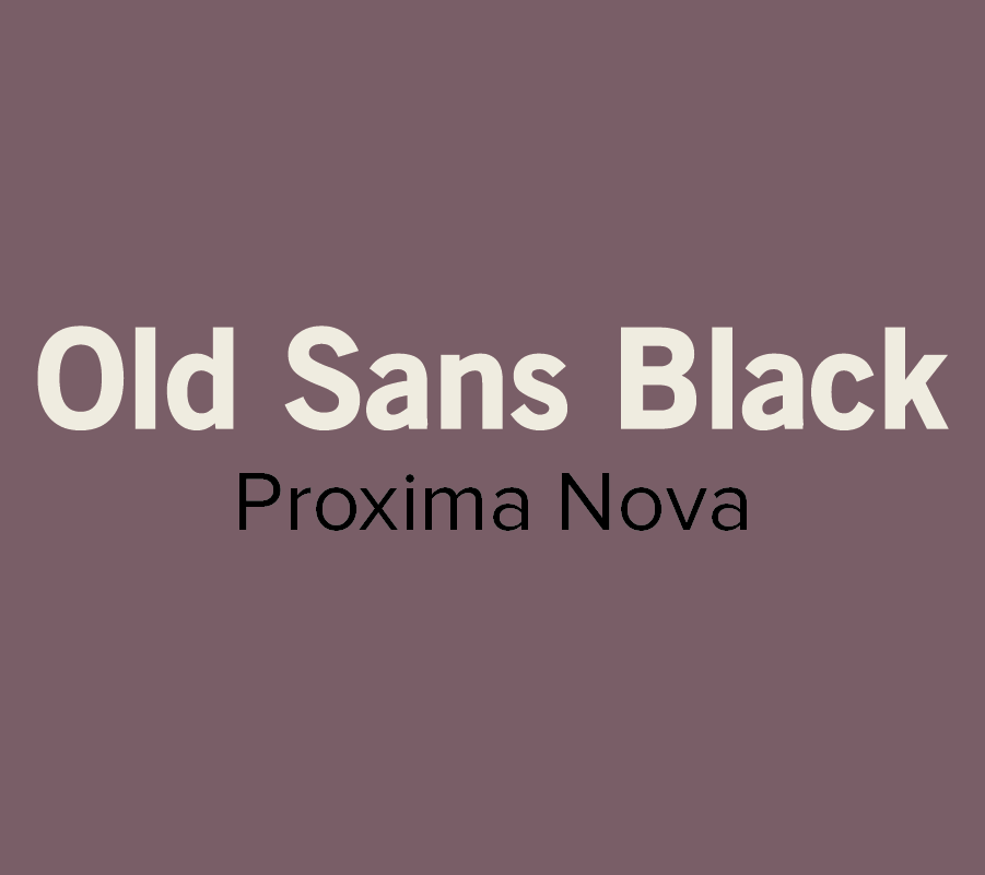
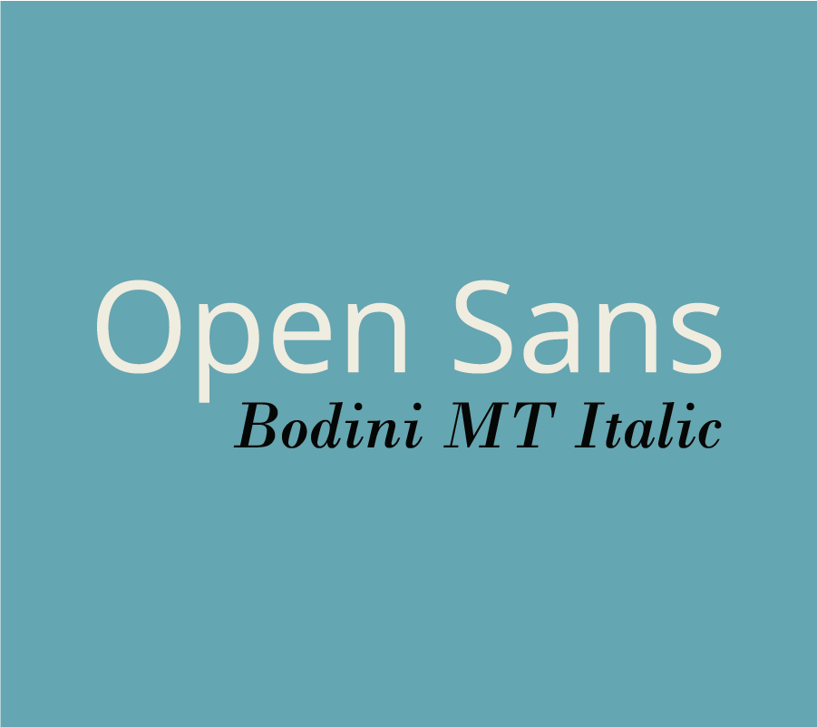
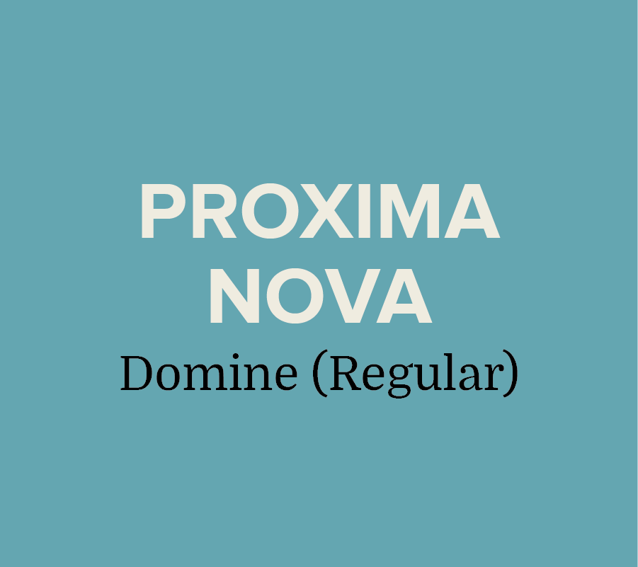
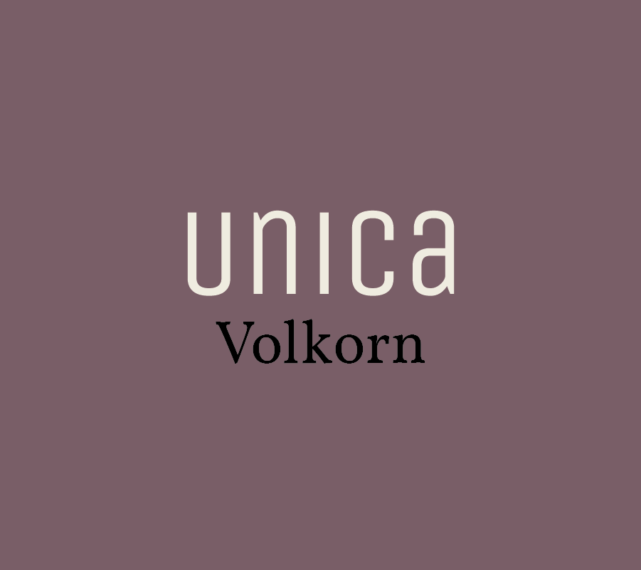
Now that you have some basics down, here are a few of our favorite combinations:

Most of the font examples we used below are from Font Squirrel, but you can also find some free or inexpensive downloads from these sites:

These are just a few of our suggestions, so don’t be afraid to branch out and try something different. There are seemingly endless font combinations to choose from! Play around and try out different combinations until you find what works best for you.

What are your favorite font pairings? Let us know in the comments!

Resume Design: Get noticed

Last week we went over all the basics of writing a killer resume. Now that your resume is written to impress, it's time to work on a knockout design.  

Selecting the right font, color, and composition can be an intimidating task, especially when your dream job is on the line. To help relieve some resume-design stress, we’ve compiled some tips and examples to help you get started. 


Personal brand

Before you begin designing your resume, you need to do some thinking about your personal brand. Your resume is more than just a piece of paper, it’s a glimpse into who you are as an employee. Are you neat and organized? Expressive and creative? Show it off! Create a strong, well-organized resume that showcases your personality and sets you apart from the competition. 


Fonts

When selecting a font, it’s crucial to choose something that’s professional and easy to read. Some fonts that seem fine at first glance may be difficult to read when they're used for a full page of text.

Best Fonts: Garamond, Helvetica, Garamond, Proxima Nova, Georgia, Gill Sans MT, and Calibri are all great choices. 

examples-02.jpg

Stay Away from: Zapfino, Brush Script, Trajan Pro, Courier (looks like you typed up your resume on a typewriter), Comic Sans (Never use Comic Sans!)

Arial & Times New Roman aren’t bad, they’re just overused. We recommended choosing something less predictable. It’s best to stick to 9 - 12pt. font for the body of your resume, but feel free to go bigger for headings and subheadings. 

Don’t be afraid to use more than one font! It adds interest and helps highlight different sections of your resume.  Just make sure to use no more than 2 (3 max) and keep it consistent. Use the same font for the body, headings, and subheadings, respectively.  

Layout

Regardless of the style and design you choose, keep your resume to one page!

Constantly looking at screens has changed the way people read. People tend to scan the entire page rather than read top to bottom. Use bolded text to make important aspects of the resume stand out.

To maintain your one page resume format, you can use columns to save on space and keep your content organized. We also recommend staggering your font sizing help highlight different aspects. Try using 12 pts. for headings, 11 pts. for the subheadings, and 9 pts. for the body text. 


Color

A pop of color is a great way to make your resume standout. While we don’t recommend one color over another, we do recommend that you chose a hue that isn’t distracting or unprofessional. A hot pink resume worked for Elle Woods, but it probably won’t work out well if you’re applying for an accounting position.          


Icons

Depending on the position you’re applying for, you may want to use icons to add some interest to your resume. Social media icons can help give your resume a contemporary look and highlight your contact information. Check out our Big List of Icons for some free downloads.

If you need a little help to get your design jumpstarted, check out this slideshow of resumes we've done for inspiration!  

Once you’ve crafted the perfect resume, make sure that you have alternative files available. You don't want to risk having your resume tossed aside because no one can open the file! 

Now that we’ve broken down some resume-design tips, it’s time for you to get started! Play around with different layouts and styles until you find what works best to express your personality as a candidate.

Looking for further reading? 

Type: A brief guide on typography

What do Chanel, Target, and Harley Davidson have in common? They all use Helvetica. This versatile Swiss typeface speaks to us every day. It’s on street signs, album covers, paper coffee cups, and even the shopping bags of our favorite stores.

Helvetica is just one of many expressive typefaces available to us today. If you’re a business owner that needs an introduction or a designer in need of a brief refresher to typography and font selection, we’ve put together a little guide. We won’t get too in depth- just some basics of typography, different type families, and some recommendations on our favorite typefaces. Sound good? Let’s jump in!


Typography

Typography is the art of arranging letters and characters in creative ways without impacting legibility. Typography isn’t just selecting an interesting font, it’s the art of adjusting the size, spacing, and placement of text in creative ways that captures the viewer’s attention. (source).

Typefaces vs Fonts

One common misconception is that typefaces and fonts are the same thing. The key difference is that font is what you use and a typeface is the creative style you see. In the early days of manual printing, individual metal blocks were used to print each character. If you wanted to use the typeface Baskerville, you would need to purchase the font in the desired point size, style, and weight separately.

Leading, Kerning & Tracking

Leading is the vertical spacing of lines of text. When dealing with several lines of text, you may need to adjust the leading. Kerning is the spacing between two letters to produce an aesthetically pleasing result. You never want your viewer to struggle to decipher tight letters that are smashed together, or to see loose awkward spacing that distracts from the message you’re trying to convey. Not to be confused with kerning, tracking is the adjustment of spacing throughout an entire word.  


Type Categories

Because of its rich and lengthy history, there are several different type families. We’ve included a few examples, but if you’re eager to learn about more in detail, you can read more here.  

SERIF:

SANS SERIF: 

SLAB SERIF: 

Serif

Typefaces in this family utilize serifs, which are the small decorative lines attached to the stroke of a letter. Serifs are like extensions or finishing strokes at the end of characters. Serifs are often used in print media like books, magazines, and newspapers.  Some examples of this type are: Garamond, Times New Roman, and Baskerville. 


Sans Serif

In the early 1900’s, San Serif was criticized as being ugly because they lacked the elegance of the classic Serif style.


Derived from the French word sans, meaning “without”, this typeface does not use decorative finishing strokes associated with its formal counterpart. Because of its simplicity and clarity, Sans Serif typefaces are usually used for websites, signage, and government documents. A popular example that is used almost universally is Helvetica. 

Slab or Square Serif

Developed in the early 19th century, this style implies a heavy block-like serif. Slab Serifs are more geometric in style and have a strong square-like appearance than traditional Serif fonts. Rockwell, Aleo, and Courier New are a few examples of this mechanistic style.


In the early 19th century, Slab Serif was extremely popular for newspapers. The bold style was eye-catching and held up well is mass printing. 


Our Favorite typefaces

There are endless styles to choose from. Here are some of our favorite styles that we think would work well for different areas.

Parlour

We love this rustic and masculine typeface, and think it would be perfect for menswear brands, barbershops, and tattoo shops. 

Hermes

This style is a popular choice for designers because it’s minimalistic, yet strong.

Oraniembaum

We like the retro feel of this stylish serif typeface, and think it would be great for blogs, headlines, or logos.

ADAM

Clean and easy to read, this modern San Serif style provides a futuristic feel to websites and logos.

Knubi

This serif typeface is delicate yet memorable. It would work well for magazines, brochures, books, and most printed media.

Zefani

Zefani has a sophisticated feel and would be perfect for luxury projects.

Rockwell

This thick slab serif is a great choice for eye-catching titles and headlines.  
 

Korneuburg Slab

We love the old world feel of this eye-catching serif typeface. 
 

Julep

We love this versatile typeface, and think it would be perfect choice for fashion brands, coffee shops, or bakeries.
 

Moderne Sans

This typeface was inspired by 1920’s typography. This minimalistic style pairs well with images. 


Shepia

This script adds a fun vintage feel to fashion labels, signage, packaging, and logos. We like that this typeface isn’t gender specific, so it would work well for both menswear and women’s fashion. 


Not sure where to find different typefaces? We’ve got you covered. Here are a few of our favorite sources- several of them offer free downloads:

Dafont

Visual Hierarchy

Hype For Type
 

Great typography can elevate the quality of a design and transform it into something remarkable. It takes time, patience, and a lot of trial and error to develop this skill, so don’t get discouraged! Play around with spacing, placement, and color until you find the best fit for you.  Don’t try to force it - great typography speaks for itself.

What do you want to know about typography? Leave a comment! 


SOURCES:
Source 1  |  Source 2  |  Source 3  |  Source 4  |  Source 5  |  Source 6  |  Source 7  |  Source 8  |  Source 9

Type Rules! The Designer’s Guide to Professional Typography, by Ilene Striver