Posts in Design
Color Stories: City Views

It only takes one visit to a city to figure out if you’re someone who belongs in the city or the country. The commotion either overwhelms or inspires you -- and the beauty of the city is truly in the eye of the beholder. 

In the past, we’ve explored color schemes found in nature, but what about those of us who are inspired by a more urban space? 

To further explore the aesthetic and inspiration found in an urban environment, we’ve snagged Unsplash photos from cities all over the world. Cities are so much more than grey and concrete – and the colors we’ve pulled from these images prove that. 

Color Stories: City Views  |  Hue & Tone Creative

French and Fancy

The facades in France evoke a feminine and understated feel. The landscaping and waterways provide a rich pop of color that reminds you nature isn’t far away. 


Color Stories: City Views  |  Hue & Tone Creative

Tonal in Taiwan 

Rich hues of purple, red, and orange light up a dreary day in Taipei City. Dusty lilac is an unexpected alternative to the grey and black of street top.


Color Stories: City Views  |  Hue & Tone Creative

Hazy in Hong Kong

These muted colors complement a monochromatic backdrop filled with metal, glass, and concrete. We think they would be perfect for a stylized flat lay photo shoot.


Color Stories: City Views  |  Hue & Tone Creative

The lights of Shanghai 

Soothing and subdued, these blue and purple hues reflect a city full of light. A pop of light pink provides some much needed contrast and depth to this color story. 


Color Stories: City Views  |  Hue & Tone Creative

Sunset in the City

Sunsets are beautiful anywhere, but this faint coral and rich turquoise scheme is one of the best mother nature has to offer… maybe the best color inspiration blends city and nature?  


Color Stories: City Views  |  Hue & Tone Creative

Stockholm Swatches

These earthy buildings evoke thoughts of rich spice. Paired with a soothing background of pale blue and seafoam, this color scheme is as dynamic as it is beautiful. 


Color Stories: City Views  |  Hue & Tone Creative

Radiant in Radio City 

These illuminated hues create a sharp contrast against dark grey and black. For a fun and youthful scheme, New York City is where it’s at. 


CREATIVE PROFESSIONALS IN GREENSBORO AND WINSTON SALEM

Need a second opinion on your brand colors? We can help with that. We're experts in color, type, branding and design -- and we can help you refresh or retool your branding to make sure it's the best reflection of your business. Reach out if you're ready to get started: hannah@hueandtonecreative.com or 336-365-8559.

How to give honest feedback without frustrating your designer

You’ve chosen your designer, you’ve briefed them on your needs, reached an agreement on terms, and you’re eager to see what they’ve come up! Then, their name lands in your inbox along with the much anticipated attachments – but then you click to find that...they’re not quite what you were after. Now what?

If you do it right, giving feedback won’t be perceived as negative. In fact, it’s an important part of the design process – and it’s something that your designer is anticipating. But giving feedback in an unproductive way can lead to an overall unproductive relationship between you and the creative you hired. 

As designers, we’re here to let you know that we’re used to feedback – we even enjoy it because it helps us do our job better. But, it can be frustrating when clients are constantly giving you negative feedback and not giving you the information you need to do your job properly. 

It’s easy for miscommunications to happen – especially if you’ve never worked with a designer before. But with just a few small tweaks to your approach we believe you can communicate with your designer better than ever – and land on a superb final product! 
 

How to give honest feedback to your designer  |  Hue & Tone Creative


Step back and ask questions

Before mindlessly shooting off negative feedback, take some time to marinate on what they sent you. Let them know you received the proofs and are putting together some notes. Then, go through the examples and guidelines you provided your designer. What varies from what you asked for? What’s in line with what you asked for (even if it’s not your favorite)? 

Put together a list of questions to better understand where your designer is coming from. The answers to your questions may change your mind on a certain concept or help you distinguish the direction you want to go. 

Creating an open dialogue will go a long way in helping you both understand each other’s point of view. 


Be professional, calm and controlled

We know it can be hard to stay calm when you feel like a project isn’t going right – but like any other professional situation it’s important to stay calm. Keep your communication -- whether it’s over the phone or on email – calm and clear is key. Be sure to politely explain why what they’ve produced isn’t quite up your alley.

Just saying “I don’t like it,” “it’s not what I asked for,” or “it’s not for me” isn’t constructive, and it doesn’t give your designer a fair chance to fix it. So, be as specific as you can so that they can understand what does and doesn’t work. That way they’ll be able to take your feedback and turn it into a stronger second draft. 

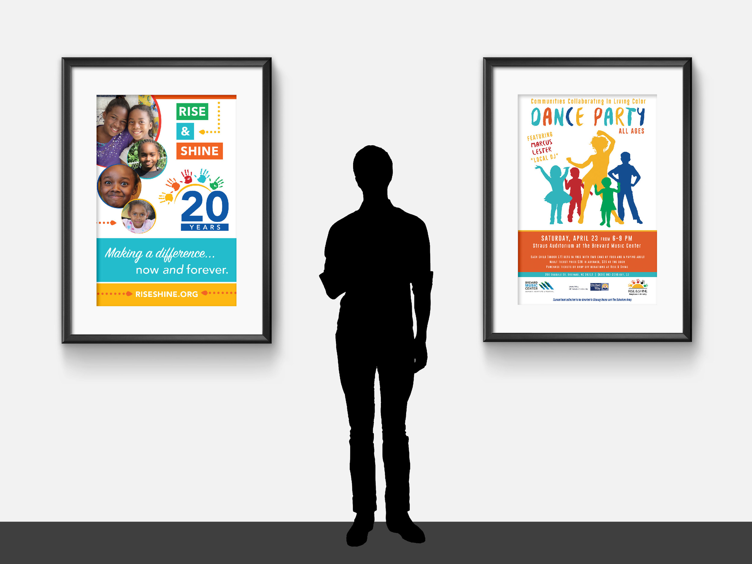
If you can, show them examples of the kind of thing you dolike from other organizations, so that they have a solid idea of the kind of design they need to be working toward. 


Explaining the why

When you’re highlighting elements of a project you’re not quite keen on, explaining the why is super important. Whether it’s because it goes against the guidelines you sent them, it’s too similar to what you’ve done in the past (and found to be ineffective), or it aligns too closely with one of your major competitors, give them a bit of context to help them understand the thinking behind your rationale.

Keep in mind, your designer has probably spent a lot of time on what you’re seeing – if you don’t like it, there was clearly a miscommunication – and it’s on both of you to fix it!


Keep it in perspective

Perfection takes time. Just because they didn’t deliver exactly what you wanted the first time around, don’t hold it against them, patronize, or start micro-managing them. You hired a designer because you don’t know how to do it yourself – so stand back and let them do their work. Keep in mind they are an expert at what they do – just because you don’t like something doesn’t mean it’s not quality work. 

Their job is to bring your vision to life. Your job is to equip them with the information they need to understand your vision.


Put your personal preference to one side

When you’re critiquing their work, remember that design is often a personal preference. Be sure to separate your personal taste from your brand image. A designer might be able to see the bigger picture in a way you can’t – so just because it doesn’t connect with you doesn’t mean it won’t connect with your target demographic. The taste of your audience is probably going to be different than yours, so be sure to talk through your designer’s rationale before shooting down a concept – they might know something you don’t.


Balance negatives with positives

It’s the old compliment sandwich trick. And this tip isn’t just to make them feel better! As we touched on earlier, the positives will help them really get a feel for what you dolike so that they can keep developing quality concepts. 

If there really aren’t any positives, you can still be complimentary about their work, but just be clear that it’s not right for your brand or this particular project. If this is the case, be crystal clear you’d like to see a totally new direction – don’t try to sugar coat it too much or they probably won’t realize that what they showed you is a complete wash. 


Keep in mind what you agreed too 

Be conscientious of when you’re asking to go above and beyond the terms of your contract. If you agreed to three rounds of revisions, you may need to pay an additional fee to go beyond that. 

Both parties of this contract are on equal footing – it’s not an employee/employer relationship. 

You can’t expect free revisions just because you don’t like something. If they’ve met the terms of the contract and you still don’t have something you like you may need to renegotiate. Keep in mind the contract is in place to protect both parties. 

Checking in on time and expectations can go a long way in demonstrating that you respect a designer’s time. It’s a great way to show you value their work, even if you haven’t come to a final product yet. 


Remember...

Rome wasn’t built in a day -- if you want a rushed job, give a rushed timeframe. It’s important you give your designer time to go back to the drawing board and really take everything in you’ve said so that you can keep working toward a high quality final product. 


Hue & Tone Creative: Your creative team

Let us help you get your project designed right! We're ready to communicate with you on your marketing needs -- whether they're big or small. To take a look at what we've done in the past, be sure to check out our design portfolio. Don't see the type of samples you're looking for? Get in touch, we can email you additional work samples!

How to design a user-friendly form (and still get the information you need)
How to design a user-friendly form (and still get the information you need)  |  Hue & Tone Creative

Forms are essential for gathering user’s information in a smart and efficient way. Getting them wrong means a poor user experience and abandoned leads – which translates to missed opportunities and lost revenue. 

Because the formatting and design of your forms has a direct impact on how well they convert, we’ve collated some top tips to make sure your forms are performing as effectively as possible.  


1.  Form length: Always question the why

How long should a good form be? The more fields you give a user to fill out, the less likely someone will be to complete it. However, the more information a lead is willing to give, the more likely they are to be a qualified lead. Like most questions of quality versus quantity, the key is to strike a balance. 

For every question you have in your form, take a moment and really ask yourself why do I need this detail at this stage of the user’s journey? If some of the information can wait until later on in the buyer’s journey, consider leaving it out in an effort to streamline your form.


2.  Page placement

When adding a form to your website, it’s important to place the form near the top of the page. Visitors shouldn’t have to scroll to get to your form – and if they do, chances are they won’t fill the form out. 


3. Tailor the keyboard

In this day and age all forms need to be mobile responsive. But, did you know you can also take user experience a step further by customizing keyboard layouts? 

This one’s only for mobile or tablet forms, but we thought it deserved its own shout out. To make the user’s life eveneasier, you can code your site so that the keyboard changes each time a user clicks on a new field. For example, the keyboard will default to digits when they’re filling out their phone number. 

For more on how to do that, check out this Treehouse article


4.  Time saving tactics

Users are accustomed to a quick and easy sign-up process – nothing should slow them down from filling out the form you provided. To make sure their experience is as streamlined as possible, make sure you’re abiding by these tips: 

  • If the user has already provided you with information, make sure you’re pre-populating any fields you can.

  • Instead of waiting until users click “submit,” make sure to highlight errors or overlooked fields as soon as users click on to the next field. Boxes with incorrect information should be highlighted in red straight away – that way users won’t be stuck scrolling through a form trying to figure out what needs to be fixed.

  • If what you’re asking might be unclear, be sure to add descriptive information or a tip call out near what you’re asking. If a user gets stuck, you can be sure they’ll abandon the form.

  • If there’s no way around using a lengthy form, give users an option to save their information so that they can return and complete it at a later date. And, if this is the case, be sure to automate email reminders that will nudge them to come back and complete the form.


5. Submit button

Once the form is filled out, the last major factor for form success is the “submit” button. While labeling this button “submit” seems like an obvious choice, it may not be the best choice. 

According to Hubspot, landing pages with buttons labeled “Submit” actually have lower conversion rates than those that use other wording. Consider buttons that relate back to your initial offer, or sound less committal than "Submit." Try out things like: "Go," "Download your free e-book," or "Get Started." 


Further reading:  

Looking for a more resources on how to create effective forms and successfully convert leads? We’ll leave you with these three suggestions for further reading: 


Hue & Tone Creative: Greensboro Web, Design, and Social

No matter what your marketing needs, we've got your back. Take a look at all of the services we offer and then get in touch -- we'll work with you to set up a custom marketing solution that addresses all your needs.

7 Reasons Why You Should Invest In A Professional Logo Design
7 Reasons Why You Should Invest In A Professional Logo Design  |  Hue & Tone Creative

Your logo is an integral part of your brand. It identifies you. It distinguishes you. And it creates consistency across everything you do.


Anybody can design any old logo. A professional can design a logo that has meaning, purpose and power. So, without further ado, here are our top seven cases for putting some investment behind your business’ logo.


1.  First impressions

You only have one shot to make a first impression, and a shoddy logo could shoot you in the foot. Put yourself in consumers’ shoes. If you’re looking to purchase a product or service and you stumble across a brand that has a logo that looks like it was made on Paint, it doesn’t set a very good tone for what’s behind the scenes.


2.  Relevancy

Telling a story through design takes a certain skill. A skill that not everyone (understandably!) has. From the colors, icons, images, fonts and sizes in your logo, to be truly impactful, every single element needs to have a purpose. And that, readers, is what a professional is paid to do.


3.  Trustworthy

The quality of your logo says a lot about you as a business. A poor logo can be construed as a poor brand, and we know that’s not the outcome you’re after.

Whether it’s a misaligned character, pixilated border or crazy color scheme, below par logos look inferior. High quality logos, on the other hand, give you an ora of professionalism, value and authority - all of which can give you one up over your competitors.


4.  Memorable

A strong logo is instantly identifiable. Whether it’s placed on a billboard, letterhead, social media or paid advert (and everything else in between!), it pulls peoples’ eyes to it, and it’s easily recognizable.

Professionals know that less can be more. That outrageous colors aren’t needed to attract attention. And that designs have to gel with a variety of settings. And they incorporate all of that into your finished product.


5.  Evergreen

As with almost everything in life, logos evolve. What might be spot on for your brand right now might feel slightly off in a few years - but that’s okay. You’ll not find many businesses out there that haven’t adapted their logo over the years, but the key is that they’re adaptable.

Entirely revamping your logo can damage your business’ brand awareness, which is why it’s more about continual tweaks than a complete do over. With a professional by your side, you’ll get a solid logo that’s designed to stand the test of time - bar the potential small touch ups now and then.


6.  Showcases your brand

Your logo is a pivotal part of your brand’s story and values. It’s your chance to let your personality shine through and showcase what you're all about! As an example, here are some of adidas’ logo milestones:

7 Reasons Why You Should Invest In  A Professional Logo Design.png

Same brand. Different logo. Completely contrasting messages.


7. Adaptable

Logos are needed left, right and centre. What might work perfectly fine on your website, might not necessarily sit right on your business card. That said, you absolutely don’t want two completely different versions that aren’t in-line with one another.

What you want, and need, is a few variations that fit in any given placement - for example, one that’s for a black background and one that’s for a white background - that are instantly associated with one another.

We could go on and on, but we’ll wrap it up at number seven. If you’re interested in sprucing up an existing logo or are a new brand starting from scratch, why not get in touch to see how we could help?


Hue & Tone Creative: Logo and Branding in the Triad

Are you now convinced that you need professional help with your logo design? We think we might just be the perfect people to help you out. From logos to branding, and everything in between, we can help you create a lasting impression. But if you're feeling a little unsure we'll let our design work speak for itself.

What's the difference between a graphic designer and a developer?
What's the difference between a graphic designer and a developer?   |  Hue & Tone Creative

Although graphic design and web development are two totally different jobs, there’s an increasing level of confusion between the two. 

As online tools make it easier for people to learn new skills there’s been more and more overlap between the two roles. Graphic designers want to dabble in the coding side of things, and developers are paying more attention to the visual elements.

Although they are experiencing more and more of each other’s worlds, there are still several clearcut differences between the skillsets of graphic designers and developers — and you should know what they are before hiring someone to take on your next web project. 


Graphic designers

Creativity

Graphic designers do what they do because they are creative (well, the good ones are, anyway!). They can see your vision from the get go, come up with concepts, and then mock-up your dream website. 

They’re able to illustrate or design anything you might need and are explicitly tuned in to the aesthetic side of things.


Attuned to detail

Unlike developers, graphic designers have a fine eye for things like fonts, sizes, colors and spacing. Because they don't have to focus on making your site work, they're free to hone in on the small details. They’ll perfect and refine every element of your site to meet brand guidelines and will ensure consistency with the rest of your brand.


Marketing awareness

In addition to a fine eye for design, a good graphic designer has a better understanding of marketing as a whole. They not only stay up-to-date on design trends, but they also have a solid understanding of what's going on in the industry so they can keep your brand collateral on trend. Whether it’s an online UX experience or offline advert, they’re responsible for ensuring their designs not only look good, but are built to convert.


Breadth of input

Last but not least, the role of a graphic designer spans far beyond a business’ website -- they can handle everything from creating a print campaign to simple things like re-sizing images. No matter what you need they'll be able to help you put together the entire package, not just your website. 


Developers
 

Make your website work

Where designer's jobs are creative, developer's jobs are technical. Developers can be split into two categories: front end and back end. In their simplest form, front end developers deal with the part of the website you can see. They typically write in languages like HTML, Javascript or CSS. Back end developers deal with servers, applications, and databases.  They work out the details of how and where your data gets stored. 


Technically driven

Developers are very analytically driven, they have a technical mindset and work behind the scenes to make graphic designers’ work live on a website. Each coding language has it's own set of rules and regulations, making their job more about memorization and problem solving than aesthetics. 


Carry the weight of your website

While developers don’t necessarily need to be creative, it falls on them to make sure the website actually works. Does it load quickly? Can you easily log-in and put things in your shopping cart? Is your billing information stored correctly? 

If pages, apps, or websites falter, it’s on developers to get them back up and running as fast as possible to ensure revenue isn’t lost.


So, who should you hire?

In the end, you need both to form a partnership.

Graphic designers and developers come as a package. Although their skills and role vary, they work in harmony to make sure end results are up to scratch.

Think of it like a production line. The graphic designer works on the visual stage, then passes their work onto the developer to encode, and then both work together to quality check the finished product.


Graphic Design for Greensboro, NC and beyond

Let us take the headaches out of creating your new website. Check out our design portfolio to see clients we've helped in the past, and then give us a call -- we can't wait to get the conversation started.

Mood Board: CMYK Inspired
Source 1  |  Source 2  |  Source 3  |  Source 4  |  Source 5  |  Source 6  |  Source 7

Source 1  |  Source 2  |  Source 3  |  Source 4  |  Source 5  |  Source 6  |  Source 7

If you work in the design or printing industry, you're probably familiar with the CMYK color mode. But for those who have never heard of it, the CMYK color model is a subtractive color model used in color printing. CMYK refers to the four inks used in some color printing: cyan, magenta, yellow, and key (black).

This color blending mode is responsible for most of the printed materials you see and interact with every day... that's why we thought it deserved a little attention! Even though we're surrounded by beautiful colors every day, we rarely stop and think about what goes in to them. 

This funky, pop-art inspired mood board is our visual ode to the CMYK printing process. We know it's nerdy... but, hey, what can we say -- we love design and color! 


Hue & Tone Creative: Color + design lovers

Does the idea of picking colors for your website stop you in your tracks? Or maybe you just can't tell the difference between two shades of blue? That's what we're here for. At Hue & Tone Creative, we can help with everything from logo design to web development to print collateral. Want to see what we've done for our other clients? Take a look at our portfolio.

Color Stories: Festive foliage

Snow covered garland, carefully crafted wreaths, eye catching poinsettias... The right greenery can usher the holiday spirit into any space! 

To get in to the holiday spirit, we've sorted through some of our favorite photos of Festivus-inspired greenery. These color stories take a closer look at some of our favorite foliage, from a close-up of a pine bough to an entire hillside of snowcapped trees. 

Color Stories: Festive foliage  |  Hue & Tone Creative

Open Invitation

A pop of rich red awakens an earthy green for an inviting color scheme... it's so rich it practically beckons you right in! 


Color Stories: Festive foliage  |  Hue & Tone Creative

Tranquil Terrain

Cool blues and purples paint the soothing and silent aftermath of a snow storm.


Color Stories: Festive foliage  |  Hue & Tone Creative

Delicate details

If you look closely enough, even the smallest detail is alive with color! This ornament inspired palette pairs a dusty plum with graphite and sage for a one-of-a-kind winter scheme.


Color Stories: Festive foliage  |  Hue & Tone Creative

Crisp Cranberry

This modern color pairing packs a bold punch with an accent of brilliant red. A nearly-black mahogany and cool greys accent this daring statement color.


Color Stories: Festive foliage  |  Hue & Tone Creative

Festive Fern

Deep earth tones take us back to nature in this rich and rugged color scheme. A pale blue pops on a backdrop of muted mahogany and soft brown.  


LOGO AND BRAND DESIGN IN GREENSBORO, NC

Need a custom holiday invite? A fresh brand to start 2018 off right? We've got you covered on all fronts. Hue & Tone specializes in logo design, branding, and collateral development. Reach out if you're ready to start the new year off right: hannah@hueandtonecreative.com or 336-365-8559.

Web Design Trends to Leave in 2017

The song, It’s so Hard to Say Goodbye to Yesterday was originally recorded for the 1975 film, Cooley High. It’s a real tear jerker and may make for fitting music as we bid farewell to design trends that can’t join us in the new year. Honestly, the list itself isn’t sad at all. It’s actually solid advice regarding 4 web design trends to leave in 2017.

Design Trends to Leave in 2017  |  Hue & Tone Creative

Before we get to the list, let’s quickly discuss why this purge is so necessary. Two letters: UX. UX or User experience refers to a person’s feelings and impressions about using a particular product, system or service. In this case, your website. To keep this experience simple, logical and enjoyable, these 4 web designs must be left behind.


#1. Skeuomorphism

The design concept that merges our real-life perception or characteristics of an object with its digital equivalent. A good example of this is the original Instagram logo; a life-like image of a camera that has since changed to a simpler, semi-flat design. Flat and semi-flat designs have a minimalistic feel and seem to be preferred more widely by web audiences. For this we say adieu to skeuomorphism. 


#2. Hero Images as the whole Story

Hero images are large images that take the place of traditional banners and are generally overlaid with text. Don’t get me wrong, they look amazing. They are captivating, they are alluring and signal substance. The problem is, some websites are little more than these images with no accompanying meaningful content. Perfectly fine for a webpage used for contact information or a place to describe a single product. However, hero images are not enough to tell the whole story about a business and its products or services. Coca-Cola is a great example of how to use hero Images while still boasting a site full of relevant and substantive content. Easy to say arrivederci to hero images as the entire story.


#3. Tight Spacing

Sometimes, full breakups aren’t necessary. A little space goes a long way at rekindling a quenched flame. White space in particular, could vastly improve the look and feel of your website. This can be accomplished pretty easily. Sites that are text heavy can add space between lines and letters, enhancing readability. Similarly, those with lots of products to display should take a hint from Amazon.com which uses grid layout design. The online superstore has successfully employed this design to organize their many products. In either case, the user experience is upgraded. We can happily say adios to tight spacing. 


#4. Sliders and Carousels

These are not the same, but are similar design techniques. They each involve the movement of images in either a sliding or rotating fashion. Neither, according to a Nielsen Norman Group study, were found to be effective conversion tools. A point made many times over the years, but appears on this list due to an even greater downside. The designs could negatively impact your SEO or search engine optimization. While the use of sliders and carousels aren’t automatic SEO killers, the risk to your website’s ranking is real and may not be worth taking that chance. Either, enlist the help of a professional website builder or try something else. Videos are a great alternative to both these elements and may be a better way to tell your story. Let us say Gooday to sliders and carousels. 


Companies in the know wisely improve their websites to increase user satisfaction. This includes, but is not limited to the way the site appears on mobile or desktop devices, how easily and intuitively one can navigate the site, and the overall functionality and feel when engaging with the website. The 4 web design trends to leave behind, tend to interfere with these aims in one way or another. It may not be so hard to say goodbye after all.


WEB DESIGN IN GREENSBORO AND BEYOND

Guilty of using all these things on your website? We can help pull you out of the past!
Hue & Tone Creative will help get your web presence up to speed. Be sure to check out our design portfolio to see clients we’ve helped in the past -- and then give us a call if you’d like us to build you a modern website that truly tells your story.

Must download free Google Fonts
Must Download Free Google Fonts  |  Hue & Tone Creative

Whether you’re designing a resumé for the job of your dreams, sending out invitations to a gala, or creating a sleek new business card, using the right fonts will help you grab someone's attention and accurately communicate your brand.
 

Google Fonts has 847 fonts to sort through, so we’ve rounded up some favorites for you to browse. And remember, all of these fonts are free and open source, so there’s no need to worry about potential licensing hiccups. You’re free to use the fonts for any project, whether it’s a personal blog or a commercial campaign.


Sans Serif

You can never have too many sans serif font options. These versatile fonts are great for logos, headlines, and graphics. 


Serif

Give Times New Roman a break and swap it for something more modern.


Slab Serif

Looking for a typeface that packs a punch? Try a slab serif.

 Want even more fonts? Keep the downloading going by syncing some of our favorites from Adobe Typekit.


Professional Creative Services in Greensboro, NC

Don’t have an eye for design? We can give your brand the creative touch it needs. From email campaigns and logos to everything else in between, Hue & Tone Creative can help your brand stand out.

The Optimal Font Size for Web, MailChimp, and Mobile

Earlier this month, Twitter rolled out a new font. Unfortunately, not everyone was a fan

Twitter’s switch from Helvetica Neue, to Segue left users complaining that the slender new font was hard to read and caused way too much eye-strain.

Like Twitter, most businesses are bound to make mistakes when it comes to using the right fonts and sizes. Instead of fumbling through and learning from trial and error, do yourself a favor by learning a few of the best font-size secrets. 

Artboard 3test.png

Websites

Whether you’re designing an online shop, portfolio, or blog, it’s crucial that your fonts look clean, appealing, and easy to read.

For best readability, we recommend that you keep your headers and buttons between 30-32 pts and sub headers between 18-26 pts. Body text usually looks best when it’s between 12-16 pts. 


The Optimal Font Size for Web, MailChimp, and Mobile  |  Hue & Tone Creative

Looking to compare email marketing platforms? Here’s a rundown on a few of our favorites.

MailChimp

Email marketing isn’t going away anytime soon. In fact, email is 40 times more successful at bringing in leads than Twitter or Facebook.

One of our personal email marketing tools, MailChimp, recommends that you keep your body text between 14-16 pts. 16 is best for short emails between 2-3 sentences, while 14 pts us better for more lengthy emails.


The Optimal Font Size for Web, MailChimp, and Mobile  |  Hue & Tone Creative

Mobile

According to MailChimp, it’s best to stick to the “one eyeball, one thumb, and arm’s length” rule when it comes to font sizes. Basically, your viewers should be able to see and scroll through the entire email with ease and clarity. 

With this guide in mind, your body fonts should be between 12-16 pts and your links, CTA, and buttons should be between 34-36 pts.


One last note…

When it comes to selecting fonts, the most important thing is to pick an easily readable font. When in doubt, go back to basics. If you stick to a plain serif or sans serif and use these size guidelines, you'll be on your way to finding the perfect typography for your next web project! 


Web & Blog Design in Greensboro, NC

Not seeing much traffic or engagement on your website? It’s probably time for an upgrade! From landing pages to business blogs, Hue & Tone Creative can help you create a site that matches your style and helps reel in leads. 

Mood Boards: Home Sweet Home

We have a confession to make...  We have a bit of an addiction to browsing home decor on Pinterest. But instead of adding to our already over flowing “dream home” board, this week we decided to channel our energy into some shareable content!

If you love day dreaming about how you're going to decorate your house, this little collection of "Home Sweet Home" moodboards is just for you!

Moodboards: Home Sweet Home  |  Hue & Tone Creative

Victorian

During the Victorian era, plain jane décor was a major faux pas. Burgundy, burnt orange, and teal hues create a modern spin on the classic style. 


Artboard 2@5x.png

Ranch

For this color scheme, we were inspired by golden fields of wheat and rustic simplicity.  


Moodboards: Home Sweet Home  |  Hue & Tone Creative

Colonial

Our collection wouldn’t be complete without one of the most popular American styles. Lemon zest, forest green, and robin’s egg blue add a nice contrast to a black and white canvas.


Moodboards: Home Sweet Home  |  Hue & Tone Creative

Cottage

We know it’s cheesy, but we’ve always loved Miss Honey’s teeny tiny cottage in Matilda. For this shabby chic palette, we chose muted shades reminiscent of tea roses, ivy, and aged stone.


Moodboards: Home Sweet Home  |  Hue & Tone Creative

Spanish

For this rich scheme, we combined warm hues like papaya and goldenrod with a bold hint of sapphire.


What’s the style of your dream house? Share it in the comments!


Creative Services & Graphic Design in Greensboro, NC

In a creative slump? Take a break and leave it to the pros! Whether you’re looking to spice up a lackluster landing page or create a lookbook for your brand, Hue & Tone can add an artistic touch to any project.

Mood Boards: Museum Favorites

Creative inspiration can be found anywhere, from a scene in a movie to a trip to the museum.

This week, we cracked open our forgotten art history textbooks and found inspiration in the works of Impressionist, Post-Impressionist, and Art Nouveau masters.

No need for an artistic background- simply peruse through our collection of mood boards to find a little inspiration of your own.


Cezanne.png

Paul Cézanne

This rich mix of cool and warm tones can add a strong pop of color to websites, resumes, or business cards.    


monet.png

Claude Monet

A bold punch of crimson adds an unexpected contrast to these lily pad greens.


Lautrec.png

Henri de Toulouse-Lautrec

For this color scheme, we channeled the fast-paced energy of Parisian dance halls filled with quirky partygoers.


degas.png

Edgar Degas

We loved the soft romantic feel of Degas’ delicate scenes. Adding a mossy green helped keep this pastel palate from feeling too girly.


klimt.png

Gustave Klimt

For this expressive color scheme, we channeled Klimt’s mosaic-like portraits and floral landscapes.


Mary Cassatt.png

Mary Cassatt

Although Cassatt’s Impressionistic scenes were inspired by Degas, she had a style all her own. Lively bursts of yellow and ochre standout against blue and green hues.


Who are your favorite artists? Let us know in the comments!


Graphic Design and Creative Marketing in Greensboro, NC & Winston-Salem

At a loss for design inspiration? Let us give you a hand! From brand boards to personal branding, Hue & Tone Creative can help add color and artistic flair to any project.

Color Stories: Inspired by Nature

Whether you’re revamping your resume or debuting a new logo, the colors you choose make a difference. With an endless library of colors at your disposal, it can be difficult to decide on the right combo.

Lately, we’ve been finding our inspiration in nature. The great outdoors is a bountiful source of *free* inspiration (and, the photos we used were free too)!

If you can't get away from your desk right this minute, turn to our nature inspired color schemes for your next project. Try out just one... or all of them! 

Neon Forest  |  Hue & Tone Creative

Neon Forest

This bold collection is perfect for trendsetters and influencers. Pair energetic colors with a charcoal brown for a crisp contrast.


Luscious Lavender  |  Hue & Tone Creative

Luscious Lavender

Not afraid to get a little girly? This playful purple match up is for you.


Salt & Seafoam  |  Hue & Tone Creative

Salt & Seafoam

Want to appeal to a wide audience? These cool tones feel calm and approachable.


Citrus Sunrise  |   Hue & Tone Creative

Citrus Sunrise

Feeling a little playful? This bright collection is perfect for a fun new culinary or children’s brand!


Desert Flower  |  Hue & Tone Creative

Desert Flower

This color scheme is perfect for spring! The feminine and playful combo works nicely for logos, business cards, or boutique packaging.


Vivid Autumn  |  Hue & Tone Creative

Vivid Autumn

These bold tones feel warm and confident -- but still modern.


Bold & Earthy  |  Hue & Tone Creative

Bold & Earthy

Looking for a natural palette that can appeal to a down-to-earth demographic? We've got just the thing. 


Pastel Sea  |  Hue & Tone Creative

Pastel Sea

Think pastels are a little too girly? Tone down the femininity with rich tones. This palette would add a modern touch to packaging or branding materials. 


Incandescent  |  Hue & Tone Creative

Incandescent

These subtle colors serve as a great foundation to help your work stand out. Give this palette a try for your next portfolio site. 


Soft & Whimsical  |  Hue & Tone Creative

Soft & Whimsical

This color scheme feels delicate yet subtly strong.


Creative Professionals in Greensboro and Winston Salem

Need a second opinion on your current creative project? We can help! From personal branding to web-design, Hue & Tone is here to help you make your brand pop.

Must-have Adobe Typekit Fonts

If you use Adobe’s Creative Cloud suite, then you’re probably no stranger to Typekit. With over 1,000 options at your fingertips, choosing the right font can be a challenge.

At a loss for which fonts to use? We’ve rounded up a collection of our must-sync fonts.


Serif

These serifs give a sophisticated feel to resumes, business cards, and printed media. 

Slab Serif

Need a font that stands out? These bold slab serifs are perfect for headlines.


Sans Serif

We love these sleek sans serif fonts for blogs, websites, and everything in between.


Web & Graphic Design Services in Greensboro: Hue & Tone Creative

Does your brand need a Spring refresh? Hue & Tone Creative will help you update your look. From email campaigns and web design, to presentation graphics and business cards, we’re here to help you put your best foot forward. Contact us today to learn more about our creative services -- 336-365-8559.
Mood Boards: Blast from the Past

Lately, we’ve been feeling a little nostalgic. Since we don’t have a DeLorian to help us hop back in time, we decided to get a little creative.

Take a trip to the past with our collection of retro mood boards: 

1960’s 

Moodboards: Blast from the Past  |  Hue & Tone Creative

Listening to Pandora’s 60’s French Pop station helped put us in the mood to create our first board. We love the graphic prints and classic style of this iconic decade.


1970's

Moodboards: Blast from the Past  |  Hue & Tone Creative

While we like the look of ruffled shirts in the 70’s, we’re happy they haven’t made a comeback.


1980's 

Moodboards: Blast from the Past  |  Hue & Tone Creative

This bright color scheme may have fueled an 80’s movie marathon on Netflix… 


1990's

Moodboards: Blast from the Past  |  Hue & Tone Creative

90’s style has definitely found its way back in recent years. We’re loving these bold geometric patterns and energetic colors. 

What’s your favorite decade? Let us know in the comments!


Greensboro Graphic Design Company: Hue & Tone Creative

In need of a little inspiration? Hue & Tone can help supercharge your creativity. From graphic design to social media management, we’ve got you covered. 

6 Signs it’s Time to Update Your Company Logo

The New Year is all about making positive changes: taking up a new hobby, improving your exercise routine, or embarking on another personal journey. Something else you might want to update? Your logo. As your company’s primary visual symbol, your logo is one of your brand’s most important assets. If you haven’t changed it in a while, here are a few signs it’s time for an upgrade.


It was a DIY project.

It’s no secret that fledgling businesses are strapped for cash, and it’s not uncommon for startups to hand the logo design to an artistic friend or family member. Now that your business has had a chance to grow a bit, it may be time to enlist the help of a professional graphic designer. A professional designer will have the best skills and experience necessary to create a modern, polished design that can compete in today’s marketplace.


It was designed for print media.

Ten years ago, company logos were most likely to appear on stationery, in newspapers, and in yellow pages. Nowadays, most consumers are squinting at websites on their phones. If your logo was designed for other times, certain details might not have been taken into consideration.

Ask yourself the following questions: is your logo still legible when shrunk to fit a smaller screen? Does it mesh well with your website design, colors, and fonts? Does it still command attention when placed on a web page with competing information? You might also want a logo that makes an appealing mobile app—think of Apple, whose infamous logo doubles as a desktop icon.


Your business has evolved. Your logo hasn’t.

Almost all businesses grow and change with time, adapting to different marketplace demands. For instance, you may have started a bookstore ten years ago, and expanded to offer coffee and small gift items. Does your logo reflect what you now offer? If not, it may be time for a logo that better represents your current services.


It uses dated design trends.

Many graphic design elements which were once extremely popular can now make a logo look dated. Color gradients, drop shadows, and “glossy” buttons are all design features that are—for lack of a better word—so 1990s. If your business is spelled out in Papyrus font or, heaven forbid, Comic Sans, it’s probably time to refresh.


Your company has made, or is making, significant changes.

Moves, mergers, and acquisitions: there are countless huge changes which can affect businesses. If your company has undergone a huge identity change, a new logo can deliver brand clarification that signifies new, better things are happening for your company.


It’s never been changed. Ever.

Many business owners worry that once their logo changes, their business will lose its brand recognition. But these concerns never stopped Starbucks, Google, or countless other popular brands from pursuing a change. A skilled graphic designer will be able to keep your brand’s core identity while still polishing the logo for a modern audience. A sleeker, more refined logo will signify to the marketplace that your company is present, relevant, and not afraid to embrace new challenges and new techniques—while retaining the core values that it has always held.


Greensboro Graphic Design Company: Hue & Tone

Looking for a graphic designer in Greensboro, Winston Salem or the surrounding areas? Hue & Tone is a creative graphic design agency specializing in logo design, web design, social media management, and more. Be sure to check out our design portfolio to see clients we’ve helped in the past, and give us a call if you’d like us to build you a custom, modern logo that truly tells your story.
12 Inspiring Font Combination

Whether you’re designing a resume, website, or even a graphic for social media, choosing the right fonts can make a good design even better.  However, the seemingly endless font options available at our disposal can make choosing the right ones a little tricky.

To help alleviate a little stress and confusion, we put together a brief guide on font pairing. 

If you’re interested in the complexities of font typography, you can learn more here. But, if you're just looking to learn a few basics, start with these guidelines: 

  • Try combing a serif with a sans serif.
  • Stick to 2-3 fonts, any more than that can be distracting.
  • Designate rolls to your fonts. Keep headings, subheadings, or body text consistent.
  • Vary the weight to achieve visual hierarchy.
  • Contrast is key! Try not to select fonts that are too similar.
  • Don’t pick fonts that clash with your aesthetic.

Now that you have some basics down, here are a few of our favorite combinations:

Most of the font examples we used below are from Font Squirrel, but you can also find some free or inexpensive downloads from these sites:

These are just a few of our suggestions, so don’t be afraid to branch out and try something different. There are seemingly endless font combinations to choose from! Play around and try out different combinations until you find what works best for you.

What are your favorite font pairings? Let us know in the comments!

Type: A brief guide on typography

What do Chanel, Target, and Harley Davidson have in common? They all use Helvetica. This versatile Swiss typeface speaks to us every day. It’s on street signs, album covers, paper coffee cups, and even the shopping bags of our favorite stores.

Helvetica is just one of many expressive typefaces available to us today. If you’re a business owner that needs an introduction or a designer in need of a brief refresher to typography and font selection, we’ve put together a little guide. We won’t get too in depth- just some basics of typography, different type families, and some recommendations on our favorite typefaces. Sound good? Let’s jump in!


Typography

Typography is the art of arranging letters and characters in creative ways without impacting legibility. Typography isn’t just selecting an interesting font, it’s the art of adjusting the size, spacing, and placement of text in creative ways that captures the viewer’s attention. (source).

Typefaces vs Fonts

One common misconception is that typefaces and fonts are the same thing. The key difference is that font is what you use and a typeface is the creative style you see. In the early days of manual printing, individual metal blocks were used to print each character. If you wanted to use the typeface Baskerville, you would need to purchase the font in the desired point size, style, and weight separately.

Leading, Kerning & Tracking

Leading is the vertical spacing of lines of text. When dealing with several lines of text, you may need to adjust the leading. Kerning is the spacing between two letters to produce an aesthetically pleasing result. You never want your viewer to struggle to decipher tight letters that are smashed together, or to see loose awkward spacing that distracts from the message you’re trying to convey. Not to be confused with kerning, tracking is the adjustment of spacing throughout an entire word.  


Type Categories

Because of its rich and lengthy history, there are several different type families. We’ve included a few examples, but if you’re eager to learn about more in detail, you can read more here.  

SERIF:

SANS SERIF: 

SLAB SERIF: 

Serif

Typefaces in this family utilize serifs, which are the small decorative lines attached to the stroke of a letter. Serifs are like extensions or finishing strokes at the end of characters. Serifs are often used in print media like books, magazines, and newspapers.  Some examples of this type are: Garamond, Times New Roman, and Baskerville. 


Sans Serif

In the early 1900’s, San Serif was criticized as being ugly because they lacked the elegance of the classic Serif style.


Derived from the French word sans, meaning “without”, this typeface does not use decorative finishing strokes associated with its formal counterpart. Because of its simplicity and clarity, Sans Serif typefaces are usually used for websites, signage, and government documents. A popular example that is used almost universally is Helvetica. 

Slab or Square Serif

Developed in the early 19th century, this style implies a heavy block-like serif. Slab Serifs are more geometric in style and have a strong square-like appearance than traditional Serif fonts. Rockwell, Aleo, and Courier New are a few examples of this mechanistic style.


In the early 19th century, Slab Serif was extremely popular for newspapers. The bold style was eye-catching and held up well is mass printing. 


Our Favorite typefaces

There are endless styles to choose from. Here are some of our favorite styles that we think would work well for different areas.

Parlour

We love this rustic and masculine typeface, and think it would be perfect for menswear brands, barbershops, and tattoo shops. 

Hermes

This style is a popular choice for designers because it’s minimalistic, yet strong.

Oraniembaum

We like the retro feel of this stylish serif typeface, and think it would be great for blogs, headlines, or logos.

ADAM

Clean and easy to read, this modern San Serif style provides a futuristic feel to websites and logos.

Knubi

This serif typeface is delicate yet memorable. It would work well for magazines, brochures, books, and most printed media.

Zefani

Zefani has a sophisticated feel and would be perfect for luxury projects.

Rockwell

This thick slab serif is a great choice for eye-catching titles and headlines.  
 

Korneuburg Slab

We love the old world feel of this eye-catching serif typeface. 
 

Julep

We love this versatile typeface, and think it would be perfect choice for fashion brands, coffee shops, or bakeries.
 

Moderne Sans

This typeface was inspired by 1920’s typography. This minimalistic style pairs well with images. 


Shepia

This script adds a fun vintage feel to fashion labels, signage, packaging, and logos. We like that this typeface isn’t gender specific, so it would work well for both menswear and women’s fashion. 


Not sure where to find different typefaces? We’ve got you covered. Here are a few of our favorite sources- several of them offer free downloads:

Dafont

Visual Hierarchy

Hype For Type
 

Great typography can elevate the quality of a design and transform it into something remarkable. It takes time, patience, and a lot of trial and error to develop this skill, so don’t get discouraged! Play around with spacing, placement, and color until you find the best fit for you.  Don’t try to force it - great typography speaks for itself.

What do you want to know about typography? Leave a comment! 


SOURCES:
Source 1  |  Source 2  |  Source 3  |  Source 4  |  Source 5  |  Source 6  |  Source 7  |  Source 8  |  Source 9

Type Rules! The Designer’s Guide to Professional Typography, by Ilene Striver

How to pick a Squarespace Template

Building a well-designed website for your business can be an intimidating task. Squarespace is one of our favorite platforms because it allows you to easily create beautiful and professional websites for a reasonable cost. 

Although it can be fun to experiment with all the offerings on Squarespace, it’s important to consider the overall goal of your website. Do you need to show off the menu of your organic coffee shop? Promote your event photography? Sell products for your online boutique?

Squarespace identifies their templates as falling into three main types of websites:

  • Information: “The goal of your site is to provide information to visitors, like business hours, who you are, or an overview of a project. The goal might be passive, where visitors find the information, read your blog, and move on, or active, where they sign up for a newsletter, submit a form, or contact you.”
     
  • Images: “The goal of your site is to display beautiful images. If you're an artist, design studio, or photographer, an image-focused template will help you display your work to prospective clients. Sites for restaurants, weddings, and more can also be very visual.”
     
  • eCommerce: “The goal of your site is to sell products, services, or media. If you're selling a small number of products, you can use a Website template to create a small shop. But if eCommerce is the primary goal for your site, a Commerce template provides advanced features to help your product display match your brand and vision.”

Squarespace also offers a cover page option. Cover pages are single-page sites that can be used as a standalone or integrated into an existing site. They’re also great if you need to get something up while you’re building your website behind-the- scenes!

Every Squarespace template offers the ability to add text, social integrations, photos, search, and gallery features. However, only some offer things like index pages, gallery pages, and blog pages. Do your research and identify any special features you might need! 

To make your search a little easier, we’ve picked out five of our favorite templates -- we’ve also highlighted some of the differences between each template. If you’re overwhelmed by the amount of options, these are a great place to start!


Bedford

Bedford is the most popular template on Squarespace and it’s also the template HueAndToneCreative.com is built on. This beautiful and clean interface is ideal for just about any small business.  We also love that Bedford offers the option to have a second navigation in the footer.

Features: Index  |  Blog  |  Header image  |  Folder & footer navigation  |  Page titles  |  Grid & slide gallery  |  Cannot display social icons


Momentum

This clean template is perfect for designers and photographers to showcase high resolution images. If you’re looking to create a portfolio site, Momentum features a great slideshow interface and full screen images. This template’s aesthetic also works well to advertise products.

Features: Index/Gallery  |  Ability to display social icons  |  Page titles  |  Slide & grid gallery  |  No side bars  |  Page titles


Farro

Farro’s sleek editorial style is a great choice for bloggers with strong images or digital publications. This post-like interface could also work well to display the portfolios of photographers.  

Features: Blog  |  Sidebar  |  Ability to display social icons  |  No page titles  |  Grid & slide gallery  |  Secondary navigation


Nueva

We love the professional and polished style of Nueva. We recommend this for stores as well as restaurants. It’s not as image heavy as our other template picks, but it’s well organized and provides the option of a gallery.

Features: Commerce feature  |  Parallax scrolling  |  Multiple navigation  |  Customizable mobile styles  |  Blog
 

Harris

If your business doesn’t rely on pictures to promote your services, Harris is a great option. Its crisp layout, sophisticated font options, and banner styles makes this a great template for law offices, accounting firms, and writers. It also features Blocks to capture customer information as well as several introduction and navigation areas.

Features: Index page  |  Left, center, and right headers  |  Shopping cart  |  Main and secondary navigation


One last note

Even though we’ve made our recommendations, don’t be afraid to try the different templates Squarespace has to offer.  You can switch templates at any time – but *be warned* not all of your formatting will stick when you switch back. For example if you switch from the Bedford to the Nueva, and then back to the Bedford again, you’ll be starting with the original template settings. 

Had a great experience with Squarespace? Let us know in the comments! Feeling a little overwhelmed with Squarespace? We can help!

Client Spotlight: Rise & Shine, 20 years of making a difference

We know, we know -- we’ve highlighted Rise & Shine before… but when your clients just keep doing great work, it never gets old showing it off.

Throughout 2016, Rise & Shine has been hosting a series of events to celebrate and raise awareness for their organization. An afterschool program with a mission of promoting racial justice and equality, we loved being able to collaborate on collateral that's helping drive their mission forward.

All of our work for Rise & Shine features bright colors, eye-catching layouts, and vibrant photography of the program participants. We work to keep the focus on the facts and figures that demonstrate the program's efficacy, as well as highlight the organization's values. 

Take a look at the colorful collateral below!


Below, starting clockwise at top left: One-page infographic (front + back), homepage web slider, event program,  Facebook graphics, and bookmark.


Below, left: Booth signage
Below, right: Event poster for the "In Living Color" Dance Party


Below: Local Movie Theater Ad


Working with non-profits is a passion of ours, and we're always eager to dive into a new partnership. If your organization's marketing needs a boost, don't hesitate to reach out to us!