The essentials: must have marketing assets for new businesses
Get your new business of to the best start possible with the right marketing materials!

Get your new business of to the best start possible with the right marketing materials!

So, you’ve decided to start a business. You know you need the basics like a logo and business cards – but what other marketing assets should you make a priority?

Marketing materials can encompass everything from websites and letterheads to social media graphics and promotional videos. If you’re just starting out in the small business world, chances are your budget is probably a little tight – but skimping when you start up can mean unnecessary spending down the road.

Think about it: you pick the first business name you think up and print up a bunch of business cards, letterheads, and pens. A few weeks later, you’re hearing from your customers that they can’t remember your business name. Now you’ve confused people, still have to pay for proper branding, and you’ve got to pay to reprint materials you could have gotten right from the start. 

The good news is that we’re here to tell you what you need it, why you need it, when you need it, and how you get it. We hope this run down of essential marketing materials helps empower you when you’re hiring a graphic designer or marketing agency.

Here’s what you need to successfully get your business off the ground:
 

1. Brand Values

Because no physical products come out of this stage of the branding process, it’s often rushed or disregarded – but this is one of the most important stages, and it will influence everything you do from here on out. Your brand values are the set of principles that will dictate every aspect of your business, including the look, messaging, and customer service approach.

Here’s what you’ll want to define:

  • Values: what does your business stand for?

  • Objectives: where do you want to be in 1, 5, or 10 year’s time?

  • Customer personas: who are your talking to and what do they care about?

  • Tone of voice: how will you talk to your customers? And why?

  • Proposition: what will you do for your customers? And how will you benefit them?

  • Tagline/mission statement: how can your brand’s essence be summed up into as few words as possible?

Taking the time to properly develop your brand values will allow you to properly train your workforce and will help you communicate your brand to third parties. We suggest asking your marketing team for a brand book or set of written guidelines that you could hand off to an outside team.
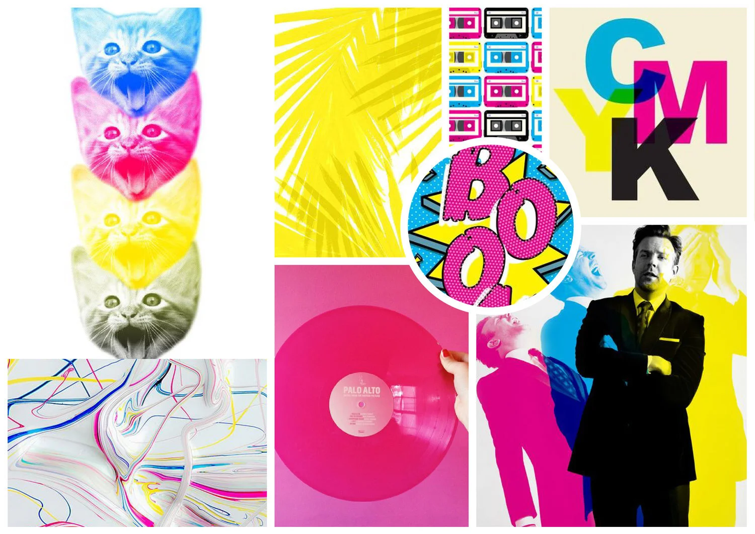
The essentials: Must have marketing assets for new businesses  |  Hue & Tone Creative


2. Brand Identity

Now it’s time to develop the look and feel of your brand. This is where you’ll work with a designer to create a logo and everything that goes with it. You’ll want to come out of this stage with:

  • Primary logo: as well as any alternative logo formats you might need for packaging, online use, or small sizes

  • Logo usage guidelines: what is the smallest size your primary logo should be printed? What do you do when you can only print your color in one logo? Make sure your designer provides you with guidelines for every situation you might encounter.

  • Font palette: what fonts are you going to use on print, web, and in Microsoft Office?

  • Color Palette: what primary and secondary colors will complement your look, logo ad tone?

  • Graphic elements: anything needed to complete your print and web designs.

  • Sample usage: make sure your designer provides examples of how all these elements will come together to create your signature look.


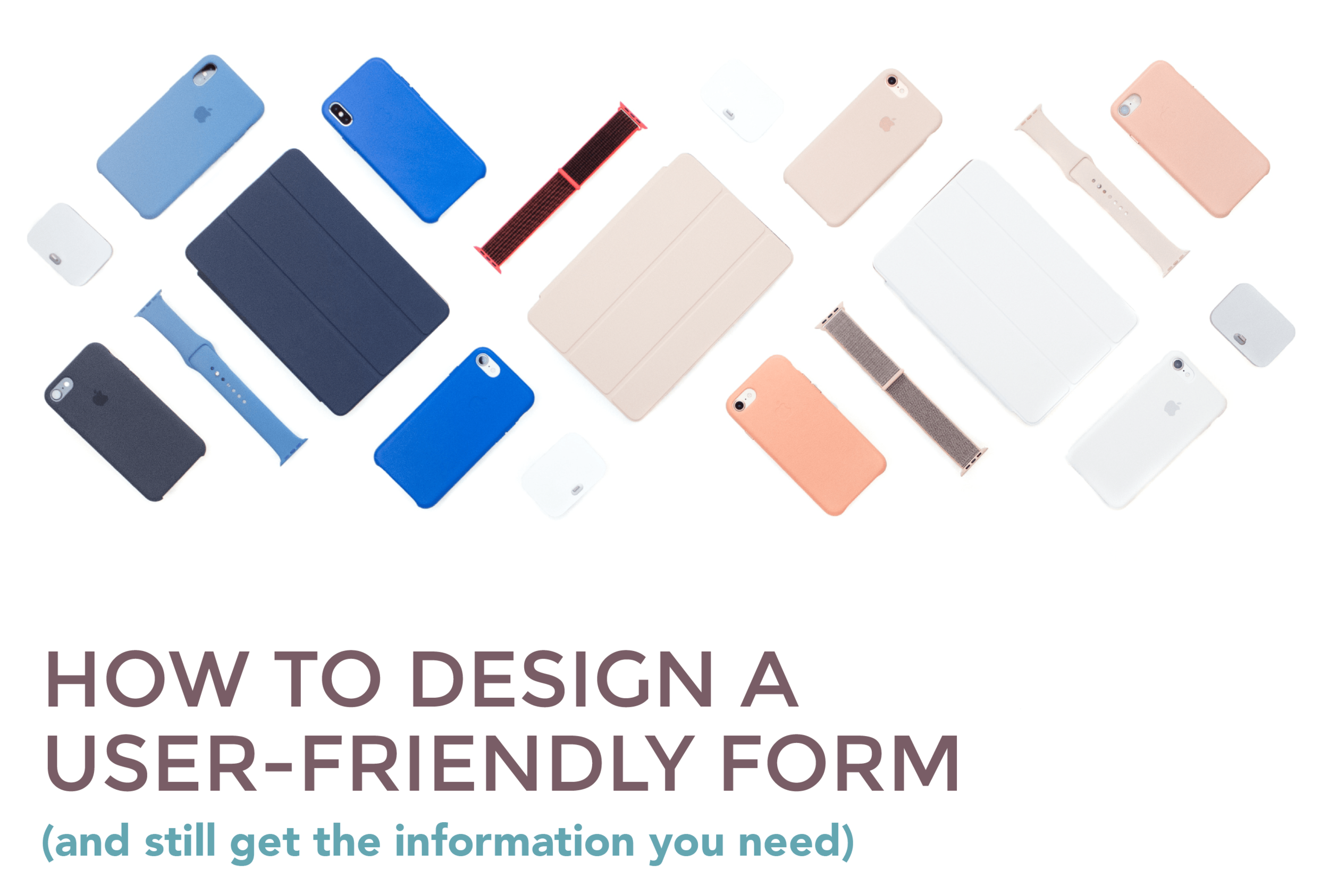
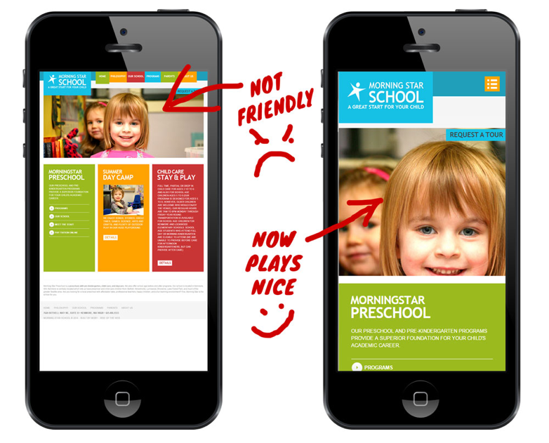
3. Build a winning website

We talk a lot about the importance of a well designed and properly optimized website, so we won’t waste a lot of space here talking through why you need one. Instead, we’ll run through a few key considerations when it comes to building it:

  • Get to the point: you’ve got a limited time to capture visitors’ attention, so get your message across clearly and effectively on every page.

  • Contemporary: outdated websites make your brand look instantly aged and untrustworthy. Take the time to get your website looking slick, and outsource it to a specialist if you need to.

  • Architecture: once you start adding menus and pages, they can be a right pain to change down the line. To make sure you’ve got a great user experience from the outset, map out your site’s architecture before you start building it.

  • Search engine optimization (SEO): with a reputation for being the cheapest marketing method around, it’s crucial that you build and write your website with SEO at the forefront of your mind.

  • Contact: make your call to actions and contact information crystal clear.

  • Host: choose a content management system that’s reliable. Personally, we would recommend Squarespace – here’s why.

  • Domain: be sure to match your domain name to your business’ name.
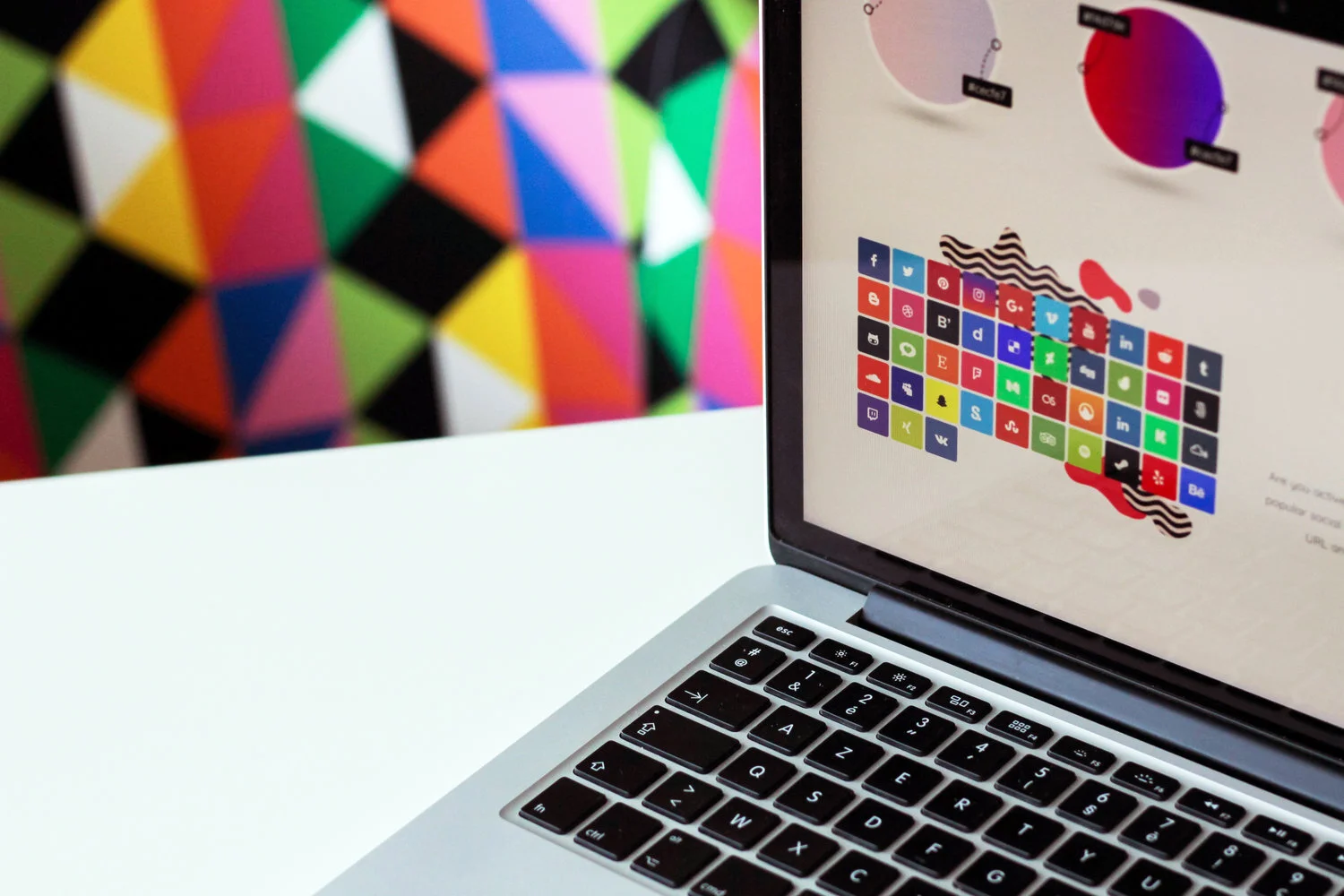
4. Social media

Did you know, 70% of the US population have at least one social media profile? That’s a whole lot of potential customers to capture.

We suggest selecting just 2-3 platforms to get started on – especially if you’re handling your social media in house. To effectively leverage social media, there’s a few things you’ll need to do:

  • Only use high resolution profile and background images (pixilated pictures make you look untrustworthy and out of touch)

  • Write a succinct and enticing bio

  • Link back to your website

  • Include contact details

  • Keep an eye on your inbox/direct messages

  • Commit to regularly posting

  • Reply to those who engage with you

  • Interact with relevant people and/or profiles

Maintaining social media should be a daily job – if it’s not, you’re not doing it right. We suggest creating a content calendar to stay organized. And, make sure you have a set of templates on hand to save time when you need to create a quick Facebook graphic. 

5. Blogs

Investing in content marketing comes with endless benefits. A well maintained blog boosts your SEO efforts, helps you build backlinks and brand awareness, generates leads, adds brand value, and ups engagement.

Just remember the golden rule: the content you’re publishing must be quality. Churning out subpar articles won’t get you far -- if it even gets you anywhere. Here are a few general post types to get you going:

  • Videos

  • Infographics

  • Webinars

  • Tutorials

  • Whitepapers

  • Presentations

  • ‘How to’ guides

  • Buzzfeed-style listicles

With good content, you need good images. If you’re not in the position to fork out money for sites like iStock and Shutterstock, consider Unsplash, Pixabay and Pexels for good, free alternatives. 
 

The essentials: Must have marketing assets for new businesses  |  Hue & Tone Creative

6. Templates

Next up is templates. The extent of this list will vary depending on the nature of your business, but below is an idea of the types of templates we suggest you think about:

  • Email campaigns - sales, welcome, thank you, updates, or otherwise

  • Newsletters

  • Direct mail

  • Job descriptions

  • Email signatures

  • Powerpoint presentations

  • Social media graphics

  • Letterhead/memos

Your logo should feature on each and every one of them -- which is why it’s important to have a logo that sits well in different settings, and your brand’s look, feel and tone should be encapsulated too. Remember though, your templates don’t need to be uniform to be consistent.

7. Print collateral

We’ve been carrying on about online a lot -- and rightly so! -- but don’t forget about good old offline advertising. Depending on your industry, things like physical brochures and business cards can be an important asset.

If you’re investing in printed materials, remember to:

  • Do your research: spending a bit of time selecting a quality printer.

  • Don’t compromise: poor quality paper reflects badly on your business.

  • Don’t rush: if there’s a proofreading mistake that’s your fault there’s no going back -- without throwing money down the drain.

  • Keep it consistent: print materials still needs to mirror your online presence.

  • Think of the bigger picture: think about how you can make print materials evergreen so that you don’t have to reprint regularly. Consider what really needs a date and what could go without one.

  • Get the right amount of copies: you can easily order more, so don’t go print crazy and order 1000s of copies unless you’re absolutely certain they’ll be used. But, you usually get a discount the more you order, so don’t be afraid to print some extras.


Need a little help?

Getting all your marketing assets together can feel really daunting -- I know, I’ve been there! But here at Hue & Tone Creative, there’s a lot we can help you with. From logo design and letterhead to web design and social media management, get in touch to see how we can support your business’ success.

How to give honest feedback without frustrating your designer

You’ve chosen your designer, you’ve briefed them on your needs, reached an agreement on terms, and you’re eager to see what they’ve come up! Then, their name lands in your inbox along with the much anticipated attachments – but then you click to find that...they’re not quite what you were after. Now what?

If you do it right, giving feedback won’t be perceived as negative. In fact, it’s an important part of the design process – and it’s something that your designer is anticipating. But giving feedback in an unproductive way can lead to an overall unproductive relationship between you and the creative you hired. 

As designers, we’re here to let you know that we’re used to feedback – we even enjoy it because it helps us do our job better. But, it can be frustrating when clients are constantly giving you negative feedback and not giving you the information you need to do your job properly. 

It’s easy for miscommunications to happen – especially if you’ve never worked with a designer before. But with just a few small tweaks to your approach we believe you can communicate with your designer better than ever – and land on a superb final product! 
 

How to give honest feedback to your designer  |  Hue & Tone Creative


Step back and ask questions

Before mindlessly shooting off negative feedback, take some time to marinate on what they sent you. Let them know you received the proofs and are putting together some notes. Then, go through the examples and guidelines you provided your designer. What varies from what you asked for? What’s in line with what you asked for (even if it’s not your favorite)? 

Put together a list of questions to better understand where your designer is coming from. The answers to your questions may change your mind on a certain concept or help you distinguish the direction you want to go. 

Creating an open dialogue will go a long way in helping you both understand each other’s point of view. 


Be professional, calm and controlled

We know it can be hard to stay calm when you feel like a project isn’t going right – but like any other professional situation it’s important to stay calm. Keep your communication -- whether it’s over the phone or on email – calm and clear is key. Be sure to politely explain why what they’ve produced isn’t quite up your alley.

Just saying “I don’t like it,” “it’s not what I asked for,” or “it’s not for me” isn’t constructive, and it doesn’t give your designer a fair chance to fix it. So, be as specific as you can so that they can understand what does and doesn’t work. That way they’ll be able to take your feedback and turn it into a stronger second draft. 

If you can, show them examples of the kind of thing you dolike from other organizations, so that they have a solid idea of the kind of design they need to be working toward. 


Explaining the why

When you’re highlighting elements of a project you’re not quite keen on, explaining the why is super important. Whether it’s because it goes against the guidelines you sent them, it’s too similar to what you’ve done in the past (and found to be ineffective), or it aligns too closely with one of your major competitors, give them a bit of context to help them understand the thinking behind your rationale.

Keep in mind, your designer has probably spent a lot of time on what you’re seeing – if you don’t like it, there was clearly a miscommunication – and it’s on both of you to fix it!


Keep it in perspective

Perfection takes time. Just because they didn’t deliver exactly what you wanted the first time around, don’t hold it against them, patronize, or start micro-managing them. You hired a designer because you don’t know how to do it yourself – so stand back and let them do their work. Keep in mind they are an expert at what they do – just because you don’t like something doesn’t mean it’s not quality work. 

Their job is to bring your vision to life. Your job is to equip them with the information they need to understand your vision.


Put your personal preference to one side

When you’re critiquing their work, remember that design is often a personal preference. Be sure to separate your personal taste from your brand image. A designer might be able to see the bigger picture in a way you can’t – so just because it doesn’t connect with you doesn’t mean it won’t connect with your target demographic. The taste of your audience is probably going to be different than yours, so be sure to talk through your designer’s rationale before shooting down a concept – they might know something you don’t.


Balance negatives with positives

It’s the old compliment sandwich trick. And this tip isn’t just to make them feel better! As we touched on earlier, the positives will help them really get a feel for what you dolike so that they can keep developing quality concepts. 

If there really aren’t any positives, you can still be complimentary about their work, but just be clear that it’s not right for your brand or this particular project. If this is the case, be crystal clear you’d like to see a totally new direction – don’t try to sugar coat it too much or they probably won’t realize that what they showed you is a complete wash. 


Keep in mind what you agreed too 

Be conscientious of when you’re asking to go above and beyond the terms of your contract. If you agreed to three rounds of revisions, you may need to pay an additional fee to go beyond that. 

Both parties of this contract are on equal footing – it’s not an employee/employer relationship. 

You can’t expect free revisions just because you don’t like something. If they’ve met the terms of the contract and you still don’t have something you like you may need to renegotiate. Keep in mind the contract is in place to protect both parties. 

Checking in on time and expectations can go a long way in demonstrating that you respect a designer’s time. It’s a great way to show you value their work, even if you haven’t come to a final product yet. 


Remember...

Rome wasn’t built in a day -- if you want a rushed job, give a rushed timeframe. It’s important you give your designer time to go back to the drawing board and really take everything in you’ve said so that you can keep working toward a high quality final product. 


Hue & Tone Creative: Your creative team

Let us help you get your project designed right! We're ready to communicate with you on your marketing needs -- whether they're big or small. To take a look at what we've done in the past, be sure to check out our design portfolio. Don't see the type of samples you're looking for? Get in touch, we can email you additional work samples!

Google Speed Update: What you need to know
Your website shouldn't leave people staring at their watch.

Your website shouldn't leave people staring at their watch.

It’s no secret that speed is central to user experience -- and slow load times translate to a higher bounce rate and less traffic. Think about it: How long did you wait around last time a page wasn’t loading? In addition to annoying users, a delayed page speed means users will read less once the page does load.

With all that in mind, it comes as no surprise that in June 2018 page speed will officially become a ranking factor in mobile search results. The algorithm update was announced in January and has been named the ‘Speed Update’.


Wait a second, isn’t speed already a factor? 

Why, yes, it’s true that page speed has been a ranking factor since 2009 – but, it’s never been an official factor for mobile ranking speed. According to a blog post by Google on the topic: “Although speed has been used in ranking for some time, that signal was focused on desktop searches...Starting in July 2018, page speed will be a ranking factor for mobile searches.”


What Google has said

If you’re already in a panic, take a deep breathe, because Google has said the new algorithm will “only affect pages that deliver the slowest experience to users, and it will only affect a small percentage of queries.” (source)

Google has also repeatedly stated that the intent behind a user’s query will still be the strong ranking factor -- so if a website has a slow page, but the content of that page is relevant and high in quality, it may still rank highly regardless.

But, how fast are we talking? In a Google Webmaster video, Maile Ohye, states that “2 seconds is the threshold for e-commerce website acceptability.At Google, we aim for under a half second.”

It’s no secret that over the last two years Google has been implementing a mobile first strategy that prioritizes mobile-optimized sites. The Speed Update just takes this initiative a step further by prioritizing speed, which is key to mobile responsiveness. 


What you need to do

In preparation for the Speed Update, Google has recommended a number of resources to help gauge where your website’s performance is at.

1. Chrome User Experience ReportChrome User Experience will give you intel on how real-world Chrome users experience popular destinations on the web, and the factors that shape and contribute to their final user experience.

2. LighthouseLighthouse is an open-source, automated tool for improving the quality of web pages. You can run it against any web page, public or requiring authentication. It has audits for performance, accessibility, progressive web apps, and more.

With each audit (which only takes between 60 to 90 seconds), you’ll receive a document detailing what’s important to fix, and how you can fix it. Suggestions could range to anything from oversized and unoptimized images, to unused CSS rules and render-blocking scripts.

3. PageSpeed InsightsAnother one of Google’s powerful speed tools, PageSpeed Insights will analyze your page and present you with a page speed rating, optimization score (out of 100), page load distributions, page stats and optimization suggestions. 

The recommendations might range from things like prioritizing visible content and leveraging browser cashing, to eliminating render-blocking Javascript and CSS in the above-the-fold content. 


What's next

Once you've made all the updates possible you'll need to monitor your search rankings. Keep in mind that because the update is entirely algorithmic, there’s no tool that will just simply show you which pages have been dinged – after you make all the adjustments you can to increase page speed, you’ll have to keep an eye on your mobile rankings to make sure your site isn’t taking a hit.

Looking for even more resources to get your page up to speed? We’ll leave you with this list to check out: 


Hue & Tone Creative

Do all these terms look like gibberish to you? Bring in an expert -- let us help you get your web presence up to speed (literally). We can help with everything from branding and email campaigns to social media and your web presence.

10 ways to make B2B blogs more enjoyable

When it comes to business to business (B2B) marketing, blogging can be a valuable tool. Your blog is a great place to showcase your knowledge and dive in-depth on your products, in a way that you wouldn’t able to in a quick tweet or status update. 

The downside is that B2B marketing has a reputation for being boring – and, unfortunately, in our experience a lot of the content we see lives up to that expectation. There’s a common misconception that blogs targeted towards other businesses need to have a straightforward or corporate feel. While we don’t believe you should compromise your professionalism, we believe it’s possible to share your knowledge without putting everyone to sleep. 

If you’re looking to give your business marketing a more approachable feel, we suggest you check out these tips to keep your marketing focused, but fun, for the reader. We believe that B2B marketing done right might even be what helps set you apart from a competitor! 


10 Ways to Make B2B Blogs More Enjoyable  |  Hue & Tone Creative


1.  Talk like a human

No matter how interested a potential customer is in your topic, talking like a robot is going to lead to people clicking off your website. Type like you talk, keep it simple, and don’t be afraid to push the conventional boundaries -- i.e. don’t let that red squiggly line stop you from experimenting with your words!

One caveat? Just make sure your meaning and professionalism aren’t lost in too much slang. If you wouldn’t say something in the workplace, don’t type it on the blog. 


2.  Don’t forget the fun factor

Business owners, directors, and managers still have a sense of humor, so don’t sap all the fun out of your blogs. Adding fun anecdotes or playful pictures into your blogs can help them feel more relatable. 


3.  Don’t baffle them with jargon

Getting lost in the jargon of a blog is never productive. Ever. Even though you’re addressing to other experts in your field, you’ll want to talk in simple terms and only use jargon when it’s needed. You never want to assume every reader knows what you do, so be sure to explain terms on the first instance you use them.


4.  Don’t publish a wall of text

Stay away from clunky chunks of text -- they’re not enjoyable to look at or read. Use subheadings, pull quotes, and succinct paragraphs to make your text easier to browse. Even if you’re publishing a whitepaper, there’s no reason not to give your readers a pleasant and intuitive experience. 


5.  Mix up your mediums

Remember, blogs don’t always have to be written like an article. Try out creating an infographic or recording a video blog. You can also consider publishing presentations or papers – it’s content you’ve already created, and chances are if it was worth presenting about it’s a relevant topic. Don’t reinvent the wheel if you don’t have to, just share the work you’ve already done! 


6.  Use images creatively

In need of some fresh photos? We’ve complied a list of FREE stock photo sites

If your blog is long, add a few images in along the way so that it’s not too text heavy. Be creative with your choice of images, and try to refrain from using the same handful of stock photos repeatedly. 


7.  Keep it concise

Business owners are busy people, so the last thing they want is to have to read through three paragraphs of mumbo jumbo before actually getting to the relevant information. Get to the point early on and it’ll be a more enjoyable read all round.


8.  Use examples

Examples can be a great way to show off how you can help. Using real life scenarios are often more relatable to potential customers and give you a chance to show off your results and solutions. So, instead of explaining, start showing what you can do!


9. Sentence structures

Writing is a craft. Not everyone’s good at it -- nor are they expected to be. But when you’ve got a good writer on board, they can make even dullest topics enjoyable. Something as simple as mixing up sentence structures can quickly ramp up the readability-factor.


10.  Reader participation

Whether it’s adding a quick poll half way through a post or inviting readers to leave a comment at the end, getting your audience involved with your blog is another way to get them more invested in the content. 


Hue & Tone: Your partner in B2B Content Creation 

Need a helping hand to elevate your blogs to the next level? Here at Hue & Tone Creative, we’ve got you covered from the right words right to the perfect picture. Contact us today to learn more about our design and marketing services.

Is print dead: In the age of digital, do you still need business cards and brochures?

The ‘is print dead?’ debate has been going on for, well, what seems like ages. Print has been on the decline for decades, but it’s far from completely irrelevant. While demand for things like hardcopy newspapers and print advertising has been decreasing, we believe there’s still a place for print in your marketing strategy. 

The power of digital marketing

Back in the day when print was everyone’s primary marketing method, there simply weren’t other effective alternatives available. As technology has evolved, so has the way we advertise. 

Digital advertising empowers advertisers with advanced analytics, sophisticated targeting options and greater monitoring capabilities. It’s also an incredibly cost effective marketing tool. With a cheaper buy-in cost than traditional advertising, digital advertising is a great option for small businesses, new businesses, and startups. Quick results and quick set-up also make it easy for non-marketing professionals to control.  

Together, all these factors make digital marketing an attractive option – but that doesn’t mean it’s without drawbacks. 


Concerns over digital advertising – and the staying power of print

According to research conducted by FedEx Office, 9 in 10 consumers believe there will always be a place for print collateral, and 85% said they’re more likely to shop with a business if it has professional printed materials like flyers, banners and business cards. (And, it wasn’t just baby boomers that FedEx Office surveyed – similar results were seen among millennial survey responses as well.) 

With so many businesses fighting for attention online, it’s easy for consumers to feel bombarded -- and many are starting to push back against the monopoly our digital devices have on our time and attention. Things like digital detoxes, technology free wedding ceremonies, and giving up Facebook for Lent have all become ideas that are part of the collective dialogue on technology’s place in our day-to-day lives.  

Additionally, concerns over data privacy on Facebook and Google are fueling a push for greater transparency in digital advertising

With all that in mind, we don’t see digital advertising as the end all be all of modern marketing. Digital advertising is here to stay for the foreseeable future, but that doesn’t mean it’s only option in the game. Diversifying your marketing plan with both traditional and digital advertising can give you a greater reach and help insulate you against future trends.  


How to make print work for you

Don’t limit your print pieces to traditional cards and brochures – think about what kind of swag you can give to people! Things like koozies, pens, and can openers can provide a repeated reminder of your brand to potential customers.

Consider this: With digital becoming the norm, is print becoming a unique way to grab people’s attention? When working on your marketing plan, think about how you might leverage print as a way to disrupt the new norm of digital. When strategically leveraged, print can provides a great opportunity to stand out from the crowd and target your market in a less saturated environment -- giving you a greater chance of getting noticed.

In addition to the element of unexpectedness, print is a tangible leave behind. If everything you do is online, you’re relying solely on the consumer remembering your brand oryou’ll be spending more to actively and repeatedly display your ads on their mobile/desktop device. Print pieces like business cards and brochures are a great leave behind for people to hang on to. 


Putting print into context

Looking for an easy way to make combine your digital + print efforts? Make sure your social media icons are on your business cards. You’ll be connecting people with your online presence through a more traditional marketing method.

Spend around print advertising might be declining, but when you look at the big picture, is print really dead? We don’t think so – and we think the facts back us up.  

While print’s role in your marketing plan has probably changed, it still has a place. A well thought out campaign will be able to leverage print and social media in tandem to stretch advertising dollars to reach the widest (and most qualified) audience possible. 

Don’t let digital distract you from missing out on a valuable marketing opportunity. Instead of thinking “print vs. digital” we suggest thinking about how all the mediums work together – and how print advertising can support your digital efforts (and vice versa).


Hue & Tone Creative: Print and social advertising in Greensboro, NC

Whether you're looking to create a new digital campaign -- or looking something a bit more old school -- we're here to help. Experts in all things digital and all things print, we'll get every element of your marketing plan up to speed. Shoot us an email and let's discuss how we might be able to partner together.

13 easy to implement SEO tips
14 easy to implement SEO tips  |  Hue & Tone Creative

In need of more in-depth information? Check out our articles on finding relevant keywords, discovering new keywords, and essential do’s and don’ts of SEO.

Implementing proper Search Engine Optimization (SEO) tactics isn’t a quick fix marketing solution – but when done properly it is worth the long-term investment. If you’re new to the world of SEO and are in need of a few quick tips to get your feet off the ground, then you’re in the right place -- because we’ve got 13 easy to implement tips for you.

  1. Make sure the meta descriptions for your images are enticing. That way, when people do come across your image in search results they’ll be more inclined to click through – it’s a great place to use your page’s keywords too.

  2. Keep internal linking front of mind when you’re creating new pages. Linking to your own content will help define your site’s architecture and encourage visitors to explore other pages of your site.

  3. Don’t underestimate the power of title tags. Title tags are the HTML title element used to briefly and accurately describes the topic and theme of an online document. They’re rumored to be the most important on-page SEO element (behind the content itself), so make sure they’re reflective of the content, catchy, and inclusive of relevant keywords.

  4. Make sure your content is fresh. Google is always crawling for new content and to avoid being left behind you need to be constantly updating your site. A blog is a simple way to do this – but can backfire if you set one up and never update it. Minimum, we suggest updating your blog a few times a month. Ideally, you’ll be updating it a few times a week.

  5. Keep an eye out for broken links. Broken links can stop search engine spiders from crawling your site, which can impede your SEO efforts. Use an online tool like Screaming Frog to find broken links and fix them.

  6. Optimize your page speed. In July of 2018, page speed will become a ranking factor for mobile search. To make sure your users aren’t left hanging around, let PageSpeed Insights’ report help you iron out any issues.

  7. Stay concise to reach featured snippet status. A featured snippet is a summary of an answer to a user's query, which is displayed on top of Google search results. It's extracted from a webpage and includes the page's title and URL. Increase your odds of having a featured snippet by creating great content that answers specific questions.

  8. Optimize your images. Make sure your file name, caption, ALT text and title text all include relevant keywords. While you’re at it, make sure the file size isn’t too big either -- this can slow down your page load speed.

  9. Make sure your XML sitemap is up-to-date. An up-to-date site map means search engines can find your pages easier. Remember, Google ranks your pages, not your website.

  10. Research your keywords before you start adding pages. Proper research will ensure you get the most out of your content and rank for the right terms.

  11. Make sure your content is high quality. Google can easily recognize quality content, so don’t think you’ll be able to fool the algorithm by posting a high quantity of subpar articles. To rank well, you’ll want to write content that is conversational, informative, focused, clear, and easy to digest (tables and numbered lists help with this). And, don’t forget to link to reliable outbound sites.

  12. Utilize a clear URL structure. Utilizing an SEO-friendly URL structure will help with the indexation process of your website. Your URL should be structured like this: http://domainname.com/subdirectory/filename.

  13. Diversify your keyword strategy. Don’t just focus all your efforts on basickeywords -- target longtail keywords too. Although long-tail keywords are usually searched for less often than their shorter counterparts, they tend to bring in a high conversion rate because they are so specific.


Hue & Tone: Your Greensboro Marketing Partner

Don't get stuck trying to figure out your entire marketing strategy yourself. Focus on what you do best, and let us do what we do best. Whether you're a new business or just in need of some fresh ideas, we can help you plan your marketing strategy from social media and SEO to print and radio advertising. Give us a call today to get started.

How to design a user-friendly form (and still get the information you need)
How to design a user-friendly form (and still get the information you need)  |  Hue & Tone Creative

Forms are essential for gathering user’s information in a smart and efficient way. Getting them wrong means a poor user experience and abandoned leads – which translates to missed opportunities and lost revenue. 

Because the formatting and design of your forms has a direct impact on how well they convert, we’ve collated some top tips to make sure your forms are performing as effectively as possible.  


1.  Form length: Always question the why

How long should a good form be? The more fields you give a user to fill out, the less likely someone will be to complete it. However, the more information a lead is willing to give, the more likely they are to be a qualified lead. Like most questions of quality versus quantity, the key is to strike a balance. 

For every question you have in your form, take a moment and really ask yourself why do I need this detail at this stage of the user’s journey? If some of the information can wait until later on in the buyer’s journey, consider leaving it out in an effort to streamline your form.


2.  Page placement

When adding a form to your website, it’s important to place the form near the top of the page. Visitors shouldn’t have to scroll to get to your form – and if they do, chances are they won’t fill the form out. 


3. Tailor the keyboard

In this day and age all forms need to be mobile responsive. But, did you know you can also take user experience a step further by customizing keyboard layouts? 

This one’s only for mobile or tablet forms, but we thought it deserved its own shout out. To make the user’s life eveneasier, you can code your site so that the keyboard changes each time a user clicks on a new field. For example, the keyboard will default to digits when they’re filling out their phone number. 

For more on how to do that, check out this Treehouse article


4.  Time saving tactics

Users are accustomed to a quick and easy sign-up process – nothing should slow them down from filling out the form you provided. To make sure their experience is as streamlined as possible, make sure you’re abiding by these tips: 

  • If the user has already provided you with information, make sure you’re pre-populating any fields you can.

  • Instead of waiting until users click “submit,” make sure to highlight errors or overlooked fields as soon as users click on to the next field. Boxes with incorrect information should be highlighted in red straight away – that way users won’t be stuck scrolling through a form trying to figure out what needs to be fixed.

  • If what you’re asking might be unclear, be sure to add descriptive information or a tip call out near what you’re asking. If a user gets stuck, you can be sure they’ll abandon the form.

  • If there’s no way around using a lengthy form, give users an option to save their information so that they can return and complete it at a later date. And, if this is the case, be sure to automate email reminders that will nudge them to come back and complete the form.


5. Submit button

Once the form is filled out, the last major factor for form success is the “submit” button. While labeling this button “submit” seems like an obvious choice, it may not be the best choice. 

According to Hubspot, landing pages with buttons labeled “Submit” actually have lower conversion rates than those that use other wording. Consider buttons that relate back to your initial offer, or sound less committal than "Submit." Try out things like: "Go," "Download your free e-book," or "Get Started." 


Further reading:  

Looking for a more resources on how to create effective forms and successfully convert leads? We’ll leave you with these three suggestions for further reading: 


Hue & Tone Creative: Greensboro Web, Design, and Social

No matter what your marketing needs, we've got your back. Take a look at all of the services we offer and then get in touch -- we'll work with you to set up a custom marketing solution that addresses all your needs.

How to curate a case study that connects

When researching a potential purchase or prospective partner organization, 78% of business to business (B2B) shoppers report seeking out case studies during their research. 

It’s hardly surprising. When you go shopping for a pair of pants online, there’s usually buyer reviews and customer snapshots available to help aide you in your purchasing decision. You can see if things are true to fit and what percent of verified customers would buy the item again. Case studies are like the business equivalent of that – they showcase outcomes of your work and convey your customer satisfaction. 

You can scream about how brilliant your brand is until you’re blue in the face, but at the end of the day, it’s the words of others that validate what you’re saying.

Keeping that starting stat of 78% in mind, think about all the potential new business you might be able to capture -- case studies can help seal the deal on referral business, as well as help pull new folks in off the street. 

How to curate a case study that connects  |  Hue & Tone Creative

Once you’ve identified a few past clients or projects you would like to highlight, it’s time to get the ball rolling. To help jumpstart your interview with your past customers we’ve put together a list of questions you can ask. These will help facilitate a useful conversation that should give you a few prime quotes to include in your case study:


Getting client feedback for a case study

1. How has our product/service helped your business?

Until businesses buy from you and experience your business for themselves, they’ll never truly know how much you can help them. So, let other businesses give them an insight into how you made their life easier. Chances are they’ll be able to see how your offerings would fit into their life as well. 


2. What was the tipping point to buying our product/service?

It’s easy to get stuck in a rut. It’s not uncommon for businesses to do things a certain way because that’s “how they’ve always done it.” Long term, this can mean getting stuck in a serious rut – sometimes without evening realizing it. 

By asking past customers what made them choose you you’ll be able to get a better idea of how to sell to new customers. Pay close attention to the pain points that customers site – what problem did you fix for them? Chances are, this is the same pain point a new potential client might have. 


3. Which part(s) of our product/service do you find most valuable?

Get your clients to brag for you! It might even give you a new idea or angle to target in your marketing.


4. Would you recommend us to other businesses? And if so, why?

The all-important seal of approval. In a world where you’re constantly fighting for clients against your competition, shout about why other businesses opted for you over them.


5. If you had to describe our business in one sentence, what would it be?

Adding in a nice little one liner is a great way to get a short and snappy overview of your business. While questions one through four are all great questions, sometimes you just need something a little less lengthy.

If you’re lucky enough to get clients recommending you on camera, this one’s great for creating a to-the-point video compilation that brings the words of many together.


6. Do you think there’s any way we could improve our product/service?

This one’s not for your actual case study, but why not kill two birds with one stone and do a bit of market research while you’re at it? Use this question to find out where your gaps are, see if there are any trends emerging, and tweak your product or service accordingly.


What else to include in your case study

Now that you’ve got a handful of client testimonials, it’s time to put together your actual case study. There’s a few things you should include to give your client an accurate idea of the scope and effectiveness of your work:

  • Give a little background around the client. If you need to keep it anonymous, no worries, just give an idea of the size of the company, industry, and a few of their products.

  • Outline the goals they were looking to accomplish. What was your client or customer looking for when they came to you? Did you help them tailor their goals? What goals could you help them with – and what services should people go elsewhere for?

  • Highlight the process, products, and services you used when working toward the client’s goal. This is your opportunity to emphasize the services you offer and show what sets you apart from the competition. Establish yourself as a subject expert by showing off what you know. You don’t have to give away your industry secrets, but showing you have a firm grasp on your field will help you build trust with a potential customer.

  • Emphasize the outcomes. In conjunction with the client quotes you gathered, you’ll want to use hard numbers to prove your success. Personal relationships and client satisfaction are important – but when it comes to business, employees want to be able to show their higher-ups that you’ll be able to deliver on what you said. Facts and figures will help you drive home your pitch.


Distribute your new case studies

Now, it’s time to start capturing potential clients. If you’re taking the time to curate case studies, you’ll want to make sure you’re getting the most out of them. Once you’ve got a bank of case studies, you’re armed to hit every single marketing touchpoint.

You can spread the word about your case studies just about anywhere: 

  • Test out pop-ups on your website with a case study download

  • Create tailored landing pages with different case studies that appeal to different buyer personas

  • Share them on social media

  • Distribute them in your email newsletter

  • Create videos or motion graphics using the information and quotes

  • Still utilize a print newsletter? Share your case studies there!

  • Arm your sales team with case studies to help them close the deal

  • Link a favorite case study in your email signature

  • Highlight them in PowerPoint presentations or lunch n’ learns

  • Use them as a training tool for new employees

Whether it’s splattering an excerpt on social media or including a banner in your emails, don’t hide them away. Use your case studies to support your messages, and take every opportunity to get your potential clients to read them! 


Hue & Tone Creative: Marketing in Greensboro, NC

Completely stumped when it comes to your B2B marketing? Case studies need a design overhaul? Or maybe you just need help distributing them? We can help with every step on the process. Want to see what we've done for our other clients? Take a look at our portfolio.

6 ingredients for a successful social media post
6 ingredients for a successful social media post  |  Hue & Tone Creative

Creating a social media post that connects with your audience can feel like a tough equation to crack. It’s not about creating a viral post or achieving international attention, it’s about getting a return on the time you invest in social media. 

Instead of constantly guessing what's going to bring you success, we’ve pulled together six key ingredients to help you build a strong social media post and get your audience socializing with you! 


1.  Know when to stop

Whatever platform you’re publishing on, keep your social media posts short and snappy. You don’t have an infinite amount of time to draw peoples’ attention, so curate something concise and eye catching. 

Every once in a while you can publish a meatier post -- but for the most part it’s important to bear in mind the medium you’re writing for. Social media is all about quick, consumable content, so try to keep it quick as often as you can.


2. Take the test

When you’re putting your post together, put yourself in your audience’s shoes and ask yourself “would I really stop scrolling for this?” - and answer honestly!

It’s easy to slip into the habit of posting every piece of content you’ve got out on social, but if it doesn’t sit right, don’t hit send for the sake of posting. Incorporate social media into your content strategy, and consider producing pieces for the sole purpose of social engagement.


3. Keep it clean

It sounds super simple, but you’d be surprised by how many businesses fill their posts with a line of clunky URL. Keep your posts nice and clean by shortening your links to something succinct and tidy - a tool like bit.lywill do the trick.


4. Don’t hide away

Make the most of hashtags to increase your post’s exposure and open yourself up to new audiences. While you’re at it, mention relevantpages or people to benefit from their bandwidth too.

As with everything in life though, remember, it’s all about balance. Going over the top with hashtags or tagging can easily start looking spammy.


5. Impactful imagery

Your words are one half of the battle. Your images are the other. People can sniff overly staged imagery from a mile off, so try to mix your pictures up a bit to keep your feeds looking human. 

Play around with styles to see what gets most traction. Cartoon figures or real-life people? Plain images or a text overlay? Something subjective or objective? If it’s feasible, the odd video would be a great addition to experiment with as well.


6. Ask away

People aren’t mind readers. If you want to spark a discussion, make it clear that you’re asking a question, looking for feedback, or welcoming their thoughts. 

If you wanted to be slightly sneaky, you could always ask a colleague to get the ball rolling by posting the first comment...
 

So, there are our six tips to start your journey to social media success – now, go get posting!


SOCIAL MEDIA MANAGEMENT IN GREENSBORO, NC

Does posting on social media slip your mind on a daily basis? Or, maybe you're overcome with panic every time you're about to hit "post"? Well, we're ready to get social on your behalf. At Hue & Tone Creative, social media is a part of our daily routine. Let us take social media off your to do list -- we'll handle everything from the planning to the posting.

5 signs you need help with your content
5 signs you need help with your content  |  Hue & Tone Creative

Your content is at the core of everything you do. Every part of your business relies on strongly written content – everything from your website and welcome emails to business cards and online ads. 

But how do you know if your content is connecting with potential and future customers? We’ve put together a list of 5 key signs that you need to revamp your content or bring in some outside help to revive it. 


1.  Your traffic isn’t converting

Plenty of people are landing on your website, but your conversion rates are way below what you’d expect them to be. There are a whole load of factors that could be contributing to this, but content tends to be one of them – along with page design, graphics, and mobile compatibility. 

Across industries, the average landing page conversion rate was 2.35%, yet the top 25% are converting at 5.31% or higher. Ideally, you want to break into the top 10% — these are the landing pages with conversion rates of 11.45% or higher. 

Ask yourself -- does your content do your product or service justice? Does it clearly explain what you’re about? Does it speak to your audience in a way they want to be spoken to? Is it accurate and engaging? Does it give people a reason to choose you over your competitors? If you just answered with a stream of no’s, there’s plenty of room for improvement.

If you’re not sure how your content is being received, consider sending out a survey or asking a few key customers for their thoughts. Sometimes an outside perspective is needed!


2.  Your website it stale

When’s the last time you added a piece of content to your site? So long ago you can’t remember? Well, therein lies your problem.

Google likes to see fresh content, and places greater value on up-to-date, newsworthy articles. In a nutshell, if you don’t have fresh content, this means you could be impeding your efforts to gain organic traffic. A simple way to overcome this is by adding a blog section (and actually posting on it!) which will help improve your SEO (find out more about that here).

In addition to a blog, consider setting a calendar reminder that goes off every 6 months to prompt you to review and update the content on your static web pages.


3.  Social media struggles

If you’re constantly grasping for ideas of what to post on social media, it’s probably because you don’t have anything to shout about, and the reason you don’t have anything to shout about is probably because you haven’t published anything new – or, worse, you’re out of touch with your audience.

Regular, relevant content will bring your social media streams to life, give you something to talk about, get your audience engaging with you, and drive traffic to your website.


4.  People aren’t talking about you

If you want people to talk about you, you need to give them something to talk about. Producing great content will get people sharing it on social media, encourage other websites to link to your material, and can help get your audience engaged in new ways. 

The end result? Brand awareness, word of mouth advertising, more inbound links (which will benefit your SEO efforts) and inevitably more leads.


5.  No internal linking opportunities

Internal linking aids your website’s navigation, help you define the architecture and hierarchy of your site, and plays a part in building your website authority. 

When it comes down to it, the more relevant content you have, the more opportunities you have to add internal links. For example, we sent you to this article about SEO earlier in our blog post – but because we have so much relevant content we also could have linked you to this article or this article… or even this one! See? Relevant content builds linking opportunities. 


When it comes down to it, having a bank of relevant content not only makes your marketing more effective – it also makes things easier on you in the long run. Having a deep well of articles and posts to send people to gives you more to promote – as well as the behind-the-scenes SEO benefits of establishing authority. 

If you’re stuck on what to post about, we’ll leave you with this blog series for a little further reading. 


HUE & TONE: TRIAD BASED MARKETING SOLUTIONS

Completely stumped on what kind of content to post? Not even sure who your customers are? Or maybe you're just not sure how to reach them? We can help you answer all these questions -- and help you plan and enact solutions for all your marketing woes. Shoot us an email or give us a call.

How long should your videos be?
How long should your videos be?  |  Hue & Tone Creative

It’s no secret that video marketing is on an upward trajectory. In fact, on Facebook alone, more than 8 billion videos are watched every single day. If you’ve ever done any video marketing, you also know it’s no secret that video marketing can be tricky. Finding the right formula of content, length, and delivery method can be difficult to say the least. 


Defining the optimum length

The optimum length for videos is a difficult thing to define, and there are a whole load of variables that can influence the answer, like:

  • Who’s your target audience?

  • What’s your product or service?

  • Where is it being promoted?

  • What’s it about?

  • How engaging is your speaker?

Because of all these factors, the ideal length will vary from industry to industry and business to business.

As an example, let’s think about the type of product you’re promotoing. If you’re selling a $20 item, it’s likely your audience will be unwilling to invest five minutes to watch your video. If you’re selling a $2,000 service though, five minutes suddenly seems like a more reasonable request.


What the data tells us

When video hosting and analytics giant Wistia looked at the stats from 500,000 videos, the sweet spot was 2 minutes. According to their research, it’s after that point that there’s a fairly steep drop off and people click away. 

That said, their numbers also showed there’s minimal drop-off between 6 and 12 minutes -- so, assuming you can keep viewers until the 6 minute mark, by that point, there’s a good chance you’ve secured the next 6 minutes of their time too.

As with any type of content, it’s important to keep your message and goals in mind – if your video needs to be long, it needs to be long. There’s no use in condensing what would have been a 10 minute video down to 2 minutes for fear of people not watching, if the end result means you’re compromising on the quality and credibility of its substance. 


Videos on social media

Once you’ve got your video edited, it’s time to disperse it through social media. According to data from HubSpot, the most engaging video lengths for each platform are:

  • Instagram: 30 seconds

  • Twitter: 45 seconds

  • Facebook: 1 minute

  • YouTube: 2 minutes


Action items: Here's what you can do 

Discovering what works for you is all about trial and error, and engagement is a key metric to measure. So, what can you do to find your own sweet spot? Here are a few ideas:

  • Categorize your videos, because there’ll likely be different patterns for sales, ‘how to’ and tutorial videos.

  • Analyze the play to finish ratio from all your videos to date and see what’s working best.

  • Look out for trends in where viewers are trailing off. If there are any, engineer your next videos to this length and see what results you get.

  • Take a look at what your competitors are doing, and if they’re getting good engagement, see if you can identify any lessons from their success.

If you’re new to the world of video marketing, check out our three-part series on producing and editing iPhone footage herehere and here.


HUE & TONE CREATIVE: SOCIAL MEDIA MANAGEMENT IN GREENSBORO, NC

Need a second opinion on your video content? Ask the experts. From compelling email campaigns to social media account management, Hue & Tone Creative is here to cover all your marketing needs.

5 things we need to know before designing your website
5 things designers need to know before designing your website  |  Hue & Tone Creative

You want a brilliant website. We want you have to a brilliant website. But, to make that happen, there’s the small matter of distinguishing between what you think you want and what your business really needs.

Before we get going, here are a few quick facts for you. Did you know:

  • 38% of people say they’d leave a website if its content/layout was unattractive?

  • 94% of people gave poor web design as the reason for mistrusting or rejecting a website?

  • 46% of mobile users face difficulties interacting with a web page?

If anyone who’s reading this post doubts the importance of a good website, hopefully we’ll be able to clear up any confusion!

Whether you’re looking for a brand spanking new website or a revamp of your existing site, here are five things we need to know before helping you embark on your web design or redesign.


1.  What's the purpose of your site?

There’s a reason we’ve started with this question: it’s probably the most important one. Why? Because your end goal will heavily determine your website’s look, feel, navigation and layout.

Is your aim to sell a product or a service? Or both? Are you B2B or B2C? Are your offerings low or high value? Or do you exist to ply people with knowledge and information? Are you on the web to raise awareness? Or are you after a personal portfolio? There are endless options. All we need know is which goal is applicable to you – and the more specific the goal the better.


2. Who's your target audience? 

Your audience and their persona also play a large part in engineering your website, and this is where collecting data comes in handy. Examples of persona information include


Need help building your audience personas?

We've got a blog for that

  • Age bracket

  • Employment status

  • Living arrangements

  • Education

  • Hobbies and interests

  • Salary

  • Online behaviors

  • Pain points

  • Motivators

  • Personality traits

All of these elements (and more) will influence how people interact with a website and what makes them tick, which is why it’s essential the behavior of your ideal end user is incorporated into your design.


3. What kind of content will you be using?

You can’t have design without words, right? So who’ll be writing those words: you or us? If it’s us, do you have tone of voice guidelines? 

And, do you plan on having a blog? Try and think of the long game for this one. Even if you don’t think you’re in the position to have one in the immediate future, is it in the pipeline? If so, it makes sense to factor it into the design stage from the get go.


4.  What kind of branding do you already have established?  

If this isn’t your first stab at a site, it’s likely you’ll already have some form of branding guidelines established – for both your on and offline brand elements. So, the question is, are there elements of that branding you’re adamant on keeping? And if so, why? We need to know the why to help us build a robust picture of how you want your brand to look.

What have you learned about your existing brand since you started using it? How are customers responding – good or bad? Knowing this will help us to make any necessary tweaks to your branding so you can reach your maximum potential. 

Bonus question: If we’re making tweaks to your branding on the website, do you also need help updating things like your emails, social media, brochures, and letterhead?


5.  Do you have any no-go's?

Whether it’s from an old website of yours, your competitors’, or the local store you buy your groceries from -- are there any color palettes, page layouts, fonts or image styles you absolutely do not like? If so, let us know! 

This’ll help us to build only the elements you like into our wireframes and reduce unnecessary back and forth. The end result? You get your polished, finished product as soon as possible!


Hue & Tone: Your Greensboro Marketing Team

Know your website needs improvements, but not sure what they are? Need a fresh set of eyes on your content and design? Give us a call. We're here to help you with all your web and graphic design needs -- no matter how big or small.

Why You Need To Be Blogging

When business is booming, it’s easy to put blogging on the back burner. If you blog frequently, it can seem logical to cut back on something that can require a lot of your thought, time, resources, and skill. However, investing all that time and skill has a very real payoff -- 74% of businesses say that engaging blog content increases their quality and quantity of leads. Surely worth the investment, right?

There are umpteen reasons you need to be blogging, but for the purpose of this post we’ll focus our attention solely on some of the top SEO and brand authority benefits.
 

Why you need to be blogging  |  Hue & Tone Creative


Blogging is a staple part of your SEO strategy


Linking

First and foremost, blogging gives you significantly more opportunity to link internally. The logic is simple -- the more quality content you have on your site, the more relevant pages you can point visitors to.

The second opportunity comes in the form of external links. If you’re pushing out engaging, authoritative, and useful content, other sites will want to link to it, so that they can add value to their audience, too. Evergreen content (timeless content that attracts both first time and repeat readers) is especially great for this, because it can earn you links until the end of time - for free!
 

Enhance your engagement

Blogging not only helps to get visitors landing on your site, but it helps to retain them too. So, why does this matter? Low bounce rates and longer session durations are signs that you’re providing people with quality content, which is exactly what search engines look for when serving people search results. 

Long-term, this will boost your rankings and help you come up higher in a Google search. 
 

Target your keywords

Blogging is the perfect platform to target all your keywords – as long as you’re incorporating them organically, of course. It allows you to answer the questions your audience is asking, to engineer your content strategy towards what’s being searched for, and to produce intent-based blogs that help to convert.

The end result? Higher rankings, greater organic visibility, more traffic and an increase in sales.


Blogging build your brand’s authority


Become an industry leader

By pushing out timely, high-quality, accurate, and interesting content on a regular basis, you’ll prove yourself as a leader in your arena. People will trust you. When they’ve got a question, they’ll come directly to you. They’ll recommend you to others. And they’ll build a rapport with you without a single word being spoken.
 

They’ll keep on coming back

Great quality content wins lasting relationships. Poor quality content turns people away. One less than interesting article can lose you a visitor for life - it sounds extreme, but it’s true. Cast your mind back to a time when you landed on a poorly put together piece of content: what impression did it leave? And, how fast did you click away from that site? 
 

Get your name out there

Having a regular flow of posts helps you get your business out there. Whether it gets traction from external sites, is shared on social media, included in your weekly newsletter or promoted in paid ads, it gives you something to shout about. Without it, you’ll soon run out of things to say.


So, that’s it for our handpicked pros of blogging. What else do you need to know? Leave us a comment below! 


GRAPHIC DESIGN FOR GREENSBORO, NC AND BEYOND

Let us take the headaches out of managing your blog. Whether you need help developing keywords, creating fresh content, or moderating comments, Hue & Tone Creative has you covered. Contact us today.

7 (more!) Squarespace font pairings

There’s no denying that deciding which fonts work well together can be (to put it bluntly) an absolute nightmare - but the benefits of fiddling around far outweigh the pain of getting there.

Finding the perfect font pairing can make a massive difference to the look and feel of your website. It changes the way the words on screen gel with your design. It alters the way visitors scan over your copy. And it can impact the overall tone you give off. So it really is key that you hit the nail on the head.

We’ve already shared 7 Squarespace font pairings and, back due to popular demand, now we’re here to give you seven more!

7 (more!) Squarespace font pairings  |  Hue & Tone Creative

Trebuchet MS + Adobe Garamond Pro

Trebuchet’s instantly easy-to-read style coupled with Adobe’s slightly old school slant effortlessly keeps pages engaging.


7 (more!) Squarespace font pairings  |  Hue & Tone Creative

Source Sans Pro + Raleway

Source Sans in simple and sleek -- pair it with Raleway and you’ve got yourself a modern combo!


Artboard 5@2x-8.png

Alfa Slab One + Titillium Web

This font combination isn't for everyone, but Alfa Slab’s bold presence coupled with Titillium’s techno vibe provides a structured, forward-looking style. 


7 (more!) Squarespace font pairings  |  Hue & Tone Creative

Playfair Display SC + Livory

Get straight to the point with Livory's imposing page presence and Playfair's easy-on-the-eye curls.


7 (more!) Squarespace font pairings  |  Hue & Tone Creative

Acier Bat Text Solid + Sanchez

What happens when you combine sharp points and straight edges? This. It’s different, but who said different’s bad?


7 (more!) Squarespace font pairings  |  Hue & Tone Creative

Adrianna + Work Sans

Both wide in style, Adrianna and Work Sans provide a really easy-to-read package.


7 (more!) Squarespace font pairings  |  Hue & Tone Creative

TextBook New + Tondo Signage

Tondo’s stocky style makes it unideal for chunky blocks of text, but paired with TextBook New it’s ideal for shorter snippets that need snippets that need to catch the reader’s eye.


BRANDING + WEB SERVICES IN GREENSBORO: HUE & TONE

Looking for a web designer in Greensboro, Winston Salem or the surrounding areas? Hue & Tone is a creative graphic design agency specializing in logo design, web design, social media management, and more. Give us a call if you’re interested in a custom, branded website that truly tells your story.

4 methods to measure your web traffic

Having a slick looking website is key. Having quality content is key. Having an SEO strategy is key. Having an enviable UX journey is key. But what use is all of that if you can’t, or aren’t, monitoring your results?

Measuring traffic is a monumental part of running a website - without it, all your efforts are essentially a guessing game. The benefits of meaningfully measuring your traffic are almost endless, but here’s a summary of our top six. It:
 

  • Identifies which pages are and aren’t working for you

  • Shows you where improvements can be made

  • Presents your business’ peaks and troughs

  • Allows you to identify trends and patterns

  • Provides a benchmark to continually evolve

  • Puts tangible data behind future design, journey and content adaptations

If you’re new to this data-driven side of things it can be daunting, but it needn’t be. To help you start your web traffic measurement journey, we’ve got four easy-to-use tools to share with you.

4 methods to measure your web traffic  |  Hue & Tone Creative


1. Google Analytics

Given it’s the leader of the pack, it only seemed natural to start with Google Analytics (GA). GA is a completely free tracking and reporting platform provided by Google, and it’s an absolute beast in the world of web traffic measurement.

So, let’s take a look at some key metrics you need to be getting the most out of:

Sources: Whether it’s email, SEO, PPC, social, referrals or otherwise, with GA, you can keep abreast of exactly which campaigns are driving traffic to your site, and how much of it they’re bringing in. This will help you to understand which campaigns are working, and which ones are falling flat.

Bounce rate: this is the number of people who land on your site and then ‘bounce’ straight back out. With this one, the lower the number the better. The bounce rate is a really good indicator as to how visitors interact with your site.

A high bounce rate could mean that people find the corresponding page difficult to navigate around, that they don’t like what’s on the page, or that the page isn’t what they expected it to be. Conversely, a low bounce rate shows that visitors have engaged with the page, so much so that they’ve gone and had a look elsewhere on your website.

Time on page: this one ties in nicely with what we’ve just been talking about. A high bounce rate and little time spent on page is the worst combo. Why? Because it’s a sign that the visitor is highly disengaged with what they’ve landed on.

On a more optimistic note, long page durations will show you which pages and content types visitors are interested in, which may help steer the direction you take other pages of your site.

Exit pages: quite simply, this’ll show you at what point visitors are abandoning your site. So, why is this so important? Of course, everyone will leave at one point or another, but if there’s a trend emerging that lots of your visitors are leaving on x page before they complete a conversion, it may well be a sign that some form of action needs taking to rectify it.

Such is the size of GA’s traffic tracking capabilities, we could literally go on forever. But hopefully we’ve given you a flavor of how it can steer your overall strategy.


2.  A/B testing

A/B testing lets you change what your traffic sees when it lands on your site - this could be anything from the text on the page to the color of a button.

So, why’s this so great? Because it puts real-life data behind which variations work best, which can subsequently steer your marketing efforts - for the better.

With A/B testing under your belt, you’re no longer sticking your finger in the air and implementing changes based on what you think might work. Instead, you can make informed decisions using a reliable and representative source of data.

One thing worth mentioning is that’s important to be patient and wait until you’ve built up a decent pot of data before coming to any conclusions. As with any type of research, the numbers need to be statistically significant to add value. Not sure what this means? Check out this calculator to help you with the maths. 


3.  Heatmaps

Another method you can use to measure your web traffic is setting up heatmaps: enter Hotjar (they’re big guns in this arena).

Heatmaps are a really handy way to monitor how your traffic interacts with pages on your site, by tallying up numbers for things like clicks, taps and scrolling behavior.

What does this tell you about your traffic? Well, it tells you where on your page visitors are losing interest. It tells you where people are clicking most, which might steer the placement of your page’s assets. It tells you if certain elements on your page are getting lost. And it tells you which part(s) of the page are drawing the most attention.

All of these learnings can form the basis of navigational, design and content decisions.

As with A/B testing, you should wait until you have a meaningful amount of data before interpreting your numbers and coming to conclusions. Heatmaps work by adding a snippet of code onto chosen pages, so if you’re after quick wins, it might be worth starting with sections of your site that you know receive large volumes of traffic.


4.  Visitor videos

Last but not least is the use of visitor recording tools. Admittedly, some of the perks overlap with that of a heatmap, but while heatmaps provide valuable numbers, videos let you actually see your visitors in action.

This helps you monitor and measure your traffic by:

  • Understanding visitors’ movements

  • Seeing how visitors interact on an individual level

  • Getting under the skin of why people get stuck in certain sections

  • Seeing exactly where visitors abandon you and forming a picture of the ‘why’

  • Allowing you to test new designs and journeys and how they impact your user experience.

The end result? Ample learnings to feed into your website strategy. If you’re unsure of where to go for video recording support, tools like UXPin, Inspectlet, Hotjar and Mouseflow do it well.


HUE & TONE: YOUR WEB MARKETING EXPERTS 

Know what you need to improve about your website, but not sure how to do it? Need a fresh perspective on your content and design? Give us a call. We're here to help you with all your web and graphic design needs -- big or small.

7 Reasons Why You Should Invest In A Professional Logo Design
7 Reasons Why You Should Invest In A Professional Logo Design  |  Hue & Tone Creative

Your logo is an integral part of your brand. It identifies you. It distinguishes you. And it creates consistency across everything you do.


Anybody can design any old logo. A professional can design a logo that has meaning, purpose and power. So, without further ado, here are our top seven cases for putting some investment behind your business’ logo.


1.  First impressions

You only have one shot to make a first impression, and a shoddy logo could shoot you in the foot. Put yourself in consumers’ shoes. If you’re looking to purchase a product or service and you stumble across a brand that has a logo that looks like it was made on Paint, it doesn’t set a very good tone for what’s behind the scenes.


2.  Relevancy

Telling a story through design takes a certain skill. A skill that not everyone (understandably!) has. From the colors, icons, images, fonts and sizes in your logo, to be truly impactful, every single element needs to have a purpose. And that, readers, is what a professional is paid to do.


3.  Trustworthy

The quality of your logo says a lot about you as a business. A poor logo can be construed as a poor brand, and we know that’s not the outcome you’re after.

Whether it’s a misaligned character, pixilated border or crazy color scheme, below par logos look inferior. High quality logos, on the other hand, give you an ora of professionalism, value and authority - all of which can give you one up over your competitors.


4.  Memorable

A strong logo is instantly identifiable. Whether it’s placed on a billboard, letterhead, social media or paid advert (and everything else in between!), it pulls peoples’ eyes to it, and it’s easily recognizable.

Professionals know that less can be more. That outrageous colors aren’t needed to attract attention. And that designs have to gel with a variety of settings. And they incorporate all of that into your finished product.


5.  Evergreen

As with almost everything in life, logos evolve. What might be spot on for your brand right now might feel slightly off in a few years - but that’s okay. You’ll not find many businesses out there that haven’t adapted their logo over the years, but the key is that they’re adaptable.

Entirely revamping your logo can damage your business’ brand awareness, which is why it’s more about continual tweaks than a complete do over. With a professional by your side, you’ll get a solid logo that’s designed to stand the test of time - bar the potential small touch ups now and then.


6.  Showcases your brand

Your logo is a pivotal part of your brand’s story and values. It’s your chance to let your personality shine through and showcase what you're all about! As an example, here are some of adidas’ logo milestones:

7 Reasons Why You Should Invest In  A Professional Logo Design.png

Same brand. Different logo. Completely contrasting messages.


7. Adaptable

Logos are needed left, right and centre. What might work perfectly fine on your website, might not necessarily sit right on your business card. That said, you absolutely don’t want two completely different versions that aren’t in-line with one another.

What you want, and need, is a few variations that fit in any given placement - for example, one that’s for a black background and one that’s for a white background - that are instantly associated with one another.

We could go on and on, but we’ll wrap it up at number seven. If you’re interested in sprucing up an existing logo or are a new brand starting from scratch, why not get in touch to see how we could help?


Hue & Tone Creative: Logo and Branding in the Triad

Are you now convinced that you need professional help with your logo design? We think we might just be the perfect people to help you out. From logos to branding, and everything in between, we can help you create a lasting impression. But if you're feeling a little unsure we'll let our design work speak for itself.

What's the difference between a graphic designer and a developer?
What's the difference between a graphic designer and a developer?   |  Hue & Tone Creative

Although graphic design and web development are two totally different jobs, there’s an increasing level of confusion between the two. 

As online tools make it easier for people to learn new skills there’s been more and more overlap between the two roles. Graphic designers want to dabble in the coding side of things, and developers are paying more attention to the visual elements.

Although they are experiencing more and more of each other’s worlds, there are still several clearcut differences between the skillsets of graphic designers and developers — and you should know what they are before hiring someone to take on your next web project. 


Graphic designers

Creativity

Graphic designers do what they do because they are creative (well, the good ones are, anyway!). They can see your vision from the get go, come up with concepts, and then mock-up your dream website. 

They’re able to illustrate or design anything you might need and are explicitly tuned in to the aesthetic side of things.


Attuned to detail

Unlike developers, graphic designers have a fine eye for things like fonts, sizes, colors and spacing. Because they don't have to focus on making your site work, they're free to hone in on the small details. They’ll perfect and refine every element of your site to meet brand guidelines and will ensure consistency with the rest of your brand.


Marketing awareness

In addition to a fine eye for design, a good graphic designer has a better understanding of marketing as a whole. They not only stay up-to-date on design trends, but they also have a solid understanding of what's going on in the industry so they can keep your brand collateral on trend. Whether it’s an online UX experience or offline advert, they’re responsible for ensuring their designs not only look good, but are built to convert.


Breadth of input

Last but not least, the role of a graphic designer spans far beyond a business’ website -- they can handle everything from creating a print campaign to simple things like re-sizing images. No matter what you need they'll be able to help you put together the entire package, not just your website. 


Developers
 

Make your website work

Where designer's jobs are creative, developer's jobs are technical. Developers can be split into two categories: front end and back end. In their simplest form, front end developers deal with the part of the website you can see. They typically write in languages like HTML, Javascript or CSS. Back end developers deal with servers, applications, and databases.  They work out the details of how and where your data gets stored. 


Technically driven

Developers are very analytically driven, they have a technical mindset and work behind the scenes to make graphic designers’ work live on a website. Each coding language has it's own set of rules and regulations, making their job more about memorization and problem solving than aesthetics. 


Carry the weight of your website

While developers don’t necessarily need to be creative, it falls on them to make sure the website actually works. Does it load quickly? Can you easily log-in and put things in your shopping cart? Is your billing information stored correctly? 

If pages, apps, or websites falter, it’s on developers to get them back up and running as fast as possible to ensure revenue isn’t lost.


So, who should you hire?

In the end, you need both to form a partnership.

Graphic designers and developers come as a package. Although their skills and role vary, they work in harmony to make sure end results are up to scratch.

Think of it like a production line. The graphic designer works on the visual stage, then passes their work onto the developer to encode, and then both work together to quality check the finished product.


Graphic Design for Greensboro, NC and beyond

Let us take the headaches out of creating your new website. Check out our design portfolio to see clients we've helped in the past, and then give us a call -- we can't wait to get the conversation started.

Mood Board: CMYK Inspired
Source 1  |  Source 2  |  Source 3  |  Source 4  |  Source 5  |  Source 6  |  Source 7

Source 1  |  Source 2  |  Source 3  |  Source 4  |  Source 5  |  Source 6  |  Source 7

If you work in the design or printing industry, you're probably familiar with the CMYK color mode. But for those who have never heard of it, the CMYK color model is a subtractive color model used in color printing. CMYK refers to the four inks used in some color printing: cyan, magenta, yellow, and key (black).

This color blending mode is responsible for most of the printed materials you see and interact with every day... that's why we thought it deserved a little attention! Even though we're surrounded by beautiful colors every day, we rarely stop and think about what goes in to them. 

This funky, pop-art inspired mood board is our visual ode to the CMYK printing process. We know it's nerdy... but, hey, what can we say -- we love design and color! 


Hue & Tone Creative: Color + design lovers

Does the idea of picking colors for your website stop you in your tracks? Or maybe you just can't tell the difference between two shades of blue? That's what we're here for. At Hue & Tone Creative, we can help with everything from logo design to web development to print collateral. Want to see what we've done for our other clients? Take a look at our portfolio.

Why having a mobile-friendly site is no longer optional
Why having a mobile-friendly site is no longer optional  |  Hue & Tone Creative

Yes, we know you've heard it before. 

The last web designer you spoke to probably mentioned it 5 times in the last 5 minutes. 

They probably used words like “mobile responsiveness,” “optimizing for mobile,” “responsive design”… maybe they even threw in “MobileGeddon” for good measure. 

But, what is "mobile-friendly," why is there a need for it on your website, and why are web designers so obsessed with it? 

In this post, we'll cover just that. We’ll also give you 7 undeniable reasons why you need to invest in your website being mobile responsive.

But first, the basics.


What is a mobile-friendly website?

Let's illustrate the concept using a couple of images:

 
Why having a mobile-friendly site is no longer optional  |  Hue & Tone Creative
 

And, this illustration from Google:

 
Why having a mobile-friendly site is no longer optional  |  Hue & Tone Creative
 

See the difference?

One looks like a typical phone app and the other one will require a magnifying glass just to read the site title.

You'll notice the "mobile-friendly" one on the right has:

  • Large, easy to read text

  • Full screen, viewable images

  • An intuitive page layout

  • Easy to use navigation

When you’re on your phone, this is exactly what you would expect a good website to look like. A website optimized for mobile adjusts and displays properly on all smaller screens – not just phones, but tablets too.


Why is mobile-friendly website important?

In addition to elevating your user experience, we’ve got some hard numbers on why mobile compatibility is important. A few highlights:
 

  1. In 2017, 52.64% of all traffic came from mobile devices.

  2. By the end of 2018, it’s expected that traffic on mobile devices will make up 79% of global internet use.

  3. Last year 50% of total eCommerce revenue came from mobile devices

  4. 57% of internet users say they won’t recommend a business with a poorly designed website on mobile.

  5. Nearly 8 in 10 customers would stop engaging with content that doesn’t display well on their device.

  6. 88% of consumers who search for a type of business on a mobile device call or go to that business within 24 hours.

It comes down to the fact that almost everyone uses their mobile device to browse, shop, and interact with businesses. Not having a mobile optimized site directly converts to losing potential customers.

If you are a business owner looking to make your mark in the digital ecosystem, we highly recommend that your website be mobile optimized. You don't want site visitors squinting to see what your website is all about.

Still not convinced? 


6 (more) reasons why you need a mobile responsive website

  • Google prioritizes mobile-friendly websites in mobile search results. Back in 2015, Google made a change to the algorithm that allows websites optimized for mobile to rank better than those that aren’t optimized.

  • Having a mobile friendly site is considered best practices today and it increases your credibility to comply with industry standards.

  • 91% of mobile internet activity is spent on social media. You don’t want to waste your social media marketing dollars by sending people to a subpar or slow loading site.

  • Good site design makes customers happy and saves them time. You always want to give your customers a good experience – and this means having an easy to navigate site. You can be guaranteed people won’t come back to your site if they can’t navigate it easily.

  • A site that operates smoothly leads to people spending more time on your site.

  • Mobile optimized sites are programmed to load more quickly – you no longer run the risk of people clicking away because your site loads slowly!

In 2018, making your site mobile friendly is no longer optional. It’s worth investing in revising or redesigning your website to make sure your site conforms to the industry standard of being mobile ready. If you don't, you risk losing potential customers, lowering the impact of your social and PPC ad campaigns, and alienating people who aren’t willing to put up with an inferior user experience.  


Hue & Tone: Greensboro-BASED Marketing FIRM

Ready to get your site up to speed? We can hook you up. At Hue & Tone Creative, we believe good marketing can help you create a lasting impression on your customers. From site design to business card design -- we can help you with every piece of your marketing strategy.

75 post ideas for Instagram

Are you lacking imagination for your next Instagram post? Everyone’s creative cogs stop turning every now and then, but fear not, we’ve put our creativity to the test by coming up with 75 post ideas to help you through your creative block:

75 post ideas for Instagram  |  Hue & Tone Creative

  1. Lighten the mood with a meme

  2. Pull out a quote from a happy client

  3. Post a picture of your products

  4. Film a demo of how to use your product or service

  5. Publish pictures of customers using your product or service

  6. Shout about any competitions you’re running

  7. Put your own spin on a big event - like Super Bowl

  8. Re-post stuff your followers tag you in

  9. Push out any promotions

  10. Create some motivational quotes

  11. Celebrate any business milestones

  12. Tell people about any job vacancies you’ve got

  13. Share team bios

  14. Share your team members favorite product

  15. Let people see what goes on behind the scenes

  16. Tease people new product launches

  17. Wish everyone a good weekend

  18. Remind your audience of your contact details so they can share any questions/concerns

  19. Promote employee recommendations

  20. Create an event reminder - if you’re hosting any

  21. Shout about any charity work you do

  22. Promote local charity events

  23. Have fun with your brand

  24. Show alternative uses for your products

  25. Ask questions to gauge audience interest in a topic

  26. Share your industry knowledge

  27. Ask for feedback

  28. Tell the story behind your brand

  29. Point people to new content on your site

  30. Shout about any awards you’ve won

  31. Raise money for charity

  32. Consider interviews with industry experts

  33. Set a challenge for people to get involved with

  34. Remind people when the clocks change

  35. Remind people of your unique selling points

  36. Share some New Year’s Resolutions

  37. Post live pictures and videos from events

  38. Share relevant news stories

  39. Visualize an inspirational, well-known quote

  40. Film a video that will make people laugh

  41. Get an influencer to endorse you

  42. Latch onto a trending hashtag

  43. Let people know what a day in the life at your business is like

  44. Publish statistics around your product or service

  45. Share any positive press coverage you receive

  46. Get involved with topical trends (think ice bucket challenge)

  47. Think of something crazy that could go viral

  48. Reach out to a celebrity and see if they’ll engage with you

  49. Show before and after transformations

  50. Thank your customers for their loyalty

  51. Congratulate customers or clients for their own successes

  52. Point people to key pages of your website

  53. Share a fun fact

  54. Create a collage to show a timeline of events

  55. Run a quiz

  56. Feature products that are on sale

  57. Make a business announcement

  58. Hook onto random awareness days - like International Day of Happiness

  59. Play an April Fool’s Day prank

  60. Show people what life would be like without your product or service

  61. Sell your product in a 20 second video

  62. Be vulnerable: share a challenge your business has

  63. Set up a user-generated content competition

  64. Post a picture of the person in control of your Instagram so people can put a face to a name

  65. Share a #throwbackthursday

  66. Invite people to follow your other social media channels

  67. Run a Christmas-themed giveaway

  68. Schedule a ‘Merry Christmas’ post for on the day

  69. Remind people of your business hours

  70. Share your company’s culture

  71. Start your own unique weekly series, like #whatifwednesday

  72. Ask people to leave you a review (and tell them where they can do it)

  73. Share styling tips

  74. Start a countdown to a key date/event

  75. Share someone else’s content that’ll be valuable to your audience - but make sure it’s not someone who can take business away from you!


SOCIAL MEDIA MARKETING IN the triad

Looking to develop your social media presence? Hue & Tone Creative is a web marketing agency specializing in graphic design and social media management. Be sure to check out our portfolio to see clients we’ve helped in the past, or give us a call if you're ready to get started building your online presence.