Posts in Resources
5 questions to guide your 2022 marketing plan

After two tumultuous years of the pandemic impacting everything from digital marketing to supply chains, it’s an important year to strategize how to reach your marketing goals for 2022. Having a sound marketing strategy will allow you to build in flexibility, plan for the unexpected, and tackle what might be yet another turbulent year. 

Planning is key for handling both the known and the unknown – and as you begin to tackle your 2022 planning, we suggest you leave yourself a discretionary marketing budget and build in additional time to tweak customer-facing collateral. Leaving yourself more timeline flexibility than usual will allow your team to do their best work even in the face of employee shortages, changing COVID event guidelines, and more. 

To kick off the planning process for 2022, we suggest you start gathering key information about your marketing performance in the last year. Gather key stats on social reach, conversion rates, best-selling products, sales metrics email opens, contact list growth, and web traffic.   

Once you’ve gathered your key statistics and have a holistic overview of the past year, it’s time to start defining where you want to go in 2022. Looking back at last year’s goals is a great starting point. If you set goals for 2021, did you reach them? If so, how much did you exceed them? Were your goals set too low or high? Or did they feel just right?   

Armed with the knowledge of what worked in 2021 -- and what didn’t -- it’s time to dive into planning for the future. These 5 questions will help you guide your planning for campaigns, budget, and timeline. 

1. How do my high-level marketing objectives fit in with the rest of the organization? 

When it comes to your goals for 2021, what were you trying to achieve beyond specific click rates or open rates? Were your goals tied to sales, reach, brand awareness, or something else altogether? Let the bottom line, sales teams, and business objectives help guide the goals you set. Ultimately, this will lead to more strategic marketing – and cooperation between different arms of the business is what leads to a high-quality customer experience. 

If your marketing department has been operating in a silo, it’s time to invite other team members to the table to start learning from each other. 

2. What return am I seeing on my current marketing efforts? 

Going back to the information you gathered, it’s time to examine what channels and campaigns have given you the best return on investment in the last year. Should you shift the budget to another channel? Are these mediums or campaigns things you should consider retiring? 

Ask yourself what you want to maintain in the next year and what needs to be reworked or eliminated. Are there certain social media channels you feel like you have to maintain… but that aren’t getting any traction? Your time and budget are limited, and if something truly isn’t working, don’t be afraid to walk away or pare down your efforts. For example, if your Instagram posts aren’t showing any results, we encourage you to consider cutting back from 3-4 posts/week to once a week. 

In addition to examining the channels themselves, this is also a great opportunity to examine the content you’re posting on them. Having clarity around the messaging and campaigns you want to use again, or refresh, will keep your team on the same page and ensure that there’s no confusion when everyone hits the ground running post-holidays. 


3. When will I check in on my marketing plan?        

As important as setting goals, checking in on your goals to track progress is a key component of a successful strategy. We suggest setting short, quarterly check-ins to assess your 2022 goals and their progress.  

Use these check-ins as an opportunity to help you stay on track, as a chance to retool if something isn’t working, or as a time to modify goals if the organization’s objectives have shifted. We suggest scheduling out all four (or more) of these check-ins by January so your team can schedule around them and ensure they’re in the office on those days. Make these check-ins non-negotiable and don’t push them down the calendar if you run into a busy week.

4. What sales and specials will I offer throughout the year?

Pivoting from budget and big picture messaging, it’s also important to use your 2022 planning session as an opportunity to properly plan your marketing timeline. Think through what sales and campaigns you want to offer throughout the year – and then plan backward to determine when the development needs to start for each. 

Planning properly means having time to make extra revisions, strategize on copy, and hire outside parties as needed – all while still completing a project on time. Building in wiggle room and having a big picture timeline will lead to less stress for your team and a higher-quality product. 


5. What contractors or outside vendors do I plan to work with? 

Tip: Make sure your existing contractors have shared their updated yearly rates and that you’ve updated your database to reflect these changes.

What’s your yearly budget for paying contractors or outside vendors? Are there new projects you’ll be needing help with this year? In 2021, did you get in a pinch because of inadequate planning and blow this line item of your budget completely? Look at the role of outside vendors in your marketing strategy and examine how you want things to go in 2022.

We suggest having a database of go-to contractors you can reach out too. The database should include details on their services, average turnaround time, rates, their strengths and any issues you’ve run into in the past with each person. 

If your database is looking a little thin, now is the time to start looking for new partners and interviewing potential candidates. Don’t wait until a project is due to start initiating a new relationship with someone.


Those are our top 5 tips to help kickstart your 2022 marketing! For more helpful resources, we would suggest these posts:  


HUE & TONE CREATIVE: YOUR DIGITAL MARKETING PARTNER

Need a partner to help you set milestones for 2022 and beyond? We’ll help you develop a plan with a clear structure, sound business goals, and beautiful graphics. Ready to get started? Let’s set up a free 20 minute consultation to get to know each other. Make an appointment here.

How to make the most of your 2021 Holiday Marketing Efforts

It’s that time of year again: holiday campaign season! Most customers don’t realize it, but the heavy lifting for small business holiday campaigns is typically completed sometime in August through October. Larger businesses might even be planning their holiday marketing out as early as spring or summer. But, if you’re just starting to think about holiday marketing for this year, there’s nothing to fear – you still have plenty of time to get caught up to have a successful winter season. 

There are a lot of ways to capitalize on the holidays, but this post is specifically geared toward small businesses. Whether you have a brick & mortar store or are primarily operating through e-commerce, you can find a way to adapt these tips to your business model! 


Email Campaigns: 

  • Start marketing early! Now is the time to start marketing to your customers – while many people wait until the last minute to shop, others get started far ahead of schedule. With shipping delays and product shortages in several industries, we suggest you encourage customers to start shopping even earlier than usual. Motivate shoppers to get started ahead of schedule by offering exclusive pre-season discounts! 

  • Include a gift guide: To help streamline online shopping and reduce decision making, give customers a quick and simple way to find gifts for their loved ones. Consider categorizing these guides by personality, relationship, or demographic. This will allow people to quickly locate (and purchase) an appropriate gift without endless scrolling. 

  • Don’t forget to include the gift giver: You know the customer you’re emailing loves your brand. However, you don’t know if your products are a good fit for the customers family and friends. Capitalize on your existing relationship by targeting the customer themselves! Even when they’re shopping for other people, people will be drawn to the idea of rewarding themselves. Promote special coupons and play around with a “treat yourself” message. 

Website: 

  • Consider a flash sale: Use limited time offers to spike sales and offload slow moving products. Putting the pressure on to buy is a great way to motivate people to make a purchase. You can host a flash sale for a few hours – or an entire week. In general, the shorter the sale the higher the chance that people will jump on making a purchase. 

  • Make shipping deadlines clear:  Don’t risk having to deal with a disgruntled customer because their order arrived late – feature any key shipping deadlines on your website to set expectations for when orders need to be placed. Update your messaging to let people know if they need to select ground, two-day, or one-day shipping to get their items on time. 

Offline: 

  • Create a special unboxing or gift-wrapping option: Enhance a great product by creating a special unboxing experience – you’ll take some of the work off the customer by pre-wrapping their gift and you’ll enhance their brand experience. Utilize high quality materials and remember that no detail is too small. Color coordinate everything and brand wherever possible with stickers, packaging, and handwritten or branded notes. An added bonus? A beautifully packaged gift might just land you a tag on social media! 

General tips: 

  • Holiday Bundles: Whether online or in person, consider offering holiday gift bundles to your customers. This is a great way to move more products without offering incredibly deep discounts. Bundle like products together for a small discount and package them well. This kind of collection is great for hard-to-buy-for individuals or last minute gifts — it also gives the customer the impression that they’re getting a great deal.

  • Holiday return policy: With many people shopping early for the holidays, a 30-day return period is often inefficient. We suggest considering offering free returns throughout the month of January -- but no matter what your policy is, make sure it’s clear to the customer and gift recipient. Offering a gift receipt with a purchase is a great way to clearly communicate your policy. 

  • Don’t just think about holiday campaigns for Christmas: Educate yourself on other culturally important holidays and tailor your message to fit a wider range of customers. For reference, here are some key dates to consider: 

    • Diwali – 11/4

    • Thanksgiving Day – 11/25

    • Black Friday – 11/26

    • Small Business Saturday – 11/27

    • Hanukkah – 11/28-12/6

    • Cyber Monday – 11/29

    • Giving Tuesday – 11/30

    • First day of Winter – 12/21

    • Christmas Day – 12/25

    • Kwanzaa – 12/26 – 1/1

    • New Year’s Eve – 12/31

Our last tip? No matter what medium you are utilizing, keep a positive customer experience front and center. Do what you can to alleviate the stress of your customers – this might mean providing free wrapping or flexible delivery options. Or maybe it comes in the form of producing content that takes the guesswork out of the shopping experience (think gift guides or recipe suggestions). 

Now, go get started on prepping your holiday cards, planning customer loyalty events, rolling out gift lists, and putting the final touches on your annual giving campaigns!

10 social media ideas for residential realtors

A few weeks ago, we tackled some general content ideas for kitchen and bath designers. In that post, we mentioned our belief that it’s impossible to run out of content ideas! We’re here to continue to prove that theory right by sharing a handful of outside the box social media ideas for residential realtors. 

As a realtor, it’s important to post about more than just new listings. Social media is a great place to show off what you know about the home buying and selling process – and it helps to give potential prospects an idea of what it would be like if they work with you. By offering up content of value, you raise the chances of engaging a potential client. 

Once you start posting high-quality content, it’s also crucial to engage with a wide and diverse audience. Don’t just chat with other realtors, connect with potential prospects, community figures, and other businesses.

1. Break down different neighborhood personalities: A series of posts with details about different neighborhoods is sure to engage people that are new to the area. Break down the personality and reputation of each neighborhood, but also include hard data like average home price, amount of available stock, school system data, and average commute times. For an added bonus, highlight a few key landmarks in each neighborhood – this could be restaurants, local art, parks, or trails. This is the perfect way to establish yourself as a local guide! 


2. Break down terminology: APR, ARM, appraisals, equity, escrow, FMV, MLS, trust sales, and seller disclosures… the list of confusing terms goes on and on. Help new buyers (or even seasoned pros) expand their knowledge of the market by breaking down common or confusing terms. This shows off how knowledgeable you are and shows you want potential buyers to be empowered… whether they work with you or not! 


3. Show us your style: Have a style of home you love? See a beautiful wallpaper or garden that you idolize? Take us on a visual journey by sharing photos that show off your personal taste. This could be décor you see out at a showing or inspiration that you’ve been coveting on Pinterest. This helps create a visually appealing feed and is a fun way to break up more factual posts. 


4. Community Events: Demonstrate that you’re plugged into the community by sharing local events or updates from community organizations. Bonus points for attending the events you promote and sharing behind-the scenes updates!


5. DIY Tips: New homeowners often need all the help they can get – especially when it comes to DIY projects and getting acquainted with regular home maintenance. Show them that your relationship with buyers doesn’t end when your check clears by providing useful resources for new and current homeowners. 


6. Inspection Preparation: The home inspection can be one of the most stressful steps in buying a new home. Help potential buyers get a better idea of what to expect by breaking down the process, explaining potential resolutions for any repairs, and sharing how to find a good inspector. This is a great time to highlight the home inspectors you often work with…because who doesn’t love some good cross promotion?


7. Buying Anniversary: Posting when a client first closes on a house makes them feel special – but take it a step further by also remembering their buying anniversary. This is a wonderful way to pop up on people’s timelines a year (or more) after you’ve worked with them. Chances are they’ll share your post, giving you the opportunity to get in front of their connections as well. This is a positive way to keep your feed house-centric even when sales are slow, or you’re stuck on what to post. 


8. Community Service: Sharing about causes and local organizations that you support is a great way to show people that you’re invested in the community. This works best (and feels most genuine) if you focus on an indirect sell – instead of making the post about you and your philanthropy, keep the attention on the cause or organization. Be sure to include a link for people to learn more, donate, or get involved. 


stephen-leonardi-XKIO6ZgCObo-unsplash 2.jpg

9. Dream Listing: People love looking at crazy-expensive listings, even if they’ll never be close to able to afford them. Share some of your most expensive or luxury listings – just be sure to link them to your website. The idea here is to get people browsing the photos so that they end up looking at homes they can actually afford! 


10. What sets you apart: In a competitive market, it’s important to have a highly qualified and dedicated realtor. Show off the accomplishments of your team by sharing some statistics on how you’ve helped sellers and buyers. This could be average selling times, negotiating for perks, or helping people close quickly. Avoid bragging and let the numbers (or testimonials) speak for themselves! 


Hue & Tone Creative: Looking to reach a new audience?

Let us help you create a social media that shows off your brand and lets you reach new contacts. Whether you’re looking to increase your views or simply need a break from handling your account, Hue & Tone Creative has you covered for all things social.

5 Economic Development Marketing Mistakes to Avoid
5 Economic Development Marketing Mistakes to Avoid  |  Hue & Tone Creative

If you work in the field of economic development, you already know what information is important to prospective companies, site selectors, and CEOs. But when you’re focused on selling your city, county, site, or state it can be easy to get entrenched in what you’re doing and make missteps on how you market your area. 

You may read a lot about best practices for your field – but what are the common blunders and worst practices in your industry? We’ve pulled together five mistakes we often see in economic development marketing. 


Mistake #1: Not defining your target industry 

Clearly marketing to a specific target industry shows that you know your area and have a solid understanding of what companies will best succeed there.  

Prospects want to know what kind of supply chain and workforce are available, and focusing on a specific industry allows you to better convey how your community will be able to serve their company. Back up your marketing towards a target industry with highlights from your labor market analysis, data, and maps that show the supply chain available to a prospective company. 


Mistake #2: Losing site of what makes you unique 

What’s truly unique about your area? Many regions promote themselves as pro-business or tout the benefits of their workforce… this message isn’t inherently bad, but it’s worth figuring out how to distinguish yourself from other areas that are promoting the same things. If you’re saying your area is pro-business, back it with specifics about the types of incentives being offered, state tax information, and information on local labor laws. 

But don’t stop there, really think outside the box about what sets you apart and then explain why potential investors should care. Quality of life, business climate, and workforce benefits are just the first step in attracting investors and talent – and they’re the same things that many other municipalities are touting. 


Mistake #3: Putting too much emphasis on your logo and tagline

Hue & Tone’s primary service is graphic design, so we feel confident saying no one thinks design is more important than us. That being said, we think it’s important to recognize that graphic design is only one piece of your marketing puzzle.  

While a strong, polished, and professional logo design is important, you can’t depend on it to do all the marketing for you. Strong messaging is a must when you’re asking people to invest the future of their company in your region. Let design complement well developed copy, a sound strategy, and well researched data, but don’t invest a disproportionate amount of your time and marketing budget into a logo and tagline. It would be misguided to expect a jazzy logo design to net you a big project. 

nasa-1lfI7wkGWZ4-unsplash.jpg5 Economic Development Marketing Mistakes to Avoid  |  Hue & Tone Creative

Mistake #4: Leaving the state out

Don’t make the mistake of assuming people know where you’re located – or even what state you’re in. Be sure to provide context for where you are and put your state name on everything. This extends to providing maps that show your city, site, or county in context of your state and the country. This is especially important if you’re dealing with international companies that may not know your country’s geography as well as you do.


Mistake #5: Not sourcing from existing companies

You’ve already got one of the most valuable resources at your fingertips – existing business. The best way to learn what will work for your marketing is to simply talk to the people have already decided to invest in your area. Grow your knowledge of what attracts companies to your city or state by speaking to the people that are already there and by building relationships with local corporate leaders. 

Developing these close relationships and improving your rapport with local companies will also open the door for future expansion projects. Ask local companies what services or products they would love to have closer – you may even find that some creative problem solving satisfies the needs of both existing and future investors.


These are just five of our top tips – what are yours? Do you disagree with any of the practices we’ve listed out here? 


Hue & Tone Creative: YOur partner in economic development marketing

Realize you’ve been making all of these blunders? Never fear — we’re here to help you get your region’s marketing back on track. Whether you’re trying to attract investors or tourists, we can give you the polished look you need to hold people’s attention.

4 ways to get the most out of your MailChimp Account
4 ways to get more out of MailChimp  |  Hue & Tone Creative

MailChimp is a tried-and-true email marketing tool – the reasonable pricing and easy to use interface make it a good fit for small to mid-sized businesses that are looking to expand their digital marketing efforts. What most people don’t know is that MailChimp offers a lot more than basic email marketing capabilities. 

We’ve personally been using MailChimp for well over 10 years – and in that time the platform has added numerous tools and integrations to help their customers manage digital marketing campaigns from start to finish in one place. For example, integrated landing pages and social ads allow you to launch full scale campaigns that go beyond just emails. MailChimp also offers a built in CRM, multiple CRM integration options, and detailed analytics so you can closely analyze and tailor your efforts. 

To get the most out of your MailChimp account, we’re highlighting a few key features and actions that will help your campaigns see better results:  


Top tip for new MailChimp Users: Have a marketing plan

If you’re new to MailChimp, it’s important to approach your first campaign with a plan. Email campaigns are an effective low-cost way for small businesses to stay in touch with customers – but without a well thought out strategy in place, you may turn into an inbox nuisance and end up alienating previous customers. 

Not sure what to talk about in your emails? Or, how to design them? We’ve got another post that dives in-depth on how to write and design your email marketing communications. 

At the most basic level, you’ll want to start by defining your audience. Even if you’re a new business, you need to have a clear idea of who your target customers are. MailChimp lets you segment audiences with multiple tags so you can better tailor emails – so, don’t just stop at one big list – instead, tag customers based on demographic information, past spending habits, and their stage of the customer journey. We also suggest tagging and targeting based on how a subscriber joined your list. Knowing how someone signed up gives you valuable insight into how best to target them. 

stephen-phillips-hostreviews-co-uk-3Mhgvrk4tjM-unsplash.jpg4 ways to get more out of MailChimp  |  Hue & Tone Creative

Once you’ve acquainted yourself with your audience, it’s time to decide what types of content you will be emailing and how often. We suggest planning regular emails at least 3 weeks in advance so that your subscribers know when they’ll hear from you – and so your content follows a cohesive narrative. 

In addition to planning out your emails, we suggest keeping a content calendar that schedules out all campaigns, blog posts, ads, and social media posts so that your email fits into your larger strategy. 

For existing MailChimp Users:  

1. A/B test for effectiveness 

MailChimp allows you to test up to 3 variations of your campaign that test subject lines, content, from names, and send times, as well as how many people will receive your test emails. Testing these various elements gives you real world data that allows you to send the most effective campaign possible. 

Need step-by-step instructions on how to conduct an A/B test? MailChimp has a resource for that.

Once you’ve built the test campaigns (but before you hit send) it’s time to choose the metric that defines success. This could be clicks, opens, or direct revenue. MailChimp will gather your results and automatically send out the winning campaign to remaining contacts.  

2. Get to know your audience better

Once you’ve sent a handful of campaigns, it’s time to get to know your audience even better. Learning more and adapting your campaigns accordingly is key to any successful campaign. If you’ve been using MailChimp for a while or have just been sending to one list, it’s time to do a deeper dive and start tailoring ­your content. 

On average, segmented campaigns have 23% higher open rates and 49% higher click-through rates than unsegmented campaigns (source: Canto). Learning more about your audience’s demographics and behavior will allow you to better use MailChimp’s powerful segmentation to micro target emails. 

Don’t worry if you haven’t gathered a lot of information about your contacts – MailChimp is here to help you with that. Their predictive demographic tool does the heavy lifting for you, predicting gender and age information for contacts in your audience, regardless of whether they've engaged with your campaign content in the past.

You can also connect your enterprise CRM to import specific information about your existing contacts. 

3­­. Make the most out of automation 

Automations allow you to send more emails (and better targeted emails) by allowing you to set and forget pre-built emails. Automated emails can be targeted based on a certain behavior or be part of a series targeted to a certain group. A few examples of MailChimp’s built in automation features:  

  • Customer Journeys: Build personalized purchase paths based on a customer’s unique behavior. 

  • Behavior Based Automations: Trigger relevant messages based on how contacts interact with your app. 

  • Transactional Emails: Send transactional emails with MailChimp’s API or SMTP. 

  • Postcards: Stand out by mailing customers postcards at regular intervals. 

  • Date-based automations: Reach out to people on big days, like birthdays or anniversaries. 

  • RSS-to-email: Keep your people in the know by sharing your latest posts.  

Automations can be used at any stage of the customer journey. You can welcome new subscribers with a series of get-to-know you content (and maybe an exclusive discount), you can remind customers about abandoned carts, provide exclusive discounts, keep them up to date on orders, or provide product recommendations. 

Have a group of inactive contacts? Consider sending a series of re-engagement emails to try to incite an action before completely removing these folks from your database. 

Build out your first automation with your newly labeled and segmented customers in mind. Automation is a great way to nurture existing contacts and grow their interaction and loyalty to your brand.

One final takeaway: Don’t forget to measure your results  

Once you’ve created a strong email marketing plan, don’t forget to measure your results and make adjustments. Passively looking at your MailChimp open rates doesn’t count as measuring your campaign success. Set benchmarks for success (open rates, click throughs, direct sales, etc) and measure your campaigns against them. Then make adjustments to the frequency, content, and related ads as needed. 


Hue & Tone Creative: your mailchimp partner

Signed up for a MailChimp account… but not sure what comes next? We’ll help you determine important reporting metrics, plan a content calendar, and even design your emails. Keep your focus on your business by outsourcing your email marketing to us, and get all the benefits of email marketing without the headaches.

4 ideas for gathering more online reviews
4 ideas for gathering more online reviews  | Hue & Tone Creative

In the competitive world of digital marketing and web-based sales, customer reviews are a powerful tool. They’re easy to solicit, low or no cost to acquire, and they do the selling for you! What’s more is that reviews offer a genuine perspective that no direct to consumer marketing can provide. 

Seeing a friend review a product online is a powerful form of personal recommendation. These reviews help consumers find new products and help businesses find qualified leads. 

A few benefits to consider: 

  • They can serve multiple purposes -- positive reviews get visitors to your website, help you attract potential new leads, and can be used to market to your existing customers. 

  • Reviews can be embedded on your website or used on print materials to up the exposure of your brand.

  • They’re especially helpful for new businesses who are looking to establish credibility in the marketplace.  

Many customers are willing to provide a review, but you have to make the process easy and be sure to ask your customers at the right time. You’ll want to watch out for signs that your customer is happy with their experience so far. A few tip offs that might write a good review? They’ve referred someone else to you, they’ve repurchased a product, they’ve tagged you on social media, or they’ve spent a lot of time browsing on your website.

To make sure you get it right, here’s four ideas to help you gather more online reviews: 

1.     Leverage social media. Social capital is a powerful tool – if your friends or acquaintances are using a product you’re more likely to give it a try. In addition to the built in referral network social media provides, most platforms provide a great channel for soliciting and sharing reviews. Don’t just ask for new reviews, be sure to share the positive ones you’ve already received! In addition to providing free promotion, they’ll also help give your customers ideas on what to post in their own reviews.

People who have purchased or repurchased products are the perfect target for reviews. Tailor an email or social media campaign directly to these customers so you can don’t miss out on the chance to collect high-quality reviews.  

 2.     Ask more than once. Asking for a review once isn’t always enough – you don’t want to bug people, but you do want to give them ample opportunity to share their thoughts. Different people will want to share their reviews on different platforms and at different times, so be equipped to ask for reviews in a number of ways. Train your team to solicit reviews, add a link into your email campaigns, and incorporate review options into your website pop-ups and landing pages.

3.     Make a direct appeal. If you work as an account manager, are a B2B sales rep, or have a one-on-one relationship, ask your customers directly for a review. Keep it conversational, but inquire how they’re enjoying their experience with your product or service so far. If the response is positive, see if they wouldn’t mind sharing their feedback online. If they have a negative response, see what you can do to fix the problem before inquiring about them giving public feedback. 

 4.     Create Incentives. Offer a future discount, add a bonus product to their order or enter them in a drawing in exchange for their feedback. Be careful you don’t compromise the integrity of the review – you shouldn’t force people to leave a positive review, rather an honest review. 


A few additional tips:

  • Accept reviews on multiple platforms like Yelp, Facebook, Google Business, Zillow and more. Everyone has a favorite method of reviewing, so don’t loose out on a good review by limiting people’s platform options. But keep in mind that people tend to trust Facebook reviews more because they’re connected to individual profiles that people can verify the legitimacy of. 

Further Reading: Want to learn more about how to handle a bad review? We’ve got a separate post that goes in-depth on the topic. Check it out here.

  • Be sure to respond to all reviews – especially the negative ones! Respond thoughtfully (without getting defensive). In addition to improving the relationship with that individual customer, you’ll also be demonstrating good customer service that shows potential buyers you care and are willing to listen. 

  • Make it easy! Cut out additional steps wherever possible and it will up the chances that your customers will take the time to leave a review. Include a direct link so they can head straight to the product page, make login seamless, and provide them with sample writing prompts. 

Have a tip that we should have included? Drop us a comment below – we’d love to learn more about what’s worked for you in the past (and what hasn’t). 


Hue & Tone Creative: Social Media + Graphic Design

Need someone to take the headaches out of your automated emailing and social media planning? We’re here to help. Whether you’re looking to increase your views or simply need a break from handling your account, Hue & Tone Creative has you covered for all things social. 

6 steps for building a strong referral program
6 steps for building a strong referral program  |  Hue & Tone Creative

If you have a great product, your customers will help do the marketing for you – but often you have to provide them with an incentive program to help compensate for their time. A referral program is a deliberate, systematic way of getting people to make referrals to your business. Having a clearly outlined program will help consistency and tact take center stage – and ensure no current customers are turned off by your ask for their help. 

Referrals can come from just about anywhere – existing customers, friends and family, or even a social media testimonial. Having an established system to help you harness the power of these referrals is key to building word of mouth and customer loyalty. 


Decide how much a customer is worth 

Not sure what kind of metric you should be looking for from a referral program? Start by aiming for a 10% conversion rate.

Before you start developing the specifics of your referral program, it’s important to identify what you hope to get out of it. First, figure out what a typical customer is worth. Your referral program should help you build a continual pipeline of new customers – each of which you’ll be obtaining at a lower cost than a traditional customer acquisition.  

Having a concrete figure for customer acquisition costs allows you to determine how much money to sink into building a referral program – as well as how much to spend marketing it. 

Establish your incentive structure

Now that you’ve identified the cost of acquiring a typical customer, it’s time to do a little math on incentives. Don’t limit yourself to just cash incentives – studies actually show that non-cash incentives are 24% more effective at boosting effectiveness (source).

In addition to a typical cash incentive system, consider offering coupons, service upgrades, free swag, gift cards, donations to charities, or access to exclusive products. 

Pinpoint what you’ll be offering to both the referrer and referral – this should be a mutually beneficial ask to ensure everyone walks away with an even more positive view of your brand.  

6 steps for building a strong referral program  |  Hue & Tone Creative

Develop quality collateral 

Putting time into developing quality referral materials and messaging around your new program is a must. Your messaging should: 

  • Feel Personal 

  • Cleary explain the benefit to the customer and their friend

  • Have easy to understand directions

  • Offer a clear explanation of the steps

The easier you make it to refer people the better. Give your customer multiple options for how to share – Facebook, Twitter, email, or a direct link. Offer a pre-filled message to them so they don’t have to do anything but click a button.  

It’s also important to ensure that your referral program is being consistently marketed among your different platforms. Use consistent language across your CTAs, blogs, emails, newsletters, and product updates. 

Track what’s working

Once you’ve got your messaging and incentive structure in place, it’s time to integrate analytics and tracking to monitor its effectiveness. If you’re shopping around for referral program software, this is definitely something you’ll want to dive into before purchasing. At a minimum, you’ll want to track: 

  • Who referred who

  • When they were referred 

  • Whether they were converted or not

  • How many links get shared 

  • How many links get clicked 

  • A/B testing effectiveness

  • Where customers tend to drop off in the referral program 

Make sure your whole team is up to date 

Now that you’ve put time into developing a quality referral program, it’s time to make sure everyone is on the same page. Sit down with sales, marketing, and support staff and make sure the whole team is aligned around the goals and vision for your referral program. 

Can they clearly explain incentives? Have they been well trained on any new software? Do they have leeway to offer additional benefits to top referrers? Get everyone up to speed so they can answer questions in real time. 


Don’t forget to say “thank you!” 

Once your program has launched, be sure to take the time to thank your referrers for helping you out! Even though you’re providing them with an incentive already, it never hurts to personally thank them for their support. 


Avoid stagnation 

Once your regular customer incentive program is up and running, consider future ways to keep things fresh or to expand your program. Here’s a few special promotions to consider or incorporate in the months and years to come: 

  • Customer Tiers: Now that you have a strong plan in place for one-time referrals, it’s time to start thinking about how to harness the power of regular or high-value customers. Creating tiers is a way to offer continual incentives as customers continue to offer you valuable leads. Each tier can have its own unique benefits so that customers stay motivated. 

  • Seasonal Campaigns: Holiday discounts and annual sales can provide a special way to draw in new consumers. 

  • Contests: Host a giveaway where customers are entered only after providing a certain number of referrals. To ensure you maintain a high quality of leads, we suggest leads have to signup instead of just provide an email. This means your success will based on conversions rather than just random referrals. 


Hue & Tone Creative: Digital Marketing for the Triad and beyond

Want to take the guesswork out of developing your referral program? We’ll help you develop a program with a clear structure, sound business goals, and beautiful graphics. Ready to get started? Let’s set up a free 20 minute consultation to get to know each other. Make an appointment here.

Key accessibility features for your app or website
Key accessibility features for your app or website  |  Hue & Tone Creative

Not designing with accessibility in mind means possibly alienating a ton of potential app or website users. Roughly 15% of the world’s population has some form of disability – which means you could be excluding over 1 billion people from using your app. 

In May, we highlighted 7 tips for successful app design. One of the tips we got the most questions about was the importance of designing for accessibility. Here’s a quick excerpt from that post: 

Designing an accessible interface means thinking about how people with vision loss, hearing loss, and other disabilities will use your app.  

For example, don’t make red and green the only indicator of a successfully filled out form. Add an “x” next to incorrect fields and a check mark by correct fields to serve as additional visual indicator so that people with red/green color blindness can still easily and successfully use your app. Similarly, consider adding transcripts to video or sound clips to aid those with hearing loss.

That quick overview left us wanting to share more about accessible design. Accessibility features should address both permanent and temporary impairments by utilizing simple and intuitive designs that address a wide range of potential impairments. Inclusive design focuses on four main areas: cognitive, visual, hearing/aural, and physical/dysmotility.

There’s a lot of in-depth research available on how best to address the challenges each type of disability may face – but there’s a handful of simple things that any designer can do to increase the usability of their app. 

Keyboard Control

Keep in mind that some users may only be interacting with your site or app through keyboard commands. You want to provide multiple ways to interact with controls. Providing keyboard shortcuts and letting users navigate your app with tab and arrow keys will allow those who are visually impaired to use your app. Once you’ve thoroughly tested the accessibility of the site or app, consider putting instructions or a video online showing people how best to navigate the site with keyboard commands only. 

intuitive navigation

Intuitive navigation will make your UI better for every user, but is also incredibly helpful for those using screen readers or keyboard controls. To increase ease and speed of use, think about what people will need to access most easily and ensure that’s front and center.

high contrast colors

When using colors, make sure you stick to a high contrast color scheme. There should be clear contrast between background and foreground, and any text should have a sharp contrast with the background color. Don’t forget to take your phone for a spin in greyscale to see how everything looks! 

Key accessibility features for your app or website  |  Hue & Tone Creative

Resolution Options

People with difficulty seeing may view your app at up to 200% zoom. Keep this in mind when you design and be sure to test your design out at multiple different zoom levels.


Limit needed gestures

People with limited physical mobility may have a hard time making complicated gestures. To ensure everyone can use your app, you’ll want to make sure that gestures and button sizes are configurable in your app. 


People that have physical motor limitations might encounter problems while navigating a mobile application. Tapping or other forms of gestures need to be configurable so that a user is not bound to a specific gesture. Also, a gesture should never be a mandatory event since physical motor limitations should not restrict the navigational behavior of an app. Both Android and iOS offer users the ability to configure shortcuts for frequently used phrases or words, as well as timing between presses on the screen. The size of buttons (or other touchable triggers in apps) are also configurable.” (Source)


Visual indication

Don’t rely on colors as the sole indicator on any element of your app. Your content should be perceivable in a variety of ways – for example, hyperlinks should be underlined as well as different a color. Checkmarks or “X”s should indicate if a form field has been accepted. 

Alternate text or descriptions

For images or videos that don't contain information, provide alternative text that briefly describes the content. If the image contains data a user needs to know, include a brief description of the data, chart, or diagram. 

Screen readers

Content can be optimized to enhance the experience of those who use screen readers or will be experiencing a text-only version of your app. Screen readers will verbalize both visible and hidden content and read it out loud to the user. It’s important to keep in mind that screen readers rely on the top-down structure of HTML. 

Informative alt text

For more on how to properly write your alt text check out this guide

Screen readers will also read the alt text of your images to help translate a visual experience into a text based one. Alt text is a short label (up to 125 characters) in the code that describes an image for users who are unable to see them. As a bonus, properly tagging and describing images in your alt text can also enhance your SEO! 

Provide alternatives to sound

When it comes to critical audio elements, text alternatives should be provided. Video transcripts, video captioning or audio transcriptions should always be included with video or sound elements. In addition to supporting those with hearing loss, many prefer to view videos without sound or would prefer to quickly skim the content of the video.


Feel like your app is accessible to everyone? Don’t stop there! Be sure you do extensive user testing before hitting the market. And, even after your app is released ensure that users can easily provide feedback. Use customer feedback and analytics to continually analyze and improve your app. 


Hue & Tone Creative

Not sure how to translate your brand into the perfect app or website? That’s what we’re here for. We’ll help you remove the guesswork from developing your brand — and everything you need to communicate it. Contact us today.

Everything you should include in your brand guide

Quick tip: Brand guidelines coming in at over 50 pages? Consider creating an abbreviated version that can serve as a quick reference guide.

Brand guides are essentially an instruction manual for how to communicate both your visual and written brand. Depending on the size of your organization, your brand guide may come in at 100+ pages, or you may decide to utilize a more simplified sheet style. No matter how complex your brand guidelines are, we advocate for making them as clear and easy to understand as possible. 

Remember, branding is the personality of a commodity and your brand guide serves to translate that brand to outside parties. You want to include everything needed to communicate the feelings and expectations that are connected to the goods, services and even people your brand represents (read more on that here). 

Further reading: If you want to learn more about all the marketing collateral your new business should consider, check out this post.

If you’re unsure what you should include, we’ve put together the reference guide below. If you’re hiring an outside agency or freelancer to compile your brand elements, this quick reference guide will help you determine everything you should expect to be included. 

Everything you should include in your brand guide  |  Hue & Tone Creative

The basics:

Brand Story/Mission/Vision: First up, you’ll want to tell people what your brand is all about. This might come in the form of a vision statement, positioning statement, elevator pitch – or, maybe it’s a more fully formed brand story. No matter the form, it’s important to give people background information about your company.  

Quick tip: Always include a table of contents in your brand guide. Trust us, every agency or freelancer that has to use your brand guide will thank you. 

Key messaging: Have a tagline or key message you repeat over and over? This can be word for word phrases or simply big picture ideas you want to see repeated.

Personality: List out all the characteristics of your brand by describing the feeling and impression people will have when they interact with you. One way to do this is to make a list of things that your brand is, and a list of things that it is not. These words will help set the tone for your copy writing and guide the written communication of your brand.

All logo variations: Once you’ve carefully outlined the personality and verbal tone of your brand, it’s time to move on to the visuals. The first (and most obvious) thing you’ll want to include is your logo. But, don’t stop there, be sure to include every version of your logo including horizontal uses, vertical, watermarks, and special stamp versions. 

Logo usage: Once you’ve outlined the logo variations you have, you’ll want to give guidance on how to use them. How close can your logo be to other elements? Is there a minimum size it should be printed in? What version of your logo do you use where? Are there limits on what colors it can be printed in? Think through all the digital and print uses of your logo and do your best to carefully outline the rules for each potential use. 

Color Palette: Outline all the colors that can be used in your brand – this includes your primary and secondary color palettes. Be sure to include guidance on how/when to use each color. For easy reference, include the Pantone, RGB, CMYK, and Hex codes for each color. 

Font Palette (for web and print): Once you’re done with colors, outline which fonts should be used where. We suggest including an example of the fonts in use, details on where people can get the fonts, and any restrictions on kerning, alignment, leading, and color usage. If your fonts are expensive and you don’t plan to provide a license to every external party, we suggest including easily accessible open source alternatives. This will up the chances that your brand guidelines are followed and increase the ease of use.  

Image Guidelines:
Whether you purchase stock photos or have your own brand photography, it’s important to include visual examples of acceptable and unacceptable photography. How should photos be edited? How should your staff or customers be represented? What kind of office environment do you want to portray? 

Sample collateral: Even after you’ve outlined all these basic elements, it’s important to show examples of your visual brand in action. The interaction of all these elements together will be valuable samples that designers will need if you want them to emulate your brand closely. The more collateral examples you can include, the better idea they will have of how your brand should look. We suggest including a letterhead, business card, sample ads, website screenshots, vehicle wraps, promotional swag, and social media ads or posts.  

Include point of sales and packaging examples in your brand guide.

Include point of sales and packaging examples in your brand guide.

Suggested inclusions

Now that we’ve covered the basics, we want to point out a handful of other items you should consider including in your brand guide. Here’s a list of our suggested inclusions:  

Target Audience: This is a valuable inclusion if you ever plan to outsource your marketing. Don’t be afraid to dive into nitty gritty information about your target demographics – this will be invaluable for anyone targeting ads or creating a media plan.

Additional graphic elements: Do you have additional graphic elements besides your logo? For example, do you have an iconic swoosh or divider bar? Include additional guidance on how to use each of these supplementary elements. 

Icon sets: Have a standardized set of icons you use on print or social media collateral? Include the full set of vectorized icons so designers can easily grab and use them. Include usage guidelines and make it clear whether it’s okay for people to create additional icons or not. 

Campaign graphics: Does your business have spinoff brands, specific subsidiaries, holiday campaigns, or additional product lines? Including a snapshot of any ancillary brands will give designers or agencies a more holistic picture of your entire brand.  

Packaging/Store Signage: Do you sell a physical product? Include samples of the packaging, as well as examples of point of sale signage, sample displays and sample promotions. 

Sample social media posts: Including more in-depth illustrations of how your visuals and verbiage are paired together on social media can provide valuable guidance on how you like to communicate with your audience. 

Video/Motion Graphics: If video – prerecorded or live – is a major part of your marketing plan, you’ll want to create some guidelines for how and where it should be shot. Talk about content, tone, guidelines for overlaying text, backgrounds, and filters.

Customer Service Examples: Your brand is a conversation, and your customers need to get to know you as a brand. Including examples of your outward facing dialogue can help get your whole company on the same page about how they should be communicating. 

Website: Is there a phrase or product you never want to see featured on your homepage? Do you have a specific plan for what first time visitors need on your website? Consider getting into more detail about what you should and shouldn’t include on your website. 


This list is by no means exhaustive, but we hope it provides a solid jumping off point for brainstorming your brand guide. See something we should include on this list but didn’t? Drop us a comment and let us know what you think is crucial for a comprehensive brand guide.


Hue & Tone Creative: Your branding partner

Completely overwhelmed by this list? We get it. We’ve worked with numerous businesses to establish clear branding and brand guidelines – and we’d like you to be the next business we support. We can help you get all your visual brand elements organized and easy to use – whether you’re starting from scratch or want to build around an existing brand. 

8 simple color palettes for any brand
8 simple color palettes for any brand  |  Hue & Tone Creative

Picking the right color palette is important — whether you’re looking to refresh your logo or just design a social media graphic, selecting the right hues can have a huge impact on the effectiveness of your graphic. Certain colors evoke feelings of action, while others are often identified with calm and serenity.

In a past post, we covered what color theory is and why it’s important to consider it during the design process. Today, we’re putting the rules of color theory into practice with a handful of sample color schemes.

These 8 color schemes are suitable for a wide range of businesses and can serve as a frame of reference for what colors connect with what customers. Copy these colors directly or use them as a jumping off point for designing your own scheme!

For interior design businesses

Light, neutral colors provide a versatile canvas for any room you want to showcase.


Artboard 10purple2.jpg

For businesses who deal with women’s health

Make your female clientele feel cared for with soothing hues of purple. A dusty mauve grounds this scheme, keeping it from feeling too girly.


For businesses who want to give off a corporate feel

If you’re in a corporate or service business, you can never go wrong with basic blues. A pop of orange adds contrast and elevates this scheme to feel more modern.


Artboard 8purple2.jpg

For businesses whose clients are tweens

When appealing to a younger clientele, keep things fun and vibrant with lilac, an aqua blue, and a pear green.


For businesses who deal with art

If you deal with an elevated clientele, these unexpected shades are neutral yet a bit adventurous. Earthy and understated.


For businesses who deal with tech

If you’re looking for something bold and clean, yellow and a deep grey speaks to an action oriented and bold brand.


For businesses whose clients are young kids

If you work with young kids, keep it fun and bright with azure blue, a grassy green and a vivid red.


For businesses whose clients go outside

If you sell outdoor equipment or experiences, branch out from earthy browns and greens and dig into some more unexpected colors. Burgundy, a muted Prussian blue, and a papaya orange are an unexpected but organic combination.


Hue & Tone Creative: Your branding partner

Looking to develop just the right color scheme for your brand? Don’t leave the process of selecting the perfect colors up to chance. Bring in our expert team and we’ll ensure you create a brand that connects with your customers. From naming your business to creating a polished website, Hue & Tone is here to help. Book an initial consultation now to get started.

7 tips for successful app design and development

The difference between a successful app design and a failure isn’t just an app that looks sleek and well-designed. When it comes down to it what makes an effective app is user experience.  

Before we get into specific design tips, it’s worth sharing our biggest development tip of all: focus your app on doing one thing well. Overloading your app with features makes it hard to market to potential users. Home in on the one thing you want your app to do really well, and once you’ve achieved success there you can begin to add on additional features. 

Once you’ve determined the sole focus of your app, you’ll be able to determine who your audience is and design for them. But no matter what your target demographic, there’s a few design considerations you’ll want to keep in mind during the development process. 

7 tips for successful app design and development  |  Hue & Tone Creative


1. Keep navigation simple 

If your app has a narrow focus, this tip will be easy to execute. You want to keep your app navigation streamlined and intuitive for users. Limit the number of options people have available and use common terms and design elements. Avoid thinking outside of the box on your navigation design – you want to stick to easily recognizable symbols.   

Most importantly, navigation should be available at ALL times, not just when you think the user might need it. 


2. Accessibility is important 

Designing an accessible interface means thinking about how people with vision loss, hearing loss, and other disabilities will use your app.  

For example, don’t make red and green the only indicator of a successfully filled out form. Add an “x” next to incorrect fields and a check mark by correct fields to serve as additional visual indicator so that people with red/green color blindness can still easily and successfully use your app. Similarly, consider adding transcripts to video or sound clips to aid those with hearing loss. 


3. Use familiar icons

Familiar icons work best when designing an app with widespread use. Use a magnifying glass to represent your search feature, a house to represent your home page, a printer to represent printing. Whatever you’re trying to communicate, your icons should have universal recognition from users – icon design is simply not the place to get creative. 

In addition to familiar visual icons, stick with simple text labels. Use intuitive terms like “Home, Search, and Back” to avoid confusing users.  

 4. Minimize user input and error

7 tips for successful app design and development  |  Hue & Tone Creative

No one would willing choose to write a novel on their phone – it’s hard to see, hard to type and people typically end up misspelling a lot of words. 

If your app includes a form or survey element, be sure to keep it as short as possible. Think hard about what fields you really need to include and ask the bare minimum you can without losing effectiveness.

Make sure you use smart features (like autocomplete) to help reduce user error and ensure accuracy. You’ll also want to make sure the correct keyboard type will pop up when a user goes to fill out a form – they shouldn’t have to navigate to their number keyboard when filling out a phone number, the numeric keyboard should just automatically pop up.


5. Respect platform guidelines 

Each mobile operating system has a set of standard guidelines to help you provide a high-quality app. Your app users are already familiar with the standard operating guidelines of each system, so it’s important to keep your design in line with customary procedures. 

Keep in mind that these guidelines constantly evolve – it’s important to stay on top of the ever-changing trends and guidelines for mobile app design.  

6. Include screen titles

 Users often forget what page they’re on, or they might just not have a good sense of where they’re at in the app. Including a simple title at the top of the page is a great way for users to get a better sense of the app and helps avoid them repeatedly navigating to the same page. 

And as an added bonus, screen titles often give a page design a polished look! 


7.  Keep branding consistent 

Your mobile app should share similar characteristics with your main website. In addition to being an important extension of your branding, visual inconsistency may lead users to be suspicious of your app or cause them confusion. 

You not only want to match the look of your app to the rest of your branding, but you also want to keep elements in the app cohesive throughout your interface. For example, typefaces, buttons, and colors should be consistent on every page of the app. Every element should have both a native and branded feel to encourage user trust. 


About Hue & Tone Creative

Hue & Tone helps businesses of all sizes build credibility and connection with intentional design. Whether you’re looking to create a mobile app or a traditional website, we’re here to help your business grow through thoughtful design. Contact us to get started. 

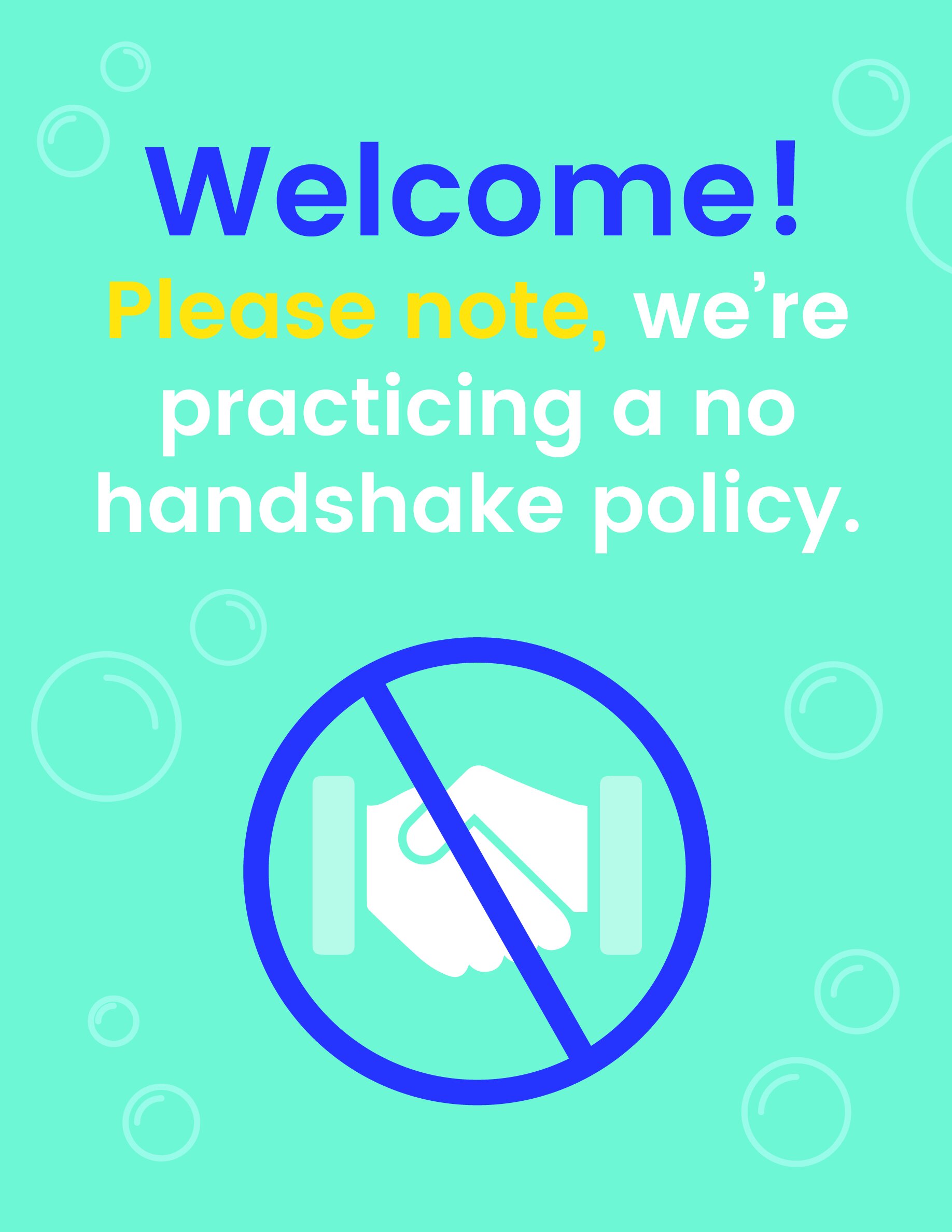
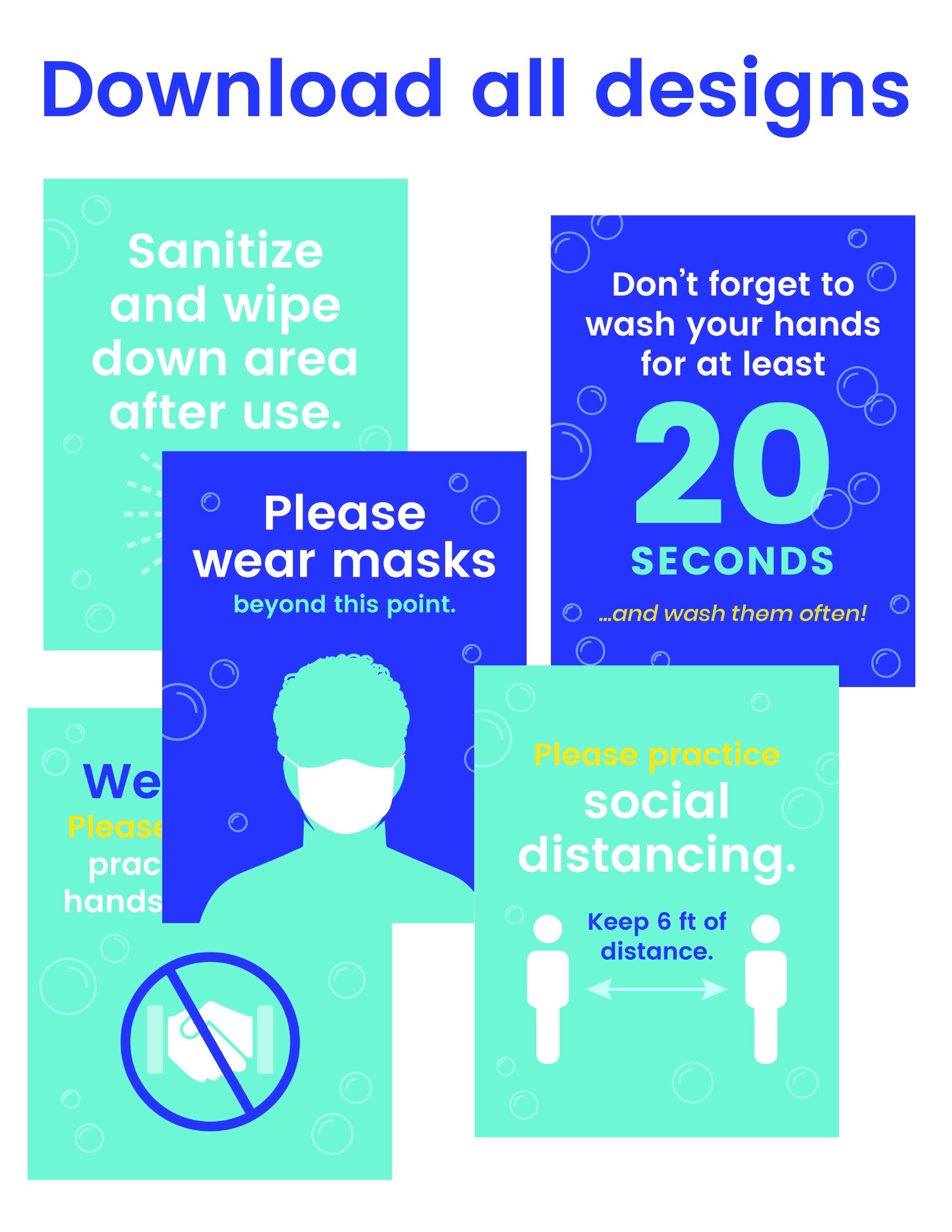
Free Download: COVID-19 Office Signs

Preparing for your employees to gradually start returning to the office? Posting helpful reminders about appropriate social distancing measures can help create a safe environment.

Select from 5 designs, or download all 5 of them. These signs are formatted to be 8.5x11 so you can easily put them in standing sign holders, or tape them up.  

If you’re looking for more detailed posters, the CDC has a selection of downloadable signs. Or, if you’re looking to share custom guidelines with your office, reach out – we can help design any signage you might need.

Click the sign you would like to download, or download all five designs here.

Designing the Perfect Business Card for 2020
Designing the perfect business card for 2020  |  Hue & Tone Creative

The old adage that you don’t get a second chance to make a first impression holds particular relevance when applied to the world of business.

Company representatives are continually vying for the attention of prospective clients and business cards are widely regarded as a quintessential tool for both seasoned pitchers and entry-level rookies, as they strive to broker deals with new customers.

The lure of a well-designed business card shouldn’t be underestimated; a suave, stylish product can instantly grab the attention of a prospective client, while an uninspiring, drab design will be confined to the trash.

Despite digital platforms dramatically altering how businesses communicate, the popularity of business cards has shown no signs of stagnating. There are a staggering 27 million business cards printed daily, with many acknowledging their capability to successfully connect businesses with clients when designed in a compelling, engaging way.


How Can Business Card Design Instill Client Confidence?

Want your logo to convey a feeling of creativity? Color can help you do that. Find out what colors convey a what emotion here.

Trust is an indispensable element to any business relationship - if a brand doesn’t convey reliability, then this will have a detrimental impact on conversion rates.

A well-designed business card has the potential to set the tone for how you treat your customers, what your business is like, and how you professionally conduct yourself.

When considering the design of a business card, meticulously plan each detail and consider how they reflect both you and your core values. For instance, what are the connotations of the coloring and fonts used? Is the typeface reflective of your personality?

Every detail should hold relevance, communicating to your intended audience what they can expect, should they decide to join forces and collaborate with your firm. 


2020 Business Card Design Trends

While business cards of yesteryear paid homage to simplistic ideas, modern-day entrepreneurs and professionals are continually opting to embrace a variety of cutting-edge designs, using their business cards as a medium to convey their brand identity, as well as communicate their personal contact information.

Research has indicated that over 80% of business cards get thrown away in less than one week, a quandary that can be rectified by paying attention to emerging design trends.

With a whole host of designs available for your company to choose from in 2020, here are a select few that are sure to catch the eye of potential clients at networking events and meetings this year.


Interactive Business Cards 

The days whereby business people are forced to settle for a conventional business card are long gone, with many embracing an interactive alternative.

While contact details are undoubtedly the most significant part of a business card, offering an interactive product is a wonderful opportunity to convey your character, ingenuity, and flair.

From branded seed pouches for gardening companies to perforated designs for divorce lawyers, there are a variety of ways that an interactive card can represent your craft - all it takes is a sprinkle of imagination! 

Designing the perfect business card for 2020  |  Hue & Tone Creative

QR Business Cards 

In 2019, a mind-blowing 5 billion people owned a mobile phone, with many gaining access to the QR code feature.

Given the dramatic growth of digital culture, more companies are deciding to incorporate QR codes into their designs and acknowledging the benefits a QR business card brings to the table.

QR codes enable the distribution of essential information to customers while saving space on the card itself; more information is offered in digital format, without compromising the sleek design. For example, by simply scanning the code, clients can gain access to informative videos about the services that a company offers.

A common downside associated with business cards is the difficulties associated with tracking their effectiveness or their impact on the customer journey. However, QR codes can be tracked with a series of online tools, providing valuable insight into audience behaviors, etc. This data can then be evaluated and used to influence future marketing campaigns, and so forth.

With mobile phone users on-screen time amounting to an average of 35 days per year, stats such as this bode particularly well for businesses who are bridging the gap between reality and the virtual world.


Perforated Cards

The business world is shaped by competition, so what better way to oust your rivals than offer customers an immediate business incentive upon receiving your business card?

A quirky design that’ll grab the attention of potential clientele, perforated cards are split into two parts and are a fantastic way to entice customers with introductory coupon offers that can be torn, without compromising the essential information printed on the other half of the card.


Deviate from the Norm… 

Rule of thumb dictates that business cards are traditionally rectangular, but in the world of design, rules are made to be broken.

Previous years have seen designers create cards that come in a range of shapes and sizes. These alternative designs are set to continue into 2020 and introducing subtleties within your design can introduce an elegance that’ll set your business card apart from the competition.

For instance, rounded edges give a card a sophisticated finish, while a more daring die-cut can make your card particularly striking. 

Furthermore, simple amendments to orientation can make a notable difference, presenting an opportunity to experiment with new typefaces and formats.


Minimalism 

While some may favor the innovative approach when designing their new business cards, a legion of traditionalists will argue: Why fix something that isn’t broken?

A design trend popular during the 20th Century, minimal business cards have survived the test of time and continue to prove popular amongst many businesses, so much so, that this design trend is expected to continue into 2020.

Minimalistic business cards convey key messages in a condensed, yet effective manner. This design is often used to increase visibility and readability, whilst also creating a sense of intrigue, in turn, prompting potential clients to get in touch for more information.


Hue & Tone Creative: Your Business Design Partners

Whether you're a traditionalist or an innovator in need of inspiration, Hue and Tone Creative has a wealth of creativity, ready to be unleashed. Call (336) 365-8559 or email hannah@hueandtonecreative.com and we'll be delighted to help you get your brand back on track. 

Our 5 Most Read Posts of 2019

Every once in a while we like to take a break from sharing a new post to recap some of our most popular posts. For the last few years, we’ve kicked off January with a rundown of some of our best posts from the previous year.

To start off 2020, we’ve compiled our 5 most read posts from 2019!

Our most read posts of 2019  |  Hue & Tone Creative

Top Read of 2019: 5 Ways to Incorporate Social Media Into Your Placemaking

It’s time to figure out how to marry your social media strategy with more traditional placemaking efforts. That’s called Digital Placemaking – and PPS defines it as “the integration of social media into Placemaking practices, which are community-centered, encouraging public participation, collaboration, and transparency.”


More Great Free Fonts to Download

Finding the perfect font is no easy feat. For starters, there’s an unfathomable number of options to choose from. Even once you select a font, there’s a ton of variables that can interfere with what does and doesn’t work - but if none of those are speaking to you, we’ve pulled together another list of ten great free and easy to download fonts.

Our most read posts of 2019  |  Hue & Tone Creative

Our most read posts of 2019  |  Hue & Tone Creative

Belief In Business: 2019 is the year of Woke Advertising

Is there a place for advertisers to take a moral, ethical, or political stance in their marketing? Historically, brands have avoided contentious topics for fear of upsetting, disgruntling, or outright alienating their audience. But, in an increasingly polarized political climate, playing on identity and political belief can lead to a big buy-in. 


4 free welcome email templates

Why are welcome emails so important? If done right, they engage new customers straight away by prompting recipients to start the next stage in their customer journey -- and they also provide a means for you to follow up on any value propositions you promised (a new customer discount, for example). 

Our most read posts of 2019  |  Hue & Tone Creative

Our most read posts of 2019  |  Hue & Tone Creative

Back to Basics: Google My Business

Need a new way to aid your organic traffic efforts? Then look no further. Google My Business is a free, easy, and proven method that will help improve your site’s visibility in search results, make key information more accessible, and enable your company to cut through the crowd with a competitive edge.


Most read of all time: 7 Squarespace Font Pairings

This post has made our lists of favorite or most read posts quite a few times! Still the number one most read article of all time, is our article on Squarespace font pairing suggestions. Although it may be tempting to stick with the default settings of your template, taking the time to select the right fonts adds depth and personality to your site.

Our most read posts of 2019  |  Hue & Tone Creative

Hue & Tone Creative: Creative consultants in greensboro, nc

We specialize in all things design and color-related. Let us help you set up your marketing plan and then execute each piece of it with precision and accuracy. Hue & Tone is a creative graphic design agency specializing in logo design, web design, social media management, and more.

How to correctly size images for your website
Don’t let your website slow down because of incorrectly sized images!

Don’t let your website slow down because of incorrectly sized images!

Sizing images incorrectly for your website can have a number of negative ramifications. Size them too small and they might look pixelated, but size them too large and they might impact the SEO for your site. Images that are too large can lead to slow load times, a higher bounce rate, and a lower SEO ranking.  

Putting time into figuring out the correct image resolution is worth your time, because high-quality visuals and a high-ranking site can say a lot about your brand. 

The trickiest part is there’s no such thing as a set size. Your feature images won’t necessarily match the dimensions of your homepage banner, full-width visuals won’t mirror blog post images, carousels will differ from collages...and so on.

 So, here are a few helpful hacks to help you figure out just what size your images need to be:

Use an extension

Tip: Chrome’s favored by most web developers and designers – if it’s not already your default browser, we suggest giving it a try! It’s especially handy if you’re in the process of building a new website.

For this trick, you’ll have to download and utilize Chrome as your Internet browser. If you don’t already use Chrome, you can download it here!

Once Chrome is downloaded and installed, you’ll also need to download Chrome’s image size extension. Once installed, you’ll be able to find out the size needed for every single element of your site.


Use the inspector tool

Another way to determine image size using Chrome is the inspector tool. This tool is built in, no extension or download needed. 

Step 1: Hit F12 or right click your mouse and go to “Inspect Element.”  

Step 2: Click on the image you’re looking to determine dimensions for, and you’ll be shown the information you need. Note that the first number is always the width.

 If you’re using another browser, you can still use this method, the process might just vary slightly -- here are a couple of video tutorials for Safari and Firefox users.


Bigger isn’t always better

 New to resolution? Read up on it in this blog.

Not sure which file format to use? Get the lowdown here.

In the world of print, the higher the image resolution the better. It results in a high-quality end product and has zero negative implications. When it comes to web that philosophy is flipped on its head. 

In the online world, large file sizes can hurt you --  they can slow your page load speed down, interfere with your visitors’ user experience and even damage your organic SEO rankings. You’ll want to use an image size that still appears crisp and clear – but isn’t so large that it negatively impacts your site. Here’s a few tips for striking that balance: 

  • Find out the exact dimensions you need, and resize your images in Photoshop or Canva for a tailored photo size. 

  • Try not to let large images or full-screen backgrounds exceed 1MB -- if it does, it could be a sign your dimensions or resolution are unnecessarily high.

  • The recommended width for full-screen backgrounds is 2000px.

  • Smaller images around your site - like thumbnails, blog headers and in-content pictures, should be no more than 300MB.

  • If you’ve got the option in Adobe Suite, always ‘Save for web’ -- this will ensure your image’s saved at a web-friendly resolution by default. 


Hue & Tone Creative: Websites for Greensboro and beyond

Already feeling overwhelmed? Let us handle your web design for you. Whether you want support finding the right photography for your site, resizing what you’ve already got, or building your website from the ground up, we’ve got the solution. Reach out at (336) 365-8559 or hannah@hueandtonecreative.com to get the process started!

5 tips for your LinkedIn business page

LinkedIn is by far the biggest lead-generating platform for businesses -- and it has been for quite some years. While Twitter (12.73%) and Facebook (6.73%) have their place, the professional networking site brings in 80% of all B2B social media leads.

Wondering why you’re yet to see this type of return from your page? It could be because you’re not maximizing all the opportunities it offers. As well as the standard tips — posting regularly, liking other people’s stuff, and replying to comments — there’s lots more that can be done to:

  • Improve your engagement

  • Boost your brand’s awareness

  • Increase your followers

  • Generate more leads

  • Secure more conversions

There’s no point in doing something if you’re not going to do it right though, so here are five pointers to help you get the most out of your LinkedIn page.

5 tips for your LinkedIn business page  |  Hue & Tone Creative

Tip 1: Follow the 1-3-1 rule

In general, social media accounts should follow the rules of thirds: 1/3 promoting your product or services, 1/3 interacting with others, and 1/3 sharing industry news.

Now you don’t have to take these numbers as gospel, but the point is, don’t just make your page all about you. For every post you create that’s centred around something you sell or you’ve written, share a couple of valuable pieces or tips from around the web before you make it all about you again.

For example:

  • Post #1: an interesting stat from a third-party source 

  • Post #2: an article from your blog

  • Post #3: a promotional post about an upcoming sale

  • Post #4: a link to your latest whitepaper

  • Post #5: a thought-provoking read from a relevant author

Tip 2: Use tracking links

When you do link back to your site use a custom URL so you know it’s come from your LinkedIn page, that way you can start to get an understanding of what type of posts a) drive people back to your site and b) convert.

Not sure how? Here’s a campaign URL builder to help you.


Tip 3: Focus on the first line 

The first few words of your posts determine whether or not people stick around and read the rest or carry on scrolling, so if you want to keep people engaged make it all about them.

For example, instead of saying “We’ve got 10 tips on how to train for a marathon” say “ Here’s how you can smash your marathon training 10 different ways.”

If you’ve lured your audience in that doesn’t mean you can start going off on a tangent though. Make your updates short and sweet and keep the desired end action in mind throughout. For example, if it’s for someone to read more about service X, do you give them ample encouragement and resources to do just that?


4. Incorporate visual elements

Did you know? Video posts are five times more likely to get comments.

You’re probably sick of hearing about this one but it’s so important and something many businesses forget to do. Complementing your words with a catchy image or video helps to bring your feed to life, grab your audience’s attention, and give people an instant flavor of what your posts are about.

And remember, neither has to cost a fortune. You can make smart looking videos on your smartphone nowadays (find out how herehere and here) and there are a whole load of free photo sites out there (Pixabay and Unsplash just to name two). 


5. Optimize your page

The same way Google ranks your website’s content, LinkedIn ranks your company page based on the information you include — especially in your ‘About Us’ section. So, take your time to write something compelling and remember to include key terms people are likely to search for.


Hue & Tone Creative: Your Marketing Partners

With a million other things on your to-do list, giving your LinkedIn page the TLC it needs can soon slip off the radar -- we get that and we can help. Whether you need support with your words, images, or the whole platform, get in touch at hannah@hueandtonecreative.com or (336) 365-8559 to see what we can do for you. 

How to get the most out of Google My Business

Google My Business is a super useful (and free!) tool which helps build credibility and visibility in organic search results by pulling your organization’s name, address, number, hours, and reviews when searchers are looking for your business – or a business in your category. 

How to get the most out of Google My Business  |  Hue & Tone Creative

Are you a Google My Business newbie? Then you might find this back to basics blog helpful first.

Given 50% of smartphone consumers visit a store within a day of their local search (and 18% of them make a purchase) Google Business is not a sales tool you want to miss out on. Having a Google Business account and updating it effectively is a low investment, effective way to leverage technology to your advantage. 

There’s no use having an account just for the sake of it though. If you want to get results you need to optimize it as best you can so we’ve come armed with tips to help you do just that.


1. Make sure all your info is complete

That includes your location, opening hours, business category and contact details. If you don’t have your location set-up, you’ll be harder for local searchers to stumble across. And, remember absent or incorrect business categories can hinder your ranking opportunities. 

Although a lack of hours and contact details won’t impact your visibility, they will make it more difficult for people to take that next step — and even small typos or minor missing information could equate to a potential lost customer.


2. Act on your reviews

Along with your location, reviews are a key ranking factor that help Google understand how people rate your business. So, make a point of asking customers to leave a review and respond when they do — whether it’s good or bad.

Don’t worry, leaving a review is incredibly easy, all people have to do is:

  • Google your business

  • Tap on your Google My Business listing

  • Click the ‘write a review’ button

  • Write the review

friday_t20_bk0gO6.jpg

3. Answer questions - promptly

People can now ask questions on your listing for either you or members of the public to answer, and unanswered queries don’t exactly look great. Make a point of regularly checking in to see if any new questions have popped up and if they have, use it as an opportunity to really show off your expertise. 

Added bonus: Answering questions will help keep your profile active which can help improve your listing rank.


4. Use Google posts

Google posts let you highlight extra information (like upcoming events and special offers) and will redirect people directly to your website — which could help give your click-through rate a boost.

A few things worth noting:

  • These posts pop-up immediately in your listing

  • They’re removed from the default view after seven days or after the event date has passed

  • You can’t schedule or bulk upload posts

5. Invest in your images

According to Google, businesses whose listings have photos receive 42% more requests for driving directions and 35% more clicks through to their site.

The moral of the story? Add high-quality, relevant images. We suggest uploading a mix of photos — for example, if you’re a bakery, you might want to add images of your:

  • Storefront/seating areas

  • Products

  • Kitchen

  • Customers 

Worried your photos look lackluster? Here are 10 tips on how to take professional-looking photos on your iPhone.


Hue & Tone Creative: Your Strategic Business Partners

Whether you need help with your words or your images we’re here to assist you. To see how we can help take your Google My Business listing to the next level (or just get it set up) get in touch at hannah@hueandtonecreative.com or (336) 365-8559.

How color affects your brand
How Color Affects Your Brand  |  Hue & Tone Creative

Whether you’re a real estate agent, hairdresser, baker, or jeweler, color plays a big part in your brand, because it affects how you attract and connect with customers. 


What’s color psychology?

It’s the relationship between colors and human behavior — for example, does a yellow logo elicit more trust? Or does grey packaging make people more likely to purchase your product? 

Color psychology explains the meaning behind why people (in and out of the business world) prefer certain hues over others. It also takes into account individual color biases when deciding on a specific color — like upbringing, gender, location, and values.


Why is it important? 

Color evokes feelings and emotions — and feelings and emotions can make or break sales. Take the time to get it right and your organization could benefit from:

  1. Standing out from the competition 

  2. Positioning itself the way it wants to be perceived 

  3. Influencing how customers digest and interpret your information 

  4. Improving credibility and trustworthiness


Colors and their meaningS

How Color Affects Your Brand  |  Hue & Tone Creative

Red

Feelings: excitement, passion, danger, energy and action

In the color psychology world, red is seen as the most intense color for creating strong emotions and attracting attention -- which is why a lot of businesses use it for their ‘Buy Now’ buttons. 

Tip: Because red can be associated with danger it’s best to use it sparingly.


How Color Affects Your Brand  |  Hue & Tone Creative

Orange 

Feelings: creativity, adventure, enthusiasm, success and balance

Orange is also an impactful color but on a less overwhelming scale, so it can often be used in larger doses without becoming overbearing. Because of its eye-grabbing nature, a lot of businesses use orange for call-to-actions.


How Color Affects Your Brand  |  Hue & Tone Creative

Yellow

Feelings: happiness, positivity, optimism, summer, warnings

Centered around the sun, our emotions around yellow are largely upbeat and summery. But, on rare occasions, yellow can be construed as dangerous too (think construction zones).

Exploring some color scheme options? Check out a few of our mood boards herehere, and here.


How Color Affects Your Brand  |  Hue & Tone Creative

Pink

Feelings: femininity, playfulness, immaturity, and unconditional love

Because of its connotations, pink is mostly used by companies who predominantly target females -- big name brands that follow suit include Barbie and Victoria’s Secret. Remember it can reflect immaturity though, so it’s important to choose the tone and quantity of pink carefully.


How Color Affects Your Brand  |  Hue & Tone Creative

Green

Inspired by nature? We’ve got some inspiration here.

Feelings: growth, fertility, health, and generosity

As far as color psychology goes, green is tightly associated with nature and money, and is commonly used by health and fitness businesses. It does have its negative ties though, like envy.


How Color Affects Your Brand  |  Hue & Tone Creative

Blue

Feelings: stability, harmony, peace, calm, and trust

Linked to the sea and sky, blue has a lot of security-related emotions attached to, making it a go to choice for retailer’s guarantee icons, certificates, or shipping icons. On the other end of the spectrum, it can also be connected with depression and coldness. 

Tip: With blue, the tone you choose will make a world of difference in the vibe you give off, so take your time to make sure you pick the right one. We suggest doing a little research on the specific shades of blue to take your color psychology research a step further!


How Color Affects Your Brand  |  Hue & Tone Creative

Purple

Feelings: power, nobility, luxury, wisdom, and spirituality

Purple is packed with royal vibes and is tightly linked to connotations of wealth, extravagance, and pride. Be careful with how much you use this one, because too much can leave people with an impression of frustration or even arrogance. 

With purple it’s all about the shade, tint, and hue you use: 

  • Light purple = feminine energy and delicacy

  • Dark purple = feelings of gloom, sadness, and frustration

  • Bright purple = riches and royalty


How Color Affects Your Brand  |  Hue & Tone Creative

White/Black 

White

Feelings: innocence, goodness, cleanliness, and humility

White can bring mental clarity, promote feelings of fresh beginnings, and encourage positive thoughts; which is why many businesses use it as the backdrop for product shoots. 

It likely goes without saying that black text on a white background is the number one readability combo, but just be mindful that too much white can leave a sterile and cold impression.


Black

Feelings: mystery, power, elegance, and sophistication

Too much black can be overwhelming and give off negative emotions -- like sadness and anger, but just the right amount can evoke strong doses of the right kind. Think strength, authority, and seriousness.


How Color Affects Your Brand  |  Hue & Tone Creative

Grey 

Feelings: neutrality, balance, and timelessness.

Balance is key if you’re dabbling with grey and less can often be more — stick to using it for things like fonts, headers, and graphics is a safe bet. Large quantities can be quite dull and bring out the connotations of depression and loss, so make sure to pick your placement wisely.


How Color Affects Your Brand  |  Hue & Tone Creative

Brown 

Feelings: comfort, security, wholesomeness, and honesty

Symbolizing earth, wood, and stone, brown is all about nature and can correspond with feelings of comfort, security, warmth, and stability.

You probably don’t tend to see brown used in large volumes, because it can be considered a bit boring. In small doses, brown can serve as a great alternative to cooler grays, and can evoke a feeling of warmth and security.


Hue & Tone Creative: Colors are our specialty

Whether you need to rebrand, are looking to launch a social media campaign, or design a billboard, we’ll help you find the color that evokes the right emotion. Want to learn more about how we might work together? Get in touch at hannah@huetonecreative.com or (336) 365-8559.

How to improve your designs using color theory
How to improve your designs using color theory  |  Hue & Tone Creative

Be honest, how many times have you sat and stared at your screen experimenting with endless color pairings only to realize three hours later you’re no further down the line? 

Frustrating, isn’t it?

Well, designers don’t hit the jackpot just by luck, they use what’s called color theory. Color theory is a term used to describe the collection of rules and guidelines regarding the use of color in art and design – and it is defined as a theory because it cannot be proven.  

Color theory is a science and art in it’s own right – but even non-artists can gain a basic understanding of color theory to better understand how to make a pleasing design. Knowing which colors play well together and the effects specific colors have on a majority of people is a valuable expertise no matter what your field.

What’s color theory?

Image via dulux.co.nz

Image via dulux.co.nz

The color wheel is a tried and tested blend of art and science that show you which hues go well together. The color wheel we use today is based off Isaac Newton’s 1666 color wheel which shows the relationship between colors. Sir Isaac Newton created the color wheel based on his experiments with prisms that led to the theory that red, yellow and blue were the primary colors from which all other colors are derived.

Now we’ll dive into a breakdown of how to use the color wheel for your own branding and design projects. By following these simple rules, you can shave hours off your next color-picking expedition and end up with a better-looking final product!


Complementary

Image via Canva.

Image via Canva.

Any two colors that sit on opposite sides of the color wheel -- like blue and yellow or pink and green, for example. Complementary colors are high in contrast and impact and work together to create bright results.


Monochromatic

Image via Canva.

Image via Canva.

Want a headstart? We’ve got lots of great color themes to choose from here.

These are shades of the same color and result in subtle and harmonious finishes. While monochromatic combinations are great for creating a consistent feel another color will need to be brought into the mix to add another layer to your work -- otherwise, everything will start blending into one another.


Analogous

Image via Canva.

Image via Canva.

Tip: to prevent that from happening pick one of the three for your dominant color and then use the other two as accents.

Any three colors that sit side-by-side on the color wheel -- like orange, yellow and green. On the plus side, these can be really versatile combinations, but on the downside, if you don’t manage them right they can soon become a bit tooin your face.


 Triadic

Image via Canva.

Image via Canva.

Make sure you get your proportions right for this one! Triadic colors sit at three evenly spaced intervals on the wheel and hit that right balance between contrast and versatility.


Tetradic

Image via Canva.

Image via Canva.

Similar to the above but this time across fourevenspaces. If you’re going with this option just remember the more colors you use the harder it’ll be to balance what’s on your palette -- and less can certainly be more sometimes. 

To avoid overwhelming people, as with analogous combinations, pick one color as your dominant and use the rest as accents. 


4 good-to-know color wheel facts

1. It’s made up of 12 colors: red, orange, yellow, chartreuse green, green, spring green, cyan, azure, blue, violet, magenta and rose.

2. It can be split into three color types:

  • Primary: colors that create pure white light when blended together (red, green and blue)

  • Secondary: the result of mixing two primary colors, i.e. green and blue make cyan

  • Tertiary: there are six in total and they’re the byproduct of combining a primary and secondary color

3. The two halves of the wheel make up warm (purple through to yellow) and cool (blue through to green) colors. 

4. If you add black, grey or white to any base hue you can create shades, tints and tones of any color:

  •  Shades darken the color and are made by adding black

  • Tints lighten and are conceived by adding white

  • Tones create a subtle version of the original color when white and black (or grey) are added


Hue & Tone Creative: Your partners in color

If this blog post left you feeling more confused than clear, why not hand the hard part over? We’re design experts through and through so you can trust us to find the perfect pairings for you. Interested? Get in touch on hannah@hueandtonecreative.com or (336) 365-8559.

10 creative swag ideas that will get you seen

In the world of events, corporate swag is becoming more of an expectation than a nice-to-have nowadays, but, with almost every organization out there opting for the staple tote bag or a safe ballpoint pen, how do you stand out from the crowd? 

By doing something different. Whether you’re hosting a conference or running an end-of-summer giveaway we’ve racked our brains to come up with 10 swag ideas that break the norm and keep your swag out of recycling bin. 

No matter what item you opt for, remember the goal is to strike the right balance between splatting your branding over it and creating something useful or trendy that people will actually want to keep.


1. Cookie-cutter

10 creative swag ideas that will get you seen | Hue & Tone Creative

There’s two great options here -- either use a more standard shape (like a heart, star, or gingerbread man) and customize the cutter itself with your colors and logo OR make the shape symbolic to your brand --  such as your logo or a representation of it.

If it fits your brand you could even bring out seasonal iterations of your cookie cutter for Thanksgiving, Christmas, Halloween, Valentine’s Day or Easter.


2. Lunch box

We all need to transport our food in something snazzy -- so why not give people a great lunch box that just happens to boast your logo? This custom container will be seen by all their colleagues and hopefully spark a discussion about your brand over lunch.

If you’re looking to take your trendiness to the next level, consider a branded Bento Box instead! 


3. Stress ball 

Because who doesn’t get stressed from time-to-time?

Not that we’ve not done any research to back this theory up, but there’s certainly a chance that relieving stress while seeing your logo could help people exude positive feelings towards your organization… isn’t that exactly what we’re after? 

10 creative swag ideas that will get you seen | Hue & Tone Creative


Tip: 
If you really want to spark a conversation think outside the box and go for something really unusual -- think avocadoes sipping a pina colada kind of out there!


4. Pool float 

Why not hit the pool with your favorite clients or customers? Whether you go for a flamingo, donut, your logo or something super simple, a custom pool float gives you a wide swath of realty to show your branding off.


5. Reusable straw

Being environmentally friendly has never been more important than it is now so do your part for the planet and your brand image by creating custom stainless steel or silicone straws. You can put them in a branded travel pouch or paint your branding across the whole thing... the color of the straw, your logo on the end, the whole thing! 


6. Christmas tree ornament 

T’is the season to...get your brand in everyone’s homes. If you want this one to work remember to get the right balance between your branding and festive vibes -- if it’s too much of the former and not enough of the latter you might not make it onto the tree.


7. Golf kit 

They say the golf course is where business is done, right? Get your brand in the middle of the conversation with some bespoke tees orballs.


8. Umbrella

On a rainy day your branded umbrella could offer up as much advertising space as a small billboard -- but for a fraction of the cost. This one’s super practical too, making your odds of securing a spot in someone’s handbag all the more likely. 


9. Bottle stoppers

Simple, small, but extremely useful -- and something people would probably be very grateful not having to spend their own money on. You won’t have a great deal of space to work with though, so remember to be sensible with the dimensions you havegot.

Or, consider upgrading to a custom corkscrew and bottle stopper set… all in a handy travel case! 


10. Customized Pop Sockets

When’s the last time you or anyone you know left the house without their phone? Exactly. People don’t go anywhere without it nowadays and, if you get it right, your Pop Socket could be with them every step of the way; opening you up to lots of new eyes every day. 


Hue & Tone Creative: Your Marketing Partners

If you’ve decided you need swag but you’re left with a big design-sized hole in your plans then we’re here to help bridge that gap. Get in touch at hannah@hueandtonecreative.com or (336) 365-8559 to get the ball rolling today.