Posts in Inspiration
Color Schemes: Scenes from Greensboro

This week, we’re taking time out from talking marketing to celebrate a few vignettes from our city. From muted downtown streets to the Bicentennial Gardens, we’re finding color inspiration in some of our favorite Greensboro spots.

We’re big believers that every city offers inspiration – sometimes you just have to stop and notice it. With a bustling downtown and expansive trails, Greensboro offers the best of both city and nature views. No matter where you are in Greensboro, we guarantee that there’s a dynamic color scheme somewhere in your view.

Artboard 18.jpg

Dappled Depot

Soft blues, purples and pinks are diffused by the fog drifting in over the J. Douglas Galyon Depot in Downtown Greensboro. We love the soft hues of this nighttime scene.
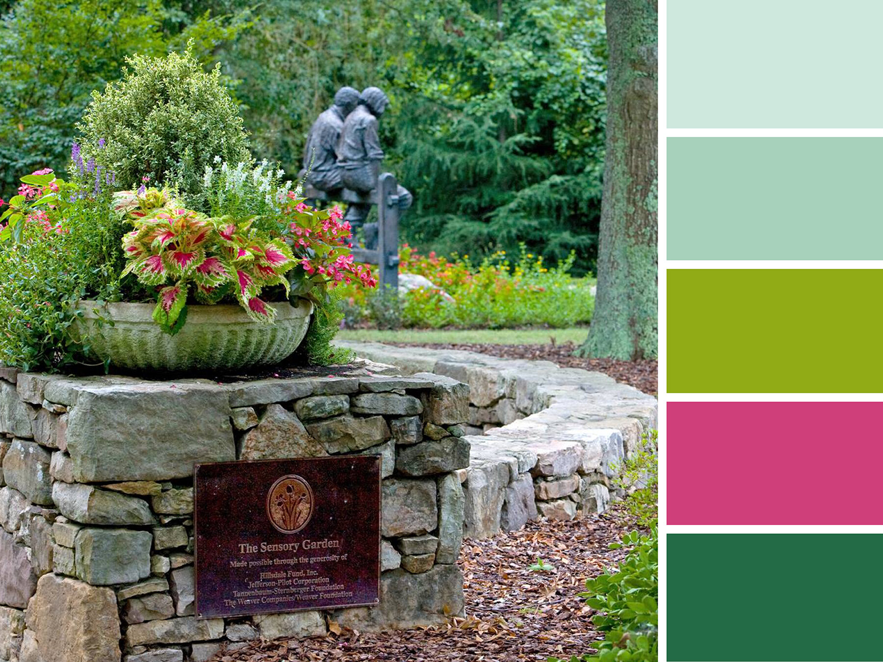
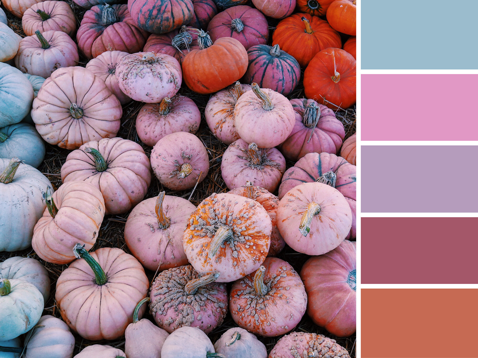
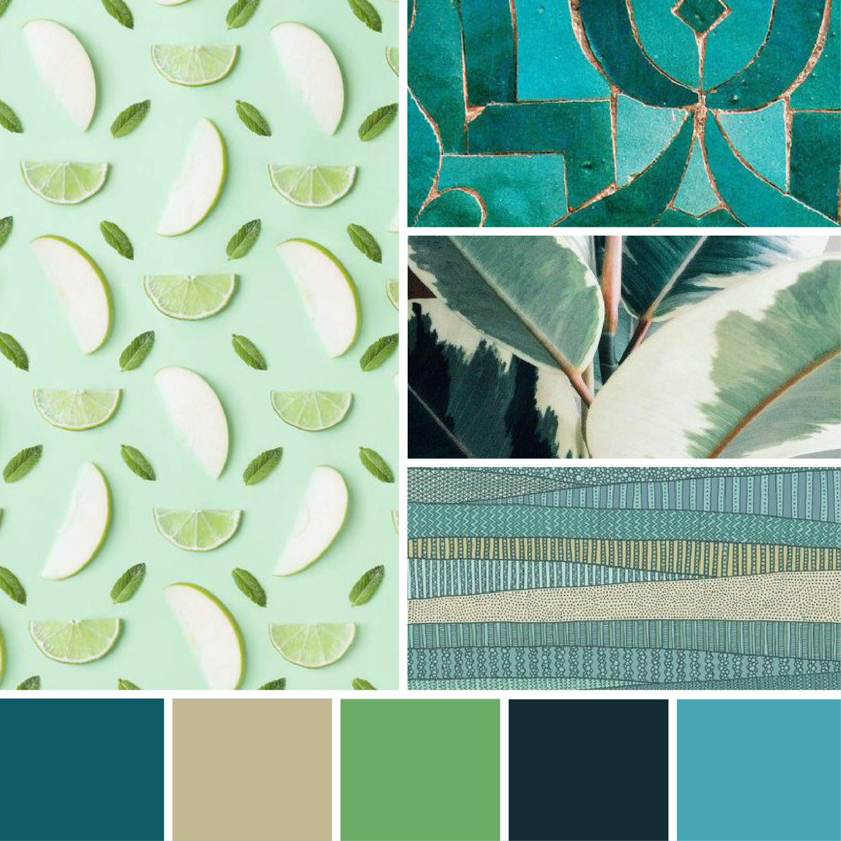

 Botanical Brights 

Great for a short walk, quiet reflection, or reading on a comfy park bench, the Tanger Bicentennial Garden is one of our favorite spots in Greensboro. Rich colors line the pathways, and a variety compelling sculptures can be found tucked among the foliage. For more secluded scenery, pop right across the road to the Bog Garden. 


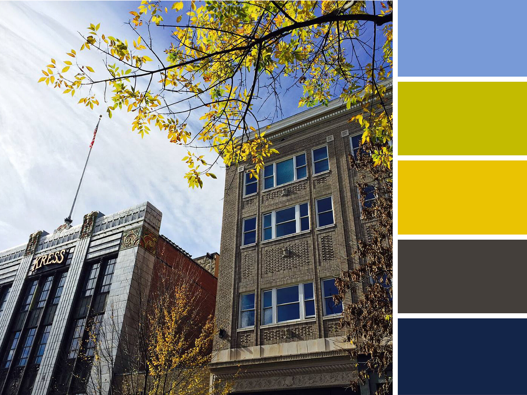
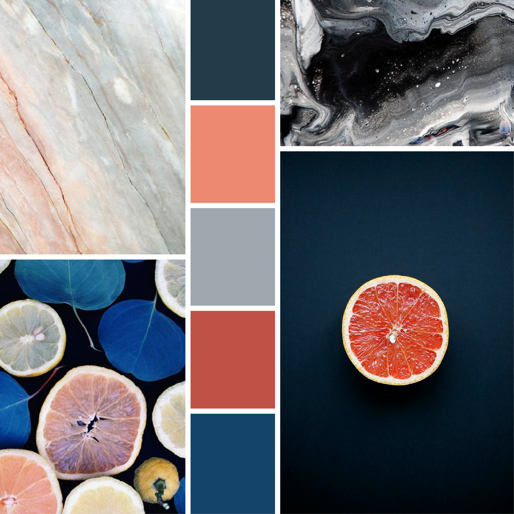
Clear Skies over Kress

Crisp blue skies highlight the pristine facades of the Kress and Meyers Buildings’ on South Elm Street. Changing leaves provide small touches of green and yellow to this palette.
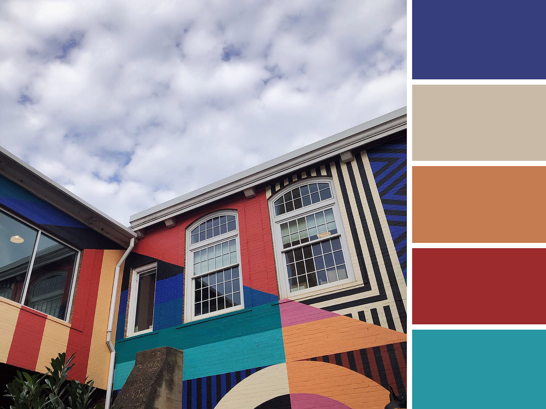
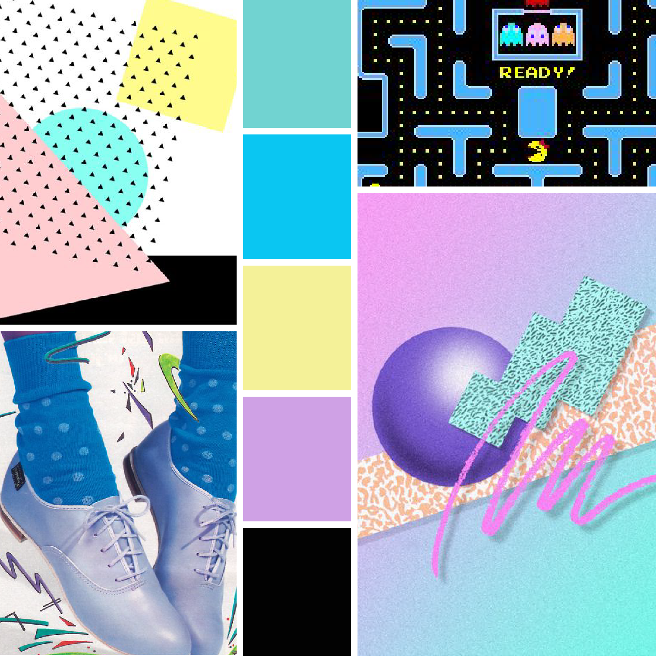

Retro Revolution

Tucked in a quiet corner of Revolution Mill’s courtyard, this retro mural installation is a bright pop of color among a sea of brick. These colors are bright and muted all at once!
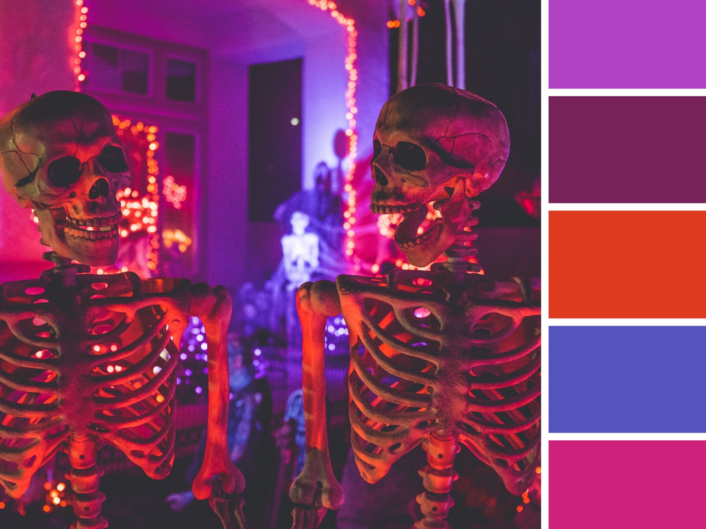

Artboard 12.jpg

Lite Brite LeBauer 

The sky is illuminated over LeBauer Park by Janet Echelman’s Where We Met installation. Our two downtown parks provide a great place to gather, celebrate, and play while immersing yourself in all the city has to offer. Bright colors are especially present in these fun and family-friendly spaces!
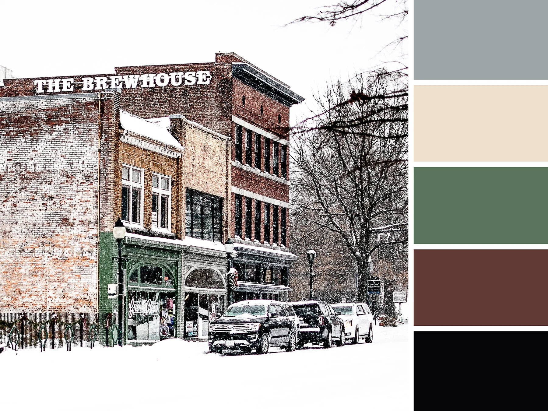

Artboard 2.jpg

South Elm Snow

On an all white day, the Green Bean’s bright facade offers a pop of color among an otherwise muted look at South Elm Street.
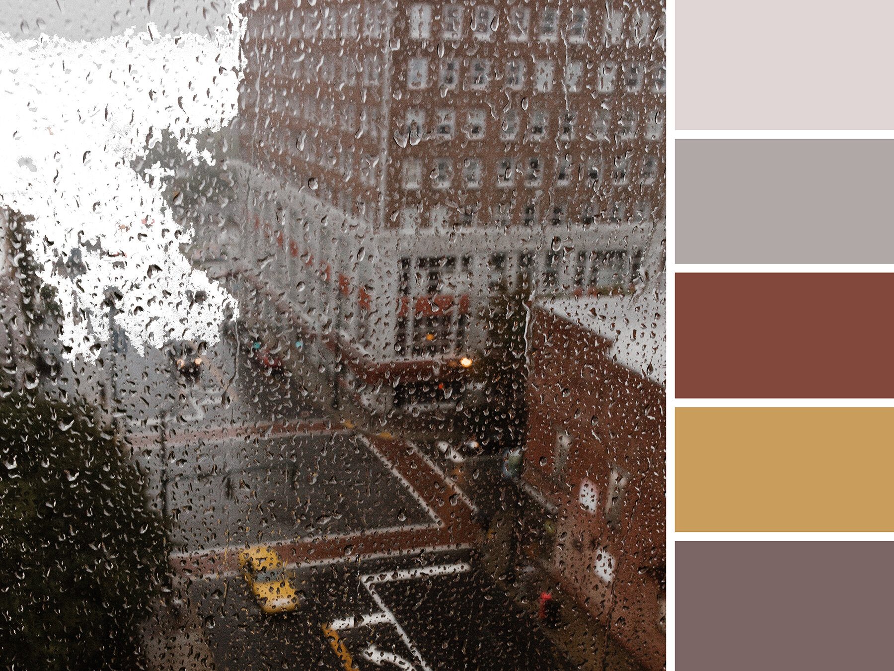
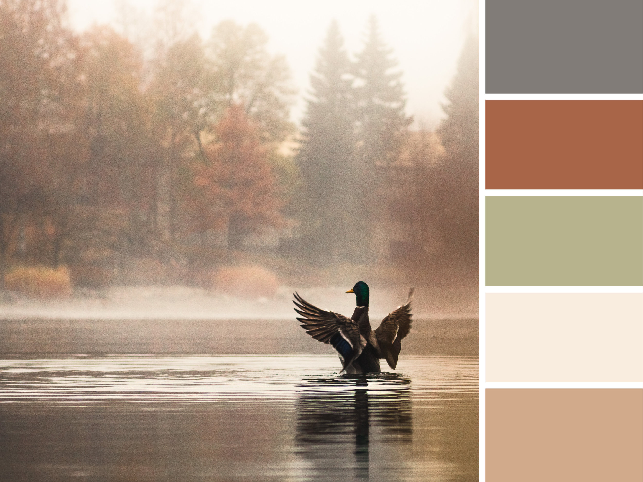

Guilford Grey 

On a rainy and grey day, the heart of downtown has mostly subdued tones to offer up. But this mood board is a favorite because you can see the Guilford Building in the upper right portion of the photo… can you spot us waving from our office windows in the top right corner? Just kidding…


Hue & Tone Creative: Inspiration and Color in Greensboro, NC

Whether you’re based in Greensboro or beyond, we’ll help breathe new inspiration into your brand. Let us help you refresh your visual branding, website, and print collateral today. Schedule a meeting to get your next project started.

Halloween Color Schemes

October is one of the eeriest times of year: Halloween, colder temperatures, the time change, end of year tax prep… it’s all pretty frightening. While most people associate this time of year with black and orange, there’s a much wider color palette we think you should consider for this spooky season.

If you’re looking for a color scheme to spruce up your latest seasonal advertisement or your creepy social media graphics, consider pulling swatches from one of these boards. In addition to the traditional orange and black we’re pulling in earth tones and shades of purple, green, red, white, and yellow. We’re even playing around with a few pops of pink! 

Artboard 1.jpg

Sinister Skies

Nothing evokes a Spooktacular feeling quite like a cloudy night sky. In this color scheme, a classic pumpkin orange pairs with goldenrod, a deep red, and an inky blue. 


Saturated Skeletons

These bright colors aren’t something you would usually associate with Halloween – but the dayglo orange and pink speak to the vibrant lights of a late night party. 


Artboard 12.jpg

Haunted Hues

Warm glowing lights illuminate the windows of this haunted mansion — the charred stone and cloudy sky inspire a more muted palette of deep orange and dark blue. With it’s toned down colors, this palette will work well for all of fall.


Macabre Mask

Pops of rich pink and teal stipple this haunting Day of the Dead face paint. The strong contrast between the deep black and accent colors creates an evocative calavera design.


Pale Pumpkins

You don’t have to use orange and black for halloween — and pumpkins don’t even have to be orange! These washed out hues show a different take on a classic halloween symbol.


Artboard 17.jpg

Frightening Forest

At first this image just looks shades of blue - but peer a little closer and you’ll see deep magenta and rich greens. Who knows what else might be lurking behind these colorful trees…


Artboard 18.jpg

Eldritch Eyes

Black cats are synonymous with bad luck, making them the perfect emblem for All Hallows Eve. Different shades of grey pepper his fur and his haunting green eyes will stay with you for days to come.


Hue & Tone Creative: Design work for every season

Not up for the work of creating your own holiday campaign? Whether you’re scrambling for last minute Halloween graphics or working on your winter campaign, we’re here to create the perfect imagery for you. Contact us to get started!

Best 404 pages: Designs that stand out

In an ideal world, your website visitors would never find themselves faced with a 404 page. But, suffice it to say, this isn’t an ideal world — people type things in wrong, links break, and technical difficulties happen.

Although your first plan of action should be ensuring there are no broken links on your site in the first place, there are ways you can make the most of a bad situation. If a visitor finds themselves facing a 404 page, you can turn their irritation into an opportunity to entertain them, sell yourself, or provide them with valuable resources.

Here’s a few people we think will delight their customers with their weird and wonderful 404 pages:

Pixar

It’s clean. It’s simple. It’s on-brand. It’s a complete over-exaggeration of the reaction you probably had. And in our opinion, it completely works.

Pixar.png

Bluepath 

Funny and relevant: the best combination! Bluepath’s a data strategy company, so they aptly designed a data-driven map to show their lost visitors where they stood.

BluePath.png

Lego

Like Pixar, Lego let their 404 page serve as an extension of their existing brands. They capitalized on a few favorite characters to illustrate the situation visitors have found themselves in. 

Lego.png

HubSpot

Not every brand necessarily has a set of iconic characters to bring their 404 page to life. But, as HubSpot have shown, this doesn't have to stop you from having a bit of fun.

They’ve also smartly reinforced their audience’s love of their services and cleverly tried to redirect them to a handful of other, selected pages - win, win!


GitHub

If all else fails, state the obvious. Super simple, but just as on brand.


Emirates

Everyone loves a good pun, right? The beauty of Emirates’ 404 result is that it puts their people on the page and capitalizes on a very obvious but on brand, pun-filled message.

Emirates.png

eHarmony

Another superb example of how your 404 page’s message can wittily relate back to your organization’s core message.


NPR 

Now there’s a lot more text on NPR’s 404 page than most, but it totally works. They do a lot here: in addition to giving you an alternative way to find what you’re looking for, they work in a little foolproof humor and even point you to a few other articles.


Magnt

There’s two elements on this page that we absolutely love:

1)   It puts some of the onus on the visitor - after all, 404s aren’t always the website’s fault!

2)   They’ve maximized on every single opportunity and managed to turn their 404 page into a sales pitch for their product


A couple of 404 basics…

 Now that we’ve taken a look at a few great examples, it’s time to create your own awesome 404 page. Daring 404 page designs aren’t for everyone, but even the most basic of templates must include:

Key links - make it easy for visitors to navigate their way back to live pages on your site. Ideally, you should make sure your main navigation bar is prominent on your 404 pages.

Branding - just because your 404 page isn’t a page you intentionally want to drive traffic to, doesn’t mean it isn’t important. Keep the look and feel of it consistent to that of your site so people know you’re still close by.


 Hue & Tone Creative: Custom design and marketing

When it comes to web design, we know what we’re doing. For help creating a killer 404 page or an entire website, make the first move toward better web marketing today: 336-365-8559 or hannah@hueandtonecreative.com.

10 accounts every designer needs to follow on Instagram

When it comes to finding design inspiration, Instagram can serve as your personal playground — it’s a gold mind for great content and inspiration… if you follow the right people, that is.

Whether you’re looking to get inspired for an upcoming photoshoot or you need to find a new font to try out, here are 10 awesome Instagram accounts every designer should tap into from time-to-time.


1.  logoinspirations 

If you’re stuck in a rut trying to create that standout logo, logoinspirations curates all the best identities out there to save you trawling the web. If you check out their highlights, you’ll find lots of tips, inspiration and tools.


2.  logonew

Sticking with the logo theme, logonew shares a healthy blend of sketches and digital concepts. From drones and eagles to bitmojis, bees and beer, their feed is brimming with variety that’s sure to set your creative wheels in motion.


3.  neil_a_stevens

Specializing in poster design, Neil’s Instagram illustrations are nothing short of ingenious. Whether you’re looking for digital or online inspo, his masterpieces will get your inspiration flowing -- and your jaw dropping.

eaters-collective-129481-unsplash.jpg

4.  darias88

In his own words, the owner of this account, Daniel Aristizábal, “brings forward new technologies to create stunning and inspiring artworks.” He’s constantly experimenting with new styles and is known for his mastery of turning everyday objects into something abstract, original, and colorful.


5.  mrseaves101

Run by an Australian artist called Gemma O’Brien, this account is packed with bold lettering, illustrations, andtypography. It’s vibrant, it’s edgy, and it encompasses a mix of bold artwork and beautiful snapshots from around the world.


6. handmadefont

Finding a font is no easy feat, but if it’s variety you’re after, handmadefont has you covered. From industrial, futuristic and floral looks, to street art, 3D and foodie feels, it curates a whole load of forward-thinking concepts. 


7. interaction_design_foundation

This one’s less actual artwork, more practical tips -- to help you achieve that perfect piece. With posts on everything from introducing lean UX and conducting heuristic evaluations to information visualization and color emotion, there’s something for everyone.


8. heystudio

Heystudio focuses on brand identity, editorial design, illustration, geometry, color and direct typography. All these topics are at the heart of what they do and their feed has a quirky and contemporary look. With clients like Apple, Vodafone and Oxfam on their books, they must be doing something right…


9. uiuxgifs

GIFs are on the up. If you’re looking to incorporate some on your site or in your social media and email campaigns but just can’t map out what you want, this feed’s full of animated inspiration.


10. velvetspectrum

Last but by certainly means not least, Velvet Spectrum houses a mix of typography, illustration and motion graphics. Oozing with dynamic color and careful composition, the updates are nothing short of electric.


Hue & Tone Creative

If you’ve hit a creative wall, we can help you take your artwork to the next level. We can work with you on every design project, no matter what the medium — no print or digital job is too small. To get an idea of what we can do, see some of the projects we’ve worked on in the past or get in touch.

Color Stories: Fall Looks for 2018

What can we say? We love fall! We know it’s still hotter than heck, but we can’t help but get excited about the impending pumpkin spice, fall leaves, and chunky sweaters. 

In fact, we also got really excited about fall last year on the blog ... and the year before … and the year before that. Basically, creating fall inspired mood boards is becoming a regular thing for us. However, this year we’re pushing ourselves to go beyond red, orange, and yellow to come up with a more out of the box set of fall palettes.  

We’ll admit, a few traditional fall colors worked their way into our mood boards – but overall we stuck to less traditional hues to keep things fresh. 

Take a look at what we came up with here – and, let us know which is your favorite in the comments!

Luscious Lake

The lake in this photo looks peaceful, but these deep colors evoke a feeling of something a little darker. Deep, rich jewel tones gives off a luscious feel. 


Moodboards_Urban-02.jpg

Crisp and Clean

Fall is all about baking and enjoying the outdoors. That’s why this tasty close up was a perfect fit for us. Cool greens and a muted ice blue speak to winter being right around the corner. 


Culinary Creativity

Family recipes abound in autumn, making it the best time to draw inspiration from your culinary supplies. Warm honey, flour, and a few kitchen tools informed this color scheme. 


Bold Bounty

This plenitude of heirloom tomatoes was perfect for a more primary color scheme. These brighter hues are a fun alternative to the soft side of fall. 


Moodboards_Urban-05.jpg

Dusty Detritus

Downed leaves make for some beautiful colors. We loved pulling inspiration from this fallen foliage. Muted lavender, subdued peach, and an understated charcoal have a soothing effect. 


Foggy Fowl

Soft lighting sets the mood here with creamy taupe, a soft sage, and a rusty brown.  


Design + Branding for Greensboro, NC and Beyond

Color scheme need an update? Brand feeling stale? Logo looking outdated? We can fix all of that -- and more! Based out of the Triad, our team can help you refresh and revitalize your flagging brand. More than just an outside team, we'll become your partner in all things visual and marketing related. Sound like what you're looking for? Give us a call.

Logo Love: 5 of the best big brand redesigns

Most brands, no matter how big or small, evolve their logo at one point or another. It might be a subtle redesign to get on trend, or it might be a total overhaul. No matter how thorough of a rebrand you're looking to do, just make sure the reason you do it is solid -- you don't want to be that company constantly confusing people with a new name or logo. 

A few of the reasons we think you should consider a redesign?

  • It was a DIY project

  • Your business has evolved, but your logo hasn't

  • It uses dated design trends

  • Your company is about to make significant changes

  • It needs to be simplified

In our opinion, a good logo update maintains the integrity of the original brand, while evolving the look. Your first logo will rarely be your last -- and as long as the thought process behind your redesign is strong, there’s no reason not to periodically enhance or revamp your logo. 

To get a better idea of why people update their look, let's look to a few big brands: 

1. Nike

Nike’s refresh couldn’t be a better demonstration that less is more. No color. No words. Just an instantly recognizable, worldwide tick.

Image source: fastsigns.com

Image source: fastsigns.com

2.  Amazon

A rebrand brought on by business changes, Amazon's logo is a great example of a clever design. While Amazon's first version wasn’t exactly irrelevant to Amazon’s name, its current logo is a true reflection of what it stands for.

With a smile for its happy customers pointing to their A-Z offering, there’s a lot that can be learned from Amazon’s slick rebranding.

 
Image source: contested.wordpress.com
 

3.  BBC

Since its inception, the BBC has developed a multifaceted brand. Having many different branches of business means needing a highly versatile and adaptable logo. 

Their simple three box logo coordinates well with other fonts, gels with any color, and has mass appeal. 

 
BBC_logo_(pre97).svg.png


Image sources: tvforum.uk and wikimedia.org

Image sources: tvforum.uk and wikimedia.org


4. Instagram

Instagram’s old logo was incredibly retro -- we'll leave it up to you if that's good or bad. Some folks certainly liked it, because they received a decent amount of pushback when they revealed their updated logo. 

Many compared its background to something seen in WordArt, but it’s since proven that it’s less paint shop and more pro. It’s simple, funky and modern; everything Instagram is as a platform.

 
Image source: obviousgroup.co.uk

Image source: obviousgroup.co.uk


5.  Spotify

Spotify’s logo was fairly streamlined before, but their rebrand took it to the next level. By sticking to one vibrant color and scrapping the gradient, they've stayed in line with design trends while still maintaining the integrity of their brand. 

 
Image source: osmanassem.com

Image source: osmanassem.com


Hue & Tone Creative: Your brand partner

Let us focus on telling your story, so that you can focus on what you do best: running your business. We're your own personal marketing department -- and will handle everything from your brand launch to daily social media needs. If you need to lighten your workload, we're here to help -- reach out today.

Mood Boards: Falling into Fall

October is finally here and we’re ready for all things fall. It’s time to trade in our summer sandals for boots, grab our favorite cardigan, and eat ridiculous amounts of pumpkin flavored baked goods.

In the spirit of the new season, we’ve put together a little collection of autumn inspired mood boards: 

Mood Boards: Falling into Fall  |  Hue & Tone Creative

Pumpkin Spice

Yes, we know all things pumpkin spice are a bit overrated, but we couldn’t resist! It just wouldn’t be fall without it.


Mood Boards: Falling into Fall  |  Hue & Tone Creative

Ember

This color scheme was inspired by the warm glow of seasonal candles and the relaxing crackle of a campfire. 


Mood Boards: Falling into Fall  |  Hue & Tone Creative

Woodland Escape

There’s nothing better than going on a walk on a crisp autumn day. We love the feel of a cool morning breeze and the sound of leaves as they crunch with each step. 


Mood Boards: Falling into Fall  |  Hue & Tone Creative

Cozy Cabin

Fall is the perfect time to enjoy freshly picked apples and endless mugs of hot chocolate. 


Mood Boards: Falling into Fall  |  Hue & Tone Creative

Autumn Leaves

Our final board was inspired by the simple beauty of the changing leaves. A soft touch of yellow and green add a subtle dash of color to chocolate brown.


What do you love most about fall? Let us know in the comments!


Social Media Marketing & Graphic Design in Greensboro, NC

New season, new look. Fall is the perfect time to give your brand a little refresh. From business cards to websites, Hue & Tone Creative can help give your brand’s look an upgrade.

Mood Boards: Home Sweet Home

We have a confession to make...  We have a bit of an addiction to browsing home decor on Pinterest. But instead of adding to our already over flowing “dream home” board, this week we decided to channel our energy into some shareable content!

If you love day dreaming about how you're going to decorate your house, this little collection of "Home Sweet Home" moodboards is just for you!

Moodboards: Home Sweet Home  |  Hue & Tone Creative

Victorian

During the Victorian era, plain jane décor was a major faux pas. Burgundy, burnt orange, and teal hues create a modern spin on the classic style. 


Artboard 2@5x.png

Ranch

For this color scheme, we were inspired by golden fields of wheat and rustic simplicity.  


Moodboards: Home Sweet Home  |  Hue & Tone Creative

Colonial

Our collection wouldn’t be complete without one of the most popular American styles. Lemon zest, forest green, and robin’s egg blue add a nice contrast to a black and white canvas.


Moodboards: Home Sweet Home  |  Hue & Tone Creative

Cottage

We know it’s cheesy, but we’ve always loved Miss Honey’s teeny tiny cottage in Matilda. For this shabby chic palette, we chose muted shades reminiscent of tea roses, ivy, and aged stone.


Moodboards: Home Sweet Home  |  Hue & Tone Creative

Spanish

For this rich scheme, we combined warm hues like papaya and goldenrod with a bold hint of sapphire.


What’s the style of your dream house? Share it in the comments!


Creative Services & Graphic Design in Greensboro, NC

In a creative slump? Take a break and leave it to the pros! Whether you’re looking to spice up a lackluster landing page or create a lookbook for your brand, Hue & Tone can add an artistic touch to any project.

Mood Boards: Museum Favorites

Creative inspiration can be found anywhere, from a scene in a movie to a trip to the museum.

This week, we cracked open our forgotten art history textbooks and found inspiration in the works of Impressionist, Post-Impressionist, and Art Nouveau masters.

No need for an artistic background- simply peruse through our collection of mood boards to find a little inspiration of your own.


Cezanne.png

Paul Cézanne

This rich mix of cool and warm tones can add a strong pop of color to websites, resumes, or business cards.    


monet.png

Claude Monet

A bold punch of crimson adds an unexpected contrast to these lily pad greens.


Lautrec.png

Henri de Toulouse-Lautrec

For this color scheme, we channeled the fast-paced energy of Parisian dance halls filled with quirky partygoers.


degas.png

Edgar Degas

We loved the soft romantic feel of Degas’ delicate scenes. Adding a mossy green helped keep this pastel palate from feeling too girly.


klimt.png

Gustave Klimt

For this expressive color scheme, we channeled Klimt’s mosaic-like portraits and floral landscapes.


Mary Cassatt.png

Mary Cassatt

Although Cassatt’s Impressionistic scenes were inspired by Degas, she had a style all her own. Lively bursts of yellow and ochre standout against blue and green hues.


Who are your favorite artists? Let us know in the comments!


Graphic Design and Creative Marketing in Greensboro, NC & Winston-Salem

At a loss for design inspiration? Let us give you a hand! From brand boards to personal branding, Hue & Tone Creative can help add color and artistic flair to any project.

Mood Boards: Around the world

Summertime is just around the corner and we’ve been bitten by the travel bug.

To quench our recent wanderlust, we used some creative energy to build a few mood boards inspired by beautiful destinations around the world.

Ready? Let’s go!

Around the world moodboards  |  Hue & Tone Creative

Greece

Craving a trip to the sea? Relax on the warm shores of Mykonos and explore the winding cliffside villages of Santorini.


Around the world moodboards  |  Hue & Tone Creative

Italy

From famous works of art to incredible food, Italy never fails to impress. We channeled the country’s rich culture and ancient landmarks for this warm and earthy mood board.


Around the world moodboards  |  Hue & Tone Creative

Iceland

Even though the Northern Lights are most visible in the wintertime, summertime in Iceland is full of natural beauty.


Around the world moodboards  |  Hue & Tone Creative

The South of France

Fragrant lavender, picturesque beaches, and charming hillside villages helped inspire this airy color scheme.


Around the world moodboards  |  Hue & Tone Creative

England

Whether you’re wandering the busy city of London, or enjoying the simplicity of the countryside, England is full of things to do and places to visit.


Around the world moodboards  |  Hue & Tone Creative

Spain

Spain is the perfect destination for creative spirits and nomads alike. The vibrant streets and whimsical architecture sparked this bold and quirky palate.


Want even more inspiration? Revisit our past mood boards here.  


Creative Services & Graphic Design in Greensboro, NC

In need of a creative refresh? We’ve got you covered. From look books to blog design and everything in between, Hue & Tone can help bring your vision to life.

Mood Boards: Blast from the Past

Lately, we’ve been feeling a little nostalgic. Since we don’t have a DeLorian to help us hop back in time, we decided to get a little creative.

Take a trip to the past with our collection of retro mood boards: 

1960’s 

Moodboards: Blast from the Past  |  Hue & Tone Creative

Listening to Pandora’s 60’s French Pop station helped put us in the mood to create our first board. We love the graphic prints and classic style of this iconic decade.


1970's

Moodboards: Blast from the Past  |  Hue & Tone Creative

While we like the look of ruffled shirts in the 70’s, we’re happy they haven’t made a comeback.


1980's 

Moodboards: Blast from the Past  |  Hue & Tone Creative

This bright color scheme may have fueled an 80’s movie marathon on Netflix… 


1990's

Moodboards: Blast from the Past  |  Hue & Tone Creative

90’s style has definitely found its way back in recent years. We’re loving these bold geometric patterns and energetic colors. 

What’s your favorite decade? Let us know in the comments!


Greensboro Graphic Design Company: Hue & Tone Creative

In need of a little inspiration? Hue & Tone can help supercharge your creativity. From graphic design to social media management, we’ve got you covered. 

What to post: Facebook
twenty20_241d783a-b1fe-4040-b33d-f644154d5ea0.jpg

Posting selfies, connecting with friends, and sharing your latest Buzzfeed quiz results are just a few of the many uses of Facebook. But for business owners, having a Facebook page is a great way to build trust, engage with customers, and promote your brand’s offerings.

If your business is in the minority not utilizing Facebook, you’re missing out on engagement opportunities! 80% of consumers prefer to connect with brands through this platform to get updates, access to discounts, and to share their experiences. Facebook has also become increasingly popular with older adults and is used equally by both men and women, making this platform ideal for virtually every business.

If you’re new to Facebook, or if you just want some inspiration about what to share, we’ve gathered a list of post ideas:

  • Stories: People enjoy reading content they can relate to. Share a funny anecdote, or even a #throwback story about your company’s beginnings.
  • Seasonal content
  • Blog excerpts: Link your latest blog entries- this also gives you an opportunity to direct followers to your business’s website and portfolio.
  • Company updates: Some of the best posts are the easiest to pull together! Use Facebook to people updated on your company. Anything from highlighting promotions to new products is fair game!
  • Tutorials
  • Promos: Share coupons, discount codes, and any promotions your business is offering. 
  • Testimonials: Repost positive customer experiences or any press/blog mentions.
  • Contests
  • Fill in the blank: Give your followers an opportunity to share their opinions by answering lighthearted questions. “My favorite way to spend a Saturday is _________.” “I can’t get through a Monday without _________”.
  • Infographics
  • Product page links: This is another great way to direct potential customers to your website. Highlight new products of promotions on older items.
  • Picture Quotes
  • Statistics: Post a statistic accompanied by an image-photos receive 39% more engagement than links.
  • Trending Topics
  • Fun pictures: Most people browse Facebook for fun. Keep it from getting too serious with a funny behind the scenes picture or maybe a viral video/ picture (depending on your target customer).
  • Videos: Share a how-to video, GIF, or a live event video.   

Depending on your business, here are a few industry-specific posting ideas:


QUICK TAKES/TIPS:

- Preplan and schedule your posts with services like Hootsuite or Buffer. It’ll save you time and help prevent those annoying “I need to think up something to post in 5 minute” moments.

- Choose engaging and clear profile pictures and cover photos

Link your other business social media accounts to your Facebook page.

Make sure to post at the right timeSaturdays and Sundays (12pm-1pm), Wednesdays (3pm-4pm), Thursdays & Fridays: 1pm-4pm


Hospitality: Photos of the property, past events/ weddings, travel/ vacation planning tips, best cocktails in town, top restaurant picks for Valentine’s Day, local restaurants/ things to do, best local restaurants, favorite weddings from past guests, must see places around town, top rated tours, best luggage brands for your next trip, how to become a better packer, 10 things to pack on your next vacation, seasonal offerings from the on-sight restaurant

Manufacturing: Sneak peak of new products, business partnerships, productivity tips, industry news, product flat lays, weekly roundup of inspiration: design, technology, etc., publication features, latest industry trends, infographics, top products of the year, contests/competitions, employee spotlight, behind-the-scenes

Retail: Promotions/ sales, picture quotes, styling tips, photoshoot sneak peaks, employee favorites, budget friendly gift ideas, seasonal must haves, coupons/ Discount codes, style inspiration, street style inspiration, fashion flat lays, gift ideas for Mother’s Day, Father’s Day, grads, etc., top 10 favorites for spring, fall, etc., outfit of the day inspiration (use #OOTD), customer style inspirations, key wardrobe pieces, holiday outfit ideas

Restaurants/ Coffee Shops: New additions to the menu, game day snacks, daily specials, employee menu recommendations, latte art tutorial video, "What’s your favorite menu item? Comment for a chance to win a gift card.", special lunch discounts during the week, behind-the-scenes, "Like us on Facebook and share this post for a muffin with your next coffee purchase", holiday recipes, tag a friend for a buy one get one coffee promo, video recipe tutorials, events/promotions 


We’ve shared our recommendations, but don’t hesitate to try something new. Just make sure that whatever you share is interesting and helps reflect your brand’s personality. Most people respond better to something that feels genuine and relatable, so don’t try too hard. Have fun and start posting!


Need more posting ideas for your business? Check out our entire "What to Post" series here:

Twitter  |  Pinterest  |  Instagram


Mood Boards: Autumn Inspiration

Autumn is (finally really) here! Many celebrate this change in season with chunky sweaters, holiday music, and pumpkin-spiced everything (seriously, why is everything flavored with pumpkin?!).

At Hue & Tone, we like to celebrate fall with a little visual inspiration.  Lately, we’re craving rich tones, warm textures, and natural aesthetics.  Want to peak into our minds? Check out our collection of mood boards below:

Blue & Citrus

We’ve been seeing a lot of navy and coral lately. Teal and grey provide a refreshing update to this color trend.


Rustic Warmth

This chilly autumn air makes our hearts long for a log cozy cabin, campfires, and misty morning sunrises. 

MoodBoard-02.jpg

Flora & Fauna

A change in temperature justifies a Netflix binge. Princess Elizabeth’s visit to Africa on The Crown inspired this prim and natural color scheme.  


Desert Rose

These hazy muted colors and cacti imagery make us want to take a road trip to the South West.


Pomegranate Wine

We’re loving deep plum hues paired with rich neutral textures.


Vibrant & Crisp

Playful green hues paired with geometric patterns. 


Muted Sea

Calm blues and soft neutrals.


What are your favorite color combos? Let us know in the comments!  

The Big List of Icons

We believe that minimalist, clean design is here to stay. 

That means that sometimes the tiniest details can make an impact. We love using icons to add a special touch to our digital content.

To help you find some of the best icons out there, we’ve compiled a big list so that you don’t have to scour the Internet for free icons. Whether you need a new social media icon or even a quirky icon of a soft pretzel, we’ve got you covered. 


1. Long Shadow SOCIAL  |  Download

2. Social Media Hexagons  |  Download

3. Simple MedicaL Icons  |  Download

4. Minimalist Medical  |  Download

5. Simple Travel Icons  |  Download

6. Mountain + Explorer Icons ($8)  |  Download

7. World Monuments  |  Download

8. Summertime Icons  |  DOWNLOAD

9. Nautical Icons  |  DOWNLOAD

10. Weather Icons | Download

11. Succulent Icons | Download 

12. Eco Icons | Download

13. Tree Icons | Download

14. Credit Card Icons | Download

15. Shopping Cart Icons | Download

16. E- Commerce Icons | Download

17. Beauty & Fashion Icons | Download

18. Beer Icons | Download

19. Dessert Icons | Download

20. Glass Bottle & Cup Icons | Download

21. Food & Drink Icons | Download

22. Cooking Icons | Download

23. Graphic Design Icons | Download

24. Drawing Tools Icons | Download

25. Email Icons | Download 

26. Minimal Line Icons | Download

27. IOS7 Icons | Downloads

28. SEO Icons | Download

29. Retro Office Icons | Download

30. Furniture Icons | Download

31. Minimalist Furniture Icons ($13) | Download

32. Home Icons | Download

33. Library Icons | Download

Now that you have plenty of icons to get you started, have fun exploring! There are so many styles out there to suit just about every aesthetic. For more inspiration be sure to follow us on Twitter, Facebook, and Instagram: 

Finding inspiration in Greensboro

We love Greensboro -- we often find ourselves stopping mid-step to snap a picture downtown or telling our friends about an upcoming event... and it’s all because Greensboro is a genuinely interesting place. With all of the history, parks, libraries, and murals in Greensboro it’s hard not to find something that will spark your creativity. We’ve picked out four places in the ’Boro that should be your first stop if you’re in need of a creative jolt. From murals and greenery to downtown shops, we’ve got it covered!

Elsewhere: A living museum set in a former thrift store, Elsewhere was just highlighted for having one of the world’s most unusual artist residencies. According to their website, “When you go Elsewhere, you enter the middle of an ongoing experiment of people, places, and things. We are constantly building, playing, trying, changing, inventing, and exploring new environments. Our artists, scholars, and creatives in-residence are excavating the past to design new futures. When you come to Elsewhere, you become part of this evolution.” This is a great place to go if you’re having a creative block. The giant array of artwork, artists, and creative energy is sure to spark a new idea.

Spring Garden Mural: These bright colors and unique patterns give Spring Garden a pop of color! But what really inspires us is the idea behind the mural -- members of the Greensboro Mural Project chatted with pedestrians in front of the wall to learn what issues mattered most to them. The Greensboro Mural Project is an arts organization that engages the people of GSO in the creative process of making a mural in their community. Their mission is to “make Greensboro a more colorful city.” Their work is scattered across Greensboro -- check out one of their pieces on Lindsay St., Friendly Ave, at the Interactive Resource Center, or Backpack Beginnings. Perfect if you need a little color in your life!

The Center City Park: A lot of times taking a break from your home or office can cause inspiration to strike! This park in downtown Greensboro is one the best places to go for fresh air. It’s lively, calming, and thanks to Action Greensboro something is almost always going on. With all of the events, food trucks, music, arts, and people around downtown is a great place to refresh.

The Forge:  A ‘makerspace’ (think coworking for craftsmen + craftswomen) located in Downtown Greensboro, The Forge just recently relocated to a new building more than twice the size of its old space. They strive to provide the community with inexpensive access to a workshop area and a collaborative space, with separate areas for advanced software development, digital design, textiles, woodworking, and more. Perfect for tinkers and innovators alike, this space provides access to advanced equipment and high-end technology that would be hard for an individual to afford. Tours are available, so stop in and get inspired by the innovation!

Inspiration can come from anywhere… especially in Greensboro! Where did we miss? What is your favorite place to find foodie, design or innovation inspiration in Greensboro? Let us know in the comments!

10 Pinterest Boards to Spark Design Inspiration

If you think Pinterest is just a site to find cooking recipes, think again!  Think of Pinterest as a site where at the click of a search button, you can find any and everything you’re looking for.  It's perfect for wardrobe tips, photo styling, and design inspiration (of course)!  We love to use Pinterest whenever we get stuck or need a little boost of creativity.

Need your own boost? We’ve picked out our top 10 Pinterest boards to spark design inspiration:

What boards do we need to be following? Leave a comment!